Buyer Fit Snapshot
| Best fit | Packaging Branding Selection Fit projects where brand print, material claims, artwork control, MOQ, and repeat-order consistency need to be specified before quoting. |
|---|---|
| Quote inputs | Share finished size, material target, print colors, finish, packing count, annual reorder estimate, ship-to region, and any compliance wording. |
| Proofing check | Approve dieline scale, logo placement, barcode or warning zones, color tolerance, closure strength, and carton packing before bulk production. |
| Main risk | Vague material claims, crowded artwork, missing packing details, or unclear freight terms can make a low unit price expensive after revisions. |
Fast answer: Packaging Branding Selection Fit: Material, Print, Proofing, and Reorder Risk should be specified like a repeatable production item. The safest quote records material, print method, finish, artwork proof, packing count, and reorder notes in one written spec.
Production checks before approval
Compare the actual filled-product size with the drawing, then confirm tolerance on folds, seals, hang holes, label areas, and retail display edges. Reserve space for logos, QR codes, warning copy, and material claims before decorative graphics fill the panel.
Quote comparison points
Review material grade, print process, finish, sampling route, tooling charges, carton quantity, and freight assumptions side by side. A quote is only useful when the supplier can repeat the same color, closure quality, and packing count on the next order.
Packaging branding how to choose sounds simple until you’re standing in a factory in Dongguan, holding two nearly identical cartons, and one costs $0.12 more per unit because the board grade, coating, and fold structure changed. I remember the first time a client brushed off that difference as “just twelve cents.” Twelve cents is how you accidentally turn a profitable launch into a very polite financial headache. I’ve watched a $0.12 box change do more for customer perception than a complete label redesign that cost the client $8,500. That’s not marketing fluff. That’s the sort of thing you learn after years of arguing with printers in Shenzhen, checking sample approvals in Guangzhou, and explaining why a cheap-looking mailer just burned through a premium brand’s margins.
If you’re trying to figure out packaging branding how to Choose the Right fit, you need to think beyond decoration. Packaging branding affects shelf impact, shipping protection, unboxing experience, and whether a customer feels good enough to buy again. I’ve seen brands pour $15,000 into a logo refresh and then ship it inside a sad brown box with tape peeling at the corners. Honestly, that kind of thing makes me want to hand the founder a roll of tape and a mirror. Guess which part the customer remembered. In a 5,000-unit launch, the box often matters more than the logo file sitting in Adobe Illustrator.
For custom packaging teams, I’d frame this as a practical decision: choose packaging branding based on your product, audience, budget, and sales channel. Not your Pinterest board. Not what your competitor did because their influencer post looked slick. Real products, real shipping, real costs, and often real deadlines—like a trade show booth in Las Vegas on a Thursday or a product drop that has to hit Amazon FBA in Kentucky by Monday.
Packaging Branding How to Choose: What It Actually Means
Packaging branding how to choose starts with a basic question: what are you trying to communicate before the customer even touches the product? In my experience, package branding is the mix of visual identity, structure, materials, and messaging that makes a product feel premium, trustworthy, or memorable. It’s not one thing. It’s the total signal, from a 350gsm C1S artboard folding carton to the Pantone 186 C printed on a pressure-sensitive label in a 10,000-piece run.
Packaging is the physical container. Branding is the identity. Packaging branding is where those two collide and either help each other or make a mess. A kraft mailer with a clean one-color logo can feel honest and modern. A rigid box with foil stamping and a custom insert can feel expensive, intentional, and giftable. A flimsy carton with a giant glossy logo and no structure? That’s not premium. That’s a refund waiting to happen, especially if it ships from a fulfillment center in Dallas or Chicago and arrives with crushed corners after a two-day transit.
Client note from a cosmetics launch: We changed a folding carton from 18pt C1S to 24pt SBS, kept the artwork identical, and the buyer said it looked like the product had jumped one price tier. Same ink. Same logo. Different board. That’s packaging branding how to choose in real life. The unit cost moved from $0.41 to $0.57 at 5,000 units, and the buyer still signed off in one meeting.
The big mistake most people make is treating packaging branding how to choose as a design-only task. It isn’t. It also has to support shipping protection, retailer requirements, barcode placement, FSC sourcing if that matters to your buyer, and the actual cost of getting 5,000 pieces out the door. I’ve seen brands pick a beautiful structure that failed ISTA drop testing in Chicago, then pay twice to redo it. Cheap is expensive in packaging. I say that with love, and with a freight invoice from Long Beach still living in my memory.
Here’s the clean way to define the pieces:
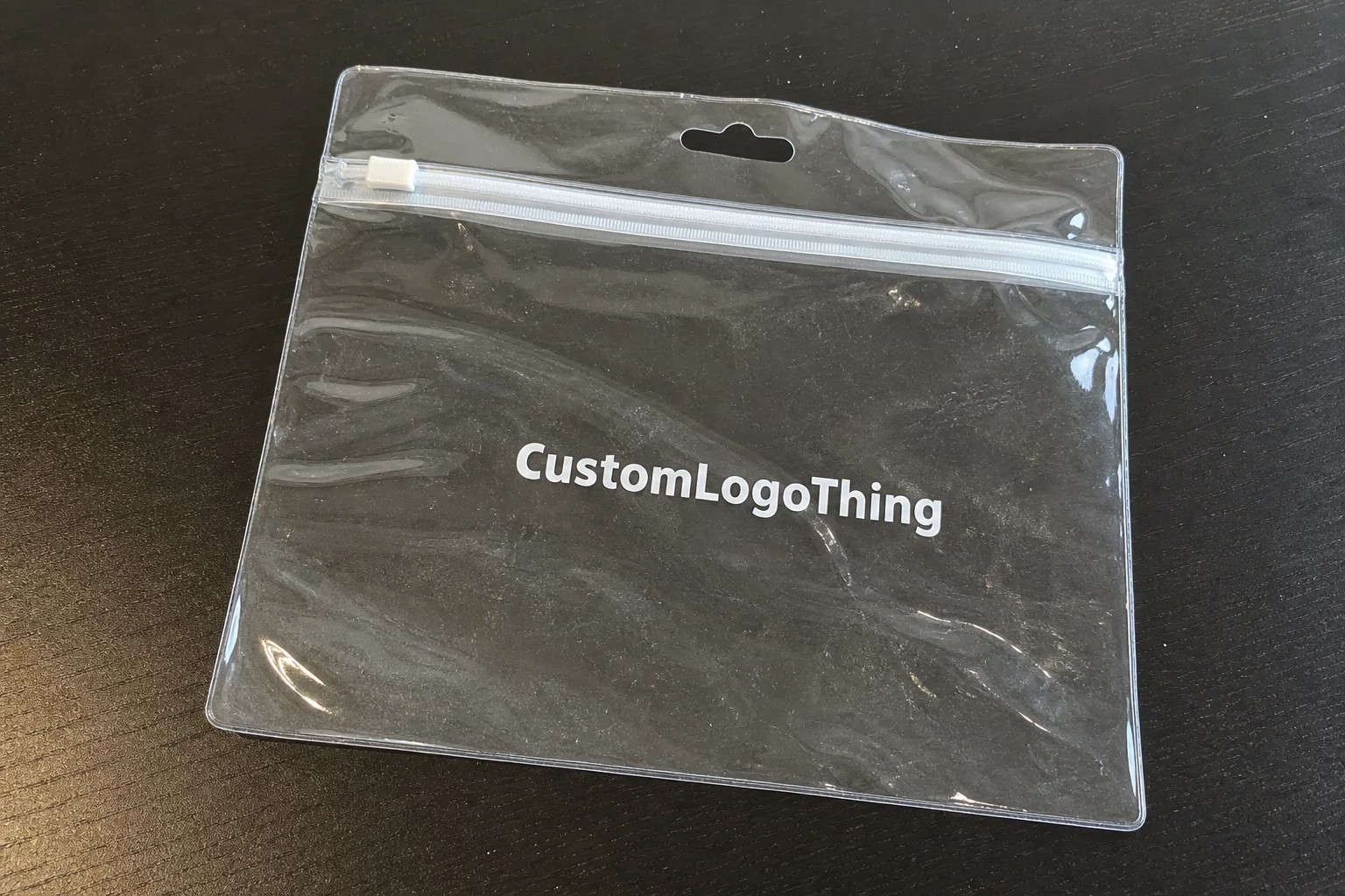
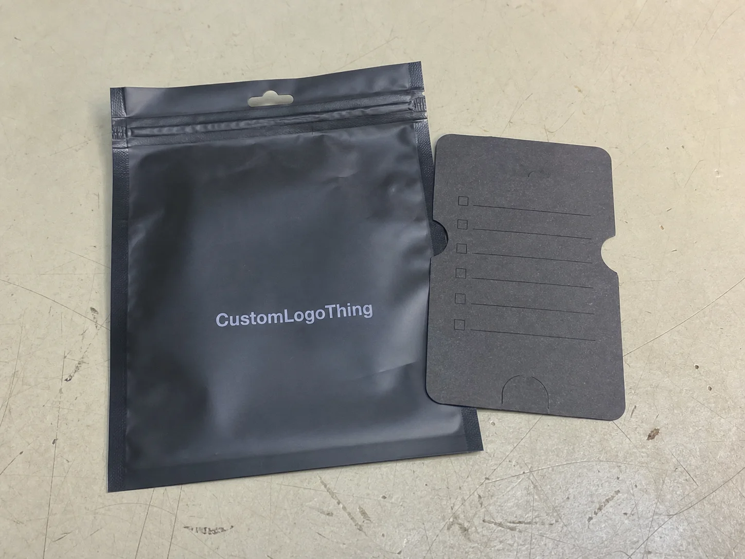
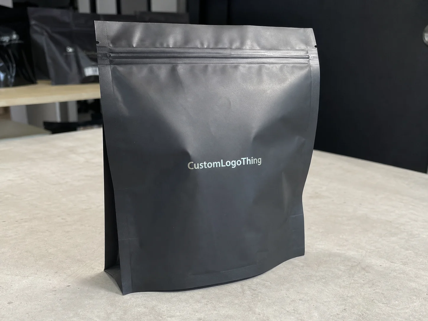
- Packaging: the box, mailer, bag, insert, or wrap that holds the product.
- Branding: the identity system—logo, color, typography, messaging, and tone.
- Packaging branding: the combination of structure, materials, print, and messaging that makes the product feel like your brand.
When you’re deciding packaging branding how to choose, you’re not just asking “what looks nice?” You’re asking “what fits my product, my price point, and my channel without wasting money?” That’s the question that keeps brands alive after the launch party is over. A box that costs $1.85 landed from a supplier in Dongguan may be perfect for a $120 gift set and absurd for a $16 accessory line, and the math does not care about aesthetics.
I’ve also seen how small changes can matter more than giant redesigns. At one food client meeting in Austin, a founder wanted to spend $6,200 on a new sleeve system. We instead moved the logo 8 mm higher, changed the finish from high-gloss to matte aqueous, and added a bold interior message. Result: better shelf visibility, lower glare in photos, and no new tooling. Sometimes packaging branding how to choose is just knowing where not to spend. Which, frankly, is the part nobody puts on a mood board.
If you need examples of actual product formats, take a look at Custom Packaging Products and compare what structure fits your item before you chase aesthetics. That saves time, and time is money. Usually a lot more than people admit, especially when a proof cycle in Shenzhen eats 12 business days because somebody forgot to include the inner flap copy on the first dieline.
How Packaging Branding Works Across Product and Customer Experience
Packaging branding how to choose becomes easier when you map the customer journey. I’m talking about first glance, purchase decision, delivery, opening, use, and post-purchase sharing. Each step gives you a chance to reinforce your brand identity or make it look like you rushed everything in a back room at 11:48 p.m. I have absolutely been in that back room, by the way, and it smelled like tape, ink, and regret.
At first glance, color and typography do the heavy lifting. A black box with restrained white type signals luxury or performance. A bright mailer with bold icons signals fun, value, or accessibility. A neutral kraft box often suggests eco-awareness, minimalism, or small-batch authenticity. These are subconscious cues, and customers react fast. I’ve watched buyers in retail packaging discussions pick one mockup over another in under 10 seconds because the finish “felt more expensive.” That was with the same product inside and the same 1200dpi mockup file.
Then comes the shipping or shelf moment. For e-commerce, packaging branding how to choose has to include transit durability. If your custom printed boxes arrive dented, no amount of foil stamping will save you. For retail shelves, the front panel has maybe 3 seconds to stand out among 40 other SKUs. That means you need strong hierarchy: logo, product name, benefit, and maybe one design cue that’s recognizable from 6 feet away. In grocery and cosmetics aisles, that 6-foot read is often the difference between being picked up and being passed over in 8 seconds.
The unboxing experience is where brands often overdo it. A branded tissue sheet, thank-you card, and insert can be effective. Three layers of ribbons and crinkle fill for a $24 item? That’s how you turn margin into confetti. Packaging branding how to choose should always follow the product economics. A subscription box can justify more theatrics because repeat revenue is part of the model. A low-margin accessory line usually cannot, especially if shipping from New Jersey to California already costs $6.40 per parcel.
Match packaging style to the sales channel
Retail packaging and direct-to-consumer packaging behave differently. On a shelf, structure and visibility matter first. In e-commerce, shipping weight, assembly time, and content reveal matter more. Subscription boxes need consistency and repeatability because the customer sees the same format every month. If you sell through wholesale, you may need barcode placement, case pack logic, and master carton compatibility to keep warehouse staff from inventing new curse words. And they will invent them. Warehouse teams are creative under pressure, especially in a 3 a.m. shift in Reno.
Here’s a simple positioning framework I use when clients ask about packaging branding how to choose:
- Value: Use standard materials, simple print, and one strong visual cue. Keep cost under control.
- Mid-market: Add one premium feature, like soft-touch lamination or a custom insert.
- Premium: Invest in thicker board, refined finishes, and a structured opening experience.
- Luxury: Focus on materials, tactile finish, precision construction, and controlled reveal.
Consistency matters too. I’ve seen brands print the outer box one way, the insert another way, and the tape a third way. That fragmented look makes the whole package feel accidental. A good brand identity should show up in the carton, the mailer, the insert card, the tissue, and even the tape if the budget allows. If you need supporting pieces, Custom Labels & Tags can help unify the system without rebuilding the whole box program. A 3-inch label on the inner flap can do more work than a full rebrand if the colors and typography are aligned.
For standards and sustainability references, I often send clients to the EPA containers and packaging recycling guidance and the FSC site when forest sourcing matters. If your packaging branding how to choose decision includes environmental claims, you need actual sourcing proof, not a vague green leaf icon and optimism. Customers have gotten smarter about this. Thank goodness. They know the difference between FSC-certified paperboard and a beige box with a recycled-looking texture.
Factory-floor reality: I once watched a premium tea brand switch from a magnetic rigid box to a standard tuck-end carton with a better coating and tighter tolerances. They saved $1.14 per unit at 10,000 units and got fewer damaged corners. The customer still thought it was premium. That’s not magic. That’s packaging branding how to choose with a calculator open and a supplier in Suzhou willing to redo the knife line.
Packaging Branding How to Choose the Right Materials, Style, and Finish
If you want packaging branding how to Choose the Right fit, start with the material. The wrong substrate can wreck the whole project, no matter how pretty the render looks on screen. A 350gsm C1S artboard behaves differently from E-flute corrugated. A rigid box wraps differently from a folding carton. Kraft paper has a different texture and print result than a coated white board. That sounds obvious until someone approves artwork on a monitor in Toronto and then acts shocked when the color prints two shades duller on uncoated stock. I get that people want the screen to be truth, but screens are basically confident liars.
Here’s the practical breakdown I use with clients:
- Folding cartons: Good for cosmetics, supplements, candles, and light consumer goods. Efficient for retail packaging.
- Corrugated boxes: Best for shipping protection, heavier items, and e-commerce.
- Rigid boxes: Higher perceived value, common for gifts, electronics, and premium launches.
- Kraft mailers: Simple, cost-conscious, and often good for eco-positioned brands.
- Molded inserts: Useful when you need a neat presentation and controlled product movement.
For finishes, each one changes both the feel and the cost. Matte lamination softens the look and cuts glare. Gloss adds shine and can help colors pop. Soft-touch feels premium but fingerprints easily and costs more. Foil stamping creates a sharp accent, especially on dark backgrounds. Embossing or debossing adds dimension, but only if your artwork supports it. Honestly, I think too many brands stack finishes just because they can. Foil, emboss, spot UV, magnetic closure, velvet insert—congratulations, you’ve built a very expensive box for a product with a $19.99 retail price. At 2,000 units, that extra finish stack can add $0.65 to $1.40 per unit without changing conversion at all.
Packaging branding how to choose also depends on the product itself. Fragile products need board strength and internal support. Heavy products need corrugation or rigid construction so the box doesn’t taco in transit. Odd dimensions can force custom tooling, which affects MOQ and price. A 3.5 oz jar in a standard carton? Easy. A tapered bottle with a custom neck insert? Different conversation entirely. A 750 ml glass bottle shipping from Los Angeles to Miami is a different animal than a 50 ml serum heading to a boutique in Portland.
Use sustainability with actual numbers, not marketing fog
Customers can smell greenwashing from across a warehouse. If you want sustainable branded packaging, say exactly what you’re doing: recycled content, FSC-certified board, minimal ink coverage, water-based coating, or recyclable mono-material structures. Don’t claim “eco-friendly” unless you can explain why. I’ve sat through supplier meetings in Ho Chi Minh City where “green” meant nothing more than a beige color and a hopeful sales rep. Cute, but not useful. A 40% post-consumer recycled board spec is useful. A leaf icon is not.
Packaging branding how to choose should also include production limitations. Some printers want 1,000-unit MOQs, others start at 5,000. Some handle foil stamping in-house. Others outsource inserts. Some can run full-color litho on rigid boxes, while others will steer you toward digital print for lower quantities. These limitations matter because your dream structure has to fit a real line, not a mood board. A factory in Ningbo may turn a 10,000-piece folding carton in 12-15 business days from proof approval, while a specialty rigid box shop in Dongguan might need 18-25 business days because the hand assembly is slower.
Here’s a comparison that shows how the choice often plays out:
| Packaging Type | Typical Use | Estimated Unit Cost | Brand Impact | Notes |
|---|---|---|---|---|
| Folding carton | Beauty, supplements, small retail goods | $0.22–$0.65 at 5,000 units | Clean, versatile, shelf-ready | Good for print-heavy branding; common board specs include 300–350gsm SBS or C1S artboard |
| Corrugated mailer | E-commerce shipping | $0.45–$1.10 at 5,000 units | Practical, strong, customizable | Great for unboxing experience; often uses E-flute or B-flute corrugate |
| Rigid box | Premium gifts, luxury items | $1.80–$5.50 at 2,000 units | High-end, tactile, giftable | Higher freight and assembly cost; handmade wraps are common in Guangzhou and Dongguan |
| Kraft mailer | Eco-focused brands, lightweight products | $0.28–$0.75 at 5,000 units | Natural, simple, honest | Limited print richness compared with coated board; good for one-color flexographic print |
I’ve personally seen a brand save $0.31 per unit by switching from a Custom Rigid Setup to a high-quality corrugated mailer with an interior print panel. They kept the same logo system and added a better structural reveal. Customers still posted the box. Margin stayed intact. Everyone won except the ego attached to the word luxury, which, frankly, was getting a bit dramatic anyway. On 8,000 units, that change freed up $2,480 for paid acquisition or better insert cards.
If you’re building a broader package branding system, keep the elements repeatable. Use the same color code, the same typography scale, and the same icon set across product packaging, inserts, and shipping materials. That’s how a brand starts feeling intentional instead of stitched together from five different vendors. One Pantone, one type family, one finish language—those details are what make a line look coordinated from Miami retail shelves to a fulfillment center in Atlanta.
Cost, Pricing, and MOQ: What Packaging Branding Really Costs
Packaging branding how to choose gets real the minute someone asks for a quote. And the quote usually arrives with more surprises than a cheap freight bill. The main cost drivers are size, material, print color count, finish, tooling, inserts, and shipping. Add rush fees if you need it yesterday, because of course the launch was planned for next Tuesday. I don’t know why this happens so often, but apparently calendars are optional in product launches. A rush print in Shenzhen can add 10% to 20% to the factory price if the line has to be shifted around an existing production queue.
One reason founders get confused is that they see a single unit price and assume that’s the whole story. It isn’t. There are one-time costs like dieline setup, plates, cutting dies, and sampling. Then there are recurring costs like unit production, freight, assembly, and sometimes storage. Packaging branding how to choose should always include both. Otherwise, you’re budgeting with half the numbers missing. A $180 dieline fee and a $220 cutting die are small on paper, but they matter a lot when the first order is only 500 units.
Here’s the kind of price swing I see all the time: a branded box might be $0.45 at 5,000 units, but $1.20 at 500 units because the setup costs are spread across fewer pieces. A rigid box with foil and a custom insert can sit at $2.30 per unit at volume and jump much higher on short runs. That’s not a printer trying to be difficult. That’s math. On a 2,000-unit job, freight from China to the U.S. West Coast can add another $0.14 to $0.26 per unit depending on carton cube and season.
What drives the quote up fastest
- Large dimensions: More board, more material, more freight.
- Extra colors: Every added print station can increase cost.
- Special finishes: Foil, embossing, spot UV, and soft-touch add labor.
- Custom inserts: Foam, molded pulp, or printed dividers raise complexity.
- Low quantities: Setup costs hit harder when volume is small.
MOQ is the part nobody likes talking about until it blocks the launch. Uline is good for stock packaging and faster access, but you’re not getting fully customized structure at the same level as a specialty vendor. PakFactory and local print shops in Los Angeles, Chicago, or Atlanta can be useful depending on the run size and complexity, but each has a sweet spot. I’ve had clients assume a boutique custom box vendor would take a 300-unit order with five finishes and a custom insert. That’s adorable. Not realistic, but adorable.
Packaging branding how to choose better means spending on the parts customers actually notice. If your audience opens the box on camera, invest in the first reveal and interior print. If the product sits on a shelf, invest in shape, typography, and front-panel hierarchy. If the item ships across the country, spend on crush resistance and corrugated strength. One high-value feature beats five weak ones every time. A strong matte board with one foil logo usually beats a box loaded with cheap-looking extras. For example, a 24pt SBS carton with matte aqueous and a single foil mark can outperform a heavier box covered in spot UV, gloss varnish, and a cluttered pattern.
I like to break the budget into three buckets:
- Protection: keeps the product safe.
- Presentation: creates perceived value.
- Efficiency: keeps assembly, freight, and storage under control.
If one bucket is starving, the whole program gets messy. For example, I once worked with a drinkware brand that spent heavily on a magnetic lid box but forgot the insert and corner protection. The product rattled in transit. They paid for a beautiful failure. We redesigned it into a simpler tray-and-sleeve setup, cut damage rates by 17%, and reduced landed cost by $0.68 per unit. That’s how packaging branding how to choose should work: as a business decision, not a trophy.
For case examples and budget logic, I always recommend reviewing Case Studies before locking your structure. You’ll see what happened when brands chose form over function, and where they saved money by simplifying instead of overbuilding. A few of those examples were produced in Shenzhen, while others were sourced from suppliers in Ohio and New Jersey, and the cost differences were not subtle.
Step-by-Step Process and Timeline for Choosing Packaging Branding
Packaging branding how to choose gets easier when you treat it like a process, not a brainstorm. I use a simple flow: audit, brief, design, sample, revise, approve, produce, deliver. Skip a step, and you usually pay for it later in delay fees or misprinted cartons. I’ve watched more than one quick project turn into a six-week game of inbox tennis because nobody wanted to be the person who approved the wrong file. One missing PDF comment can cost an extra 7 business days.
Start with an audit. What is the product size, weight, fragility, shelf life, and shipping method? What does the current packaging do wrong? Is it too expensive, too plain, too fragile, or just inconsistent with the brand identity? I’ve had clients bring me a box they loved until we measured the shipping cost and found it added $1.90 per order from a warehouse in New Jersey to customers on the West Coast. Love is nice. Unit economics are better.
Then write a real brief. Not “make it premium.” I mean dimensions, target customer, retail or DTC, acceptable unit cost, target MOQ, print method, finish preferences, and any compliance requirements. If you need a barcode, keep it in the brief. If you need FSC-certified stock, say that. If assembly time matters, mention it. This is the difference between a useful quote and a stack of pretty samples that solve the wrong problem. A proper brief should also include exact construction, such as a 3mm rigid chipboard base, a 1200gsm greyboard shell, or a 300gsm fold with 1/8-inch tolerance at the tuck flap.
Typical timeline for packaging branding how to choose
- Concept development: 2–3 weeks, including direction and dieline review.
- Sampling and prototypes: 1–2 weeks, depending on material availability.
- Revision cycle: 3–7 business days per round if feedback is clean.
- Production: 3–6 weeks, longer for specialty finishes or large runs.
- Freight and delivery: 3–14 days depending on route and mode.
That timeline assumes you’re responsive. If approvals sit in someone’s inbox for nine days because the team is syncing, the schedule stretches. I’ve seen a project that should have taken six weeks stretch into ten because three people kept approving the wrong PDF version. Packaging branding how to choose is often less about design skill and more about decision discipline. If your proof is approved on a Thursday in Dongguan, production typically starts the following Monday after plate preparation, not the same afternoon.
Reviewing dielines matters more than people think. I always ask clients to check fold lines, glue areas, barcode placement, and text safety zones. If you’ve got a top flap that hides the product name, that’s not a creative choice. That’s a mistake. When a printed proof arrives, verify board color, print contrast, corner squareness, and finish gloss. A screen mockup can lie. The sample doesn’t. In one case, a matte lamination sample from a supplier in Qingdao showed a better contrast ratio than the approved render by about 15%, which changed the final direction completely.
Supplier negotiation anecdote: At one Shenzhen meeting, a carton vendor quoted me $0.19 extra per unit for a custom window patch. I asked them to show me the labor step. They folded, charged $0.06 instead, and kept the same board spec. That saved the client $3,150 on a 15,000-unit run. Packaging branding how to choose sometimes means asking one annoying question at the right time. Apparently annoying is sometimes just another word for effective.
Before production, check these decision points:
- Product dimensions are final.
- Artwork is locked.
- Print colors are approved against material samples.
- Insert method is confirmed.
- Compliance copy and barcode placement are correct.
- Unit cost, MOQ, and freight are within budget.
If all six are green, move. If not, pause and fix it now. A small delay in approval is cheaper than 2,000 misprinted boxes sitting in a warehouse. If the factory in Ningbo says 12-15 business days from proof approval, plan your handoff around that exact window and add another 3-5 days for ocean or domestic freight if the launch date is fixed.
Common Mistakes in Packaging Branding How to Choose Better
Packaging branding how to choose gets derailed by the same few mistakes over and over. First: people choose packaging that looks expensive but fails in transit. I’ve seen rigid boxes collapse in shipping because the structural design was weak and the inner fit was sloppy by 2 to 3 mm. That sort of error looks minor on paper and awful in a customer’s hands, especially after a 1,200-mile ground shipment from Texas to Pennsylvania.
Second: over-designing for the wrong audience. A luxury finish on a budget product can create distrust if the rest of the brand promise doesn’t match. If your item sells for $14 and the box looks like it belongs to a $150 perfume, customers notice the gap. They may not say it politely, but they notice. Packaging branding how to choose should match the actual price point and repeat purchase behavior. Not every product needs a velvet interior, and thank goodness for that. A $0.28 satin insert can be enough if the category is practical and the product is under $20.
Third: ignoring operational details until the end. Barcode placement, shipping labels, regulatory copy, and insert instructions should be part of the initial design. I once had a supplement client who approved a beautiful front panel, then realized the FDA-required panel needed more room than the dieline allowed. We had to compress the layout and reprint the proof. That delay cost them nine business days and about $420 in revised prepress work. Not dramatic. Just expensive.
Fourth: color mismatches. Digital mockups often look richer than the final printed result, especially on uncoated stock or kraft paper. A deep blue on screen can turn muddy on recycled board if you don’t adjust ink values. This is why I insist on physical samples whenever possible. Packaging branding how to choose can’t be done reliably from a monitor alone. Monitors lie for a living, and the cheapest ones are the most confident about it.
Fifth: chasing trends instead of building a system. If you redesign every season because you saw a competitor use neon gradients or a die-cut window, your packaging loses continuity. Better to create a system that scales across product lines, sizes, and channels. Strong branding should survive new SKU launches without starting from zero every time, whether you’re printing in Portland, Shenzhen, or a small shop in Atlanta.
One more trap: forgetting assembly time. A box that takes 40 seconds to fold is fine for 100 orders. It becomes a nightmare at 10,000. I’ve watched warehouse teams quietly hate a packaging decision that looked elegant in a mood board. Practicality is not boring. Practicality is what keeps the business from self-sabotage, especially when the line workers in a Sacramento warehouse need to hit 1,500 units per shift.
Expert Tips to Make Packaging Branding Work Harder
If you want packaging branding how to choose that actually performs, pick one signature brand element and repeat it intelligently. That could be a color band, an interior print surprise, a structural reveal, or a specific typography treatment. One thing. Done well. I’d rather see a brand own one visual cue than scatter budget across five half-baked effects. Five weak effects is how you end up with packaging that looks busy and expensive in the worst possible way. A single embossed mark on a 350gsm board can do more than a full-panel foil storm.
Testing matters too. I usually suggest two or three packaging directions and a small customer test before a full run. Show people the physical sample if you can. Ask what feels trustworthy, what feels expensive, and what they’d expect the product to cost. The answers are often humbling. In one client test, the premium box was called too clinical, while the simpler version was rated more honest and easier to gift. That one stung a little, but it also saved the launch. We tested 18 samples in a room in Los Angeles, and the winner was the design with fewer effects and a better tactile finish.
Want to reduce cost without looking cheap? Simplify artwork. Standardize box sizes. Reduce color count. Use a single premium finish instead of three. Keep the structure efficient. I’ve cut packaging budgets by 18% just by tightening the size spec by 4 mm and removing an unnecessary inside flood print. No one complained. They barely noticed, which is exactly the point. At 10,000 units, that small dimension change saved nearly $1,900 in board and freight combined.
Packaging branding how to choose should also coordinate with your other channels. If your e-commerce photos show a matte white box with a soft shadow, the retail display and social media should echo that mood. If your social brand is bold and energetic, but the packaging looks sterile and corporate, you create friction. Buyers feel that mismatch even if they can’t explain it. A customer in Chicago may not know why a box feels off, but they know it in 2 seconds flat.
Another factory-floor story: I once stood beside a print line where we swapped a full-coverage dark ink interior for a 15% coverage pattern with one gold accent. The cost dropped by $0.27 per unit because ink waste and drying time fell. The brand still got the dramatic reveal. That tiny tweak paid for the entire insert program, and it came out of a facility in Guangzhou that quoted the job at 14 business days from proof sign-off.
If your packaging program is growing, keep a master spec sheet. Include board grades, exact Pantone references, approved finishes, insert dimensions, and carton assembly notes. When you launch a new SKU six months later, you won’t be reinventing the wheel. You’ll be extending a system. That is how packaging branding how to choose becomes scalable instead of chaotic. A good spec sheet also saves your factory partner in Dongguan from guessing at glue flap dimensions or redoing a cutting form.
For brands working on the broader package branding system, I also like to coordinate with labels, tags, and other smaller items so the product packaging feels consistent from the shelf to the shipping box. That’s where Custom Labels & Tags can quietly do a lot of heavy lifting. A 2-inch neck label or a 1.5-inch hang tag can reinforce a box design without adding much to the unit cost.
And yes, if sustainability is part of the pitch, make sure the claim holds up. Use recycled board where appropriate, reduce unnecessary lamination, and check recyclability by region. The EPA and FSC references I mentioned earlier are good starting points, but your actual packaging spec should be built around your market and material supply. A recyclable carton in California may still need different ink or adhesive choices than one destined for Toronto or Berlin.
When clients ask me packaging branding how to choose in one sentence, I tell them this: choose the format that protects the product, fits the channel, and tells the truth about the brand without overspending on decoration. Simple. Not easy. But simple. And if the final landed cost is $0.88 per unit instead of $1.44, the business will usually thank you before the customer even notices the box.
Frequently Asked Questions
How do I choose packaging branding for a small business?
Start with your product price, customer expectations, and sales channel. If you’re selling a $22 candle on Shopify, you do not need the same packaging branding how to choose playbook as a $180 skincare kit in retail. Pick one strong brand cue, like a signature color or a clean interior reveal, and use standard sizes first. Then upgrade after the sales data proves the demand. That keeps you from buying fancy boxes before the business earns them. A practical first run might be 500 units at $0.72 each instead of 5,000 units at $0.39 each.
What is the best packaging branding for e-commerce products?
For e-commerce, choose packaging that protects the item in transit and looks good in the unboxing experience. Corrugated mailers or custom printed boxes with a clean inside reveal usually work well. Add an insert if the product moves around, but keep weight and assembly time low. Packaging branding how to choose for online sales is mostly about damage prevention, shipping cost, and making the first opening feel intentional. If a parcel ships from Ohio to Arizona, even a 4-ounce weight increase can add measurable freight over 5,000 orders.
How much should packaging branding cost per unit?
There’s no single number, because quantity, material, and finish can swing pricing hard. A simple branded mailer might stay under a dollar at scale, while rigid boxes can run several dollars each depending on the details. I’d ask for quotes at 500, 2,000, and 5,000 units so you can see where the break-even point lands. That’s the only way packaging branding how to choose becomes a business decision instead of a guess. A 5,000-piece folding carton run in Dongguan can come in at $0.24 per unit, while the same design at 500 pieces may jump to $0.88.
How long does packaging branding take from concept to delivery?
Simple projects can move in a few weeks if your artwork is ready and the structure doesn’t need major changes. More complex packaging with custom inserts, specialty finishes, or multiple proof rounds takes longer. A realistic plan usually includes concept time, sample approval, production, and freight. If you’re launching a product, build that time into the schedule early. Packaging branding how to choose too late is how launch dates get wrecked. In practical terms, a straightforward carton may take 12-15 business days from proof approval, plus 3-10 days for freight depending on whether it ships from Shenzhen, Los Angeles, or a domestic plant in Ohio.
What are the biggest mistakes when deciding packaging branding?
The biggest mistakes are picking packaging before you understand the customer and channel, ignoring shipping durability, and spending on looks without checking MOQ, cost, and timeline. I’d add one more: approving a digital mockup and assuming it will print exactly the same on real board. It won’t. Packaging branding how to choose better means testing materials, checking actual samples, and keeping the final use case in view. A carton that looks elegant on a MacBook screen can print 8% darker on kraft board and change the entire feel.
If you want branded Packaging That Actually supports sales, start with the product, not the fantasy version of the product. I’ve seen too many brands spend money in the wrong place and then wonder why returns are high or the shelf presence feels weak. Packaging branding how to choose is about fit. Fit the product. Fit the buyer. Fit the budget. Fit the channel. Do that, and the packaging starts working for you instead of against you. A $0.31 improvement per unit across 10,000 orders is $3,100 back in the business, which is usually a better story than a prettier box.