Personalized Liquor Bottle Labels can look perfect on a proof and still fail on the bottle once cold glass, condensation, and real handling start doing their work. That gap catches buyers off guard all the time. The print is only one part of the job. The label also has to stay flat, stay readable, and keep its finish after it has been chilled, touched, stacked, and moved around.
If the order is for a wedding bar, a gift run, a private-label launch, or retail display, the actual decision is not just artwork. It is substrate, adhesive, finish, and whether the label matches the bottle and the storage conditions.
That sounds obvious. It usually is not until the first test bottle comes out of the cooler with a lifted edge.
Why Bottle Labels Fail After Cooling
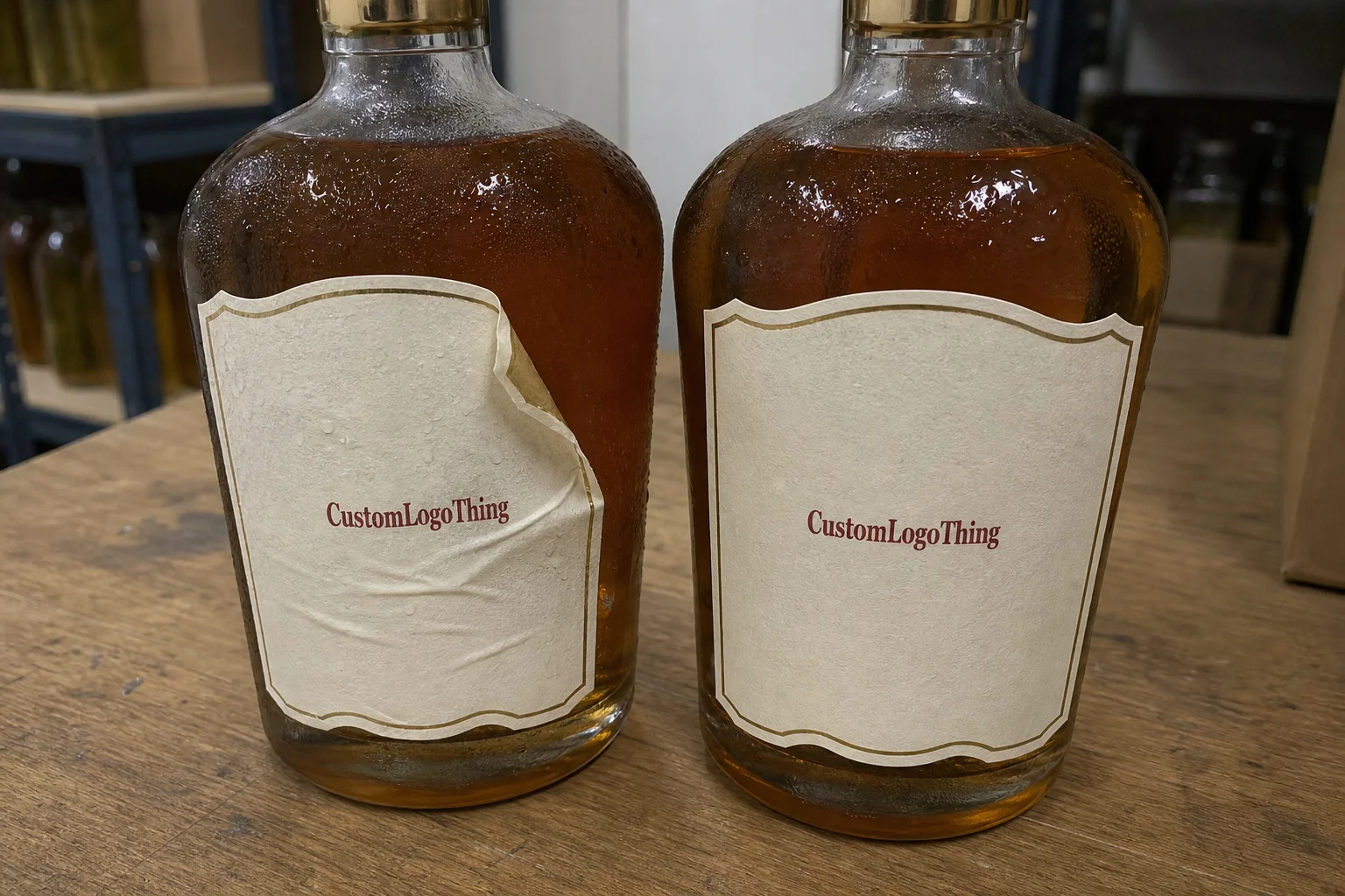
Most label failures are not dramatic. They begin with a corner lifting, a wrinkle at the edge, or a cloudy patch that appears after the bottle sits in a cooler for an hour. On paper, the label looked fine. On glass, under moisture and temperature change, it behaves differently.
Cold bottles create three common problems. First, condensation weakens adhesives that were never meant for wet service. Second, repeated contact from hands, ice buckets, and transport scuffs the surface. Third, curved glass puts pressure on the label edges, especially if the label is oversized or the stock is too stiff.
That is why personalized liquor bottle labels should be specified by use case, not by artwork alone. A label for a shelf-only bourbon bottle has different requirements than a label for a chilled vodka bottle served from a bar well. One may do fine on a standard paper stock. The other usually needs a synthetic face stock and a more aggressive adhesive.
The useful question is simple: will the label survive the route the bottle actually takes? If the bottle goes from warehouse to fridge to ice bucket, the spec has to account for moisture, temperature swing, and abrasion. If it sits dry on a shelf, the requirements are lighter. That difference affects cost, material, and finish.
A label that survives the proof but fails in the cooler is not a good label. It is just an expensive surprise.
Buyer education on pressure-sensitive labels is well covered by the Packaging Association, and transit stress testing is often discussed through ISTA. Those standards do not pick the label for you, but they help frame the right questions before a quote is approved.
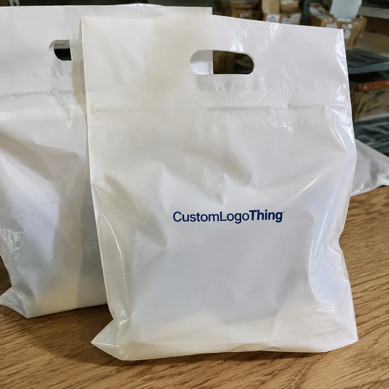
What Personalized Liquor Bottle Labels Are and How the Print Run Works
At the basic level, personalized liquor bottle labels are pressure-sensitive stickers or wraps printed to fit a specific bottle shape, size, and placement area. Some are front labels only. Some include a neck label, back label, and tamper-style accent. Others wrap partway around the bottle and need tighter registration because the label is visible from multiple angles.
The process starts with measurements. Not guesses. Measure the flat label panel, the curve of the glass, and the space around shoulders, ribs, and seams. A bottle with a tall straight face gives you more freedom. A tapered or highly curved bottle demands more restraint in layout and a better adhesive choice.
After that comes artwork prep. Most vendors want vector files, outlined type, and a defined dieline or fit template. A proof usually shows trim, bleed, and placement. If the job has a custom shape, the die line matters because even a small shift can make the label read as off-center on the bottle.
Digital short-run printing is usually the better fit for small event orders, variable designs, or faster proof cycles. It reduces setup work, which means lower waste and quicker turnaround. Conventional press work can lower unit cost at higher volume, but it is less forgiving if design changes are still moving. That tradeoff drives most of the buying decision.
Placement also matters. A front label carries the main brand story. A neck label adds a premium cue. A back label handles legal copy, origin notes, or flavor details. The more surfaces you use, the more you need to respect legibility. Tiny type on curved glass looks neat on screen and becomes a problem on the bottle.
Materials, Adhesives, and Finishes That Control Durability
Material choice drives durability more than most buyers expect. Standard paper labels are fine for dry shelf display, but they are a weak choice for wet service or refrigeration. Synthetic film stocks, especially BOPP or a similar waterproof film, hold up better on chilled glass because they resist moisture and scuffing.
Adhesive matters just as much. A good face stock with the wrong adhesive still fails. For cold bottles, ask for a cold-temperature or freezer-grade permanent acrylic adhesive if the bottle will be chilled often. For curved glass, the adhesive has to grab cleanly without telegraphing edge lift. If the label must survive condensation, adhesive spec is not optional. It is the core of the job.
Finishes change appearance and wear. Gloss gives sharper color and a brighter shelf hit. Matte reads more restrained and hides fingerprints better. Soft-touch feels premium, but it can scuff if the bottles are packed loosely or handled a lot. Foil and spot UV can create strong contrast, though they need restraint. If the design is already busy, extra effects can make it look less expensive, not more.
| Option | Typical Use | Relative Cost | Durability |
|---|---|---|---|
| Paper stock with standard adhesive | Dry shelf display, gift bottles, low-handling runs | Lowest | Fair in dry conditions |
| BOPP or synthetic film | Chilled bottles, bar service, moisture exposure | Moderate | High |
| Waterproof stock with cold-temp adhesive | Ice buckets, refrigeration, condensation-heavy use | Moderate to high | Very high |
| Textured premium stock with specialty finish | Gift sets, luxury presentation, collector bottles | Highest | Depends on handling |
If the bottle will be chilled, ask whether the stock is rated for moisture resistance and whether the adhesive has been tested for cold application. If the answer stays vague, that is a warning sign. A prettier label that curls in an ice bucket is still a packaging failure.
For paper-based materials, FSC certification can matter if procurement asks for responsible sourcing. See FSC for chain-of-custody context. It will not solve the wrong adhesive, but it can support sourcing requirements if the project uses paper face stock.
Cost, MOQ, and Unit Pricing: What Changes the Quote
Pricing for personalized liquor bottle labels changes with size, shape, substrate, finish, artwork complexity, number of SKUs, and quantity. A 3 x 4 inch rectangular label on paper is not priced like a custom die-cut waterproof wrap with foil accents. If a quote ignores those differences, it is not a real comparison.
The practical rule is straightforward: unit cost drops as quantity rises, but setup cost has to be spread across enough labels to matter. For small runs, the per-label price feels high because prepress, proofing, die-cutting, and press setup are doing a lot of work for a short order. At larger volumes, those fixed costs get diluted. That is why a 250-piece order can look awkward next to a 5,000-piece run.
MOQ also changes by production method. Digital runs often support lower minimums, sometimes a few hundred pieces, especially if the design is simple. Custom press work usually wants higher volume to make sense. If the labels are only needed for one event or a limited release, forcing a large order just to chase a lower unit price usually backfires. Dead inventory is not savings.
For apples-to-apples quotes, ask vendors to price the same bottle size, the same finish, the same adhesive, and the same quantity break. Otherwise one quote may quietly include waterproof stock while another assumes plain paper. That is how buyers end up comparing labels that are not actually equivalent.
Typical price drivers look like this:
| Driver | What It Changes | Buyer Impact |
|---|---|---|
| Custom shape | Die-cut setup and trimming | Higher setup cost, stronger shelf impact |
| Waterproof film | Material cost and print handling | Better durability, higher unit price |
| Foil or spot UV | Additional finishing steps | Premium look, slower production |
| Multiple SKUs | Separate proofs and changeovers | More coordination, more room for error |
As a rough range, small promotional runs can land around $0.20 to $0.80 per label depending on complexity, while larger runs can fall below that if the spec is simple. The exact number matters less than the pattern: each added finish, shape change, or material upgrade pushes the quote upward.
Process and Turnaround: From Artwork to Case Pack
The cleanest jobs follow a predictable path. First, collect specs and bottle measurements. Next, place artwork against the correct dieline. Then review the proof carefully, approve a sample if the bottle is tricky, and move into print, finishing, inspection, and packing. If one step gets rushed or skipped, the delay shows up later in the chain.
Turnaround depends on the order. A simple digital run with existing artwork and a standard shape can often move in about 5 to 10 business days after proof approval. Add a custom die, specialty finish, or multiple revisions, and 12 to 15 business days is more realistic. If the label needs to be tested on a new bottle shape, add more time. Physics is not in a hurry.
Rush service sounds convenient, but it does not fix incomplete specs. If the artwork is missing bleed, the bottle measurement is wrong, or the adhesive has not been chosen for cold service, fast production only speeds up the mistake.
Packaging and delivery deserve attention too. Labels should be packed flat, protected from heat and humidity, and counted with a sensible overage if the run is intended for events or bar service. If they are shipped with other packaging, ask whether the cartons are protected against crushing. A fast ship date means very little if the labels arrive warped.
For buyers building a broader packaging program, it helps to keep labels and related components aligned in one spec file. If you already use Custom Labels & Tags for adjacent packaging pieces, keep the bottle label data in the same structure so revisions are easier to track.
Common Mistakes That Waste Time and Money
The most expensive mistake is usually simple: the bottle measurement was wrong. If the flat panel is smaller than expected, the label may crowd the shoulder or land too close to a curve. Once that happens, the design looks cramped or the adhesive struggles at the edges. Measure the actual bottle, not a supplier photo.
Artwork errors cause the next round of problems. Low-resolution images, type too close to the trim, missing bleed, and unapproved color shifts all create delay. Proof approval matters more than many buyers want to admit. If the spelling, date, bottle size, or legal copy is wrong on the proof, that mistake can turn into a reprint very quickly.
Quantity mistakes show up often too. Some buyers order too few and miss breakage, spoilage, or event overages. Others order too many before the brand story is locked. If the design is still under review, do not overcommit on volume. A box full of obsolete labels is not a strategy.
Another issue is bottle inconsistency. If the supplier changes the bottle mold or the glass finish changes, label placement can drift. That is especially painful on wraps and neck labels where alignment is obvious. The artwork can be correct and still look wrong because the container changed. Packaging teams see this constantly, and it is expensive in a very dull way.
If the bottles will ship long distances, ask whether the label needs transit testing aligned to common distribution stress. Standards from groups like ISTA help structure that conversation. You do not need to become a lab. You do need to stop guessing.
Expert Tips for Better Shelf Life and Presentation
Test the label under the conditions it will actually face. Chill one bottle, let it sweat, and rub the edge after handling. Check whether the corners lift, whether the print smears, and whether the finish clouds under moisture. One sample test can save a run.
Keep typography readable. Curved glass, reflective lighting, and condensation punish tiny type and thin strokes. A clean sans serif can work well, but the layout still needs enough contrast and spacing to survive real use. Fancy lettering is fine until nobody can read the brand name from six feet away.
Use finish to support the story, not carry it. Matte works well for a restrained premium feel. Gloss gives stronger color pop. Foil can signal luxury, but only if the rest of the design can support it. If the label is small, too many decorative effects will make it feel crowded.
Small layout changes often beat expensive decoration. Increasing the margin, shifting the logo higher, reducing copy by one line, or moving legal text to the back can improve the bottle faster than adding another finish. That is where practical design judgment matters more than flash.
For quality control, ask whether the printer checks edge alignment, color consistency, and adhesion performance on the final carton count. A good supplier has a clear answer. A vague one is usually a clue.
Next Steps: Build a Clean Spec Before You Order
Start with a short spec sheet. Include bottle height, diameter, flat label area, neck area if needed, quantity, finish, storage conditions, and target ship date. Add whether the bottle will be chilled, shipped, or displayed dry. Those details decide more than the artwork does.
Then request quotes from the same spec set. Same dimensions, same substrate, same adhesive, same finish, same quantity. If one vendor gets a different spec than another, the comparison is fake. That is not efficiency. It is noise.
Before approval, ask for a proof workflow, a material recommendation, and a sample test if the bottle will be handled often or stored cold. If the order is for an event or launch, build in time for proof review, production, packing, and delivery margin. A good label on a late truck is still a late label.
Personalized liquor bottle labels work best when they are treated like any other production component: measured, specified, tested, and checked against reality instead of assumptions. That is the difference between a label that merely looks premium and one that actually performs like part of the package.
How long do personalized liquor bottle labels last in an ice bucket?
Durability depends on the stock and adhesive, not just the artwork. For ice-bucket use, choose a moisture-resistant material with a cold-temperature adhesive and test one finished sample on a chilled bottle before ordering the full run.
What material works best for personalized liquor bottle labels on chilled glass?
Synthetic or waterproof label stocks usually hold up better than standard paper. The material still needs the right adhesive for cold, slick glass, or the edges can lift once condensation starts.
How much do personalized liquor bottle labels cost per unit?
Unit cost changes with quantity, size, finish, and whether the shape needs a Custom Die Cut. Small runs usually cost more per label because setup work is spread across fewer pieces, so quotes only make sense if all vendors are pricing the same spec.
Do personalized liquor bottle labels need waterproof adhesive?
If the bottle will be chilled, submerged in ice, or handled with wet hands, yes, that is the safer choice. Standard adhesives may work for dry shelf display, but they are a weak bet for cold or wet service.
What should I prepare before ordering personalized liquor bottle labels?
Have the bottle dimensions, print size, quantity, finish, and use case ready before requesting a quote. Be specific about whether the bottles will sit on a shelf, go into refrigeration, or live in an ice bucket.