Custom Liquor Bottle Labels That Make Bottles Sell Faster
In spirits packaging, the label often has to earn attention before the bottle shape, closure, or liquid color gets its turn. That is why custom liquor bottle labels are not just decorative. They are a sales surface, a compliance surface, and a durability test all at once. If any one of those fails, the rest of the package usually feels weaker too.
From a buyer’s perspective, the label has to do several jobs at once. It needs to carry the right legal copy, match the brand position, and still read well in the few seconds a shopper spends scanning a shelf. A bottle can look premium in a rendering and still miss the mark in person if the stock is wrong, the contrast is too low, or the finish fights the lighting. That is why label decisions belong in the same conversation as bottle selection and carton design, not after them.
For tasting rooms, private-label launches, gift sets, and seasonal runs, the visual read matters fast. People do not compare line by line. They scan, compare, and move on. A good label can make a new product feel established. A weak one can make a solid product look generic. The same principle shows up across packaging categories, including Custom Labels & Tags and broader Custom Packaging Products, because buyers read the whole package as one system.
The practical rule is simple: the design has to survive the bottle's real life. That means cold storage, condensation, friction in case packs, and the occasional hurried hand application on a busy line. If the label cannot handle those conditions, it is not finished, no matter how good the proof looks.
What Custom Labels Actually Change on the Shelf
On a crowded shelf, the label usually does the first and fastest work. Bottle silhouettes get similar. Clear glass becomes invisible. Liquid color helps, but the label still carries the main visual story. Typography, contrast, spacing, and finish often matter more than people expect. A small typeface on a dark background can look elegant on screen and disappear under bar lighting.
Custom liquor bottle labels influence how a bottle is read in three seconds or less. They tell the shopper what the product is, they suggest price tier, and they signal whether the brand feels careful or improvised. That matters in premium spirits, where people often buy by cues rather than by deep product research. It also matters in value tiers, where clarity and credibility can beat ornament every time.
The label also has a direct effect on staff use. Bartenders need to identify a bottle quickly. Retail buyers need to see product family and SKU differences without squinting. If a label is busy, cramped, or poorly placed on curved glass, the friction is immediate. People may not articulate it, but they feel it.
There is another practical layer: label construction changes perceived quality. Paper can feel refined in a dry environment, but it can fail fast around ice buckets. BOPP or other film stocks can look slightly different in hand, yet they usually hold up better in wet conditions. If the adhesive is wrong, the corner lifts. If the finish is too glossy, the copy can flare under hard light. Those problems are not cosmetic. They affect whether the bottle seems dependable.
A label that looks expensive in a proof but wrinkles on a cold bottle is not premium. It is a reprint waiting to happen.
How the Production Process and Timeline Usually Works
The production path is straightforward, but each step has a point where the schedule can slip. It starts with specs: bottle size, label panel dimensions, application method, order quantity, and the final copy. Then comes artwork setup, proofing, approval, finishing, slitting or sheeting, packing, and shipment. The press time is rarely the bottleneck. The revisions before approval usually are.
The most accurate quotes start with real bottle dimensions, not just a logo and a mood board. Curved shoulders, tapering panels, and narrow necks all affect the usable label area. A label that fits a flat die line on paper may still buckle on glass if the bottle narrows faster than expected. That is why physical measurements matter more than rough estimates.
Application method matters too. Hand application gives more flexibility, but it also tolerates small inconsistencies that can become visible on a premium bottle. Semi-automatic and automatic application require cleaner registration, more predictable roll specs, and tighter tolerances. If the label is going onto a high-speed line, that needs to be stated before the proof stage, not after the first test roll arrives.
Typical timing varies with complexity. A simple digital run can often move from proof approval to shipment in 5 to 8 business days. Standard pressure-sensitive labels usually fall in the 8 to 12 business day range. Specialty finishes, foil, embossing, Custom Die Cuts, and exact color matching can push that to 12 to 15 business days or longer. Freight time sits on top of that, and it is worth planning for if the launch date is fixed.
For some brands, packaging testing matters as much as artwork approval. Teams that move goods through multiple channels sometimes look at ISTA test methods as a reference point for transport stress, even if the focus is not the label alone. That mindset is useful. A package should be designed for the route it actually takes, not the ideal route in a presentation deck.
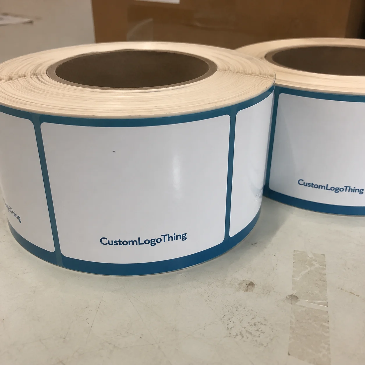
Materials, Adhesives, and Finishes That Decide Performance
Material selection is where most label projects win or lose. Paper is often the easiest place to start. It prints well, it can look refined, and it works for dry shelf conditions or short campaigns. The problem is moisture. A paper label that looks excellent in a sample carton may start to curl, stain, or soften once it sees condensation.
BOPP, a moisture-resistant film, is usually the safer choice for chilled bottles, bar service, and retail environments where the product will be handled a lot. It does not have the same tactile feel as textured paper, but it tends to hold shape better and stay clean longer. Vinyl is tougher still, though it is less common for premium spirits labels unless the use case is unusually demanding. For most bottle programs, BOPP hits the best balance of appearance and durability.
Adhesive choice is just as important as the face stock. A standard permanent adhesive may be fine for dry shelf display. Once a bottle is going into a cooler, ice bucket, or refrigerated case, the adhesive needs to cope with cold glass and moisture. Many peeling issues are blamed on print quality when the real problem is bond failure. If the corners lift first, that is often the clue.
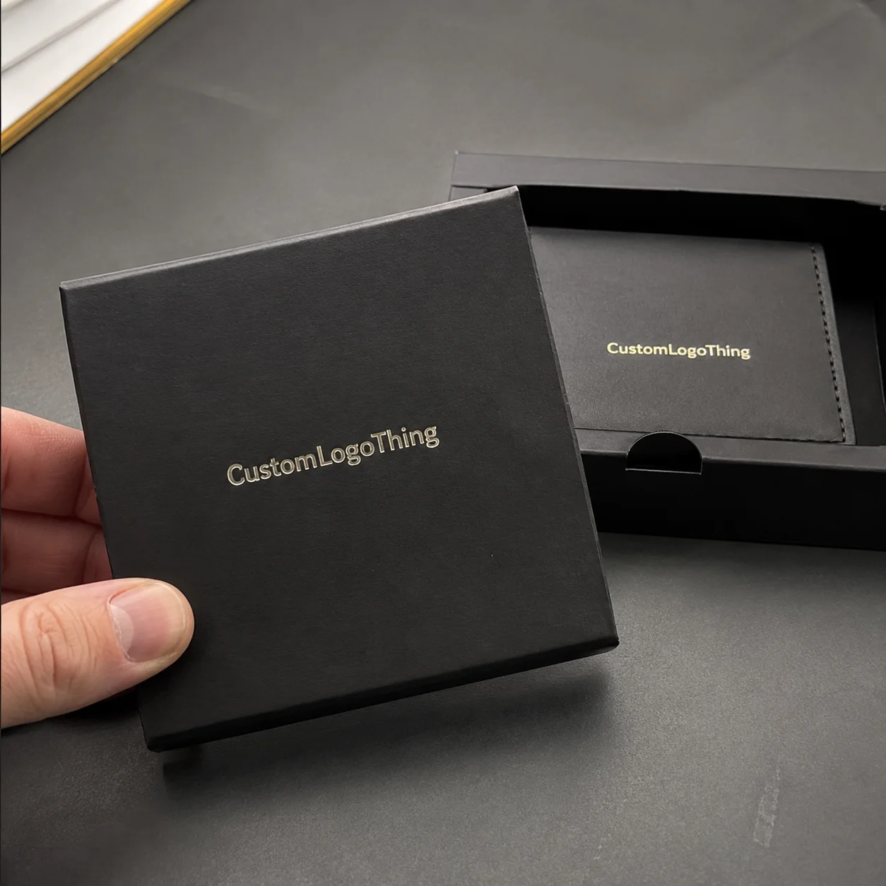
Finishes change the perceived price point fast. Matte gives a quieter, more modern read. Gloss makes color feel denser and stronger. Soft-touch creates a velvety surface that can help a spirits brand feel more considered, but it also adds cost and can reveal scuffing if the bottles rub together in transit. Foil, embossing, and spot UV create contrast and depth, although each one adds setup time and more opportunities for proofing mistakes.
For brands making sustainability claims, paper stock sourced with FSC certification can support the story, but only if the rest of the packaging follows through. A label does not become sustainable by association. It needs the right stock, the right adhesive, and a realistic plan for how the product is stored and shipped.
Here is the useful filter: if the bottle will sit in a gift box or on a dry shelf, tactile finish and visual depth matter more. If the bottle will live in a cooler, ice bucket, or busy bar rail, durability comes first. That tradeoff is the difference between a label that photographs well and a label that keeps working after it leaves the printer.
| Material or Finish | Typical Use | Approx. Unit Cost | Main Strength | Main Tradeoff |
|---|---|---|---|---|
| Paper label, matte finish | Dry shelf, tasting room, short campaigns | $0.06-$0.14 | Low cost, easy to print | Weak in moisture |
| BOPP pressure-sensitive label | Chilled bottles, retail packaging, bar service | $0.10-$0.22 | Moisture resistance, better durability | Less tactile than specialty stock |
| Soft-touch with foil or spot UV | Gift sets, premium launches, limited editions | $0.18-$0.40 | High perceived value | Higher cost, more proofing attention |
Custom Liquor Bottle Labels Pricing, MOQ, and Quote Drivers
Pricing depends on a small set of variables: size, shape, stock, print coverage, finish, quantity, and whether a custom die is required. People often expect a single clean number, but label pricing does not work that way. A rectangular paper label with one ink color is a different production job from a shaped label with foil, coating, and heavy ink coverage.
MOQ, or minimum order quantity, is where the economics become visible. Small runs cost more per unit because setup, proofing, and prepress work are spread over fewer labels. That is not a penalty. It is simply how print production works. As quantity rises, the unit price usually falls, especially when the project uses standard materials and a repeatable shape.
For a rough planning range, buyers commonly see numbers like these:
- 1,000 units on a simple digital run: roughly $0.20-$0.45 per label.
- 5,000 units on a standard BOPP roll label: roughly $0.10-$0.24 per label.
- 5,000 units with foil, embossing, or spot UV: often $0.18-$0.40 per label.
Those ranges move with coverage, die complexity, and color accuracy requirements. If a label uses deep solids or difficult metallics, the setup can take longer than the artwork suggests. A custom die can also add a one-time tooling charge in the low hundreds, while standard shapes avoid that cost. Small differences in spec can move the price more than a buyer expects.
The best quote request includes bottle diameter, panel size, quantity tiers, finish preference, whether the bottles will be chilled, and whether labels are hand applied or machine applied. Sending artwork alone is not enough. The production context is what turns a rough estimate into a useful number. That is especially true for custom liquor bottle labels, where a label that works on one bottle may fail on another with a slightly different curve or finish.
Price should not be judged in isolation. A label that costs a few cents more but survives condensation and reduces waste can be the cheaper choice in practice. Buyers who treat the project as part of the full packaging system usually make better decisions than buyers who only compare the print quote. The label is one piece of the package, but it is often the piece that takes the most abuse.
Step-by-Step: From Artwork to Finished Roll
The cleanest ordering process starts with measuring the bottle. Check the flat label area, the curvature, the height available before the shoulder, and the clearance around seams or embossing. Then choose the label format: roll, sheet, or cut piece. After that comes stock selection, artwork fit, and proof review. Skipping the measurement step usually leads to late fixes.
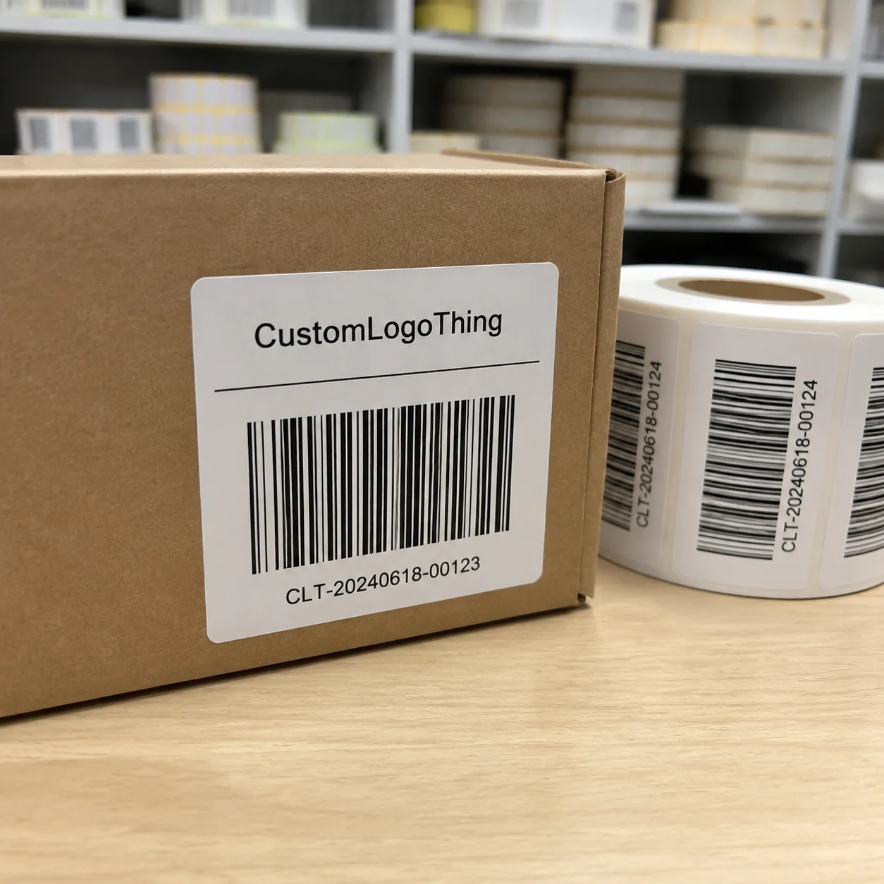
Artwork should be built with proper bleed, safe zones, and the right image resolution. For raster images, 300 dpi at final size is the practical floor. Logos, icons, and compliance marks should remain vector where possible. The barcode needs a quiet zone, and critical copy should stay away from the edge of the dieline. A design can be attractive and still fail if the type lands too close to a curve or seam.
Proof review should be treated as a production check, not a style review. Confirm spelling. Check the fill size. Verify the SKU name, alcohol details, and any mandatory statements. If the label is meant for multiple markets, confirm region-specific text before approval. A proof can look polished and still be wrong in a way that causes a reprint.
Application planning comes next. Hand-applied labels allow some tolerance, but the shape still has to look intentional on the bottle. Semi-automatic systems need a label that feeds predictably. High-speed lines require consistent roll direction, liner choice, and gap. If the bottle is going through automation, that should be disclosed before the artwork is finalized, because certain shapes and materials run better than others.
The proof is not a milestone to celebrate. It is the last chance to catch an error before the bottle is filled, packed, and shipped.
For brands building a full package, the label should be coordinated with secondary packaging, closure details, and carton graphics. If the product also ships in custom printed boxes, the visual language needs to stay aligned. Otherwise the bottle and the outer package start telling different stories, and that weakens the whole presentation.
Common Mistakes That Cause Peeling, Wrinkling, or Reprints
The most common failure is the wrong adhesive for the environment. A label can look perfect on a dry bottle and still fail as soon as it meets condensation. The next common issue is curvature. A label that fits a flat mockup can wrinkle on the actual glass because the bottle narrows faster than expected near the shoulder or base.
Another expensive mistake is approving artwork before checking the real print size. A few millimeters can eat into the barcode quiet zone or push copy too close to the edge. That sounds minor until the roll is printed and every label carries the same problem. A physical test on the bottle catches this quickly, which is why sample mounting matters so much.
Compliance errors are harder to recover from. Regulatory copy, batch information, warning text, barcode placement, and legibility requirements all need to be checked before approval. The risk rises when a label is used across multiple channels or export markets. A proof that looks right to marketing can still be wrong for distribution.
Cheap materials are not a reliable shortcut. They may save a little on the purchase order and cost more in waste, rework, or damaged presentation later. That is especially true for chilled bottles, bar programs, and any product that will be touched repeatedly. Reprints are expensive because they replace time, material, and launch momentum at the same time.
The Labels That Last are the ones designed for the actual route the product takes: storage, handling, chilling, and display. That is where custom liquor bottle labels move from being a design decision to being a practical packaging decision.
Expert Tips for Better Shelf Life and Faster Approvals
Test the label on the real bottle before committing to the full run. Not just the flat art. Not just a digital mockup. Put it on the actual container and expose it to the conditions it will face. If it will be chilled, place it in a cooler. If it will be handled at service, handle it with damp hands. Real-world checks expose issues that proof files do not.
Order a pilot batch when the bottle is new, the finish has not been proven, or the product will face heavy moisture. That short run costs a little more per piece, but it can prevent a much larger loss if the first production choice is wrong. It also gives the brand a chance to see how the label reads under store lighting, bar lighting, and camera flash.
Keep a spec sheet for repeat orders. Record the bottle dimensions, label stock, adhesive, finish, application method, and approved artwork version. That one page saves time on the next run because it prevents someone from guessing the dieline or swapping materials by memory. The more SKUs a brand carries, the more valuable this becomes.
Faster approvals usually come from better inputs, not faster decisions. Send the dimensions, quantity tiers, end-use environment, and copy requirements together. Include whether the bottle will be chilled, whether the line is manual or automated, and whether the order needs to match an existing label exactly. Clear inputs reduce back-and-forth and make the quote more useful.
For teams managing more than one packaging element, keep the label program aligned with the rest of the system. Cartons, closures, neck tags, and outer packaging should all follow the same visual logic. That consistency matters because buyers notice mismatch faster than they notice perfection. A good package does not ask to be admired in pieces.
The workflow is not complicated: measure the bottle, decide where the label needs to live, request a quote with real production details, and review the proof with a production mindset. If the bottle has to look credible on a shelf, in a cooler, or in a gift set, custom liquor bottle labels deserve the same rigor as the rest of the package.
Frequently Asked Questions
How long do custom liquor bottle labels last in cold or wet conditions?
Durability depends more on the material and adhesive pairing than on the print method alone. For chilled bottles, ice buckets, or refrigerated displays, moisture-resistant stock and a cold-surface adhesive are the safer choice. A real test on the actual bottle is still the most reliable way to confirm performance before a full run.
What should I send when requesting a quote for custom liquor bottle labels?
Send bottle dimensions, label size, quantity, finish preference, and whether the labels will be applied by hand or by machine. Include artwork files, required copy, barcode details, and any special conditions such as cold storage or curved glass. The more production context you provide, the more accurate the quote will be.
What is the best material for premium-looking bottle labels?
Matte and soft-touch finishes often create a more upscale feel, while foil and spot UV add contrast and visual depth. For wet environments, premium BOPP or another moisture-resistant stock is usually the safer option than plain paper. The best choice balances appearance, durability, and how the bottle will actually be handled.
Do small orders of custom liquor bottle labels cost more per label?
Yes. Smaller quantities usually have a higher unit cost because setup, proofing, and prepress work are spread over fewer labels. The unit price drops as quantity rises, especially when the label uses standard materials and a simple shape. Tiered pricing helps show where the breakpoints are.
How can I avoid reprints on my liquor bottle labels?
Check the dieline, dimensions, and copy placement against the actual bottle before approval. Confirm compliance text, barcode readability, and color expectations during proofing. If the bottle is unusual or the environment is harsh, test a sample first. That is usually the cheapest place to catch a mistake.