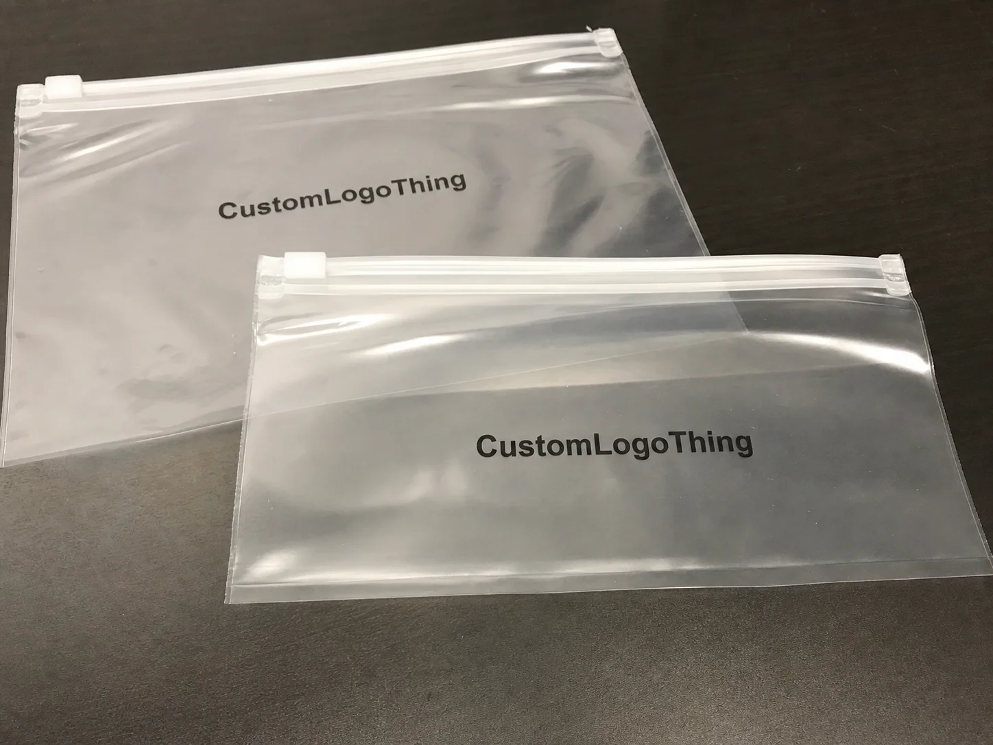
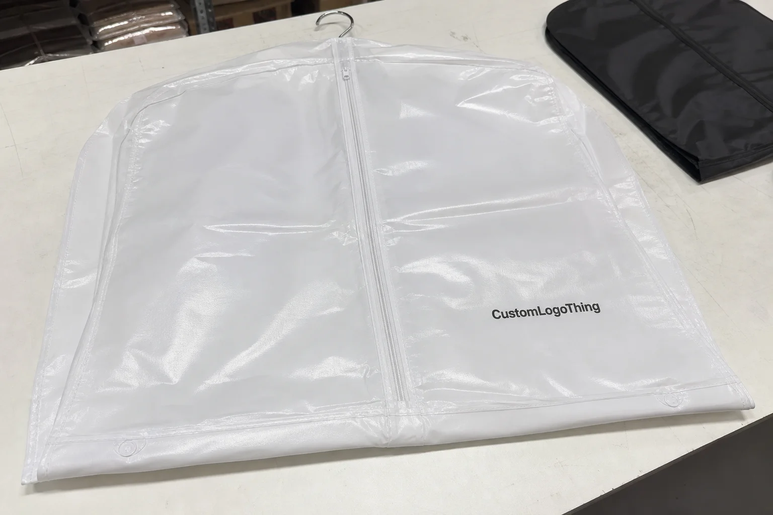
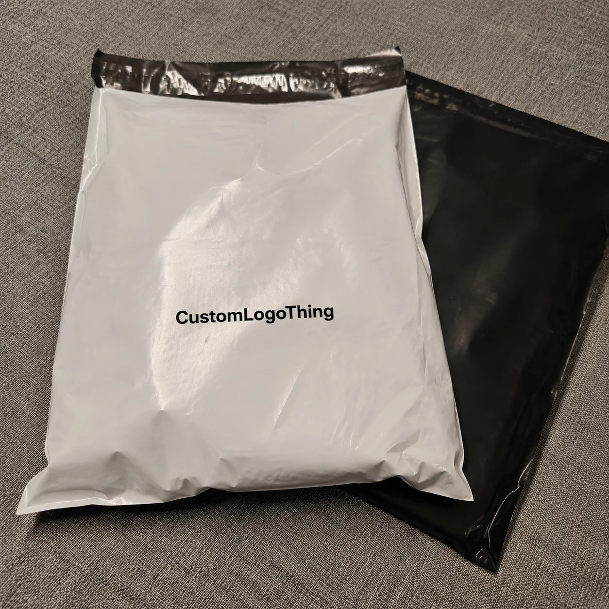
If you sell apparel, printed garment labels are one of those tiny details that quietly tell people whether your brand is thoughtful or just trying to look thoughtful. A shirt can fit beautifully and the fabric can feel substantial, but if the inside label scratches, peels, curls, or reads like an afterthought, customers notice. They may never mention it. They just stop reaching for that piece first.
That is the real role of a label. It carries brand identity, size information, care instructions, and compliance copy, but it also affects comfort every time someone wears the garment. A label that disappears in the best possible way makes the product feel finished. A label that sits wrong can make a carefully developed garment feel less expensive than it really is.
Printed labels are not all the same, either. A heat-applied neck print, a satin care label, and a fold-over side seam label each behave differently on the body and in the wash. The right choice depends on the fabric, the intended price point, and how long the garment is expected to stay in rotation. A basic tee that is washed often does not need the same spec as a limited-edition fashion piece, and activewear brings a different set of demands again.
Buyer rule: if the label feels cheaper than the garment, the garment starts losing value in the customer’s mind.
For brands that want a cleaner inside finish, Custom Labels & Tags can cover neck labels, care labels, size tabs, and swing tag add-ons without making the product feel overdesigned.
Printed garment labels: the small detail customers actually notice
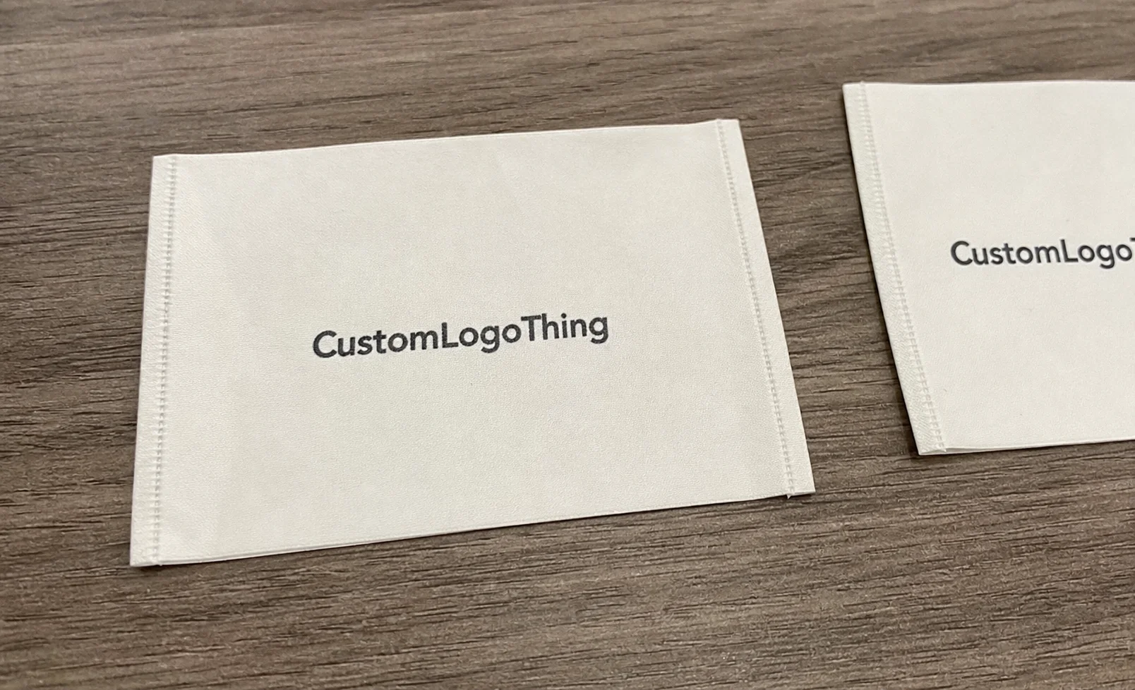
Printed garment labels are exactly what they sound like: branding, size, care, and compliance information printed onto label material or a garment-adjacent substrate instead of being stitched from woven threads. In practice, they’re used on tees, hoodies, activewear, kidswear, loungewear, and limited drops where comfort and clean branding matter more than a heavy, textured label.
The big advantage is flexibility. Printed labels are usually softer against the skin, easier to customize in smaller batches, and faster to update when artwork changes. If you are testing a new capsule line or adjusting a logo lockup, printed labels are far less painful than carrying old woven inventory that no longer matches the product. They also work well when the inside of the garment needs to stay visually quiet rather than competing with the fabric and cut.
That does not mean there is one standard construction. Heat-transfer labels are nearly tagless and sit flat, which suits comfort-first garments and performance pieces. Satin labels have a smoother, more traditional textile feel and are common in fashion basics. Cotton labels create a softer, more natural look, although the finish can be less consistent in harsher wash conditions. Tyvek-style labels are tougher and better for utility-minded products, but they are not the softest option against the skin.
The right choice depends on how the garment is worn, washed, and perceived. A premium label does not need to shout. It just needs to match the product honestly.
How printed garment labels work in production
The production flow is usually straightforward, though the details matter more than first-time buyers expect. It starts with artwork, moves to a proof, sometimes includes a physical sample, and then goes into bulk printing and finishing. Somewhere in that sequence, the supplier has to make sure the text is readable, the color holds, and the edges finish cleanly. None of that is decorative work; all of it affects whether the label performs once it reaches the garment.
Common production methods include screen print, heat transfer, digital print, and tag-style printed labels. Screen printing is useful for stronger ink coverage and repeatable runs. Heat transfer suits soft garments where a flat, low-profile result matters. Digital printing reduces setup friction and can be helpful when color variety is high or the order is short. Tag-style labels may be used for hang tags, inserts, or attachment-based brand systems where the label is part of the packaging story rather than the garment interior.
Placement changes the spec. A neck label is not the same as a side seam label or a care label. Neck labels need softness, clarity, and enough contrast to stay readable against the base fabric. Care labels need compliance text that holds up through repeated washing and abrasion. Side seam labels need to avoid bulk and irritation. If the label is being paired with a swing tag or packaging insert, the entire system should be planned together rather than pieced together after the fact.
Artwork prep matters more than many buyers assume. Vector files are still the cleanest starting point because they hold line quality well at small sizes. Pantone targets are useful when color consistency matters across repeats. Minimum line thickness should be checked early, especially on compact label formats, because fine lines and tiny icons can disappear once ink meets the actual substrate. What looks crisp in a mockup can lose clarity very quickly on fabric.
Durability comes down to a handful of practical variables: ink type, curing, fabric compatibility, and how the label is attached. A good supplier should be able to advise whether the spec is better suited to stitching, heat application, folding, or another attachment method. Even so, the buyer still needs to approve the label against the actual garment whenever possible. A label can look excellent on paper and still fail on a stretchy polyester blend, a brushed fleece, or a textured knit. That is not unusual. It is just part of production.
Key specs that affect print quality, comfort, and durability
If you want printed garment labels that feel intentional, you need to think beyond the logo. Material, finish, text size, wash resistance, and compliance all shape how the label performs. One weak spec can make a carefully designed label look rushed, and that tends to show up right away in a customer’s first wear.
Material choice is the first decision. Satin is common for a smoother, softer feel and works well on many fashion garments. Cotton can support a more natural look, although it is not always the best choice for heavy wash cycles or very crisp print reproduction. Soft-touch synthetic labels often give a useful balance of comfort and durability. Tyvek is tougher and better suited to utility or higher-abrasion applications. Heat-transfer film creates a nearly tagless finish, which is why it appears so often in activewear and comfort-first basics.
Finish matters too. Matte usually reads quieter and more premium in a minimal way. Gloss can sharpen contrast, but it can also feel less refined if the brand is aiming for understatement. Edge quality matters as much as the surface itself. If the label curls, cracks, or frays, the premium story starts to fall apart.
Readability is non-negotiable. If the text is too small, too light, or too decorative, it can become unusable once printed. For care instructions and fiber content, the hierarchy should be clear. The logo may carry style, but compliance text has a different job. It should remain legible after the garment has been worn and washed, not just on a proof sheet.
Wash and abrasion resistance should match the garment category. A casual tee can tolerate a different level of wear than performancewear, where sweat, stretch, repeated washing, and friction are part of normal use. If a supplier gives a wash-performance expectation, ask what that means in practical terms. A label that survives one or two quick washes is not the same as one designed for 20, 30, or 50 laundering cycles.
Brand consistency is where many labels quietly fall short. The inside label should coordinate with the hang tag, garment color palette, and packaging. If the outer packaging is restrained and refined but the neck label uses a color that misses the palette entirely, the product feels disconnected. Customers might not consciously diagnose the mismatch, but they feel it. The inside and outside of the product need to speak the same visual language.
Compliance can be tedious, but it is part of the job. Depending on the market, labels may need size, fiber content, country of origin, and care instructions. Wholesale accounts and marketplaces often have stricter expectations than direct-to-consumer sales, and international sales can bring a different set of rules again. Check the requirements for the region you are selling into instead of assuming one version will work everywhere. For broader packaging and labeling context, the Packaging Machinery Manufacturers Institute and the U.S. Environmental Protection Agency are useful references for material and sustainability-related considerations, though they are not substitutes for product-specific legal advice.
| Label type | Typical feel | Best use | Typical tradeoff |
|---|---|---|---|
| Satin printed label | Smooth, soft | Tees, loungewear, fashion basics | Can show wear if spec is too light |
| Heat-transfer label | Very flat, low bulk | Activewear, kidswear, comfort-first pieces | Needs careful fabric compatibility |
| Tyvek-style label | Structured, durable | Utility, outerwear, higher abrasion use | Not as soft against skin |
| Cotton printed label | Natural, soft | Eco-positioned or softer aesthetic brands | Not always ideal for heavy wash abuse |
Cost, pricing, and MOQ: what changes your unit cost
Pricing for printed garment labels swings based on quantity, size, print colors, material, and attachment method. That list is expected. The less obvious part is that setup and proofing can dominate the cost on small runs, which is why a 100-piece order can look disproportionately expensive next to 500 pieces.
For many buyers, practical minimums start around 100 to 500 pieces depending on the material and process. Lower quantities usually carry a higher unit cost because the setup effort stays almost the same whether you order 100 labels or 5,000. If the order is only for a test run, that is fine. It just should not be mistaken for wholesale pricing. Production does not reward optimism.
Printed labels often make more sense than woven labels for lower-to-mid volume runs and for brands that change artwork often. Woven labels can feel more premium in some applications, but they are not always the better choice if your designs shift seasonally or you need a softer interior finish. At scale, woven can become competitive, but that depends on artwork complexity, quantity, and the production method being used.
Typical pricing drivers include:
- Quantity — more units usually lower the per-label cost.
- Label size — bigger labels use more material and more print area.
- Print colors — more colors can raise setup and production complexity.
- Material — satin, cotton, Tyvek, and heat-transfer film each price differently.
- Attachment — stitched, heat-applied, folded, or cut-and-pack formats change the labor.
- Proofing and sampling — if you want a physical sample, budget for it.
For rough planning, small startup runs can sit in a modest budget band, while mid-tier DTC labels often land in a middle range with better finishes and cleaner compliance copy. Premium materials, specialty constructions, or tight color matching can raise the price quickly. A practical way to compare options is to ask for tiered quotes at 100, 250, 500, and 1,000 units. That shows where the price starts to flatten and where it still falls sharply.
Hidden costs are usually where the budget gets stretched. Shipping, rushed production, revised proofs, and Pantone matching can all add up. Sometimes the lowest quote is cheap only because it excludes part of the work. That is a common trap, especially for first-time buyers who are comparing only the headline number.
If you are deciding between label systems, it helps to look at the full brand stack rather than just the interior label. A tidy neck label, consistent hang tags, and clean packaging usually do more for perceived value than spending one extra cent on a flashy finish nobody notices. For product planning, Custom Labels & Tags lets you compare formats before you commit to one label style for everything.
Process, timeline, and lead time from proof to delivery
The production timeline usually follows a predictable path: inquiry, quote, artwork review, digital proof, sample approval, bulk production, finishing, and shipment. If the order is simple and the artwork is already clean, it moves faster. If it is a first-time custom job with multiple corrections, expect a longer cycle. There is no mystery there, just stages that take time.
Simple repeat orders can sometimes move in about 7 to 12 business days after proof approval, depending on the supplier and method. New custom projects with sampling and revisions often need 12 to 15 business days or more. Rush service may be possible, but it usually costs extra and narrows the room for corrections. That becomes uncomfortable fast if the proof still needs work.
What slows things down? Unclear files. Slow approvals. Color changes after proofing. Last-minute wording edits. Slightly different dimensions because someone guessed instead of measuring. If the goal is to ship on time, the supplier needs final copy, accurate sizing, and a clear approval path on the first pass.
Building in one sample cycle is usually worth it. A lot of label problems only show up in hand: the finish is too shiny, the text is too small, the label feels stiffer than expected, or the logo disappears on a dark garment. A sample costs less than a full batch that misses the mark.
For buyers who need packaging and transit durability to hold up, standards such as ISTA testing can be useful when labels are bundled with product inserts or shipped with packaging components that may rub, crease, or shift during transit.
Step-by-step guide to ordering the right label spec
Here is the practical way to order without creating unnecessary back-and-forth.
- Define the garment and use case. A baby tee, hoodie, and sports bra do not need the same label spec. Comfort, stretch, and placement all change the choice.
- Choose placement and attachment method. Neck, side seam, care label, or integrated swing tag. Decide based on comfort, visibility, and how your production line is set up.
- Prep artwork correctly. Use vector files, clear hierarchy, and final legal copy for care and fiber content. If the text is tiny now, it will be unreadable later.
- Request a proof or sample. Review it on a real fabric swatch or sample garment, not just as a flat file on your monitor.
- Confirm quantity and packing. Ask how the labels are bundled, counted, and shipped. If you need them sorted by size or style, say that before production starts.
- Archive the final spec sheet. Save dimensions, artwork, ink targets, attachment method, and approved copy. Future reorders should not require detective work.
The best buyers treat the label as part of the product, not a throwaway accessory. That keeps the garment from feeling finished only on the outside. Customers do notice the inside, especially when the label sits against the skin or appears after the first wash.
Common mistakes that make garment labels look cheap
Most label problems are predictable. That is the frustrating part. They are avoidable, and people still make them.
- Choosing the wrong handfeel. A stiff label on a soft garment is a bad pairing, especially for comfort-first products.
- Using tiny, low-contrast text. If people cannot read it, the label is failing its job.
- Ignoring compliance copy. Adding fiber content and care instructions after approval usually causes delays and cramped layouts.
- Ordering too few units. Small quantities can push the unit cost up in a way that eats margin fast.
- Skipping a sample. The on-screen mockup often leaves out the very issues that matter most.
- Not coordinating with the rest of the brand. The label should match the tone of the garment, hang tag, and package.
The worst version of this is a label that technically works but feels disconnected from the product story. A brand can spend heavily on fabric, fit, and packaging, then finish the garment with a label that looks like it came from a completely different line. That undercuts value immediately.
Another common mistake is specifying a finish that looks refined in theory but becomes noisy in practice. High gloss can reflect too much light. Tiny script can disappear on soft knits. Heavy contrast can look harsh on minimal brands. Good label work is rarely about adding more; it is about removing the things that get in the way of comfort and clarity.
Expert tips and next steps before you place an order
Ask for a material recommendation based on the garment type, not just the lowest quote. Price matters, but the cheapest option is not always the right option. A better label spec can reduce comfort complaints and rework, which are both more expensive than they first appear.
Request tiered pricing so you can see whether moving from 250 to 500 units actually changes the economics enough to matter. Sometimes it does. Sometimes the spread is small and not worth the inventory risk. Let the numbers do the talking.
Check the proof on a real fabric swatch whenever possible. Color, contrast, and edge quality shift once the label sits against actual garment material. A white label that looks crisp on screen may read gray against cream fabric. A black label may disappear into dark jersey. Context matters more than the mockup.
Keep two label systems ready if your line includes both core products and seasonal drops. A stable version for repeat sellers. A simplified version for capsule runs. That gives you flexibility without forcing every collection into the same spec.
Build a reorder file that includes final dimensions, artwork, approved copy, attachment method, and packing instructions. Future reorders should not depend on memory. That is a poor system for anything that needs to stay consistent across seasons.
Keep the label aligned with your broader packaging. If the garment, packaging, and branding all tell the same story, the product feels more intentional. If not, customers feel the mismatch even when they cannot explain it. That is why printed garment labels deserve real attention rather than being treated as the last five minutes of the design process.
Are printed garment labels better than woven labels?
They are often softer, faster to produce, and better for small runs or comfort-focused garments. Woven labels usually feel more textured and can look premium, but they are not always the best fit for delicate fabrics or fast-changing designs.
What is a normal MOQ for printed garment labels?
MOQ varies by material and production method, but many buyers see practical starting points around 100 to 500 pieces. Lower quantities usually cost more per label because setup and proofing take the same effort as larger jobs.
How long does it take to make custom printed garment labels?
Simple orders can move quickly after proof approval, while new custom projects usually take longer because of sampling and revisions. Lead time depends on quantity, complexity, and whether you need a rush run or a standard production slot.
Do printed garment labels hold up in the wash?
Good ones should survive repeated washing if the material, ink, and attachment method are chosen correctly. The real test is matching the label spec to the garment and getting a sample approved before bulk production.
What information needs to be on printed garment labels?
Most brands include size, fiber content, care instructions, and country of origin when required. Your exact label content depends on where you sell and whether you need retail or wholesale compliance.