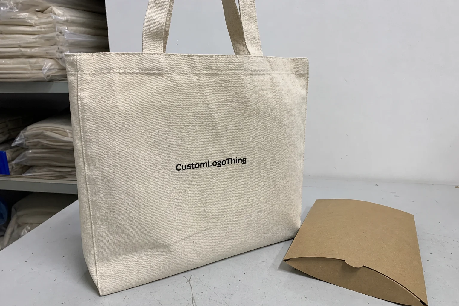
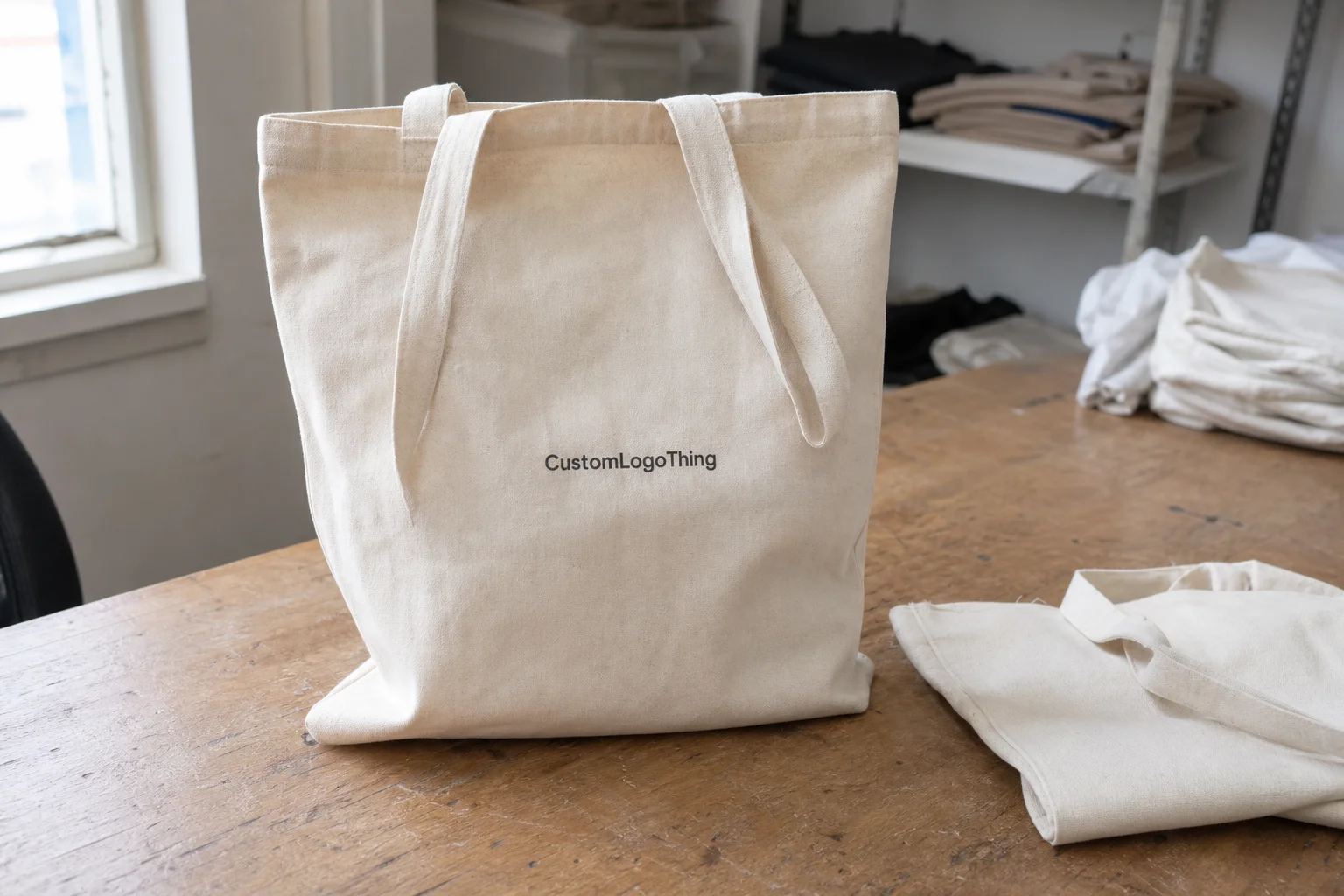
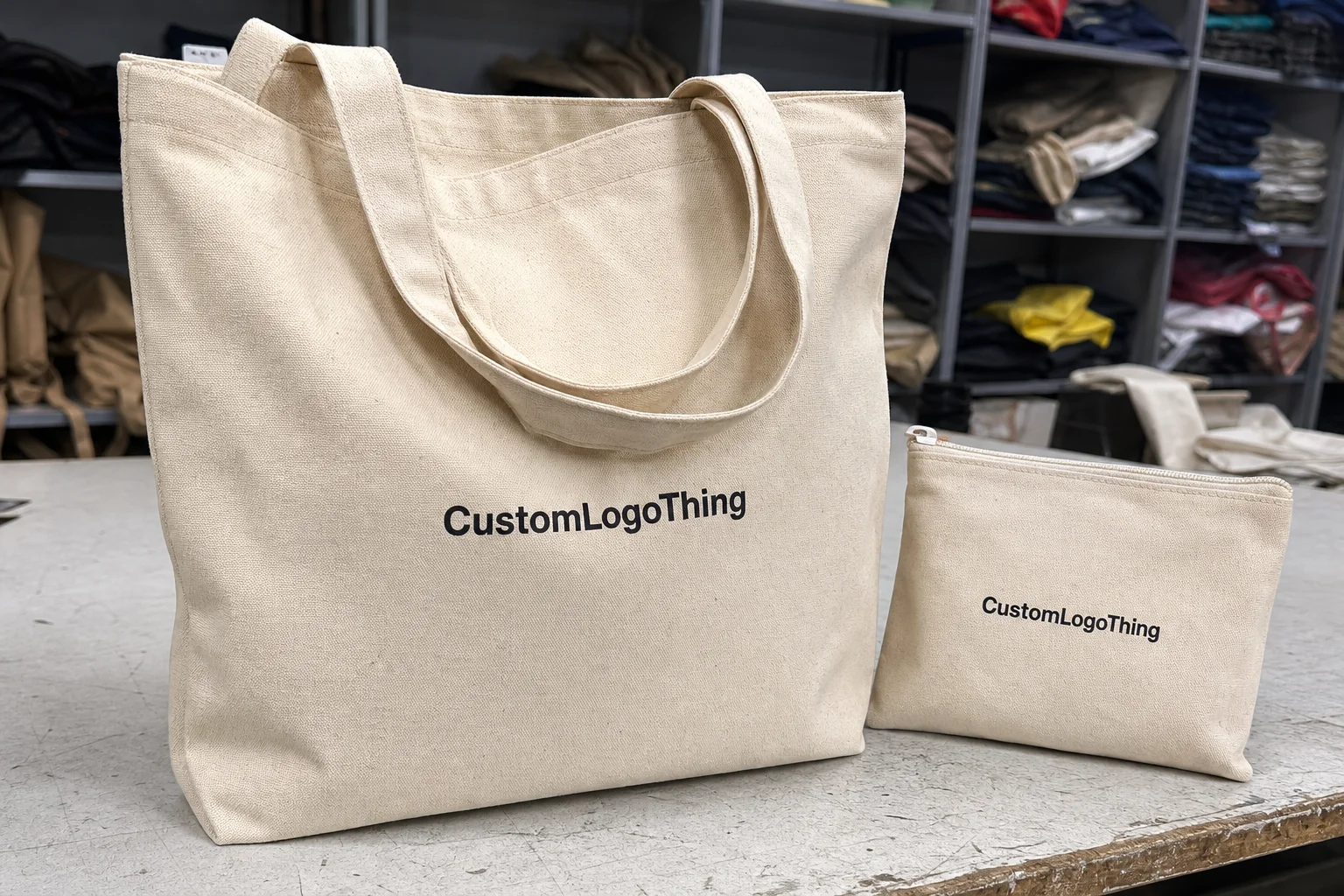
Screen printed canvas bags are one of the few promo items that can look plain at the quoting stage and still deliver real value after distribution. A tote gets handled, folded, stuffed, tossed in a car, and reused in places a brand cannot usually follow. That means the print has to hold up, the fabric has to feel credible, and the whole piece has to make sense in the hand, not just in a mockup.
There is a reason buyers keep returning to this format. Screen printing gives sharp, repeatable decoration for logos, short taglines, event marks, and retail graphics without forcing the unit price into premium territory. For trade shows, store launches, onboarding kits, and resale programs, the real question is usually not whether a tote belongs in the mix. It is whether screen printed canvas bags are the right version of that tote.
Why Screen Printed Canvas Bags Still Outperform Many Giveaways
Canvas bags stay useful because they solve a basic problem: people always need something to carry. That sounds obvious, but it is the reason they outperform novelty giveaways that get binned before the week is over. A useful bag earns repeat exposure. A disposable trinket gets one glance and disappears.
Screen printing fits this category well because it handles bold, direct artwork efficiently. The process works best on the front panel, though side placements and repeated patterns are also common. Most buyers use it for one- or two-color logos, simple illustrations, and typography that needs clean edges more than visual complexity.
From a buying perspective, the use case shapes the spec. Event teams want a bag that carries catalogs, samples, and a thick stack of handouts without looking flimsy. Retail teams need a bag that feels intentional enough to sell. HR teams often want onboarding or welcome kits that do not resemble leftover promo inventory. If the bag is meant for resale, the print and material quality have to justify the shelf price before the customer even uses it.
"A tote is branding surface first and carrier second. If the print looks muddy or the bag feels weak, the whole item reads cheaper than it should."
Screen printing is strongest when the artwork is built for it. That means strong shapes, solid fills, and enough contrast to survive production variables. It is not the right answer for photo-realistic art, dense gradients, or artwork that changes every week. That is not a limitation unique to this category. It is the practical tradeoff that makes the method affordable and repeatable.
The better the match between design and decoration method, the less the buyer spends correcting avoidable problems later. That is the part people tend to miss. Cheap only stays cheap if the art, bag, and quantity line up cleanly.
How the Printing Process Works
The production flow is predictable, but each step affects the final outcome. Artwork is reviewed, colors are separated, screens are prepared, ink is pushed through the mesh, and the print is cured so it bonds properly to the fabric. A clean run produces a sharp, opaque impression that looks consistent from the first bag to the last.
Each print color usually needs its own screen. A one-color logo is therefore faster and cheaper to set up than a three-color illustration. That sounds simple because it is. It also means artwork complexity has direct cost implications. A black logo on natural canvas is straightforward. A multi-color mark with tight registration and fine type needs more setup care, more press time, and a better-prepared file.
Canvas changes the behavior of the ink. A tighter weave usually gives cleaner edges. A heavier bag tends to lie flatter on press, which helps consistency. A looser weave can absorb more ink and soften the edge slightly. That may be fine for a casual tote, but it is not ideal if the brand depends on crisp geometry or small text.
Ink opacity matters too. Light print on dark canvas needs enough coverage to read well from a distance. If the wrong ink system is used, the print can look thin or washed out. The bag color also affects the result more than many buyers expect. Natural canvas is forgiving. Deep colors look sharper, but they leave less room for weak contrast or poor ink selection.
Spot-color logos and simple text translate especially well. Thin rules, tiny lettering, and detail-heavy artwork are where trouble starts. A digital mockup can be useful, but a real proof should show scale, placement, and contrast on the exact tote color. That is the version that reveals whether the design is actually print-ready.
If the bags are tied to a launch, retail program, or event with a hard date, pre-production approval is worth the time. It is a small checkpoint compared with remaking hundreds of bags after the art and placement are already locked.
Cost, Pricing, MOQ, and Unit Cost
Pricing for screen printed canvas bags usually comes down to five variables: quantity, number of print colors, bag size, ink coverage, and decoration location. A one-color print on one side of a standard tote is simpler than a two-color design printed on both sides of a heavier gusseted bag. The gap shows up in setup, press time, and rework risk.
The lowest bag price is not always the best value. A light tote with weak handles can cost more over time if it fails in use or makes the brand look cheap. The better question is more practical: what does the bag need to survive, and what does it need to communicate while it does that?
Minimum order quantities exist because screen setup has fixed cost. Whether the run is 100 units or 1,000, the screens still need to be made, the press still needs to be calibrated, and the art still needs approval. That is why small runs can look expensive per unit. Once quantity rises, the setup cost spreads out and the unit price usually improves quickly.
For planning, it helps to think in rough bands rather than chasing a single perfect number. As a rule, simple natural totes with one-color prints sit at the lowest end. Midweight bags with one or two colors sit in the middle. Heavier canvas, two-sided decoration, and higher ink coverage push the price up. Rush timing can move the number again.
| Option | Typical Use | Print Complexity | Typical Unit Cost Trend | Buyer Takeaway |
|---|---|---|---|---|
| Basic 8 oz natural tote, one-color print | Events, internal giveaways, entry-level retail | Low | Lowest at moderate volume | Best for simple branding and tight budgets |
| 10 oz tote, one- or two-color print | Retail resale, client kits, upgraded promo use | Medium | Moderate, with better perceived value | Strong balance between cost and presentation |
| 12 oz or heavier tote, two-location print | Premium launches, durable daily use, higher-end resale | Higher | Highest, but usually stronger shelf appeal | Worth it when the bag must carry weight and brand status |
Inventory intent matters just as much as volume. A throw-in event bag should stay simple. A product-adjacent tote, especially one sold through retail, can justify heavier fabric, better handles, and cleaner decoration. That extra spend is easier to defend if the bag will be seen repeatedly and judged next to other paid products.
If the art, fabric choice, or deadline is still moving, ask for a range first and a formal quote once the variables settle. A good supplier can estimate early, but a real quote needs clarity on size, fabric weight, print count, and delivery target. When those pieces are fuzzy, the price will be too.
Process and Timeline: From Artwork Approval to Delivery
The normal sequence is quote, artwork review, proof, approval, screen setup, printing, curing, packing, then shipping. That sounds mechanical because it is. The delays usually happen at the handoff points. A missing font file, a logo that is not vectorized, or a last-minute color change can add days before production starts.
Buyers should separate factory lead time from transit time. Factory lead time is the period from proof approval to finished goods leaving the facility. Transit time is the shipping leg after that. The two often get lumped together in a way that causes avoidable disappointment. A bag can finish on schedule and still miss a launch because freight was not given enough room.
Turnaround depends on stock availability, number of colors, proof revisions, and seasonal congestion. Rush orders are possible, but they reduce flexibility. Sometimes the supplier can move an order ahead. Sometimes the rush fee buys speed but not choice, especially if the exact tote color or print combination is not already in stock.
For event work, buffer time is not optional. A one-day miss on a conference bag can do more damage than a small price difference. I see buyers focus on per-unit savings and then discover that the event date is the most expensive variable in the whole project. The budget is not the issue at that point. Timing is.
Good planning starts before the quote. Vector art should be ready. The preferred bag style should be known. The quantity should be close to final. If those decisions happen late, production can still move forward, but it will move on the schedule the supplier has left, not the one the buyer hoped for.
For broader packaging and shipping performance, standards groups can be useful references. The ISTA framework helps teams think about distribution stress, while the EPA offers material and waste-reduction guidance that can support more disciplined procurement decisions.
How to Choose the Right Canvas Spec
The best tote spec is the one that fits the job. Canvas weight affects body and durability. Weave affects print sharpness. Finish affects hand feel. A matte natural tote can look practical and grounded. A smoother weave can read more retail-ready. Neither is automatically better. The use case decides.
Handle style matters more than many buyers expect. Short handles work well for hand carry and compact bags. Long handles give shoulder carry and more flexibility for daily use. Gussets add room for boxes, bottles, or thicker merchandise. Open tops are common and inexpensive. Zipper closures move the bag into a more finished, higher-cost category.
Bag color is not just an aesthetic choice. It changes opacity demands, contrast, and the tone of the whole item. Natural canvas offers a warm, neutral background and usually plays well with black, navy, or deep red print. Colored canvas can look sharper, but it leaves less room for a weak ink choice. Light artwork on a dark bag needs the right coverage or the logo disappears.
Placement affects how the bag reads in motion. A centered front print is the standard. A side print can feel more subtle and premium. Repeat patterns can work for retail resale or brand activation, but they make less sense for utility-first orders. Think about what the bag looks like when it is empty, half full, and slung over a shoulder. That is the version customers actually see.
FSC certification can matter if the buying team needs documented fiber sourcing for a broader sustainability program. It will not make the tote inherently better, but it can support procurement goals when canvas or packaging standards are part of an internal review.
The most overlooked spec is often the one that appears boring: handle length, body dimensions, bag weight, and allowable color variation. If two quotes do not match on those points, they are not really competing on the same product. A lower price can hide a lighter fabric or a smaller print area. That is not savings. That is comparison noise.
Common Mistakes Buyers Make With Printed Tote Orders
The first mistake is overcomplicated artwork. Tiny text, thin outlines, gradients, and crowded illustrations are the fastest path to a disappointing print. Screen printing likes strong shapes. If the logo only works when zoomed in on a monitor, it probably needs simplification before it goes on a tote.
The second mistake is approving a mockup too fast. A digital proof can make a small logo look acceptable even when it will sit too low, too small, or too close to a seam on the actual bag. Check the exact tote color, the print dimensions, and the placement. Those details decide whether the item feels designed or improvised.
Quantity errors happen just as often. Order too few, and the unit cost stays high while the event supply runs short. Order too many, and inventory sits unused. A retail program can absorb overage better than a one-time conference. An employee kit might justify a modest buffer. A launch tied to a fixed date should be much tighter.
Another common mistake is treating every tote program as identical. A store bag, a conference bag, and a client gift bag do not need the same canvas weight, handle length, or print coverage. If the use case changes, the spec should change with it. Otherwise you end up paying for features nobody notices or saving money in the one place that actually mattered.
Some buyers also assume production starts before art approval or stock confirmation. It usually does not. That is not bureaucracy for its own sake. It is risk control. Once screens are made and fabric is committed, changes get expensive fast. A corrected file is easy. A corrected run is not.
Expert Tips for Better Results and Fewer Reprints
Start with simplified art whenever possible. Clean logos, solid fills, and strong contrast usually outperform busier graphics. That is not a design compromise. It is a production advantage. A simpler mark prints more consistently, survives rough handling better, and reads faster across a crowded room.
If the bag supports a launch or a paid retail program, ask for a sample or pre-production proof. You want to see how the ink sits on the fabric, how large the mark appears in real life, and whether the bag color supports the artwork instead of fighting it. If the supplier cannot show a useful proof, that is a warning sign.
Ask directly about cure quality, ink hand feel, and wear resistance if the bags will be used heavily. A tote is not a sweatshirt, but the same basic risk applies: if the print is not properly cured, it can crack, transfer, or feel overly sticky. Buyers rarely ask about this early enough, and they should.
Match bag size to contents. A huge tote with a tiny logo can make the branding disappear once the bag is in use. A bag that is too small can look strained at the seams. The printed area should still be visible when the item is full, not only when it is photographed empty on a white background.
Before approving production, review the supplier specs: print area, handle length, body dimensions, bag weight, and allowed color variation. If you are comparing vendors, ask whether they are quoting the same fabric weight and the same print location. Otherwise the lower bid may simply be a different product with the same general shape.
"Good tote work is rarely about chasing the cheapest quote. It is about matching the print method, bag spec, and delivery schedule to the actual use case."
One more thing: if the order is meant to be handled all day at an event, resist the temptation to overspec the bag while underspecifying the print. A heavy canvas tote with a weak logo still underperforms. The fabric and decoration need to be balanced, not just expensive.
Next Steps for a Smarter Order
A cleaner buying process starts with a short checklist. Confirm the artwork. Choose the bag spec. Set the quantity. Request the quote. Verify the timeline. Those five steps remove most of the noise before production starts.
Ask for a mockup that shows scale and placement on the exact canvas color you want. If possible, compare a lower-cost tote with a heavier-duty version before you commit. The price difference is often smaller than the difference in how the bag will be used, and that is where value shows up.
For event or launch work, prepare logo files early and define the target quantity before the calendar gets tight. Lead times are easier to control when the art is ready and the stock assumptions are clear. That matters even more for screen printed canvas bags, where decoration, material choice, and turnaround all affect the final outcome.
Choose the tote to fit the job, not just the budget. When the print, bag spec, and schedule line up, screen printed canvas bags stop being generic merch and start doing their actual work: carrying things, carrying the brand, and holding up long enough to matter.
How long do screen printed canvas bags usually last?
Durability depends more on canvas weight and daily use than on the print itself. A well-cured screen print should hold up through repeated handling, and heavier bags generally keep their shape and appearance longer.
What artwork works best for screen printed canvas bags?
Simple logos, bold text, and solid shapes print most cleanly. Small lettering and fine gradients are harder to reproduce well, and vector files usually give the best production results.
What affects the unit cost the most?
Quantity, number of print colors, and setup complexity are the biggest factors. Bag style and canvas weight also change pricing, and rush timing can increase cost if production has to be reprioritized.
How do I estimate turnaround time for a custom order?
Start with proof approval time, then add production time and shipping time. More colors, revisions, or stock shortages can extend the schedule, so build in a buffer if the order is tied to an event.
Are screen printed canvas bags better than other tote decoration methods?
They are usually a strong choice for bold branding and efficient repeat orders. They are less ideal for photo-realistic art or very small detailed graphics, so the best method depends on the logo, quantity, and desired finish.