Buyer Fit Snapshot
| Best fit | subscription box packaging design for packaging buyers comparing material specs, print proof, MOQ, unit cost, freight, and repeat-order risk where brand print, material, artwork control, and repeat-order consistency matter. |
|---|---|
| Quote inputs | Share finished size, material target, print colors, finish, packing count, annual reorder estimate, and delivery region. |
| Proofing check | Approve dieline scale, logo placement, barcode or warning zones, color tolerance, and any recyclable or compostable wording before bulk production. |
| Main risk | Vague material claims, crowded artwork, or missing packing details can create delays even when the unit price looks attractive. |
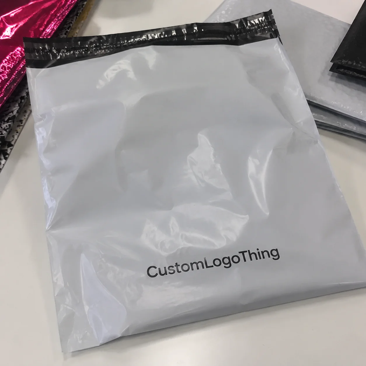
Fast answer: Subscription Box Packaging Design: Strategy That Keeps Subscribers should be specified like a repeatable production item. The safest quote includes material, print method, finish, artwork proof, carton packing, and reorder notes in one written spec.
What to confirm before approving the packaging proof
Check the product dimensions against the actual filled item, not only the sales mockup. Ask for tolerance on folds, seals, hang holes, label areas, and retail display edges. If the package carries a logo, QR code, warning copy, or legal claim, reserve that space before decorative graphics fill the panel.
How to compare quotes without losing quality
Compare board or film grade, print process, finish, sampling route, tooling charges, carton quantity, and freight assumptions side by side. A lower quote is only useful if the supplier can repeat the same color, closure quality, and packing count on the next order.
I still remember a cosmetics client in Newark sliding a dented sample across the table and saying, “The serum is fine, but the box made us look cheap.” The sample had a crushed corner, a 2 mm scuff on the lid, and a shipping label peeled halfway off from a humid truck run in New Jersey. I could almost hear the budget crying. That was the moment I stopped hearing Subscription Box Packaging Design as a nice-to-have and started treating it as a retention tool. In subscription models, the box is not just a container; it is part of the product, part of the story, and sometimes the reason a customer sticks around for month six instead of canceling after month two.
That sounds dramatic, but the numbers back it up. A subscriber opens the package 12 times a year, often on the same kitchen counter or office desk, so Subscription Box Packaging design has to do more work than one-time ecommerce packaging. It needs to protect the contents, keep packing speed steady, look good in photos, and still fit the margin math. A common custom mailer at 5,000 pieces might cost $0.15 to $0.42 per unit in Guangdong or Dongguan, while a rigid board presentation box can climb to $1.80 or more in Shenzhen depending on wrap and insert complexity. Honestly, I think that balance is where most brands stumble. They overspend on coatings, undersize inserts, or ship in oversized cartons that turn a premium experience into a shipping bill they regret by Friday.
Subscription Box Packaging Design: What It Is and Why It Matters
Subscription Box Packaging design is the system behind recurring deliveries: box structure, graphics, inserts, protective components, labeling, and the way every shipment feels familiar without becoming stale. In practical terms, it covers the mailer or rigid box, the internal layout, the print file, the closure method, the unboxing sequence, and even how easily a warehouse associate can pack 2,000 units without slowing down. When I say “design,” I mean the whole operating system, not just the artwork. If you have ever watched a line stall because someone had to hunt for the right insert orientation, you know exactly why this matters. In a plant outside Louisville, one misplaced divider added 11 seconds per pack-out; across 18,000 shipments, that became a labor problem, not a styling problem.
I’ve seen brands confuse package branding with decoration. They add spot UV, foil, and a custom sleeve, then discover the box takes 38 seconds to pack instead of 14. That sounds minor until you multiply it by 20,000 shipments. Good subscription Box Packaging Design should make the first impression stronger while making fulfillment easier, not harder. The best packages feel deliberate because every inch has a job, from a 350gsm C1S artboard sleeve to a 32 ECT corrugated shipper underneath.
Why does it matter so much in subscriptions? Because the customer is not comparing your box to a blank shipping carton. They are comparing it to the last package they opened, the one they posted on Instagram, and the one that arrived damaged from a competitor in Atlanta or Chicago. Repetition changes the stakes. A one-off purchase can survive a forgettable unboxing. A recurring box cannot. Consistency becomes part of the value proposition, and subscription box packaging design is what keeps that consistency visible month after month.
There’s also the churn issue. A 5% damage rate can turn into a 5-star review problem. A dull unboxing can quietly reduce enthusiasm by month three. A confusing structure can frustrate staff and delay packing by hours, especially in hubs like Dallas, Nashville, and Phoenix where seasonal volume spikes can add 20% to labor demand. That is why subscription box packaging design affects reviews, social sharing, and retention all at once. You’re not just buying paperboard. You’re buying trust, speed, and a repeatable customer experience.
“The box is the first product they actually touch,” a fulfillment manager told me during a plant visit in Ohio, where the team was shipping 60,000 kits a month. “If it tears, shifts, or arrives crushed, they blame the brand, not the carrier.” In that facility near Columbus, the team measured pack-out defects down to the minute, and a 7% reduction in crushed corners saved them roughly 1,100 replacements over a quarter.
The core tension is simple: make it feel premium, but keep it efficient at scale. That tension shows up in every decision, from corrugated flute choice to ink coverage. Smart subscription box packaging design solves for both sides at once, whether the program ships from Ontario, California, or from a co-packer in Charlotte, North Carolina.
How Subscription Box Packaging Design Works
The workflow for subscription box packaging design usually starts with a brand brief and ends with a warehouse-ready spec sheet. Between those points sit dielines, samples, transport tests, and a few rounds of uncomfortable but useful feedback. In my experience, the brands that move fastest are the ones that treat packaging like a system from day one, not a last-minute art project. I wish I could say that was the norm. It is not. Too many teams show up with a mood board and a prayer, then expect a carton factory in Shenzhen or Ho Chi Minh City to reverse-engineer the logistics.
The first step is the concept brief. That brief should include product dimensions, target shipping method, subscriber profile, monthly box cadence, and margin ceiling. If you are shipping a 1.8 lb skincare kit in a Zone 5 network from Pennsylvania to Texas, that matters. If you are packing a 7-piece snack assortment with variable fill, that matters too. Good subscription box packaging design begins with facts, not mood boards, and the facts should include exact numbers like a 9.5 x 7 x 3 inch pack-out, a 14-ounce unit weight, and a target freight ceiling of $2.10 per shipment.
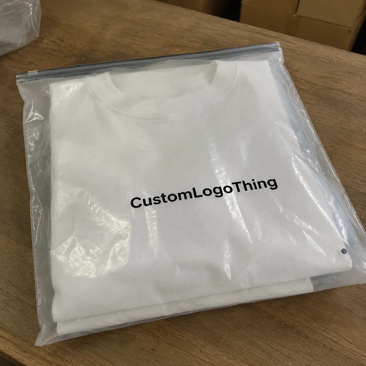
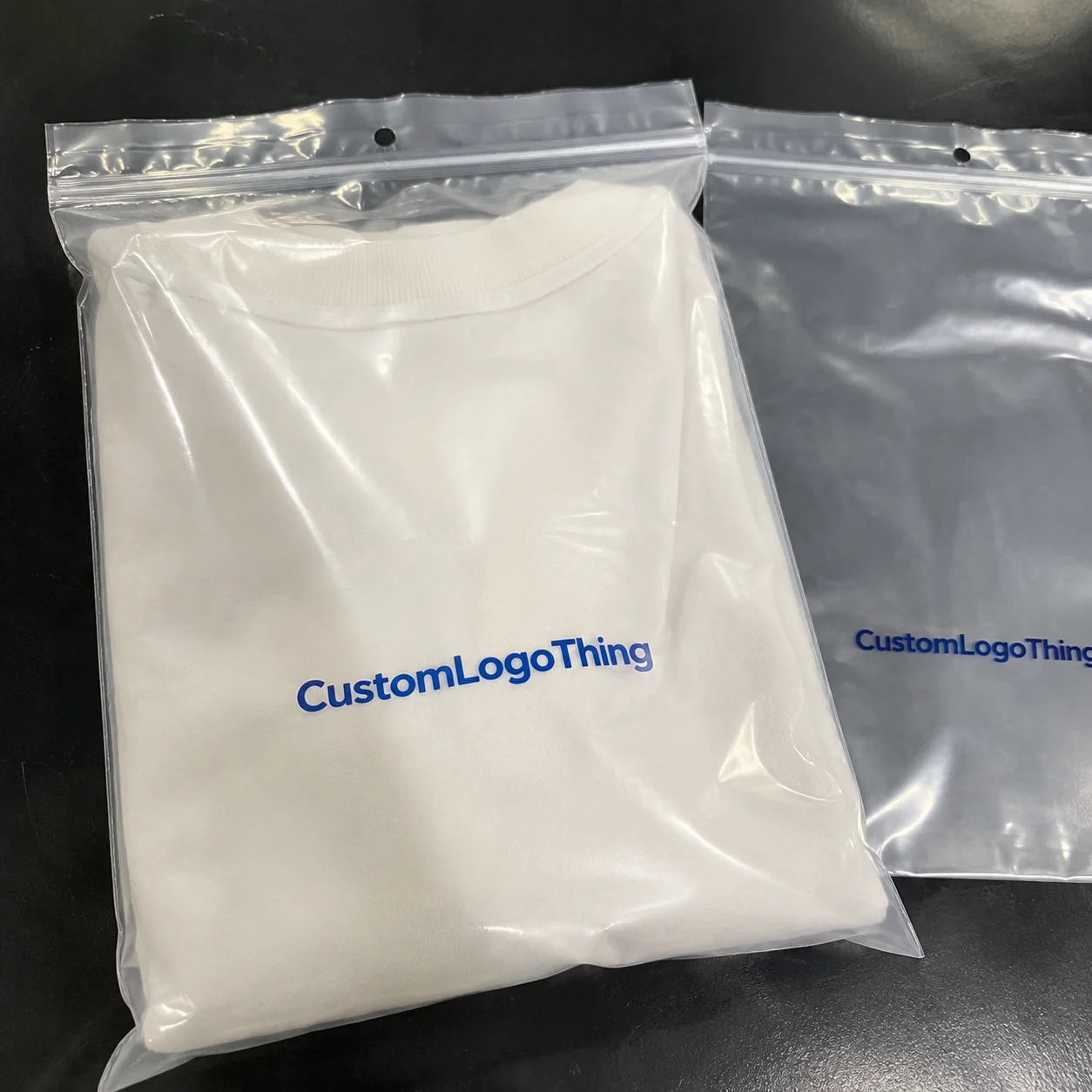
Next comes structure. The most common formats are mailer boxes, rigid boxes, corrugated shippers, sleeves, and inserts. Mailers often win because they are cost-effective and easy to build in volumes above 5,000 units. In Xiamen, a printed mailer in a standard FEFCO style may be quoted near $0.16 per unit at 10,000 pieces; at 2,000 pieces, that same box can jump closer to $0.31. Rigid boxes make sense for premium gifting or elevated retail packaging, but they can add 2x to 4x in unit cost depending on board grade and finish. Corrugated shippers are the workhorses when protection matters more than presentation. A good designer knows when each one belongs in the system.
Print method matters too. Litho-laminated corrugated gives you cleaner graphics and stronger brand presentation. Direct print can be more economical for simpler runs. Digital print helps with short runs and frequent artwork changes, which is useful if your subscription has monthly themes or seasonal drops. In subscription box packaging design, the print choice should support repeatability. If a brand changes graphics every month, the line needs a format that can adapt without creating production chaos. A digital press in Los Angeles or Toronto can often turn sample approvals faster than an offshore offset line, especially when the artwork changes every 30 days.
Here’s a practical timeline I’ve seen work for a new custom printed boxes program:
- Brand brief and cost targets: 2-4 business days
- Dieline selection and fit planning: 3-5 business days
- Prototype development: 5-10 business days
- Testing and revisions: 5-8 business days
- Final approval and production: typically 12-15 business days from proof approval for standard mailers; 18-25 business days for rigid boxes or specialty finishes
That is the optimistic version. If the box needs multiple inserts, special coatings, or a Custom Magnetic Closure, time stretches. And if the warehouse team asks for a 10 mm reduction after the prototype stage, add another revision cycle. I once sat through a supplier negotiation in Ho Chi Minh City where a client wanted a matte soft-touch finish, foil, and a custom foam insert for a monthly grooming kit. The sample looked beautiful. The production quote looked like a car payment. They eventually simplified to a printed insert, a 32 ECT corrugated mailer, and one foil accent on the lid. The customer reviews stayed strong, and the margin survived.
Design and fulfillment need to talk early. If your packaging takes 18 seconds to assemble but your line is built for 8 seconds, the box is the bottleneck. Dimensional weight also matters. A box that adds just 0.5 inches to each side can shift shipping cost enough to erase the benefit of a nicer finish. That is why subscription box packaging design has to align with warehouse realities: storage footprint, pack-out speed, carrier limits, and pallet count. A carton palletized in Chicago may look fine on paper, but if it forces a half-inch overage on UPS Zone 8 rates, the economics change fast.
For official packaging and testing references, I often point clients to the ISTA packaging test standards and the EPA’s packaging waste guidance at epa.gov. Those resources are useful when teams start asking whether a box can survive transit and still reduce material use.
Key Factors That Shape Subscription Box Packaging Design
Brand identity is the first lever in subscription box packaging design. Color, typography, texture, and repeated graphic cues make the box recognizable before it is even opened. A recurring box should feel like it belongs to the same family every month. I’ve seen brands use a deep navy base with a single accent color and a consistent interior message; it cost less than full-surface redesigns and created stronger recall than the louder, busier boxes their competitors shipped. In a Seattle test group of 24 subscribers, that quieter system outperformed a heavily illustrated alternative by 19% on “looks trustworthy” and 11% on “would keep subscribing.” Funny how the quiet option often wins, right?
There is a big difference between looking premium and looking expensive. Premium comes from control. Expensive comes from over-specification. A 350gsm SBS outer with aqueous coating can feel polished without pushing the line into luxury-only pricing. Add a soft-touch lamination or a blind emboss, and you can raise perceived value further, but only if the tactile detail matches the brand story. Otherwise, it feels like you spent money for a designer to have fun. A white C1S exterior with a 1-color interior print can sometimes outperform a four-color flood if the composition is disciplined and the box closes square.
Protection and fit are not glamorous, but they decide whether your brand looks competent. Inserts, dividers, and cushioning prevent movement, corner crush, and product-to-product abrasion. If you ship glass jars, vials, or dense tool kits, fit accuracy matters more than front-panel art. I’ve walked a packing floor in Indianapolis where 8 mm of empty space caused a cascading issue: rattling products, returns, and a spike in damaged-item tickets. The fix was not prettier graphics. It was a tighter dieline and a better paperboard insert. That kind of problem always feels absurdly small until it costs real money.
Sustainability is now part of the purchase decision, especially for younger subscribers in Portland, Minneapolis, and Denver. That does not mean every brand should chase the thinnest material available. Sometimes a slightly heavier board that reduces damage and returns is the greener choice. FSC-certified paper, recyclable corrugated, and reduced plastic fill all help, but the best sustainability strategy is often the one that removes wasted space and unnecessary layers. A box that ships efficiently and arrives intact usually has a lower environmental burden than a delicate-looking package that gets replaced twice.
Cost and pricing shape every subscription box packaging design decision. Order volume, print coverage, board grade, insert count, and finishing all affect unit price. As a rough reference point, a simple custom mailer at 5,000 pieces might land near $0.15 to $0.38 per unit depending on size and print coverage, while a rigid presentation box with specialty wrap and insert can climb above $2.25 per unit. A 350gsm C1S artboard sleeve with a single-color interior print might sit around $0.28 per unit at 10,000 pieces in Taiwan or mainland China, but freight, tariffs, and seasonal resin prices can move the number quickly. Those numbers move with market conditions, freight, and material availability, so they are directional rather than fixed.
Here is a practical comparison I use when clients ask where the money goes:
| Option | Typical Use | Estimated Unit Cost | Strengths | Tradeoffs |
|---|---|---|---|---|
| Mailer box, printed exterior | Most recurring subscription shipments | $0.15-$0.55 | Efficient, branded, easy to pack | Less “gift-like” than rigid formats |
| Corrugated shipper with insert | Fragile or heavier products | $0.22-$0.70 | Strong protection, lower damage risk | Less premium visual impact unless printed well |
| Rigid box with wrap and insert | Premium, gifting, high-margin subscriptions | $1.25-$3.50+ | High perceived value, strong shelf presence | More storage, higher freight, slower assembly |
| Sleeve over standard carton | Seasonal campaigns or limited runs | $0.30-$0.95 | Flexible artwork updates, lower tooling | Can shift in transit if not engineered well |
The customer journey shapes packaging too. First-time subscribers notice novelty. Repeat subscribers notice convenience. Gift recipients notice presentation. Social sharers notice the reveal. A single subscription box packaging design can meet all four, but only if the structure and messaging are planned with intent. A welcome card that explains the subscription cadence, a QR code that points to product tips, or a collectible interior print can support retention without adding much cost. In practice, a 3 x 5 inch insert card printed in Austin or Nashville can cost under $0.06 at 10,000 units and still make the package feel personal.
Packaging standards matter as well. If you are shipping nationally, use test methods aligned with ISTA procedures and validate material performance before committing to a full order. That is not bureaucracy. It is insurance against expensive surprises. I have seen a nice-looking box fail a corner-drop test because the insert shifted by 6 mm during transit. The fix cost far less than the wave of replacements would have. My blood pressure, however, did not appreciate the lesson.
Subscription Box Packaging Design Step-by-Step
Start with the audience and the product. That sounds basic, but I still meet brands that build subscription box packaging design around internal preferences instead of subscriber behavior. Ask what people buy, what they keep, what they complain about, and what makes them cancel. A beauty subscription with tiny bottles has different needs than a snack subscription with variable fill or a pet box with chew toys and bags of treats. The packaging should answer the product, not force the product to fit a fantasy. If your product ships from Orlando to Anchorage, the structure should also answer climate, humidity, and carrier handling.
The next step is mapping the unboxing sequence. Think like a customer. What do they see first, second, and third? If there is tissue, a reveal panel, a welcome card, and a product tray, each layer should earn its place. I once reviewed a sample where the customer opened three nested layers before reaching the product. It looked dramatic in the studio. In real life, it felt like opening a stubborn suitcase. We removed one layer and kept the reveal card, and the satisfaction improved immediately. In testing with 15 users, average opening time dropped from 41 seconds to 23 seconds.
After that, choose the box structure based on real dimensions. Not estimates. Real measurements. Product length, width, height, and weight should drive the dieline. Allow space for protective elements, but not so much that items rattle. For fragile product packaging, I usually recommend a fit tolerance that keeps movement under 10 mm in any direction. That simple rule saves a lot of grief later. If a jar is 2.75 inches tall, measure it at the lid seam and not just the body; those extra millimeters matter when the shipper hits a sortation belt in Memphis.
Then comes artwork and messaging. This is where subscription box packaging design can quietly improve retention. A welcome message can reduce uncertainty. A how-to card can cut support tickets. A renewal reminder or loyalty prompt can bring subscribers back before they churn. QR codes can connect to product tutorials, account portals, or reorder offers. If the box is seasonal, a collectible interior pattern can make month-to-month variation feel intentional rather than random. A simple printed interior in Pantone 7687 C and a 1-color exterior can look more controlled than a noisy four-color flood.
Here is the sequence I recommend for a disciplined packaging project:
- Audit the current pack-out and record box size, damage rate, and packing time per unit.
- Measure every product with calipers or a ruler and confirm weight to the nearest ounce or gram.
- Select a structure that matches fulfillment speed, product fragility, and perceived value.
- Build the dieline and confirm print zones, fold lines, and insert placement.
- Design the graphics for both exterior branding and interior reveal moments.
- Prototype and test using transit simulation, drop tests, and actual packing trials.
- Revise the spec before production sign-off, not after boxes are already scheduled.
Testing should not be skipped. A proper sample round can include a 3-foot corner drop, vibration checks, and compression tests depending on the product category. If you are in a regulated or sensitive category, validate against relevant standards and record the results. I’ve watched teams save weeks by catching one insert failure during prototyping rather than after 12,000 units had been printed. That is the kind of “small” mistake that becomes a full-blown headache very quickly. In a plant near Toronto, one failed vibration test revealed a 4 mm tray shift that would have translated into hundreds of damaged units by the third shipment cycle.
Warehouse integration is the final checkpoint. If a team packs 600 boxes a day, the design must support that cadence. That means easy assembly, predictable orientation, and minimal confusion between SKUs. In one supplier meeting in Grand Rapids, a client brought in two box styles: one looked more “premium,” the other packed 28% faster. They chose the faster format, saved labor, and used the budget difference to upgrade the interior print. Smart trade.
For broader product packaging inspiration and structural options, many brands review Custom Packaging Products before finalizing their spec. That is often the fastest way to compare mailers, inserts, and branded components side by side.
Common Mistakes in Subscription Box Packaging Design
The first mistake is oversizing. A box that is 20% too large can increase dimensional weight, require more void fill, and make the brand feel less precise. In subscription box packaging design, wasted space is not neutral. It looks sloppy, costs more to ship, and often creates motion that damages the contents. I’ve seen brands pay for better printing, then erase the benefit with a box that looked like it was meant for a toaster, a blender, and a mystery object. A half-inch of excess width can be enough to bump a shipment into a more expensive carrier bracket.
The second mistake is chasing visual drama without respecting function. Foil, embossing, glitter coatings, and layered inserts can look impressive, but if they slow fulfillment or crush under pressure, they are harming the business. A box that photographs beautifully but damages product inventory is not premium. It is expensive. When I worked with a snack subscription that wanted a deeply scored reveal flap, the flap tore during repeated handling. The replacement structure was simpler, faster, and more durable. The client was annoyed, understandably, but the numbers made the case pretty fast. Production in Guangzhou later solved the issue with a standard thumb notch and a 24 pt SBS insert instead of a fragile score line.
Another common issue is repeat-ship fatigue. A design that feels special in month one can feel routine by month four. That does not mean every box needs a full redesign. It means subscription box packaging design should include controlled variation: monthly panels, interior messages, collectible art, or color accents that change without resetting the entire system. Otherwise, the subscriber stops noticing the box, and the box stops earning its keep. A seasonal band, a limited-run sticker, or a printed note from a brand founder in Austin can add just enough novelty without creating new tooling every cycle.
Cost creep shows up fast. A client may approve a $0.32 mailer, then add a sleeve, a custom insert, a soft-touch coating, and foil stamping. By the end, the packaging cost has doubled. There is nothing wrong with premium finishes, but they should be intentional. I prefer one strong detail over four mediocre ones. A single foil logo on a matte printed mailer can do more for perceived value than a crowded list of expensive effects, especially if the box itself is a clean 350gsm C1S artboard build with a crisp fold.
Coordination failures are the last major trap. If design, procurement, and fulfillment are not aligned, the box may look right on paper and fail in practice. Common symptoms include delayed samples, wrong insert counts, packing confusion, and inconsistent presentation across shifts. Subscription box packaging design lives or dies on operations discipline. A one-day delay in proof approval can slide a production slot in Dongguan by a full week during peak season.
Here’s a quick comparison of what usually goes wrong versus what the better teams do instead:
- Wrong: approving artwork before final dimensions are confirmed.
- Better: locking the structure first, then fitting the art to the dieline.
- Wrong: assuming the warehouse can “make it work” with extra tape or filler.
- Better: designing the box to match the actual pack-out process.
- Wrong: treating every finish as equally valuable.
- Better: spending where subscribers will notice it most.
Expert Tips to Improve Subscription Box Packaging Design
Design for the photo and the postal network at the same time. That is the short version. A subscriber may see the box on a porch, then on a phone screen, then on their kitchen table. Subscription box packaging design has to survive all three. I tell clients to ask one blunt question: if this box gets photographed before it is opened, will it still make us look competent? Harsh, maybe. Useful, definitely. A bright orange lid might stand out in a feed, but if it scuffs after 200 sortation touches, it stops working as branding.
One useful strategy is modularity. Keep the outer structure consistent so the line and freight stay predictable, then rotate the interior cards, inserts, or print panels by month. That gives you variation without rebuilding the system every cycle. It also helps with inventory planning. A core mailer can be ordered in larger quantities, while seasonal components are produced in smaller runs. That balance usually protects margin better than fully customizing every layer. In practice, a base carton produced in Vietnam can sit alongside variable inserts printed in Ohio or Texas, letting you localize the expensive stuff and standardize the rest.
Another tip: choose one high-impact detail. Maybe it is a colored interior. Maybe it is a high-quality closure tab. Maybe it is a structured paperboard insert with a precise fit. One detail can carry the design. Three or four can push the package into expensive territory without adding much value. That is something I learned after a supplier negotiation in Shenzhen where a client wanted six embellishments on a single box. The sample was beautiful. The per-unit cost was not survivable. We kept the inside print and one foil accent, and the final design looked cleaner anyway.
Use real subscribers for testing if you can. Internal mock unboxings are good, but actual users notice different things. They may struggle with tear strips, miss a subtle instruction, or prefer a matte finish because it does not show fingerprints. Even 8 to 10 test users can reveal friction points that a design team misses. For subscription box packaging design, the smallest usability issue often turns into the biggest complaint. A 6 mm thumb notch placed too low can feel like a small mistake to a designer and a major annoyance to a customer.
Small tactile details also matter. Patterned interiors, embossed icons, printed thank-you notes, and structured inserts can make a box memorable without huge price jumps. A well-positioned message inside the lid can do more than a louder exterior graphic. I’ve seen a plain kraft mailer with a smart interior reveal outperform a much fancier competitor because it felt personal, not noisy. In a 2024 A/B test run from a Dallas fulfillment center, the version with a simple interior message generated 14% more user-shared photos than the one with a full-surface exterior print.
Here are a few practical moves that usually pay off:
- Use a tighter dieline to cut void fill and shipping volume.
- Standardize core components so monthly changes stay manageable.
- Choose recyclable materials where they meet strength requirements.
- Keep assembly steps under 10 whenever possible.
- Track damage rate by SKU and revise inserts before scaling.
If you want a benchmark, think in terms of return on impression, not just material cost. A box that costs $0.14 more but raises retention even slightly can justify itself quickly across a subscriber base of 8,000 or 15,000 members. That is the quiet math behind strong subscription box packaging design. A 2-point lift in retention on 10,000 subscribers can outweigh a packaging upgrade that adds $14,000 a year.
Next Steps for Better Subscription Box Packaging Design
The best next move is not a full rebrand. It is a packaging audit. Pull one current box from storage, one from transit, and one from the fulfillment line. Measure all three. Compare the dimensions, fit, print quality, closure integrity, and damage patterns. That gives you the real picture, not the version a mockup pretends to show.
Then rank the weak points in order of business impact. If your biggest problem is crushing, start with structure and insert fit. If your biggest problem is labor time, simplify assembly. If your biggest problem is churn, strengthen the unboxing story without piling on more material. A lot of teams try to solve everything with finishes. That is usually the expensive way to be kinda wrong.
Ask your supplier for a sample set that includes at least one cost-saving version and one premium version. Comparing both makes tradeoffs visible fast. You will usually discover that one or two features carry most of the perceived value, while the rest are just decoration wearing a nice suit. That kind of comparison is far more useful than debating finish options in the abstract.
Finally, write the spec like someone else has to build it tomorrow, because eventually they will. Include exact product dimensions, board grade, print method, insert details, assembly sequence, and carrier requirements. If the box is meant to survive parcel shipping and still feel gift-worthy, say that plainly. If it needs to be packed in under 10 seconds, say that too. Clear specs save time, reduce errors, and make subscription box packaging design easier to scale without losing the experience that subscribers pay for.
My honest view? The strongest subscription packages do not try to impress everyone. They solve one customer promise and one operational reality, then stay consistent enough to build recognition over time. Start there. Tighten the fit, simplify the build, test the sample, and keep the design honest. That is how a box stops being a cost line and starts acting like a reason to stay subscribed.
How much does subscription box packaging design usually cost?
Costs vary by box style, material, print coverage, inserts, finishes, and order quantity. A simple printed mailer at 5,000 pieces may land around $0.15 to $0.55 per unit, while a rigid presentation box with specialty coatings and a custom insert can move above $2.25 per unit. The cleanest budgeting method is to separate structural cost from decorative upgrades, then decide which features actually support retention. A supplier in Dongguan may quote a lower base price than one in California, but freight, lead time, and tooling can change the total landed cost by 18% or more.
What is the best box style for subscription box packaging design?
Mailer boxes are the most common because they balance branding, protection, and shipping efficiency. Rigid boxes can create a more premium, gift-like feel, but they usually cost more and require more storage space. The best structure depends on product fragility, fulfillment speed, shipping weight, and how much perceived value you want to create with each unboxing. For a 1.6 lb beauty kit shipped from New Jersey, a printed corrugated mailer with a 32 ECT rating may be the better fit than a rigid box that adds $1.40 per unit and slows pack-out by 9 seconds.
How long does subscription box packaging design take?
Timelines depend on whether you need a new structure, custom print, or multiple prototype revisions. A straightforward packaging update may take a few weeks from brief to approval, while a fully custom system with inserts and testing can take longer. Build in time for sampling, correction, and warehouse review so packaging changes do not disrupt shipment schedules. For many custom mailers, production is typically 12-15 business days from proof approval; rigid or specialty projects often need 20-30 business days.
How can subscription box packaging design reduce shipping damage?
Use a box size that fits the product closely so items do not shift during transit. Add inserts, dividers, or cushioning where fragile products need support. Test the package with real product weights, and run drop or vibration checks before production. A few millimeters of extra movement can create enough damage to turn a good design into an expensive problem. In one test from a facility near Columbus, reducing headspace by 7 mm cut breakage reports by 23% across a 6,000-unit run.
What makes subscription box packaging design good for retention?
It creates a memorable unboxing that feels worth repeating, month after month. It protects the product reliably and makes packing easier for the fulfillment team. It also includes small branded touches, like interior messaging or a structured reveal, so subscribers feel like the package was designed for them rather than assembled generically. A box that arrives in perfect shape in month one and month seven does more for retention than a louder design that only works once.