t shirt neck label printing is one of the smallest decisions in apparel, but it changes how a shirt feels the moment someone puts it on. A clean inside print can make a basic tee read as a better-built product. A bad one does the opposite. Buyers notice the difference faster than they usually admit, especially when the shirt is meant to sit next to retail pieces rather than giveaway stock.
That is why the neck label should be treated as a production spec, not a decorative afterthought. It affects comfort, brand presentation, repeat ordering, and how much information the garment can carry without adding a sewn tag. For brands comparing Custom Labels & Tags with traditional neck labels, the real question is usually not style. It is whether the shirt needs a cleaner hand feel, a lower-friction supply chain, or a more controlled retail finish.
There is also a practical economics angle. A scratchy label can become a return issue in a way that front graphics rarely do. If the shirt is worn often, the inside print has to survive friction, stretch, and repeated washing while staying readable. That is a narrow technical job, which is why the best results usually come from a clear spec and a print method matched to the fabric, not from shrinking a logo and hoping for the best.
Why neck labels can change a T-shirt's first impression
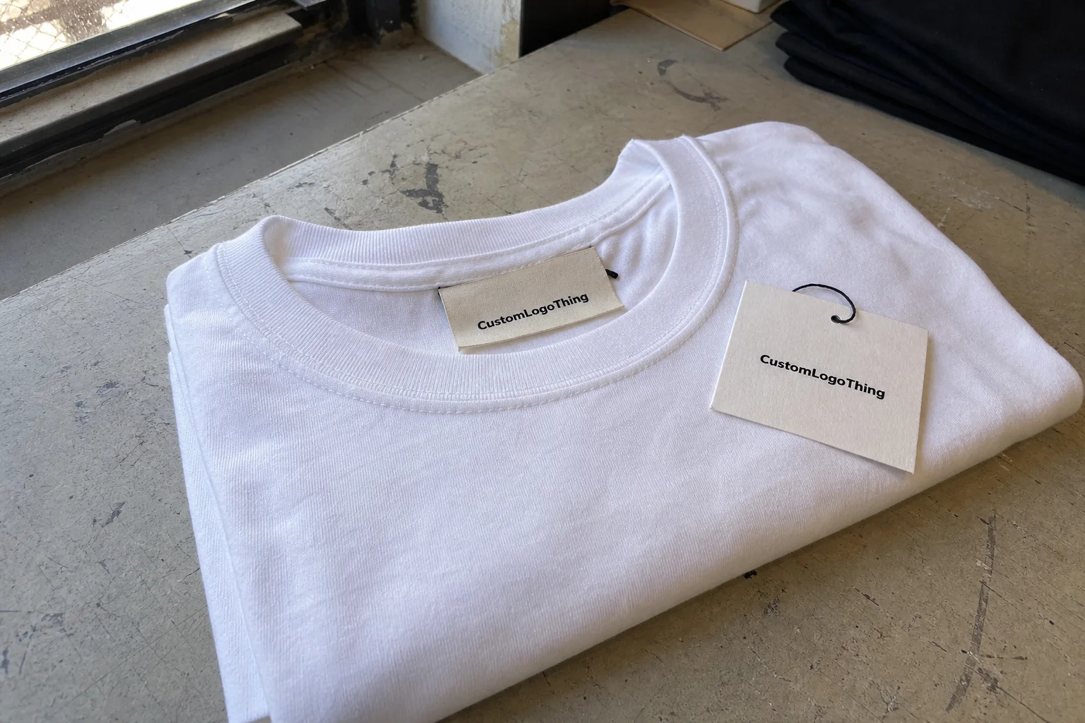
Most people do not inspect the collar of a T-shirt on purpose. They feel it. Then they decide whether the garment seems cheap or considered. That is the quiet power of inside branding: it shapes the first physical impression before the wearer has time to think about the logo on the chest.
A neck label can replace a sewn-in woven tag, supplement a temporary hang tag, or stand in for a size sticker during packing. Those options serve different jobs. A woven tag is durable and familiar, but some customers find it irritating. A hang tag helps on the shelf and disappears immediately. A size sticker is efficient for inventory handling, not for long-term branding. A printed neck label sits in the middle. It gives you brand identity and product information while reducing the scratchy feel that pushes shirts to the back of the drawer.
That comfort issue is not trivial. A label that irritates the neck reduces wear frequency, and a shirt that gets worn less often loses value in the customer’s mind. The inside print may be hidden, but it still affects how often the product gets chosen. In apparel, that matters more than most packaging teams want to admit.
A neck label is small, but not minor. Done well, it disappears in wear and still does its job: identify the brand, show the size, and avoid the scratchy-label complaint that can sink a good shirt.
There is a second layer here that buyers sometimes overlook. The neck area has one of the highest-contact points on the garment. It sits against skin, moves with the collar, and stretches every time the shirt is pulled on or off. That means print placement and print feel are part of the product experience, not just the decoration spec. A shirt with a great front graphic can still feel unfinished if the inside collar looks improvised.
For private-label apparel, the inside print often does more brand work than a hang tag. The shirt reaches the customer with a cleaner silhouette, and the labeling is still present after packaging has been removed. That is useful for brands that want a retail look without adding another sewn component to the garment.
How t shirt neck label printing works from file to fabric
The workflow is straightforward in theory. Artwork is prepared, the print method is chosen, the placement is fixed, and the label is applied during a controlled garment stage. The part that usually causes problems is not the press or the ink. It is the artwork being treated like a front-chest graphic and then reduced into a tight neckline space.
Suppliers usually begin with the shirt spec. They need the blank, the fabric blend, neckline dimensions, label size, and the exact copy to print. Brand name, size, care instructions, country of origin, and a web address can all fit inside the collar if the layout is disciplined. If the design is vector-based, preferably in AI, EPS, or an editable PDF, the edges stay cleaner at small size. Raster files can work, but only if the resolution is strong and the typography is already well controlled.
The print method should follow the shirt, not the other way around. Screen printing is often the first choice for simple one-color branding on cotton and cotton blends because it lays down ink cleanly and becomes economical as quantities rise. Digital printing is more useful when the order is small, the artwork changes often, or a buyer wants a quick proof without screen setup. Heat transfer is a better fit when detail matters and the print area is small, though the supplier still has to control adhesion, pressure, and cure.
People sometimes hear broader print terms during quoting. CMYK comes up when the label uses multiple tones or image-like detail. Spot color is usually the cleaner route for a brand mark or a single line of care text. If the same vendor also handles packaging, offset printing, flexographic printing, or print finishing may enter the conversation for hang tags, inserts, or carton work. Those are separate processes, but they influence scheduling because a vendor often manages several production lines at once.
| Method | Best fit | Typical strengths | Watch-outs |
|---|---|---|---|
| Screen printing | Simple brand marks, cotton tees, medium to larger runs | Strong opacity, durable ink deposit, better unit cost at scale | Setup time, less efficient for frequent artwork changes |
| Digital printing | Short runs, proofs, artwork with color variation | Fast file changes, no screen setup, useful for test orders | Higher unit cost on larger quantities |
| Heat transfer | Detailed branding, mixed fabric programs, compact label areas | Fine detail, flexible placement, clean results on small zones | Adhesion and wash performance depend on cure and substrate |
The design itself needs to be built for the collar space. Curved placement, seam clearance, and line weight all matter. A logo that works across the chest can become cramped and awkward once it is reduced for the inside neck area. Text that looks sharp on a screen may vanish after scaling if the strokes are too thin or the spacing is too tight. Good neck label artwork reads like a label, not a mini poster.
Cost, pricing, and MOQ factors to price before you order
Price usually comes down to five variables: print method, color count, label size, quantity, and whether the label needs extra care or size information. A one-color inside print on 5,000 tees is a very different job from a multi-line label on a 100-piece pilot run. The first spreads setup across volume. The second carries more fixed cost per unit, even if the artwork is simple.
Low minimum order quantity is attractive, but it comes with a pricing penalty. Setup, proofing, and file cleanup take time whether the run is 50 shirts or 5,000. Once those fixed steps are divided by a larger order, the unit cost drops. That is why buyers who focus only on the per-piece number often miss the real picture.
A practical quote usually separates the base label from the variables that push it upward. A simple one-color brand mark can sit in a lower price band because it needs minimal prep. Add size, care copy, or a second line of text and the alignment work increases. Bring in more colors, and the cost can rise again because each color adds control points and more opportunities for drift.
Placement can change the price too. A narrow print zone, a curved neckline, or a shirt range with several sizes can require tighter registration control. The same is true if the vendor also needs to print other items in the launch, such as hang tags or carton inserts. A supplier with broader Manufacturing Capabilities may coordinate those pieces faster, but the buyer still needs to confirm what is included in the quote and what triggers a new setup fee.
For planning purposes, most buyers should ask for two numbers: a basic neck label and a version with the full label content they actually need. That comparison tells you more than a single unit price ever will. It also shows whether the added copy is worth keeping, or whether the label should be trimmed down to the essentials.
There is a sustainability angle, too. If the neck label is part of a launch that includes Paper Hang Tags or inserts, FSC-certified stock can keep the brand’s printed pieces aligned with a cleaner paper spec. That does not change the shirt itself, but it matters when the packaging program is being judged alongside the garment.
Production steps and turnaround expectations for neck labels
The best production runs follow a predictable sequence. Artwork comes in. The supplier confirms the print method and placement. A proof is issued. A sample may be run if the shirt blank is new or the label is more complex than usual. Then production starts, followed by inspection and packing. That sequence sounds routine, but every step can add time if the buyer is not ready.
Proof approval is often the first delay. If the logo needs font correction, spacing cleanup, or a size adjustment for the neck area, that work has to happen before the job can move. Pantone matching can also slow things down when the brand insists on a specific color. A spot color print is usually easier to control than a more complex CMYK build, especially at small size where minor shifts are visible fast. The problem is rarely the theory of color. It is the time lost to changes that should have been locked earlier.
Blank inventory matters just as much. If the shirts are in stock, the job can move quickly. If the order waits on incoming blanks, the neck label becomes only one part of a larger production schedule. Buyers should always ask when the clock starts. Some vendors count from proof approval. Others count from payment. Some do not begin until the blanks arrive. Those details change the delivery date more than many quotes make obvious.
Typical turnaround is shorter when three things are true: the artwork is final, the blanks are available, and the method only requires one production stage. Once the order needs multiple passes, the calendar expands. That is normal. What creates friction is assuming all neck label work is the same when the actual workflow varies by fabric, method, and order size.
For branded apparel that ships in cartons, packaging tests can be worth the extra step. Standards such as ISTA testing can reveal scuffing, abrasion, or ink transfer before the shirts reach customers. That is not a neck label issue alone, but it is part of the same quality chain. A garment that looks good leaving production still has to look good after folding, transit, and retail handling.
Material, fit, and print factors that affect durability
Durability starts with the fabric. Cotton usually accepts inside printing well, but the exact weave, finish, and weight affect how the print sits and how the garment feels after washing. Cotton blends behave differently because synthetic content changes both stretch and ink interaction. Performance fabrics are more demanding still. They move more, recover more, and can expose weak adhesion faster than a standard jersey tee.
The real test is not whether the print looks clean on day one. It is whether it stays legible after repeated washing, collar stretch, and normal wear. Good adhesion matters, but so does cure. If the ink or transfer is under-cured, the print may crack or lift too early. If the label design is too thin, it can disappear once the fabric starts moving. On a mockup, everything looks balanced. On a shirt after three washes, not always.
Fit changes the placement picture as well. A label that sits perfectly on a medium may drift on an extra-large if the grading is not adjusted. Neck rib width, seam height, and collar construction all affect where the print lands. Too high, and it can get trapped in the seam. Too low, and the label starts to feel off-center even if the press hit its target.
Opacity and hand feel are a tradeoff that buyers should check early. The print has to be readable, especially on dark shirts, but it should not feel heavy or plasticky against the skin. On light shirts, the surface can be softer, but the color still has to hold. That is why a good supplier may recommend a different build for black cotton than for white jersey or a blended performance tee.
There is a simple quality-control rule worth keeping: test on the actual substrate, not only on a digital render. If possible, approve the label on the real shirt color and real fabric hand before full production. That catches contrast problems, spacing issues, and comfort problems before they become expensive.
If the garment program also includes paper add-ons, FSC certification still matters there. It will not improve print durability, but it keeps the wider branding package consistent when the launch includes hang tags, inserts, or other printed materials.
Common mistakes that make neck prints fail faster
The first mistake is oversizing the artwork. A print that crowds the seam will wrinkle, distort, or feel uncomfortable after a few wears. Neck labels need margin. That blank space around the print is not wasted. It protects readability and keeps the collar area from feeling packed.
The second mistake is weak contrast. Light gray on off-white may look elegant on a screen, but inside a neckline it can read like an unfinished proof. Ultra-thin fonts create the same problem. They may look refined in a mockup and then collapse into unreadable strokes at label scale. In practice, clarity beats cleverness every time.
The third mistake is skipping the sample. That is especially risky on a new blank, a dark fabric, or a method the team has not used before. A test print is cheaper than a full run with peeling edges or blurry text. It also tells you whether the label feels acceptable on skin, which is hard to judge from art alone.
Another problem is inconsistent placement. Even when the print itself is excellent, the run can feel lower quality if the label floats around from shirt to shirt. Buyers notice that quickly. It makes the product look less controlled, and once that impression lands, it is hard to undo.
Documentation failures cause a lot of the damage before production even begins. If the supplier does not know the exact shirt blank, color, size range, and print zone, they may build the label around the wrong assumptions. A good spec should include the fabric, the placement distance from the collar seam, the print dimensions, and the full copy that has to stay visible. Most failures start in the brief, not on the press.
There is a final mistake that is easy to miss: treating every shirt the same. A label that works on one fabric or one color may fail on another. Brands that scale quickly often discover that the inside print needs to be adjusted by SKU, not just copied across the line. That is not overengineering. It is what the material usually demands.
Expert tips and next steps for ordering the right run
If you want a cleaner quote, send the shirt blank spec, the size range, the exact neck copy, and the print dimensions before asking for pricing. That removes guesswork and helps the vendor tell you whether the job is better suited to spot color, digital proofing, or a larger production lot. The fewer assumptions in the quote stage, the fewer surprises later.
For a new fit or a new fabric, start with a short pilot run. It is the safest way to check placement, hand feel, and wash performance before scaling. A pilot also helps when the team is deciding between a printed collar mark and a sewn-in tag replacement. The unit cost is higher than a full run, but the risk is lower and the feedback is real.
Always approve the final proof under real lighting and on the actual garment color. A mockup on a white background can hide contrast problems. A dark tee can make a once-readable label disappear. If the order includes multiple SKUs, check the proof against each color rather than assuming one version works everywhere.
For a practical production sequence, use the following order:
- Lock the shirt blank and size range.
- Finalize the inside label copy and print area.
- Choose the method based on quantity and detail.
- Review a proof on the actual garment color.
- Approve a sample if the run is new or complex.
- Release the order once the neck label details are fixed.
The best neck label programs are coordinated with the rest of the garment. The inside branding, the hang tag, the carton presentation, and the care information should all feel like one system. That is especially true for retail launches, where the shirt has to work visually and physically after the packaging is gone. Vendors who can handle file cleanup, print finishing, and final inspection usually reduce friction simply because fewer handoffs are needed.
For buyers comparing suppliers, ask how they handle proof control, placement checks, and final inspection. Those are the controls that usually separate a neat garment program from a frustrating one. If the order is tied to a launch date, the label spec should be fixed before production begins. Changes after that point are rarely cheap.
For comfort, brand consistency, and a cleaner finish, t shirt neck label printing is usually worth the extra planning. Keep the artwork legible, match the method to the fabric, and confirm the label on the real shirt before the run is released. That is how the inside of the garment supports the brand instead of getting in its way.
What is t shirt neck label printing used for?
It replaces or supplements a sewn-in tag with printed branding, size, or care details inside the neckline. Brands use it to improve comfort, reduce scratchiness, and give the shirt a more finished look.
How much does neck label printing cost per shirt?
Cost depends on print method, color count, label size, and quantity. Higher quantities usually lower unit cost because setup charges are spread across more shirts, while short runs carry a heavier setup burden.
Which file format is best for neck label artwork?
Vector files such as AI, EPS, or editable PDF are usually safest because they scale cleanly. If you only have raster art, it should be high resolution and cleaned up for tiny text before approval.
How long does neck label printing usually take?
Simple runs can move quickly if the artwork is final and blanks are ready. Turnaround expands when proofs, color matching, or sample approvals are required, especially for new blanks or multiple sizes.
What makes a printed neck label last longer?
Good adhesion, correct curing, and artwork designed for small-scale readability all improve durability. A proper wash test on the actual shirt is the fastest way to catch peeling, fading, or cracking before full production.