Buyer Fit Snapshot
| Best fit | visual branding on mailer boxes for packaging buyers comparing material specs, print proof, MOQ, unit cost, freight, and repeat-order risk where brand print, material, artwork control, and repeat-order consistency matter. |
|---|---|
| Quote inputs | Share finished size, material target, print colors, finish, packing count, annual reorder estimate, and delivery region. |
| Proofing check | Approve dieline scale, logo placement, barcode or warning zones, color tolerance, and any recyclable or compostable wording before bulk production. |
| Main risk | Vague material claims, crowded artwork, or missing packing details can create delays even when the unit price looks attractive. |
Fast answer: Visual Branding On Mailer Boxes: Film, Closure, Print, and Fulfillment should be specified like a repeatable production item. The safest quote includes material, print method, finish, artwork proof, carton packing, and reorder notes in one written spec.
What to confirm before approving the packaging proof
Check the product dimensions against the actual filled item, not only the sales mockup. Ask for tolerance on folds, seals, hang holes, label areas, and retail display edges. If the package carries a logo, QR code, warning copy, or legal claim, reserve that space before decorative graphics fill the panel.
How to compare quotes without losing quality
Compare board or film grade, print process, finish, sampling route, tooling charges, carton quantity, and freight assumptions side by side. A lower quote is only useful if the supplier can repeat the same color, closure quality, and packing count on the next order.
Visual branding on mailer boxes does more than dress up a shipment. It makes the package part of the brand experience before the product is even visible. A plain corrugated box does one job well: it protects what is inside. A branded mailer does that too, but it also signals care, builds recognition, and creates a stronger first impression at the door, in the warehouse, and on the kitchen table where the unboxing actually happens.
That matters because a mailer box is handled constantly. It gets picked, stacked, scanned, loaded, dropped, carried, and opened under less-than-perfect conditions. The artwork has to survive all of that and still look intentional. A nice mockup is easy. A box that still looks like your brand after shipping is the real test.
For buyers comparing packaging options, this is where branded mailers keep earning their place in Case Studies and supplier conversations. They are not just packaging. They are a working part of the customer experience, and they keep doing their job long after the truck leaves.
Why visual branding on mailer boxes grabs attention fast
The outer box is often the most visible branded surface a customer sees. A homepage banner may get a glance. An ad may be skipped. A mailer box gets touched by fulfillment staff, carriers, building staff, and the customer, sometimes in that exact order. That repeated contact gives the packaging real value as brand space.
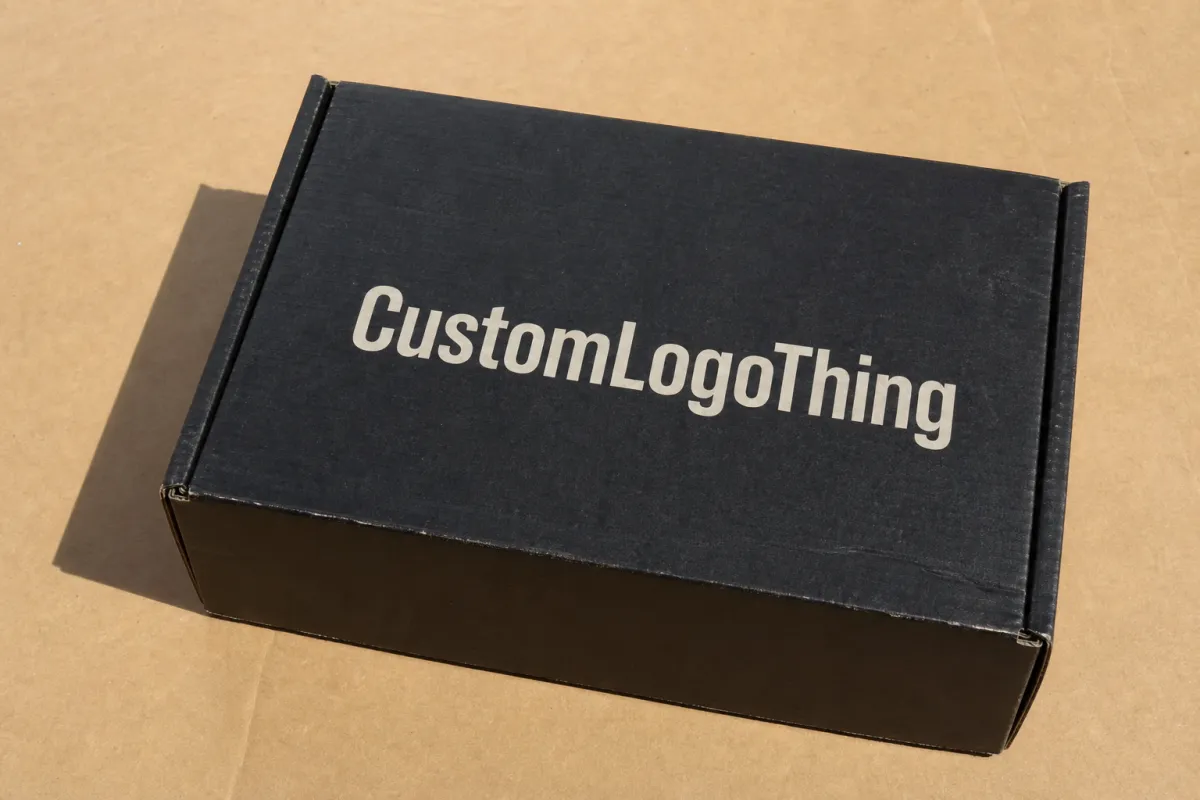
Visual branding on mailer boxes is the mix of color, logo placement, print method, finish, and structure that turns a shipping box into part of the story. It is not just a logo on cardboard. It is tone. A bold retail look sends one message. A restrained, premium look sends another. Natural kraft and minimal ink suggest something different again. The box does not need to shout. It just needs to sound like the brand.
There is also a trust effect, and it shows up fast. Customers read packaging as a signal of how carefully the product was handled. A crisp, aligned, consistent mailer suggests a brand that pays attention. A generic or sloppy one does the opposite. That reaction does not require a full-print exterior or expensive finish. It usually comes down to whether the details agree with each other: logo, colors, labels, inserts, tape, and the inside reveal all need to pull in the same direction.
From a buyer's perspective, the strongest mailers are rarely isolated pieces. They work with inserts, custom labels, and secondary packaging so the whole presentation feels coordinated instead of improvised. If you are building a broader system, it helps to treat Custom Packaging Products as a set of connected parts rather than one box in a vacuum. A smart outer box, a clean label, and a consistent insert can do more for brand recognition than a fancy finish in the wrong place.
And the box still has to ship. That part never goes away. If the design looks great on screen but scuffs on a conveyor or crushes under pallet load, the branding is doing more harm than good. The job is to balance visual impact with structural behavior so the box arrives looking like the brand meant it to look.
A good mailer box should survive shipping and still look like it belongs to the brand afterward. That sounds simple until you try to keep both goals intact.
How visual branding on mailer boxes works from artwork to box
A mailer box starts as a flat dieline and becomes a three-dimensional structure with panels, flaps, and closure tabs. Every surface can carry branding, but every surface behaves differently. The top panel usually gets the first read. Side panels matter when the box is stacked or carried. Inside panels matter during the reveal. Closure flaps can support a message, but they should stay light because folds interrupt both text and graphics.
Artwork is built on a dieline, which is the technical map of the box. It shows cuts, folds, bleeds, and safe areas so the design lands where it should after production. If a logo crosses a fold, it needs careful placement testing. What looks centered in a PDF can shift once the box is assembled. Good packaging art is design work and prepress discipline at the same time.
Print method matters too. Digital printing is often the better fit for shorter runs, fast artwork changes, and color-heavy testing, especially if the brand is launching a seasonal line or trying a new graphic direction. Other production methods can make sense for larger volumes or different surface requirements. The right choice depends on quantity, turnaround, coverage, and how the box will be handled. A vivid print can look sharp on a desk and still fail in a rough fulfillment lane if the finish is too delicate.
Bleed, safe area, and panel orientation are where a lot of first-time buyers stumble. Bleed keeps color extending cleanly to the edge. Safe area keeps copy away from folds and trimming. Panel orientation keeps the artwork readable when the box is opened, stacked, or photographed from the front. A logo that looks perfect in a file can become awkward after a flap folds over it. That is why proofing the dieline matters as much as choosing the artwork.
Real-world handling changes the outcome more than many teams expect. Corrugated board has texture, which softens fine detail. Ink can show wear at the edges. A light board can bow if the load is too heavy. If the box is going into a subscription program, a direct-to-consumer order, or a promotion kit, the artwork should be judged on screen and under conditions that resemble the actual route. For higher-value goods or longer shipping lanes, packaging testing standards such as ISTA procedures are useful references. They are not a replacement for supplier advice, but they do help frame the conversation around transit performance. You can review packaging testing resources through the International Safe Transit Association.
Key design factors that shape the final look and feel
Color is usually the first thing people notice, but it should not be picked in isolation. Bold brand colors create instant recognition and stronger visibility in photos. A restrained palette can feel premium, quiet, or natural depending on the category. A beauty brand may want a controlled, soft palette with a clean logo lockup. A streetwear brand may want high contrast and more graphic energy. A food subscription box may need warmth and freshness rather than a saturated field that fights the product story.
Hierarchy matters just as much as color. The box should tell the eye what to see first, second, and third. Usually that means logo first, then a brand message or pattern, then supporting text or compliance copy. If every panel competes, the design starts to feel busy instead of deliberate. This matters even more on small mailers because there is less room to breathe. Leaving some panels quieter can make the important parts stronger, not emptier.
Material and finish choices change the look more than many buyers expect. A kraft corrugated board gives a natural, tactile feel and suits brands that want to signal simplicity or lower-impact materials. A white-face board gives stronger color accuracy and higher contrast, especially for fine logos and detailed graphics. Matte coatings reduce glare and create a calmer premium look. Gloss adds brightness and punch, though it can show scuffs more easily in some shipping environments. Specialty effects such as spot varnish, foil, or soft-touch lamination can elevate a box, but they should support the brand story rather than exist just because they are available.
Typography deserves more respect than it usually gets. On a small mailer, type has to be readable at arm's length and in uneven lighting, often after the box has already been handled a few times. Thin fonts can disappear on textured board. Decorative type can make a premium brand feel less credible if it becomes hard to read. Clean, well-spaced type with clear contrast usually does more work than a complicated headline treatment. If the box carries a callout, tagline, or promotion, it should be short enough to read in a second or two.
Sustainability belongs in the design conversation from the start, not as an afterthought. Recycled board, FSC-certified paper inputs, water-based inks, and fewer coatings can change both appearance and procurement. If certification matters to the customer, the paper chain should support that claim properly rather than borrowing the language. The Forest Stewardship Council is a useful reference point when comparing paper sourcing and certification expectations.
Durability is another design factor, even though it does not always show up in the mockup. Shipping wear can soften edges, rub away heavy ink, and crease lighter board. If the design depends on perfect alignment or ultra-fine gradients, the final effect may not survive the trip. That is why visual branding on mailer boxes should always be judged with the product, the route, and the customer's opening environment in mind.
Visual branding on mailer boxes: cost, pricing, and MOQ
Pricing for branded mailers depends on several moving parts, and the biggest one is usually size. A larger box needs more board, more ink coverage, and more freight space, so the unit cost rises. Board grade matters too, because stronger corrugated constructions can cost more but also improve stacking and crush resistance. Print coverage changes the price as well: one-color exterior printing is usually less expensive than full-coverage graphics, and printing the inside of the box adds another layer of production work. Special finishes, inserts, and structural changes all push the price upward.
Minimum order quantity, or MOQ, has a major effect on unit cost. Smaller runs usually carry a higher per-box price because setup work, proofing, and production prep are spread across fewer pieces. Larger runs usually bring the unit cost down because the fixed work is divided more efficiently. That does not mean the biggest order is the right order. It means the buyer should price the box in the context of inventory turnover, launch timing, and cash flow. A cheap box that sits unused in storage is not really cheap.
For typical small-to-mid runs, the following ranges are a practical starting point, though exact pricing depends on box size, board grade, print area, and finishing choices:
| Mailer Box Option | Typical MOQ Context | Common Unit Price Range | Best Fit |
|---|---|---|---|
| Plain kraft mailer | 500-2,000 units | $0.45-$0.90 | Simple shipping with minimal branding |
| Single-color exterior print | 500-5,000 units | $0.70-$1.35 | Clear logo use and strong brand recognition |
| Full-color outside print | 1,000-5,000 units | $1.10-$2.20 | Pattern-led or image-led visual branding on mailer boxes |
| Inside print or premium finish add-on | 1,000-10,000 units | $1.40-$2.80+ | Unboxing experience and higher perceived value |
These numbers are examples, not a quote. They are useful because they show the tradeoff: the more the box does visually, the more it tends to cost. Buyers should also ask whether the price includes proofing, dieline adjustments, inserts, and freight. A quote that looks lower on paper can become more expensive once shipping, file prep, or packaging extras are added.
It helps to request pricing with complete information up front. Share the box dimensions, target quantity, print areas, brand colors, artwork files, and finish preferences. If the inside should carry a message or the exterior needs matte lamination, say that before the quote is issued. That gives the supplier a cleaner path to compare options and cuts down on back-and-forth. For brands that also use labels, tags, or secondary wraps, pairing the box with Custom Labels & Tags can sometimes create a more flexible branded system at a lower starting cost than printing every surface.
One useful way to judge pricing is to look at cost per impression, not just cost per box. A branded mailer that creates a stronger reveal, reinforces consistency, and increases the chance that the package gets photographed or remembered may do part of the marketing work long after it leaves the dock. That is not a promise of sales by itself, but it is a real business effect for direct-to-consumer brands and subscription programs.
Production process and timeline for visual branding on mailer boxes
The production path usually starts with a brief and a structural decision. What is the product, how heavy is it, how will it ship, and what kind of visual presence should the outer box create? Once the size is confirmed, the supplier provides or reviews a dieline, and artwork is placed onto that template. After that comes proofing, where layout, color, bleed, and safe areas are checked. Sampling may follow if the order is high-value, the structure is new, or the finish needs a hands-on review before full production.
Delays often show up in the same places. Artwork without proper bleed can stall prepress. Brand colors described too loosely can trigger revision rounds nobody wanted. Structural changes can force a new proof. Missing vector files can slow everything down if a logo has to be rebuilt. In practice, the cleaner the files, the faster the project moves. This is why experienced packaging teams lock the box size first and move into design after that. A pretty concept that does not match the real structure tends to cost time later.
Standard lead time and rush turnaround are not the same thing. A standard run may move comfortably in a matter of weeks, while a rush job may need extra scheduling pressure, tighter file approval, and fewer revision windows. Complex finishes, large quantities, and structural add-ons can add time even when the visual concept looks simple. A one-color box with high-volume production can still take longer than expected if the order queue is full or the freight plan needs to be staged differently.
For launches, seasonal campaigns, and subscription starts, timing should be built around the fulfillment calendar, not just the art deadline. If inventory is already in a warehouse, a packaging delay can push the launch off the shelf. If the box is arriving directly to the fulfillment center, late freight can create a costly pause. The safest approach is to work backward from the ship date, leaving room for proof approvals, any required samples, and transit time. Buyers planning a direct mailer often use the same discipline for other formats too, including Custom Poly Mailers when they need a lighter-weight outer shipper for soft goods.
There is also a coordination issue many teams miss: the box and the inventory plan should be discussed together. A polished package approved too late can become dead stock in a warehouse corner, while a rough package ordered too early can lock the brand into something it will want to change later. The best mailer projects treat print production, warehouse space, and launch timing as one connected decision.
For buyers who want to judge production quality against industry practice, it is useful to look at broader packaging guidance from organizations such as the Paperboard Packaging Alliance and to keep distribution standards in mind when shipping fragile or premium products. Those references do not replace a supplier's advice, but they help keep the conversation focused on performance instead of appearance alone.
Step-by-step guide to building a stronger box design
Start with the job the box has to do. A mailer needs to protect the product, represent the brand, support the unboxing moment, and fit the shipping workflow without slowing fulfillment. That sounds simple. It is not. Each job can pull in a different direction. A box that is visually dramatic may be harder to pack. A box that is ultra-minimal may protect the product perfectly but fail to create enough visual branding on mailer boxes to be memorable. The right balance depends on the category, the customer, and the shipping path.
Next, choose the box size and print footprint before refining the artwork. A layout that looks elegant on a screen can fail once it is wrapped around a real corrugated form. Panel widths, flap depths, and fold lines all change where elements land. This is where a dieline mockup matters more than a flat beauty render. It shows how the logo behaves at the edge, how a pattern wraps around the corner, and whether a message is still readable once the box is assembled.
Then build the visual system. Decide what belongs on the outside, what belongs inside, and what belongs on closure areas or inserts. The outside should usually carry the fastest read: logo, key color, or pattern. The inside can hold the reveal message, a short thank-you note, or a brand story line that feels more personal once the box opens. If there is too much to say, cut it down. The strongest boxes usually communicate in seconds, not paragraphs.
- Outside: logo, brand color, and a simple graphic language that reads from a distance.
- Inside: message, pattern, or reveal element that rewards opening.
- Closure areas: small details only, because folds and tape can interrupt artwork.
- Inserts: product support plus a chance to reinforce the same visual branding.
Once the system is set, create mockups or physical samples. This is the stage that saves money later because it exposes contrast problems, alignment issues, and weak panel flow before full production begins. A sample also shows how the board texture handles the artwork. Fine lines that looked crisp on a monitor may soften in print. Dark tones may absorb more visibly into the board surface. A sample lets the buyer see whether the design still feels premium after folding and handling.
Finish by checking production readiness and reorder logic. Confirm the file format, color references, and print notes. Make sure the supplier knows whether the next order must match the current one exactly or whether a planned refresh is coming. If reorders are expected, keep the core identity stable so the packaging does not drift from one run to the next. Visual consistency is easier to maintain when the brand system is documented clearly from the start rather than improvised every time stock runs low.
If the brand needs a broader packaging kit, think beyond the box surface alone. Inserts, tissue, labels, and outer transport materials can all reinforce the same identity without forcing one part of the pack to do all the work. That is often where the best results come from: not one overloaded box, but a coordinated system that makes the whole order feel intentional.
Common mistakes and expert tips to apply next
The most common mistake is crowding the box. Teams often try to cram too many messages onto one surface because every stakeholder wants visibility. The result is usually a panel that feels busy, unclear, and more promotional than branded. Visual branding on mailer boxes works best when one clear story is easier to absorb than five competing ideas. A customer should not need to study the box to understand it.
Low contrast is another frequent problem. Gray type on kraft board, thin logos on textured surfaces, and pale pattern work can disappear once the box is under warehouse lighting or photographed on a porch. Good contrast does not always mean loud contrast, but it does mean deliberate contrast. If the logo must be subtle, the surrounding space should help it stand out rather than hide it.
Weak logo placement can also make a box feel generic, even when the print quality is solid. A logo tucked too close to a fold or placed where a hand naturally covers it may not perform well. Think about how the box will be held, stacked, and opened. The best placement is usually the one that reads cleanly in the few moments when the customer first notices the package. That is where recognition starts turning into memory.
Ignoring the inside of the box is a missed opportunity. The reveal moment often carries the most attention, because the customer has already committed to opening the package. A simple inside print, a well-placed message, or a clean patterned panel can turn the reveal into part of the story rather than just an empty cardboard interior. Even a small interior detail can improve the unboxing experience more than another layer of exterior decoration.
Here are a few habits that usually pay off:
- Use negative space so the logo has room to breathe.
- Limit the palette to a small set of colors that print cleanly on the chosen board.
- Match the finish to the product category instead of chasing effects for their own sake.
- Check the box in both bright and dim light before approving it.
- Ask for a sample or proof on the exact board when the visual details matter.
Another practical step is to decide early whether the packaging must support a premium retail feeling or a heavier shipping lane. Those are not identical goals. A box meant to impress on arrival may need stronger print coverage and a more polished finish. A box moving through a high-volume warehouse may need simpler artwork, stronger board, and fewer fragile visual elements. Both can work. The mistake is trying to force one box to behave like two different formats.
For teams ready to improve the current pack, the next move is straightforward: audit the box with fresh eyes, pick one improvement in structure or print, request a sample or proof, and refine the system before the next reorder. That usually produces better results than a full redesign under deadline pressure. If the current system is already close, a few precise changes can improve customer perception without rebuilding everything from scratch.
FAQ
What does visual branding on mailer boxes usually include?
It usually includes logo placement, brand colors, typography, patterns, and any supporting message printed on the outside or inside of the box. Many brands also use inserts, tissue, labels, and tape to keep the packaging system visually consistent. The strongest setups balance brand impact with shipping durability so the design still looks good after transit and handling.
How much does visual branding on mailer boxes cost?
Cost depends on size, board grade, print coverage, quantity, and whether you add special finishes or interior printing. Smaller orders usually have a higher unit cost because setup costs are spread across fewer boxes. A useful quote should include the box itself, production extras, and any shipping or proofing costs so you can compare options on the same basis.
How long does production take for branded mailer boxes?
Timing depends on artwork readiness, proof approval speed, quantity, and whether the design needs a sample or structural revision. Simple runs move faster when files are clean and the box size is already finalized. If the project has a launch date, build in time for revisions and freight so the boxes arrive before fulfillment starts.
What files do I need for visual branding on mailer boxes?
A dieline, vector artwork, and clearly specified colors are the most helpful starting points. Designs should include bleed and safe-area margins so text and logos do not land too close to folds or cut lines. If color matching matters, provide brand references early so the printer can plan the most accurate setup and avoid guesswork.
What are the most common mistakes with mailer box branding?
The biggest mistakes are too much text, weak contrast, and designs that ignore how the box folds and opens. Another common issue is forgetting that corrugated texture and shipping abrasion can soften fine details. The safest fix is to simplify the layout, test a proof before ordering in volume, and keep the brand system focused so visual branding on mailer boxes stays clear from the warehouse to the customer's hands.
What is the best way to improve a current mailer box without starting over?
Start with one weak point, not the whole system. That might be contrast, logo placement, interior messaging, or finish selection. Make one change, proof it on the actual board, and compare it against the old version in real light. Small adjustments usually go further than a full redesign when the basic structure already works.
The practical takeaway is simple: treat visual branding on mailer boxes as a packaging system, not a surface decoration. Pick a box structure that fits the product, keep the artwork readable after folds and shipping, and proof the exact board before ordering in volume. That is the difference between a mailer that just moves freight and one that actually carries the brand.


