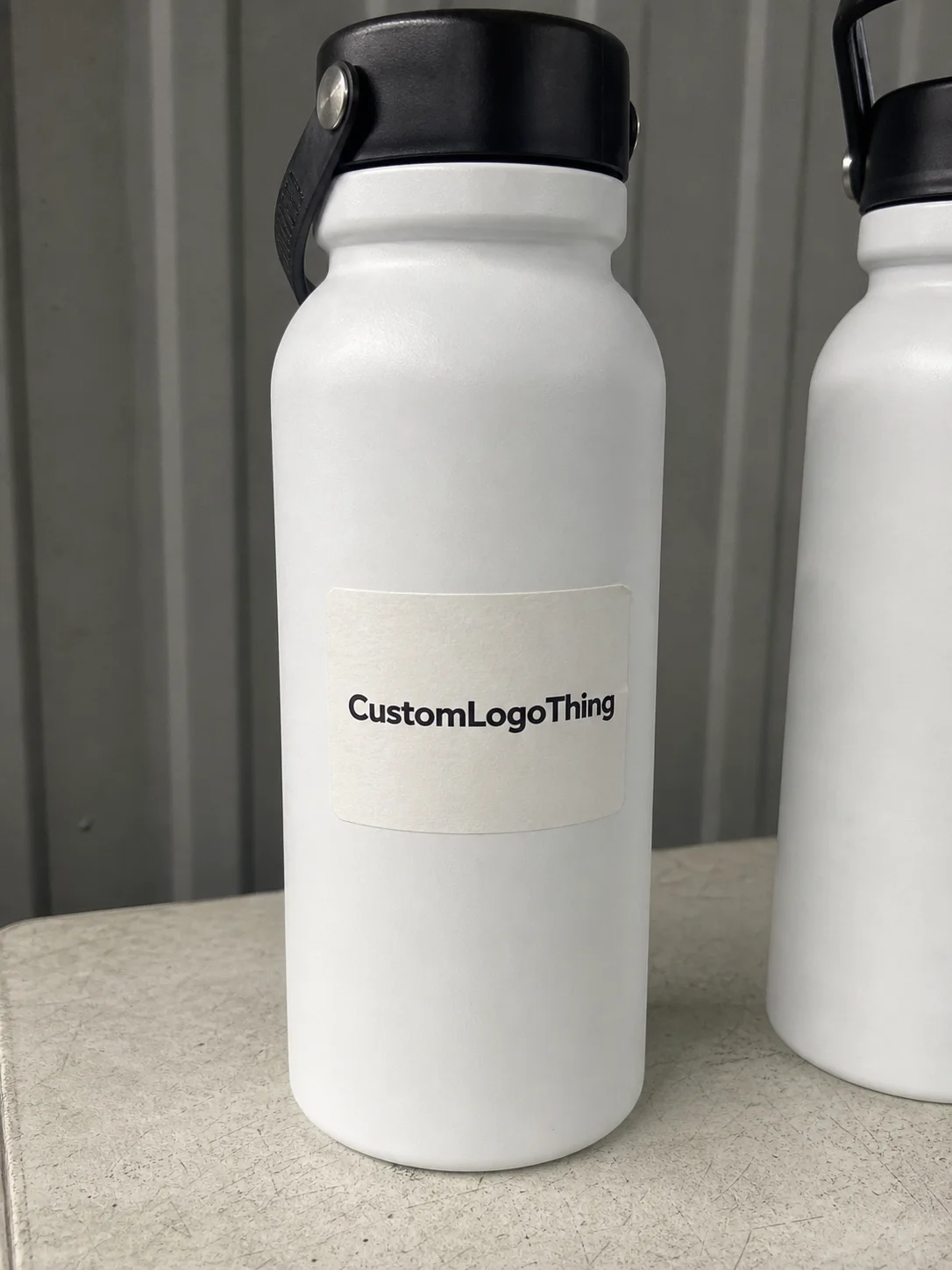
avery custom Water Bottle Labels sounds like a simple search, but the practical questions arrive quickly once you start planning a real order. Will the labels stay put on a chilled bottle? Which stock handles condensation better? How much does the unit price change between 250 pieces and 5,000? Those details matter because a bottle label is often the first branded surface people touch, inspect, and remember.
From a packaging buyer’s point of view, a well-made bottle label does more than carry a logo. It signals care, organization, and a level of finish that people notice immediately, even if only for a second. At events, in gyms, on retail counters, and in corporate giveaway kits, the label is often closer to eye level than the product itself. If the print is crisp and the edges stay flat, the whole package feels intentional. If the label lifts, wrinkles, or looks misaligned, the brand can feel rushed even when the product inside is solid.
Why a simple bottle label can change the whole package
A water bottle gives you only a small space to work with, but that small space has a lot of visibility. It moves through hands, coolers, cup holders, and conference tables, which means it is viewed at close range rather than from across a room. That changes the design brief right away. Small type becomes hard to read. Busy layouts lose clarity. Thin contrast can disappear under glare or condensation.
avery custom Water Bottle Labels are usually chosen by buyers who want a fast, polished branding solution without committing to a fully custom bottle. They sit somewhere between convenience and custom packaging. You are not redesigning the container itself, but you are still making a packaging decision that affects presentation, labor, and cost. Fit, adhesive strength, and stock selection all matter more than most people expect at first glance.
That is especially true if the bottles are going into a cooler, being handed out at an outdoor event, or moving through a retail setting where lighting, moisture, and handling all work against weak materials. A label that looks fine in a mockup can behave very differently once it touches a curved, chilled surface.
If you are building a broader branding system around labels and packaging, it helps to keep the visual language consistent across the set. Products such as Custom Labels & Tags and other Custom Packaging Products can support that consistency when a launch or event needs a coordinated look.
A bottle label does not need to be flashy. It needs to stay readable, stay attached, and support the brand in a few square inches.
How Avery-style labels work on bottles
Avery-style labels are built from three basic layers: a printable face stock, an adhesive layer, and a release liner. The face stock may be paper, film, or a moisture-resistant material. The adhesive can be permanent or removable, depending on whether the label needs to come off cleanly later. The liner is the backing you peel away before application. Some formats are sheet-fed for desktop printing; others are roll-fed for higher volume and more consistent placement.
The workflow is simple enough on paper, but the details decide whether the finished bottle looks polished or patched together. Design the label. Measure the bottle. Print a proof. Test the label on actual bottles. Apply the final run only after the test fits correctly. That last step saves more reprints than most buyers realize. A label that looks perfect on a flat screen may wrinkle on a bottle with a narrow waist, a tapered shoulder, or a molded seam running through the placement area.
Condensation is usually the first real stress test. Cold storage, ice buckets, and chilled displays create moisture that can weaken the bond if the stock or adhesive is not suited for wet handling. A removable adhesive can make sense for short-term promotions or reusable bottles, but for bottles that will sit in coolers or be distributed outdoors, a stronger bond and a moisture-resistant face stock are usually the safer choice. No label material performs well under every condition, so it is better to match the label to the use case than to assume one standard spec will work everywhere.
There is also a meaningful difference between labels meant for event giveaways and labels meant to support light retail packaging or resale. For events, appearance and quick application may matter most. For resale, buyers often need better scuff resistance, cleaner print stability, and a label that continues to look presentable after transport and shelf handling. Those are not the same requirement set, and they should not be priced or spec’d as if they were.
One of the easiest mistakes to avoid is skipping a physical test. Even a small shift in placement can reveal edge lift, seam overlap, or artwork that disappears around the curve. A pilot batch is usually cheaper than reworking a large order because the logo sat too close to the bottle seam or the label extended a little too far around the wrap.
Key specs that affect fit, durability, and appearance
The bottle itself is the first measurement that matters. Start with circumference, then check the flat area available for the label if the bottle has one. After that, note the taper, ridges, shoulder shape, and any seams or molded features that interrupt the surface. A label that is technically the right width may still fail visually if it lands on an uneven zone or crosses a seam. A small buffer at the top and bottom usually helps prevent curl and gives the adhesive a cleaner surface to grab.
That buffer is not wasted space. It reduces the chance of lifting at the edges, and it gives the label a little tolerance when application speed varies from one person to the next. On busy production tables, that tolerance matters.
Material choices that change the result
Paper labels are generally the most economical and work well for dry, short-life applications. They are common for indoor events, simple promotions, and packaging that will not be chilled for long. Film labels or moisture-resistant stocks are the better fit for cooler storage, outdoor use, and bottles that may be handled with damp hands. Clear labels can look premium, but they also depend heavily on the artwork. If the bottle color is light and the print has weak contrast, a clear label can disappear visually instead of enhancing the package.
Finish changes the feel as much as the material does. Matte usually gives a softer, more restrained look and can hide minor scuffs a little better. Gloss tends to brighten color and works well when the label needs to pop under event lighting or retail display lights. Clear labels create a minimal, modern effect, but they require tighter artwork discipline because there is less visual separation between the label and the bottle underneath.
Color accuracy is another place where expectations and production reality can drift apart. Small type, thin rules, and low-contrast logos are the first elements to show problems if print calibration is off. If your brand depends on a specific red, navy, or gradient treatment, ask for a proof and, when possible, check the label on the actual bottle shape rather than relying on a flat proof alone. A screen proof can hide curve-related issues that appear immediately once the label is applied.
For buyers who want a standards-based reference point, it can help to remember that transit and packaging performance are often discussed through organizations such as ISTA for shipping tests and EPA guidance on containers and packaging when recyclability questions come up. A bottle label is only one component, but it still sits inside a larger packaging and waste conversation.
Fit, finish, and use-case comparison
| Label type | Best for | Typical strengths | Watch-outs |
|---|---|---|---|
| Paper label | Dry indoor events, short promos | Lower cost, easy print quality | Weak in condensation, can scuff |
| Film label | Cold drinks, cooler storage, outdoor use | Moisture resistance, better durability | Usually higher cost per unit |
| Clear label | Premium branding, minimalist designs | Clean look, strong modern feel | Needs strong contrast and careful placement |
| Removable adhesive | Temporary promotions, reusable bottles | Easier cleanup, less residue risk | May lift sooner in wet conditions |
| Permanent adhesive | Retail packaging, longer display life | Stronger bond, more secure on curved surfaces | Harder to remove cleanly |
If the bottles are being resold or distributed through a retail channel, the label should support the broader packaging requirements too. That may mean space for barcodes, ingredient or compliance information, lot coding, or simply a finish that will not look dull under store lighting. The visual target is not only “nice.” It is “still nice after handling, transport, and display.”
Cost and pricing: what changes the unit price
The price of avery custom water bottle labels depends on more than most first-time buyers expect. Quantity drives the biggest swing. Size is next. After that come material, finish, print method, and whether the label needs a custom cut or a standard shape. If the job needs special proofing, a rush turnaround, or added handling, those factors move the quote again.
Smaller runs usually cost more per label because setup and production overhead are spread across fewer units. A 250-label order may carry a noticeably higher unit price than a 5,000-label order, even though the total order value is lower. That is normal print economics, not an unusual markup.
What buyers usually pay attention to
- Quantity: more pieces usually lower the unit price.
- Size: larger labels use more material and can increase the quote.
- Stock: film and waterproof options typically cost more than basic paper.
- Finish: matte, gloss, and specialty coatings can change pricing.
- Cutting: custom die-cut shapes add setup complexity.
- Shipping: tight event deadlines can make freight a significant part of the total.
In practical budgeting terms, buyers often see pricing that ranges from a few cents to several tens of cents per label, depending on volume and spec. A 5,000-piece film run with a standard shape may price very differently from a 250-piece paper order with a custom outline and short turnaround. The useful comparison is not just unit cost, but the full picture: print, finishing, packaging, and shipping.
That distinction matters because a lower-cost label that fails in cold storage is not a real savings. It creates waste, adds labor, and can make the entire package look less reliable. Paying more for the right stock is often cheaper than replacing labels that would have been fine on a dry shelf but not in a cooler.
Process and timeline: from artwork to delivery
The production process is usually straightforward, but there are a few points where a clean schedule can slip. It starts with file prep. If the artwork arrives at the wrong size, with missing bleed, low-resolution images, or fonts that have not been outlined, proofing slows down right away. After that come proof review, approval, printing, finishing, and shipping.
Digital printing is often the right choice for shorter runs because it can move quickly once the file is approved. Longer runs may use different production methods and can take a little more time, though the per-unit economics usually improve as quantity rises. Standard turnaround is often measured in business days after proof approval, while rush jobs compress the schedule and usually raise the cost.
Build in buffer time rather than assuming every step will go right on the first pass. If labels are needed for a conference, campaign launch, or store opening, leave time for one proof cycle, one correction cycle if necessary, and a small bottle test before the full batch is applied. That buffer protects the schedule far better than it delays it.
Lead time also matters because bottle labels rarely stand alone. If the same event uses custom printed boxes, branded napkins, or retail displays, one delay can throw off the appearance of the entire setup. Packaging works as a system, and the weakest link tends to be the first thing people notice.
A good operational question to ask is, “What happens if the artwork changes?” The honest answer is that even a small change can reset part of the approval process. If the label size shifts by a quarter inch, if copy is added, or if a barcode moves, treat it as a new proofing step. That discipline prevents unnecessary reprints and last-minute adjustments.
For organizations that care about sourcing, it can also help to ask whether paper stocks are FSC-certified. The Forest Stewardship Council explains certification and responsible sourcing at fsc.org. Not every water bottle label order requires that level of documentation, but some brands and procurement teams do ask for it.
Common mistakes that make labels fail early
The most common failure is simple: the label was sized for a flat mockup instead of the actual bottle. Curvature changes the fit, and taper changes the wrap. A label that looks fine on screen may need a narrower layout or a different placement once it meets a real container.
The second mistake is choosing the wrong adhesive. A removable adhesive may sound convenient, but it can start lifting in a cooler or after condensation forms. A permanent adhesive solves that problem more often, though it is not the right answer if the label must come off cleanly later. The correct choice depends on storage, handling, and whether the bottle is meant to be reused.
The third mistake is crowding the layout. Tiny text, thin lines, and dense copy reduce legibility fast. A bottle label is read at arm’s length and often while someone is moving. If the viewer needs to stop and study it, the layout is carrying too much information for the available space.
The fourth mistake is skipping a proof on a real bottle. A PDF proof is useful, but it does not show how the label wraps, where the seam lands, how the finish behaves under light, or whether the edges stay down after refrigeration. A physical test on one or two bottles can reveal wrinkles, opacity issues, edge lift, and placement problems before those issues scale up.
There is also the risk of ordering too much before the spec is proven. A pilot batch is usually the smarter move. It gives you a chance to confirm the look, check application speed, and make sure the label survives the conditions it will actually face. Buying large quantities before that test is a common way to turn a small design problem into a full inventory problem.
Expert tips for better results and a cleaner rollout
Design for distance first. Strong logos, fewer words, and solid contrast usually outperform crowded artwork. If the bottle will be photographed, the brand mark should be large enough to survive cropping, compression, and social sharing. If the message is promotional, keep it short enough to read in a glance.
Order extras. That advice sounds ordinary, but it is one of the most practical rules in packaging. Some labels will be lost to test bottles, damaged cartons, misapplied pieces, or last-minute replacements. A small overage can keep a rollout from turning into a scramble.
Before application, clean the bottle surface and let it dry fully. Dust, oil, and condensation all reduce adhesion. Apply the label slowly from one edge to the other, smoothing as you go so bubbles do not get trapped under the face stock. If a team is labeling at scale, use a placement guide or simple alignment aid so the bottles look consistent from one piece to the next.
Finish should match the setting. Gloss can look sharper under bright event lighting. Matte can feel more restrained and less reflective. Clear labels can work beautifully on tinted bottles if the artwork has enough contrast to remain visible. The best result usually comes from treating the label as part of the whole package rather than as an afterthought that gets added at the end.
For buyers comparing avery custom water bottle labels with other branded packaging options, the smartest sequence is still practical and direct: measure the bottle, Choose the Right stock, request a proof, and test a few pieces before full production. That approach protects time, money, and the final appearance. It also tends to produce a result that looks planned instead of improvised.
That is the real difference between labels that merely identify a bottle and labels that strengthen the brand. If the fit, finish, and application are handled well, avery custom water bottle labels can do a surprising amount of work for a very small piece of packaging.
FAQs
Are Avery custom water bottle labels waterproof enough for cold drinks?
Water resistance depends on both the label stock and the adhesive, not just the print quality. For chilled bottles, film-based or moisture-resistant labels usually hold up better than standard paper. The safest move is to test a sample on a cold bottle with visible condensation before placing a full order.
What size should Avery water bottle labels be for standard bottles?
Measure the bottle circumference and the usable label panel first. Leave enough clearance so the label does not overlap seams, curves, or ridges. A template test on one physical bottle is usually the fastest way to confirm fit.
How much do custom water bottle labels usually cost?
Pricing depends on quantity, size, material, finish, and whether the order needs custom cutting. Higher quantities generally lower the unit cost, while specialty materials raise the price. Ask for a quote that separates print, finishing, and shipping so you can compare options clearly.
How long does the production process take for custom bottle labels?
The timeline usually depends on proofing speed, artwork readiness, and the production method. Orders move faster when files are print-ready and the label size is already confirmed. Add extra lead time if you need a new design, special material, or a rush shipping option.
What is the best way to apply custom labels without bubbles or wrinkles?
Clean and fully dry the bottle surface before application. Apply the label slowly from one edge to the other while smoothing as you go. Use a small test batch first to confirm placement, pressure, and adhesion before labeling the full run.


