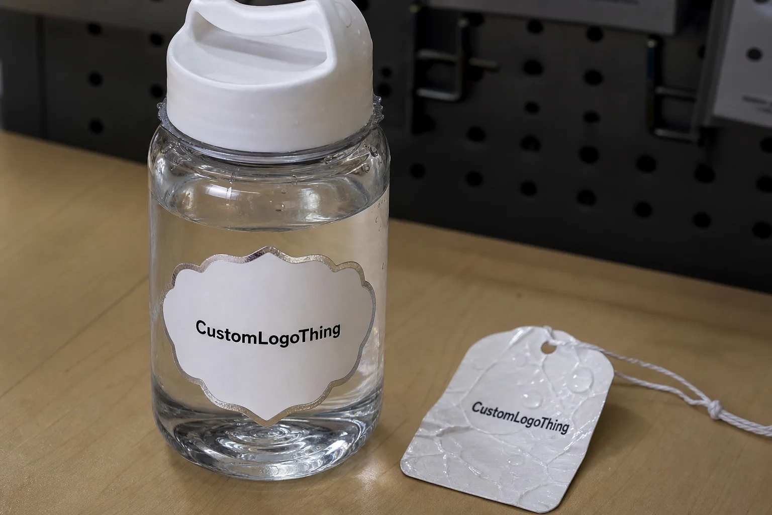
If you have ever watched a label slide sideways after ten minutes in an ice bucket, you already know why waterproof Water Bottle Labels personalized are not a cosmetic detail. The weak point is usually the edge, not the artwork. Once cold bottles start sweating, paper stock and weak adhesive give up fast.
Most buyers do not need a chemistry lecture. They need labels that stay readable through condensation, handling, and the kind of abuse that happens at weddings, gym promotions, retreats, team events, and chilled beverage displays. That means choosing the right film, the right adhesive, and a layout that survives curved surfaces without looking cheap.
The practical split is simple: if the bottle is staying dry on a table for two hours, a lot of materials will survive. If it is going into ice, getting pulled out with wet hands, and sitting in a cooler, the spec needs to be real. That is where the cheap option usually stops being cheap.
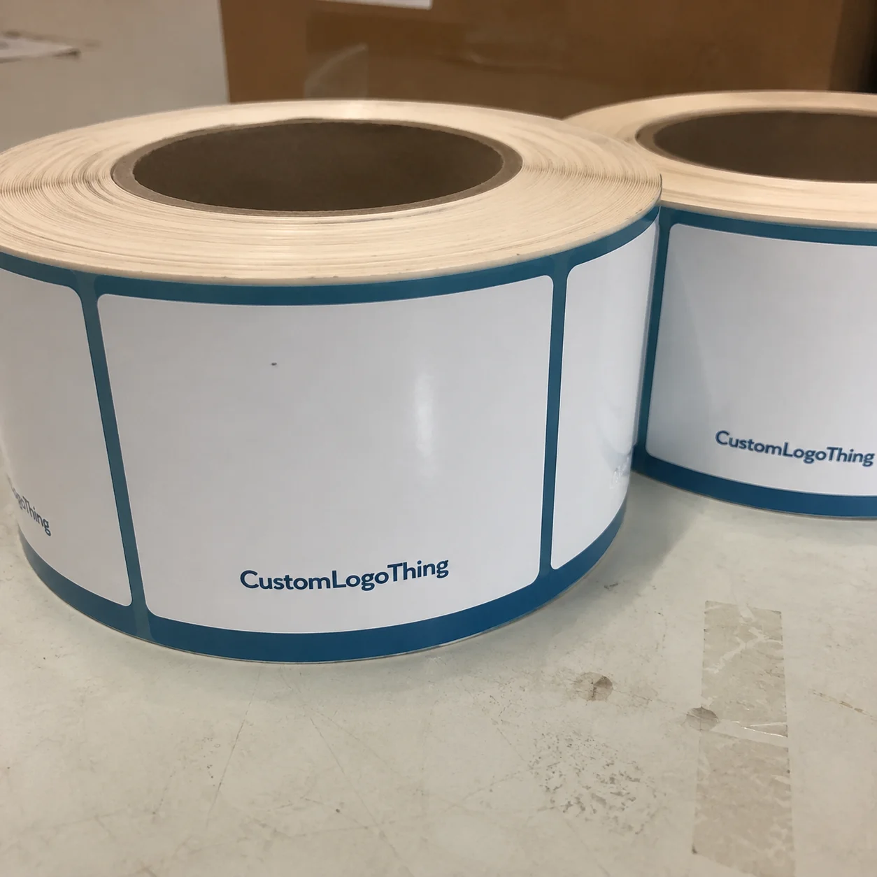
Why waterproof water bottle labels personalized beat paper tags
The real difference between a decent label and a bad one is not how it looks on a flat mockup. It is what happens after the bottle gets cold. Paper tags absorb moisture, the fibers swell, and the corners start lifting. Then the label curls, smears, or turns into a soggy rectangle nobody wants to touch.
Waterproof water bottle labels personalized are built for moisture resistance first, then print quality. That order matters. A glossy paper sticker may look fine on day one, but if the adhesive is not designed for chill and condensation, the edge lift starts early and keeps going. Real waterproof construction means the face stock, adhesive, and finish all have to hold together under wet handling.
A pretty label that peels in the cooler is not branding. It is waste with a logo on it.
These labels show up anywhere drinks are handled cold and often in a hurry:
- Weddings and showers with bottled water on guest tables
- Gyms, wellness retreats, and corporate events
- Team sports, camps, and community runs
- Branded giveaways and retail sampling
- Coolers, ice tubs, and chilled beverage displays
The language matters too. Water-resistant means the label can tolerate some moisture. Waterproof means the construction is intended for wet environments, short submersion, and repeated handling without falling apart. Those are not interchangeable terms, and buyers get burned when suppliers blur the line.
There is also a difference between looking waterproof and performing waterproof. Some labels use a shiny top coat that looks durable, but the construction underneath is still paper. Once water gets to the edge, the failure starts there and spreads. If the label will ever sit in crushed ice, the edge seal and adhesive matter more than the marketing language on the quote.
For cold bottles, the safest call is to build for the worst condition you expect, not the best. That does not mean overbuying every time. It means being honest about the use case. A short indoor event with light condensation is one thing. An all-day outdoor activation in summer is another. The label spec should match the latter if there is any chance the bottle ends up there.
Materials and finishes that hold up on cold bottles
For cold bottles, the safest base materials are synthetic films. In practice, that usually means BOPP, vinyl, or synthetic paper. They do not absorb water the way standard paper stock does, which is why they stay dimensionally stable when the bottle sweats.
Most event buyers do not ask for the exact film construction, but they should. A label that bends and returns to shape is useful. A label that swells, wrinkles, or clouds up when chilled is not. That difference shows up quickly once a bottle comes out of refrigeration and sits in humid air.
| Material | Wet performance | Typical feel | Best use | Relative cost |
|---|---|---|---|---|
| BOPP | Excellent against condensation and brief chilling | Smooth, clean, professional | Most event water bottle labels | Low to moderate |
| Vinyl | Very strong moisture resistance and abrasion resistance | Flexible, slightly heavier hand | Rough handling, cooler use, longer display life | Moderate to higher |
| Synthetic paper | Good water resistance, better than paper, less durable than vinyl | Closer to paper in appearance | Short-run branded labels with a paper-like look | Moderate |
Finish choice changes both appearance and durability. Gloss boosts color saturation and gives the label a brighter retail look. Matte lowers glare, which helps text read better under event lighting. Soft-touch lamination gives a premium feel, but it is not the best choice if the bottles will rub against each other in a cooler all day. That surface can show scuffs faster than a hard gloss finish.
There is a tradeoff buyers do not always get told. A soft-touch finish hides fingerprints and looks refined in hand, but it is less forgiving during transport and packing. If the bottles are boxed tightly or moved around in bulk, a harder finish usually survives the trip better. That is a production issue, not a taste issue.
The adhesive is just as important as the face stock. A permanent adhesive is usually the right call for chilled bottles because the label needs to bite quickly and stay down. Removable adhesives are useful for short campaigns or bottles that must come off cleanly, but they are not the first choice for ice exposure. Freezer-safe adhesive is worth asking for if the bottles will sit in near-freezing conditions or in ice water for long stretches.
There are also practical compatibility issues. A chilled glass bottle behaves differently from a plastic bottle. Condensation on PET can be slicker than many buyers expect, and a label that feels fine on a room-temperature bottle can shift once the surface gets cold. Oily hands make the problem worse. So does rinsing. If the bottle will only get a quick wipe, that is one thing. If it will be submerged or washed, that needs to be stated before production starts.
Thickness matters too. Most event labels do not need a heavy industrial film, but they do need enough body to survive handling without tearing at the corners. Once a label is too thin, it can wrinkle around the curve or stretch during application. Too thick, and it starts to fight the bottle. The best spec is the one that applies cleanly in one pass and stays put after the bottle is cold.
For buyers who care about certification, paper outer cartons or supporting print components can be sourced to FSC standards. See the basics at FSC. For durability testing, transport-style abuse checks are better referenced against ISTA protocols than gut feeling and hope.
Cost, pricing, MOQ, and unit cost drivers
Pricing for waterproof water bottle labels personalized usually comes down to six things: material, size, shape, finish, quantity, and how much variable data the job includes. A simple one-color label in a standard rectangle costs less than a die-cut, full-color, name-specific run with lamination and a specialty adhesive. That is not the supplier being difficult. It is just how print work prices out.
Typical buyer ranges look like this:
- Short run, 250-500 pieces: roughly $0.35-$0.90 per label, depending on size and finish
- Mid run, 1,000 pieces: often $0.18-$0.45 per label
- Larger run, 5,000 pieces: often $0.09-$0.25 per label
Those numbers move fast if you add unusual shapes, heavy ink coverage, soft-touch lamination, or multiple versions. Variable data printing for names, flavors, or guest-specific text usually adds cost too, but not always as much as buyers fear. The bigger issue is setup and proofing discipline. A messy spreadsheet can cost more than the print itself because it creates delays and rework.
The minimum order quantity depends on the press setup and whether the job is digital or flexographic. Digital work often supports lower MOQs, which is helpful for events and short campaigns. Flexo becomes more efficient at higher volumes, but the economics make more sense when you are ordering thousands, not a few hundred. If you need a small event run, ask for a quote that includes both the label spec and the true MOQ. Some suppliers will quote a low headline price and then add setup, die-cutting, proofing, and shipping later. That is how a cheap label turns into an expensive annoyance.
A fair quote should separate the obvious from the hidden:
- Setup: file prep, color adjustment, and press calibration
- Die-cutting: custom shapes or rounded corners
- Proofing: digital or printed sample approval
- Finish: gloss, matte, soft-touch, or lamination
- Rush: expedited production or shipping
There are also hidden cost drivers buyers only notice after a job goes sideways. If a bottle needs a narrow label panel, the trim tolerance gets tighter and the waste can rise. If names change across hundreds of labels, the file prep time goes up. If the artwork uses small text reversed out of a dark background, print inspection gets slower. None of that is dramatic. It just adds labor.
My simple rule: lowest price is useless if the label fails on an ice-cold bottle after one hour. A label that peels in the cooler is not cheap. It is expensive in the worst possible way. If your event is once and done, a mid-tier waterproof build is usually the smarter buy than gambling on paper stock that looks fine in the quote and bad in real life.
If you are comparing options for a broader labeling project, the same structure applies to Custom Labels & Tags. The spec sheet matters more than the headline price.
Process and turnaround: from artwork to delivery
Good label jobs move in a straight line. Bad ones bounce around because the files are incomplete, the colors are not approved, or the buyer did not think through the bottle size until the last minute. Here is the normal flow:
- Artwork prep and dieline confirmation
- Proof review for size, copy, color, and variable fields
- Material and adhesive selection
- Print production
- Finishing or lamination
- Cutting and packing
- Shipping or pickup
The most common delays are predictable. Missing dielines slow everything down. Low-resolution logos force a cleanup pass. Brand colors need correction more often than clients expect, especially when the original files came from social media or a compressed PDF. And if personalized names are involved, one typo in the spreadsheet can stall the whole release while someone checks whether “Micheal” was supposed to be “Michael.” Yes, it happens.
Standard turnaround is often 7 to 12 business days after proof approval for common materials and simple finishing. Rush options can shorten that to 3 to 5 business days if the stock is available and the artwork is clean. Specialty finishes, Custom Die Cuts, or unusual adhesives can add time. That is not a delay. It is production doing actual work.
There is a reason the approval step matters so much. The press does not care that your event is on Friday. It cares whether the file is complete and the colors are stable. Once a job is approved, changing a name list, resizing artwork, or switching bottle formats can send the schedule backward. That is avoidable if the input is clean.
A clean approval workflow saves money and sanity:
- Confirm final bottle dimensions before design starts
- Check names, spellings, and quantity breakouts in one spreadsheet
- Approve color intent, not just the layout
- Verify finish choice against the actual event use case
- Lock the delivery date before you set the application window
If you are ordering through Custom Labels & Tags, send the files in the cleanest form you have. Vector art is best for logos. Raster files should be high resolution. Tiny screenshots are not production files. They are problems with margins.
Design choices that keep logos readable on curved bottles
Design on a flat screen and design on a curved bottle are not the same job. A label can look balanced in a mockup and still wrap poorly around the container. The safest approach is to size from the actual bottle, not from a generic template someone downloaded two years ago and never tested.
For standard event bottles, many labels land in the 1.5" to 3" tall range, with width driven by the bottle circumference and the visible panel space. Leave a small gap unless you want a full wrap. On a curved bottle, that gap helps prevent edge conflict and makes application less fussy.
Typography matters more than decoration. Use a heavier font weight than you would on a business card. Keep the line count under control. Tiny serif text on a wet bottle is a bad idea dressed up as elegance. If the bottle is likely to be handled in dim lighting or by people who are moving fast, keep the important text large and central. Names, event date, flavor, or logo should win. Long slogans should not.
Here is the practical design hierarchy I recommend:
- Top priority: logo or guest name
- Second priority: event name or flavor
- Third priority: short supporting detail
- Skip if crowded: long taglines, dense copy, or tiny icons
Shape strategy also changes the result. A front-only label is easier to read and quicker to apply. A wraparound label gives more space for branding or ingredient text, but it demands better alignment. A spot label works well for minimalist event branding, especially when the bottle itself is already attractive and you only need a clean mark.
Build in real print margins. Use bleed so trimming does not clip the design. Keep critical copy inside a safe zone so edge cut variation does not swallow it. If names are personalized, leave room for the longest expected name, not the shortest one in the file. That one detail saves more reprints than most buyers realize.
Color contrast deserves its own check. Dark text on a light field is the simplest option, especially on a wet surface. Light text over a dark background can work, but only if the type is bold enough and the finish does not introduce glare. On small labels, high contrast beats clever graphics almost every time.
For a branded event package, I would rather see a strong, short label with excellent contrast than a crowded design that tries to say everything at once. The bottle is moving. The label should not make people work to read it.
Common mistakes that shorten label life
The most common failure is still application error. People stick labels onto damp, dusty, or oily bottles and then act surprised when the edges lift. Surface prep matters. Wipe the bottle, let it dry, and apply the label at room temperature if possible. If the bottle is already sweating, wait or dry it properly. That one step solves a lot of complaints.
Paper-based labels are another recurring mistake. They can work for dry, short-term use, but they do not belong in ice buckets or coolers. The problem is not just moisture. It is the combination of cold, abrasion, and handling. A server pulls a bottle out of ice, the label rubs against another bottle, and the weakest edge starts to fail. Then the whole run looks cheap.
Overdesign causes its own trouble. Too much copy, too many decorative elements, and too many small moving parts make the label harder to read and more likely to print poorly at small size. Personalization makes this worse if the variable field is not planned. A name that fits in one version may crash into a border in another. That is why testing with the longest expected text is not optional.
The biggest testing miss is using the wrong bottle during approval. A label that performs on one brand of bottle may behave differently on another because of curvature, coating, surface texture, or temperature. If you care about the result, test the actual bottle, chilled to the actual use temperature, with the actual handling conditions. Do not test room-temp samples and pretend that is enough. That is how false confidence gets packaged.
Another common issue is underestimating condensation at the point of application. If labels are applied after bottles have already been chilled, the surface can be slick before the adhesive has time to grab. Some adhesive systems handle that better than others. If the application is happening in a busy prep area, build in enough time for the bottle and the label to acclimate. Speed is useful. Sloppy speed is expensive.
Good suppliers will encourage a sample or short-run proof before the full order, especially if the bottle shape is unusual or the event setup is new. That is a sensible check, not a sales trick. It is the cheapest insurance in the process.
What to order next: samples, quantities, and application tests
If the bottle, finish, or event use case is new, start with a sample or a short-run proof. That gives you a real answer on adhesion, scuffing, and readability. A room-temp digital proof is useful for layout. It is not proof of performance. Real bottles have curves, condensation, and people touching them.
Before you Request a Quote, gather the basics:
- Quantity
- Bottle size and diameter
- Label dimensions or target area
- Shape preference
- Material and finish
- Artwork files
- Delivery date
- Whether names or flavors vary from label to label
Then test the label on the actual bottle after refrigeration, not before. Handle it with wet hands. Put it in a cooler or ice tub for a realistic time window. If the event uses guests who will pick the bottle up, put it back down, and maybe shove it in a bag, test that too. The point is to simulate use, not admire a sample.
A clean order usually follows this sequence:
- Confirm spec
- Review proof
- Approve production
- Schedule application
- Keep a few extras for breakage or last-minute additions
If you need a realistic quantity recommendation, do not stop at the guest count. Add spares for misapplied labels, damaged bottles, and the occasional last-minute addition. A small overage is cheaper than reordering a rush batch because the count was optimistic.
If you want help comparing a few build options, Custom Labels & Tags is the right place to start. The smarter buyers do not ask for the cheapest sticker. They ask for the one that survives the bottle, the cooler, and the event without embarrassing them.
Are waterproof water bottle labels personalized safe for ice buckets?
Yes, if they use a synthetic film and a permanent adhesive made for cold, wet conditions. Paper labels are the wrong choice for ice buckets because condensation and chilled surfaces break them down fast. Test the label on the actual bottle after chilling it, because performance changes once the surface is fully cold.
What size should personalized waterproof bottle labels be for standard bottles?
Measure the bottle circumference and leave a small gap unless you want a full wrap design. Common sizes vary by bottle style, so the right answer is to size from the actual bottle instead of guessing from a generic template. For curved bottles, keep the essential text centered in the flattest visible panel.
How long do waterproof bottle labels last in real use?
That depends on material, adhesive, finish, and how much handling or abrasion the bottle sees. A well-built label should survive condensation, brief rinsing, and regular hand contact without peeling or smearing. If the label must survive repeated washing or prolonged ice exposure, say that up front.
Do waterproof water bottle labels personalized cost more than paper stickers?
Usually yes, because the base material and finishing are more durable and more expensive. The better comparison is value per usable label, not sticker price alone. Ask for pricing at your actual quantity, since unit cost often drops quickly as volume increases.
Can I personalize each label with a different name or flavor?
Yes, variable data printing can handle names, flavors, numbers, or guest-specific details. You will need a clean spreadsheet and a proofing step to catch spacing or spelling issues. Keep the variable fields short and readable so the labels still look intentional, not cramped.
Do cold bottles need special application steps?
Usually yes. The bottle should be clean and dry at the point of application, and the adhesive needs time to bite before the bottle is handled heavily. If the bottle is already sweating, the failure rate goes up. That is not a design problem. It is a prep problem.
If the bottle has to sit in ice, get waterproof water bottle labels personalized in a synthetic stock with the right adhesive, then test them on the exact bottle shape before you commit. That is the difference between labels that hold up and labels that become a cleanup task before the event is even over.