Buyer Fit Snapshot
| Best fit | Brand Packaging with Logo projects where brand print, material claims, artwork control, MOQ, and repeat-order consistency need to be specified before quoting. |
|---|---|
| Quote inputs | Share finished size, material target, print colors, finish, packing count, annual reorder estimate, ship-to region, and any compliance wording. |
| Proofing check | Approve dieline scale, logo placement, barcode or warning zones, color tolerance, closure strength, and carton packing before bulk production. |
| Main risk | Vague material claims, crowded artwork, missing packing details, or unclear freight terms can make a low unit price expensive after revisions. |
Fast answer: Brand Packaging with Logo: Build a Stronger First Impression should be specified like a repeatable production item. The safest quote records material, print method, finish, artwork proof, packing count, and reorder notes in one written spec.
Production checks before approval
Compare the actual filled-product size with the drawing, then confirm tolerance on folds, seals, hang holes, label areas, and retail display edges. Reserve space for logos, QR codes, warning copy, and material claims before decorative graphics fill the panel.
Quote comparison points
Review material grade, print process, finish, sampling route, tooling charges, carton quantity, and freight assumptions side by side. A quote is only useful when the supplier can repeat the same color, closure quality, and packing count on the next order.
I’ve watched two identical products leave a warehouse on the same morning in Indianapolis, both filled with the same formula, the same 250 ml fill weight, and the same profit margin, yet the one packed in brand packaging with logo inside a rigid box with a 1.5 mm chipboard shell and soft-touch lamination felt like a $60 purchase while the other, in a plain 18pt mailer, felt closer to a bargain-bin sample. That difference is not magic; it comes from packaging design, structure, print quality, and the way the logo is carried across the entire pack. Honestly, I still get a little irritated when people call that “just packaging,” because anyone who has stood beside a Heidelberg press check table in a factory in New Jersey knows better.
At Custom Logo Things, I see this constantly in client samples from Shenzhen, Dongguan, and Dalton, and people still underestimate how much brand packaging with logo shapes trust before the product is even touched. One clean mark on a well-built carton can change the perceived value of product packaging in a way a flashy ad never will. Packaging works like a physical brand handshake, not just a container, and the best teams understand that right away. I remember one cosmetics buyer in Los Angeles tapping a sample carton with her pen and saying, “If the box feels cheap, I assume the serum probably does too.” Brutal? Maybe. Accurate? Also yes.
What Brand Packaging with Logo Really Means
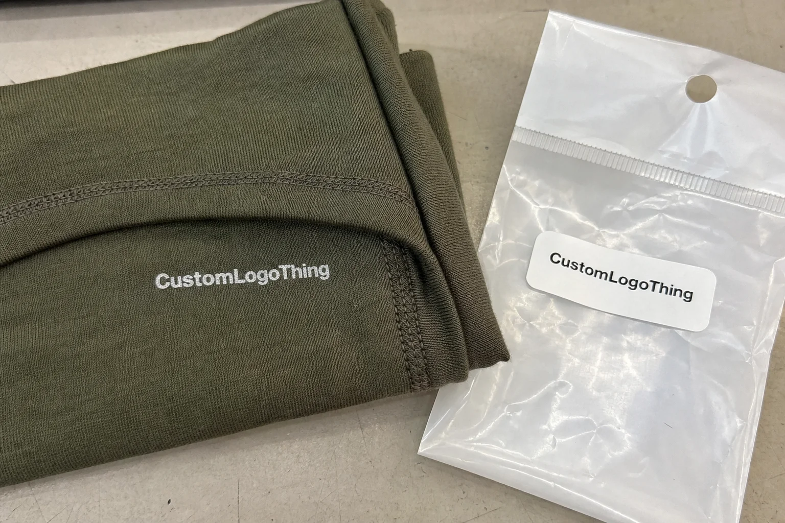
Brand packaging with logo is the full visual and structural system that presents a product, not simply a logo printed on a box panel. It includes the carton style, the material grade, the finish, the placement of the mark, the color story, the unboxing sequence, and even how the packaging feels when a customer lifts it out of a shipping carton. In other words, brand packaging with logo is package branding in its complete form, and if the logo is the only thing the team has thought about, the project is already halfway in trouble.
I remember standing beside a line in a folding-carton plant in Grand Rapids where two skincare brands were being packed on adjacent tables in May 2024. Same bottle, same fill weight, same retail price target. One went into a 350gsm C1S artboard carton with a matte aqueous coat and a centered gold foil logo, while the other used a plain kraft sleeve with a small black mark in the corner. The first brand looked like it belonged in a boutique; the second looked functional, even though the product inside was just as good. That is the practical power of brand packaging with logo. The product did not change. The perception did, and perception is a stubborn thing.
The distinction between a logo, a brand mark, and a complete packaging identity matters more than most teams realize. The logo is the symbol or wordmark. The brand mark may include a monogram, icon, or secondary asset. The packaging identity is the full system: type, color, hierarchy, texture, structural shape, and how the package performs in retail packaging, subscription boxes, or direct-to-consumer shipping. Strong brand packaging with logo makes all of those pieces work together, which is why the best designs feel inevitable rather than assembled from a dozen last-minute decisions.
In retail, the logo needs to read from a shelf distance of 3 to 6 feet, which is roughly the width of two shopping carts parked end to end. In DTC, the logo often appears first on the mailer, then on tissue, then again on the inner box, so the brand gets repeated touchpoints across at least three printed surfaces. In luxury and promotional programs, the logo often carries reassurance: “this is the real thing,” “this is consistent,” and “this brand pays attention.” That is why brand packaging with logo is not just decoration; it is part of the buyer’s confidence, and confidence is hard to fake once a customer has the package in hand.
“The box doesn’t just hold the product. It tells the customer how seriously the brand takes itself.” I’ve heard that line from a buyer in a cosmetic procurement meeting in Chicago, and after twenty years around packaging lines, I’d say she was right more often than not. She was also the kind of person who could spot a crooked logo from ten feet away, which made the rest of us look like amateurs for a second or two.
The rest of the decision tree comes down to three questions: what should the customer feel, what should the package do, and what should the logo communicate from the first glance? Once those are answered, brand packaging with logo becomes much easier to design, quote, and produce. It also becomes easier to keep consistent across custom printed boxes, mailers, inserts, and seasonal variations, which is a relief because reworking a whole system after launch is the kind of headache nobody deserves twice.
How Brand Packaging with Logo Works in Production
Production starts long before ink hits paperboard. A proper brand packaging with logo workflow begins with concept artwork, then moves to a dieline, a prepress review, a proof, and finally the press run, finishing, cutting, folding, and assembly. On a good day in a converting plant, you can almost feel the rhythm: artwork checks at a screen, sheets feeding through offset litho, cartons being die-cut, and finished blanks stacked for gluing or hand insertion. I love that part of the process, even when the floor is loud enough to make your coffee taste like pressure.
Different substrates change how the logo behaves. SBS paperboard, especially 350gsm C1S artboard, gives a crisp print surface and clean edges for small type. Corrugated mailers can handle shipping abuse better, but they need a smarter print strategy because the flute pattern and liner texture affect the final image. Rigid chipboard supports premium structures and heavier finishes, while kraft paper gives a natural tone that works beautifully for eco-focused branded packaging. Coated stocks hold sharp detail, but they can make fingerprints and scuffs more visible, so the finish choice matters.
Printing method changes the outcome, too. Offset litho is excellent for sharp logos, tight registration, and consistent color over larger runs. Digital printing is fast and flexible for shorter runs or frequent artwork changes. Flexographic printing is common for corrugated packaging and mailers, especially when the run size is high and the design uses fewer colors. Screen printing can work well on specialty surfaces or promotional packaging where thicker ink laydown is desirable. If a client wants a fine-line logo to hold at 6-point type, I usually push them toward the process that gives the most predictable edge quality, because “close enough” is how you end up squinting at a box under fluorescent lights and muttering under your breath.
Finishing is where brand packaging with logo often earns its premium feel. Matte lamination softens glare and gives a calmer surface. Soft-touch coating adds a velvety texture that customers notice immediately. Foil stamping, whether gold, silver, copper, or a custom colored foil sourced through suppliers in Guangdong, makes the mark pop. Embossing lifts the logo off the surface; debossing presses it inward for a subtle, expensive look. Spot UV can highlight one word or symbol without flooding the entire pack with gloss. Varnish can be used for protection, sheen control, or a light visual lift. Each one changes how the logo is perceived in hand and under light, and yes, some of them also show every fingerprint like they’re trying to embarrass you.
Prepress is where many projects live or die. Bleed is usually 0.125 inch on most carton jobs, safe zones matter, and vector artwork is non-negotiable if you want a clean logo at production scale. Pantone matching needs real stock references, not just a PDF on a laptop. A white logo on uncoated kraft will never behave the same way as a white logo on coated SBS. If a brand skips proof approval, they are gambling with the most visible part of the package. I’ve seen jobs in a Midwest carton plant stall for two days because the logo sat 3 mm too low on the front panel; on paper that sounds minor, but on a shelf it looked off-center and unbalanced, which is the sort of detail that keeps art directors awake at night.
On the floor, the production environment matters more than outsiders think. Carton converting lines, die-cutting presses, and hand-assembly stations all introduce their own tolerances. When I toured a high-volume mailer facility outside Shenzhen, the operators kept a magnifier at the inspection table because even a 1 mm shift in fold score could affect how the logo landed on the finished face. That level of detail is why brand packaging with logo should always be built with real manufacturing constraints in mind. Pretty mockups are fine, but the factory is where the truth shows up.
For technical reference and broader industry standards, I often point teams to resources such as ISTA for transit testing and FSC when they want to understand certified paper sourcing. If the package has to travel 300 miles by ground freight, survive drop tests from 30 inches, or meet sustainability claims, those references are worth the time.
Key Factors That Shape Brand Packaging with Logo
The first thing I look at is visual hierarchy. Where does the eye go in the first second? With brand packaging with logo, that usually means logo size, placement, negative space, and contrast. A mark that is technically correct but visually buried under too much copy will not do its job. On a shelf, the customer should find the logo fast, usually in under two seconds. On a mailer, they should recognize it before the tape is even cut, otherwise you’re asking the packaging to do acrobatics it was never built for.
Brand consistency across SKUs is another major factor. One logo system might need to stretch across 30 ml cartons, 120 ml cartons, gift sets, and display sleeves. The trick is keeping the family recognizable without making every box look like a copied-and-pasted clone. I’ve seen beauty brands use the same typographic lockup but vary the background tone and finish by line, which kept the family together while still giving each product its own presence. That is strong brand packaging with logo work, because it respects both recognition and SKU differentiation.
Structural choice affects the presentation more than many design teams expect. A tuck-end box gives a different feel than a sleeve box. A shoulder box creates a lifted reveal. A mailer box is practical for DTC but can still look premium if the interior print and insert are handled well. Rigid boxes, especially with hinged lids or magnetic closures, create a deeper reveal moment and often support higher-margin products. Inserts matter, too. A custom insert can center the product, protect it during transit, and frame the logo during the unboxing experience.
Here’s the pricing reality, and I’d rather be direct than vague: cost is driven by order quantity, print complexity, number of colors, finish selection, material thickness, structural complexity, and assembly labor. A simple digitally printed folding carton in 5,000 units may land around $0.15 to $0.32 per unit depending on size and stock. A rigid box with foil, embossing, and a two-piece insert can easily move into the $2.10 to $6.50 range per unit at lower quantities. Those are not universal numbers, but they are close enough to help brands plan intelligently. Brand packaging with logo gets more expensive when teams want multiple premium effects on one surface, especially if every effect insists on having its own special moment.
Volume changes the economics fast. I’ve watched brands move from short-run digital to longer-run offset once they hit a repeat order of 10,000 units, and the unit price drop was enough to justify better board, better inks, and a stronger finish. The setup costs still exist, though. Dielines, plates, proofing, and press setup do not disappear just because the logo is simple. In many cases, the brand packaging with logo quote is less about the logo itself and more about what surrounds it. That part surprises people, but the factory bill never lies.
Sustainability has become a serious design factor, not a side note. Recyclable substrates, soy-based inks, water-based coatings, and reduced ink coverage all help align the packaging story with customer expectations. Still, eco claims need to match the actual package construction. A kraft look does not automatically mean sustainable, and a premium black rigid box is not automatically wasteful. The right question is whether the board, adhesive, and finish support the claimed end-of-life path. That matters in brand packaging with logo because the logo is tied to trust, and trust breaks quickly when the packaging message feels misleading.
| Packaging Option | Typical Use | Approx. Unit Cost | Best For | Notes |
|---|---|---|---|---|
| Digital Folding Carton | Short runs, frequent artwork changes | $0.38–$0.72 | Startups, seasonal launches | Fast setup, good for smaller logo variants |
| Offset Printed Carton | Mid-to-large volume retail packaging | $0.18–$0.45 | Stable SKUs, high consistency | Best when color accuracy matters |
| Rigid Box with Finish | Luxury product packaging | $2.10–$6.50 | Premium gifting, cosmetics, electronics | Foil, emboss, and inserts raise cost |
| Corrugated Mailer | Shipping and DTC | $0.65–$1.80 | Subscription, e-commerce, kits | Structural strength matters for transit |
For teams looking to build out a broader system, it helps to review Custom Packaging Products early, because the logo may need to live across cartons, mailers, inserts, labels, and promotional kits. I also encourage clients to study Case Studies before they lock a structure, since the smartest packaging decisions often come from seeing what has already worked in a similar category. I’ve had more than one client change direction after seeing a case study and saying, “Oh, so that’s why our first idea felt a little too fragile.”
Step-by-Step Process for Brand Packaging with Logo
Every strong brand packaging with logo project starts with the brand goal, not the artwork. Who is the customer? Is the box going to retail shelves, shipping cartons, trade show tables, or a subscription fulfillment line? What should the emotional tone be: clinical, playful, premium, natural, or industrial? If a team cannot answer those questions, the packaging brief is too soft to produce good results.
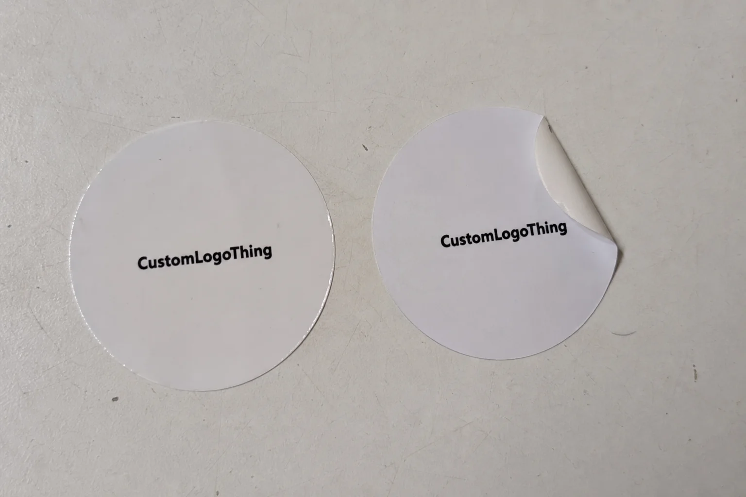
Next comes artwork preparation. I always want vector logo files, usually AI, EPS, or print-ready PDF, with fonts outlined and brand colors specified in Pantone if possible. High-resolution raster art can work for some parts of a design, but the logo itself should be built to scale without pixelation. On a press sheet, a 1-point stroke that looked fine on a monitor may disappear if the file was not prepared properly. That is one of the most common points of failure in brand packaging with logo projects, and it is maddening because it is so avoidable.
Then the packaging format gets chosen. A retail carton, a mailer, a sleeve, or a rigid presentation box each carries different functional and visual implications. For a 14 oz candle, for example, a rigid box may be overkill unless the brand wants gift-grade presentation. A mailer might work better for direct-to-consumer shipping, especially if the outer branding needs to survive parcel handling from a fulfillment center in Memphis or Reno. The right format keeps the logo visible and the product protected without overspending on structure.
Material and finish selection come after that. A matte black SBS carton with silver foil will create a very different mood from a natural kraft mailer with a single-color flexo print. Soft-touch lamination may suit a beauty brand, while an uncoated stock may be better for an artisan food item or an eco-focused line. Brand packaging with logo should never ignore touch; customers feel the package before they read every word. I’ve had clients insist on glossy everything because it “looked premium,” only to discover that premium on screen and premium in a hand are not always the same animal.
Proofing is where the work becomes real. I prefer digital proofs for layout and physical proofs or press checks for color-critical jobs. During proof review, I’m checking logo placement, safe margins, color consistency, barcode readability, and fold behavior. If a box has a side panel with legal copy, that copy has to remain readable after folding and gluing. That sounds obvious, but I’ve watched otherwise polished projects fail because the QR code landed too close to a score line. Nothing humbles a pretty design faster than a QR code that refuses to scan.
Sampling is worth the time. A good factory will often provide a plain sample, a structural prototype, or a press proof before the final batch. That allows the team to test the fit, the opening sequence, the logo reveal, and the shipping performance. In one supplier meeting I attended in Edison, New Jersey, a client changed the insert height by 4 mm after opening a prototype and realizing the bottle cap sat too low. That tiny change made the logo on the lid line up with the product top, which looked far more intentional. Brand packaging with logo often improves through those small production-led adjustments, the kind that nobody notices until they suddenly make everything feel right.
Finally, production and fulfillment need real quality control. Folding, gluing, insert placement, carton packing, and final inspection all shape the customer’s first impression. A beautiful design can still feel cheap if the corners are crushed or the lids are misaligned by 2 mm. In branded packaging, the handoff from machine to finished pack is where precision pays off. I’ve stood at the end of a line watching a perfect box get ruined by one sloppy stack, and let me tell you, it is not the glamorous part of packaging work, but it is the part customers remember.
Cost, Pricing, and Timeline Considerations
Packaging budgets are usually driven by five practical variables: box style, material grade, print method, finish complexity, and order volume. With brand packaging with logo, the logo itself can add cost when it requires foil stamping, multiple ink passes, or tight registration between layers. A simple one-color mark on kraft is very different from a four-color process print with embossing and spot UV on a coated stock. I’ve seen teams underestimate that gap by a mile, then act shocked when the quote arrives. The quote was not the surprise; the ambition was.
Timelines usually move through design approval, dieline setup, sampling, material procurement, production, curing or drying, and shipping. A straightforward digital carton may be ready in 10 to 14 business days after proof approval if materials are in stock and there are no major revisions. A more complex rigid box with foil and embossing might need 20 to 35 business days, especially if specialty board or custom inserts are involved. A production run in a plant in Dongguan can move faster than a domestic job waiting on imported paperboard, but freight into the U.S. can add 5 to 12 business days depending on port congestion. Those ranges shift with factory capacity, seasonality, and freight conditions, so I never promise a blanket timeline without checking the job details first.
Fast turnarounds are easier with simple structures and a limited color count. Once the job includes foil, embossing, or a multi-part insert, the schedule stretches because each step has to cure, align, and pass inspection. I’ve seen brands try to rush logo packaging only to discover that a color correction on the logo itself added an extra proof cycle and three more days. That is not unusual. Brand packaging with logo rewards planning more than panic, even if the sales team would really prefer a miracle by Friday afternoon.
Budget also changes depending on whether a brand is buying sample quantities or production quantities. A 250-piece test run may look expensive per unit, but it helps the team avoid a 10,000-piece mistake. If you want to compare options fairly, ask for both a sample-based quote and a production-based quote. That way, you can see exactly what changes if the logo is foil stamped instead of printed, or if the box shifts from SBS to rigid chipboard. I’m opinionated about this: sample costs sting less than reprints, and reprints are where budgets go to sulk in the corner.
| Stage | Typical Duration | Main Cost Driver | Risk if Rushed |
|---|---|---|---|
| Artwork and Dieline Setup | 1–3 business days | Complex shape, copy volume | Misplaced logo or folding issues |
| Sampling and Proofing | 3–7 business days | Color checks, structure tests | Incorrect fit or weak legibility |
| Material Procurement | 2–10 business days | Stock availability | Delays from paper or board shortages |
| Production | 5–20 business days | Print method, finishing, assembly | Registration errors, scuffing, glue problems |
| Shipping | 2–7 business days | Freight method, distance | Damage if packed poorly |
For regulated categories, timelines may also stretch because the copy has to be reviewed against compliance rules, barcode standards, or country-of-sale requirements. If the pack includes claims, ingredients, warnings, or certifications, those details must be verified before print. That is one more reason brand packaging with logo should be built with a disciplined schedule instead of a last-minute scramble. Fast is fine; sloppy is expensive.
Common Mistakes to Avoid with Brand Packaging with Logo
The most common mistake I see is a logo file that is too small or not truly vector. A raster logo can look decent on a screen and still fall apart on press, especially if the edges are soft or the file was enlarged beyond its original resolution. With brand packaging with logo, that mistake shows up fast: blurry type, broken edges, and uneven color blocks. You can almost hear the press operator sigh when it happens.
Another problem is overdesign. Too many fonts, too many finishes, or too many decorative elements can crowd the front panel until the logo loses authority. I’ve watched brands add gold foil, spot gloss, embossing, gradients, and three taglines to one carton. The result was not premium; it was noisy. A simpler front often performs better, especially when the logo is the hero. Honestly, if the box needs a three-minute explanation, the box has already lost the argument.
Low contrast is another easy way to weaken the package. A pale logo on kraft can vanish under store lighting. A dark logo on a deep black stock can disappear if the ink density is too close to the substrate. Metallic inks can be beautiful, but they are not always the best choice for readability. Good brand packaging with logo respects visibility first, decoration second.
Structural mismatch causes headaches, too. A weak carton used for a heavy item can crush at the corners, bow at the side panels, or arrive with crooked flaps. That damages both the product and the presentation. If the package is meant to travel through parcel networks, the structure should be tested against practical handling, not just photographed on a studio table. I’ve seen a gorgeous box survive a mockup shoot and then get absolutely bullied by a delivery route from Columbus to Atlanta. The courier did not care that the foil looked expensive.
Color mismatch is also common when brands skip proofing or assume the screen preview is accurate. Screen RGB, press CMYK, and Pantone spot inks all behave differently, and board color affects the final result too. On an uncoated kraft substrate, a white logo may need to be engineered very carefully or replaced with a knocked-out design that suits the stock. The best brand packaging with logo projects account for these interactions early.
Finally, designing only for the mockup is a trap. A 3D render may look elegant, but it won’t show how the box ships, how the label peels, how the fold line lands, or whether the customer can open it cleanly. I always tell clients to think about shelf, transit, and opening as three separate scenes. If the logo works in all three, the package is doing its job. If it only works in a render, well, that’s not packaging; that’s theater.
Expert Tips to Make Brand Packaging with Logo Stand Out
My first tip is simple: treat the logo as one part of a system, not the whole system. Strong brand packaging with logo balances the mark with texture, spacing, structure, and material feel. A minimal package can still feel premium if the board weight is right, the score lines are clean, and the logo sits in a deliberate field of negative space. I’m a big believer in restraint, probably because I’ve seen what happens when nobody practices it.
Subtle premium cues usually outperform heavy-handed effects. Blind embossing, a restrained foil accent, or soft-touch coating can give the package depth without overwhelming the brand. I’ve seen a small candle company in Portland spend less on decoration and more on a clean rigid structure, then win on perception because the pack felt expensive in hand. That is the kind of packaging design choice that pays off quietly, the way a good suit does when nobody is trying too hard.
Test logo visibility under real conditions. Retail lighting can be harsh, warm, or uneven, and phone cameras flatten contrast in a way that studio mockups do not. I like to see a prototype under warehouse LEDs, grocery aisle lighting, and daylight near a window. That’s not excessive; it’s practical. If the logo still reads clearly at 6 feet under those conditions, the package is ready.
Keep the front-panel layout consistent across product lines. When the logo sits in a repeatable position, the customer learns the brand faster, and the family looks organized on shelf or in a shipment. This matters especially for subscription packaging and product packaging families that may have 6, 12, or 24 SKUs. Consistency builds recognition, and recognition builds comfort. And yes, it also makes the line review go faster, which is something everyone appreciates once the meeting has run too long.
Here’s something I learned on a corrugated line in a plant outside Dallas: the best-looking packs often come from teams that simplify registrations, reduce unnecessary print passes, and decide on the finishing process before artwork is finalized. That sounds dull, but it saves money and improves quality. If the logo is designed with the press in mind, not just the render, brand packaging with logo usually looks cleaner and ships better.
Build the packaging from the inside out. Inserts, tissue, trays, and reveal layers all support the unboxing experience. A logo on the lid is good, but a logo revealed after a well-fitted insert and a clean first lift is better. That sequence creates memory, and memory is what branded packaging is really after. I still remember a Rigid Box Sample from years ago where the lid opened to a perfectly centered product card; the whole thing felt like a tiny ceremony, and I mean that in the best possible way.
For teams still mapping out their next packaging move, I often recommend checking a few real-world examples through Case Studies and then comparing those structures to Custom Packaging Products so the design choices and production choices stay aligned from the start. It saves a lot of “why does this look different in production?” conversations later, which are rarely anyone’s favorite afternoon.
One more authority reference that’s useful for sustainability-minded projects is the EPA recycling guidance, especially when a brand wants recyclable claims to line up with the actual material stream. I’ve sat through enough packaging reviews in New York and Toronto to know that a pretty claim means very little if the substrate and finish don’t support it.
When a brand gets this right, brand packaging with logo stops being a box and starts becoming an asset. It helps the customer recognize the product, trust the quality, and remember the name after the first opening. That is the kind of result that shows up in repeat orders, better reviews, and fewer complaints about presentation. And from where I’ve stood on factory floors, that is where the real value lives.
What is brand packaging with logo and why does it matter?
Brand packaging with logo means the combination of structure, print, finish, and visual hierarchy that presents the logo as part of the product experience. It matters because it shapes first impressions, recognition, trust, and perceived quality before the product is even used, whether the pack is a 250-piece pilot run or a 25,000-unit retail launch.
Frequently Asked Questions
What is brand packaging with logo, and why does it matter?
It is the combination of packaging structure, print, and branding that presents the logo as part of the full product experience. It matters because brand packaging with logo shapes first impressions, recognition, trust, and perceived quality before the product is even used, whether the pack is a 250-piece pilot run or a 25,000-unit retail launch.
How do I choose the right packaging style for brand packaging with logo?
Match the box or mailer to the product weight, shipping method, and desired customer experience. Choose a style that gives the logo enough visible space and supports the brand's tone, whether premium, eco-friendly, or functional, and confirm the structure with a physical sample before committing to a 5,000-piece order.
How much does brand packaging with logo usually cost?
Cost depends on quantity, print method, materials, finish choices, structural complexity, and labor. Simple digitally printed cartons can start around $0.38 per unit at 2,500 pieces, while offset cartons may land closer to $0.15 per unit at 5,000 pieces, and rigid boxes with foil, embossing, or custom inserts can move into the $2.10 to $6.50 range. Brand packaging with logo for larger volumes usually lowers the unit price, especially when the design stays to one or two print colors.
How long does the brand packaging with logo process take?
The timeline usually includes design setup, sampling, proof approval, production, and shipping. Basic projects can move in 10 to 14 business days after proof approval if the paperboard is in stock, while more complex rigid boxes with specialty finishes typically take 20 to 35 business days. For many carton programs, a straightforward press run is typically 12-15 business days from proof approval, not counting ocean freight from Shenzhen or customs clearance at the port.
What file format is best for logo packaging artwork?
Vector files such as AI, EPS, or PDF are preferred because they scale cleanly and print sharply. You should also supply brand color references, outlined fonts, and any placement notes for the packaging team so brand packaging with logo can be produced accurately, with the logo set to the correct safe zone, usually 0.125 inch from trim on standard carton work.
The clearest path forward is to define the customer experience first, then build the structure, print method, and finish around the logo so the package can do real work on shelf, in transit, and in the customer’s hand.