Open a product grid on a phone and compare two hats side by side. The cleaner front panel usually wins the scan test, while a busier cap can lose its logo before the shopper even taps the image. That is the basic reason branded five-panel caps for ecommerce keep turning up in merch drops, creator bundles, and onboarding kits. The silhouette is simple. Simple tends to travel well online.
What branded five-panel caps for ecommerce are and why they convert
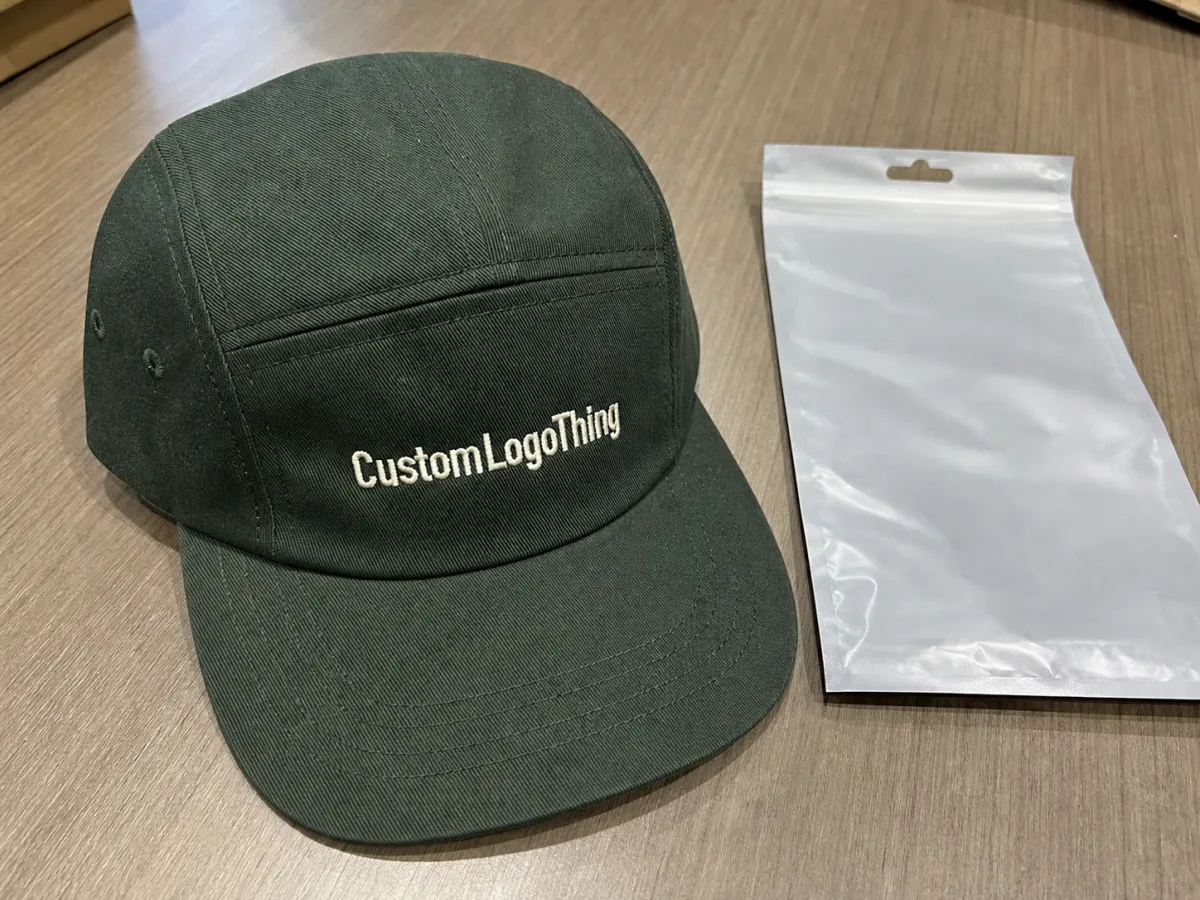
A five-panel cap uses one uninterrupted front piece instead of a two-piece split front. That small difference changes a lot. The logo gets a cleaner landing zone, the front reads better in thumbnails, and the product feels more deliberate than a generic promo cap. On ecommerce pages, that matters more than buyers sometimes expect. The front panel does most of the selling.
These caps also sit in a useful middle ground. They have more style than a standard corporate hat, but they do not drift so far into fashion that the average shopper feels boxed out. The shape works for streetwear, creator merch, outdoor brands, and company kits that need to look current without becoming precious. That is a narrow lane. It is also the right lane for a lot of ecommerce assortments.
The real advantage is perception. A restrained silhouette gives the brand more visual space. A strong mark on a clean front panel can make the whole product feel more premium, even if the decoration is basic. People respond to clarity. A cap that looks intentional in the first photo usually performs better than a louder product that needs extra explanation.
Five-panel caps are not just a blank canvas, though. Crown depth, closure type, fabric hand-feel, and visor shape all change how the final item wears and photographs. Treat the build like a spec sheet. That is where most quality problems start, and where the better margins usually begin.
If you need a benchmark for how these caps are usually positioned in retail-style programs, the examples in our Custom Logo Things work can help frame the brief before sampling starts.
How the cap structure changes fit, decoration, and photos
The structure looks straightforward from the outside. It is not complicated, but it is detailed. The front panel holds the logo. The side panels keep the shape in check. The crown depth affects whether the cap sits high or low on the head. The visor changes the tone, from flatter and more streetwear to slightly curved and more casual. The inner band and sweatband decide whether the cap feels fine after ten seconds or after a full day.
For branded five-panel caps for ecommerce, the front panel is the main event. A seam-free front gives embroidery, woven patches, print, or leather labels a cleaner field. No center seam means less visual interruption. That alone can save a logo from looking cramped or awkward at small size. It also helps with detail. Thin letters and fine icon work usually survive better on a flatter, cleaner panel.
Structure matters in photography too. A lightly structured crown often looks sharper in studio and lifestyle shots because it keeps its line. A fully floppy cap can feel more relaxed, but it can also collapse in a way that makes the product look cheaper than it is. There is no universal winner. The right choice depends on the brand voice and the model shot. A streetwear label may want a softer drape. A premium bundle may need a firmer profile.
Fit consistency is not a small thing. If the first sample sits differently from the bulk run, customers notice. Returns rise, support tickets follow, and the product starts eating into profit. In ecommerce, that extra friction is expensive because it shows up in freight, repacking, and reputation. A cap that is one inch off in the wrong place can feel like a much bigger problem than the spec sheet suggests.
"If the front panel cannot carry the logo cleanly, the artwork is not the problem. The spec is."
Comfort still matters after the unboxing moment. Ventilation eyelets, sweatband material, stitch density, and the stiffness of the inner front buckram all change the wearing experience. A cap can look great on the PDP and still disappoint in hand if the fabric scratches, the crown pinches, or the visor feels awkwardly rigid. A common build uses 100 percent cotton twill at 220-280 gsm, a pre-curved EVA or cardboard visor insert, a cotton twill sweatband, and 6-8 rows of visor stitching. For lower-profile styles, a softer unstructured front without buckram can improve comfort, but it may reduce logo crispness in the first photo. That is the tradeoff.
Materials, decoration, and color choices that shape sell-through
Material choice changes more than durability. It changes drape, shine, perceived quality, and how the cap behaves under a camera. For branded five-panel caps for ecommerce, cotton twill is the safest starting point. It is stable, easy to decorate, and familiar to most buyers. Washed cotton softens the look and feels more broken-in. Nylon creates a lighter, sportier profile. Canvas feels denser and more rugged. Blends can split the difference if the brief needs structure without stiffness.
Decoration should follow the artwork, not the other way around. Flat embroidery works well for wordmarks, icons, and simple marks that need a clean finish. 3D puff adds height and reads strongly on bold logos, but it punishes small text and tight corners. Woven patches hold fine detail better than embroidery when the artwork gets busy. Leather patches can push a cap toward premium, outdoor, or heritage positioning. Print has a place, especially for flat graphics or subtle gradients, but it can lose the tactile quality some brands want in a cap.
The rough cost impact below assumes a mid-size run and a standard five-panel build. Actual pricing moves with order volume, fabric weight, thread count, patch type, crown construction, and packaging.
| Decoration method | Best use | Typical cost impact at 500 units | Main watchout |
|---|---|---|---|
| Flat embroidery | Wordmarks, icons, simple branding | +$0.35 to $0.90 per cap | Fine detail can close up at small sizes |
| 3D puff embroidery | Bold logos with strong outlines | +$0.75 to $1.60 per cap | Small type and tight corners do not hold up well |
| Woven patch | Detailed logos and sharper line work | +$0.60 to $1.40 per cap | Patch shape must match the panel size |
| Leather patch | Premium, outdoors, heritage looks | +$0.90 to $2.00 per cap | Not every logo reads clearly in this format |
| Artwork with flat color areas or gradients | +$0.25 to $0.80 per cap | Finish can feel less tactile than embroidery |
Color choice shapes sell-through more than many teams admit. Neutral bases such as black, stone, navy, and washed olive are easier to style, easier to photograph, and usually easier to keep in stock without regret. Strong brand colors can help recognition, but they narrow the audience if the shade is too specific or too loud. For a first launch, one neutral and one accent color usually beat six options that split demand and complicate production.
Packaging should be aligned with the product, not bolted on after the fact. If the program uses inserts or hangtags, the paper stock should match the brand story. FSC-certified paper is a sensible procurement filter for brands that want a more responsible paper chain. If the cap is made with organic cotton, ask for GOTS certification on the yarn or fabric stage. If recycled polyester is part of the build, GRS can help verify the recycled content. For finishes, ink limits, and skin-contact claims, OEKO-TEX Standard 100 is the most common lab certificate buyers ask for. For social compliance, WRAP and BSCI are frequently used factory audits. These do not guarantee perfect output, but they reduce avoidable risk when the supplier has the paperwork to back up the claim.
If the cap is going to a warehouse, carton density and dimension weight matter. If it is shipping direct to customers, the packaging has to protect the crown from being crushed. That means the box or mailer is part of the product spec, not an afterthought.
Production steps and turnaround: from artwork to delivery
A good cap order moves through a predictable sequence. The fastest programs start with a clean tech pack, Pantone references, decoration art at actual size, and a clear buyer decision on crown structure and closure type. From there, the factory can quote fabric usage, trim sourcing, and decoration time without guessing.
Typical steps look like this: artwork review, bill of materials confirmation, digital mockup, sample approval, bulk material booking, cutting, panel stitching, visor assembly, decoration, shaping or steaming, final sewing, trimming, and packing. For embroidery, the artwork usually needs digitizing first. For patches, the supplier should confirm the patch edge type, adhesive or sew-on method, and exact placement distance from the visor seam. If the cap uses printed panels, the factory should run a strike-off before cutting the bulk fabric.
Sampling is where a lot of problems get caught early. A practical sample flow is first proto sample, revision sample, and pre-production sample. The first proto checks silhouette, fit, panel proportions, and logo scale. The revision sample checks stitch count, color correction, visor curve, and closure hardware. The pre-production sample should match the planned bulk materials, decoration method, and labels as closely as possible. If the sample is still off at that stage, the bulk order should not start.
Reasonable timeline expectations are usually 7-10 business days for sample development, then 18-22 business days for bulk production after sample approval, assuming fabric and trims are in stock. If materials need sourcing, if the decoration is complicated, or if the order includes custom packaging, add time. Peak-season production can stretch beyond that, especially for brushed cotton, washed finishes, and high-stitch-count embroidery.
Inspection should happen in layers, not only at the end. Good checkpoints include incoming fabric inspection for shade variation and defects, first article inspection on the first sewn sample, in-line checks for panel symmetry and stitch tension, decoration checks for logo placement and thread breaks, and final AQL inspection before carton sealing. A practical AQL plan often focuses on critical points such as crown height, panel alignment, visor curve, label placement, seam puckering, loose threads, and hardware security. If the order uses custom polybags, the packing stage should also verify barcode accuracy and count per carton.
For direct-to-consumer orders, add a drop-test or compression check on the packed carton if the caps are shipping to fulfillment centers. A crushed crown ruins the whole unboxing. That is an avoidable loss, so it should be tested before the first carton leaves the factory.
Cost, MOQ, and quote drivers behind the unit price
Most branded five-panel caps for ecommerce land in a practical MOQ range of 100 to 500 units per color or per design. Some factories can sample lower, but the economics usually improve at 300 to 1,000 units because fabric lays, cutting waste, and setup time spread out better. If the cap uses a stock blank with a simple transfer or patch, the MOQ can be lower. If the order uses custom fabric, custom sweatbands, and custom packaging, the MOQ tends to rise.
For a standard cotton twill five-panel cap at 500 MOQ, a realistic factory price is often $2.50-4.00 per unit before freight, depending on decoration, packing, and compliance requirements. A simple blank with one-color flat embroidery will sit toward the low end. Custom woven patches, 3D puff, garment washing, premium labels, and boxed retail packaging push the number up. If the program needs GOTS, OEKO-TEX Standard 100, WRAP, BSCI, or GRS documentation, expect some additional admin and audit cost to show up in the quote.
Below is a more specific way to think about quote drivers.
| Driver | Typical effect on price | Why it moves the quote |
|---|---|---|
| Fabric type | +$0.20 to $0.80 per cap | Organic cotton, washed cotton, nylon, or heavier canvas changes material cost |
| Decoration complexity | +$0.25 to $2.00 per cap | Stitch count, patch construction, and print setup add labor and tooling |
| Closure hardware | +$0.10 to $0.60 per cap | Snapback, tri-glide, metal clasp, or custom self-fabric strap each has a different cost |
| Labels and packaging | +$0.15 to $0.90 per cap | Woven labels, printed size labels, hangtags, polybags, and cartons add parts and assembly time |
| Certification and testing | +$0.05 to $0.40 per cap | Lab reports, audit admin, and traceability paperwork can raise overhead |
Freight and duty can matter as much as the unit price. A cap that is cheap at the factory can become uncompetitive once air freight, carton volume, and fulfillment labor are included. For ecommerce, the right question is not only what the cap costs to make. It is what the landed cost will be after decoration, packing, freight, inspection, and any rework allowance.
Buyers should also watch sample charges. Many suppliers waive the first sample cost if the bulk order is approved, but custom embroidery digitizing, patch tooling, and special fabric swatches are still real expenses. If a quote looks unusually low, check whether the supplier excluded samples, testing, packaging, or export cartons.
Common mistakes that hurt margins and reviews
The first mistake is overcomplicating the artwork. A five-panel cap usually rewards bold, clean marks. If the logo needs too much detail, it will either get distorted or require a decoration method that increases cost and lead time. Keep small text, thin outlines, and tiny symbols under control before they go to production.
The second mistake is approving a sample without checking scale on head size. A cap that looks balanced on a small sample head can sit too shallow or too tall on real customers. Ask for the crown height, visor length, and front panel width in millimeters, not just a thumbs-up photo.
The third mistake is ignoring the inner build. A scratchy sweatband, a rough seam tape, or a stiff visor insert can create negative reviews even when the outside looks fine. A good inspection checklist should include hand-feel, seam finish, thread trimming, and hardware function.
The fourth mistake is using too many SKUs too early. Four colors, three decorations, and two closures can turn a simple cap into a planning headache. The best early programs usually start with one structure, one or two colors, and one decoration method. That keeps MOQ manageable and demand easier to read.
The fifth mistake is skipping compliance questions. If a product is being marketed as organic, recycled, or skin-safe, the supplier should provide documentation that matches the claim. Ask for the actual certificate number and scope, not just a logo on a presentation slide. A valid certificate for the wrong facility or product scope is not useful.
Expert sourcing tips for better margins and fewer defects
Start sourcing with a spec sheet that includes fabric composition, gsm, panel count, visor type, closure, sweatband, label placement, decoration size, and packaging method. The more concrete the brief, the less room there is for quote drift.
Ask for a breakdown by fabric, labor, decoration, and packaging. That makes it easier to compare suppliers fairly. A quote that is $0.30 lower on the cap but higher on cartons or embroidery may not be cheaper in the end.
Request a pre-production sample that uses the final bulk fabric lot, not a random stock piece. Shade variation is one of the most common reasons a supposedly good cap looks mismatched when it lands in the warehouse. For dark colors, check against daylight and indoor light. For washed finishes, expect a little variation, but not a different identity.
Use a simple QC gate at three points: before bulk cutting, after first decoration run, and before packing. The most useful checkpoints are seam alignment, logo placement, stitch tension, thread trim, visor shape, label orientation, and carton count. If any one of those slips, the defect rate climbs fast across the full order.
When sustainability is part of the sales story, map the claim to the supply chain. GOTS supports organic textile content and processing controls. GRS supports recycled content and chain-of-custody. OEKO-TEX Standard 100 supports testing for harmful substances in the finished product. WRAP and BSCI support social compliance audits. The right certificate depends on the claim you are making. Do not ask for every certificate on every order if the product does not need it.
If the order is time-sensitive, lock the artwork and packaging first, then ask the supplier to confirm material availability before deposit. A fast yes that turns into a material shortage is not a real yes. Better to delay approval by two days than to lose two weeks later.
Next steps for launching your first order
Define the use case first. A creator drop, a retail promo item, and a team uniform do not need the same cap build. Decide whether the product should feel sporty, premium, rugged, or minimal.
Then choose the structure: structured or unstructured front, flat or curved visor, snapback or strap closure. After that, lock the fabric and decoration. Cotton twill with flat embroidery is the most dependable starting point for a first run. If the brand needs more texture, move to a woven patch or 3D puff after the base version is proven.
Ask for a written quote with MOQ, sample cost, production lead time, decoration details, and packaging details. A good supplier should be able to answer whether the run is 100, 300, or 500 units per color; whether samples take 7-10 business days; and whether bulk production can hit 18-22 business days after approval.
Once the sample arrives, inspect it as if it were bulk: logo size, crown shape, panel symmetry, visor curve, inside finishing, and packaging. If it passes those checks, the product is ready for the next stage. If it does not, fix the spec before scaling.
FAQ
What is the best material for five-panel ecommerce caps? Cotton twill is the most reliable starting point. It decorates well, holds shape, and photographs cleanly. Washed cotton, nylon, and canvas are useful when the brand story calls for a softer, lighter, or more rugged look.
What MOQ should I expect? A practical range is 100 to 500 units per color or design for many programs, with 500 MOQ being a common point for competitive pricing. Custom fabric, custom trims, or special packaging can push the minimum higher.
How long does production usually take? Sampling often takes 7-10 business days, and bulk production commonly takes 18-22 business days after sample approval when materials are ready. Custom fabrics or peak-season orders can take longer.
What is a realistic unit price? For a standard cotton twill five-panel cap at 500 MOQ, $2.50-4.00 per unit before freight is a realistic working range. Decoration, packaging, and certification requirements can move it up or down.
Which certifications matter most? GOTS is relevant for organic textile claims, GRS for recycled content, OEKO-TEX Standard 100 for harmful substance testing, and WRAP or BSCI for social compliance. Only request the certificates that match the actual claim.
What should I inspect on the first sample? Check crown height, panel symmetry, logo placement, stitch quality, visor curve, sweatband feel, label placement, and packaging. If any of those are off, revise the spec before bulk production starts.

