Buyer Fit Snapshot
| Best fit | Branded Packaging for Social Media Unboxing projects where brand print, material claims, artwork control, MOQ, and repeat-order consistency need to be specified before quoting. |
|---|---|
| Quote inputs | Share finished size, material target, print colors, finish, packing count, annual reorder estimate, ship-to region, and any compliance wording. |
| Proofing check | Approve dieline scale, logo placement, barcode or warning zones, color tolerance, closure strength, and carton packing before bulk production. |
| Main risk | Vague material claims, crowded artwork, missing packing details, or unclear freight terms can make a low unit price expensive after revisions. |
Fast answer: Branded Packaging for Social Media Unboxing: Board, Finish, Dieline, and Unit Cost should be specified like a repeatable production item. The safest quote records material, print method, finish, artwork proof, packing count, and reorder notes in one written spec.
Production checks before approval
Compare the actual filled-product size with the drawing, then confirm tolerance on folds, seals, hang holes, label areas, and retail display edges. Reserve space for logos, QR codes, warning copy, and material claims before decorative graphics fill the panel.
Quote comparison points
Review material grade, print process, finish, sampling route, tooling charges, carton quantity, and freight assumptions side by side. A quote is only useful when the supplier can repeat the same color, closure quality, and packing count on the next order.
On a factory floor in Dongguan, I watched a brand manager stop a production line because the first tear-strip on a mailer opened with too much resistance. Her exact words were, “If the customer fights the box, they won’t film it.” She was right. Branded Packaging for Social Media Unboxing is not decoration. It’s a performance cue, and the first seven seconds decide whether a package becomes content or landfill. In that same run, the supplier had quoted 18,000 pieces at $0.24 per unit for a basic printed mailer, but a bad opening sequence would have made the whole batch feel cheap.
That sounds dramatic because it is. The box has one job in transit and another on camera. Packaging and presentation show up in customer reviews, tagged posts, and short-form videos because people like showing the reveal. A plain carton says utility. Branded Packaging for Social Media unboxing says experience. Those are very different jobs, and the difference can affect perceived value by a lot more than the ink coverage suggests. I’ve seen a $28 candle in a kraft mailer get ignored online, while a $14 lip gloss set in a two-color sleeve got 19 tagged posts in a week. Same product margin story. Very different camera story.
Branded Packaging for Social Media Unboxing: Why It Matters
Branded packaging for social media unboxing is the packaging system around a product that’s designed to look good on camera while still protecting the item in transit. That includes the outer box or mailer, tissue, inserts, tape, labels, internal print, and the reveal sequence itself. In plain English: every surface the customer touches or sees should work together. A 350gsm C1S artboard insert, a one-color mailer, and a printed tissue wrap can do more for the camera than an expensive box with no internal story.
I’ve seen brands spend $1.20 more per order on packaging and then recover that cost through higher repeat purchase rates, better social proof, and fewer “my item arrived damaged” emails. I’ve also seen the opposite: a $400 coat shipped in a generic poly mailer, then wrapped in a damaged, rattling box that looked tired before it hit the doorstep. The product was fine. The perception was not. Retail reality, apparently, loves a plot twist. One apparel client in Manchester moved from plain mailers to printed folding cartons and saw damage complaints drop from 3.8% to 1.1% over a 60-day period.
Honestly, I think most people get this wrong because they treat branded packaging for social media unboxing as an aesthetic add-on. It’s not. It affects three things that matter in measurable ways: brand recall, perceived quality, and user-generated content volume. If a package looks clean, cohesive, and easy to film, it can function like free advertising every time a customer posts it. A simple $0.32 insert card can do more than a $15 ad spend if the card lands in a creator’s hands and gets filmed in natural light by a window.
There’s also a social proof effect that packaging teams sometimes underestimate. A box shared by one customer can influence dozens of viewers, especially in beauty, apparel, supplements, and boutique electronics. A polished unboxing becomes a shortcut. People assume the product inside is equally considered. That assumption is powerful, and it costs less than a paid media buy when you compare it against typical creator fees. In Los Angeles, I’ve seen micro-creators charge $150 to $400 for a post; a shareable package can turn a customer into a much cheaper amplifier.
Think of it as utility-first versus experience-first. Utility-first packaging keeps the item dry and intact. Experience-first packaging does that too, then adds visual rhythm, a memorable reveal, and a camera-friendly finish. The best branded packaging for social media unboxing does both, because customers don’t separate logistics from emotion. They feel the whole thing at once. In a sample review I did in Guangzhou, the winning structure used a corrugated mailer with a die-cut insert and a 20 mm paper void fill strip, not because it was fancy, but because it kept the product centered for the reveal shot.
In my experience, the strongest package branding happens when the design team, operations team, and freight planner sit in the same conversation. That rarely happens enough. At one meeting with a direct-to-consumer skincare brand, the marketing team wanted foil everywhere. Operations pushed back because foil on a flexo-printed mailer was rubbing off in transit. The answer was a single foil logo on the insert card, not every panel. Result: lower cost, fewer scuffs, better video readability. The final spec came in at $0.41 per unit for 10,000 pieces, not the $0.67 quote everyone first panicked over.
For brands building out Custom Printed Boxes or retail-ready shipping packs, the question should not be “Can we make it prettier?” It should be “Can we make it more shareable without making it harder to ship, open, or replenish?” That balance is where good packaging design turns into commercial value. If the pack takes 45 seconds to assemble on a bench in Dallas, it may kill the labor savings that looked so good in a spreadsheet.
To see how broader packaging strategy fits together, I often point teams to Custom Packaging Products and to examples from Case Studies. Real production outcomes tell you much more than a mood board ever will. A case study with a 12-day turnaround and a 2% defect rate is a lot more useful than a glossy pitch deck with no unit cost.
Quick reality check: if your packaging looks beautiful but arrives dented, the camera will still catch the dent. Social content is brutally honest. It amplifies both the good and the bad. I’ve watched creators zoom in on a crushed corner from 3 inches away. They will absolutely do that.
How Branded Packaging for Social Media Unboxing Works
The mechanics behind branded packaging for social media unboxing are simpler than most presentations make them sound. Customers move through five beats: anticipation, opening, reveal, texture, and the hero shot. If your packaging design supports those beats, the odds of a post go up. If it fights them, the content usually stops at the shipping label. On a typical unboxing video, the first 5 to 8 seconds decide whether the viewer stays.
The exterior is the first frame. Logo placement, color contrast, and cleanliness matter because phones capture detail differently than your eyes do. A dark logo on a dark box may look elegant in a showroom, then vanish in a vertical video shot under kitchen lighting. I’ve seen that exact mistake in sample reviews from a supplier in Shenzhen. The package looked “premium” in the conference room and nearly invisible on a phone screen. Charming, in a deeply annoying way. A white logo on matte black board, by contrast, can stay readable even at 720p on an iPhone 13.
The next layer is the opening sequence. Easy-open features are not a luxury here. Tear strips, pull tabs, and calibrated fold lines help the customer feel in control. That matters because filming behavior changes when the package opens predictably. Nobody wants a 40-second struggle with scissors on camera. That’s not content. That’s frustration with a side of cardboard dust. A properly scored flap and a 15 mm pull tab often beat a fancier closure that takes two hands and a prayer.
Then comes the interior. This is where branded packaging for social media unboxing earns its keep. Inner flaps, printed messages, tissue wraps, and inserts create a staged reveal. The customer opens one layer, then another. That layered pacing gives the phone camera something to follow. It also creates a natural pause point for reactions, which is why so many unboxings feel almost theatrical. A double-layer reveal can add 3 to 5 seconds of watchable movement without making the package feel overdesigned.
Texture helps more than brands expect. Matte laminate photographs differently from gloss. Embossing catches side light. Soft-touch coating gives a velvet impression that looks expensive, even when the substrate is standard SBS. Foil accents can work beautifully, but only if they’re used with restraint. Over-foil a box, and the reflections can flatten in video, especially under LED ring lights. A 15% foil coverage logo on a 350gsm C1S artboard carton often reads better than a full-panel metallic flood.
I learned that lesson on a beauty client project where the first prototype used full-panel gloss and a silver hot-stamp logo. Under office lighting, it looked expensive. Under a phone camera, it looked like a reflective lunch tray. We changed to 350gsm C1S artboard with soft-touch lamination, moved the foil to a 20% coverage emblem, and the package suddenly read as premium rather than shiny. The supplier in Yiwu quoted an extra $0.09 per unit for the soft-touch film, which was cheaper than redoing 8,000 cartons after the first bad sample round.
Platform fit matters too. Short-form vertical video favors bold contrast and quick reveals. Still photography rewards symmetry and tidiness. Live shopping or livestream unboxings reward packaging that opens predictably and doesn’t create awkward delays. Branded packaging for social media unboxing should be camera-friendly across all three, because customers rarely use just one format. TikTok, Instagram Reels, and YouTube Shorts all punish slow openings, especially if the first action is buried under a dozen layers of paper.
There’s one more factor that people ignore: practical frustration. If the structure is too elaborate, customers may respect it less than the brand hoped. I’ve watched buyers post fewer clips simply because the inner tray felt overbuilt and hard to remove. That’s the paradox. A box can be impressive and annoying at the same time. The winning package is premium without being fussy. In a 2,000-piece launch kit I reviewed in Ho Chi Minh City, removing one extra tray cut pack-out time from 62 seconds to 38 seconds per unit.
“The best unboxing box doesn’t ask to be admired. It asks to be opened, filmed, and remembered.”
If you’re exploring branded packaging for social media unboxing as part of a wider packaging design refresh, the best starting question is: what is the visual hierarchy? First the outside. Then the reveal. Then the product. If those three moments aren’t deliberate, the package becomes clutter instead of content. A good hierarchy is readable at 2 feet, not just from a design presentation projected onto a wall in Brooklyn.
Key Factors That Make Branded Packaging Shareable
Shareable packaging looks intentional in a 9:16 frame, not just in a design deck. The most effective branded packaging for social media unboxing usually gets five things right: consistency, story, protection, materials, and fit for channel. Miss two of those, and the rest of the package works harder than it should. I’ve seen a package with excellent print fail because the insert rattled like loose change inside a tin.
Visual consistency is the first lever. A brand palette should travel from outer mailer to inner insert without drifting into visual noise. One color, one type family, one logo treatment, and one repeated motif can do more than a box covered in six graphics. I’ve seen apparel brands increase perceived organization simply by repeating the same line-art icon on the tape, flap, and thank-you card. Small move. Big effect. A two-color system in Pantone 2965 C and warm white can look more polished than a six-color print file with no discipline.
Brand story matters because the package needs a narrative hook. That doesn’t mean writing a novel on the box. It can be as simple as a product-use tip, a mission statement, or a one-line welcome that matches the brand’s voice. For a supplement brand I worked with, we added a side-panel message explaining why the powder pouch was packed separately. Suddenly, customer service calls about “missing items” fell because the package explained itself. That one line saved the team roughly 40 tickets a month.
Product protection is non-negotiable. Damage kills shareability fast. If the item arrives crushed, rattling, or leaking, the best color palette on earth won’t save the content. This is where structure and cushioning matter more than decorative extras. Corrugate flute selection, insert density, and fit tolerances are the hidden workhorses of branded packaging for social media unboxing. For a 1.8 kg skincare set, E-flute may be enough in some lanes, while B-flute or a mailer-plus-carton combo may be safer for cross-country shipping.
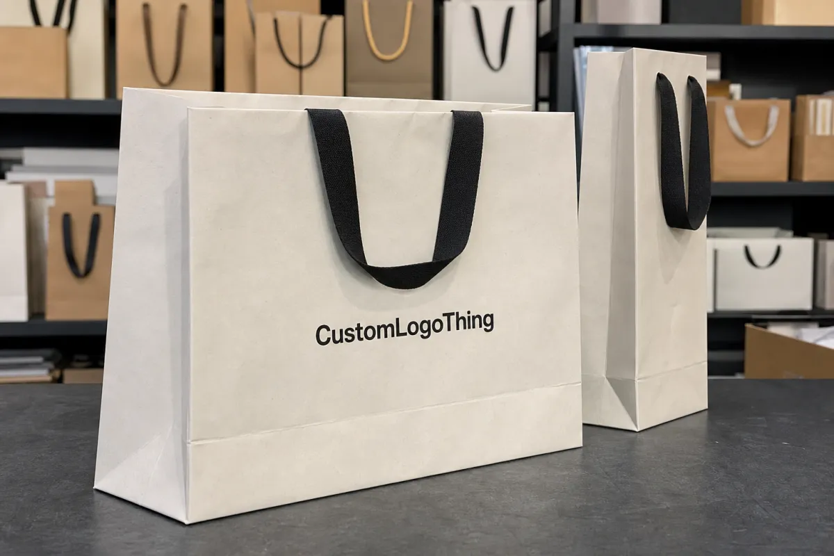
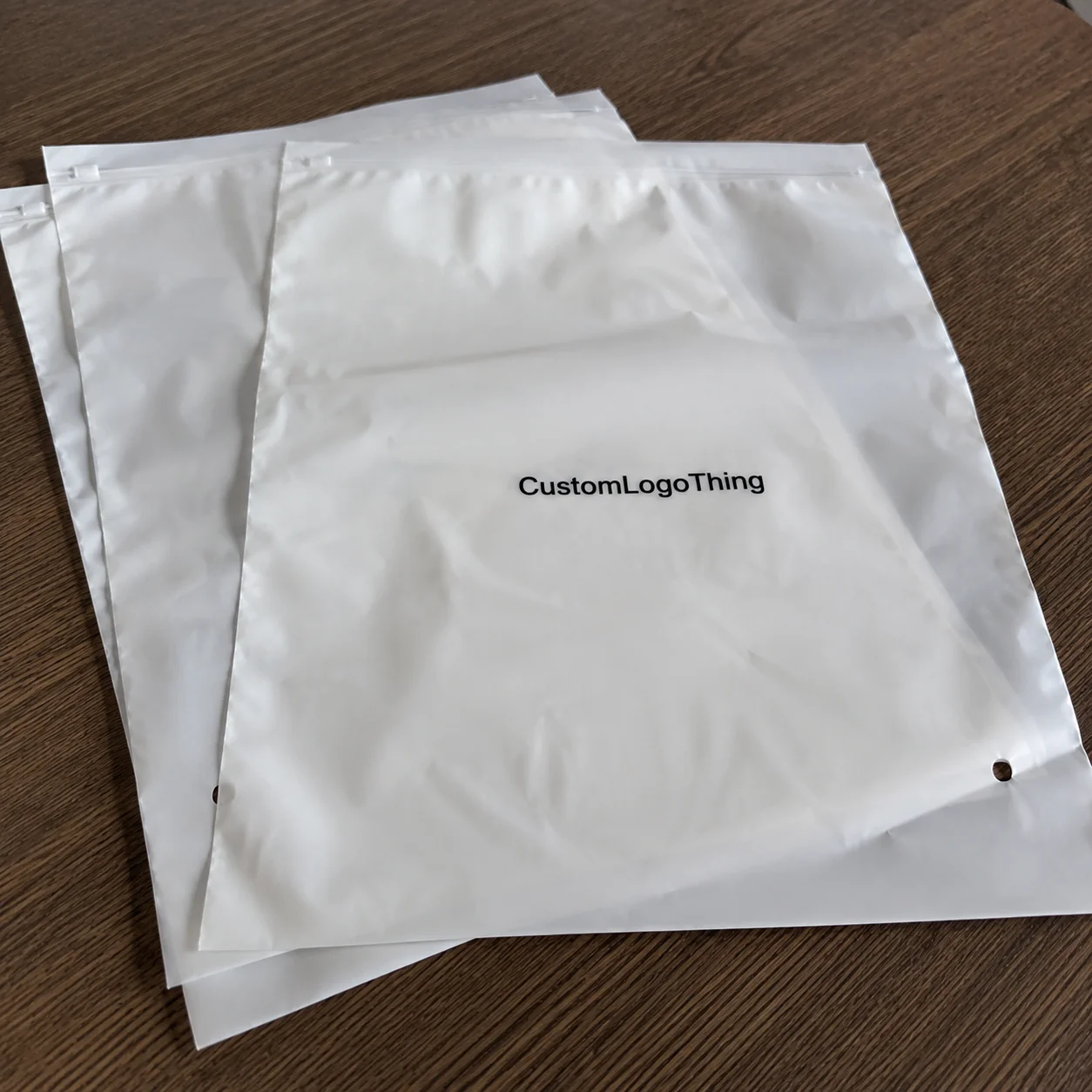
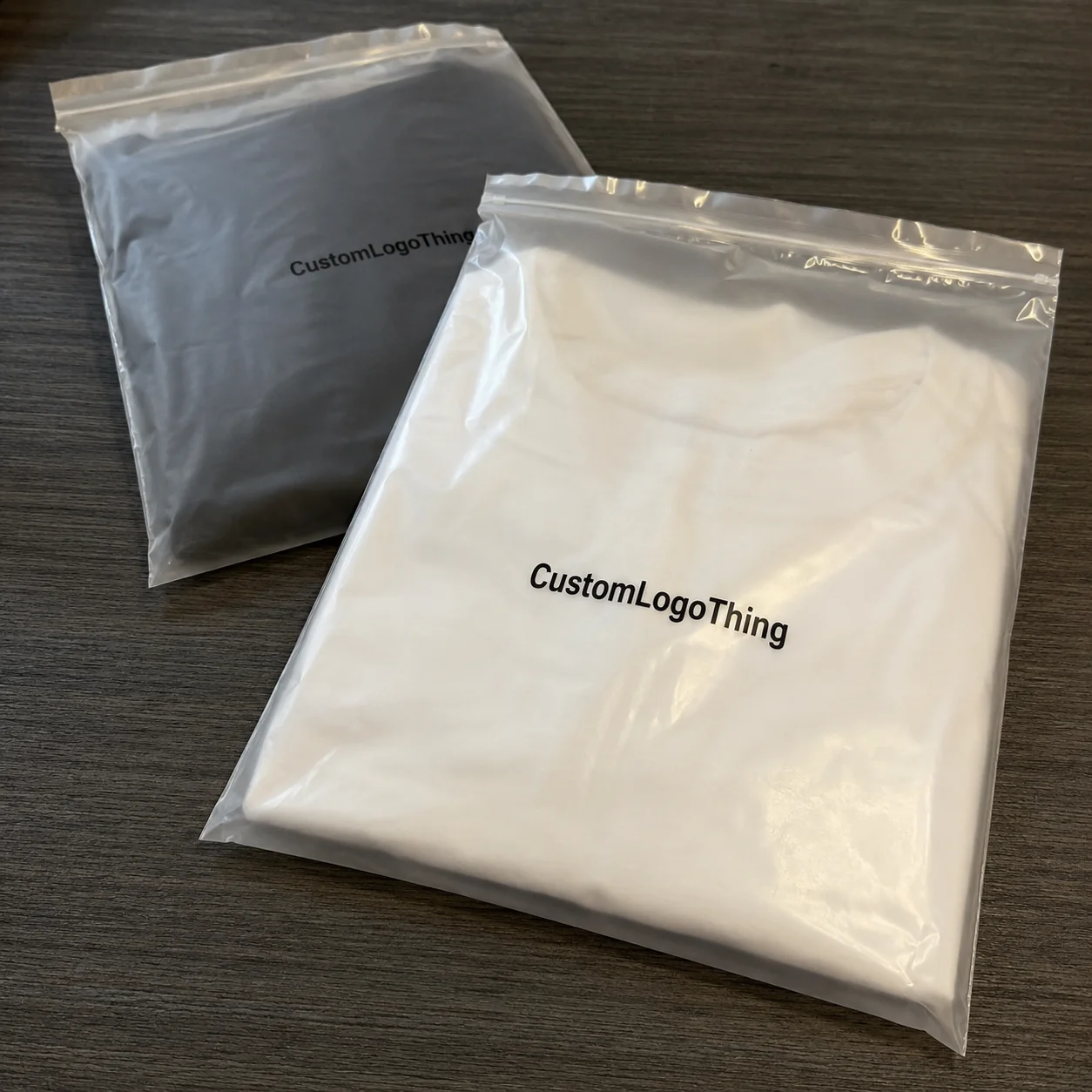
Materials and finishes shape the camera impression. Paper stocks, aqueous coating, UV varnish, foil, embossing, and soft-touch film all change how expensive a package looks. They also change cost. A simple printed mailer may land around $0.18/unit at 5,000 pieces, while a rigid setup box with specialty finishing can jump to $2.10/unit or higher depending on size, insert complexity, and freight. That spread is why packaging design needs finance in the room, not just creative. A 1,000-piece order in Dongguan and a 10,000-piece order in Suzhou will not behave the same on price, either.
Sustainability is part of the story now, whether brands like it or not. Consumers notice recyclable paper, reduced plastic, and reusable formats. When a brand says “100% recyclable” or uses FSC-certified board, that message becomes part of the content. For sourcing and material standards, the Forest Stewardship Council explains certification clearly at fsc.org, and the EPA’s packaging guidance at epa.gov is useful when teams compare recyclability claims and waste reduction efforts. A recycled-content mailer with soy-based inks can also photograph well if the branding is kept clean.
Platform fit changes by category. Beauty buyers often expect nested trays and premium inserts. Apparel buyers tend to prefer crisp folding, tissue, and a branded seal. Supplements need legibility and compliance-friendly labeling. Electronics need protection first, then reveal. Retail packaging logic does not always map cleanly onto direct-to-consumer shipping, and that’s where many teams get tripped up. A 60-watt diffuser and a pair of earbuds should not be packaged the same way just because the SKU count is similar.
Cost and order volume are where reality hits. With custom printed boxes, a run of 1,000 units can cost dramatically more per unit than 10,000 units because setup, plates, and labor get spread differently. A logo-heavy mailer might be efficient, while a three-part presentation pack with foil and magnets can eat margin fast. Honestly, I think this is why many of the best branded packaging for social media unboxing programs start modestly and scale once a winning structure is proven. In one factory visit in Ningbo, the quote dropped from $0.96 to $0.61 per unit when the order moved from 3,000 to 12,000 pieces.
Testing is the final filter. I always recommend photographing prototypes in the same conditions customers use: desk lamp, window light, handheld phone, and a plain background. A pack that looks excellent under studio lights can become muddy in a bedroom at 7 p.m. Test for readability, glare, and how the opening sequence feels on video. That single step saves more rework than a second round of artwork revisions. It also catches annoying details like tape seams reflecting under ring lights.
| Packaging option | Typical use | Approx. unit price | Camera impact | Operational note |
|---|---|---|---|---|
| Printed mailer | Apparel, accessories, lightweight goods | $0.18 to $0.55 | Good if color and logo are strong | Fast to pack, lighter freight |
| Standard folding carton | Beauty, supplements, small retail items | $0.35 to $0.95 | Strong when paired with inserts and tissue | Needs accurate product fit |
| Rigid setup box | Premium gifts, launches, influencer kits | $1.60 to $4.50+ | High premium feel, excellent reveal | More expensive freight and assembly |
That table is why branded packaging for social media unboxing should never be treated as a one-size-fits-all project. The right structure depends on the product, the audience, and the content strategy. A vitamin brand and a luxury candle brand may both want more shares, but they will not get there with the same packaging architecture. One may need a $0.27 mailer, the other a $2.85 rigid box with a foam insert and a foil seal.
Step-by-Step Process and Timeline for Branded Packaging
A clean process keeps branded packaging for social media unboxing from turning into a revision spiral. The best programs I’ve worked on follow a simple path: define the goal, audit the current experience, choose the structure, prototype, test, approve, and build in buffer time. That sounds neat on paper. In practice, it saves the budget. One packaging refresh in Shenzhen went from first sketch to signed-off sample in 19 business days because the team kept the approvals tight and the artwork final.
Step 1: Define the goal
Start with a measurable objective. Do you want more tagged posts, higher perceived value, better repeat purchases, or stronger brand recall? Pick one primary outcome and two supporting ones. A brand that tries to optimize everything usually ends up with packaging that does nothing especially well. If your goal is creator shares, say that out loud and set a target like 30 tagged posts in the first 90 days.
Step 2: Audit the current unboxing
Take your current product packaging apart on video. Literally film it. Where does the opening feel awkward? Which panel is boring? Does the product slide around? Where does the customer see the logo first? I once sat with a subscription brand that thought its packaging was “minimal and elegant,” then realized the customer saw a blank interior for 11 seconds before reaching the product. That’s not minimal. That’s missed opportunity dressed up as style. We fixed it by moving the branded insert to the top and cutting opening time from 27 seconds to 14.
Step 3: Choose format, materials, and finish
The format should match weight, shipping method, and budget. Lightweight apparel can live in a printed mailer with tissue and a seal. Heavier goods may need a corrugated shipper with an inner folding carton. If you’re using premium finishes, choose them with the camera in mind. Soft-touch, spot UV, and embossing often travel better visually than high-gloss flood coating, which can blow out highlights. In one sample set from Guangzhou, a 250gsm SBS carton looked fine until we switched to 350gsm C1S artboard and the edges finally held their shape.
Step 4: Build the dieline and artwork
This is where packaging design gets technical. Logo placement should consider folds, glue areas, and how the box opens in frame. Copy should be short enough to read quickly. If a message takes five seconds to decipher, it will be skipped by most viewers. Keep the hierarchy tight: brand, product, message, reveal. A good dieline also leaves enough room for a 3 mm bleed and avoids placing critical text across a score line, which sounds obvious until someone does it.
Step 5: Prototype and test with real products
Prototype with the actual product weight and dimensions, not a placeholder. A box that fits a dummy sample can fail once the full kit is inserted. Check crush resistance, corner integrity, tape adhesion, and whether the package looks composed after shipping vibration. ISTA test standards are a good benchmark for distribution performance, and ISTA’s site at ista.org is a sensible reference point when teams want a shipping-test language everyone can agree on. If a carton survives a 1-meter drop test and still looks camera-ready, you’re closer to the finish line.
At one client meeting in Los Angeles, a startup founder wanted a magnetic closure on every kit. On the table, it looked luxe. On the packing bench, it added 90 seconds per unit. That can be acceptable for 100 influencer sets. It is not acceptable for 15,000 retail orders. The timeline and labor math matter as much as the appearance. A closure that adds $0.48 in labor is fine for a launch box and ridiculous for a subscription reorder.
Step 6: Approve samples and lock the schedule
Once you approve a physical sample, lock the spec sheet. Include substrate, print method, finish, dimensions, insert type, and acceptable color tolerance. Without that documentation, reorder quality drifts. If the first batch looked perfect, but the third batch arrives with duller ink or a slightly shorter flap, customers will notice. Add the approved Pantone numbers, carton thickness, and a reference photo shot under neutral 5000K lighting.
As for timing, simple printed mailers can move faster than complex rigid boxes, especially when artwork is final and the dieline is standard. More customized structures usually need more proofing, more sample rounds, and more production setup. A straightforward run might take 12 to 15 business days from proof approval, while a specialty box with inserts and finishing could stretch much longer depending on sourcing. That’s not a scare tactic. It’s manufacturing reality. A factory in Zhejiang may quote 7 days for assembly, but shipping paper, magnets, and specialty film can turn that into 3 extra weeks.
Build in a buffer. Always. Shipping delays, color corrections, and last-minute copy edits happen. I’ve seen launch dates missed because a team forgot to account for one round of sample shipping across time zones. If your marketing calendar is tied to an influencer drop, that kind of slip can be expensive. A two-week buffer can save a six-figure campaign from looking amateur on day one.
My rule of thumb: the more the box has to do, the earlier it should enter the workflow. Great branded packaging for social media unboxing is not designed at the end of a launch plan. It is built into the launch plan from the start. If the product ships from a warehouse in Atlanta on Monday and your content brief goes live Thursday, your packaging spec should already be frozen.
Common Mistakes to Avoid With Social Media Unboxing Packaging
The biggest mistake is overbranding. Cover every surface with logos, slogans, patterns, and icons, and the box starts to feel noisy instead of premium. People might still film it, but the content will look busy. Sometimes one strong brand mark on a clean field creates more impact than six printed panels. A single 80 mm logo on a kraft box often photographs better than a full-pattern repeat fighting for attention.
Second, don’t choose fragile finishes that scratch in transit. High-gloss laminate, poor-quality foil, and soft coatings without abrasion testing can arrive looking tired. That is especially true for long-haul freight and rough parcel handling. If the surface marks easily, the camera will find it. It always does. Cameras are rude like that. A 1,200-mile truck route from Chicago to Dallas can ruin a finish that looked perfect in the sample room.
Third, never design only for the mockup. A package can look great in a PSD and fail in a customer’s hands. If the opening feels confusing, the customer may stop filming before the reveal. That’s a bad trade for any brand investing in branded packaging for social media unboxing. I’ve seen a box with a hidden tab require 6 steps to open, which is 5 steps too many for a phone video.
Fourth, ignore sizing at your own risk. Too much headspace means wasted filler and product movement. Too little space means crushed corners, bent inserts, and poor presentation. Good product packaging is measured, not guessed. I’ve seen a 3 mm fit correction eliminate both rattling and the need for extra void fill. In one case, that tiny change saved $0.06 per unit and cut pack-out time by 9 seconds.
Fifth, too many layers can kill momentum. Tissue, sticker, insert, tray, pouch, inner carton, outer carton—at some point the package starts feeling like homework. People love a reveal; they do not love a maze. Keep the ritual, drop the clutter. A two-step opening with one insert card and one branded wrap is often enough.
Sixth, don’t mismatch packaging style and price point. A $22 skincare serum in a cheap-looking mailer undermines trust. A $10 accessory in a rigid magnet box may over-invest in presentation and crush margins. The package should support the price story, not argue with it. If your unit economics only allow $0.29 for packaging, don’t spec a luxury box that costs $1.80 and hope for magic.
Finally, skip user testing and you’ll pay for it later. First-time buyers see your package with fresh eyes. They don’t know where the logo is supposed to be, what should open first, or whether the insert is decorative or functional. That confusion shows up in comments, customer service tickets, and low-share content. One quick test with five real buyers in Austin or Toronto can expose more issues than a week of internal debate.
I had one supplier negotiation where the box maker insisted a thicker board would “solve everything.” It didn’t. The customer still struggled to open the flap because the tab geometry was wrong. Structure and experience are related, but they are not the same thing. The fix was a 12 mm tab extension and a cleaner cut line, not more cardboard.
Expert Tips to Improve Branded Packaging for Social Media Unboxing
If you want branded packaging for social media unboxing to perform better, start with one signature visual element. That could be a color, an icon, a striping pattern, or a short slogan. The point is memorability. In a 12-second clip, viewers remember one thing, not ten. A coral interior with a black logo, for example, can be more recognizable than a complicated pattern that disappears in motion.
Design for the thumbnail moment. That is the frame people see before they decide to tap. A strong opening shot might be the logo on the lid, a bold insert card, or a neat tissue reveal with a high-contrast product shape beneath it. On mobile, clarity beats complexity almost every time. If the hero shot reads in a 2-inch thumbnail, you’re in good shape.
Add one short printed message that feels human. “Packed with care in our Shenzhen facility.” “Thanks for choosing a smaller footprint.” “Start here for best results.” Those lines do more than fill blank space. They guide the customer and create a voice. Just don’t make it sound like a generic template. People spot that immediately, and they are not shy about ignoring it. A single line on the inside flap can do more than a paragraph no one reads.
Consider modular packaging for multiple SKUs. If one box structure can support three products with different inserts, your packaging design becomes easier to manage at scale. That matters when launches multiply and inventory shifts. Modular solutions also help keep package branding consistent across product families. A standard 120 x 80 x 35 mm inner carton with swap-in inserts can save a team from redesigning every SKU from scratch.
Sometimes a small upgrade creates more impact than a full redesign. Switching from standard matte to soft-touch, adding a single foil mark, or moving from plain tissue to printed tissue can dramatically improve camera appeal. That kind of upgrade often costs less than redesigning the whole system. Honestly, I think brands overestimate how much change they need. A $0.04 printed tissue upgrade can do more than a $3,000 rebrand deck.
Track performance. Ask customers where they discovered the product. Ask whether they posted the package. Look at tagged content, referral traffic, and repeat orders. Those signals tell you whether the investment in branded packaging for social media unboxing is earning its place. If tagged posts rise by 25% after a packaging refresh, that’s not a coincidence worth ignoring.
Work with suppliers who speak both creative and manufacturing. You need someone who can explain why a 1-color flexo print behaves differently from a 4-color litho label, and why a 350gsm board may perform better than a lighter stock under parcel pressure. A supplier should challenge assumptions early, not after the artwork is finalized. The good ones will tell you when your idea needs a scoring change, a stronger adhesive, or a less shiny finish.
One more practical tip: build a packaging shelf life check. If you’re storing printed cartons for six months, humidity and corner crush can change performance before assembly even starts. That’s boring until the boxes arrive warped. Then it becomes a very expensive lesson. In humid warehouses near Shenzhen or Jakarta, I’ve seen board curl enough to ruin stacking and slow down pack lines by 15%.
My opinion: the best branded packaging for social media unboxing is never the most expensive package in the room. It is the package with the clearest job, the fewest distractions, and the strongest first frame. That combination is rarer than people think. A well-built $0.58 carton can beat a $2.40 box if the opening is cleaner and the visual hierarchy is sharper.
What to Do Next: Build a Packaging Test Plan
Start with two or three concepts, not twelve. Compare them against budget, protection, and social sharing potential. If one version wins on appearance but loses on damage rates, it is not the winner. If another protects beautifully but looks anonymous on camera, it also needs work. The best option sits in the middle and then improves with testing. In practice, that usually means one mailer concept, one carton concept, and one premium option with a clear cost delta.
Request physical samples and film them under the same conditions your customers use. Natural light by a window. A desk lamp. Handheld phone video. If possible, ask one person to open the package without any coaching, because first-time behavior is the truest test. A package that works for a trained marketer may fail for a normal buyer. I like testing in a 10-foot by 12-foot room because it feels closer to a bedroom, kitchen table, or studio apartment than a polished conference room.
Map the full journey from delivery to first reveal. Where does the customer cut tape? What do they see first? Where does the product sit? Which element gets lifted, peeled, or folded? Remove anything that adds friction without adding value. That one exercise often trims both cost and confusion. A 15-second path from doorstep to product is usually easier to share than a 45-second unboxing with unnecessary filler.
Set measurable targets. Maybe you want 20% more tagged posts. Maybe you want fewer damage claims. Maybe you want higher perceived value in post-purchase surveys. A good packaging test plan keeps the conversation tied to outcomes instead of opinions. Otherwise the loudest voice wins, and that is usually a bad manufacturing strategy. If you can tie the box to a 2-point lift in perceived value, the finance team will pay attention.
Document the final spec. Include artwork files, board grade, finish, glue areas, insert dimensions, and approved sample photos. Reorders become much easier when the specification is clear. Production costs stay predictable. Color drift drops. And your branded packaging for social media unboxing stays consistent from one run to the next. Put the spec in a shared folder, not buried in someone’s inbox in Singapore.
I’ve sat through enough pack-out reviews to know this much: brands that treat packaging like a one-time creative project usually pay for it later. Brands that treat it like a repeatable system tend to get better content, better customer feedback, and fewer costly surprises. That’s the quiet advantage. A process with a 14-day proof cycle and a locked spec sheet beats “we’ll figure it out later” every single time.
Branded packaging for social media unboxing works best when it is tested, repeatable, and built around how people actually share online. Not how a slide deck says they should. Not how a competitor’s box looked in a screenshot. Built around real hands, real cameras, and real shipping conditions. That is where the value shows up. The box still has to survive the truck ride from the factory in Dongguan to the customer’s front door, but it also has to earn its split second on camera. If you want the highest return, start by testing one prototype in real light, with real product, and a real first-time opener. Then fix the opening, the fit, or the finish before you place the production order. Simple. Not easy, but simple.
FAQ
What makes branded packaging for social media unboxing effective?
It combines visual appeal, protection, and easy opening so customers want to film and share the experience. Strong branding, a clear reveal sequence, and camera-friendly finishes improve the odds of user-generated content, especially when the package opens smoothly in one or two steps. A matte black mailer with a white logo and a clean insert card often performs better than a crowded design with too many elements.
How much does branded packaging for social media unboxing usually cost?
Cost depends on structure, print coverage, finish complexity, and order quantity. Simple printed mailers are usually cheaper than rigid boxes, foil stamping, or multi-part presentation packaging. For example, a basic mailer can land around $0.18 to $0.55 per unit, while premium rigid packaging can run much higher. At 5,000 pieces, a printed carton might land near $0.15 per unit if the structure is simple and the print is one or two colors.
How long does it take to produce custom packaging for unboxing videos?
Lead time varies by packaging type, artwork changes, and sample approvals. Straightforward designs typically move faster, while custom structures and special finishes add time for proofs and production. In many cases, a simple run can move in 12 to 15 business days after proof approval, but more complex projects need more buffer. If you’re adding foil, magnets, or custom inserts, plan for extra time in Guangzhou, Shenzhen, or Dongguan.
What packaging features get the most attention in unboxing content?
Bold color contrast, a neat reveal, premium textures, and personalized inserts tend to stand out. Packaging that looks clean on camera and opens smoothly is more likely to be shared, especially when the first frame is readable on a phone screen. Soft-touch lamination, spot UV, and a well-placed insert card can create a stronger on-screen moment than a loud pattern.
How do I know if my branded packaging is worth the investment?
Track whether the packaging improves repeat purchases, brand recall, and social mentions. Compare the added packaging cost against potential value from organic exposure and stronger customer perception. If the package drives more tagged posts or reduces damage claims, it may pay for itself faster than expected. A simple before-and-after test across 1,000 orders is usually enough to see whether the numbers move.