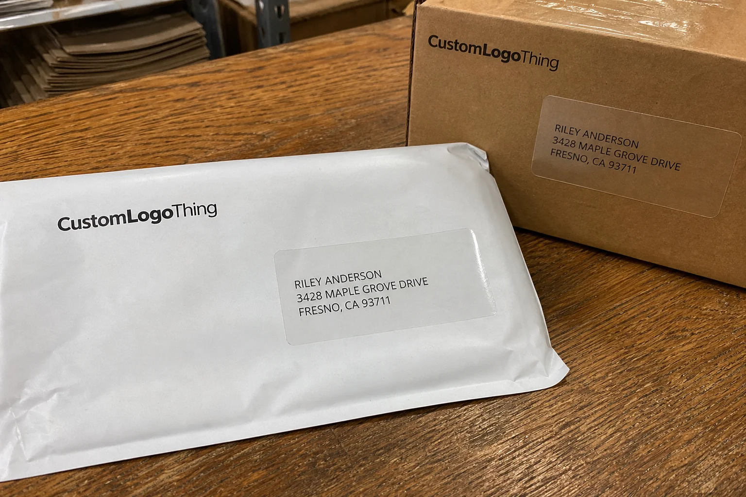
Clear Address Labels Personalized are one of those packaging details people tend to overlook until a shipment starts looking messy. Then the handwriting is smeared, the ink softens in transit, or the return information sits on the package like an afterthought. For brands shipping clothing, subscription boxes, or small retail parcels, the address label is not only a utility item. It also shapes the first impression a customer gets before the box is even opened.
The practical value is simple. Good clear labels keep packaging looking intentional while still doing the unglamorous job of carrying sender details, recipient information, and sometimes a logo or internal code. They reduce manual writing, cut down on mistakes, and help the package feel finished. Bad labels do the opposite: they create reprints, delay dispatch, and invite avoidable complaints from the warehouse and the customer side alike.
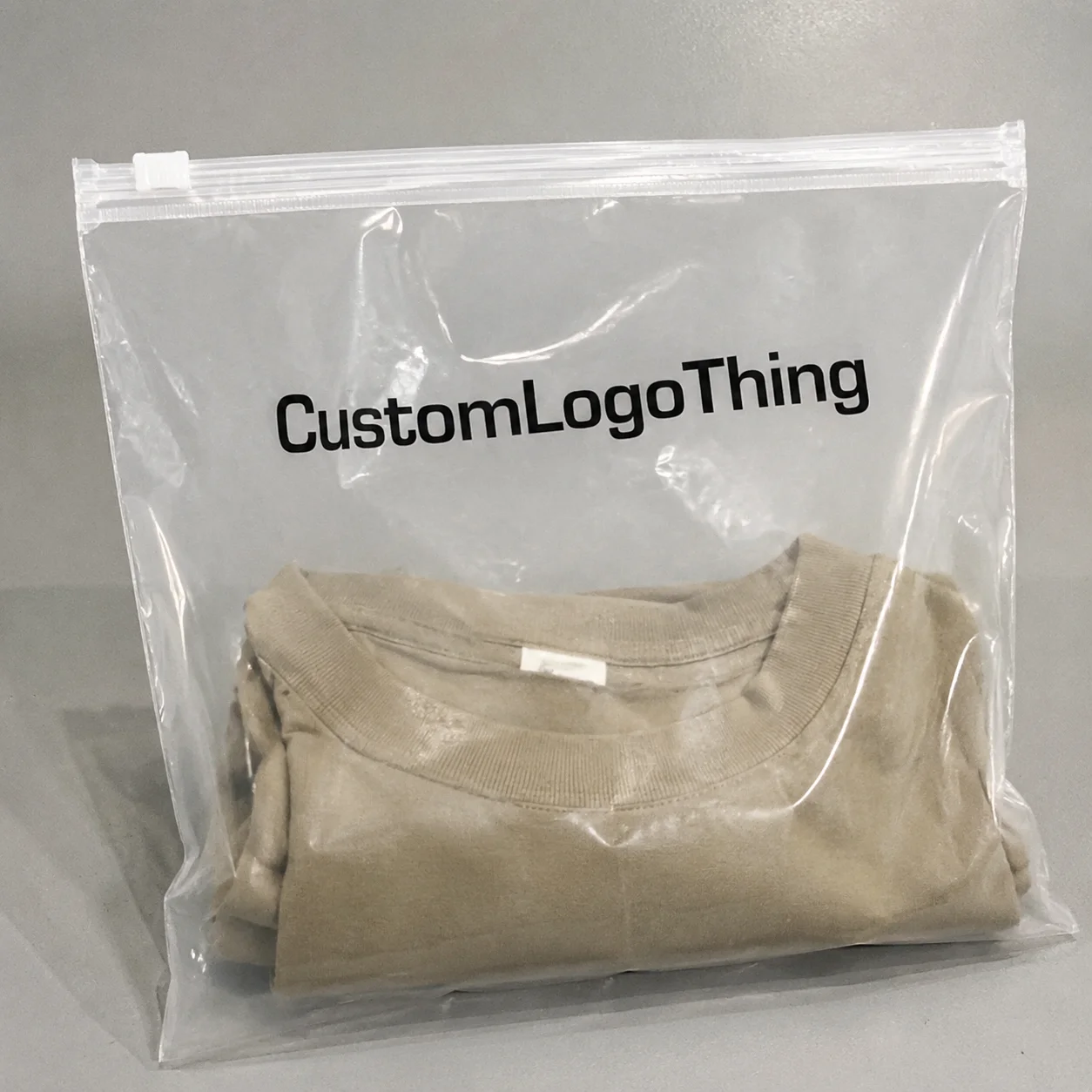
Clear stock works best when the packaging has color, texture, or branding you do not want to cover up. On a nicely printed poly mailer or a clean kraft box, a transparent label can look quieter and more polished than a white rectangle. That does not mean clear is always the right answer. Readability, opacity, and adhesive performance still decide whether the result feels premium or merely clever.
“A label should help the package do its job. If it looks refined but becomes hard to read or fails in transit, it is not doing enough.”
Clear Address Labels Personalized: What They Solve
At a basic level, clear address labels personalized are transparent or semi-transparent adhesive labels printed with custom address details, return information, logos, or routing codes. They are especially useful when a business wants a cleaner presentation without moving to fully printed packaging. In that sense, they sit between plain shipping stickers and custom cartons: more polished than a handwritten label, far less expensive than changing the box structure itself.
That middle position is why many buyers choose them for repeat shipping programs. A label can carry brand identity without stealing the whole face of the package. It can also be updated faster than printed packaging, which matters when addresses, return details, or seasonal graphics change. For smaller brands, that flexibility is often the real selling point.
These labels are commonly used on poly mailers, rigid mailers, coated boxes, and retail bags with flat surfaces. They are also handy for branded tissue wrap or sleeve areas where a small label can anchor the visual system without overwhelming it. Why cover a good-looking mailer with a giant white block if you do not have to?
Clear material does have limits. It does not hide a busy background, and it does not forgive weak contrast. If the print is too light or the packaging surface is too patterned, the label can blend in more than intended. That is why the design and substrate need to be considered together rather than treated as separate decisions.
For buyers already using Custom Labels & Tags, clear address versions usually fit into the same packaging system without much disruption. The important part is keeping the layout consistent enough that fulfillment staff can apply labels quickly and customers can still read them at a glance.
How Personalized Clear Labels Work on Packaging
The production path is straightforward: artwork is prepared, printed onto clear film, then converted into sheets or rolls depending on how the labels will be applied. Buyers usually provide the mailing format, logo, label size, and any layout notes. If the label needs to carry a barcode, route code, or scan-safe zone, that should be flagged before proof approval rather than after.
Because the substrate is transparent, contrast becomes the central design issue. Black text usually gives the best readability. White ink may be needed on dark packaging, or when the background needs to be blocked out so the information remains legible. Without enough opacity, the label can visually disappear into the mailer and create a readability problem that is easy to miss on screen.
Clear labels tend to perform best on smooth, flat surfaces:
- Poly mailers
- Rigid mailers
- Kraft and coated boxes
- Retail bags with clean flat panels
- Branded tissue wrap or sleeve areas
They are less forgiving on rough, dusty, soft-touch, or heavily textured surfaces. Adhesive needs direct contact to bond properly. If the package surface is flaky, contaminated, or uneven, the label can lift at the corners or fail early in transit. In day-to-day operations, that usually shows up as curled edges, scuffed print, or a return address that no longer looks secure.
There is also a meaningful difference between a shipping label and a brand label. A shipping label must be readable, scan-safe, and positioned correctly. A brand label can carry more design personality, but it still cannot sacrifice the address block just to preserve a minimalist look. Minimal is fine. Unreadable is not.
Key Factors That Affect Fit, Finish, and Readability
The three specs that matter most are material, adhesive, and print method. Material determines clarity and durability. Adhesive determines whether the label stays in place. Print method determines sharpness, opacity, and how well the ink resists smudging. If one of those is under-specified, the finished label can feel cheap even if the digital proof looked polished.
Finish matters too. Gloss can sharpen text and give the label a more polished appearance, especially on smooth mailers or boxes. Matte reduces glare and can look more restrained. Neither is universally better. If the labels will be handled under bright warehouse lighting, gloss can help visibility. If the brand wants a softer presentation, matte may fit better. The right choice usually comes down to surface color, handling conditions, and how much visual contrast the package needs.
Size and layout deserve the same attention. A short return address on a compact label behaves very differently from a larger shipping panel that includes a logo, compliance text, or SKU information. Too small, and the type becomes cramped. Too large, and the label can look awkward on a slim mailer while wasting useful packaging space. Good label design is mostly restraint, measured carefully.
Storage and application conditions matter more than many buyers expect. Labels kept in hot storage, shipped through poor conditions, or applied to cold packaging without enough pressure can fail early. Curling edges, weak bond strength, and partial lift are common symptoms. None of that is dramatic, but it is exactly the kind of detail that decides whether a shipping program feels controlled or constantly reactive.
For brands shipping through multiple channels, it can also help to reference basic transit testing language. Packaging durability standards are not identical from one program to another, but the terminology from ISTA is useful when you want to compare how a label might behave under handling, vibration, and stacked storage. Even if you are not running formal lab tests, the framework helps buyers ask better questions.
A few practical specs often come up during evaluation:
- Film type: clear polypropylene is a common baseline for shipping and brand use because it balances clarity with durability.
- Adhesive strength: standard permanent adhesive works for most smooth cartons and mailers; stronger options may be needed for difficult surfaces.
- Print coverage: a simple black-text layout costs less than a design that requires white ink or heavier opacity.
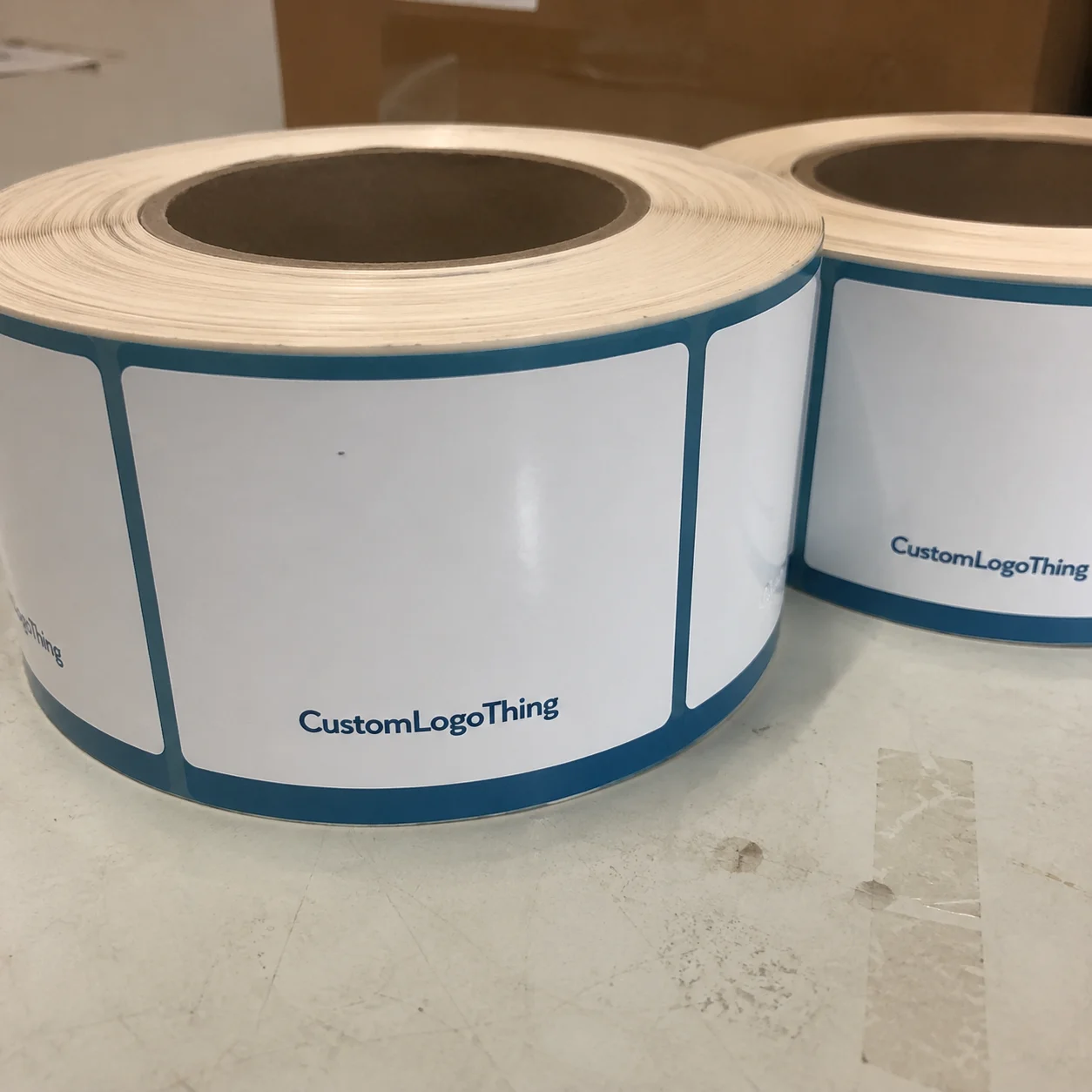
- Application method: sheet format suits hand application, while rolls are more efficient for higher-volume packing lines.
Cost, Pricing, MOQ, and Quote Basics
Price depends on size, quantity, print coverage, material quality, finish, and whether special inks are required. Simple clear labels with black text usually cost less than versions that need white ink, full branding, or custom die-cuts. Once setup changes or ink coverage increases, the quote rises accordingly. That is not a trick; it is just print production math.
For smaller custom runs, many buyers will see pricing in a range of $0.12-$0.30 per label, depending on quantity and specification. Larger runs can drop materially, sometimes into the $0.05-$0.12 range per label if the artwork is simple and the format is efficient. Those numbers are not universal, because label size and ink load can shift pricing quickly, but they are realistic enough to anchor expectations.
Minimum order quantities exist because setup costs do not disappear in a small batch. A supplier still has to review artwork, confirm material, prepare print settings, and run the job. Smaller quantities usually mean higher unit cost. Larger quantities generally improve price, but only if the labels will be used before the artwork, address format, or season changes.
It is worth asking for pricing at two or three volume levels. That comparison usually reveals the breakpoints faster than a polished sales pitch. A quote should clearly state:
- Label dimensions
- Material type
- Adhesive type
- Print colors
- Quantity
- Delivery location
- Proof inclusion
If those details are missing, the quote is incomplete. It is not something you want to discover after approval. For sustainability-minded programs, it also makes sense to ask what the film, liner, and backing materials are made from and whether there are any sourcing standards in place. The FSC framework is more relevant to paper-based components than to clear film itself, but the larger point remains: material questions should be asked before the order is locked.
| Option | Typical Use | Approx. Unit Cost | Tradeoff |
|---|---|---|---|
| Basic clear label with black text | Simple return address, small parcels | $0.05-$0.12 at volume | Lowest cost, least design complexity |
| Clear label with logo + custom layout | Branded mailers, boutique shipments | $0.10-$0.22 | Better presentation, slightly more setup |
| Clear label with white ink or special opacity | Dark packaging, higher contrast needs | $0.14-$0.30+ | Stronger visibility, higher print cost |
Process and Lead Time: From Artwork to Delivery
The ordering process usually follows the same sequence: Request a Quote, confirm specifications, send artwork, approve the proof, produce the labels, then ship them out. The stage that creates the most delays is usually proofing, not printing. A press run can move quickly once everything is correct, but it cannot be rushed through bad files.
For simple reorder jobs, lead time can be relatively short, often around 7-12 business days after proof approval. First-time custom jobs usually need more time, often 12-18 business days or longer if the design requires revisions or if white ink is involved. Transit time is separate. People combine those two too often and end up with orders arriving after the launch, not before it.
The practical rule is to plan backward from the in-hand date, not from the quote request date. If the labels support a launch, sale, or seasonal shipping window, build in a cushion. A few extra days can prevent expensive scrambling later.
Files that tend to create problems usually have one or more of these issues:
- Low-resolution logos
- Missing bleed or trim margin
- Small text on transparent stock
- Unclear address hierarchy
- Poor contrast against the packaging color
Good suppliers can correct some of that. They cannot fix everything. Every correction adds time, and every revision pushes the order closer to the deadline you were trying to avoid. Clean files save more than design time; they reduce back-and-forth that can stall the entire production schedule.
Step-by-Step Ordering Guide for Accurate Results
Start with the use case. Is the label for outgoing parcels, return addresses, internal inventory, or branded mailers? The answer changes the layout and often the size. A label built for internal use may not need the same visual polish as one going on a customer-facing shipment.
- Measure the available area. Do not guess. Measure the flat zone on the mailer, box, or bag.
- Choose the right format. Sheets are convenient for hand application. Rolls make more sense for higher-volume packing lines and applicators.
- Prepare readable artwork. Use strong contrast and clean type.
- Request a proof. Check spelling, spacing, placement, and any barcode or scan area before printing starts.
- Confirm the quantity and lead time. Make sure the order matches the shipment window, not just the budget.
Proofing deserves more attention than it usually gets. Inspect the label like a production buyer, not someone staring at a polished mockup. Check the address order, logo scale, line spacing, and whether the type will remain legible on the actual packaging surface. If there is a barcode or scan zone, verify that as well. A label can look fine on a monitor and still fail the moment it reaches a dark or patterned mailer.
A practical file package should include the exact mailing format, the final logo file, any special instructions, and photos of the packaging if the label needs to fit a defined space. That gives the supplier something concrete to work from instead of a vague request for “something clean.” Clean is not a specification. It is a preference that still needs dimensions, contrast, and placement rules.
Before placing the order, confirm the adhesive category, the delivery window, and whether the approved artwork version will be kept on file for the next run. Repeatability matters. A label program that changes slightly every order tends to create a quiet but steady operational headache.
Common Mistakes Buyers Make With Clear Labels
The biggest mistake is assuming clear stock automatically looks premium. Sometimes it does. Sometimes it simply makes poor contrast more obvious. If the background is busy, the design can disappear or look cluttered. Transparent material is unforgiving in that way; it does not hide much.
Another common miss is ignoring the packaging surface. A label that looks great on a smooth poly mailer may lift on textured kraft, dusty recycled stock, or soft-touch coatings. If the surface is too rough or uneven, adhesion drops and the corners start to curl. In that situation, a plain white label would have performed better.
Skipping proof approval is another expensive habit. A wrong digit in the address, a poor line break, or a logo sitting too close to the edge can trigger a full reprint. That kind of mistake sounds small until it shows up as a wrong batch in the shipping area.
Ordering the smallest possible quantity to save money is not always smart either. If you ship consistently, tiny runs usually raise unit cost and create replenishment stress. Cheap on paper is not the same as cheap in practice. A slightly larger run can lower the label cost, but only if the order remains relevant long enough to use it.
A quick mental test helps: if the label would still look acceptable after a busy warehouse shift, it is probably specified well. If it only works in the mockup, it is not ready yet.
Expert Tips and Next Steps for a Better Order
Choose the label size around the longest real-world address you expect to print, not the average one. Average data is how people end up with cramped text or awkward line wraps. A label should be sized for the messiest valid version of the address data, not the neatest.
If your packaging is dark, patterned, or textured, ask whether white ink, higher-opacity elements, or a different label stock would improve readability. Clear material is not the best option in every situation just because it looks modern. Sometimes a slightly less invisible label performs better and saves more time in the warehouse.
For repeat orders, keep a simple spec sheet. Nothing elaborate. Just note the size, material, finish, adhesive, quantity, approved artwork version, and any application notes. That makes reordering easier when someone else on the team takes over and needs the exact same result.
Before requesting a quote, gather the mailing format, packaging photos, and expected monthly volume. Then ask for a sample or proof, compare pricing at two quantities, and confirm the lead time before approval. If you want clear address labels personalized for real production use, that sequence keeps the order from turning into a repair job later.
The best label programs are rarely the loudest ones. They are the ones that stay readable, stay put, and keep the package looking deliberate without creating extra work for fulfillment. That is the real standard here: clear address labels personalized should make shipping cleaner, faster, and easier to trust.
Are clear address labels personalized a good choice for clothing mailers?
Yes, especially for Branded Poly Mailers, kraft boxes, and retail packaging where you want the address to look clean instead of taped on. They work best when the surface is smooth enough for the adhesive to bond and when the print has enough contrast to stay readable.
What material works best for personalized clear address labels?
For most shipping and branding uses, clear polypropylene or a similar film is the practical baseline because it balances clarity and durability. If the package gets handled a lot or exposed to moisture, ask about the adhesive and print method rather than assuming all clear stocks perform the same.
How much do clear address labels personalized usually cost?
Cost depends on size, quantity, print coverage, finish, and whether you need white ink or special formatting. The lowest unit cost usually comes from larger runs, but the right order size is the one you can actually use before the artwork changes.
How long is the turnaround for custom clear address labels?
Simple reorders can move quickly, but first-time custom orders need proofing time before production starts. Lead time and shipping time are separate, so ask for both and avoid guessing.
Will clear personalized address labels show up on dark packaging?
They can, but only if the contrast is designed correctly. Dark or patterned packaging often needs stronger print contrast or opaque elements, and if the address has to be scanned or read quickly, test the proof against the actual packaging color before approving the run.