Buyer's Woven Labels Material Guide for Supplement Brands
Woven labels material guide for supplement brands: what the material really means
A woven label can make a $28 hoodie feel like considered brand merchandise. It can also make the same hoodie feel like a rush-order afterthought. That gap is not caused by the logo alone. Yarn type, weave density, edge finish, fold style, and hand-feel decide whether the label still reads as premium after it has been worn, washed, stretched, packed, and pulled out of a gym bag twenty times.
Supplement brands rarely use labels on one product only. The same brand mark may appear as a neck label on tees, a hem tag on hoodies, a small tab on gym towels, a patch on shaker bags, or an accessory label inside a subscription kit. A polished tub label, disciplined carton system, and sharp product photography lose a little authority if the fabric label curls, fuzzes, or turns the brand name into a muddy thread block at 25 mm wide.
The buyer decision is practical: durability, touch, cost, size, artwork detail, and placement all compete. A smooth damask label may be right for a premium training tee that touches skin. A heavier patch-style woven label can work better on a hoodie sleeve, duffel, cap, or outer pocket. Neither choice is inherently superior. The right spec is the one that matches the garment, the brand mark, and the way the customer will actually handle the item.
One common error is judging the label as a loose sample in hand. That tells only part of the story. A soft label can behave differently once folded into a neck seam. A bold mark can lose contrast on black fleece. A label that feels fine for 10 seconds can become irritating during a workout if the back side, fold, or stitching creates a stiff ridge.
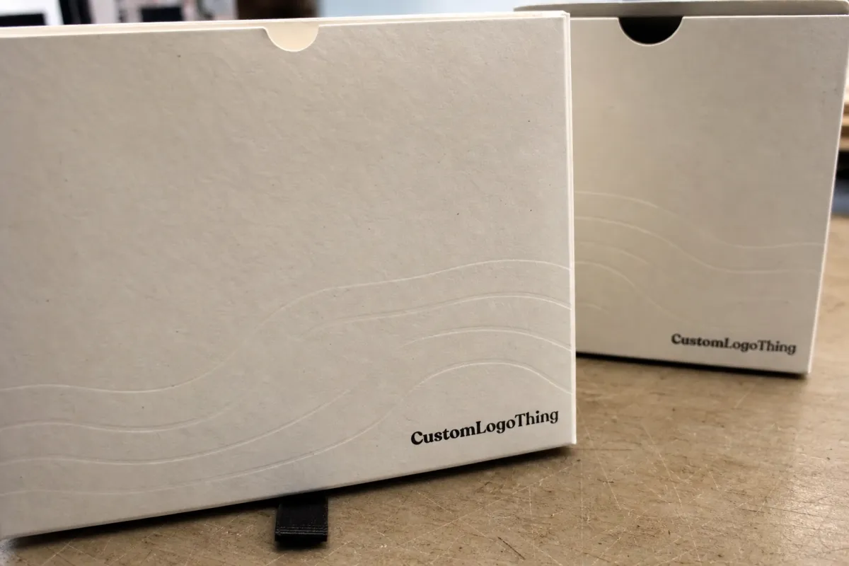
For Custom Logo Things buyers, the goal is not to over-engineer a tiny piece of trim. It is to make the label support the product without creating avoidable proofing delays, comfort complaints, or inconsistent reorders. A useful Woven Labels Material guide for supplement brands should help the team ask sharper questions before artwork proofing begins, because one clear spec sheet often prevents two or three rounds of revisions.
How woven construction changes softness, detail, and wear
Woven labels are made by interlacing threads on a loom rather than printing ink on top of fabric. That gives them a textile feel and strong wash durability, but it also forces the artwork to translate into thread. Fine outlines, tiny trademark text, gradients, and half-tone effects rarely reproduce the way they look on a screen.
Damask is the usual workhorse for branded apparel labels. It uses finer yarns and a tighter weave, which helps small type, curves, and logo marks stay cleaner. Satin-backed styles can feel smoother against skin, although comfort still depends on yarn, fold, label thickness, and edge finishing. Taffeta-style labels can be more economical, but they may feel crisper and show less refined detail, especially on small labels below about 20 mm tall.
The same artwork can read very differently at different sizes. A 60 mm wide woven label has room for a symbol, a brand name, and perhaps a short line of supporting text. A 25 mm side seam tab may only support a simplified mark and one strong color contrast. For the premium athletic look many supplement brands want, the label usually needs fewer colors, stronger negative space, and type with enough stroke weight to survive the weave.
Wash testing matters more than a desk review. Heat, detergent, friction, and repeated bending can change the feel of the label and the crispness of the border. A practical test is 3 to 5 home wash cycles on the actual garment before approving a large run, especially for tees, compression layers, and hoodies that will see regular laundering.
Practical callout: If the logo contains small text under 6 pt at final label size, ask for a woven proof or strike-off before full production. Thread is honest, but it is not magic.
For internal buyer notes, rank construction decisions in this order: legibility first, comfort second, durability third, price after the label has passed those checks. A cheap label that scratches the neck or blurs the brand mark is not cheap once it is sewn into 2,000 garments.
Choosing fiber, finish, and color match
Polyester is the most common fiber for woven labels because it handles abrasion, laundering, and color stability well. It is also predictable in production, which matters when ordering 1,000 to 25,000 labels that need consistent sizing, folding, and edge behavior. Cotton can offer a softer, more natural hand, but it may not hold sharp detail or long-term structure as well in hard-use apparel.
Recycled polyester is worth considering when the brand story includes recycled materials, post-consumer waste, or broader packaging improvements such as FSC certified paperboard, kraft paper mailers, or responsibly sourced inserts. Claims need discipline. Environmental language should match the actual material documentation, and the EPA recycling guidance is a useful reference for understanding how material claims may be interpreted by consumers.
Finish changes the customer experience. A smoother finish is usually better for direct skin contact, especially in neck labels and side seams. A firmer finish can hold shape better on outerwear, bags, heavy hoodies, and patch-style placements. Heat-cut edges can be clean on synthetic yarns, while woven edges can give a softer, more finished feel, depending on the label style.
Color matching has limits. Woven production uses thread, not ink, so the supplier selects the closest available yarn colors to your brand palette. Pantone references help, but a neon green, metallic effect, or subtle gradient from a tub label may need simplification. If your logo depends on a precise supplement-category color, such as a specific electrolyte blue or pre-workout red, ask for thread cards or a physical proof.
Contrast deserves more attention than most teams give it. White thread on black fabric reads strongly. Charcoal on black may look premium in a mockup and nearly vanish in use. Thin outlines cause similar problems. On labels below 30 mm wide, fewer colors and bolder forms usually work better because quick recognition matters more than reproducing every small brand asset.
The apparel label should also connect to the wider packaging system. If the product ships in corrugated cardboard mailers with clean monochrome graphics and the retail carton uses soft-touch laminate, the woven label should feel like part of that same brand language. Otherwise, the trim starts to look like a separate order made after the main identity work was finished.
Material choices by product type and placement
Placement changes the spec. A neck label for a tee needs a soft face, smooth edges, and a fold style that will not create a stiff stack inside the collar. A side seam label on a lightweight performance top needs low bulk and enough flexibility to move with the fabric. A hem tag on a hoodie can be thicker because it usually sits away from high-friction skin contact.
Supplement brands often need one label system to cover several merchandise types: soft cotton tees, fleece hoodies, training shorts, shaker bags, caps, towels, and promotional bundles. That does not mean every item needs the same label. It means the label family should look related while the material spec changes where the product demands it.
| Use case | Recommended material direction | Typical size range | Buyer watchout |
|---|---|---|---|
| Neck label on tee | Soft damask or satin-backed woven label | 35-55 mm wide | Avoid stiff folds and scratchy cut edges |
| Side seam tab | Tight weave with strong contrast | 18-30 mm wide | Keep artwork simple; tiny type will close up |
| Hoodie hem tag | Damask or firmer woven label | 40-70 mm wide | Match label weight to fleece thickness |
| Cap or bag patch | Structured woven patch or merrowed edge label | 50-90 mm wide | Check curve, stitching path, and edge lift |
Tighter, smoother materials usually work best in direct-contact areas. Thicker options can be excellent for decorative placements, especially on outer layers and accessories, because they hold shape and give the mark more presence. The problem starts when a structured label is placed where the wearer feels it every time they move.
Fold style matters more than it sounds. Centerfold labels are common for neck applications. End fold labels work well when sewn on two sides. Straight cut labels suit patches and flat applications. Manhattan folds and book folds can look polished, but they add layers, so they need enough garment weight to sit cleanly.
Backing is another quiet decision. Some woven patches use adhesive or heat-activated backing for positioning, but sewing is still the more reliable hold for apparel and bags that will be washed or flexed. If the label will be applied to fleece, rib knit, canvas, or a cap panel, ask how the backing behaves with that substrate and whether it affects needle movement during sewing.
If you are comparing formats, the Custom Labels & Tags page is a useful starting point for seeing how different tag and label styles can fit into a broader branded merchandise program.
Cost, pricing, MOQ, and quote basics
Cost is driven by label size, weave complexity, number of colors, fold style, edge finish, quantity, and proofing requirements. A small two-color centerfold label at 5,000 pieces will price very differently from a large six-color patch with a merrowed border at 500 pieces. Setup time matters because the loom and finishing process have to be prepared before the first sellable label is produced.
As a planning range, simple woven labels may land around $0.08-$0.18 per piece at higher quantities. Smaller runs or more complex labels can move into the $0.22-$0.60 per piece range. Specialty finishes, recycled yarns, premium borders, and preproduction samples can add cost. These ranges are not fixed quotes; supplier equipment, yarn availability, finishing method, and shipping speed all affect the final number.
MOQ varies, but many custom woven label orders start around 500 to 1,000 pieces. Lower MOQs usually carry a higher unit price because production preparation is spread across fewer labels. Larger runs often improve price efficiency, and the best break may appear at 2,500, 5,000, or 10,000 pieces depending on the spec.
Compare quotes only when the specifications match. Two prices can look similar while hiding real differences in weave density, edge finishing, trimming, folding, packing, or sample approval. From a buyer's point of view, the cleanest quote request includes artwork, dimensions, fold style, quantity, placement, color references, and the garment or item type.
| Quantity | Typical buyer scenario | Estimated unit range | Planning note |
|---|---|---|---|
| 500 pieces | Launch test, influencer kit, small merch drop | $0.28-$0.60 | Good for validation, less efficient per unit |
| 2,500 pieces | Growing apparel program or reorder stock | $0.14-$0.32 | Often a sensible balance of cash and inventory |
| 5,000 pieces | Ongoing tees, hoodies, and bundle items | $0.08-$0.24 | Better cost spread if specs are already proven |
Ask for pricing at a few quantities. It gives the team a clearer view of the cost break and prevents the common mistake of ordering 1,000 pieces when 2,500 would have cost only a little more in total. The smarter calculation is not just unit price; it is unit price plus storage, reorder timing, launch risk, and the likelihood that the artwork or garment line will change before the labels are used.
Production process and timeline from proof to delivery
The standard workflow is straightforward: artwork review, digital proof, optional strike-off or sample, proof approval, weaving, cutting, folding, inspection, packing, and shipment. The slow parts are usually not the weaving itself. Delays tend to come from unclear artwork, missing dimensions, uncertain color references, or late changes after the proof has already been built.
For many woven label orders, standard production after proof approval may run about 10-15 business days, with additional time for transit. A physical strike-off can add several days, but it can also prevent a full reorder if the label is going on premium apparel. Rush timing depends on queue position, finish type, quantity, and shipping method.
Artwork files should be vector whenever possible. AI, EPS, or clean PDF files are better than low-resolution PNGs pulled from a web header. If the logo includes fine typography, provide outlined fonts or a simplified version created specifically for woven use. The same brand may need one logo for cartons, one for biodegradable packaging claims on inserts, and one simplified woven mark for apparel.
Build label timing into the broader merchandise schedule. Garment sewing, insert assembly, subscription kit packing, and launch dates can all be held up by a label that arrives late. If the label is part of a larger packaging program, standards from groups such as ISTA can also help teams think about distribution testing, especially for kits that include apparel, bottles, shakers, and printed components in one box.
Quality control should be specific, not vague. Check final width and height against the approved spec, confirm fold alignment, inspect color consistency under normal light, and look for loose threads, edge fray, skewed logos, or uneven cutting. For neck labels, run a fingertip across the edge and back fold after washing. For patches, check whether the corners lift or the border warps after sewing.
The best timeline habit is boring but effective: approve the label before the garment production window gets tight. Material decisions are easier while there is still time to test comfort, color, and placement without rush fees.
Common mistakes when specifying woven labels
The first mistake is asking the label to carry too much. Tiny ingredient-style text, thin outlines, shadows, gradients, and multiple taglines can all look fine on a PDF and weak in thread. If the label is 30 mm wide, the artwork needs discipline. One strong mark often beats a crowded miniature billboard.
The second mistake is choosing only by loose sample feel. A label may feel soft in your fingers and still irritate the wearer once it is folded, stitched, and pressed into a collar seam. Test it on the actual garment. Wash it. Rub the edge between your fingers after laundering. That quick check tells you more than a desk sample.
The third mistake is an incomplete spec sheet. A woven label order should define final size, fold style, logo orientation, number of colors, thread references, edge finish, backing if any, placement, and packing requirements. If one buyer says “small black label” and another says “side tab,” production has to guess. Guessing is where avoidable errors enter.
The fourth mistake is approving from paper alone. A digital proof confirms layout, not hand-feel. It cannot show exact texture, edge behavior, or how the label sits on rib knit, fleece, jersey, canvas, or cap fabric. For premium launches, ask for a strike-off or a sewn sample before placing the full order.
The fifth mistake is ignoring the sewing operation. A beautiful label can still fail if it is too thick for the seam, too narrow for the planned stitch path, or too rigid for the garment panel. Ask how much sew margin is needed. Confirm whether the label will be topstitched, caught in a seam, bar-tacked, or applied as a patch. Those details affect both comfort and durability.
For brands reviewing past merch performance, Case Studies can help frame the bigger question: how does the label support the product, the kit, and the customer experience together? A trim component is small, but it can carry a surprising amount of brand trust.
Next steps before you place the order
Before requesting final pricing, gather the artwork file, exact label size, fold style, placement, quantity, garment type, fabric color, desired finish, and color references. Put those details in one message. It keeps the quote clean and makes it easier to compare one supplier's price with another.
Ask for three practical options if the order matters: one durable option, one softer option, and one value option. That gives the team real tradeoffs instead of a single number floating without context. For example, a damask polyester neck label may cost more than a basic woven label, but the comfort and detail may justify the difference on a premium tee or hoodie.
If the label will sit on a high-value garment or a launch kit, request a sample or preproduction proof. Check legibility at arm's length. Confirm the edge does not scratch. Place it against the actual fabric color. If the label is part of a larger sustainable packaging story, make sure material claims around recycled yarn, FSC certified inserts, or kraft paper mailers are documented rather than assumed.
Use this Woven Labels Material guide for supplement brands to lock the final spec before production approval: material, construction, size, fold, color, placement, quantity, and proof status. Once those details are clear, the order becomes much easier to produce correctly, and the finished label has a better chance of feeling like part of the brand rather than a small piece added too late.
FAQ
What woven labels material works best for supplement brand apparel?
Damask-style woven labels are usually the best all-around choice when a brand wants clean detail, strong durability, and a premium look on apparel. Polyester is the most practical fiber for repeat wear and wash cycles, while cotton can feel softer but may not hold up as well in harder-use items. The right choice depends on whether the label will sit inside a neck seam, outside on a hoodie, or on an accessory with less direct skin contact.
Are woven labels better than printed labels for gym and lifestyle merch?
Woven labels usually last longer and keep a more textile-forward premium feel, which works well for active and lifestyle branding. Printed labels can handle very fine graphics more easily, but they may not deliver the same tactile quality or long-term wear performance. If the logo is simple and the garment will be washed often, woven is often the sturdier choice.
How many colors should a woven label use for a supplement brand?
Two to four colors often gives a strong balance of clarity, cost control, and visual polish on a small woven label. More colors can raise complexity and price, and very thin color changes can disappear once woven at small size. Simplifying the palette usually helps the logo read more clearly on dark apparel or narrow label widths.
What is the usual MOQ and lead time for woven labels?
MOQ varies by supplier, label size, and finishing style, but many custom woven label orders start around 500 to 1,000 pieces. Production after proof approval often runs about 10-15 business days, plus transit time. If the order has a launch date, ask for both standard and rush timing before approving artwork.
How do I request a quote for woven labels material for supplement brands?
Send the artwork file, label size, fold style, placement, quantity, and color references in one message so the quote is accurate. Include whether the label will be used on tees, hoodies, bags, caps, towels, or other items, because the fabric type changes what material feels and performs best. Ask for price breaks at a few quantities so cost, MOQ, and future reorder needs can be reviewed together.


