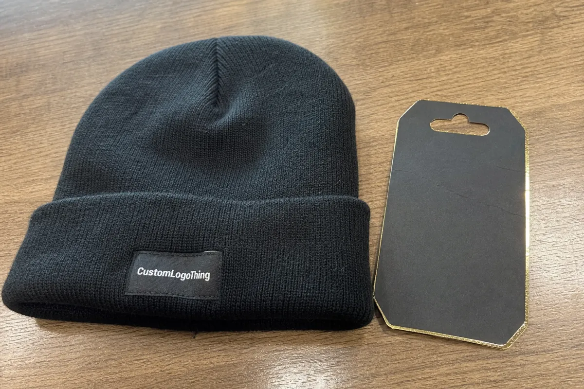
A woven label can look right on a flat proof and still feel wrong on a beanie. On knit headwear, the label has to stay readable, sit comfortably, and avoid fighting the fabric. In practical terms, that usually means keeping the finished profile around 0.6-1.5 mm depending on the beanie type, using a clean weave, and testing the trim on the real blank before bulk approval.
Thickness is not one number. It comes from weave density, yarn choice, fold construction, backing, and edge finish. Buyers who ask for “medium” or “premium” without more detail usually get inconsistent samples. A useful spec should say how the label should feel, where it will be placed, what blank it will be sewn onto, and whether the program needs GOTS-certified organic cotton, GRS-certified recycled polyester, OEKO-TEX Standard 100 for skin-contact safety, or WRAP/BSCI documentation for social compliance. If you need a comparison point while specing, review woven label options against the beanie itself, not in isolation.
Ceramic Woven Label Beanies Material Thickness Guide
For beanies, thickness is best treated as a finished profile. That includes the weave body, fold style, any backing, and the edge treatment. A dense weave can still feel soft if the finish is clean. A thinner weave can still feel bulky if the border is stiff or the backing adds rigidity. In production, the label body is usually woven on a computerized jacquard loom using polyester, recycled polyester, or cotton blend yarns, then cut with a hot knife, laser, or ultrasonic cutter, and sewn onto the blank with a flat, low-bulk stitch.
As a practical guide, low-profile woven labels usually finish around 0.6 to 0.9 mm, mid-weight labels often land around 1.0 to 1.4 mm, and heavier labels can reach 1.5 to 2.0 mm once folded, bordered, or backed. Once you go beyond that, the trim starts to behave more like a patch than a label on many knit styles. For small artwork, a 4-color weave is usually the cleanest and most economical target; 5 or 6 colors can work, but they often need finer yarn and tighter weave settings, which increases cost and reduces softness.
Beanie style changes the decision. Cuffed beanies can handle a little more structure because the cuff already adds body. Slouch beanies need more drape, so a heavy trim can feel out of place. Rib-knit beanies stretch aggressively, which makes any ridge more noticeable. Double-layer beanies can take a bit more substance, but comfort still matters if the label sits near skin. If the label is for a style intended for winter retail, it is common to test it against both the folded cuff and the stretched-worn position, because the feel changes once the knit is on-head.
- Cuffed beanies: work well with low-profile or mid-weight labels because the cuff hides some structure.
- Slouch beanies: usually need a lighter finish so the crown keeps its drape.
- Rib-knit beanies: need careful placement because stretch exaggerates bulk.
- Double-layer beanies: can carry a denser label if the edge stays smooth.
The common mistake is choosing thickness based on logo visibility alone. That works until the beanie is worn for a while. Then the label starts rubbing, lifting, or pulling the knit out of shape. On headwear, a restrained label is often the safer and better-looking choice. For most programs, a sewn-on woven label with a soft folded edge, 3 to 4 mm seam allowance, and no hard adhesive backing gives the best balance of comfort and durability.
A thin label is not automatically cheap. A poor fit is what makes it feel cheap.
How Thickness Changes Handfeel and Stitch Definition
Thin woven labels sit flatter against knitwear, which makes them useful for small logos, minimal branding, and cuff placements where you want the trim to disappear a little. They are comfortable and tidy, but very fine artwork can blur if the weave gets too light. Letters close up. Small details weaken. The label starts to look tired before the first wash. If you need a readable wordmark below about 3 mm cap height, a slightly tighter weave is often worth the extra bulk.
Mid-weight labels are the safest choice for most beanie programs. They hold lettering and icon shapes better without turning into a stiff block. If the style later changes from a standard cuffed knit to a softer slouch knit, a mid-weight label is more likely to still work. That matters in production, where reorder blanks are not always identical. This is also the range where most factories can keep pricing efficient, because the loom settings do not have to push the weave so tight that the handfeel becomes boardy.
Heavier labels can work on dense winter beanies with substantial yarn body. They read clearly from a distance and feel deliberate in hand. The downside is more risk of scratchiness, edge lift, or a ridge under the cuff. Once the hat stretches on a head, the label often feels larger than it looked on the table. If the label is intended to be seen in retail photography, a 20 x 50 mm label with 2 to 3 lines of text often performs better than trying to cram the same information into a smaller area.
Stitch definition changes with weave density too. A label woven too loosely loses sharpness. A label woven too tightly can feel dense even if it is small. The best test is simple: fit the sample to the real beanie blank, wear it, and check whether the logo still looks crisp after the knit is pulled into shape. If it only looks good before wear, it is not the right trim. Good sample review should also include a 10x visual check for broken floats, color bleeding, and edge fuzzing, followed by a rub test and a wash test on the sewn sample.
There is also a production tradeoff. Finer artwork often forces a tighter weave, and that can push the label toward a firmer handfeel. So the buyer is balancing comfort, clarity, and construction limits at the same time. If the logo is highly detailed and the hat is soft, one of them has to give. In many orders, the cleanest compromise is to simplify the artwork slightly, keep the yarn count to 2 to 4 colors, and reserve intricate detail for hangtags or packaging instead of the woven trim itself.
Fabric, Gauge, and Edge Finish Factors That Matter
Knitting gauge changes the whole decision. A looser, heavier knit can support a more substantial woven label because the beanie already has visual weight. A tight-gauge knit is less forgiving. On a fine rib, even a medium label can look like it sits on top of the fabric instead of belonging there. Typical beanie blanks in acrylic, recycled polyester, or cotton-blend yarns can vary a lot in body, so the same label that feels perfect on one blank may feel too firm on another.
Placement matters as much as size. Side seam placements have more freedom because they sit off the main face of the hat. Front-cuff placements are less forgiving because they sit where the forehead presses into the trim. If the beanie is worn low and snug, a low-profile label is usually the better call. If it is a taller cuff with more structure, there is a little more room. A common placement spec is 8 to 12 mm from the cuff edge, but the exact distance should be confirmed on the real blank because fold height and seam allowance change the visual result.
Edge finish is where labels quietly win or lose the job. Folded labels are tidy and durable, but the fold adds bulk. Cut-edge labels stay lighter, though they need a clean finish so they do not fuzz out. Merrowed borders add definition, but they can turn a small woven label into a chunkier object than expected. None of these is wrong. They just behave differently once sewn onto knitwear. For premium beanies, a hot-cut or laser-cut edge with tight weave control often gives the softest hand, while a merrowed edge is better when the label needs a stronger outline from a distance.
Backing changes feel too. Sew-on labels are usually the safest on beanies because they keep the trim flexible. Heat-applied backing can speed assembly, but it may create a stiffer zone. Adhesive support is less common for premium headwear because the handfeel often suffers. If the label needs to stay soft, keep the construction simple. A no-back sew-on label with a flat lockstitch or narrow zigzag is usually the cleanest option, especially if the beanie is meant to be worn directly against the forehead or hairline.
Artwork density belongs in the same conversation. More colors, smaller text, and finer lines usually require tighter weaving. That often means a firmer label. For most buyers, the cleanest order prioritizes comfort first, logo clarity second, durability third, and decoration detail last. If the line uses organic cotton beanies, recycled polyester labels, or recycled acrylic yarns, ask for the relevant certification paperwork up front so the spec sheet matches the final bill of materials.
The same discipline applies to packaging and the rest of the headwear program. If beanies are folded into sleeves, packed in cartons, or shipped with inserts, note that alongside the label spec. It is easier to keep the product consistent when trim, blank, and pack-out are written down together. A good factory will usually confirm carton count, polybag thickness, label position, and final pack-out format before cutting bulk, then recheck the first cartons against the approved sample.
Process and Lead Time: From Spec Sheet to Sample Approval
A clean spec sheet saves time. It should list the beanie style, label dimensions, thickness target, color count, placement, attachment method, and quantity. If any of those are missing, the sample round starts drifting because the factory fills gaps with assumptions. The best spec also calls out yarn type, blank fabric composition, and whether any certification support is needed, such as GOTS for organic cotton, GRS for recycled content, or OEKO-TEX Standard 100 for skin-safe trim.
Digital proofs are useful, but they only answer part of the question. They show color blocking, size, and layout. They do not tell you whether the label sits too proud of the knit or catches at the cuff. Physical samples are where the real decision happens, and every beanie style in the order should be checked if the blank changes. A normal sample path is artwork proof in 24 to 48 hours, woven strike-off in 3 to 7 business days, fit check on the actual blank, then a corrected pre-production sample if anything needs adjustment.
Most programs need at least one revision round. Sometimes the issue is artwork. Sometimes it is edge finish. Sometimes the first thickness choice was simply too ambitious. For a straightforward order, artwork approval comes first, then sample production, then one correction if needed, then bulk production and shipping. Simple runs may sample in about a week. Bulk production often takes 18 to 22 business days after approval, while more complex builds, high color counts, and peak-season schedules can push longer. If the beanies are part of a larger retail order, it is smart to hold 3 to 5 business days at the end for final QC and packing.
Late changes are expensive because they compound. Switching from cuffed to slouch changes placement logic. Changing label size can force a new weave balance. A different edge finish can alter the feel enough that the sample has to be remade. That is why the thickness decision should be locked early instead of left open while someone chases a slightly nicer mockup. Even a small change like moving from a 35 x 15 mm label to a 50 x 20 mm label can affect stitch count, fold depth, and how the label sits after washing.
Keep approval notes in plain language. “Use low-profile woven label, sewn flat on front cuff, no raised backing, approved on sample v2” is much more useful than vague notes like “make it better.” Clear instructions reduce back-and-forth and give the factory a measurable target for bulk. The best production notes also include inspection checkpoints: measurement tolerance within +/- 2 mm, color tolerance checked under D65 lighting, seam tension verified on the first 10 pieces, and final carton count compared against the approved packing list.
Cost, Pricing, MOQ, and Unit Cost Tradeoffs
Price depends on more than just the label. Yarn type, gauge, color count, label size, beanie construction, and finishing all affect the quote. For a simple acrylic or acrylic-blend beanie with one woven label at 500 MOQ, a realistic factory range is often $2.50-4.00 per unit ex-works. If the program uses recycled yarn, organic cotton, or a more complex cuff and label combination, the number can move to $4.50-7.00 per unit. The woven label itself is usually a small part of the total, often $0.08-0.25 per piece for a standard size, but high color counts, special borders, or small MOQ runs can push that higher.
MOQ also varies by construction. A custom woven label alone may be possible at 300-500 pieces per design or colorway. Finished beanies are more commonly quoted at 300-1,000 pieces per color, depending on yarn availability, gauge, and whether the factory is knitting blank bodies or decorating ready-made blanks. If the label requires a special weave or the order includes multiple sizes, expect the minimum to rise. A factory that offers WRAP or BSCI social compliance documentation may also require cleaner pre-approval because they need stable production planning and documented inspection steps.
Sample cost should be written down too. A woven strike-off may be $15-40, while a full sewn sample on the actual beanie blank is often $25-75 depending on complexity. Some suppliers credit sample fees against bulk, but not all do. If the sample needs reworking because the first thickness choice was wrong, the cost can stack quickly. That is why it is better to settle the label profile early than to save a few cents and lose a week on revisions.
The cheapest option is not always the best value. A very thin label can reduce material cost but increase rework if the artwork loses clarity. A very thick label can look premium in a still photo but create returns if the cuff feels scratchy. The most reliable choice is usually the one that holds its shape, washes cleanly, and still feels soft after the beanie has been worn and folded a few times. When in doubt, ask the factory for two quotations: one with a low-profile sew-on label and one with a mid-weight folded label, then compare the cost delta against the comfort and readability gain.
Common Sizing Mistakes That Make Beanies Look Cheap
The first sizing mistake is making the label too tall. On beanies, height draws the eye faster than width, which means an oversized vertical label can overpower the cuff. The second mistake is choosing a label that is too narrow for the text, which forces the letters to crowd together. The third is ignoring how the label looks when the knit stretches, because a perfectly proportioned flat sample can look awkward once the beanie is worn.
Another common problem is putting the label where the cuff naturally folds. That creates bulk and makes the edge look messy. If the label has a stiff border or backing, the problem gets worse. Side placement can solve this on some styles, but only if the seam line and fold direction are checked first. On rib-knit beanies, even a few extra millimeters matter because the fabric rebounds and reveals any unevenness.
Some buyers also over-spec the trim by adding too much detail. More text, more colors, and more border complexity can all be justified on paper, but they are harder to sew cleanly and harder to wear comfortably. A cleaner spec usually produces a cleaner hat. If the beanie is for retail, it is better to keep the label legible at arm's length than to force in extra information that can live on a hangtag or care label.
Finally, many orders skip the wear test. That is a mistake because beanies are not flat goods. A label should be checked while the hat is stretched, cuffed, unfolded, and worn against the head. If it still sits flat, reads clearly, and does not scratch, the sizing is probably right. If it twists, curls, or creates a ridge, the label is too large, too thick, or too stiff for that blank.
Expert Tips and Next Steps for a Cleaner Order
Start with the blank, not the logo file. Confirm the beanie composition, cuff depth, knit gauge, and target fit before locking the label. Then decide whether the brand needs a soft sew-on label, a folded woven label, or a lighter cut-edge version. If the style uses recycled yarn, ask for the GRS paperwork at the same time as the sample request. If it uses organic cotton, ask for GOTS documentation. If skin contact matters, ask for OEKO-TEX Standard 100 proof for the relevant materials.
Keep the approval package tight. A good packet includes artwork, exact dimensions, preferred thickness, color count, placement photo on the actual blank, attachment method, and the expected MOQ. It should also say whether the order needs pre-production approval, inline inspection, or full final inspection. That kind of clarity helps the factory keep the label consistent from strike-off to bulk.
Ask for at least three checkpoints: a digital proof, a sewn sample on the real beanie, and a pre-shipment inspection with piece counts, measurement checks, and visual checks under consistent lighting. For larger orders, an AQL-style final inspection is standard practice, with attention to stitch security, edge integrity, label placement, and carton accuracy. If the label passes those checkpoints on the sample, it is much more likely to behave in bulk.
If you want the cleanest result, keep the order simple: one beanie body, one label size, one placement, one approved sample, and no late changes. That approach usually produces the best handfeel, the least waste, and the most consistent retail appearance. In most cases, the winning spec is not the thickest label or the most complex weave. It is the one that balances softness, readability, and repeatable production.
Clear instructions reduce back-and-forth and keep the bulk run closer to the approved sample. Put the exact label size, thickness, finish, and inspection notes in writing, then approve only after you have felt the sample on the actual beanie, not just viewed the artwork on screen.


