Buyer Fit Snapshot
| Best fit | Cmyk Printed Kraft Mailers projects where brand print, material claims, artwork control, MOQ, and repeat-order consistency need to be specified before quoting. |
|---|---|
| Quote inputs | Share finished size, material target, print colors, finish, packing count, annual reorder estimate, ship-to region, and any compliance wording. |
| Proofing check | Approve dieline scale, logo placement, barcode or warning zones, color tolerance, closure strength, and carton packing before bulk production. |
| Main risk | Vague material claims, crowded artwork, missing packing details, or unclear freight terms can make a low unit price expensive after revisions. |
Fast answer: Cmyk Printed Kraft Mailers: Film, Print, MOQ, and Carton Packing should be specified like a repeatable production item. The safest quote records material, print method, finish, artwork proof, packing count, and reorder notes in one written spec.
Production checks before approval
Compare the actual filled-product size with the drawing, then confirm tolerance on folds, seals, hang holes, label areas, and retail display edges. Reserve space for logos, QR codes, warning copy, and material claims before decorative graphics fill the panel.
Quote comparison points
Review material grade, print process, finish, sampling route, tooling charges, carton quantity, and freight assumptions side by side. A quote is only useful when the supplier can repeat the same color, closure quality, and packing count on the next order.
CMYK Printed Kraft Mailers: Sustainable Branding Guide
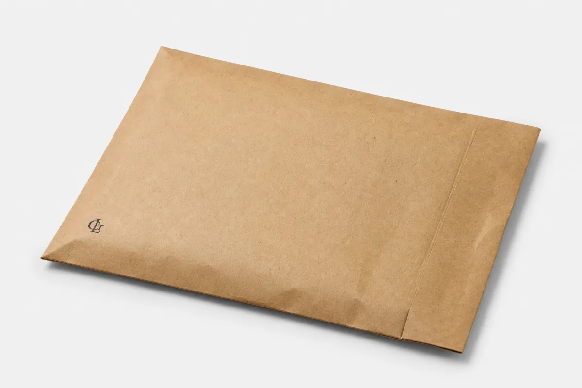
CMYK Printed Kraft Mailers have a habit of changing the conversation once the first sample lands on the desk. They look straightforward in a mockup, but the brown kraft base brings its own tone, texture, and visual temperature into the final piece, and that changes how every line, logo, and photo reads. That is a big part of the appeal of cmyk printed kraft mailers: the stock is not a blank stage. It has character, and good packaging design works with it instead of trying to erase it.
For apparel brands, subscription kits, and flat product shipments, cmyk printed kraft mailers sit in a practical middle ground. They protect the contents, stack neatly, and carry a tactile, material-driven look that feels more grounded than glossy packaging. The tradeoff is real, though. CMYK on kraft does not behave like CMYK on coated white board, so the artwork, finish, and production method all shape the result in a bigger way than many buyers expect. If you are used to white mailers, kraft can be a little humbling at first, but that is also what makes it interesting.
Smart packaging decisions go beyond the artwork file. Substrate, print method, ink coverage, closure style, and fulfillment handling all affect how the finished mailer performs. That wider view is what separates packaging that merely carries a logo from packaging that supports the whole shipping operation. Buyers comparing formats often look at our Custom Packaging Products and, for lighter shipping needs, our Custom Poly Mailers.
Practical rule: bright, exact color matching will shift on kraft. A design built around that reality can make cmyk printed kraft mailers look sharp, confident, and more refined than a safer white-mailer approach.
What Are CMYK Printed Kraft Mailers?
At the most basic level, cmyk printed kraft mailers are paper-based shipping mailers printed with the four process colors used in full-color production: cyan, magenta, yellow, and black. That makes them a strong fit for logos, product imagery, patterns, brand messaging, and layouts that need more freedom than a single spot color allows. In e-commerce, subscriptions, and direct-to-consumer fulfillment, they often serve two jobs at once: they protect the product and carry the brand.
The kraft part matters more than many first-time buyers realize. Kraft stock usually brings a brown, earthy tone and a less reflective surface, so the printed artwork never lands on a blank canvas. Pale colors absorb some of that base tone, darker colors warm up, and subtle gradients can shift more than they would on a bright coated sheet. That is not a defect. It is simply how cmyk printed kraft mailers behave. Once that is planned for in the design stage, the final result usually feels deliberate rather than compromised.
Brands choose cmyk printed kraft mailers for a few grounded reasons. The packaging looks tactile and honest, which suits natural beauty, apparel, wellness, and artisan products especially well. The structure can also do real shipping work, especially when the mailer is built from strong kraft paperboard or reinforced paper stock. The printed surface leaves room for logos, messages, and visuals without the heavier feel of a rigid box. For packaging buyers balancing cost, storage, and brand image, that combination is often hard to beat.
There is a perception advantage too. Brown kraft can read as less polished in a generic sense, but more authentic in a brand sense. A well-planned run of cmyk printed kraft mailers can stand out in unboxing photos and support repeat recognition even when the palette stays modest. The texture does some of the branding before the customer even opens the package, which is why a simple design often ends up looking stronger than a crowded one.
CMYK is not the only path, either. Depending on quantity, artwork, and construction, suppliers may use digital printing for shorter runs, offset printing for cleaner reproduction at scale, or flexographic printing for certain paper structures. Spot color can also make sense when a brand wants a specific logo tone or a stronger single-color identity. The right choice depends on the artwork and the production volume, not only on taste.
The real question in production is not whether the mailer can be printed. It is what the finished piece will look like on that stock, at that quantity, with that finish, and under that kind of handling. That is the lens that makes cmyk printed kraft mailers useful instead of merely decorative.
How CMYK Printed Kraft Mailers Are Produced
Production starts with the substrate. Most cmyk printed kraft mailers are made from kraft paper or kraft-based paperboard selected for foldability, abrasion resistance, and the natural look that supports recycled-content branding. The build can vary a lot. Some mailers stay lightweight and flexible, while others use thicker board so the finished piece resists bending, crush, and edge wear better during parcel handling. That difference shows up quickly once the mailers move through a warehouse.
Once the structure is chosen, the artwork is separated into CMYK channels and prepared for the print method. Digital printing moves more directly from file to output, which makes it attractive for shorter runs or variable content. Offset printing often gives more controlled image quality and more even solids, especially when the design includes photos or detailed gradients. Flexographic printing is common in packaging environments where speed and repeat production matter. For cmyk printed kraft mailers, the method affects both the appearance and the economics, so it is worth deciding early instead of treating it like a last-minute detail.
The brown kraft base changes color behavior in predictable ways. Pure white in the file may not read as white on the finished mailer unless white ink or a white underprint is added, and that is not always necessary or cost-effective. Reds warm up, blues can look deeper or slightly muted, and pale greens or pastels may lose some brightness. That is why cmyk printed kraft mailers work best when the design uses strong contrast, clear type, and color choices that respect the stock rather than assuming the stock will disappear.
Finishing is the next major variable. Some runs stay uncoated so the customer feels a raw paper surface right away. Others get a light varnish or protective coating to improve rub resistance, reduce scuffing, and stabilize the printed area during transit. A matte finish often feels more natural and understated, while a glossier treatment can give stronger image pop, even if it softens some of the earthy appeal that makes kraft attractive in the first place. On cmyk printed kraft mailers, finish is not only a cosmetic decision; it affects handling, durability, and the way the package reads on a doorstep or shelf.
A typical manufacturing sequence goes like this: the kraft material is printed, dried or cured, cut to shape, folded, glued, inspected, and packed for shipment. If the mailer includes a tear strip, tamper-evident closure, or return strip, those features are built into the conversion stage. That matters because the package is not just a printed surface; it is a mechanical object that has to survive folding, adhesive bonding, and repeated handling. Good cmyk printed kraft mailers look clean because the process was set up to support both structure and print quality.
For brands that want a deeper view of the packaging side, it helps to look at standards and testing guidance from recognized organizations. The ISTA site is useful for understanding distribution testing, and the EPA offers a useful view of paper and paperboard sustainability considerations. Those resources do not replace supplier specs, but they do help you ask sharper questions about cmyk printed kraft mailers before a run gets approved.
The main takeaway is straightforward: the look of cmyk printed kraft mailers comes from the interaction of stock, ink, print method, and finish. Ignore one of those pieces and the final result usually shows it.
Key Factors That Change Color, Strength, and Finish
Paper weight and board structure are the first things I check. A mailer that feels crisp in the hand usually starts with a board that has enough stiffness to resist sagging without getting so thick that folding becomes awkward or freight cost jumps. In cmyk printed kraft mailers, that balance influences shelf presence, feed behavior, and the overall feel of the finished piece. If the structure feels flimsy before it is packed, it is probably going to feel flimsy after it has made a few stops in transit.
Ink coverage is another major decision point. Heavy flood coats tend to cost more because they use more ink and can increase the risk of rub or blocking during storage. A cleaner layout with strategic color placement usually prints better on kraft anyway. That is one reason many successful cmyk printed kraft mailers use strong logos, a few well-chosen background elements, and clear typography rather than trying to cover every inch of the surface.
Artwork complexity matters more on brown stock than on white. Small type, hairline rules, delicate gradients, and low-contrast elements can disappear faster once they are printed, folded, and handled in a warehouse. A design that looks elegant on a monitor can turn weak on a mailer if it was built as though the stock were bright white. Buyers who understand cmyk printed kraft mailers usually simplify the layout early, then let the stock color do part of the branding work.
Sustainability claims need careful handling too. Recycled content, paper-based construction, and reduced coverage can support a greener message, but the claim only holds if the material and finish actually support it. Some coatings, laminates, or adhesive systems may complicate recycling. Others are much more compatible with paper recovery streams. If sustainability shapes the positioning for cmyk printed kraft mailers, ask the supplier exactly what is in the structure rather than relying on the marketing sheet alone. That conversation is worth having, even if it feels a little boring.
Finish choices change the customer experience more than many teams expect. An uncoated mailer feels natural and tactile, but it may scuff sooner. A matte varnish can preserve a soft look while improving rub resistance. A more sealed finish can improve color stability, though it can also reduce the raw kraft feel that many brands want. There is no universal best answer. The right finish depends on whether the package is going through a short local delivery network or a rougher national distribution path.
It also helps to think about the product the mailer will carry. A subscription kit with soft goods has different needs than a flat promotional mailer or a return envelope. If the package will hold heavier items, test burst resistance, flap strength, and adhesive performance before the order is finalized. Strong branding is valuable, but cmyk printed kraft mailers still need to perform as shipping packaging first.
| Option | Typical Look | Strength / Handling | Typical Use Case | Relative Cost |
|---|---|---|---|---|
| Uncoated kraft with CMYK print | Raw, earthy, matte | Good, but more prone to scuffing | Apparel, accessories, lifestyle brands | Lower to mid |
| Light varnish on kraft | Slightly smoother, cleaner color | Better rub resistance | Subscription kits, retail shipping | Mid |
| Heavier coated kraft | Sharper image, less raw texture | Better protection from abrasion | Longer transit, higher presentation needs | Mid to higher |
| CMYK with spot color accents | More branded and controlled | Depends on structure and finish | Exact logo colors, premium identity systems | Higher |
One thing I tell buyers often is that color and strength are not separate issues. If the mailer scuffs in transit, the brand impression changes even if the print file was perfect. That is why the smartest cmyk printed kraft mailers are designed with both the image and the distribution route in mind.
For reference, FSC certification can matter when the goal is to support responsible forest sourcing. You can review certification information through the FSC site, then confirm whether the actual kraft material in your order is certified and whether chain-of-custody paperwork is available. For many buyers, that detail strengthens the story behind cmyk printed kraft mailers without complicating the design.
Production Process, Timeline, and Lead Time
The strongest production starts with a complete spec sheet. Before ordering cmyk printed kraft mailers, confirm dimensions, paper weight or board thickness, closure style, flap design, whether a tear strip is included, and how the mailers will be packed for shipping. Those details may feel basic, but they control whether the supplier can quote accurately and whether the finished package will fit the product line without padding or excess space. A missing spec here can snowball into a much bigger problem later.
Artwork setup comes next. The design should be built on the dieline, with all critical text and graphics kept inside safe zones away from folds, seams, and adhesive areas. If the design uses photos, gradients, or subtle tonal changes, expect some variation when the file moves onto kraft. That is normal. What matters is whether the artwork was prepared with that variation in mind so the end result still feels balanced. With cmyk printed kraft mailers, strong prepress work is often the difference between “close enough” and “exactly what we wanted.”
Proofing should not be rushed. A digital proof is standard, but for color-sensitive or high-volume jobs, a physical sample or press proof gives a much better picture of how the mailer will actually behave on the selected stock. You can see how the brown base changes the palette, how dense the ink sits on the surface, and whether the fold lines or closure area affect the artwork. That kind of check is especially helpful for cmyk printed kraft mailers with photography or branded illustrations. It also catches weird stuff that only shows up once paper is folded, which is exactly the stuff people miss on a screen.
After approval, the production sequence usually moves through printing, drying or curing, die cutting, folding, gluing, inspection, and packing. If the run requires special finishing, extra time can be added for varnish, coating, or quality checks. A simple mailer in a straightforward configuration may move faster than a more customized construction, but lead time still depends on how busy the line is, how complex the artwork is, and whether the material is in stock. That is why cmyk printed kraft mailers should be ordered with scheduling buffer, especially if they are tied to a product launch or seasonal shipment.
Here is a useful way to think about timing:
- Simple runs: often 10-15 business days after proof approval, depending on supplier capacity.
- Custom structures or heavier finishes: often 15-25 business days, sometimes longer if sampling is needed.
- Larger quantities: may take longer in production, but can reduce risk of unit cost spikes.
Those are general ranges, not promises. Actual timing for cmyk printed kraft mailers depends on the print method, the factory schedule, freight lane, and whether revisions are introduced during proofing. If a launch date is fixed, the safest move is to approve the artwork early and leave time for sampling before the main run starts.
From a process standpoint, this is where many buyers underestimate the chain reaction. A small artwork change can trigger a new proof. A new proof can push production. Production can push freight booking. Freight can push fulfillment. None of that is unusual. It just means cmyk printed kraft mailers need to be treated like a real supply item, not just a design file with a shipping label.
CMYK Printed Kraft Mailers: Cost, Pricing, and MOQ
Pricing for cmyk printed kraft mailers usually comes down to five big variables: size, material thickness, print coverage, finishing, and quantity. If any one of those changes, the quote can move. A compact mailer with restrained graphics will often price very differently from a larger mailer with full-coverage color and custom coating. That is normal, and it is why comparing quotes without comparing specs wastes time.
MOQ, or minimum order quantity, is often tied to setup cost and production efficiency. The supplier needs to cover plate creation, machine setup, ink, waste allowance, and labor. As volume rises, those fixed costs spread across more units, which usually lowers the per-piece price. For cmyk printed kraft mailers, the sweet spot often depends on whether the print method is digital, offset, or flexographic. Digital can be attractive for smaller runs, while offset and flexo become more economical as quantity increases.
Hidden pricing variables matter too. Freight weight, carton count, warehousing needs, and sampling can affect the landed cost more than the quote line suggests. If the mailers are oversized or heavily built, shipping can become a meaningful part of the total. The cheapest unit price is not always the cheapest real cost once everything reaches your fulfillment center. That is especially true for cmyk printed kraft mailers shipped internationally or stored for months before use.
Artwork complexity also changes cost. A restrained logo treatment or a single bold color accent is usually easier to produce than a full-surface CMYK design packed with rich imagery and dense coverage. In some cases, using a spot color for a logo and keeping CMYK for supporting elements gives a cleaner result and better control over price. That hybrid approach can work very well on kraft, and it is often one of the smarter ways to buy cmyk printed kraft mailers without overbuilding the design.
Here is a practical pricing comparison framework buyers can use when talking to suppliers:
| Spec Profile | Example Volume | Typical Unit Price Range | What Drives the Price |
|---|---|---|---|
| Simple kraft mailer, light CMYK coverage | 5,000 pcs | $0.18-$0.28 | Basic setup, limited ink, straightforward structure |
| Mid-weight kraft mailer, moderate artwork, matte finish | 10,000 pcs | $0.15-$0.24 | More stable run economics, moderate finishing |
| Heavier structure, full-coverage CMYK, added varnish | 20,000 pcs | $0.20-$0.36 | Thicker material, higher ink use, extra print finishing |
| Short-run digital print, custom variations | 1,000 pcs | $0.35-$0.70 | Lower volume, faster setup, higher per-piece production cost |
Those ranges are illustrative and will vary by supplier, region, and spec, but they help frame the discussion. The point is not to chase the lowest number. The point is to understand how cmyk printed kraft mailers move through pricing tiers so you can choose the order size that fits the brand and the inventory plan.
I also recommend asking for quotes at three quantities whenever possible. Pricing at 5,000, 10,000, and 20,000 pieces often reveals where the unit cost drops enough to justify a larger order. If the difference is small, flexibility may matter more than saving a few cents. If the difference is substantial, that can change the economics of the whole packaging program. Either way, cmyk printed kraft mailers deserve the same quote discipline as any other custom packaging item.
Common Mistakes to Avoid Before You Approve Artwork
The most common mistake is designing as if the mailer were white stock. That assumption leads to weak contrast, dull brand colors, and disappointment when the press result arrives. Kraft paper changes brightness and color temperature, which means the artwork has to be designed with that base in mind. Many of the weakest cmyk printed kraft mailers are simply overdesigned for the substrate they sit on.
Small type is another frequent problem. A fine logo tagline or a thin legal line might look crisp on screen, but once it is printed and folded, the result can be harder to read. Stronger type weights, larger line spacing, and simpler hierarchies usually hold up better. The same applies to thin rules or micro patterns. They may disappear into the brown base or break up along folds. For cmyk printed kraft mailers, readability should be treated as a structural feature, not an afterthought.
Ignoring seam areas can get expensive fast. Anything important placed near adhesive zones or fold lines risks distortion, cropping, or interruption once the mailer is assembled. This is especially true when the design uses bands, borders, or full-surface graphics. A clean dieline review prevents a lot of frustration later. I have seen more than one strong packaging concept weakened simply because the artwork was not mapped onto the real construction of the cmyk printed kraft mailers.
Skipping samples can create surprises with scuffing, sizing, and closure performance. A mailer can look excellent flat and still behave badly once it is folded, packed, and shipped. That is why sampling matters. It shows how the material lies, how the adhesive grabs, and whether the visual identity survives normal handling. If you are ordering cmyk printed kraft mailers for a launch, sampling is not optional in my view; it is cheap insurance.
Another issue is assuming all sustainable materials behave the same. Recycled kraft, virgin kraft, coated paper, and different adhesive systems all have different tradeoffs. Some are easier to recycle. Some print better. Some hold up better in damp warehouses or rough parcel networks. A good supplier should explain those tradeoffs clearly instead of hiding behind broad sustainability language. When teams treat cmyk printed kraft mailers as both a branding decision and a logistics decision, they usually get better outcomes.
Useful mindset: the artwork should do more than look nice on screen. It should survive folding, shipping, handling, and opening without losing the message.
Expert Tips and Next Steps for a Better Mailer Run
Start with fewer colors, not more. On kraft, a restrained palette often reads with more authority than a crowded one. One strong focal color, a disciplined black type system, and maybe one accent can make cmyk printed kraft mailers feel sharper than a busy multi-tone design. The stock is already doing part of the visual work, so the artwork should support that rather than overpower it.
Ask for a print sample or at least photos from a previous run on similar stock. What you want to see is not just the logo, but the assembled mailer, the fold quality, and the way the ink sits on the paper. If the supplier can show a sample with the same or similar finish, you will know much more about the real-world appearance of cmyk printed kraft mailers than any mockup can tell you. A render is helpful; a real sample is honest.
It also helps to build a simple approval checklist before production begins:
- Artwork matched to the dieline and safe zones
- Material thickness and construction confirmed
- Print method selected for the quantity and design
- Finish or coating reviewed for rub resistance
- Quantity, lead time, and freight method aligned
- Packaging test plan set for shipping and fulfillment handling
If the mailer will carry heavier items, verify burst resistance, flap adhesion, and closure performance before committing to the full run. A beautiful package that fails in transit is a net loss. The best cmyk printed kraft mailers are the ones that hold up under the conditions the fulfillment team actually sees, not only the ones that photograph well on a design board.
From a buying perspective, it also helps to compare a few sizes before the project is locked. Too much empty space can make a mailer feel flimsy, while too little room can stress the seams or force awkward packing. The right size keeps the product secure and the presentation clean. That small choice often has more impact on the customer experience than another round of color tweaking on cmyk printed kraft mailers.
If you are still early in the process, start by requesting a clear quote, a real dieline, and one proofing round that shows the artwork on the actual kraft stock. Then judge the piece the way a recipient will judge it: by how it looks, how it opens, how it feels, and whether it still looks good after shipping. That is the standard that makes cmyk printed kraft mailers worth the investment.
CMYK printed kraft mailers work best when the design, production method, and fulfillment reality all point in the same direction. Respect the stock, plan for color shift, and keep the structure aligned with the product inside, and the result is packaging that feels purposeful, ships well, and supports the brand without shouting. If you want a mailer that looks good and still behaves like real shipping packaging, that is the line to hold.
FAQs
Are cmyk printed kraft mailers recyclable?
Often yes, if the mailer is made from paper-based kraft and does not use heavy plastic coatings or incompatible laminates. Always confirm the exact construction, because recyclability can change with adhesive type, barrier layers, or specialty finishes. For cmyk printed kraft mailers, the material build matters as much as the print itself.
Do cmyk printed kraft mailers need white ink under the design?
Not usually, but white ink can help when you want brighter highlights, stronger contrast, or cleaner logos on a brown surface. Without white ink, expect the kraft color to influence every printed shade, especially light colors and skin tones. That is a normal part of designing cmyk printed kraft mailers.
How much color shift should I expect on kraft stock?
Expect a warmer, more muted result than the same file printed on coated white stock. The exact shift depends on paper tone, ink coverage, finish, and whether the artwork uses light pastel colors or bold saturated tones. Good proofs make that shift much easier to judge before production of cmyk printed kraft mailers.
What affects the MOQ for cmyk printed kraft mailers?
MOQ is usually tied to setup cost, print method, and how efficiently the supplier can run the size and material on their equipment. More complex finishes or multiple versions of the same design can raise the minimum quantity needed to keep pricing practical for cmyk printed kraft mailers.
How long does production usually take for cmyk printed kraft mailers?
Lead time depends on proofing, quantity, print method, and any added finishing, so simple runs can be faster than highly customized ones. If you need a launch date, build in extra buffer for artwork approval, sampling, and freight so the mailers arrive before fulfillment starts. That buffer is especially useful for cmyk printed kraft mailers tied to seasonal demand or product launches.


