Buyer Fit Snapshot
| Best fit | CMYK Printed Mailer Bags projects where brand print, material claims, artwork control, MOQ, and repeat-order consistency need to be specified before quoting. |
|---|---|
| Quote inputs | Share finished size, material target, print colors, finish, packing count, annual reorder estimate, ship-to region, and any compliance wording. |
| Proofing check | Approve dieline scale, logo placement, barcode or warning zones, color tolerance, closure strength, and carton packing before bulk production. |
| Main risk | Vague material claims, crowded artwork, missing packing details, or unclear freight terms can make a low unit price expensive after revisions. |
Fast answer: CMYK Printed Mailer Bags: Design, Cost & Production should be specified like a repeatable production item. The safest quote records material, print method, finish, artwork proof, packing count, and reorder notes in one written spec.
Production checks before approval
Compare the actual filled-product size with the drawing, then confirm tolerance on folds, seals, hang holes, label areas, and retail display edges. Reserve space for logos, QR codes, warning copy, and material claims before decorative graphics fill the panel.
Quote comparison points
Review material grade, print process, finish, sampling route, tooling charges, carton quantity, and freight assumptions side by side. A quote is only useful when the supplier can repeat the same color, closure quality, and packing count on the next order.
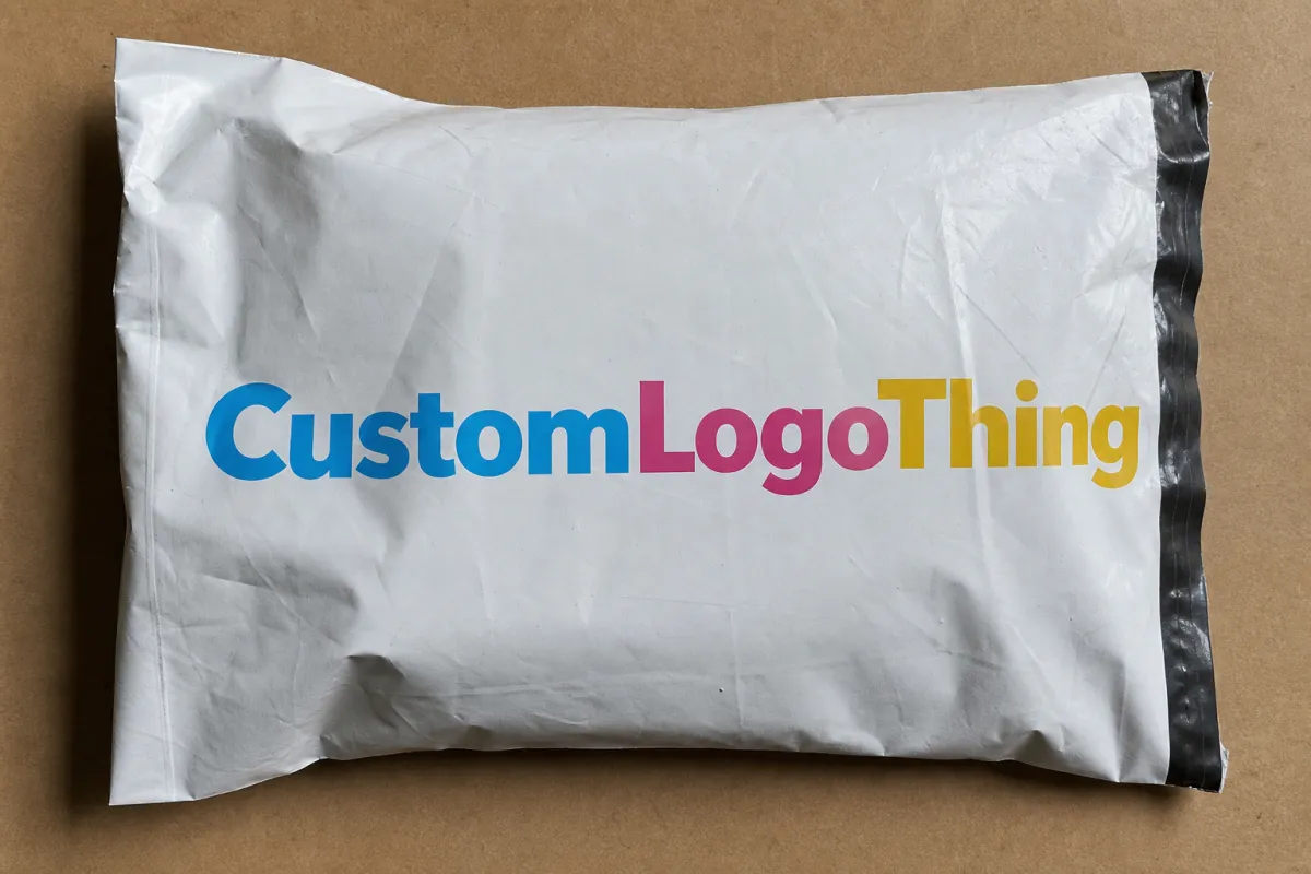
CMYK Printed Mailer Bags: Design, Cost & Production
A mailer bag can look sharp on a screen and still print like it got dragged through a mud puddle. That gap is exactly why CMYK Printed Mailer bags need planning, not optimism and a pretty mockup.
CMYK Printed Mailer Bags: What They Are and Why They Stand Out
CMYK stands for cyan, magenta, yellow, and black. Those four process colors build full-color artwork from tiny dots, which is why cmyk printed mailer bags can handle gradients, photos, layered branding, and busy layouts without forcing you into a single ink color the way spot printing does.
That flexibility matters for brands that do not package the same way all year. Fashion labels, beauty brands, supplement companies, and subscription boxes all use mailers for seasonal artwork, campaign copy, QR codes, and detailed logo systems. A branded mailer does more than hold product. It gives you a larger canvas, a stronger first impression, and one more place to reinforce the brand before the customer even opens the parcel.
The appeal is easy to understand. You get more surface area than a plain shipping bag, and you are not stuck with one or two colors. CMYK sits in the middle ground between bare-bones logo printing and expensive specialty decoration. It also works well if your fulfillment setup already uses Custom Poly Mailers and you want the outside of the package to match the rest of the brand.
There is a catch, because there is always a catch. Bright colors on a mockup do not always survive the jump to a real bag. Fine text can soften. Dark areas can clog up. Gradients can band when the setup is sloppy. On textured or tinted substrates, the same design can come out flatter, heavier, or duller than expected. That usually is not a CMYK problem. It is a file problem, a material problem, or both.
Good packaging has one boring quality: the proof matches the run, the seal holds, and nobody has to explain a color shift to the team.
That is the bar. Not perfection. Just printed mailers that look intentional when they land and survive the ride there.
How CMYK Printing Works on Mailer Bags
CMYK printing uses process color. Instead of printing a separate ink for every shade in the artwork, the press lays down tiny dots of cyan, magenta, yellow, and black in controlled patterns. The eye blends those dots into the final color. On a mailer bag, that has to happen on a surface that bends, stretches a little, and behaves differently from paper. That is why production setup matters so much.
The artwork usually gets separated into color channels before production starts. If the file is prepared properly, the printer can predict how each channel will behave and adjust dot gain, registration, and ink balance to keep the result close to the proof. If the file is messy, the job starts with back-and-forth emails and a lot of fixes that should have happened before quoting. Proofs matter for a reason. A digital proof checks layout and placement. A physical sample tells you what the package really looks like.
Substrate choice changes the print more than most buyers expect. Polyethylene mailers print differently from kraft mailers, and coated surfaces behave differently from matte ones. Glossy film can make color punch harder, but it also shows scuffs faster. Kraft can look earthy and premium, though the base color shifts every ink on top. Dark or metallic films often need a white underprint before CMYK goes down. Skip that layer and the colors sink into the background. That is not clever printing. That is just physics being annoying again.
Full-bleed graphics and a centered logo are not the same job. Full coverage needs tighter control over alignment and ink density because every edge is visible. Photographic work needs smoother tonal shifts so skin, fabric, and product texture do not turn mushy. Flat logo prints are easier. Busy artwork gets less forgiving fast.
A simple way to break it down:
- Digital mockup: useful for layout, spacing, and general composition.
- Printed proof: useful for color behavior, finish, and material interaction.
- Bulk run: the real test, because bags get handled, packed, stacked, and kicked around by people who were not invited to care.
For brands that care about transit performance, print quality should sit next to durability. That is where ISTA packaging test procedures matter. They help check whether a package survives distribution instead of just looking good in a render. If your packaging program includes paper-based outer packs or corrugated pieces, FSC-certified fiber options are worth reviewing early, not after the artwork is locked.
Key Quality Factors That Change the Final Print
The file comes first. Vector logos stay sharp at any size, which makes them safer than low-resolution artwork. Raster images need enough resolution to hold up, and 300 DPI is the practical floor. If the artwork starts soft, the printer cannot rescue it later. Color mode matters too. RGB belongs on screens. CMYK belongs in production files. Converting after proofing is a great way to buy disappointment.
Brand color accuracy is the next fight. CMYK is a process system, so exact spot-color matching is harder than with Pantone or dedicated spot inks. That does not mean brand colors are off limits. It means you need a tolerance range and a proofing step. If the blue in your logo must match across mailers, cartons, inserts, and labels, ask for a printed reference instead of staring at a monitor and hoping for the best. Screens are not loyal.
Material and finish change the result in a real way. A matte mailer softens contrast. Gloss finish makes saturated colors look louder and cleaner. Soft-touch lamination adds a premium feel, but it also shifts how shadows and dark tones read. Kraft gives a natural look, though the brown base warms everything printed on top. That can work beautifully for earthy brands. It can also turn a bright white-blue concept into oatmeal.
Print area and layout deserve more attention than they usually get. Mailer bags have seams, seals, gussets, folds, and often a tear line cutting through the artwork. Put critical text too close to the edge and it can get clipped. Place a logo across a fold and the design breaks once the bag fills out. Safe zones are not there to slow anyone down. They exist because production does not care about wishful thinking.
Durability is the piece people ignore until a warehouse complaint lands in the inbox. Ink adhesion, seal strength, and scuff resistance all matter. If the print flakes during sorting or the seal fails in transit, the bag stops doing its job. Pretty is not enough. A mailer is packaging, not a poster.
Ask suppliers what kind of transit or drop testing they use. Some reference compression or drop methods. Others work to common shipping-test programs. The exact standard depends on the bag type and the distribution path, but the point stays the same: judge a sample in motion, not just under studio lights. If you are comparing mailer bag options, the supplier who can explain the test method usually knows more than the one who only sends a shiny render.
CMYK Printed Mailer Bags Process and Timeline
Good projects move in a straight line: specs, artwork, proof, production, shipping. Bad ones loop forever because the size was never confirmed, the logo file was wrong, or nobody agreed on what “close enough” means. A clean order starts with the basics. Size. Material. Quantity. Print sides. Finish. Delivery address. Deadline. None of that is exciting, and that is exactly why it matters.
- Gather the specs. Bag dimensions, thickness, material type, print coverage, quantity, destination, and target delivery window should all be clear before quoting starts.
- Prepare artwork properly. Add bleed, respect safe margins, convert colors to CMYK, and keep logos sharp. If the art uses fine type, make it large enough to survive the print process.
- Review the proof. A digital proof is good for placement and spelling. A physical sample is better when color precision matters. If the bag needs a white underlay or a special finish, confirm that before the run starts.
- Approve and lock it. Once the proof is signed off, changes get expensive. That is normal. Production lines do not enjoy creative improvisation after setup.
- Produce, cure, finish, pack, and ship. The bag may need drying or curing, then finishing such as slitting, folding, sealing, or carton packing before freight moves it out.
Timeline depends on the order. A sample or prototype often takes about 5 to 10 business days after artwork approval if the spec is simple. Standard production for custom mailers commonly lands around 12 to 20 business days after proof approval. Larger runs, special finishes, or layered artwork can stretch that out. Rush jobs exist, but the fee is rarely small and the margin for error gets thinner if the files are not ready.
That is why a request sent with messy files slows the whole chain. The vendor has to stop, ask questions, wait for revisions, and sometimes rebuild the setup more than once. If the project is time-sensitive, the fastest move is not “rush the factory.” It is “send clean files on day one.” That advice is plain because it works.
The proof is the product. A mockup shows intent. A sample shows reality.
For repeat purchasing, make a short approval checklist and use it every time: size, material, print coverage, color target, finish, quantity, and ship-to details. Simple process habits keep ugly email threads from becoming a second project.
Cost, Pricing, and MOQ: What Actually Drives the Quote
Pricing for cmyk printed mailer bags is not random, even when the quote looks like it was generated by a coin flip. The main drivers are predictable: bag size, film thickness, print coverage, number of colors, finish, quantity, and shipping method. If the artwork sits on one face of the bag, the price is usually lower. If the design wraps across both sides with full bleed, the quote climbs because ink use, setup, and waste all go up.
Minimum order quantity, or MOQ, has a huge impact on unit cost. Lower MOQs help with launches and seasonal drops, but the price per bag rises fast. Higher volumes spread setup cost across more units, which is why a 10,000-piece order usually looks better on paper than a 1,000-piece one. That does not mean small orders are wrong. It means the economics change.
Here is a practical planning range for common mailer-bag scenarios. These are broad estimates, not quotes, and they move with material choice, finish, and freight.
| Order Type | Typical Quantity | Print Style | Estimated Unit Price | Best Fit |
|---|---|---|---|---|
| Simple branded mailer | 1,000-3,000 | 1-2 color logo, limited coverage | $0.18-$0.42 | Basic branding with controlled spend |
| Short-run CMYK mailer | 500-2,000 | Digital printing, partial coverage | $0.90-$2.50 | Testing a new design or seasonal launch |
| Standard full-color mailer | 3,000-10,000 | CMYK with moderate coverage | $0.24-$0.55 | Growing DTC brands and recurring campaigns |
| High-coverage premium mailer | 10,000+ | Full-bleed CMYK with finish upgrades | $0.32-$0.78 | Higher-volume fulfillment where packaging is part of the brand experience |
The table says what buyers need to hear: the cheapest-looking quote is not always the cheapest project. A low MOQ with heavy coverage can cost more per unit than a larger, simpler run. Add matte lamination, soft-touch feel, or scuff-resistant coatings, and the price rises again. That extra spend can be worth it if the bag is a visible brand touchpoint. If the mailer is going straight into a shipping carton or barely seen, the upgrade may be pointless.
There are hidden costs too. Proof fees can show up on custom jobs, especially if a physical sample is needed. If the print method uses plates, those are usually charged separately. Freight can become a serious line item on light but bulky packaging because volume eats truck space fast. Rush fees appear when schedules shrink. None of that is unusual. It just needs to be budgeted instead of discovered after approval.
Printing method also changes the quote. Digital printing works well for lower quantities and fast artwork changes because setup is lighter. Flexographic printing makes more sense for longer runs, especially when the artwork is stable and unit cost matters more than quick swaps. Offset printing is rarely used directly on flexible mailer film, but it can matter across a wider packaging program that includes paper inserts, cartons, or outer wraps. The right method depends on the substrate, run length, and how much flexibility you need in the artwork.
If you want a cleaner comparison point, start with Custom Poly Mailers and compare that baseline against the more decorative version. That usually makes the cost jump easier to explain internally, especially to anyone who thinks packaging is just another box to check.
Common Mistakes Brands Make with CMYK Mailer Designs
The first mistake is treating RGB artwork like it will print the same way. It will not. Screens emit light. Inks reflect it. That difference alone can turn a bright coral into a dusty pink and a lively teal into something tired before the package even leaves the dock. If the file is not converted properly, the press can only work with what it gets.
The second mistake is ignoring trim, folds, seals, and gussets. A logo placed too close to an edge may look fine in layout, then vanish into the seal line during production. Fine text near a fold can warp or break once the bag is filled and flexes. If the design depends on precision, build in safe space. It costs less than a reprint.
The third mistake is forgetting that the substrate changes the color. Kraft, tinted poly, metallic films, and textured finishes all shift the final look. Dark surfaces often need a white ink underlay. Skip that detail and the artwork can go from crisp to murky in a hurry. That is not a small issue. It is the difference between a brand asset and an awkward expense.
The fourth mistake is overloading the design with tiny details. Thin rules, small text, and crowded layouts can look fine on a screen and disappear in real use. Mailer bags get touched, bent, stacked, and sometimes filmed in terrible lighting by someone posting an unboxing. Simple often wins because simple survives handling better.
The fifth mistake is skipping the sample because the deadline feels tight. That is usually fake urgency. One sample can prevent an entire run from leaving with the wrong color, wrong size, or wrong finish. The first bulk shipment is a bad place to find out the logo was scaled incorrectly or the approval note got buried in email.
- Do this instead: build the design around one clear side of the bag.
- Do this instead: keep body copy readable at arm’s length, not just zoomed in on a laptop.
- Do this instead: ask for a proof before production, especially if brand color matters.
- Do this instead: confirm that the print method fits the quantity and the timeline.
The brands that avoid these mistakes usually do one thing differently: they treat packaging like a production purchase, not a mood board exercise. That shift saves time and money in a very unglamorous way.
Expert Tips for Better Results and Next Steps
Start with restraint. It is tempting to turn every side of the mailer into a billboard, but a cleaner design usually performs better. One strong hero panel, a sharp logo lockup, and a controlled palette often beat a crowded bag trying to prove how much the brand can cram onto plastic. The result looks more premium and is easier to keep consistent from run to run.
Think about the unboxing path, not just the render. The customer sees the mailer in motion: on the doorstep, in the hand, past the shipping label, then at the desk or kitchen table. If the graphics fight the label, or the design only works from one angle, the package is doing extra work for the wrong reasons. Plan the art around what stays visible after fulfillment adds its own clutter.
A practical approval checklist keeps projects sane:
- Bag size and thickness confirmed
- Artwork converted to CMYK
- Bleed and safe zone checked
- Color target reviewed against a printed sample
- Finish selected: matte, gloss, or soft-touch
- Quantity and timeline aligned with inventory needs
- Ship-to address and freight method confirmed
That checklist sounds basic because it is basic. Basic work is what keeps expensive work from getting messy.
If you are not sure where to start, compare two routes: a modest logo-focused bag and a fuller branded version. Then look at the price gap beside the customer experience gap. A lot of the time, the right choice is not the most decorated bag. It is the one that matches the product margin and the brand position without pretending the package is a billboard.
For teams scaling from pilot runs to repeat orders, it helps to build a packaging spec sheet and reuse it. The next purchase gets faster, the print expectations get clearer, and the vendor is not trying to decode three versions of the same logo file. If you need to sort out baseline options first, start with Custom Branded Packaging and compare material, finish, and quantity before you commit to a print run.
My blunt advice: do not buy on render quality alone. Buy on proof quality, production consistency, and whether the bag can survive the actual shipment. If those boxes are checked, cmyk printed mailer bags become a smart branding tool instead of an expensive lesson in wishful thinking.
Once your files are clean, your quantity is realistic, and your finish choice fits the product, you are in good shape. That is the point where a quote becomes useful instead of decorative. Treat cmyk printed mailer bags like a production decision, and you usually get better color, fewer delays, and a package that earns its spot in the shipping line.
Frequently Asked Questions
Are CMYK printed mailer bags good for brand logos and photos?
Yes. They work well for multicolor logos, gradients, and photographic artwork when the file is prepared correctly. Strong contrast, clean separation, and a substrate that holds detail all help the final print stay sharp instead of muddy.
What file format should I use for CMYK printed mailer bags artwork?
Vector formats like AI, EPS, or PDF are best for logos and text because they stay crisp at production size. For raster artwork, use high-resolution files at 300 DPI or better, and convert colors to CMYK before proofing so you are not guessing about the output.
How long does production usually take for custom printed mailer bags?
Timing depends on proof approval, quantity, material, and finish. A simple sample may take about 5 to 10 business days, while standard production often lands in the 12 to 20 business day range after approval. Rush orders can move faster, but they usually cost more and leave less room for revision.
What affects the price of CMYK printed mailer bags the most?
Quantity has the biggest effect on unit cost. Size, print coverage, finish, material thickness, and shipping method also move the number around. A small run with full-bleed artwork can cost far more per bag than a larger order with simpler branding.
Can I use CMYK printing if I need exact brand color matching?
Yes, but CMYK is a process system, so exact spot-color matching is harder than with Pantone or spot printing. If color precision matters, ask for a proof, set an acceptable tolerance range, and confirm that range before production starts.


