Coffee roaster printed poly mailers artwork proof checklist
The film is rarely the expensive mistake. The costly part is the error that gets repeated across thousands of bags. That is why an Artwork Proof Checklist matters before anyone approves the run. A wrong character, a logo shifted off-center, or a color that drifts from the brand standard can turn a clean shipping pack into a costly reprint.
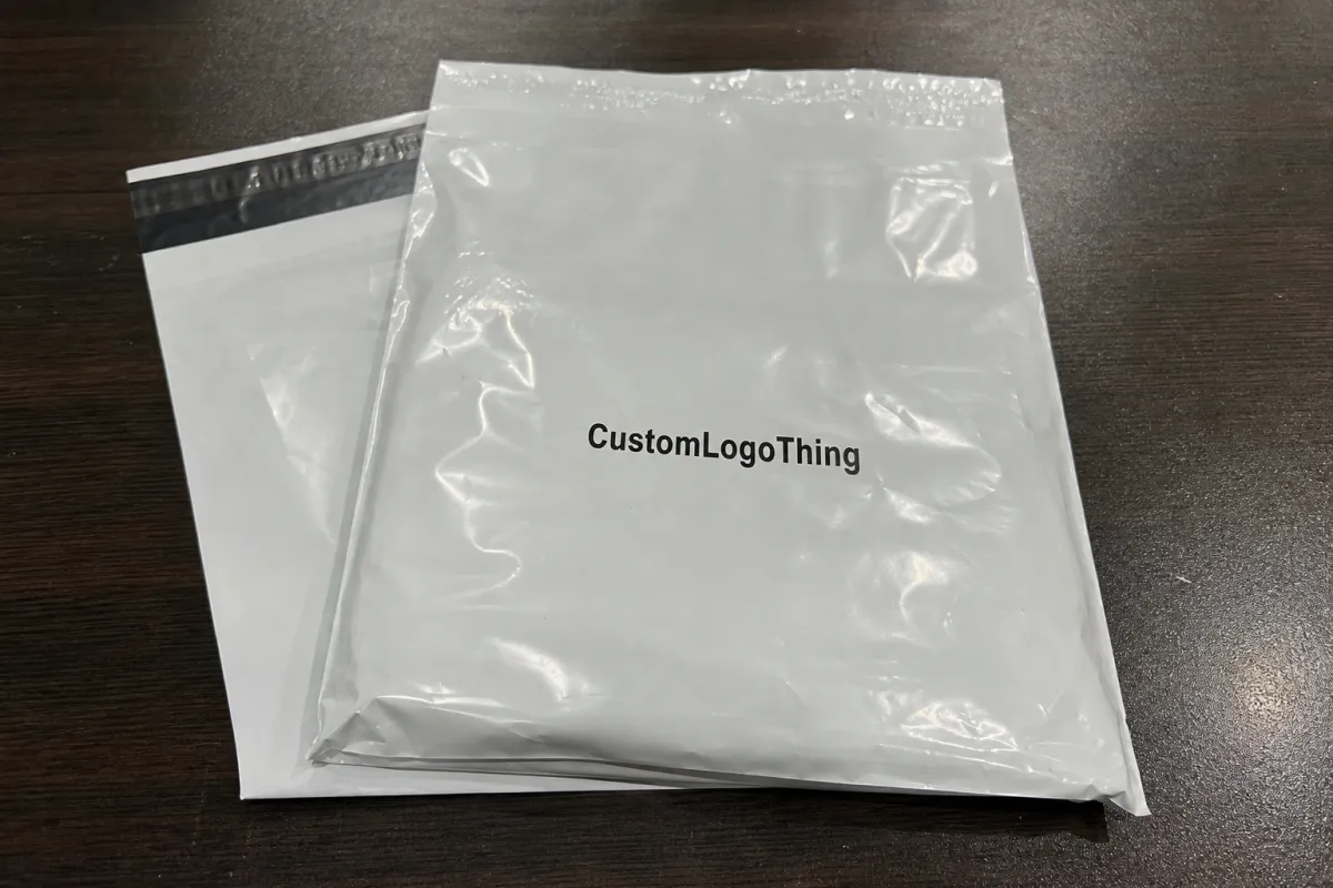
A proof sits between a finished design file and a bag that can be folded, sealed, shipped, and scanned. Screen visuals are not enough on their own. The flat dieline, bleed, safe area, seam zones, label space, and any barcode or return-address placement all need a check. If those details are off, the finished mailer can still look fine in a mockup and fail in production.
Coffee roasters have more moving parts than many brands. The mailer has to protect the shipment, present the brand, and leave room for real logistics. It may need a logo, roast story, handling marks, website, QR code, and shipping label on a flexible surface that shifts when the bag is filled. The proof is where those constraints get sorted out.
Good proofing is not about making the artwork prettier. It prevents waste, keeps the print where the brand expects it, and avoids a late-stage scramble.
How artwork proofs work on printed poly mailers
The process usually starts after the buyer sends final artwork and the supplier confirms the bag spec. Prepress checks the file structure, confirms the dieline, and prepares a proof that shows placement, color intent, and print boundaries. Behind the scenes, someone is checking resolution, font handling, overprint settings, knockout behavior, and whether the layers are named clearly enough to avoid confusion.
A visual mockup helps, but it is not the same as a production proof. A render can place the logo in the right spot and still miss the side seam, gusset, or the way the film folds when the bag is filled. A production proof shows whether the print survives the real structure. That is the point. If a design depends on perfect symmetry, flexible packaging will expose the weakness quickly.
For roasters, this is also where practical questions show up. Is the bag size right for the ship-from workflow? Does the finish make dark ink look muddy? Is there enough room for the label without crossing a crease? Has the file been mirrored by accident? These are boring questions, and boring questions save money.
Most proof failures are not design failures. They are interpretation failures. The file gets translated by someone who was not in the original conversation, and a detail that felt obvious was never documented clearly.
If you want a broader packaging reference point, the Institute of Packaging Professionals has educational material on package design and testing, and ISTA publishes parcel test standards that help brands think beyond graphics and into shipping stress.
Cost, pricing, and MOQ factors that change your quote
Price depends on more than the artwork. Bag size, film thickness, print colors, finish, and whether the order uses a standard spec or a custom dimension all affect the quote. A simple one- or two-color design is usually cheaper to set up than a full-coverage layout that prints across every visible panel. Heavy ink coverage, tight color matching, and specialty finishes usually raise setup and material costs.
Most coffee mailers use coextruded poly film in the 2.5 to 3.0 mil range, often LDPE or an LDPE/LLDPE blend. Thicker film can feel more substantial, but it also changes cost and can affect fold memory, seal behavior, and how sharply fine type holds on the surface. A glossy white film hides dust and fingerprints better. A matte finish can feel more premium, but it may mute some colors. Each choice solves one problem and creates another.
MOQ changes the quote just as much. Setup cost, plate prep, and press calibration are fixed whether the run is 2,000 bags or 20,000. Smaller runs carry more of that cost per unit. A roaster testing a new bag size or seasonal design may pay more per piece on a pilot order, but that can still be the smarter move. Catching a mistake on 3,000 bags hurts less than catching it on 30,000 bags.
Proof-related charges can show up too. Extra revisions, printed samples, spot-color matching, and another approval round all take time and labor. The cleanest way to control cost is to send one final internal version, not a draft that still needs several people to "just tweak a few things."
| Proof option | Typical cost impact | What it confirms | Best use |
|---|---|---|---|
| Digital proof | Usually included or low cost | Placement, copy, dieline, and basic color intent | Early approval when the artwork is already final |
| Printed sample | Often about $50-$150, sometimes more with shipping | Material feel, finish, and real-world layout balance | First-time mailer runs and brand-critical jobs |
| Press proof | Usually the highest cost, often several hundred dollars or more | Closest match to actual production output | Large orders or projects with strict color expectations |
For buyers comparing formats, a Custom Poly Mailers quote often looks very different from a carton or insert quote because the film gauge, print method, and conversion process all affect the final number. If you are building a wider shipping system, the Custom Packaging Products page is useful for comparing what belongs in the outer shipper versus what belongs inside the box.
Process and timeline: from dieline to final approval
The process is straightforward when the buyer sends complete information. It starts with requested specs, then the supplier shares the dieline. The designer builds the artwork on that dieline, the proof comes back for review, and the buyer collects internal feedback before signing off. In practice, trouble starts when one of those steps is treated like an optional suggestion.
Timeline depends on how complete the file is at the start. A clean proof with final copy and vector artwork can move quickly. Custom layouts, barcode testing, or brand approvals from multiple departments add time. If a QR code needs to be checked for scanability, or if the shipping label zone has to be reserved exactly, the schedule should include that review. A typical custom mailer job often moves from proof approval to production in about 12-15 business days, but color complexity, order size, and material availability can stretch that window.
The usual delay triggers are predictable: missing fonts, low-resolution logos, vague copy, and late changes to the bag size or shipping information. Coffee brands also create delays by splitting the decision across marketing, operations, and fulfillment without naming a final approver. Marketing wants the story polished. Operations wants the label zone bigger. Fulfillment wants the bag to pack fast. All three need to agree before the proof lands.
The simplest way to keep the schedule on track is to send one complete approval package: final copy, logo files, barcode or QR instructions, size confirmation, and a single person who can actually approve the work. If the proof has to wander through six inboxes, the calendar slips.
Step-by-step file review for copy, color, and layout
The easiest way to review a proof is to follow the order a customer will notice it. Start with the copy. Brand name, product name, roast notes, website, QR code, legal text, and shipping info all need a line-by-line check. A mailer proof often looks fine at first glance, then one small typo hides in a corner or a CTA points to the wrong URL.
After the text, move to color. Confirm the approved palette, check for any spot-color requirements, and compare the proof against the brand standard under consistent lighting. Digital proofs can only show so much. If the project depends on a precise red, deep black, or a quiet gray, ask how the supplier is matching it. Small shifts are easy to miss on screen and obvious on press.
Layout comes next. Check the logo size, the balance of whitespace, the alignment of repeat elements, and the safe distance from seams, folds, and cut edges. A centered mark on a flat file can look too close to the edge once the bag is converted. Barcode and QR placement deserves a close look too. Scannable codes need enough contrast and quiet space to work after printing.
Finish with the production notes. Make sure the dieline version matches the order, the quantity is correct, the address or label area is right, and any special instructions were captured. If anything changed after the first round, that change needs to appear in the proof, not just in an email thread.
Common mistakes coffee roasters make on mailer proofs
One common mistake is approving a proof before the final shipping workflow is settled. The team may like the design, but the label area is too small for the real carrier sticker or the return address lands on a fold. That creates a clean-looking mailer that is awkward to use.
Another frequent issue is treating screen color as the final answer. A rich coffee-brown that looks perfect on a laptop can print flatter than expected on film. Matte and glossy finishes behave differently too, which is why the sample stage matters when color is part of the brand story.
Font problems create their own mess. Missing fonts, flattened text, and tiny legal lines are easy to overlook if the file gets passed around without a careful preflight. Once type is rasterized or outlined incorrectly, fixing it can take another round of file cleanup.
Late copy changes cause plenty of trouble as well. A product name change, a new URL, or a last-minute sustainability claim can ripple through the whole proof. The safest habit is to freeze the copy before the artwork enters the proof stage. Every extra change gives the file another chance to slip.
Expert tips and next steps before you approve
Print the proof or view it at full scale when possible. A design that feels balanced at thumbnail size can look crowded when it is enlarged. Real-size review helps catch spacing problems, tiny type, and barcode placement before the job moves forward.
Ask for one person to own the approval. If marketing, operations, and fulfillment all send separate sign-offs, someone will eventually approve an outdated version. A single decision-maker keeps the process clean and avoids crossed wires.
Keep a record of the final proof, the version number, and any notes that were agreed to in writing. That documentation makes reorders easier and gives the team a reference point if the next run needs a small change.
If the project is a first run, a printed sample is often worth the extra step. It gives the team a real surface to inspect, which is a better test than a screen image when packaging has to do real work.
FAQ
How long does proof approval usually take? A clean file can move in a day or two. Multiple reviewers, missing assets, or color questions can stretch that to several days.
Do coffee roasters need a printed sample? Not always, but it helps when the mailer is brand-critical, the color is specific, or the team has never used that size before.
What slows the proof process most? Missing fonts, unclear copy, and late design changes are the biggest delays. Unclear ownership inside the buyer's team slows things down too.
Why does the dieline matter so much? It shows where print can safely go. Without it, artwork can land on seams, folds, or cut edges and cause problems in production.


