One swapped logo file, one wrong shade of blue, one missing bleed. That is enough to turn a clean gift drop into a reprint nobody wanted. The corporate gifting Printed Poly Mailers Artwork Proof checklist matters because the mailer is doing three jobs at once: protecting the shipment, selling the brand, and setting the tone before the recipient even opens the package. Miss the art details and the whole thing reads cheaper than it should.
For branded gifting, the proof is not admin noise. It is the last real checkpoint before film, ink, press time, and freight are committed to one version of the artwork. That is why the review needs to be specific, not polite. A good proof catches the things that look small on a screen but become obvious on a finished bag.
Why Proofs Matter Before a Single Mailer Is Printed
Buyers sometimes treat proofs like a courtesy step. That attitude gets expensive fast. Once production starts, even a minor error can lock in the wrong color, wrong placement, or wrong quantity. Fixing it later usually means paying twice.
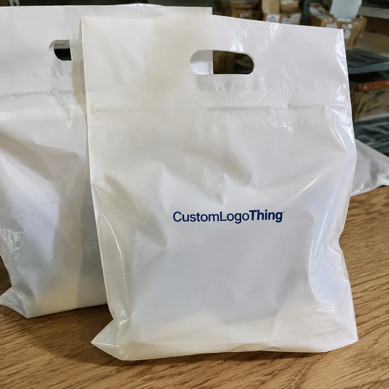
Printed Poly Mailers are not hidden behind a warehouse shelf. They are handled by staff, photographed on desks, and seen again at home or in the office. That makes the artwork more visible than on a plain shipping pouch. A logo that is a little too small, a headline that sits too close to the seal, or a background that prints darker than expected changes how the entire gifting program feels. The bag stops looking intentional and starts looking rushed.
One detail tends to get overlooked: the proof is the point where brand expectations meet production reality. A designer may be thinking in pixels and brand guides. A printer is thinking in film width, registration, seam placement, and how much ink the material can actually hold. Both views matter, but only one version makes it onto the bag. The proof should reconcile them before anyone approves the job.
"The fastest way to slow a mailer project is to approve a proof nobody actually reviewed."
That is not a dramatic line. It is just how these projects fail. The damage usually comes from a pile of small misses: a typo in the tagline, a logo version that is no longer current, a panel orientation mistake, a Pantone number left unconfirmed, or art that slips outside the safe area by a few millimeters. Alone, none of those sounds fatal. Together, they create reprints, delays, and some awkward conversations.
What an Artwork Proof Should Show, Line by Line
Not every proof carries the same weight. A digital mockup is a visual preview. A production proof is a setup check. A press proof, when available, gives a closer read on how the job behaves under actual print conditions. Buyers use the word "proof" for all three, but they should not be treated as equal.
A proper proof should show the artwork at the correct size, the correct location on the panel, and the correct orientation once the bag is formed and sealed. It should also show the bleed, the safe zone, and any seam or flap restrictions. If the mailer has a tear strip, adhesive flap, gusset, or fold line, those details need to be visible. A design can look centered on screen and still land awkwardly once the bag is full and handled in real use.
The dieline is the map. The artwork is the passenger. Mixing those up causes trouble. The bag shape controls what the printer can do, and the print area is usually tighter than people expect. Thin lettering, fine rules, and small legal copy may look sharp in a PDF but lose clarity on flexible film. A screen is useful for review, but it is not the finished product. Color on a monitor is a reference, not a promise.
For teams building a broader packaging program, it helps to review the full Custom Packaging Products mix at the same time so the mailer, tissue, and box do not drift into different versions of the same brand. If the campaign centers on bags, the Custom Poly Mailers page is also useful for comparing sizes, closures, and print styles before the artwork gets locked.
Another thing the proof should make obvious: what is final and what is still editable. Placeholder text, sample shipping notes, a temporary color block, or a logo used only for layout testing should be flagged before approval. Ambiguous files create expensive assumptions. A clean proof says exactly what will print and exactly where it will land.
| Proof Type | Typical Use | What It Confirms | Typical Cost Impact |
|---|---|---|---|
| Digital mockup | Early concept review | Layout, scale, overall look | $0-$25, often included |
| Production proof | Pre-approval sign-off | Panel orientation, safe area, print-ready setup | $25-$75 |
| Press proof | Higher-risk brand programs | Ink behavior, color approximation, physical output | $75-$250 |
Process and Timeline: From File Upload to Approval
The cleanest projects follow a simple path. Artwork is uploaded. The supplier checks format, resolution, font handling, linked images, and whether the file actually fits the dieline. A proof gets generated. The buyer reviews it. Brand, procurement, marketing, and sometimes finance weigh in. Then the approved file goes to production.
That sounds orderly because it is. The delays usually happen between those steps, not inside them. A marketing lead wants a brighter brand color. Procurement wants a quantity change. Finance wants the shipping line revised. None of that is unusual. It just means the proof clock keeps resetting while the team debates details that should have been settled earlier.
Timing depends on complexity. A one-color logo on one side of the bag can move quickly. A multi-color design, a full-wrap pattern, or art that needs panel-by-panel correction takes longer. If the supplier needs to convert non-print-ready artwork, rebuild the layout, or reconcile a brand color that does not translate cleanly into CMYK, expect another review cycle. Clean files shorten the loop. Messy files stretch it.
For planning, many printed poly mailer orders can get a first proof back in 24-48 hours once the file is usable. Production often starts only after approval, and the total lead time can land around 12-15 business days from sign-off, depending on quantity, print method, and current capacity. Rush orders are possible, but only if the art is already clean and the production schedule has room.
That timeline matters more than it looks. A late proof approval can create freight pressure if the bags are tied to a launch date, holiday drop, or executive gifting program with a hard delivery window. Print, pack, and ship are linked. Delay one piece and the rest of the schedule moves with it.
One practical fix: assign ownership before the first file upload. One person should control brand approval. One person should confirm quantity and budget. One person should own shipping details. That sounds formal, but it avoids the classic failure mode where four people assume somebody else approved the final version.
Material choice affects timing too. A 2.5 mil co-ex poly mailer usually prices and ships differently than a 3 mil bag built for stronger puncture resistance or better opacity. Heavier film can feel more premium, but it also costs more and can slow things down if the supplier is juggling multiple material grades. That is a tradeoff, not a flaw. Buyers just need to know it exists.
Cost, Pricing, and MOQ Variables That Move the Quote
Pricing for custom mailers is never just one number. It is a set of decisions bundled into one quote. Quantity, bag size, print method, ink coverage, color count, one-side versus two-side print, film thickness, opacity, and shipping destination all move the price. Two bags can look similar in a mockup and still cost very differently once the production details are clear.
MOQ matters because setup costs do not shrink just because the order is small. On a 500-piece run, the artwork prep and press setup get spread across fewer bags, so the per-unit cost jumps. On a larger run, the same setup is distributed more efficiently. As a market range, a small custom run can land around $0.30-$0.60 per unit or higher depending on print complexity, while a 5,000-piece single-color run may fall closer to $0.18-$0.28 per unit. That is a range, not a promise. The details drive the final number.
There are also the costs people forget to ask about. Plate charges may appear on one estimate and not another. Rush production can add a premium. A thicker film, higher-opacity material, or tighter brand color matching can move the quote up. Freight matters too, especially if the mailers are headed to several sites instead of one warehouse. A low per-unit price is not much of a win if shipping swallows the difference.
Flexographic and gravure setups behave differently as well. Flexo can be a better fit for simpler artwork and mid-size runs. Gravure usually makes more sense at higher volumes, but the cylinder cost can be harder to absorb on a small order. If a supplier does not spell out the print method, ask. It changes both the quote and the proof review.
The smartest comparison is apples to apples. Same artwork. Same quantity. Same film spec. Same print method. Same ship-to terms. If one quote looks lower but hides setup, freight, or a vague proof stage, the savings can disappear fast. A cheaper front page is not cheaper if the project needs a reprint.
For programs that include multiple packaging items, group them in the same approval flow. A box, insert card, and mailer often share the same launch date and the same brand rules. If the artwork is reviewed separately, inconsistencies creep in. The mailer starts to look like it belongs to a different campaign.
Standards can help frame expectations. ISTA references are useful for handling and transit questions. FSC is relevant for paper-based components if the package includes inserts or boxes with sourcing claims. Those standards do not solve art approval, but they help teams ask better questions before the order is locked.
| Scenario | Likely Cost Pressure | Buyer Risk | Best Move |
|---|---|---|---|
| Small run, heavy artwork | Higher setup cost per unit | Proof misses feel expensive | Simplify the design and verify the dieline first |
| Large run, single-color logo | Lower unit cost | Oversights scale fast | Lock color and placement early |
| Rush order with revisions | Expedite fees and schedule pressure | Approval shortcuts | Freeze artwork before ordering |
Step-by-Step Corporate Gifting Printed Poly Mailers Artwork Proof Checklist
Here is the practical version of the corporate gifting printed Poly Mailers Artwork Proof Checklist. Start with the source file. The cleanest results usually come from editable vector art such as AI, EPS, or a print-ready PDF. Fonts should be outlined or embedded. Linked images should be high resolution, not just sharp enough for a slideshow.
Next, check the brand details. Is the logo current? Is the scale correct? Are the approved colors present? Is the tagline exact? Are legal marks, certification symbols, and trademark indicators still intact? These are easy to miss in a quick review, which is exactly why they deserve a slower one.
Then move to the layout. Measure where the art sits relative to the mailer size, the seal edge, and any seam, fold, or adhesive flap. If the design is meant to feel centered once the bag is full, the proof should reflect that. A technically aligned file can still look off if the visual center is too high, too low, or pushed into a seam zone.
Now check the print mechanics. A useful proof should call out bleed, safe area, and any panel rotation. If the design wraps around the bag, the back panel should not be guessed at. If the print includes tiny copy, ask yourself a blunt question: would this still read cleanly at arm's length? If the answer is no, the art probably needs to be simplified.
Operational details belong on the same list. Confirm the ship-to address, carton count, pack instructions, and whether the proof reflects the final quantity. A surprising number of delays have nothing to do with printing and everything to do with fulfillment notes that changed after approval.
- Confirm the file is print-ready and in the right format.
- Verify logo scale, placement, and spacing.
- Check bleed, safe area, and edge clearance.
- Review color names against brand standards.
- Inspect type size, line weight, and readability.
- Confirm panel orientation and dieline alignment.
- Check seam, flap, and closure placement.
- Confirm carton count, ship-to details, and label copy.
- Get one named decision-maker to sign off.
The final step is recordkeeping. Save the approved proof, the final art file, the quote, and the production notes in one shared folder before the job moves ahead. If the same mailer gets reordered later, nobody should have to reconstruct approval history from a mess of email threads. Reorders run smoother when the approved version is easy to find.
For programs that need repeat consistency, lock in the production details that matter most: material thickness, print method, approved color values, bag size, and final pack instructions. If those drift from order to order, the brand starts to look inconsistent even when the logo is technically the same. That is how a strong campaign starts to feel off by the third shipment.
Common Mistakes That Create Reprints, Delays, and Waste
The most common mistake is approving artwork that looks fine on a laptop but fails on flexible film. Thin lines soften. Small text loses clarity. Low-contrast logos disappear against busy backgrounds. Proofs exist to catch those problems before they become waste.
Color causes the next round of trouble. A monitor, an office printer, and a finished poly mailer are not the same thing. They never have been. If someone says "close enough" without checking brand standards, the gap can be bigger than expected. For color-critical jobs, ask how the printer handles CMYK conversion, Pantone approximation, and film color influence. The print method matters more than the mockup suggests.
Rushed approvals also miss practical issues like art sitting too close to the edge, tiny legal copy, or a logo that gets crowded once the bag is filled. None of that feels dramatic in review. It feels small. That is exactly why it slips through. A premium gift package depends on restraint. Crowded art makes the mailing feel less considered.
File prep mistakes are just as common. A linked image gets lost. A font is not outlined. The artwork is exported at the wrong size. The design gets flattened too early and loses editable layers. These are basic production errors, but they still show up in real orders because the file passed through too many hands before it reached print.
The business cost goes beyond the bag itself. A misprinted mailer can delay the campaign, force an emergency reorder, and add freight expense if corrected bags need to move fast. It can also change how the gift is received. In corporate gifting, presentation is part of the message. A weak package makes the whole program feel less planned.
Industry references help with the non-art side of the job. ISTA standards are useful for transit and handling expectations, while ASTM references help teams speak the same language about performance and material behavior. Not every supplier tests to the same level. Ask direct questions and do not assume the proof covers durability just because the artwork looks right.
Next Steps: Lock the Proof and Keep Reorders Consistent
Once the proof is approved, keep the paperwork tight. Store the final artwork, signed proof, quote, and production notes in one place. Assign one person to own future changes so comments do not scatter across threads. That single habit prevents a lot of rework on repeat orders.
It also helps to keep the internal review list boring and consistent: brand, quantity, budget, shipping, and fulfillment. Boring is good here. Packaging projects do not fail because teams lacked creativity. They fail because the basics were not locked early enough.
If a reorder is likely, reuse the same proof standards every time. Confirm the same bag size, same material thickness, same print method, same approved color values, and same delivery terms. If a new request changes any of those, treat it like a new order, not a casual duplicate. That keeps the work honest and the result consistent.
A clean proof today is usually the cheapest insurance policy on tomorrow's reorder. Nothing glamorous about that. Still true.
What should be checked in a corporate gifting poly mailers artwork proof?
Check logo size, placement, colors, spelling, bleed, safe area, panel orientation, seam clearance, and any legal or brand marks that must stay visible. The checklist works because it keeps the review focused on the details that actually affect print quality.
How long does the proof approval process usually take for printed poly mailers?
A clean file can move quickly if one decision-maker reviews it. Multiple stakeholders, revisions, or custom color matching can add days before production begins, so the calendar often depends more on internal response time than on press time.
Does MOQ affect the artwork proof or just the price?
MOQ mainly affects pricing, but it can also change how the proof is set up if the print run, carton count, or packaging format changes. Ask for the proof to reflect the exact ordered specs so there is no mismatch between approval and production.
What file format is best for corporate gifting mailer artwork?
Vector files such as AI, EPS, or PDF usually give the cleanest print result for logos and text. High-resolution linked artwork matters too, especially when the design includes detailed graphics or small type.
What are the most common proof mistakes buyers miss?
The biggest misses are tiny text, wrong placement, and assuming monitor color is final print color. Teams also forget to verify quantities, ship-to details, and whether the proof matches the final dieline, which is why the checklist pays for itself quickly.