Buyer Fit Snapshot
| Best fit | Compare Gloss and Soft Touch Mailers for Better Branding projects where brand print, material claims, artwork control, MOQ, and repeat-order consistency need to be specified before quoting. |
|---|---|
| Quote inputs | Share finished size, material target, print colors, finish, packing count, annual reorder estimate, ship-to region, and any compliance wording. |
| Proofing check | Approve dieline scale, logo placement, barcode or warning zones, color tolerance, closure strength, and carton packing before bulk production. |
| Main risk | Vague material claims, crowded artwork, missing packing details, or unclear freight terms can make a low unit price expensive after revisions. |
Fast answer: Compare Gloss and Soft Touch Mailers for Better Branding should be specified like a repeatable production item. The safest quote records material, print method, finish, artwork proof, packing count, and reorder notes in one written spec.
Production checks before approval
Compare the actual filled-product size with the drawing, then confirm tolerance on folds, seals, hang holes, label areas, and retail display edges. Reserve space for logos, QR codes, warning copy, and material claims before decorative graphics fill the panel.
Quote comparison points
Review material grade, print process, finish, sampling route, tooling charges, carton quantity, and freight assumptions side by side. A quote is only useful when the supplier can repeat the same color, closure quality, and packing count on the next order.
If you need to compare gloss and soft touch mailers for a live e-commerce launch, start with the part people usually underestimate: the finish changes the entire read of the package. Same artwork. Same logo. Different mood. Gloss is brighter, sharper, and a little more impatient. Soft touch is quieter, denser, and more deliberate. That split matters once the mailer leaves a design deck and starts living in a warehouse, a courier bag, and somebody's camera roll.
For apparel, beauty kits, gift sets, and subscription orders, finish is not decoration. It affects how the brand feels in hand, in transit, and on unboxing day. The wrong choice can make a premium product feel cheap, or make an energetic brand feel sleepy. Fun stuff. This article breaks down the practical side of the decision: print behavior, grip, scuff resistance, cost, turnaround, and what actually survives real fulfillment.
Quick Answer: Compare Gloss and Soft Touch Mailers in Real Use
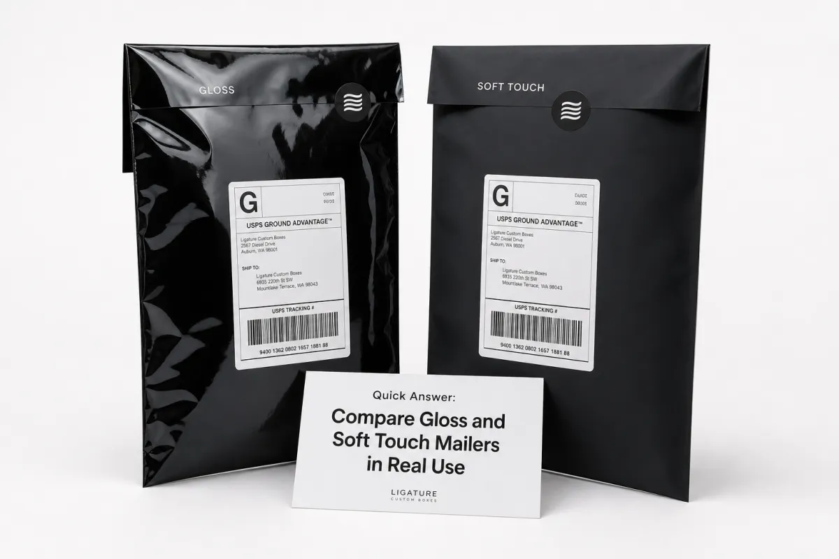
Here is the short version after you compare gloss and soft touch mailers side by side: gloss usually wins on color pop, visual energy, and lower unit cost, while soft touch usually wins on tactile feel and premium presentation. That sounds tidy. Real life is messier, which is why the sample in your hand matters more than the render on your screen.
Gloss reflects light, so saturated reds, blues, and black logos can look sharper and more aggressive in a pile of parcels or on a retail shelf. Soft touch cuts the shine and gives the surface a flatter, velvety look that many buyers read as more premium before they ever touch the product inside. If you want the parcel to announce itself from across the room, gloss is usually the louder choice. If you want the package to feel intentional and expensive without shouting, soft touch usually does the job better.
Handling is different too. Gloss feels slicker, which can look crisp, but it can also slide around more on a packing bench. Soft touch has a gentler grip and usually feels more substantial in the hand, even when the substrate is similar. So when you compare gloss and soft touch mailers, do not stop at appearance. Think about how your team seals them, stacks them, and ships them all day long. A pretty sample sitting on a desk does not have to survive a fulfillment line. Real mailers do.
My blunt view: if the brand needs bright color and a sharper price point, gloss is hard to beat; if the goal is a quieter luxury signal, soft touch usually earns the extra spend.
One more thing before you lock it in. The best finish on a sample card is not always the best finish in transit. A mailer can look perfect under studio lights and then pick up fingerprints, scuffs, or glare once it starts moving through bins, trucks, and sorting centers. Smart teams do not compare swatches and call it done. They compare filled samples, packing flow, and phone photos taken in real light. If you want a broader packaging starting point before narrowing the finish, Custom Logo Things has useful product categories like Custom Packaging Products and the dedicated Custom Poly Mailers page for branded shipping options.
For teams that want a more technical benchmark, transit testing standards are worth a look. ISTA test methods and common distribution tests such as ASTM D4169 help buyers think about abrasion, vibration, compression, and handling instead of trusting color chips like they are prophecy. That matters because finish is only one piece of the durability picture. Film gauge, seal quality, and print adhesion still do a lot of heavy lifting.
Top Options When You Compare Gloss and Soft Touch Mailers
When buyers compare gloss and soft touch mailers, they are really comparing two different ways to tell the same brand story. Gloss is the louder choice. It tends to amplify saturated artwork, bold logos, and high-contrast graphics, especially with full-coverage print or a big central mark. Soft touch is the more restrained choice. It softens the same artwork and gives minimal layouts, monochrome branding, and editorial-style graphics a more deliberate look.
That difference matters because packaging is often the first physical brand touchpoint a customer gets outside the website. Streetwear, promotional bundles, fast-moving seasonal merch, and bright youth-focused designs usually benefit from gloss because the finish carries the energy. Beauty, skincare, premium accessories, and curated subscription kits often fit better with soft touch because the packaging says care without acting like it needs a megaphone.
The answer shifts again depending on whether you are ordering stock-printed mailers, Custom Printed Mailers, or a fully branded run with artwork across most of the surface. More ink coverage means the finish has more influence on the final look. Gloss can make dense graphics look sharper and more vivid, though it can also create glare in photos. Soft touch usually gives artwork a flatter, richer appearance, which creative teams often prefer because it feels calmer and more expensive without trying too hard.
- Choose gloss if the goal is brighter color, stronger shelf visibility, and a lower-cost branded look.
- Choose soft touch if the goal is a tactile, elevated feel that supports premium positioning.
- Choose gloss for bold promotions, influencer mailers, and everyday apparel shipments.
- Choose soft touch for beauty, giftable goods, and brands that want the parcel to feel collectible.
There is no universal winner when you compare gloss and soft touch mailers. A loud graphic can look flat on soft touch if the contrast is weak. A minimalist logo can feel underpowered on gloss if the brand depends on restraint, texture, and tactile detail. The cleanest process is simple: review the artwork first, then the shipping environment, then the budget. That order avoids a pile of revisions nobody asked for.
Detailed Reviews: Print, Grip, and Unboxing Experience
Strip away the marketing gloss, and the real test is how the finish behaves on a packing line. I pay attention to grip, stacking, and the feel of the mailer when it gets pulled from a carton and sealed in a rush. Gloss usually feels smoother and more slippery. Fine, if that is the look you want. Less fine if the fulfillment team handles thousands of pieces a week and starts muttering under their breath. Soft touch usually feels less slick, which makes it easier to control in hand and often nicer for the person packing orders all day.
Print behavior is where the compare gloss and soft touch mailers decision becomes visible to almost everyone. Gloss tends to intensify color and sharpen contrast, so logos appear more vivid and energetic. The catch is reflection. Under bright warehouse lights or a phone flash, gloss can bounce light back in a way that masks fine details or makes dark fields look uneven in photos. Soft touch reduces that shine. Artwork often looks more composed, and solid color areas tend to read smoother because the surface is not fighting the image.
Scuffs and fingerprints deserve a real-world look, because this is where buyers get surprised. Gloss can show scratches and surface scuffs more clearly under strong light, especially after rubbing against other parcels in a tote or conveyor bin. Soft touch can hide some glare, but it is not magic. Heavy handling can leave burnished marks, and the surface may wear differently depending on the coating system and film thickness. That is why I never judge a finish from one pristine sample. I want to see filled samples after they have been stacked, carried, and slid around like actual parcels. You know, the thing they are supposed to do.
Shipping Abrasion Testing
For shipping abrasion testing, a simple field method tells you a lot. Fill the mailer with the actual product load, seal it, then rub it against a rough carton edge, stack it under a few other parcels, and leave it alone for a day. After that, inspect it under bright light and again with a phone camera. If the finish is gloss, look for scuff lines and hot spots from reflection. If the finish is soft touch, look for burnishing or a dull patch where handling compressed the surface. Teams that want a formal benchmark can align internal testing with ISTA-style transit checks, especially if the mailer has to survive repeat handling or long parcel chains. If the route is rough, test it like the route is rough. Otherwise you are just decorating a guess.
Unboxing Perception
The unboxing moment is where finish becomes memory. Sound plays into it too. A gloss mailer can feel crisp and purposeful when the customer tears it open, while a soft touch mailer usually feels quieter and more refined before the product is even visible. That first tactile impression changes what the customer expects next. If the packaging feels premium, the product starts with a better setup. If the surface looks bright and lively, the brand can feel younger and more direct. That is why teams that compare gloss and soft touch mailers should ask not just, "Which looks better?" but also, "Which one sounds and feels like the brand I want people to remember?"
Apparel brands often see the difference more clearly than they expect. A bold streetwear drop can benefit from gloss because it makes graphics hit harder in social photos. A premium loungewear line may do better with soft touch because the package suggests softness before the garment is touched. Gift sets usually lean soft touch because the parcel becomes part of the gift instead of just the shipping shell. Promotional mailers often make more sense in gloss because visibility and price control matter more than quiet luxury.
Price Comparison: What Gloss vs Soft Touch Actually Costs
Price is where many teams start, and that makes sense. If you compare gloss and soft touch mailers at the quote level, gloss is usually the cheaper path. The production system is often simpler, and the finish does not always need the extra coating or lamination step that soft touch requires. The catch, because there is always a catch, is that unit price is only part of the story. Setup charges, artwork coverage, minimum order quantities, freight, and revision rounds can matter just as much.
At low quantities, freight and setup can swallow the finish difference whole. At larger quantities, the gap becomes easier to see, but it still depends on print coverage and material spec. A heavily printed, custom branded mailer with full bleed artwork will cost more than a simple one-color logo design, whatever the finish. Soft touch usually carries a premium because the tactile surface adds process cost or material cost somewhere in the chain. That premium might be small on a 10,000-piece order and annoying on a short run where setup gets spread across fewer units.
| Order Size | Gloss Mailers | Soft Touch Mailers | What Usually Drives Cost |
|---|---|---|---|
| 1,000-2,500 units | $0.38-$0.62 each | $0.45-$0.74 each | Setup, freight, and proofing matter more than finish |
| 5,000 units | $0.24-$0.38 each | $0.29-$0.46 each | Artwork coverage and film gauge start to shape the quote |
| 10,000+ units | $0.18-$0.29 each | $0.22-$0.36 each | Volume helps, but premium finish still carries a small uplift |
Those numbers only matter if you compare landed cost, not just factory price. A quote that looks cheaper on paper can end up more expensive after freight, customs handling, or an extra round of artwork corrections. I have seen brands save a few cents on the unit and hand it right back to the carrier because they left proof approval too late. Very efficient, in the worst possible way. That is why smart buying teams compare finish, timeline, and logistics together instead of pretending they live in separate universes.
Here is the practical rule of thumb. If the packaging is for fast-moving everyday orders, gloss usually gives you the cleaner cost path. If the parcel is part of the product experience and the brand can justify a higher presentation spend, soft touch usually earns the premium. To compare gloss and soft touch mailers properly, build the quote around the real order profile: quantity, artwork coverage, seal type, film thickness, and delivery destination. That is the only way the numbers mean anything useful.
Process and Timeline: Sampling, Proofing, and Turnaround
Timelines stay under control when the finish decision happens early. If a team waits until artwork is almost approved before it tries to compare gloss and soft touch mailers, the schedule can slide because the proofing conversation changes. Gloss and soft touch can make the same design look different under warehouse lighting, so the proof review needs to include finish, not just size and logo placement. I always tell buyers to request samples early enough to test the mailer with actual product weight and sealing pressure. A pretty empty shell is not much help.
The workflow is straightforward, but every step matters. First comes artwork review, where line art, logo placement, and bleed areas are checked. Then comes a digital proof or physical sample, followed by internal sign-off. After that, production starts, inspection happens, and the finished order gets packed for shipment. If color matching matters, leave room for one extra correction round. If the finish is custom or the print coverage is heavy, leave more time than the optimistic calendar promised you. Calendars are great at lying.
- Request a sample or spec sheet and confirm the film gauge, seal style, and print coverage.
- Review the proof in the same light your team uses for packing.
- Load the sample with the actual product so you can see how the finish behaves under strain.
- Check the mailer on a packing line, not just on a desk.
- Approve the final sample and lock the reorder spec for future runs.
For most e-commerce launches, a realistic planning window is often 12-15 business days after proof approval for standard custom runs, with longer timelines for complex artwork, special coatings, or larger orders. If the launch date is fixed, the safer move is to approve finish and artwork before the campaign goes public. That keeps production, freight booking, and warehouse receiving from stepping on each other’s toes.
There is another reason to move early. Samples tell you a lot about how the finish will photograph. A glossy surface can look great in person but harsh on camera. Soft touch can look rich and muted in photos but slightly darker than expected under cold LED lighting. Teams that compare gloss and soft touch mailers after the first printed sample usually avoid ugly surprises later, because they have already seen the finish in a real setting rather than only on a screen.
How to Choose Based on Brand, Product, and Shipping Conditions
The cleanest decision rule is simple: choose gloss if the brand needs brighter color, a more energetic look, and a lower-cost branded presentation. Choose soft touch if the brand promise is premium, tactile, and understated, especially for products that rely on perceived luxury. That sounds neat, but the final choice should still be shaped by product type and shipping conditions, because a beautiful sample that fails in transit is not a good purchase. It is just an expensive regret.
Product type matters more than many teams expect. Apparel brands often do well with gloss when the look is young, quick, and promotional. Beauty brands often prefer soft touch because the surface feels calmer and more deliberate. Gift sets and curated subscription boxes usually benefit from soft touch, especially if the packaging is part of the reveal. Promotional mailers or event send-outs often make more sense in gloss because they need visibility and price control more than quiet luxury.
Shipping conditions can tilt the answer. If parcels move through rough carrier networks, are stacked tightly on pallets, or travel in humid conditions, the best-looking sample is not always the best shipping choice. Gloss can show scuffs and glare more easily; soft touch can show burnishing if it gets handled heavily. Neither finish is bulletproof. The more the route stresses the package, the more important film thickness, seal quality, and print adhesion become. Finish matters, yes. Substrate and sealing system matter too, which is the part people usually try to skip.
- Brand signal: Decide whether you want bright and direct or quiet and premium.
- Product fit: Match the finish to apparel, beauty, gifts, or subscription goods.
- Fulfillment reality: Test how the mailer slides, stacks, and seals on the real packing line.
- Transit stress: Check how the finish holds up under rubbing, compression, and handling marks.
- Budget control: Balance finish cost against freight, setup, and reorder frequency.
If your team includes marketing, operations, and procurement, this is the point where everyone should weigh in. Marketing will care about camera appearance and brand feel. Operations will care about speed, grip, and seal consistency. Procurement will care about landed cost and minimums. A good finish choice keeps all three groups reasonably happy. That is why I suggest brands compare gloss and soft touch mailers with actual samples in the room before anyone signs off. A three-minute review under the right conditions can save a month of rework.
One more practical detail: custom logo printing changes the stakes. A small one-color logo can look polished on either finish if the placement is smart and the contrast is strong. A full-surface design depends much more heavily on the finish. Gloss can sharpen the statement, while soft touch can make the same artwork feel more refined and less promotional. If you want the parcel to act like a brand asset instead of a shipping sleeve that nobody notices, the finish deserves the same attention as the logo itself.
Our Recommendation: Next Steps After You Compare Gloss and Soft Touch Mailers
After you compare gloss and soft touch mailers, the recommendation should be practical, not dramatic. Use gloss if you want brighter color, stronger shelf pop, and a more cost-conscious custom presentation. Use soft touch if you want tactile branding, a calmer premium signal, and a parcel that feels more like part of the product experience. There is no universal winner because the right finish changes with the brand position, the product category, and the shipping path.
The next move is simple: order physical samples, load them with the actual product, and test them on the real packing line. Do not stop at a flat sample on a desk. Put the mailer under the same light your team uses every day, then look at it again on a phone camera, then check it after some rubbing and stacking. That sequence tells you a lot. It also prevents the most common mistake, which is choosing a finish because it looked good in a proof but felt wrong in use.
My advice to buyers is straightforward: compare gloss and soft touch mailers in the conditions that matter, not just on a spec sheet. The finish that survives the line, the truck, and the unboxing moment is the one worth ordering again.
Before placing the full run, confirm artwork requirements, minimum order quantities, lead times, freight timing, and any reorder assumptions. If the launch is seasonal or tied to a product drop, leave enough room for sample approval before the campaign goes live. That way your packaging arrives as a brand asset instead of a scheduling problem. If you are already down to two finishes, write the spec down clearly and keep a copy with the artwork files. Future-you will be grateful, which is rare and worth protecting.
For most teams, the cleanest final answer is not complicated: compare gloss and soft touch mailers with real samples, choose the finish that fits the brand story, and lock in the spec before the order window gets tight. That one disciplined step usually saves money, improves the unboxing experience, and keeps the packaging aligned with the rest of the brand.
When I compare gloss and soft touch mailers, which finish looks more premium?
Soft touch usually feels more premium in hand because the surface has a velvety, understated finish that many buyers associate with higher-end packaging. Gloss can still look premium if the artwork is bold and the brand wants a brighter, more energetic presentation. The better choice depends on whether the goal is luxury tactility or visual pop, and that is why teams should compare gloss and soft touch mailers with the actual logo, not a blank sample. Empty mailers are terrible at telling the truth.
Are gloss mailers or soft touch mailers cheaper to produce?
Gloss mailers are usually the lower-cost option because the finish is often simpler to produce. Soft touch mailers often cost more due to the coating or lamination step and the premium material feel. The price gap can widen with heavy print coverage, lower quantities, or more complex customization, so the only fair way to compare gloss and soft touch mailers is to look at the full landed cost, not just the unit price on a quote.
Do soft touch mailers scratch or show wear more easily than gloss mailers?
Soft touch mailers can show burnishing or handling marks if they are rubbed heavily during transit, while gloss mailers can show scuffs and glare, especially under strong light or when photographed. Neither finish is immune to wear. The best way to judge durability is to test samples with real packing and shipping conditions, then compare gloss and soft touch mailers after they have been handled, stacked, and carried through a normal fulfillment flow. Shipping is rude like that.
Which finish is better for custom logo printing on poly mailers?
Gloss usually makes saturated colors and bold logos stand out more strongly, which is useful for bright or high-contrast branding. Soft touch is often better for restrained, high-end branding where feel matters as much as color. Logo clarity, contrast, and ink coverage matter more than finish alone, so the artwork should guide the decision when you compare gloss and soft touch mailers for a branded shipping program. The logo is not separate from the surface; they work together.
How do I choose between gloss and soft touch mailers for apparel shipments?
Use gloss if the goal is a brighter, faster, more cost-conscious branded look for everyday apparel. Use soft touch if the apparel line is positioned as premium, giftable, or fashion-forward. The smartest move is to test both with actual garments and real shipping conditions before placing a full order, because the way you compare gloss and soft touch mailers in hand is usually very different from how they look in a proof. A sample that feels right on a desk can still behave badly once it hits the packing table.


