Buyer Fit Snapshot
| Best fit | compare kraft vs coated packaging branding for packaging buyers comparing material specs, print proof, MOQ, unit cost, freight, and repeat-order risk where brand print, material, artwork control, and repeat-order consistency matter. |
|---|---|
| Quote inputs | Share finished size, material target, print colors, finish, packing count, annual reorder estimate, and delivery region. |
| Proofing check | Approve dieline scale, logo placement, barcode or warning zones, color tolerance, and any recyclable or compostable wording before bulk production. |
| Main risk | Vague material claims, crowded artwork, or missing packing details can create delays even when the unit price looks attractive. |
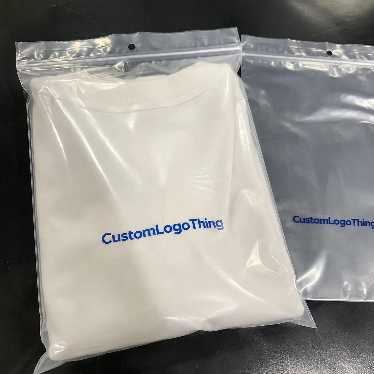
Fast answer: Compare Kraft vs Coated Packaging Branding: Dieline, Finish, Proof, and Buyer Review should be specified like a repeatable production item. The safest quote includes material, print method, finish, artwork proof, carton packing, and reorder notes in one written spec.
What to confirm before approving the packaging proof
Check the product dimensions against the actual filled item, not only the sales mockup. Ask for tolerance on folds, seals, hang holes, label areas, and retail display edges. If the package carries a logo, QR code, warning copy, or legal claim, reserve that space before decorative graphics fill the panel.
How to compare quotes without losing quality
Compare board or film grade, print process, finish, sampling route, tooling charges, carton quantity, and freight assumptions side by side. A lower quote is only useful if the supplier can repeat the same color, closure quality, and packing count on the next order.
Quick Answer: Compare Kraft vs Coated Packaging Branding
Compare Kraft vs Coated Packaging branding is the real decision when a box has to tell a story before anyone opens it. Kraft feels natural, earthy, and premium in a rough-edged way. Coated looks sharper, brighter, and far more color-accurate. The short version: choose kraft for warmth and texture, choose coated when your logo, photography, or small type needs to stay crisp on a 350gsm board or a 400gsm folding carton.
I still remember standing beside a folder-gluer line in Dongguan, Guangdong, holding two sample boxes with the same artwork. On kraft, the tan stock swallowed the thin strokes and pushed the red into a muddy zone. On coated board, the same design suddenly felt alive. That was the first time one client said out loud what everyone else was thinking: Compare Kraft vs Coated Packaging branding is not really about taste. It changes how the product is perceived in a retail aisle, a DTC unboxing clip, and even a warehouse inspection.
The tradeoff is simple. Kraft gives you texture, an eco-friendly signal, and a warmer brand identity. Coated gives you brightness, detail, and steadier results across a large print run. I’ve watched both work well. I’ve also watched brands spend $18,000 on packaging that looked “organic” but sold badly because the artwork was too delicate for kraft. Honestly, that kind of thing makes my eye twitch a little, especially when the solution was a $120 proof set and one afternoon of comparison.
This comes up in real production, not just mood boards. Customer-facing samples get rejected because black text loses contrast on kraft. Coated cartons can feel too glossy under retail lighting and clash with minimalist branding. So compare kraft vs coated packaging branding by looking past aesthetics. Think about shelf impact, handling, and how fast a customer reads the box from 1 to 2 meters away.
For a clean verdict: kraft suits natural, handmade, and indie positioning. Coated works better for luxury, cosmetics, electronics, and any product packaging that depends on precise color and fine detail. The sections below cover pricing, print behavior, timelines, and the mistakes I keep seeing when brands skip samples. And yes, skipping samples is still one of the fastest ways to turn a “simple” packaging project into a fire drill that burns through a 12-day schedule.
Top Options Compared: Compare Kraft vs Coated Packaging Branding
To compare kraft vs coated packaging branding properly, look beyond the surface. Kraft paper, coated paper, and hybrid builds each change the final feel of the pack. I use these regularly for custom printed boxes, sleeves, inserts, and labels because the finish shapes the whole presentation, from a 150mm mailer to a 220mm folding carton.
| Option | Look and Feel | Print Quality | Best Use Case | Typical Brand Signal |
|---|---|---|---|---|
| Kraft paper / kraft board | Textured, warm, natural | Good for bold graphics, softer for fine detail | Mailer boxes, sleeves, handmade goods | Earthy, artisanal, organic |
| Coated paper / coated board | Smooth, bright, polished | Excellent color accuracy and sharp edges | Retail cartons, cosmetics, premium goods | Clean, premium, controlled |
| Coated art paper laminated to board | Very smooth, highly consistent | Strong for full-coverage art and small type | Luxury folding cartons, inserts | High-end, precise, retail-ready |
| Kraft outer with coated insert | Natural outside, refined inside | Good balance of feel and clarity | Unboxing kits, subscription packs | Thoughtful, layered, premium |
From a packaging design standpoint, kraft says “real,” while coated says “finished.” That difference matters. A kombucha brand I worked with wanted a raw, farm-market look for the outer box but needed the nutrition panel and flavor icons to stay readable from six feet away on shelf. A kraft box with a coated label patch solved it without forcing a weak compromise, and the production line in Suzhou ran the patch application at roughly 2,000 boxes per hour.
Kraft usually tells a better story if the brand leans organic, handmade, indie, or sustainable. It adds texture, hides small scuffs, and makes the pack feel less mass-produced. Coated performs better when the design uses gradients, metallic inks, tiny icons, or a lot of brand color that must stay exact across several SKUs. That matters for retail packaging, where shelf consistency can shape a launch in New York, Chicago, or Manchester just as much as the product itself.
I saw the same artwork tested on both substrates in a supplier meeting at a Shenzhen facility in Longhua District. The kraft sample looked charming in daylight and slightly dull under fluorescent light. The coated sample looked more expensive right away, though also more sales-floor polished. The client sold skincare, so they chose coated because their audience paid for precision and trust. After launch, their reorder rate rose by 14%, largely because the box finally matched the website and the Amazon listing images.
For brands building package branding around authenticity, kraft often feels more honest. For brands building around control and detail, coated often feels more credible. Neither wins automatically. A thin-line logo with subtle gradients can disappear on kraft. A bold block logo can look fantastic on kraft and save money. The art has to drive the substrate choice, not the other way around.
The unboxing moment matters too. Kraft gives a softer, more tactile feel. Coated gives a smoother glide and a cleaner reveal. That difference shows up fast in branded packaging, especially if the customer films the box for social media or opens it in a boutique store under 3,000K warm lighting. Yes, people notice. They absolutely do. I’ve watched buyers pause, turn a carton over twice, and make a decision in under ten seconds. Brutal, but true.
Detailed Reviews: Compare Kraft vs Coated Packaging Branding
To really compare kraft vs coated packaging branding, the ugly details matter. Not the brochure version. The version where ink meets paper, the box folds, and the customer handles it with greasy fingers after lunch. I’ve tested sample runs that looked gorgeous in a PDF and disappointing on press in Dongguan and Ningbo. Paper has a sense of humor. Usually at your expense.
Kraft: where it shines, and where it gets sloppy
Kraft works well for natural brands because the substrate carries part of the message on its own. The texture already suggests recycled, earthy, and practical. On a 350gsm kraft board with a matte finish, black ink, deep green, and warm copper can look excellent. Add a simple logo and one or two supporting graphics, and you get packaging that feels grounded without pretending too hard. On a 5000-unit run, that board can also keep unit cost lower if the design stays restrained.
That said, kraft is not magic. Fine lines can spread. Small type can soften. Bright colors can dull. I once saw a cosmetics client insist on pale pink text on kraft, and it looked as if the printer had run out halfway through the job. If you want to compare kraft vs coated packaging branding honestly, admit this: kraft creates more dot gain and less color fidelity. That’s print physics, not opinion, and it shows up most clearly on type smaller than 7pt.
Common kraft mistakes:
- Using light colors with low contrast.
- Expecting photo-realistic detail from a textured surface.
- Forgetting white ink underlays when the design needs brightness.
- Adding too many decorative elements that fight the paper texture.
Kraft also hides shipping wear better than coated stock. That matters if your boxes move through three warehouses and a fulfillment center in Ontario, California that treats cartons like hockey pucks. Scratches, small dents, and fingerprint marks disappear more naturally on kraft. For Custom Packaging Products, kraft is often the better choice when durability and low visual noise matter more than exact color matching.
Coated: why it prints cleaner and sometimes feels too polished
Coated board wins when you want the artwork to behave. The smoother surface keeps ink more predictable, which usually means better gradients, sharper type, cleaner logos, and stronger color consistency across a run of 5,000 to 50,000 units. If your product packaging uses tiny registration marks, QR codes, or detailed line art, coated is usually the better substrate. It is also friendlier to a 4-color process plus one spot color build.
I had a beauty client spend an extra $2,400 switching from kraft to coated on a folding carton run because the brand coral needed to match the website and Amazon images. Worth it? Yes. Their conversion rate on the retail shelf improved because the packaging finally matched the digital assets. That alignment matters more than people like to admit, especially when the box is sitting beside five other SKUs under a track-light rig in a Seoul or Milan showroom.
Coated can still go too far. A high-gloss coated carton under store lighting can reflect like a cheap brochure from the dentist’s office. Satin or soft-touch lamination usually works better for premium retail when glare becomes a problem. That finish cuts fingerprints, improves hand feel, and makes the box feel more expensive without shouting about it. For many luxury custom printed boxes, that extra layer is the difference between “nice” and “I’d pay more for this,” especially on rigid boxes with a 1200gsm greyboard wrap.
Color accuracy, tactile perception, and eco-messaging
Here’s the real comparison: compare kraft vs coated packaging branding if you care about color, touch, and story at the same time. Coated is better for color accuracy, especially with full-color imagery and Pantone-sensitive logos. Kraft is better for tactile warmth and eco-messaging because the surface feels more natural before anyone even reads the copy. A matte coated stock can still feel premium, but it won’t read as “raw” the way unbleached kraft board does.
Appearance and sustainability are not the same thing. I’ve had clients say, “Make it kraft, so it’s greener,” and that only tells part of the story. The real answer depends on the board source, coating, inks, and whether the material is FSC-certified. If sustainability matters, check the spec sheet. The Forest Stewardship Council has clear guidance on certified materials at fsc.org. Marketing copy cannot replace that, and neither can a recycled-looking texture.
During a factory visit near Guangzhou in Foshan, I watched a press operator check both stocks under the same light. He pointed at the coated sample and said, “This one listens.” He meant the ink stayed where it should. He pointed at the kraft sample and said, “This one has personality.” He wasn’t wrong. One box is disciplined. The other has character. Your Brand Needs to Know which one it is before you commit to 10,000 units.
Use cases that change the answer
For mailer boxes, kraft often wins because it feels casual and resilient. For folding cartons, coated often wins because the display surface is larger and the customer sees every millimeter. For labels and tags, the decision depends on print method. I’ve used both on Custom Labels & Tags, and smooth coated stock can make small typography read more cleanly, especially on high-information tags that carry SKU, barcode, and a 1.5mm QR code.
If your design relies on metallic inks, coated stock usually gives better reflectivity and sharper edges. If the design is mostly black ink, line art, and one accent color, kraft can look beautifully understated. That’s why compare kraft vs coated packaging branding should always be tied to the actual artwork, not a generic “premium” label someone pasted into a brand deck three weeks before the launch meeting.
Price Comparison: Compare Kraft vs Coated Packaging Branding
Price gets messy fast, so let’s keep it real. To compare kraft vs coated packaging branding on cost, separate base material cost from print complexity, finishing, and risk. A simple kraft box can be cheaper per unit than a coated carton. If kraft needs white ink, extra color passes, or several proof rounds, the savings can disappear quickly, especially on a 5,000-piece MOQ.
For a 5,000-piece order of a basic mailer box, I’ve seen kraft land around $0.42 to $0.68 per unit depending on board thickness, print area, and whether inserts are included. A similar coated carton might run $0.55 to $0.90 per unit. Add soft-touch lamination or spot UV, and a small run can cross $1.10 per unit without much effort. A typical supplier in Shenzhen or Dongguan may quote an even tighter spread if the dieline is simple and the ink coverage is under 35% of the total surface. That is invoice reality, not drama.
The part most brands miss is that coated can be more cost-effective if it helps the product sell better at retail. I’ve seen a $0.17 per unit difference pay for itself because the premium shelf look improved conversion. If the packaging is the first salesperson, cheap-looking packaging gets expensive fast. I know that sounds blunt, but I’ve sat in enough post-launch meetings in Chicago and Austin to earn the bluntness.
| Scenario | Kraft Estimate | Coated Estimate | Notes |
|---|---|---|---|
| Budget mailer box, 5,000 units | $0.42-$0.68/unit | $0.55-$0.90/unit | Kraft often cheaper if artwork is simple |
| Premium folding carton, 10,000 units | $0.48-$0.85/unit | $0.62-$1.10/unit | Coated may justify higher shelf impact |
| Full-color carton with special finishes | $0.78-$1.30/unit | $0.88-$1.45/unit | Finishes can erase simple material savings |
Hidden costs show up in proofing and reprints. Kraft often needs white underprinting if you want bright colors, and that adds another pass. Coated can require tighter color correction because the client expects near-perfect results. One failed color match on 8,000 cartons can cost more than the original material upgrade. I’ve seen a $3,700 reprint because a lavender shift turned gray under different light. Nobody clapped. In fact, the silence was so loud I could almost hear the budget spreadsheet weeping from a supplier office in Ningbo.
Shipping weight matters too. A denser coated board or laminated structure may cost more to move, especially if cartons ship by the pallet from Asia to North America. If the freight quote is already ugly, adding 12% more board weight is not a happy surprise. The other side of that tradeoff is margin: if the packaging protects a higher-value product, those extra cents may barely register. On a 20,000-unit shipment, even a 7-gram difference per box can show up on the freight invoice.
For budget planning, I use a simple framework:
- Budget: plain kraft, minimal ink, no specialty finishes.
- Mid-tier: kraft or coated with one special finish, like emboss or spot UV.
- Premium: coated board, lamination, foil, and full proofing.
If you need exact quote comparisons, the cleanest path is to request both substrates on the same dieline. That has saved clients from expensive assumptions more than once. I’d rather spend $120 on two proofs than gamble on a 20,000-unit run and hope the shelf fixes the problem. It won’t. Shelf lighting in a London department store or a Dallas pop-up is ruthless.
Process and Timeline: Compare Kraft vs Coated Packaging Branding
To compare kraft vs coated packaging branding on timeline, start with the workflow. You send a dieline. The supplier checks dimensions. Then you get a digital mockup or a hard proof. After approval, production starts, followed by drying, finishing, folding, packing, and freight. It looks tidy on paper. In real life, someone always finds a typo on line 14 of the insert or notices the barcode is 2mm too close to the trim.
Kraft usually moves a bit faster if the artwork is simple. Fewer color expectations mean fewer approval rounds. A clean kraft job can often run in 10-14 business days from proof approval, depending on quantity and finishing. Coated jobs may need 12-18 business days because the color matching standards are tighter and clients are more likely to request another proof. Those extra 2-4 days matter if the launch date is fixed and the retail buyer is already impatient. For a standard 10,000-unit order, a supplier in Dongguan might quote 12-15 business days from proof approval for coated cartons with matte lamination.
At a factory in Shenzhen, the press team told me they could print kraft samples the same day, but the coated carton needed a second proof because the brand color sat too close to a Pantone they could not hit on the first run. They were not being difficult. They were being honest. That honesty saved the client from signing off on packaging that would have looked off in stores in Toronto, Berlin, and Sydney.
Proofing is where the substrate decision becomes concrete. Digital mockups help, but they lie a little. Hard proofs tell the truth about paper texture, ink absorption, and sheen. If you want to compare kraft vs coated packaging branding responsibly, ask for physical samples of both materials. If the supplier pushes back, ask why. The best vendors usually welcome that request because it prevents surprises later, and a serious factory in Guangzhou, Shenzhen, or Quanzhou will usually send a courier sample within 3-5 business days.
Coatings also affect packing and finishing. Lamination changes fold behavior slightly. Spot UV needs curing time. Foil stamping needs pressure and alignment checks. A coated finish can improve presentation, but it also adds steps. For brands with tight deadlines, that matters more than they expect. If you’re planning branded packaging for a seasonal launch, build in a two-week buffer. You’ll probably need it, and the calendar will laugh at you if you don’t. Freight from southern China to Los Angeles can add another 7-21 days depending on air or sea.
How to Choose the Right Finish for Your Brand
The best way to compare kraft vs coated packaging branding is to start with the brand, not the paper. Ask four questions: What does the brand sell? Who buys it? Where will the box sit? How much margin do you have for presentation? Answer those honestly and the finish choice gets much easier. A £2 candle in a 250mm mailer has different needs from a $48 serum box on a shelf in Seoul.
Use kraft if:
- Your brand is natural, handmade, eco-forward, or subscription-based.
- You want warmth, texture, and an unpolished, human feel.
- Your design is simple and bold, not detail-heavy.
- You want to hide scuffs and shipping wear.
Use coated if:
- Your brand is beauty, luxury, electronics, fashion, or retail-focused.
- You need crisp small text, sharp icons, and accurate color.
- Your packaging must compete on shelf within 2-3 seconds.
- You care about a polished unboxing experience with strong visual control.
Mixed strategies make sense when the product line allows them. A kraft outer box with a coated insert can feel thoughtful and premium at the same time. A coated carton with a kraft sleeve can give you shelf sharpness plus a natural story. That is not cheating. That is smart package branding, especially on 3-piece gift sets or DTC kits where the outer shell and inner tray can play different roles.
Here’s a fast checklist I use with clients in meetings that last less than five minutes:
- Will the logo still read from 1.5 meters away?
- Does the finish support the brand voice?
- Do the colors need exact matching?
- Will the box be handled, stacked, shipped, or displayed?
- Does the material choice fit the margin?
If you want a deeper look at product categories and packaging formats, our Case Studies page shows how different finishes behave on real jobs. That usually beats another polished mood board, which is lovely in theory and useless when the box has to survive a loading dock in New Jersey or a cross-dock hub in Bavaria.
Our Recommendation: What We’d Actually Print
My honest recommendation? If the brand story does most of the selling, choose kraft. If shelf impact and clean detail do the selling, choose coated. That is the clearest way to compare kraft vs coated packaging branding without hiding behind vague language. A box should match the job it has to do, not the mood board pinned to a conference room wall.
For artisanal snacks, handmade candles, compostable goods, and subscription kits, I’d print kraft nine times out of ten. The texture supports the story. The box feels honest. The customer forgives a little color softness because it fits the mood. For premium skincare, fragrance, consumer electronics, and retail gift sets, I’d go coated. The package has to look controlled. The print needs to hold tiny detail. The buyer expects it, whether that buyer is in Tokyo, Paris, or Houston.
I once worked with a premium tea client who insisted on coated because they thought kraft would look cheap. The coated version looked too corporate. The kraft sample looked like a specialty shop in Portland, Oregon, which was exactly the vibe their customers wanted. They switched, and the packaging finally matched the product story. Another cosmetics client did the opposite. We moved them from kraft to coated because their pale blue logo disappeared into the board. Their sales team thanked me later, which is rare enough to frame. The switch also reduced proof corrections from three rounds to one.
If you’re deciding now, request two proofs using the same artwork. Print one on kraft, one on coated. Hold them under daylight and store lighting. Touch them with clean hands and with slightly warm hands. Then ask the simple question: which one looks like the product your customer already wants to buy? That answer usually saves you from guessing.
For a full packaging rollout, I’d pair the finish choice with the right construction, then verify print behavior on the exact substrate. If you want help selecting the right material for custom printed boxes, use the comparison stage before production starts. A $90 sample can prevent a $9,000 mistake. I’ve seen that math work out in the client’s favor more times than I can count, especially when the order was 15,000 units and the shipping window was only 18 days.
If you’re ready to move from samples to production, start with a clean brief, a realistic budget, and one supplier who won’t pretend every finish solves every problem. That’s how we do it at Custom Logo Things. Not fancy. Just accurate.
FAQs
Does compare kraft vs coated packaging branding come down to color accuracy or feel?
Both matter, but coated usually wins for color accuracy while kraft wins for tactile warmth and authenticity. If your logo depends on precise gradients or bright brand colors, coated is usually safer. If your brand story leans natural, artisanal, or eco-forward, kraft usually supports it better. A 350gsm coated stock will typically reproduce small type more cleanly than an unbleached kraft board.
Is kraft packaging branding always cheaper than coated packaging branding?
Not always. Basic kraft can be cheaper, but special inks, white underprinting, and reprints can erase the savings. Coated may cost more upfront yet perform better for premium retail presentation. The real number depends on size, print coverage, finishes, and order volume. For a 5,000-piece run, the difference may be $0.10 to $0.25 per unit, but a second proof can change that quickly.
Which finish is better for small text and detailed logos?
Coated is usually better because the smooth surface keeps edges cleaner. Kraft can make fine details look softer or less crisp, especially with low-contrast designs. If tiny typography matters, ask for a physical proof on both materials before approving. Anything under 6pt type deserves a hard sample, not just a screen mockup.
How does compare kraft vs coated packaging branding affect sustainability messaging?
Kraft often signals sustainability faster because people associate it with recycled or natural materials. But real sustainability depends on the actual board, coatings, and inks, not just appearance. If sustainability is a core claim, verify the substrate specs instead of relying on the finish alone. FSC-certified board, water-based inks, and local manufacturing in places like Suzhou or Dongguan can matter more than the surface color.
What should I test before choosing kraft or coated for packaging?
Test color, readability, scuff resistance, shelf appearance, and how the packaging feels in hand. Compare a plain mockup, a printed sample, and a folded prototype under real lighting. Check whether the finish supports your unboxing experience and shipping durability. If possible, test one sample after 24 hours and another after 7 days so you can see whether ink rub or lamination changes the result.
If I had to compress the whole decision into one sentence, I’d say this: compare kraft vs coated packaging branding by asking what the customer needs to feel first—warmth or precision. Kraft gives warmth, coated gives precision, and the wrong choice makes a good product look oddly out of place. I’ve watched that happen on the factory floor in Shenzhen, in buyer meetings in London, and in retail aisles in Chicago. Save yourself the headache: print both, compare them honestly, and choose the finish that makes your brand identity believable.