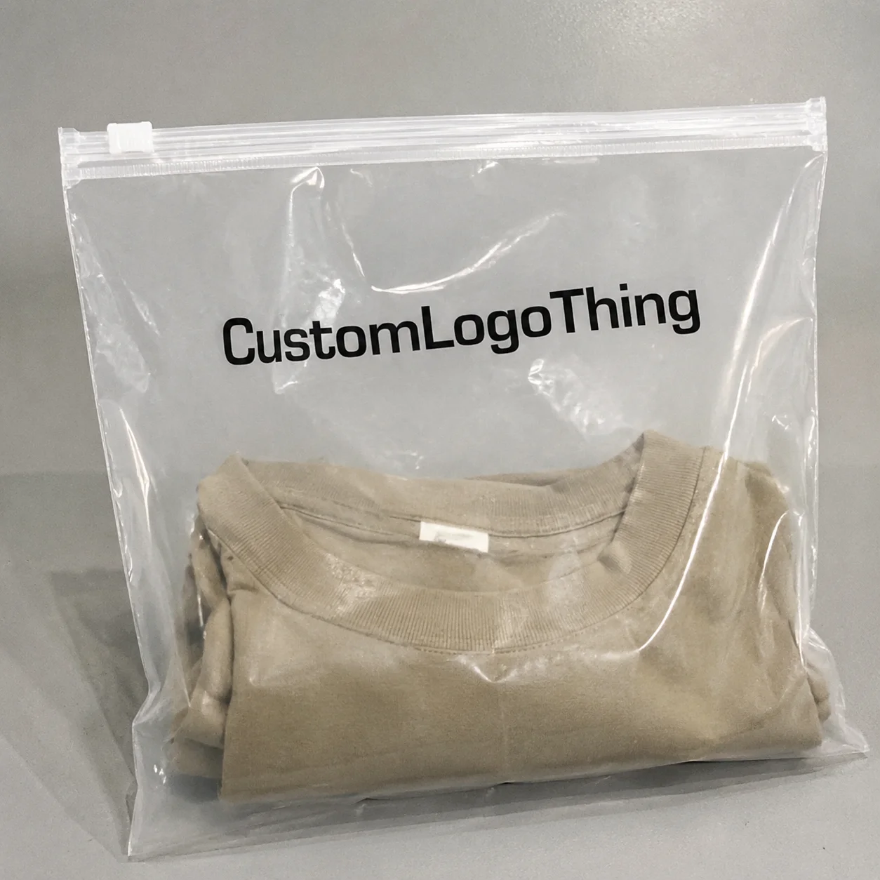
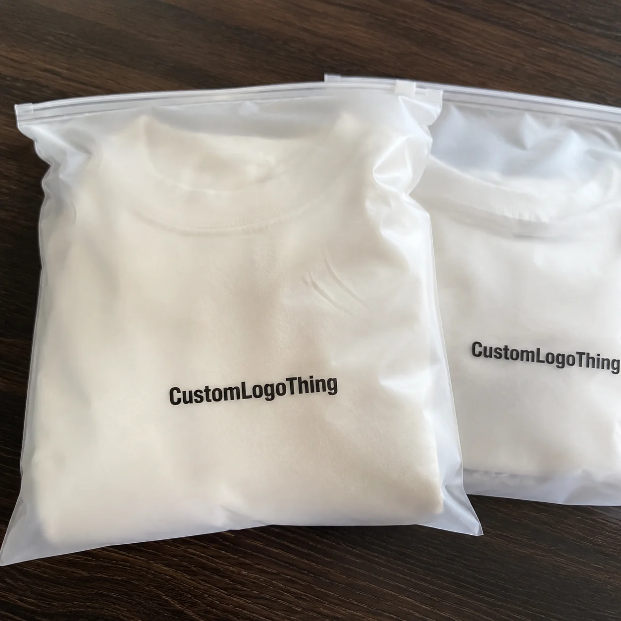
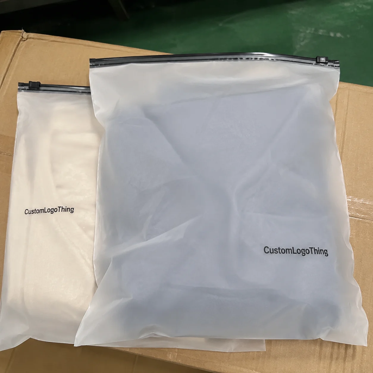
Frosted Zipper Bags are deceptively simple packaging. They soften the product view, protect the contents, and leave enough room for the brand to speak without shouting. That is exactly why the stationery Frosted Zipper Bags Packaging Insert checklist matters. The insert is often the first clear reading surface inside the pack, and it has to do more than look tidy. It has to explain the product fast, support the price point, and survive the realities of printing, folding, and assembly.
For stationery, that pressure is higher than people expect. A notebook set, sticker kit, or pen bundle can look attractive in a frosted pouch and still feel unfinished if the insert is vague or poorly sized. Buyers notice the difference in seconds. A good insert makes the pack feel intentional. A weak one makes the whole package look like it lost a round with production.
That is not a branding theory problem. It is a practical one. The tighter the bag, the more visible the insert becomes. If the copy is crowded, the type is too light, or the dimensions are off by a few millimeters, the flaw is visible immediately. Good packaging reduces friction. It does not create more of it.
Why Inner Inserts Make Frosted Bags Feel Premium
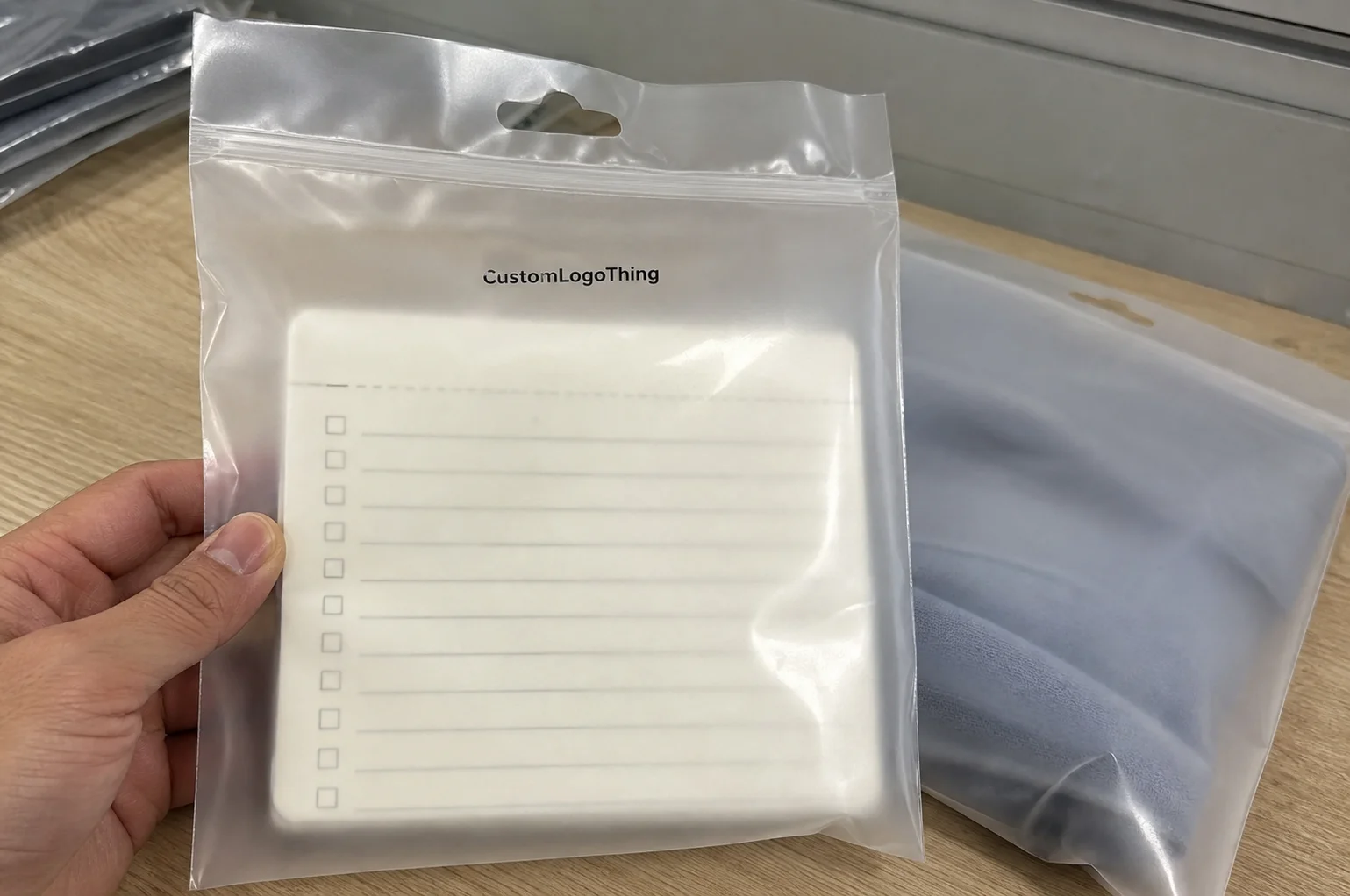
Frosted film sits between clarity and privacy. You can see enough to understand the category, but not enough to let the product sell itself. That middle ground gives the insert more authority. It becomes the piece that translates a bundle of stationery into a retail offer.
That matters because stationery is often judged by bundle logic. A buyer is not only asking whether the notebook is good or the pen writes well. They are asking whether the set feels coherent, whether the contents are obvious, and whether the price makes sense for what is inside. The insert answers those questions faster than a long product page ever could.
There is also a small but important psychological effect. A frosted bag can make premium materials look restrained and low-quality materials look even thinner. A clean insert offsets that risk. It gives the pack a point of focus and helps the product read as complete rather than improvised. In retail packaging, completeness is a quiet signal of value.
That is why the checklist should begin before artwork starts, not after. If the message, dimensions, print method, and assembly method are all agreed early, the odds of revision drop. So do the odds of a late-stage compromise that turns a good design into a production headache.
A frosted bag can hide small flaws in the product and magnify flaws in the insert. The reverse is also true: a disciplined insert can make a modest pack feel more expensive than the budget suggests.
What the stationery frosted zipper bags packaging insert checklist should cover
Start with the information the buyer needs first. The insert should answer five things quickly: what the product is, what is inside, why it matters, how to reach the brand, and what the buyer should know before use. If those five are clear, the insert is doing its job.
- Product name: Match the exact name used on the SKU sheet, carton, and web listing.
- Contents list: State quantities plainly, such as 1 notebook, 2 gel pens, and 1 sticker sheet.
- Short value statement: Use one line that explains the bundle’s function, not a vague slogan.
- Brand contact: Include website, QR code, or reorder path only if it supports real buyer action.
- Use or care note: Add this only when it prevents confusion or reduces returns.
The best inserts for stationery are usually compact. They read quickly, use plain hierarchy, and do not try to sound like a brochure. Buyers scan packaging in motion, under store lighting, with other products competing for attention. Dense paragraphs and oversized claims slow them down. Worse, they make the product feel overdesigned.
A useful rule is to treat the insert like a label with structure, not a marketing page. If the copy needs six sentences to say what could be said in two, it is probably trying to do too much. If it only says “premium quality,” it is not saying enough. The useful middle is specific, brief, and concrete.
Optional elements can help, but only when they earn their place. A QR code works if it leads to a real landing page or reorder flow. Sustainability language works if the supply chain can support it. A care note helps if the set includes coated paper, adhesive items, or metal accessories. Anything else should be questioned. Decorative noise is not the same thing as branding.
One more caution: do not repeat claims that belong elsewhere on the pack. If the pouch, header card, or carton already carries legal or compliance text, the insert should not duplicate it unless there is a clear reason. Repetition burns space and makes the layout feel less controlled.
For paper sourcing references, the FSC site is a useful baseline if you are verifying certified paper pathways. Keep the language accurate. Loose environmental claims are easy to print and expensive to defend.
What not to crowd in
Do not fill the insert with multiple taglines, oversized logos, three contact methods, legal copy, and a paragraph of brand philosophy. In a frosted bag, clutter is more visible than it looks in a PDF. The first thing that disappears is the product message. The second is trust.
Hierarchy matters. Product name first. Contents second. Support information last. That order matches how people actually read packaging, and it keeps the layout easier to update if the bundle changes later. Stationery lines change often. Seasonal sets, new colors, and revised SKUs appear more frequently than buyers see from the outside.
Size, Material, and Print Specs That Protect Fit
Fit is where many projects fail. An insert can look balanced on a screen and still fail in the pouch because it is too tall, too rigid, or folded in the wrong direction. Before approval, confirm the finished bag opening, the usable internal height, and whether the insert sits flat, folds once, or folds twice.
Frosted Zipper Bags are less forgiving than rigid cartons. The insert is framed by soft plastic, not a stiff wall. That means even small dimensional errors are visible. If it is oversized, the top edge can buckle or catch near the zipper. If it is undersized, it shifts around and looks accidental.
Material choice should follow use, not habit. A 100-120 gsm uncoated text stock suits lightweight inserts and lower-cost runs. A 200-300 gsm coated or matte card gives more body, holds a fold better, and tends to feel more finished. If the design uses dense text or fine rules, a smoother surface can improve print sharpness. If the insert needs to stand upright inside the bag, heavier stock usually performs better. Test the actual stock, though. Spec sheets are useful; they are not a substitute for printed samples.
Color behaves differently behind frosted film. The film mutes contrast slightly, which can flatten pale type, fine lines, and weak gradients. Strong black text on warm white stock usually reads better than delicate color-on-color layouts. If you want a pastel palette, make sure it survives the fogged effect of the pouch. A mockup on a bright monitor can be misleading here.
Before production, ask the printer to confirm the technical details that tend to create problems later:
- Trim size and final folded size
- Bleed, usually 3 mm or 0.125 in
- Safe margin around QR codes, barcodes, and small type
- One-sided or two-sided print
- Fold direction and fold allowance
- Proof type: digital only, or digital plus physical sample
For quality control, borrow from the same logic used in transit-sensitive packaging. The ISTA testing framework is useful when the insert sits inside a larger kit or ships with products that must still look presentable after handling. It does not solve every packaging issue, but it gives a more disciplined way to think about compression, movement, and appearance after transit.
That discipline matters because the insert has two jobs at once. It has to look good and it has to behave mechanically. A pretty file that curls, shifts, or loses edge sharpness is not a finished packaging component.
Process and Timeline From Brief to Approved Proof
A controlled workflow saves time. The actual sequence is straightforward, but each stage has a common failure point if the brief is incomplete.
- Brief: define the product, bag size, quantity, and target launch date.
- Dieline confirmation: lock the insert dimensions and folding method.
- Copy review: verify product names, contents, and any claim language.
- Layout: place text, logos, QR code, and support details.
- Digital proof: check alignment, spelling, margins, and color balance.
- Correction round: fix only what needs fixing, then reconfirm.
- Final approval: release production only after the file matches the physical use case.
Proof speed and production speed are not the same thing. A supplier may return a digital mockup in one or two business days, but the finished order will take longer. For simple inserts, a working production window is often 10-15 business days after approval. If folding, kitting, or physical sampling is involved, add time. Rush jobs are possible in some cases, but they usually carry cost and risk.
Late changes are the main reason schedules slip. Missing artwork, unresolved dimensions, barcode edits, and contact updates can each slow the job down. If the insert is tied to a launch or trade show, budget at least one revision round. Two is safer when multiple people are approving the same file.
It also helps to separate content lock from print lock. Content lock means the words are final. Print lock means the file is technically ready for production. Those are different milestones. Mixing them up is one of the easiest ways to waste a week.
Cost, MOQ, and Quote Drivers
Packaging pricing becomes easier to read once it is broken into components. The main drivers are insert size, stock choice, print coverage, finishing, quantity, and whether the work is print-only or includes folding and insertion. Assembly adds labor. Higher labor usually means more control on your side but more unit cost from the supplier.
For a practical range, simple stationery inserts can start around $0.08-$0.16 per unit at higher quantities with minimal color coverage. A full-color folded insert on heavier stock often lands around $0.18-$0.35 per unit, depending on quantity and finish. If the supplier also folds, inserts, and packs the bag, $0.30-$0.60 per unit is common enough to be credible. Freight is usually separate.
| Insert Option | Typical MOQ | Indicative Unit Range | Best For | Main Tradeoff |
|---|---|---|---|---|
| Single-color flat insert on uncoated stock | 1,000-2,000 | $0.08-$0.16 | Simple SKU labeling, low-cost runs, internal bundling | Limited visual impact |
| Full-color folded insert on coated or matte card | 3,000-5,000 | $0.18-$0.35 | Retail packaging, gift sets, stronger brand presentation | Higher setup and proof discipline |
| Printed insert plus folding and bag insertion | 5,000+ | $0.30-$0.60 | Launch packs, subscription bundles, seasonal stationery drops | More labor and tighter timeline coordination |
MOQ changes the math quickly. Small runs look expensive because setup costs are spread across fewer units. That does not always mean the cheaper path is to downgrade the package. Sometimes the better adjustment is to reduce the insert size, simplify the color usage, or move to a cleaner one-side design. A 15 percent design simplification can produce a bigger cost reduction than a 5 percent paper change.
Quote comparison needs discipline too. One supplier may quote print only, another may include folding, and another may include kitting. Those are not equivalent numbers. Compare landed cost, not just the headline rate. The lowest quote can become the most expensive if it leads to reprints, delayed launch inventory, or manual handling later.
If you are already sourcing related materials from our Custom Packaging Products range, ask whether the insert can be aligned with the rest of the system. Matching paper tone, finish, or visual language across SKUs reduces design friction and helps the line feel coherent.
Common Mistakes That Trigger Reprints
The expensive mistakes are rarely dramatic. They are usually small, ordinary, and easy to overlook until the run is already in motion.
- Wrong dimensions: the insert looks right digitally but sits badly in the bag.
- Ignored folded thickness: a flat card performs differently once folded.
- Approved too early: artwork is signed off before the bag size is final.
- Outdated details: website, email, or social handle no longer matches the live brand.
- Unverified claims: recycled content, sourcing, or performance language is used without proof.
- Poor resolution: logos and icons print fuzzy, which stands out on premium stationery.
QR codes deserve special attention. A code that scans in a PDF preview can fail after printing if it is too small, too light, or placed on a noisy background. Test it at actual size on the intended stock. Then test it again after proofing. Frosted film can soften contrast before the eye reaches the code, so a design that feels fine on-screen may behave differently in the pouch.
Color mismatch is another quiet problem. A palette that looks refined on a bright monitor can flatten in print, especially on muted frosted packaging. If the design depends on pale text or subtle gradients, assume nothing. Request a proof. If the run is valuable, ask for a physical sample. A small sample fee is cheaper than replacing thousands of inserts because the headline disappears against the pouch.
Do not overload the insert with legal language that belongs elsewhere. Buyers want readable packaging, not a block of fine print. If the message needs legal protection, place the legal copy where it belongs and keep the insert focused on clarity and purchase confidence.
Next Steps Before You Request a Quote
Before sending a request, gather the technical details in one file. That cuts the back-and-forth and makes supplier answers easier to compare.
- Finished bag dimensions, including opening width and usable height
- Insert size, both flat and folded if applicable
- Quantity and target replenishment window
- Paper preference, finish, and thickness target
- Artwork files in editable and print-ready formats
- Approval contacts so the proof does not stall in email chains
Then review the order in this sequence: measure, draft copy, confirm the layout, request proof, check the proof against real use, and approve only after the fit makes sense physically. That order is basic, but basic is where most production problems are either prevented or created.
If the insert is part of a wider branded packaging program, make sure it matches the rest of the system. The components do not need to look identical. They do need to feel related in tone, stock choice, and hierarchy. A stationery insert that feels disconnected from the bag, label, or outer pack weakens the whole presentation, even if each piece is technically well printed.
The useful takeaway is simple: the stationery Frosted Zipper Bags Packaging Insert checklist belongs before pricing, not after it. That is how you protect fit, reduce revisions, and keep the finished pack looking deliberate instead of assembled under pressure.
What should a stationery frosted zipper bags packaging insert checklist include?
It should cover the product name, contents list, short value statement, brand contact details, and any use or care note that genuinely helps the buyer. Add print specs too: finished size, fold direction, stock choice, bleed, safe margin, and approval contacts. If a QR code improves clarity, include it; if it crowds the layout, leave it out.
How do I size an insert for frosted zipper bags without guesswork?
Measure the finished bag opening, then account for closure hardware, fold allowance, and any bulk from the contents. Mock the insert at full size before approval so you can check fit and visibility in the actual pouch. If the insert folds, confirm both the flat size and folded size with the printer.
What drives the cost of stationery frosted zipper bag inserts?
Quantity, stock, color coverage, finishing, and whether the order is print-only or includes folding and insertion all affect the quote. Small runs usually cost more per unit because setup and proofing are spread across fewer pieces. Ask for separate pricing on printing, assembly, and freight so you can compare vendors fairly.
How long does the process usually take from proof to production?
Digital proofing can move quickly, often within one or two business days, but the finished order usually takes longer. A typical production window for simple inserts is about 10-15 business days after approval, with extra time needed for revisions, folding, or physical samples. If the launch is fixed, build buffer time into the schedule.
Do I need special copy or design rules for frosted zipper bags?
Yes. Use strong contrast, keep the hierarchy simple, and avoid dense blocks of text because frosted film softens the visual field. Test small type, reversed type, and QR codes at actual size before release. That is why the stationery Frosted Zipper Bags Packaging Insert checklist should be the final internal sign-off document before you ask for pricing.