Why a frosted zipper bag makes the insert do more work
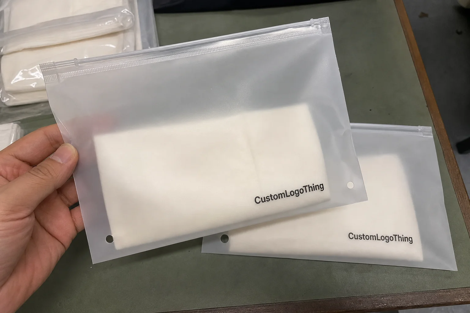
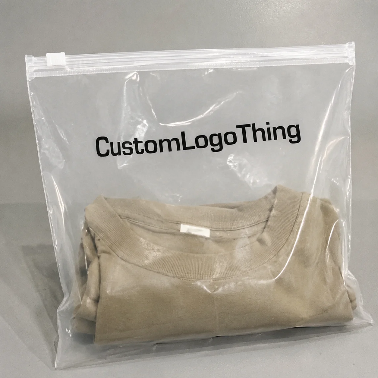
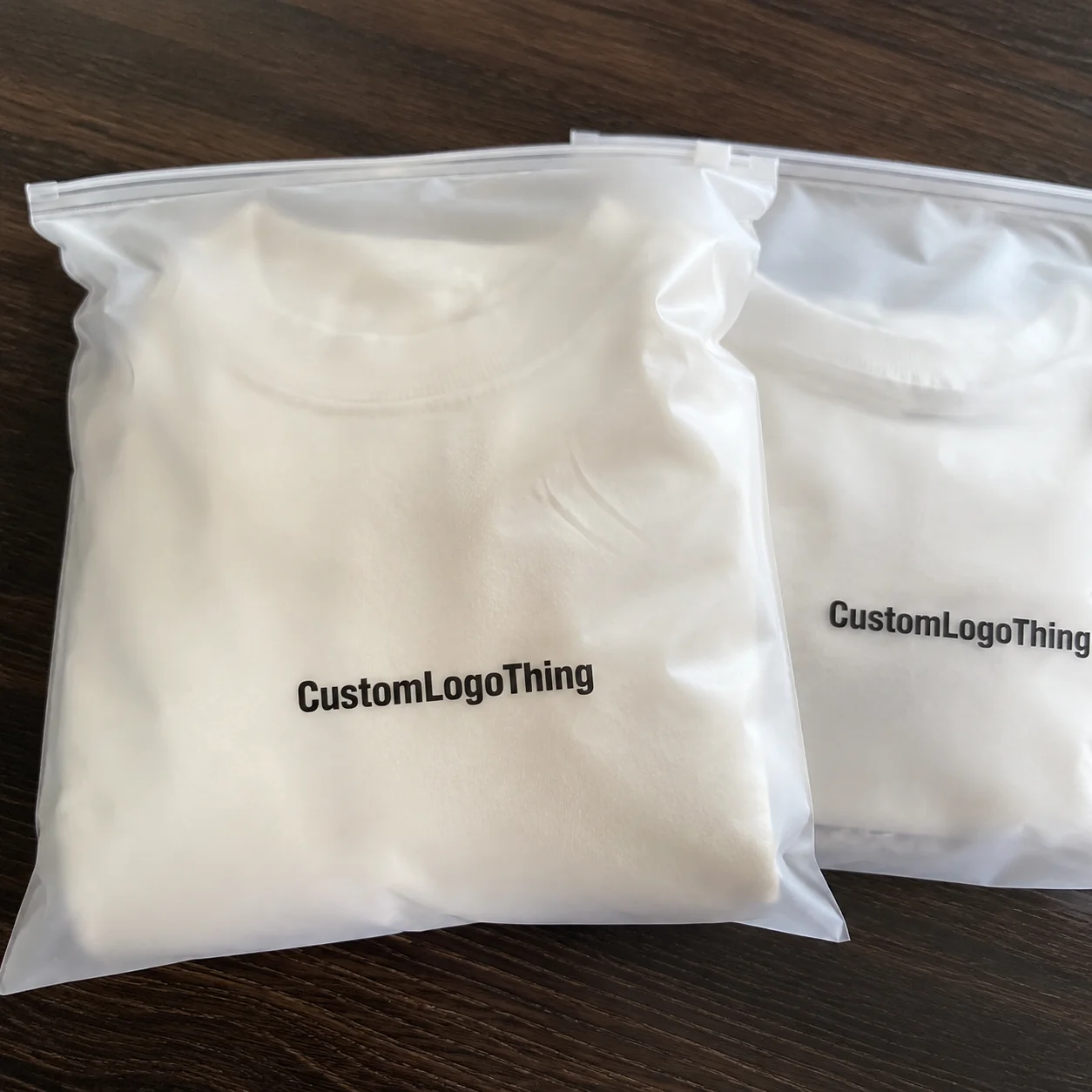
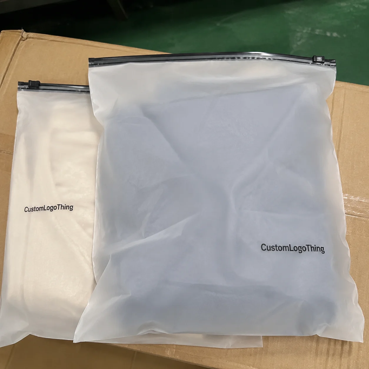
The cosmetics Frosted Zipper Bags Packaging Insert checklist matters because a frosted pouch changes how information is seen. Clear film shows everything at once; frosted film softens edges, cuts glare, and makes the insert carry more of the message. That sounds subtle. In production, it changes the whole hierarchy.
A frosted zipper bag has a quieter shelf presence than a fully transparent bag, but that quietness is not an excuse for visual clutter. The insert has to communicate product identity, usage, compliance text, and brand tone without fighting the pouch. If the card is crowded, the package reads as busy. If the card is sparse but thoughtful, the pack feels intentional, and the pouch does the rest.
That is why the insert should be treated as a structural part of the packaging system, not as a leftover print item. For a cosmetic line, it may carry ingredient callouts, shade names, batch information, a QR code, a subscription offer, or a short brand note. Each of those roles creates different layout pressure. A thank-you card needs space and texture. A technical insert needs contrast and precision. A promotional card needs restraint so it does not turn the pouch into a billboard.
A frosted pouch is forgiving on color and unforgiving on clutter. If the insert cannot be read in two seconds, it is carrying too much or laid out poorly.
There is also a practical comparison worth making. A clean insert can do some of the work that a heavier carton would otherwise do, which can reduce the need for extra print on the outer pack. That does not mean the insert replaces every other component. It means the package system should be divided by function: the pouch contains, the insert explains, and the shipping layer protects. When those jobs blur together, waste usually rises and the presentation gets less stable.
For brands that already use Custom Printed Boxes, the insert may be the simplest way to raise the perceived value of the set without adding another full carton. If you are comparing packaging structures, it helps to evaluate the pouch, insert, and shipper as one assembly rather than as separate design exercises. The frosted film magnifies that decision. It hides less than people think, but it also hides just enough to punish visual noise.
How the insert should fit, fold, and read inside the pouch
Start with the usable interior dimensions, not the labeled bag size. Gussets, zipper tape, seals, and product bulge all reduce the area that will actually hold the insert. A pouch listed as 5 x 7 inches rarely behaves like a flat 5 x 7 pocket once it is filled. The real measurement is the one taken after the cosmetic is inside and the zipper is closed. That is the dimension that matters.
The insert can sit flat behind the product, fold as a tent card, or tuck behind a side panel. The best option depends on the shape of the cosmetic and the amount of movement in the pouch. A slender serum ampoule leaves more room than a round jar. A soft sachet compresses differently from a rigid bottle. Those differences sound minor on a spec sheet and obvious on the packing bench. The insert has to be designed for the physical behavior of the filled bag, not for a mockup floating on a screen.
Reading distance matters too. Through frosted plastic, small type and thin strokes can fade faster than expected. For most cosmetic inserts, body copy in the 8.5 to 9.5 pt range is safer than trying to squeeze dense text into 7 pt. Short lines, generous leading, and a disciplined hierarchy usually outperform a crowded layout. If the card needs a QR code or barcode, place it where folds, glare, and pressure from the product will not interfere. A code that scans on a flat proof but fails in the filled pouch is not ready.
There are a few low-cost checks that catch a surprising number of reprint problems:
- Keep a 0.125 in safe margin on all sides unless the supplier specifies a different tolerance.
- Confirm that no critical text crosses a fold, score, or seal area.
- Test the insert inside a filled pouch, not just against the dieline.
- Scan QR and barcode elements through the actual frosted film before sign-off.
The last step is the one teams skip most often. It feels redundant until the first production run lands with a code that worked in prepress but not inside the bag. The fix is usually simple: move the code, enlarge it, or change the contrast. The cost of finding that after print is far higher than catching it on a desk with one sample pouch.
Material and print choices that change shelf impact
Paper stock is the first decision that changes how the insert feels, bends, and reads through the pouch. Uncoated stock gives a softer, more natural finish. It works well for ingredient notes, minimal branding, and products that want a restrained, earthy tone. Coated stock holds ink better, resists scuffing during packing, and tends to look sharper behind translucent film. For cosmetics, 14 pt to 16 pt cover stock is common, which roughly corresponds to 300 to 350 gsm depending on the board and mill.
Thickness affects more than appearance. A heavier insert stays straighter in the pouch, which improves front-panel legibility, but it can also make folding harder and create a bulge behind the zipper line. A 16 pt SBS card with a well-placed score line may be ideal for a folded insert. A thinner sheet may be easier to pack but can wrinkle or curl if the pouch is stored warm or under pressure. The correct answer depends on how the pack is handled, not just how it looks in the artwork file.
Color treatment matters more than many buyers expect. A restrained palette with strong white space often looks more premium inside a frosted zipper bag than a dense field of saturated color. Heavy coverage can look excellent on a monitor and still feel visually loud once it sits behind translucent film. If the line leans toward a clean clinical look, a minimal layout with strong type and controlled contrast usually reads better than decorative layers. If the product is positioned as natural or recycled, FSC-certified paper from FSC is a sensible option, provided the shade and finish still support the brand. For distribution durability, ISTA test methods are useful if the insert will travel with the pouch through secondary packaging or ship-ready kits.
Finish is where cosmetic brands often overreach. Aqueous coating is usually enough for a clean retail insert. Soft-touch laminate, foil, and spot UV can add depth, but each one raises cost and can complicate legibility if the frosted film already introduces haze. Gloss on gloss is the easiest way to make a small insert look more expensive on paper and less readable in hand. A calm, matte, or lightly coated surface often performs better because it lets the copy stay visible instead of competing with reflected light.
One useful comparison: an insert does not need to look as finished as a luxury carton to feel premium. It needs to feel consistent with the rest of the packaging. That means the colors, type weight, and finish should match the product position. A low-gloss pouch with a mirrored foil insert will feel disjointed. A muted pouch with a simple coated card will feel coherent.
Cost, pricing, and MOQ: what changes the unit price
The main price drivers are stock, print method, size, finishing, and quantity. The same insert can move from inexpensive to premium very quickly if the board weight changes or if a second finish is added. For a branded packaging program, separate the insert from the pouch and any shipping carton so each line item is visible. That makes the quote easier to read and exposes where the cost is actually sitting.
Minimum order quantity matters because setup costs do not shrink just because the piece is small. Plate setup, file prep, proofing, press calibration, and cutting all happen before the first unit is packed. That means a short run can look expensive on a per-piece basis even when the insert itself is physically simple. Once the run grows, the price usually drops faster than buyers expect, especially on one- or two-color jobs with limited finishing. In practice, many cosmetic buyers see the most obvious price improvement somewhere around 2,500 to 5,000 pieces, though the real break point depends on the supplier and the spec.
| Insert Option | Typical Spec | Approx. Unit Price at 5,000 | Best Use |
|---|---|---|---|
| Simple uncoated insert | 14 pt, 1-color or black plus one spot color | $0.10-$0.18 | Ingredient notes, basic brand messaging, low-gloss presentation |
| Standard coated insert | 16 pt, 4-color process, aqueous coating | $0.18-$0.32 | Most cosmetic lines that need sharper color and stronger shelf presence |
| Premium finish insert | 16 pt, soft-touch laminate or spot UV | $0.28-$0.48 | Higher-end skincare, gift sets, stronger package branding |
| Specialty insert | FSC board, foil, tight color match, complex die-cut | $0.35-$0.75 | Launches, premium retail packaging, and brand-forward promotions |
Those figures are working ranges, not promises. A narrow card with little ink coverage will usually price lower than a large insert with dense solids and a specialty finish. Folding, perforation, variable data, or a custom die can move the quote again. Freight and packing labor can also matter if the insert is being assembled with other custom printed boxes and retail packaging components.
The cheapest spec is not always the cheapest project. A lower-cost stock that curls, scuffs, or turns copy muddy will cost more once rework and schedule delay are counted. In cosmetics, presentation is part of the product story. A clean insert usually returns more value than a tiny reduction in board cost.
Process and lead time: from file check to production
The production path usually starts with file review, then dieline confirmation, then proofing or sampling, and only after approval does the job move to full production. That sequence sounds ordinary, yet a lot of projects slip because the proof stage is treated like a formality. For a simple insert, a clean approval cycle may take a few business days. For a matched pouch-and-insert set, the timeline stretches because the pieces need to align in size, color, and finish.
Most delays come from avoidable issues: missing dimensions, low-resolution art, barcode problems, or copy changes that arrive after proofing starts. Even a small edit can trigger another round if it changes line breaks or shifts the fold position. If the insert carries ingredients, caution text, or batch fields, legal and operations should review the copy before prepress begins. That protects the schedule and reduces the chance of a late-stage reprint.
The relationship between the bag and the insert also affects timing. Ask one direct question: are they running in parallel or in sequence? If the insert is ready but the pouch is still in a finishing step, the kit is not actually ready to ship. The same issue appears in custom printed boxes, where one component can be complete while the set remains incomplete. A packaging schedule has to reflect the slowest piece, not the fastest one.
A realistic schedule for a straightforward cosmetic insert often looks like this:
- 1-2 business days for file check and corrections.
- 2-4 business days for proofing or sample approval.
- 5-10 business days for production, depending on finish and quantity.
- 3-7 business days for shipping, depending on lane and destination.
That puts many projects in the 12-23 business day range after a clean first submission. Simple runs can move faster. Complex runs, especially those with multiple finishes or tight color matching, can take longer. The useful question is not “how long does printing take?” but “how long until the approved version is packed, checked, and on hand?”
Common mistakes that create reprints or bad handfeel
One of the most common mistakes is designing for the flat file instead of the finished piece. A centered logo in the artwork can land too close to a fold. A text block that looks balanced on screen can slide into the seal area once the card is scored and inserted. The dieline is not just a technical reference; it is the real shape of the package. If the die changes, the art has to move with it.
Another error is trying to say too much. A frosted pouch already adds visual texture, so the insert needs room to breathe. If the card is filled with paragraphs, icons, claims, and multiple callouts, the shopper has to work too hard. That may be acceptable for a technical leaflet. It is usually a poor fit for retail packaging that needs quick reading and a clean shelf view. In most cosmetic applications, one strong message and one supporting block outperform a page that tries to explain everything.
Finish can create trouble as well. High-gloss stock may look rich in a sample book, but under store lighting it can reflect enough glare to blur the copy through the film. Heavy laminate can feel substantial in hand and still make the insert slide or curl inside the pouch. The result is a package that feels uncertain. Good handfeel and good readability should support each other, not compete.
These are the checks that save the most rework:
- Place the insert in the filled pouch and photograph it under store-like lighting.
- Check the copy at arm's length instead of relying only on screen proofs.
- Fold and unfold the card several times to see whether the score line cracks.
- Confirm that barcode and QR elements scan through the actual film surface.
That last check matters because a pack can look tidy in PDF form and still fail in the hand. Curvature, sheen, and pressure from the product change the way the insert behaves. A proof process that includes the real pouch catches those faults before a pallet is on the dock.
Expert checks before you release the order
Before approving the job, confirm the final bag dimensions, zipper location, and product fill height. Those three numbers determine how much of the insert remains visible, how the card sits, and whether it presses into the seal. If any of them move, the insert size may need to move with them. That is the kind of detail that keeps the cosmetics Frosted Zipper Bags Packaging Insert checklist useful instead of theoretical.
Review copy for both brand clarity and operational accuracy. If the insert includes ingredients, warnings, or directions, have the content checked by the right team before files are released. If it carries a batch or lot field, make sure there is room for the variable data without crowding the layout. Good package branding is not only visual. It also has to support the work the operator and the end user need to do.
Ask for a proof that shows the insert in context, not just as a flat sheet. A mockup or assembled sample is better for judging contrast, white space, and visual hierarchy than a PDF on its own. It also reveals whether the card feels too stiff, too thin, or too dominant inside the pouch. If the line also needs a matching shipper or carton, compare the insert with the wider system through our retail packaging options so the tone stays consistent across the set.
The cleanest approval decisions usually come down to four questions:
- Does the insert fit the actual pouch without buckling?
- Can the main message be read in two seconds?
- Does the finish support the brand, or does it compete with it?
- Is the quote aligned with the material, quantity, and timeline you actually need?
If those answers are yes, the order is usually ready to release. If one is no, it is cheaper to fix it now than after production. That is the practical value of the checklist: it keeps a small printed piece from becoming a costly packaging mistake and helps the cosmetic presentation feel deliberate from first touch to final shelf read.
What size should a cosmetics frosted zipper bag insert be?
Base the insert on the usable interior space, not the outer pouch dimensions. Leave clearance for the zipper, seals, and product bulge so the card sits flat. If the insert folds, test the folded size in the real bag before approving the dieline.
Do frosted zipper bags need coated inserts for cosmetics packaging?
Coated inserts are useful when you want sharper color, better scuff resistance, or a cleaner premium feel. Uncoated stock can work well for minimal designs, but it may show wear faster during packing. Choose the finish based on handling, storage, and how much light will pass through the frosted film.
How does the insert affect the cost of frosted zipper bag packaging?
Material choice, print coverage, finish, and quantity are the main cost drivers. Small runs usually have a higher unit cost because setup is spread across fewer pieces. Complex inserts can also add approval time, which matters when you are comparing total project cost.
What is the typical lead time for a printed insert with zipper bags?
Lead time depends on proof approval, print method, finishing, and shipping distance. Extra revisions or missing artwork can add days before production even starts. Ask whether the bag and insert are produced together or separately, since that changes the timeline.
What should I check before approving a cosmetics frosted zipper bag insert proof?
Check size, fold lines, safe margins, and any text that sits near the edge. Confirm readability through frosted plastic, especially for small type, QR codes, and warnings. Review the proof in the actual pouch if possible so you can catch fit or contrast issues early.