Buyer Fit Snapshot
| Best fit | Compare Matte and Glossy Poly Mailers projects where brand print, material claims, artwork control, MOQ, and repeat-order consistency need to be specified before quoting. |
|---|---|
| Quote inputs | Share finished size, material target, print colors, finish, packing count, annual reorder estimate, ship-to region, and any compliance wording. |
| Proofing check | Approve dieline scale, logo placement, barcode or warning zones, color tolerance, closure strength, and carton packing before bulk production. |
| Main risk | Vague material claims, crowded artwork, missing packing details, or unclear freight terms can make a low unit price expensive after revisions. |
Fast answer: Compare Matte and Glossy Poly Mailers: Material, Print, Proofing, and Reorder Risk should be specified like a repeatable production item. The safest quote records material, print method, finish, artwork proof, packing count, and reorder notes in one written spec.
Production checks before approval
Compare the actual filled-product size with the drawing, then confirm tolerance on folds, seals, hang holes, label areas, and retail display edges. Reserve space for logos, QR codes, warning copy, and material claims before decorative graphics fill the panel.
Quote comparison points
Review material grade, print process, finish, sampling route, tooling charges, carton quantity, and freight assumptions side by side. A quote is only useful when the supplier can repeat the same color, closure quality, and packing count on the next order.
Compare Matte and Glossy Poly Mailers: Which Wins?
Compare matte and glossy poly mailers in a real shipping workflow, and the differences show up fast. Not in a clean, showroom way. In the warehouse-light, belt-scarred, customer-opens-it-after-a-long-day way. A mailer can look perfect on a monitor, then arrive with rub marks, label haze, or fingerprints after one ugly trip through the carrier network. Finish choice matters more than a lot of buyers want to admit.
This is not just a shine-versus-softness debate. Finish affects how the package reads, how print holds up visually, and whether the shipment still feels intentional after transit has done its thing. I look at poly mailers the same way I look at any other brand touchpoint: if it falls apart the minute it leaves your hands, it is not doing its job.
My short answer is simple. Matte usually wins if you want a quieter, more modern presentation that hides handling marks well. Glossy usually wins if you want brighter color, stronger reflection, and a finish that jumps out in photos or stacked displays. Neither finish is wrong. The better choice depends on the brand story, the product, the shipping lane, and how much abuse the package will take before it reaches the customer.
The smart way to compare matte and glossy poly mailers is to look beyond the first impression. Appearance matters. So do scuff resistance, print quality, freight cost, lead time, and the kind of unboxing moment you want to support. A boutique apparel brand shipping folded tees needs a different answer than a cosmetics label sending small prestige items. A reseller has different priorities again. Compare matte and glossy poly mailers with those realities in mind, and the decision stops feeling fuzzy.
Quick Answer: Compare Matte and Glossy Poly Mailers
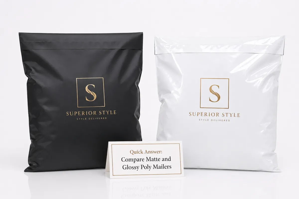
If you need the short version, compare matte and glossy poly mailers by asking what you want the customer to notice first. Matte gives you a calm, refined, low-glare look. It feels closer to premium stationery or minimalist retail packaging. Glossy feels brighter and more energetic, especially when the artwork uses saturated color or strong contrast. Those signals are louder than most buyers expect.
Matte usually hides small imperfections better. If a carrier machine presses too hard, if another parcel rubs against it, or if a label gets touched more than once, matte tends to forgive that wear. Glossy makes a bold logo look louder and a bright brand palette feel more alive. That can be useful. It can also be too much. Depends on the brand. Funny how that works.
So, if you compare matte and glossy poly mailers from a presentation standpoint, the basic rule is simple: choose matte for restraint, choose glossy for visual impact. Then check whether that choice still makes sense once the package is in the hands of an actual customer. A mailer that looks great on a photography table but looks scratched after a regional parcel network is not earning its keep.
A finish is not just a style choice. It is a handling choice too. If you compare matte and glossy poly mailers honestly, the one that still looks intentional after transit usually serves the brand better.
One practical move helps a lot. Compare matte and glossy poly mailers under the same light, with the same artwork, and with the same label stock. A finish can look completely different under warm warehouse LEDs than it does near a window or in a studio. That is why the rest of this breakdown looks at appearance, durability, printing, cost, and production timing. That is the real-world version of the decision.
Top Matte vs. Glossy Poly Mailer Options Compared
When buyers compare matte and glossy poly mailers, they usually start with finish, then realize there are several versions of each. A standard matte poly mailer uses a low-sheen exterior that softens reflections and gives the surface a muted, tactile look. A standard glossy mailer uses a reflective film that lifts color and makes the package feel brighter. Then there are metallic-gloss looks, heavier printed gloss finishes, and custom versions that pair finish with branding choices like opaque white ink, spot color, or clear design zones.
Hand-feel matters more than people expect. Matte is usually less slippery. That sounds minor until you are pulling thousands of mailers from a case, stacking filled bags on a bench, or trying to keep the work surface from turning into a skating rink. Glossy can feel slicker, which some teams like because it feels clean and sharp, but it also tends to show light scratches sooner. If you compare matte and glossy poly mailers while actually handling them, that difference lands immediately.
Channel matters too. Apparel brands, subscription shipments, reseller operations, influencer merch drops, and promotional mailings all use poly mailers differently. Matte tends to fit brands that want to look calm, curated, and premium without shouting. Glossy tends to fit brands that want the package to look lively in a stack, in a back room, or in a social clip. I have seen matte work very well for neutral-toned fashion labels and clean beauty brands. Glossy often suits louder graphics, youth-oriented merch, and saturated artwork. Not a law. Just a pattern that keeps showing up.
Before you compare matte and glossy poly mailers, check the mechanical side too. Thickness, seal strength, and tear resistance matter more than finish alone. A 2.5 mil mailer with a weak seal is still a weak mailer, no matter how nice the surface looks. Label adhesion matters as well. Most shipping labels bond fine to either finish, but handwriting, return notes, and marker-based handling can behave differently on matte versus glossy. Matte usually accepts writing more cleanly. Glossy may resist ink or smear if the wrong pen shows up. That part is annoyingly real.
- Matte standard mailers: Best for soft presentation, low glare, and scuff hiding.
- Glossy standard mailers: Best for bright color, reflection, and shelf-like visual punch.
- Metallic-gloss mailers: Best for premium campaigns that want extra shine.
- Custom-printed versions: Best when the finish needs to support a branded unboxing experience.
If you are building a broader packaging program, it helps to treat the mailer as one piece of a system. The rest of your branded shipping materials, from cartons to inserts, should feel like they belong together. That is where a catalog like Custom Packaging Products helps buyers compare components side by side instead of guessing at each piece alone. And if the priority is specifically shipping bags, the Custom Poly Mailers page is the direct place to narrow finish, size, and print choices.
Detailed Reviews of Matte and Glossy Poly Mailers
Matte mailers are often the safer visual choice. If you compare matte and glossy poly mailers after a realistic shipping cycle, matte usually hides the tiny stories parcels collect along the way. Conveyor rub, finger contact, a scuffed corner, or a light crease near the seal line tends to disappear better on matte than on glossy. That makes matte useful for brands that want a restrained premium look and do not need every package advertising the handling history.
Matte also photographs well for a simple reason: it avoids harsh glare. If a brand wants to capture product shots or customer-generated unboxing footage, the matte surface gives the camera less trouble. The logo reads clearly, shadows stay manageable, and the package looks composed instead of shiny. For minimal branding, black-on-matte, white-on-matte, or muted tone-on-tone printing often looks better than the same artwork on a bright reflective film.
Glossy mailers deserve the same honest treatment. If you compare matte and glossy poly mailers and you want color intensity, glossy can be excellent. Rich reds, saturated blues, vivid gradients, and high-contrast logos often feel more dramatic on a glossy surface. That shine can help when the package is supposed to feel like a little event. In some categories, such as influencer merch, promotional drops, or brands with a louder visual identity, the reflection becomes part of the appeal.
Glossy is less forgiving, though. Scratches stand out. Smudges stand out. A crease that would blend into matte can flash under light on glossy film. That matters once shipments leave your control, because the package is likely to be stacked, slid, and separated several times before delivery. If you compare matte and glossy poly mailers in warehouse light and then in daylight, the glossy unit often looks richer while the matte unit looks steadier. That is the tradeoff. No mystery there.
Print behavior is another place where buyers get surprised. Dark ink on matte can read deep and even, while glossy can make the same color appear more electric or more reflective depending on the base film. Photographic art often looks punchier on glossy, but very fine typography can sometimes feel cleaner on matte because the finish does not fight the eye. If your artwork depends on subtle details, compare matte and glossy poly mailers with actual proof sheets rather than trying to read the future from a PDF.
Shipping reality has a habit of ruining pretty assumptions. Moisture, heat, and abrasion affect both finishes, but glossy often reveals those issues sooner to the eye. Matte can disguise wear, which is useful for long transit lanes or mixed handling environments. If your parcels move through busy sorting centers, local delivery routes, and multiple handoffs, matte usually gives you a calmer outcome.
I also pay attention to label adhesion and inserted materials. If you are using a printed insert, return card, or handwritten note, the surface of the mailer changes how the package feels when the customer opens it. Matte gives a more paper-like contrast against tape, labels, and inserts. Glossy feels more sealed and product-like. Neither is automatically better, but the feel influences the unboxing moment. That is why serious buyers compare matte and glossy poly mailers with the whole parcel assembled, not just a loose sample in hand.
For standards-minded teams, testing matters. The best packaging departments look at film tensile behavior, seal integrity, and transit simulation instead of trusting a sales sample alone. Industry references such as ISTA parcel protocols are useful when you want to simulate vibration, drops, and compression in a controlled way. A finish cannot fix a poor structure, and a strong structure should not be downgraded just because one surface looks shinier on day one.
Honestly, if a brand has to choose quickly, I usually suggest a simple test. Compare matte and glossy poly mailers under the lighting they will see most often, then look at them again after handling. The finish that still looks intentional after the second round is usually the better one. I have seen teams talk themselves into the shiny option and regret it the first time a pallet gets bumped. Not a fun meeting.
Price Comparison: Cost, Minimums, and Print Methods
Price is where the conversation gets oversimplified fast. Buyers compare matte and glossy poly mailers and assume the finish itself is the main cost driver. It is not. Size, thickness, print coverage, seal style, order quantity, and freight often matter just as much, sometimes more. A plain stock mailer in a common size may sit near the bottom of the range, while a fully custom-printed run with heavy ink coverage and a specialty finish moves upward quickly.
For a commercial order of around 5,000 pieces, a realistic range for Custom Poly Mailers might look something like this: plain matte or plain glossy stock-style units around $0.10-$0.18 per unit, custom-printed matte mailers around $0.18-$0.28 per unit, custom-printed glossy mailers around $0.19-$0.30 per unit, and premium metallic-gloss looks around $0.24-$0.38 per unit. Those are not fixed quotes. They move with size, film thickness, print coverage, and whether the artwork needs extra setup. They do, though, give you a real framework instead of vague marketing fluff.
That is why I always tell buyers to compare matte and glossy poly mailers on total landed cost. The base unit price is one line. Freight is another. Storage matters if you are receiving large cartons. Reprint risk matters too, especially if you are proofing artwork for the first time. A slightly cheaper unit can become expensive if the proof cycle is messy or if the finish does not match your brand and you end up with a reorder.
Minimum order quantity changes the equation as well. Some suppliers keep minimums high because the setup for print plates, film runs, and color matching takes time. Other programs support smaller runs, but the per-unit cost usually rises. If you are trying to compare matte and glossy poly mailers for a new product line, it may be smarter to start with a manageable MOQ, test response, and then scale. That protects you from sitting on cases of packaging that looked fine in a mockup and wrong in hand.
Print method matters too. Flexographic printing is common for larger runs because it handles speed and repeatability well. The artwork setup can be more involved, but the unit economics usually improve at volume. Digital printing can be useful for shorter runs or frequent design changes, though it may cost more per unit and require tighter artwork prep. Matte often pairs well with understated branding and solid ink blocks, while glossy can make bright coverage feel more intense. If you compare matte and glossy poly mailers by print method, the best value is usually the one that matches your run size and your brand style, not the one with the flashiest sample.
| Option | Typical Use | Visual Effect | Estimated Unit Cost at 5,000 Pieces | Practical Notes |
|---|---|---|---|---|
| Plain matte poly mailer | Apparel, resale shipping, low-glare branding | Soft, clean, understated | $0.10-$0.18 | Hides light scuffs well and writes on more easily |
| Plain glossy poly mailer | Promotional mailings, high-color visuals | Bright, reflective, attention-grabbing | $0.10-$0.18 | Can show handling marks more clearly |
| Custom matte print | Premium e-commerce, minimal branding | Muted, polished, modern | $0.18-$0.28 | Good for logos that need a calm, clean presentation |
| Custom glossy print | Bold merch, colorful campaigns | Rich color, strong reflection | $0.19-$0.30 | Useful when the artwork depends on shine and saturation |
| Metallic-gloss specialty finish | Prestige promotions, limited drops | High-impact, eye-catching, premium | $0.24-$0.38 | Usually needs tighter artwork approval and more budget room |
There is a reason finance teams and operations teams sometimes disagree on this decision. Finance sees the unit cost and wants the cheaper line item. Operations sees rework, returns, handling, and storage burden. Branding sees the customer experience. When you compare matte and glossy poly mailers well, you put all three views in the same room. That is usually where the right answer shows up.
For teams that also source paper-based packaging, the environmental side may enter the conversation too. The EPA’s sustainable materials guidance is useful background when you are weighing material reduction, recyclability, and waste planning across a packaging program. It does not pick a finish for you, but it does remind buyers that packaging decisions sit inside a broader materials strategy.
Process and Timeline: Sampling, Proofs, and Lead Times
The best time to compare matte and glossy poly mailers is before the order is locked, not after the invoice is paid. A good buying process starts with a sample request. You want the actual feel of the film, the actual reflectivity of the finish, and a sense of how the mailer behaves when folded, sealed, and labeled. If color matters, ask for samples with similar print coverage to your intended artwork, not just blank material.
Proofing saves or burns time. During proof review, the artwork should be checked for size, logo placement, bleed, and any finish-specific issues that affect clarity. A glossy proof may appear brighter than the final production unit under the wrong light. A matte proof may look softer, which can be exactly what you want. I always advise buyers to compare matte and glossy poly mailers in the same environment where the finished product will be used. Warehouse lighting is not studio lighting. That difference is real.
Timeline usually breaks into a few stages: sample delivery, artwork revision, proof approval, production scheduling, and freight. For many custom runs, production can often take around 12-15 business days after proof approval, though more complex print jobs or high-volume orders can take longer. Freight may add another few days for domestic delivery or more for cross-border shipments. If a supplier is waiting on artwork corrections, those revisions can be the longest delay of all.
There are also decision points that prevent expensive backtracking. Confirm the dimensions early. Confirm the seal style. Confirm the required quantity by size and color. Confirm whether the mailers will ship with other branded components so the finish can be matched across the set. If you compare matte and glossy poly mailers after the order is already moving, you lose flexibility. If you compare them before proof approval, you gain room to improve the whole system.
One more practical tip: ask how the finish is controlled during the run. In real manufacturing, consistency across film lots and print batches matters. If the finish varies too much, you can end up with a reorder that looks slightly different from the first batch. That may sound minor, but branded packaging buyers notice immediately. A shade shift or gloss shift is visible the moment cases are stacked side by side.
For operations teams, testing the finished unit against a realistic transit path is worth the time. If you want a formal shipping simulation, ISTA methods are a strong reference point. If the package will be exposed to compression, vibration, or drop handling, a simple in-house test can still reveal a lot. Load the mailer, seal it, label it, stack it, and move it through a normal workday. Then compare matte and glossy poly mailers after that trial. The winner is usually obvious.
Lead time also depends on print method. Flexo often makes sense for repeat programs and higher volumes because the setup can pay off over larger quantities. Digital can shorten the path for smaller, changing runs, but may cost more per unit. Either way, it is wise to ask for sample photos, proof timing, and shipment estimates before committing. If the timeline is tight, matte often gives you a simpler approval process because the visual expectations are less sensitive to glare and light variation.
How Do You Compare Matte and Glossy Poly Mailers for Your Brand?
If you want a practical framework, compare matte and glossy poly mailers by brand personality first, then by handling environment, then by budget. The fast answer is this: matte usually says calm, considered, and premium without being loud, while glossy says bright, vivid, and attention-seeking. Those messages fit very different customers. One may belong to a quiet-luxury apparel line. The other may be perfect for a merch drop that needs the package to do part of the marketing.
Start with the customer experience you want to create. If your packaging should feel restrained and polished, matte is usually the cleaner fit. If the parcel should pop on a shelf, in a stack, or in a video, glossy can do more of the visual heavy lifting. That choice should still be checked against how the mailer will move through your workflow. A finish that looks polished in a design deck but picks up marks in fulfillment is asking for trouble.
Here is the simplest decision path I give buyers:
- Choose matte if you want a softer, low-glare appearance and better scuff hiding.
- Choose glossy if you want color punch, shine, and stronger shelf-like presence.
- Choose matte if your team writes on labels or inserts by hand often.
- Choose glossy if your artwork depends on vivid saturation and reflection.
- Choose matte if long transit and rough handling are common.
- Choose glossy if the unboxing photo matters more than subtle wear hiding.
That list is not the whole answer, but it gets the discussion moving in the right direction. If you compare matte and glossy poly mailers for an apparel brand, matte often works beautifully with folded tees, hoodies, and soft goods because it looks thoughtful without distracting from the product. For cosmetics, skincare, or accessories, glossy can amplify the perceived energy of the brand, but only if the artwork is disciplined. A glossy bag with too much clutter can look busy fast. Nobody needs that.
For resale and marketplace shipping, matte often wins because it looks cleaner after repeated handling and is easier to annotate. For promotional mailings and event merchandise, glossy can be more effective because the package has to do some showmanship. If you sell through channels where the package appears in photos before the buyer opens it, compare matte and glossy poly mailers against actual camera flash. That is where the differences get obvious fast.
Operational realities matter too. Storage space, humidity, and label visibility all influence the right finish. If a fulfillment team is moving fast, a matte surface that hides handling marks can make the workday smoother. If the brand operates in a clean, tightly controlled environment and wants the mailer to pop, glossy may hold up perfectly well. The better answer is not the one with the loudest shine. It is the one that keeps the brand consistent after real use.
I also recommend thinking about the whole branded stack, not just the outer bag. If the mailer is one part of a broader packaging system, the finish should match the feel of inserts, tissue, cartons, and any seals or labels. A glossy bag paired with a soft matte insert can work if the contrast is deliberate. It can also feel disjointed if the rest of the package is understated. The same is true in reverse. Compare matte and glossy poly mailers with the rest of the unboxing set on the table, and you will make a better call.
One detail buyers forget: the person receiving the parcel may not open it immediately. The mailer might sit in a lobby, a warehouse, a front desk, or a mailbox for hours. That means the package has to look good in more than one context. Matte tends to be more forgiving in mixed light. Glossy can be more attention-grabbing in person, but it may also reveal every angle shift. That is why it helps to compare matte and glossy poly mailers under bright light, soft daylight, and ordinary room lighting before you commit.
If you are working through this with a packaging supplier, bring the conversation back to specs. Ask about film thickness, seal strength, print method, dimensional tolerance, and minimum order quantity. Ask how reorders will be handled. Ask whether the finish can be matched across future production lots. Buyers who compare matte and glossy poly mailers this way usually end up happier with the result, because they are buying a finish and a process, not just a look.
Our Recommendation and Next Steps
Here is the honest recommendation: choose matte if you want a refined, low-glare brand presentation with better wear hiding, and choose glossy if visual pop and color intensity matter most. If you compare matte and glossy poly mailers only by how they look on a sample sheet, you may miss the thing that matters most, which is how they look after they have been packed, shipped, stacked, and opened.
The next step should be a real side-by-side test. Request both finishes. Compare them under indoor light and natural light. Print or apply your actual label. Put your logo on both. Then run a simple handling test: load the mailer, seal it, stack it, slide it, and inspect it again. If possible, repeat that after a short transit simulation. A mailer that still looks intentional after that test is usually the one that deserves the order.
Before you place the final PO, verify the buying details. Confirm MOQ, print method, lead time, freight cost, and reorder consistency. If you are building a wider packaging system, make sure the new mailers fit with the rest of your branded supplies. The broader Custom Packaging Products lineup can help you keep the finish, color, and unboxing tone aligned across the shipment. And if your decision is centered entirely on shipping bags, compare matte and glossy poly mailers directly on the Custom Poly Mailers page so the finish choice stays tied to the product spec, not to a guess.
My final take is simple. Matte usually gives you the safer, more polished, more forgiving result. Glossy gives you more shine and more drama. Neither is automatically better. The better pick is the one that matches your handling conditions, your art direction, and your customer’s expectations. If you compare matte and glossy poly mailers with that level of honesty, the decision stops being a debate and starts being a fit.
So if you are ready to compare matte and glossy poly mailers for a real order, start with samples, test them in your own light, and choose the finish that still feels right after the package has done its job. That is the version your customer will actually remember.
FAQ
Which is better when you compare matte and glossy poly mailers for branded shipping?
Matte is usually better for a subtle, premium look that hides scuffs. Glossy is usually better if you want brighter color and stronger visual impact. The right choice depends on whether your brand values restraint or shine, and on how rough the shipping path tends to be.
Do matte poly mailers hide scratches better than glossy poly mailers?
Yes. Matte finishes usually disguise light scuffs, fingerprints, and conveyor wear more effectively. Glossy finishes can make those marks more noticeable because the reflective surface catches the eye faster. If packages travel through rough handling, matte is often the safer visual choice.
Are glossy poly mailers more expensive than matte poly mailers?
Not always. Total price depends on size, thickness, print coverage, order volume, and freight. Glossy can cost a bit more in some custom runs if the finish or artwork setup is more complex, but the best comparison is total landed cost rather than the base finish alone.
Can I write on matte or glossy poly mailers?
Matte mailers are usually easier to write on with markers or shipping notes. Glossy mailers can resist ink better, which may cause smearing or poor readability. For handwritten labels or notes, matte is generally the more practical option.
How do I choose between matte and glossy if I need fast production?
Ask for sample photos, proof timing, and production lead times before placing the order. Choose the finish that fits your packaging workflow without extra rework or testing delays. If you need speed and visual flexibility, matte often gives you a simpler approval path.