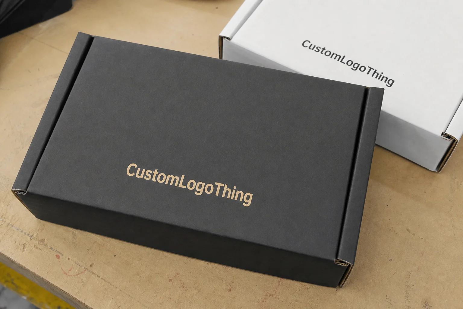
Custom black mailer boxes are popular for a reason: they deliver a premium first impression with very little visual noise. Black makes typography sharper, gives metallic and white inks more contrast, and helps a shipment feel considered instead of generic. That same strength is also the risk. If the board is weak, the print coverage is inconsistent, or the finish is wrong for the shipping route, the box starts to look tired before it reaches the customer.
The practical question is not whether black looks good. It usually does. The real question is whether the package spec can support that look without creating extra waste, delays, or hidden cost. Dark packaging exposes shortcuts more quickly than kraft or white stock, especially along folds, edges, and corners where ink coverage and board quality are easiest to judge.
A black mailer only feels premium when the substrate, print method, finish, and sizing are aligned. If one of those elements is off, the whole package reads lower quality.
That is why buyers need more than a mockup. A render can flatter a bad spec. A sample, a clear die line, and a realistic shipping test tell you much more about how the finished box will perform in the hands of the customer and in the parcel network.
Why black mailer boxes get noticed so quickly
Black works because it creates contrast immediately. A clean logo stands out. White type looks crisp. Foil accents, spot UV, and subtle textures are easier to notice on a dark field than on a natural kraft surface. That is why black mailers are so common in cosmetics, apparel, subscription kits, gifting, and other categories where the outer package is part of the brand experience, not just a shipping shell.
There is also a practical side to the color choice. Black hides some kinds of transit wear better than lighter substrates. A faint rub mark or small handling scuff may disappear into the surface instead of screaming for attention. That advantage is real, but it is not automatic. High-gloss black, for example, can show fingerprints and abrasion more clearly than a matte finish. Soft-touch can look rich, but it needs a controlled fulfillment environment and careful handling if you want it to stay that way.
Buyers often underestimate how much the product itself affects the value of a black mailer. A luxury fragrance set, a premium apparel drop, or a limited-edition gift box can justify the added print and finishing cost. A low-margin item usually cannot. If the outer packaging is carrying too much of the perceived value, the economics get strained fast. The box should support the product, not try to compensate for it.
Black also has a downside that shows up in production. Dust, ink defects, crushed corners, and uneven edge coverage are easier to spot against a dark background. That is why black packaging demands tighter quality control than a lot of first-time buyers expect. The finished piece has less room to hide.
How black mailer packaging is constructed and printed
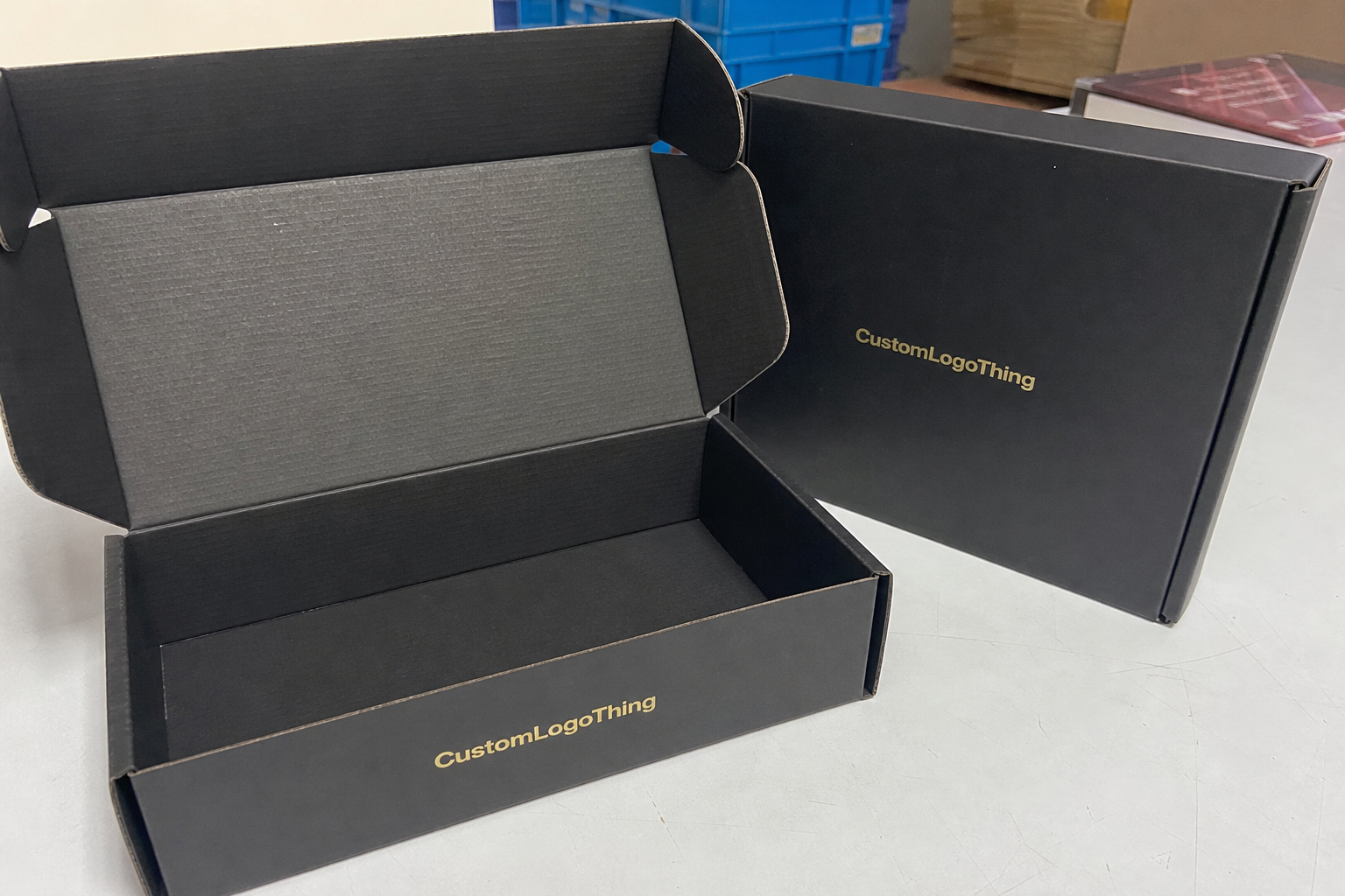
Most mailer boxes are built from corrugated board, and the flute choice matters. E-flute is often used for lighter products and cleaner print detail. B-flute offers more structure and better crush resistance, which is useful for heavier shipments or parcels that will be stacked, sorted, and handled repeatedly. The structural geometry is not just a technical note; it changes how the box looks after the first few miles of transit.
Black can be achieved in different ways. Some boxes use pre-colored black board. Others are printed black on the outside, often with a coating or lamination layered over the print. A third option is a wrap or liner applied to the corrugated base. Each approach affects cost, appearance, and durability. Pre-colored stock can give a strong base tone, but edge treatment still matters. Full-surface printing can look excellent, but it needs better press control to avoid streaks or patchy coverage. Laminated wraps usually improve presentation, though they add cost and can change how the box folds and ships flat.
Print method matters just as much as the material choice. Digital printing is often the better fit for shorter runs, frequent artwork changes, or test programs. Offset printing becomes more attractive as quantities rise and the artwork is stable enough to justify plates and setup. If the design uses solid black backgrounds, the supplier should be able to explain how they control ink density and registration across the run. Uneven coverage is one of the fastest ways to make a black box look cheap.
Finishing options should be chosen with restraint. Matte coatings usually hide handling marks better than glossy ones. Soft-touch lamination creates a richer tactile feel, but it can be more sensitive to scuffing in high-friction fulfillment environments. Spot UV works best when it is used to emphasize a logo, border, or pattern instead of covering the whole box in shine. Foil can be effective on black stock, but only if the artwork is strong enough to justify it. Over-decorating a black mailer tends to flatten the premium effect rather than improve it.
The inside of the box matters too. Inserts, dividers, and custom die cuts keep the product from shifting and reduce the chance of damage during shipping. They also change the customer experience the moment the lid opens. A box that looks polished on the outside but allows the product to rattle in transit does not feel premium for long. For multi-item kits, the insert is part of the design, not an accessory.
Before approving a run, ask three questions that cut through the sales language: how is the black actually being created, how is edge coverage handled, and what finish will survive transit without making fingerprints or scuffs obvious. That is where quality usually rises or falls.
For reference points on shipping performance and fiber sourcing, the guidance at ISTA and FSC is useful if you need to align packaging claims with actual transport and sourcing expectations. Those are not decorative references. They help separate marketing language from material reality.
Pricing, MOQ, and what drives unit cost
Unit cost is shaped by size, board grade, print coverage, finish, inserts, and freight. Black itself is not the entire price driver, but it often increases the pressure on every other variable because the surface has to look clean at scale. If the design requires solid coverage on all panels, controlled edge coloring, and a premium finish, the quote will rise accordingly.
For planning purposes, simple black mailers in volume can sometimes land in the roughly $1.20 to $3.50 per unit range, depending on quantity, dimensions, and print method. Premium builds with soft-touch lamination, foil, inserts, or heavier board can move into the $4.00 to $8.00-plus range quickly. Those are broad market ranges, not promises. Small differences in size, run length, and shipping method can move the final number more than people expect.
MOQ is usually where the economics become clearer. Shorter runs carry higher per-unit cost because setup expenses are spread across fewer boxes. Larger runs reduce unit cost, but they increase inventory risk if the artwork, product size, or branding changes later. A buyer who is still refining the package should be cautious about locking into a large order just because the per-piece number looks attractive.
Quotes need to be compared on the full scope, not just the headline unit rate. Setup fees, dieline revisions, proofing charges, plate costs, inserts, packaging for shipment, and freight can change the landed cost meaningfully. Two suppliers can look similar on paper and still end up far apart once everything is counted.
| Option | Typical Use | Cost Impact | Practical Effect |
|---|---|---|---|
| Basic black mailer, no special finish | Apparel, standard DTC shipments | Lower | Cost-efficient, but coverage and edge quality need close review |
| Matte-coated black mailer | Branded packaging with a cleaner surface | Moderate | Improves scuff resistance and reduces glare |
| Soft-touch with foil or spot UV | Gift sets, cosmetics, premium retail packaging | Higher | Stronger presentation, but more expensive and less forgiving |
If sustainability claims are part of the brief, ask for documentation rather than a label in a quote line. A certified board claim should come with chain-of-custody details, not just a general statement. Buyers do themselves a favor by treating those details as part of the spec, not as an afterthought.
The cheapest quote is not usually the cheapest package. If the box arrives with visible rub marks, poor closure, or weak structure, the hidden cost shows up in replacements, complaints, and lost confidence. A clean pack-out and a predictable unboxing experience are worth more than a small unit discount that disappears in the field.
Production process, proofing, and lead time
The production flow is straightforward on paper. The buyer submits dimensions and artwork. The supplier confirms the dieline. Proofs are reviewed. Samples may be approved. Production begins. Finishing, folding, and packing follow. Shipping closes the loop. In reality, the slowest part is usually the first round of coordination, not the physical manufacture.
Most delays happen before the run starts. Missing bleed, incorrect dimensions, vague finish instructions, and last-minute copy changes all force additional proofing. If the box size is still changing, the schedule will move. Black packaging does not forgive rushed setup, because small imperfections are more visible on the final surface.
A realistic timeline for many standard programs is around 12 to 20 business days after proof approval, with shipping added on top. Simpler digital jobs can move faster, especially when the artwork is final and the spec is uncomplicated. Jobs with lamination, foil, inserts, heavy board, or custom die cuts usually take longer. International freight changes the timeline again, and ocean transit should never be treated like a quick option if the launch date is fixed.
Lead time is easier to control when the buyer locks four details early: final dimensions, print method, finish, and delivery address. Those choices drive the rest of the order. Once they change, the project usually moves from production into re-quoting or re-proofing territory.
Quality control on black mailers should be more specific than a general visual check. Inspect the ink coverage at the folds and edges. Confirm that the box holds its shape when assembled. Check for scuffs on high-contact surfaces. Verify that the finish does not create distracting glare or fingerprints. If inserts are included, confirm fit with the actual product, not just a placeholder sample. The box may look fine flat on a table and fail once folded, packed, and handled.
Shipping method matters too. Air freight moves faster and costs more. Ocean freight lowers landed cost on larger orders but adds time and requires better planning. For recurring shipments, that tradeoff can work well. For a launch tied to a marketing calendar, it is safer to plan around the slower path and treat faster freight as a contingency rather than a default.
Spec decisions that make the box feel premium
Size comes first. A well-fitted box feels intentional, protects the product, and uses material efficiently. Oversized mailers tend to look wasteful and can push shipping costs up for no good reason. If the contents slide around, the unboxing feels less controlled and the protection drops at the same time.
Finish comes next. Matte is often the safest baseline because it softens light and makes surface wear less obvious. Soft-touch adds a richer feel, though it should be used carefully in fulfillment environments where friction is common. Gloss can create a striking contrast on black stock, but it also highlights fingerprints and handling marks. Spot UV can be effective if it is used sparingly and with discipline. Overuse makes the box look busy rather than refined.
The board needs to match the product weight and the transport conditions. A lightweight apparel item does not need the same structure as a bundled cosmetic set or a heavier kit that moves through a rough parcel network. If the supplier cannot tie their recommendation to product weight and shipping conditions, the advice is too vague to be useful.
Inside presentation deserves more attention than it usually gets. Tissue, product cards, inserts, and dividers are not filler. They shape the opening experience and help the product arrive intact. A black mailer with a clean interior layout feels more deliberate than a dark box with loose contents rattling around inside it. That difference is easy to feel, even when it is hard to quantify on a quote sheet.
Artwork on black stock should stay disciplined. Strong contrast usually performs better than crowded graphics. White, silver, or one controlled accent color often reads better than a dense full-color layout. Tiny type is risky if the font weight is too light. Barcodes, legal copy, and handling marks need enough contrast to stay legible in less-than-ideal lighting. Black packaging rewards clarity and punishes clutter.
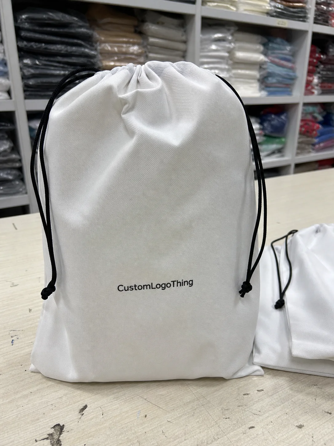
For brands building a fuller packaging system, consistency matters across the range. The mailer, inserts, and secondary cartons should feel like parts of one visual language, which is why many teams coordinate the outer box with Custom Packaging Products and, for lighter shipments, Custom Poly Mailers. The goal is not matching for its own sake. It is making the package system feel deliberate from shipment to shelf.
Premium does not mean ornate. It means every visible decision has a job to do.
Common ordering mistakes to avoid
The first mistake is trusting a digital mockup too much. A render can make almost any black box look polished. The sample is the real test, because surface finish, edge coverage, and color density only become obvious in hand.
The second mistake is overcomplicating the artwork. Dense graphics, multiple finishes, and tiny details can dilute the effect of black stock. They also raise the chance of visible imperfections. A clear logo, a restrained layout, and one or two finish treatments usually age better than an overloaded design.
The third mistake is forgetting how hard parcels are on packaging. Corner crush, rubbing, humidity, and repeated handling all affect appearance. If the box is going through parcel distribution rather than local handoff, the spec should be checked against real transit stress, not only against a tabletop sample.
The fourth mistake is comparing quotes that are not built the same way. One supplier may include coating or inserts, another may not. One may quote a lighter board, another a heavier one. If the apples are different, the pricing comparison is not useful.
The fifth mistake is weak artwork prep. Low-resolution logos, poor contrast, and small white text on black stock create avoidable problems. If the file is not ready for print, the finished box will expose it quickly. Black leaves very little room for guesswork.
Quoting with less risk and more clarity
Before requesting quotes, gather the exact dimensions, product weight, quantity, finish preference, insert requirements, and delivery target. The more precise the brief, the more useful the quote. A vague request invites a vague answer, and black packaging is too spec-sensitive for that kind of guessing.
If the box is tied to a launch, a subscription refresh, or a high-value gift program, ask for a sample or prototype before committing to volume. Check it under normal indoor light, not just under studio lighting. Review the folds, the corners, the closure, and the way the logo reads at a glance. If the sample already feels dull, it is unlikely to improve during production.
When comparing suppliers, examine board spec, print method, finish, and landed cost together. That gives a truer picture than unit price alone. A lower price with weak board and higher freight is not a bargain. It is just a less obvious expense.
If order volume is still uncertain, phase the purchase. Start with a manageable run, learn from fulfillment and customer response, then revise the spec with better information. That approach is slower at first, but it reduces the risk of being stuck with the wrong box in the wrong quantity.
A supplier should be able to explain why one spec will hold color better, resist scuffs more effectively, or fit the product with less waste. If that explanation is missing, the quote is probably just transactional. The better result is usually the one grounded in the actual job the box needs to do.
Custom black mailer boxes work best when the presentation, structure, and shipping reality are treated as one problem. If the spec reflects the product, the route, and the brand promise, the box will do its job cleanly. If not, black will show the weakness faster than most other packaging choices.
What makes custom black mailer boxes more expensive than kraft boxes?
Black packaging often needs tighter print control, stronger finishing, or a better board grade to look clean. Costs rise again if the design uses foil, spot UV, soft-touch lamination, inserts, or heavier corrugated board. Freight can also increase if the finished carton is larger or heavier than a simpler kraft mailer.
What is a typical MOQ for black mailer boxes?
MOQ depends on the size, print method, and finish. Short-run digital jobs can usually start lower than offset or highly customized production. Ask whether the minimum applies to one artwork version, one size, or a combined run across variants, because that detail changes the pricing structure.
How long does production usually take?
A straightforward order often runs about 12 to 20 business days after proof approval, then shipping time is added. More complex builds with inserts, foil, or special coatings take longer. If the artwork or dimensions are still changing, the timeline usually stretches with them.
How can I keep black mailer boxes from looking scratched or dusty?
Choose the finish carefully, because matte, gloss, and soft-touch all behave differently on dark stock. Keep the artwork clean and avoid tiny details that disappear in low light. Request a sample and inspect the box for scuffing, edge coverage, and fingerprints before approving a larger run.
What should I send when asking for a quote?
Send exact dimensions, product weight, quantity, target finish, insert or divider needs, and the delivery address. Include artwork files or a clear design brief so the supplier can price the actual scope. Ask for setup fees, lead time, and freight to be broken out so the quotes can be compared properly.