How to Print Custom Mailer Boxes That Carry the Brand Well
If you want to print Custom Mailer Boxes that do more than survive transit, start with the unboxing moment rather than the shipping label. The customer sees the carton before the product is in hand, so the box is already setting expectations, signaling price point, and either making the order feel deliberate or making it look like a plain warehouse shipment.
That is why packaging is not just decoration. A well-built mailer can replace loose filler, reduce secondary packaging, and make the whole delivery feel closer to retail packaging than bulk shipping. For ecommerce brands, subscription kits, and giftable goods, that difference shows up quickly in perceived value, repeat orders, and the number of customers who post the package instead of just the product.
There is a practical line, though. If the item is low-margin, purely functional, or already ships inside a battered outer carton, a plain corrugated box may be the better spend. Printed mailers matter most when the packaging is part of the sale: direct-to-consumer brands, launch kits, influencer sends, premium accessories, cosmetics, candles, apparel, and anything else where package branding matters as much as the item inside.
Use the printed box when the carton has a job beyond containment. If it is only a container, keep it simple.
Why printed mailers outperform plain shipping cartons
Plain shipping cartons get the job done. They are fine for storage, bulk freight, and back-of-house logistics. They are not built to sell a brand. A printed mailer turns the shipping surface into a customer touchpoint, and that matters because the shipment gets judged before the product does.
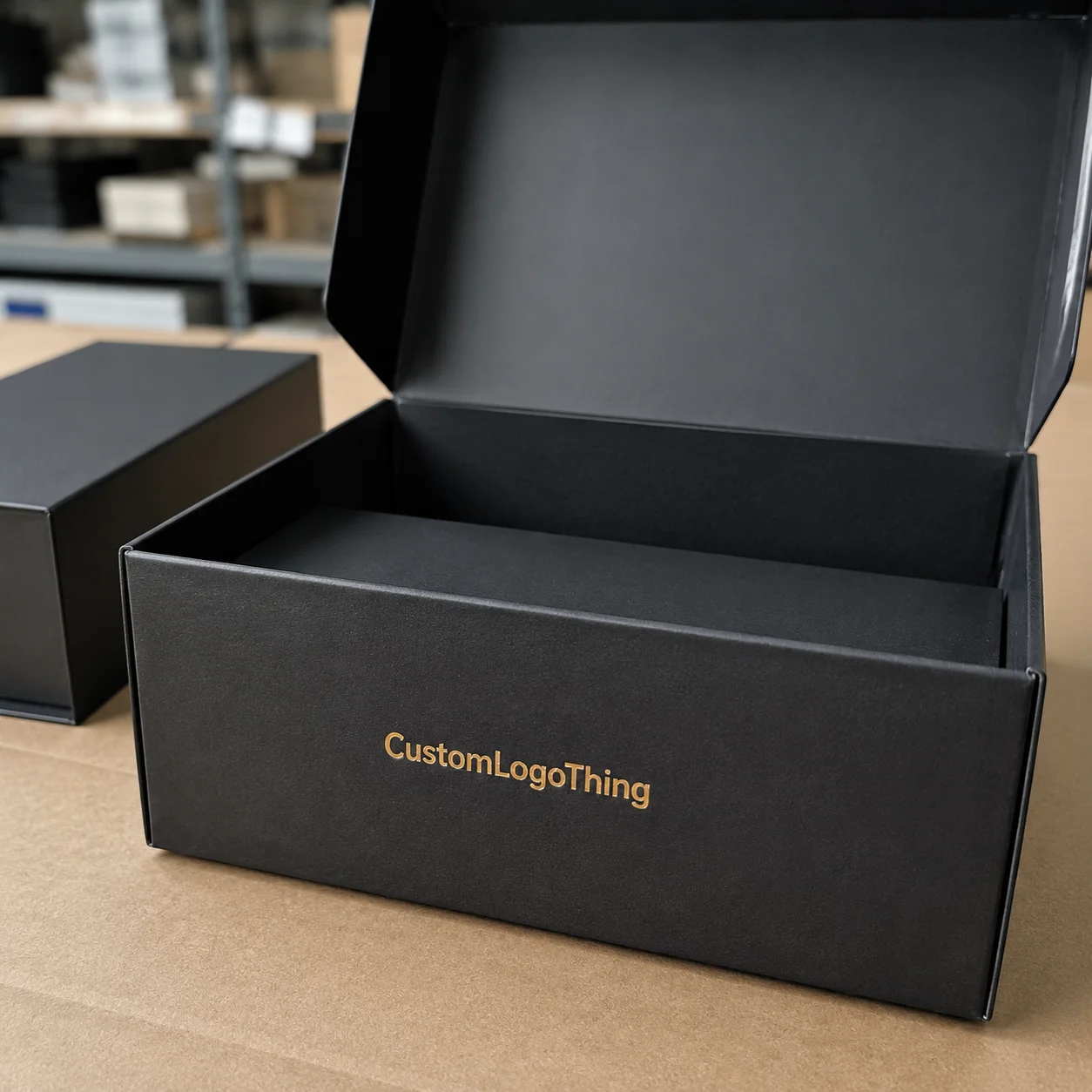
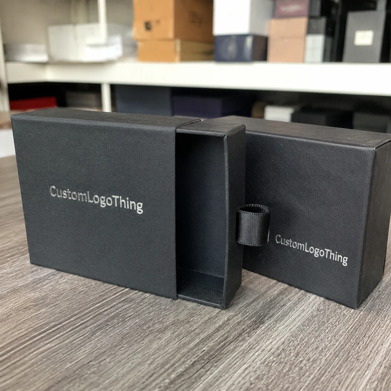
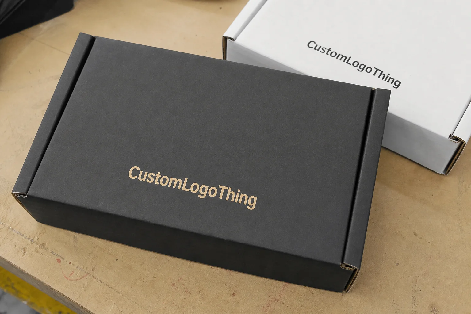
The main advantage is control. Printed mailers let you shape the first impression with color, typography, pattern, and structure. A one-color logo on kraft can feel restrained and premium. A full-coverage exterior with a thoughtful inside reveal can feel like a proper unboxing. Either way, you are making it easier for the customer to understand who sent the package and why it feels intentional.
There is also an efficiency angle that gets overlooked. A better box design can simplify the rest of the packout. If the insert, tissue, or printed card is doing the storytelling, the carton can stay cleaner. In the right setup, that reduces clutter and keeps cost under control, especially when the custom printed boxes are sized correctly and the print coverage is limited to the panels customers actually see.
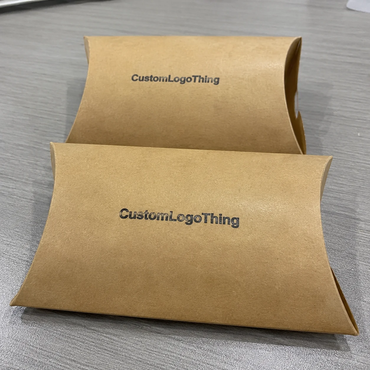
Not every brand needs heavy coverage. A clean kraft exterior with a strong mark can outperform a crowded design that tries to do everything at once. One clear idea executed well will usually beat six design moves fighting each other.
Good candidates for printed mailers usually share a few traits:
- The customer opens the box on camera, in-store, or in a gifting context.
- The product benefit is emotional as well as functional.
- Brand recognition matters more than hiding the shipper.
- The packaging needs to communicate quality before the product is handled.
Plain cartons still win on cost and speed. If you are shipping replacement parts, wholesale replenishment, or very high-volume commodity goods, custom print can be overkill. In those cases, spend where the customer notices it and stop there.
A box that looks expensive but arrives scuffed is not premium. It is just expensive damage with better typography.
For brands comparing formats, it helps to review a broader range of Custom Packaging Products. If the product itself needs a lighter shipper, Custom Poly Mailers can make more sense than corrugated mailers, especially for apparel and other soft goods.
How to print custom mailer boxes without rework
The production flow is straightforward once the jargon is stripped away. First comes the dieline, the flat template that shows folds, cuts, glue areas, and panel sizes. Artwork is then placed on that dieline and checked for bleed, safe zones, and panel orientation. After the proof is approved, the board is printed, cut, creased, folded, and packed.
The most common mistake is assuming artwork can be dropped onto any box size without adjustment. Mailer panels, tuck flaps, seams, and folds all affect what the customer sees. A logo too close to a crease will distort. Fine type near a fold can look shaky. A centered pattern can suddenly feel off because the front panel is not the same width as the side panel.
Print method matters, but it should not be the first decision. Digital printing is usually the best fit for lower quantities, faster turnarounds, and artwork that needs flexibility. It handles short runs well and avoids the setup burden of plates. Offset printing is a better fit for higher volumes and tighter control over color, especially when the design uses rich coverage or needs a refined finish. Flexographic printing can be economical at scale for simpler graphics, but it is not the first choice for every premium build. If the box needs a litho-lam presentation, that is another route entirely, usually with more setup and a higher total cost.
Pick the volume, finish, and quality target first. Match the print method to that combination instead of forcing the design into a process that does not suit it.
Physical proofs are worth the time when color matters, when the box is part of a launch, or when the design uses tight registration and small type. A screen proof is useful, but it is not the same as seeing ink on board. A press proof or sample is slower. It is also cheaper than discovering that a deep navy reads flat on kraft or that the logo disappears once a flap folds inward.
Packaging standards matter too if the box needs to survive shipping abuse. For transit performance, the testing methods used by ISTA are a sensible reference point. If the board needs certified fiber, FSC is the label to ask for. Neither one fixes weak design, but both help set a cleaner sourcing baseline.
Die lines are not decoration. They are production instructions. If the file is missing dimensions, fold marks, or panel labels, the job stalls. That is one of the simplest ways to lose a week for no useful reason.
Material, finish, and structure choices that change the result
Board choice changes almost everything. For most mailer-style jobs, E-flute corrugated board is common because it balances printability, stiffness, and shipping weight. It is thin enough to feel clean, but strong enough for retail-style mailers and direct-to-consumer shipments. Heavier products may need a stronger flute or double-wall construction, especially if the box will be stacked, drop shipped, or handled many times before the customer sees it.
The surface finish changes the perceived price point fast. Matte reads understated and modern. Gloss makes color pop, but it also shows scuffs and fingerprints more readily. Soft-touch can feel premium in hand, though it is not the best choice for every carton because it can pick up wear. Uncoated kraft has its own appeal: earthy, honest, and less fussy, but not every graphic looks right on it. Some designs are built for smooth white board and flatten badly on brown stock. That is not a print failure. That is a substrate mismatch.
Structure matters just as much as surface. Standard tuck flaps are familiar and efficient. Tear strips can improve the opening experience if you want a cleaner first reveal. Inserts are useful when the product shifts in transit, but they add cost and design complexity. If the item is fragile or oddly shaped, an insert can be worth it. If the product already fits snugly, skip the extra part and keep the build simpler.
From a packaging design standpoint, the best shape is the one that protects the product while keeping the opening path obvious. The customer should not have to fumble with tabs and flaps to reach the reveal. That is where better branded packaging separates itself from generic cartons. It feels intuitive. It does not make the customer work for the moment that matters.
There is no universal best finish. There is only the finish that fits the handling conditions. If the boxes ship in master cartons, travel through multiple warehouses, or get tossed around at fulfillment, abrasion resistance matters more than luxury feel. If the box is handed directly to the customer or used for a gift set, the tactile finish becomes more valuable.
Choose the material for the route, then choose the finish for the customer. Doing it backward is how people end up with attractive boxes that arrive looking tired.
| Option | Typical Use | Common Per-Unit Range | Tradeoff |
|---|---|---|---|
| Simple kraft mailer, 1-color print | Starter brands, low-complexity packaging | $0.55-$1.10 at 1,000 units | Low cost, restrained look, fewer finish options |
| Full-color digital print on corrugated | Short runs, launches, seasonal kits | $0.85-$1.60 at 500-1,000 units | Higher per-unit cost, fast setup, flexible artwork |
| Offset or litho-lam build | Higher volume, premium retail packaging | $0.35-$0.85 at 5,000+ units | Better unit economics at scale, more setup and lead time |
| Mailer with insert and specialty finish | Gift sets, fragile goods, premium launches | $1.20-$2.50+ | Stronger presentation, higher material and labor cost |
Cost, pricing, and MOQ: what actually moves the quote
Price is usually driven by six things: size, board type, print coverage, finish, quantity, and whether the box needs inserts or special converting. Each one affects waste, setup, and how efficiently the supplier can run the job. If you want to print Custom Mailer Boxes without being surprised by the quote, lock those six variables before you compare vendors.
MOQ is not a moral judgment. It is a production reality. Digital jobs can often start low because they do not need plates and can be set up quickly. Offset and specialty finishing usually want larger volumes because the setup cost has to be spread across more units. The smaller the run, the more each setup step shows up in the unit price. That is why a 250-unit order can look stubbornly expensive next to a 5,000-unit run.
The usual places where people overspend are easy to spot:
- Printing full coverage on every inside and outside panel when only one or two sides are visible.
- Adding soft-touch, foil, and spot UV to a box that does not need all three.
- Choosing oversized dimensions that increase board usage and freight cost.
- Forcing a custom insert when a simple product cavity would hold the item securely.
The places where money can be saved without making the box look cheap are just as clear:
- Use one strong design move instead of several weak ones.
- Keep the outside graphic clean and limit heavy ink coverage.
- Use standard board thickness unless the product genuinely needs more protection.
- Reserve premium finishes for a single panel or the inside reveal.
For planning, these ranges are useful as a starting point, not a quote:
- 500 units, digital print, simple design: often $0.85-$1.60 depending on box size.
- 1,000 to 3,000 units, mixed print coverage: often around $0.55-$1.20.
- 5,000 units and up, offset or litho-lam: sometimes $0.35-$0.85 when setup costs are spread out.
Those ranges move with board thickness, delivery location, and the amount of finishing. A large box with narrow tolerances will never price like a small stock mailer. That is normal. The wrong expectation is what creates frustration.
If you are comparing suppliers, ask for total landed cost, not just the unit price. Freight, cartons, palletization, and any insert assembly can move the final number more than a few cents of print cost. Unit price is easy to compare. It is not the whole bill.
Production steps and lead time from proof to delivery
Real lead time starts after artwork approval. Before that, the clock is noisy and usually not useful. Once the proof is signed off, a typical job moves through prepress checks, setup, printing, die cutting, folding, quality control, and packing. Shipping time is separate, and that matters more than many teams realize because production can look healthy while transit quietly eats the launch date.
For straightforward runs, a common window is 10 to 15 business days after proof approval. Larger quantities, specialty finishes, inserts, or litho-lam construction can stretch that to 15 to 25 business days or more. Rush jobs are possible, but they narrow the choices. You usually lose finish flexibility, board flexibility, or both. That tradeoff is fine if the launch date is fixed and packaging is a secondary constraint. It is not fine if the copy is still changing the day before print.
The slowest part is usually not the press. It is the handoffs. Late logo revisions, missing dieline dimensions, color corrections after proofing, and unclear panel labels can stop the job cold. Every round of "just one more change" pushes the schedule. Packaging teams are not mind readers, and production schedules do not forgive vague files.
If the box is tied to a product launch, influencer drop, or seasonal campaign, build buffer time early. It is better to have finished packs sitting in the warehouse than to ship product in generic cartons because the branded boxes are still in transit. That is an expensive way to find out planning matters.
Useful checkpoints:
- Approve the dieline with final dimensions.
- Confirm the print method and finish before proofing.
- Request a physical sample if the color is critical.
- Lock the delivery window with freight included.
Once those are settled, the rest of the process is mostly execution. Simple, but not automatic.
Common mistakes that make printed mailer boxes look cheap
The fastest way to ruin a good design is to ignore the structure. A pattern that looks balanced on a flat screen can land badly once it wraps around folds and seams. Logos drift. Type lands too close to a crease. Artwork that was supposed to feel centered ends up split across panels. That is why dieline-aware design is not optional.
Another common miss is trying to do too much. Tiny type, low-contrast logos, multiple metallic effects, gradients, and a busy interior print can make the box feel crowded. Good custom printed boxes do not need every effect available. They need a clear visual hierarchy. If the customer has to squint to understand the brand, the packaging has already failed.
Board strength can also sabotage the result. A beautifully printed box on weak stock still feels cheap if it bends, sags, or creases too easily. People read stiffness as quality whether they say it out loud or not. That is especially true for retail packaging, where the box may sit on shelves, in photos, or in the customer’s hand before opening.
Skipping a sample is another expensive habit. If the order uses brand-critical colors, soft-touch lamination, foil, or a tricky substrate, the sample is the insurance policy. Screen previews do not show how ink sits on board. They do not show finger marks, fold behavior, or how deep the blacks really are after conversion. A sample does.
Here is the short version of what makes a mailer look worse than it should:
- Bad artwork placement on folds and seams.
- Overdesigned panels with no visual rest.
- Weak board for a heavy product.
- No physical proof on a color-sensitive job.
- Finish choices that fight the substrate.
When people say the box did not feel premium, this is usually what they mean. Not the logo. Not the typeface. The details around the logo and typeface.
Next steps to order cleaner boxes with fewer surprises
If you want fewer surprises, send a quote request with the real specs, not a rough guess. Include inside dimensions, quantity, print sides, finish, insert needs, and the target delivery date. If the box is part of a launch, say so. If the product is fragile, say that too. Vague briefs create vague pricing, and vague pricing is how budgets turn into arguments.
Give the supplier a dieline-ready file set, brand color references, and a photo of the product next to a ruler. That last part sounds basic because it is. It still saves time. A clear product photo helps the box size match the actual item instead of the idealized version somebody thought they were ordering. If you are comparing substrate choices, a sample of the product itself is useful too. A note about how the item is packed now is even better.
For the first run, a physical proof makes sense whenever the design is new, the color matters, or the schedule leaves no room for a second pass. Once the box is dialed in, repeat orders become easier. That is where good vendor communication pays off. The second run should be boring. Boring is efficient.
Before you place the order, compare quotes on the full landed cost and the actual box experience, not just the unit price. Ask what happens if artwork changes after proofing. Ask whether the finish is included or charged separately. Ask whether the supplier is pricing plain mailer stock or a fully custom build. That checklist is less glamorous than mockups, but it is how you keep the numbers honest.
Done right, you can print Custom Mailer Boxes that protect the product, reinforce the brand, and still stay inside a sane budget. That is the point. Not fancy for the sake of fancy. Just packaging that earns its keep.
How do I print custom mailer boxes without blurry graphics?
Use high-resolution artwork and build it on the supplier’s dieline at the correct scale. Keep small type and fine lines away from folds and seams. If the design uses gradients, thin rules, or detailed pattern work, ask for a proof before full production.
What finish works best for print custom mailer boxes shipped in bulk?
Matte is usually the safest default because it reads clean and hides glare better than gloss. Gloss can help colors pop, but it also shows scuffs faster. If the boxes will be handled a lot, ask about abrasion resistance before choosing a finish.
How long does it take to print custom mailer boxes after proof approval?
Simple runs often take 10 to 15 business days after approval. Larger orders, specialty finishes, and custom inserts can extend that to 15 to 25 business days or more. Shipping time is separate, so build that into the launch schedule.
What is the MOQ for print custom mailer boxes?
MOQ depends on the print method and box structure. Digital printing usually supports lower quantities, while offset printing and specialty finishing often need higher volumes to make the setup worthwhile. The lowest unit price usually comes from larger orders.
How can I lower the cost without making the box look cheap?
Focus print coverage on the panels customers actually see, use standard materials unless the product needs more protection, and simplify the artwork instead of stacking multiple effects. A cleaner design usually looks more expensive than a busy one anyway.