Custom Candy Labels That Hold Up on Shelf, in Shipping, and in the Real World
Custom candy labels do a lot of quiet work. They identify flavor, carry the brand, and make a bag or jar look like finished retail packaging instead of something filled on a folding table. Buyers notice that faster than they admit. A label that is clean, legible, and properly sized can lift perceived value without changing the candy itself.
The hard part is not making it pretty. The hard part is making it fit the package, the filling method, and the environment where the candy will actually live. A glossy label on a jar can look polished. The same stock on a chilled pouch with condensation can turn into a problem. That is why custom candy labels should be treated as part of the packaging system, not a decorative add-on.
If your line also uses Custom Packaging Products or pairs candy with Custom Labels & Tags, the label needs to stay visually consistent with the rest of the range. The strongest brands usually keep that consistency tight across jars, pouches, boxes, and seasonal sets. It makes the shelf read faster. It also reduces the chance that one SKU looks like it belongs to a different company.
There is no mystery formula here. The good results come from measured choices: the right stock, the right adhesive, the right size, and a proof that someone actually checks before production starts.
What Custom Candy Labels Actually Do on Shelf and in Hand
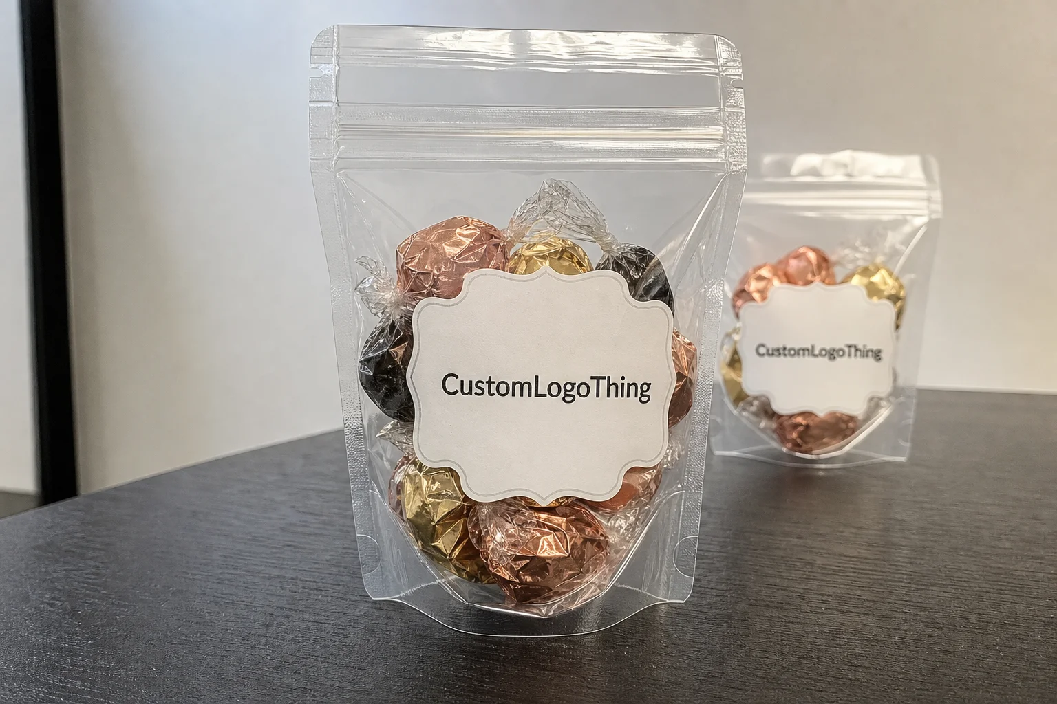
The basic job is simple: identify the product and survive handling. The better version of that job does more. It helps a shopper find the flavor quickly, shows the net weight clearly, carries ingredients and warnings without crowding the design, and makes the product feel like it belongs in a retail setting. That matters for small-batch makers as much as it does for larger confectionery brands.
Label choice changes the way a package reads. Matte paper can make a candy bag feel handcrafted and warm. Gloss film usually feels brighter and more retail-ready. Clear labels let the package show through, which works well on glass jars and premium pouches, but only if the text stays readable against the contents behind it. Opaque stocks give you more control over contrast and usually make compliance text easier to read.
The shelf effect is real. A standard container with a strong label often performs better than a fancy container with a weak one. Buyers scan first and inspect second. If the brand name, flavor, and net weight are easy to read from a few feet away, the package is doing its job. If the label is crowded or the color contrast is soft, the product has to work harder than it should.
A label that reads quickly usually sells better than one that tries too hard. The essentials need room: brand, flavor, weight, ingredients, and any required warnings.
There is also a production side to this. Custom candy labels can separate SKUs during packing, keep seasonal runs organized, and reduce mistakes when a team is handling multiple flavors at once. That is more than a convenience. It is a control point. If a strawberry mix and a cherry mix look too similar, someone eventually ships the wrong thing. Labels are one of the cheapest ways to prevent that kind of error.
For bags, jars, favor boxes, sleeves, and pouches, the label should match the shape of the package instead of fighting it. A square label may work on a flat carton. A curved jar needs different planning. A pouch that changes shape as it fills needs even more care. The best packaging design usually looks simple because the size and placement were worked out early.
There is a reason experienced buyers obsess over “small” details like label edge distance or corner radius. Those details decide whether the package looks deliberate or improvised. That difference is easy to see on shelf and hard to hide later.
How the Labeling Process and Timeline Usually Works
A typical order starts with file review, sizing, and proofing. That sounds routine. It is not. Before anyone prints, someone has to check the art file format, bleed, trim, font size, barcode placement, and whether the label size actually matches the package. If those details are off, the job slows down immediately.
Dielines matter more than most buyers expect. A wraparound jar label behaves differently from a flat label on a carton. A gusseted pouch changes shape after fill. A favor box may have less usable space than the mockup suggests. Good production teams verify the safe area, trim line, and any seam or fold before the job moves forward.
Proof approval is the checkpoint where expensive mistakes are usually caught. Spelling, color expectations, barcode contrast, and legal copy should all be checked here. After approval, production is no longer an art discussion. It is a manufacturing job. That is the point where late changes start affecting schedule and cost.
Timing depends on file readiness and complexity. A repeat run with clean art and a standard stock can often ship in 5 to 7 business days after proof approval. Many custom orders land in the 8 to 15 business day range. Specialty shapes, unusual finishes, variable data, or a stock that has to be ordered in can push that longer. If the product launch is tied to a holiday or market event, build in buffer time. Label jobs rarely get faster at the end.
Application method matters too. Hand-applied labels give flexibility, but machine-applied labels require the roll format, core size, unwind direction, and spacing to match the applicator. That detail gets ignored more often than it should. If the brand may automate later, say so early. Ordering with the future format in mind is cheaper than reordering after the process changes.
For buyers who want a broader industry reference point, the packaging industry association resources are useful for terminology and packaging basics. They do not replace a proof from the printer, but they help when you are sorting out the language around materials, conversions, and package structures.
Material, Finish, and Adhesive Choices That Change the Result
Material choice is where the label becomes a functional part of the package. Paper stocks work well for dry candy, shorter display cycles, and a handcrafted look. Film stocks, usually polypropylene or polyester, are better when handling, moisture, condensation, or refrigeration are part of the actual use case. If the candy is going into a cooler case or a fulfillment stream, durability matters more than a pretty mockup.
Finish changes both appearance and performance. Gloss gives color more punch and makes the package feel brighter. Matte softens the look and usually hides scuffs better. Soft-touch can feel premium, but only if the rest of the design supports that tone. Clear labels can be strong on jars or transparent pouches, though they need careful contrast planning or the copy gets lost fast. Finish is not just style. It changes legibility, smudge resistance, and how the label behaves under store lighting.
Adhesive choice deserves the same level of attention. Permanent adhesive is the default for most retail candy packaging because the label needs to stay in place through transport, shelf display, and handling. Removable adhesive makes sense for reusable containers, promotional runs, or short-lived seasonal packs. Specialty adhesives are sometimes necessary for chilled surfaces, textured materials, or curved containers that do not give the label much surface to grab.
The most common mistake is choosing from the rendering instead of the environment. Candy can release oils. Packages can sweat. Warm product can meet cool air after filling. Any of those conditions can expose weak stock or a marginal adhesive. If the package is going to live in real shipping and storage conditions, test for that early.
Size and shape also matter more than they look on screen. A label that is too large can wrinkle or cross a seam. A label that is too small can feel timid and leave the package looking unfinished. On a small pouch, a few millimeters can decide whether the flavor name stays clean and readable or gets trapped in a crowded block of text. Good packaging usually looks calm because the spacing was solved before print.
Paper, film, and finish choices should also align with sourcing claims. If a brand wants a paper-forward look or needs to support a responsible sourcing story, it is worth understanding certifications such as FSC. Not every candy label needs certified stock. For some brands, though, that detail matters to the buyer and to the story the package is trying to tell.
Cost, Pricing, MOQ, and Quote Factors
Pricing for custom candy labels usually comes down to six variables: quantity, material, size, shape, finish, and setup complexity. If the label is a standard size, printed on a common stock, and the artwork is ready to go, quoting is straightforward. If the job needs a custom die, specialty adhesive, variable data, or a more complex finish, the price rises. That is normal. The real question is which part of the spec is driving the cost.
Unit cost typically drops as quantity rises, but total spend rises with it. That means the cheapest per-label option is not always the smartest order. A seasonal candy line or a small gift run should not be over-ordered just to win a lower unit price. Inventory, storage, and shelf life all matter. Labels that sit in a box for a year are not a savings.
Minimum order quantities exist because setup costs are real. Press adjustments, die cutting, material prep, and quality checks all take labor. If the run is very small, those fixed costs get spread across too few labels. That is why some printers prefer higher quantities for standard stock items and why custom shapes often carry a higher MOQ.
| Label Option | Typical Best Use | Typical Price Signal | Practical Note |
|---|---|---|---|
| Standard paper die-cut | Dry candy bags, short-run favors | Lower end of the range, especially at volume | Good for a handmade look if moisture is not part of the environment |
| BOPP film with gloss or matte finish | Jars, pouches, handled retail packs | Moderate, often the practical middle ground | Better resistance to scuffing and light moisture |
| Clear film with specialty finish | Premium jars and boutique packaging | Higher, especially with detailed artwork | Strong shelf presence, but contrast has to be planned carefully |
| Custom shape with specialty adhesive | Gift sets, chilled products, odd surfaces | Highest setup impact | Worth it when fit and performance matter more than a standard outline |
For rough budgeting, very small runs can sit in the $0.18 to $0.45 per-label range, depending on size, stock, and finish. Larger runs may drop into roughly $0.05 to $0.16 per label. That is a wide band, and it should be. A quote for a heavy-coverage film label is not comparable to a simple paper die-cut. If two quotes are far apart, the missing detail is usually in the spec, not the math.
A useful quote should state the material, size, quantity, finish, turnaround, and whether artwork support is included. If any of that is vague, the buyer is not comparing prices. They are comparing assumptions. That is where projects go sideways.
Step-by-Step Ordering Checklist for Better Results
Start with the package itself. Measure the usable label area on the actual container, not the mockup. If it is a pouch, note whether the label goes on before or after filling. If it is a jar, check the curve, the shoulder, and any seam that could affect placement. Those details sound minor until the label is printed and does not sit flat.
Then gather the content. Brand name, flavor, net weight, ingredients, allergen statements, barcode, warnings, and any required regulatory copy should all be ready before artwork goes to proof. Missing copy slows the process. Worse, last-minute edits can force a new proof round after the job was otherwise ready.
Next, choose the label construction based on the actual environment. Dry shelf display, refrigerated storage, high-touch counters, and gift packaging all behave differently. A label that works in one setting may fail in another. If the candy will be shipped in summer or stored in a cooler case, film stock and a stronger adhesive are usually safer than a decorative paper label.
Application method should be decided early too. Hand application is flexible. Machine application is not. If the order will eventually run through a labeler, the roll format has to match the machine now. Waiting until later often means paying twice.
Before approving the job, review the proof like someone who has to run the line, not like someone admiring the mockup. Check barcode quiet zones, spelling, font size, cut lines, and contrast at actual size. If possible, print the proof and place it on the real package. A paper mockup catches a lot of issues that a screen never will.
If the product line may expand into cartons or sleeves, keep the whole system in view. A label that works alone but clashes with Custom Printed Boxes makes the range feel disconnected. Strong package branding usually comes from consistency across the label, the container, and the shipper.
Save the final approved spec. Not the vague version. The actual one: size, stock, adhesive, finish, orientation, and application notes. Reorders drift when people rely on memory. Drift creates mismatched runs, and mismatched runs are more expensive to fix than most teams expect.
- Measure the real package surface before quoting.
- Collect all copy, barcode data, and warnings in one file.
- Choose a stock that matches the storage environment.
- Confirm whether labels will be hand-applied or machine-applied.
- Approve the proof only after checking the label at actual size.
Common Labeling Mistakes That Create Reprints
The first mistake is sizing from the design file instead of the container. A label can look perfect on a screen and still overlap a seam, wrap too far, or stop short on the real package. Physical measurement wins every time. Once printing starts, a sizing error turns into waste.
Low-resolution artwork is another repeat offender. Logos that looked fine in a slide deck can print soft or fuzzy. Thin type, especially in light colors, can disappear on busy backgrounds. On a small candy label, every stroke counts because there is less room for weak contrast to hide.
Moisture and handling problems show up fast. A stock that works on a dry candy bag may fail on a chilled jar. A label that survives one touchpoint may scuff badly on a retail shelf or in a tote bag. Those failures are frustrating because they are usually preventable with the right stock and adhesive from the start.
Crowded layouts cause their own trouble. If the flavor name, ingredients, brand mark, and promotional copy all compete for the same space, the label stops functioning as a fast communication tool. Buyers Should Know the flavor in a glance. Packing staff should be able to separate versions without reading every line. Speed matters on both sides of the counter.
Orientation problems are another easy way to lose time. If the rolls are wound the wrong way for the applicator, or if hand-applied labels are not centered consistently, the package starts to look sloppy even when the print quality is fine. On multi-SKU programs, that inconsistency can also make inventory tracking messy.
Approving artwork too quickly is probably the most expensive mistake of all. Small spelling errors, missing barcodes, and edge issues are easy to miss when a proof is glanced at instead of checked. A preflight mindset is worth the time. Confirm the size, confirm the content, confirm the stock, and confirm the application method before the job goes live.
That may sound slow to someone trying to hit a launch date. It is still faster than reprinting.
Practical Next Steps Before You Request a Quote
Before you ask for pricing, gather the facts a printer can actually use: package measurements, quantity, label application method, desired finish, and the deadline tied to launch or seasonal sales. If the brief is complete, the quote is useful. If it is vague, the quote is just a guess with numbers attached.
Narrow the material choices instead of asking for everything. Two or three realistic options are usually enough. For example, a matte paper version, a gloss film version, and a clear premium option will give you a meaningful comparison without sending the project back to square one every time a number changes.
Decide whether the label needs a standard shape or a custom die-cut. Standard shapes are usually quicker and easier to price. Custom shapes can improve shelf impact, but they also add tooling and setup. The right choice depends on whether speed, budget, or presentation is doing the heavier lifting for that SKU.
Get the artwork and the copy moving at the same time as the quote. Waiting on ingredients, barcode data, or flavor names delays everything. If the product is tied to a seasonal launch, calendar the proof review and approval window before the order is placed. That removes pressure later, which is exactly when projects get messy.
For repeat orders, save the approved spec somewhere the team can find it without digging through email. Include size, stock, adhesive, finish, orientation, and any application notes. That record matters more than people think. The second run should match the first unless you intentionally changed the design.
The strongest custom candy labels do not try to do everything. They make the product easy to identify, keep the package looking deliberate, and survive the conditions the candy will actually face. Start with the container, the environment, and the sales goal. The label choice gets clearer after that.
What materials are best for custom candy labels on bags and jars?
Paper works well for dry, short-term packaging and a softer handcrafted look. Film is usually the better choice for moisture resistance, handling, and refrigerated use. For jars, pouches, and products that may see condensation, match both the stock and adhesive to the real environment instead of the mockup.
How much do custom candy labels usually cost?
Pricing depends on quantity, size, material, finish, shape, and whether the job needs special setup or tooling. Unit cost usually drops as quantity rises. The best quote is the one that fits your sales volume, storage plan, and reorder pace rather than the one with the lowest headline number.
How long does the custom candy label process usually take?
Timeline depends on artwork readiness, proof approval, print complexity, quantity, and finishing details. Clean repeat orders are usually faster than custom shapes or specialty materials, especially if the files are already prepared correctly and the material is in stock.
What information do I need before ordering custom candy labels?
Have package measurements, label quantity, artwork files, ingredient and warning text, barcode details, and application method ready. Knowing whether the labels will be hand-applied or machine-applied helps avoid ordering the wrong format.
How do I avoid reprints when ordering custom candy labels?
Confirm the size on the actual container, not just on screen, and review a proof before production starts. Make sure the label stock, adhesive, and finish match storage conditions like heat, condensation, or frequent handling. That front-end check protects both margin and schedule.


