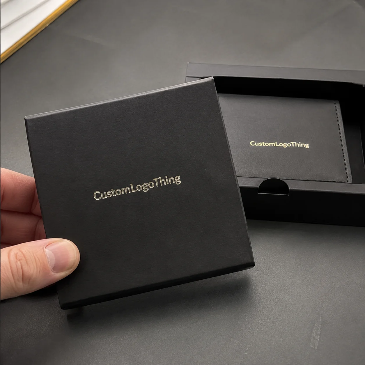
Custom Clothing Labels for jewelry brands do one job before the customer even touches the product: they set the tone. On a velvet pouch, ribbon wrap, or soft dust bag, that small label is often the first branded surface in the unboxing sequence, and it can make the entire package feel thoughtful or unfinished in a single glance.
That is why labels matter more than their size suggests. Jewelry packaging depends on restraint, texture, and clean visual hierarchy, so a label has to support the presentation without interrupting it. If the finish is wrong, the logo is oversized, or the attachment looks improvised, the whole package reads cheaper than the jewelry inside.
The best label spec is usually the one that feels quiet but deliberate. It should sit naturally with the box, insert card, tissue, and outer mailer, then hold its place through handling, storage, and shipment. The buyer should notice polish first, not the effort behind it.
Custom clothing labels for jewelry brands: what they actually do
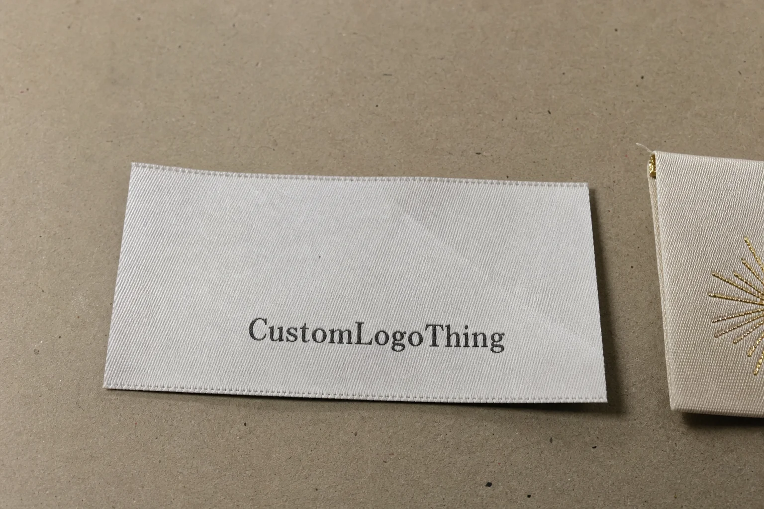
In this context, “clothing labels” covers woven or printed labels used on soft packaging and textile accessories, not just apparel. Jewelry brands use them on pouches, cloth wraps, display sleeves, ribbon ties, and fabric tags that travel with the product. The label becomes part of the packaging language, even if the jewelry itself is boxed separately.
A good label can carry more than a logo. It can hold care instructions, a short material note, fiber content, a brand line, or a discreet authentication cue without crowding the package. That is useful because jewelry buyers tend to notice details fast. They also notice clutter fast.
Scale is the first trap. A label that looks balanced on a garment can overpower a ring pouch or narrow insert card. Jewelry packaging usually wants smaller visual gestures, cleaner margins, and softer contrast, so the label should feel like a fitted component rather than a borrowed one. The most successful versions sit in the background until someone picks them up.
There is also a practical packaging reason to keep the label disciplined. Soft goods move, fold, and crease during shipping, which means a label can twist or distort if the attachment method is too rigid for the material. A label that looks beautiful flat can still fail once it is sewn, folded, packed, and handled at retail.
“The label should look like it belongs to the packaging system, not like it was added because there was blank space left on the pouch.”
That rule is simple, but it solves a lot of problems. If the box is minimal, the label can add a tactile layer. If the box, insert, and mailer already carry a lot of branding, the label needs to stay quieter and cleaner.
Materials, weave, and finish choices that hold up
Woven labels usually feel more premium and tend to age better under handling, while printed labels are useful when the design needs finer text, smaller detail, or smoother gradients. The right choice depends on how visible the label will be and how much contact it gets during use. Jewelry packaging usually favors a refined look over abrasion resistance, but the label still has to survive folding, stacking, and shipping without curling or fading.
Damask is a common woven option because it can hold relatively fine detail without feeling rough. Satin gives a smoother, more reflective surface that can look elegant on silk pouches or ribbon ties, though too much sheen can turn glossy under store lighting. Taffeta is lighter and more economical, and cotton twill has a matte, natural character that works well for heritage or eco-leaning branding. Each one changes the tone of the package more than people expect.
Finish matters just as much as substrate. Clean-cut edges, end folds, center folds, and miter folds all change how a label sits on a seam or edge, and the wrong fold can make even a good material look awkward. A label that curls, twists, or shows too much adhesive will make the packaging feel rushed. The eye catches that faster than most teams want to admit.
Color matching is another place where samples pay for themselves. A deep black on screen can land as charcoal in production, and a muted gold can lose warmth under cool lighting. If the label is supposed to coordinate with a black velvet pouch, a cream insert, or a foil-stamped box, ask for a strike-off or physical sample before approving a full run. Digital proofs are useful for layout. They are not enough for final color judgment.
That same caution applies to sustainability claims. If the label system includes paper cards, backers, or hang tags, ask for FSC-certified stock where appropriate, and keep the claim tied to the actual component being specified. For paper sourcing, the Forest Stewardship Council is the standard reference many buyers recognize. For transit and handling, ask suppliers how they protect labels from abrasion, carton compression, and humidity rather than settling for broad quality language.
| Label option | Best use | Typical unit price range | Notes |
|---|---|---|---|
| Woven damask | Premium pouches, dust bags, soft wraps | $0.10-$0.24 per unit at 1,000-3,000 pcs | Sharp detail, durable texture, stronger brand feel |
| Printed satin | Fine text, care information, smoother touch | $0.06-$0.18 per unit at 1,000-3,000 pcs | Good for softer color work, less texture than woven |
| Cotton twill | Natural or heritage packaging systems | $0.08-$0.20 per unit at 1,000-3,000 pcs | Matte, understated, can look expensive if the art is simple |
If the packaging line includes boxes, sleeves, or paper inserts, ask whether the supplier can coordinate those pieces instead of treating every component as a separate job. A label rarely exists in isolation. It has to sit next to the box finish, the tissue color, the card stock, and the shipping carton, and inconsistency between those pieces is one of the fastest ways to make an otherwise premium set look fragmented.
Production steps and turnaround: from proof to ship
Start with a real spec sheet. List the size, material, fold style, attachment method, quantity, and the exact packaging piece the label will live on. One clear page saves days of back-and-forth because the supplier can quote against the actual use case instead of guessing from a logo file and a sentence of context.
Artwork preparation deserves the same discipline. Fine text, thin lines, and small icons can disappear in weave construction or become hard to read on textured fabric, so the file should be built for the production method rather than adapted after the fact. If the label needs tiny type, a print method may be safer than woven construction. If the branding depends on tactile detail, woven often wins.
Proofing should show more than a flat logo mockup. A useful proof includes scale, placement, fold orientation, color notes, and any limits on stitch or weave resolution. If the supplier can only show a pretty picture, that is not enough. You need evidence that the design will survive the material and the chosen construction.
Sampling is worth the time for visible packaging. A single physical sample can reveal the problems that digital proofs hide: a logo that feels too large, a sheen that reads wrong, text that is too small, or an edge treatment that looks messy next to the pouch seam. For jewelry packaging, sample approval is often the cheapest insurance in the project.
Typical production time after approval often lands in the 10 to 20 business day range, though that changes with quantity, color count, and construction complexity. Simple woven labels can move faster. Special folds, unusual backing, or fine detail usually add time. If the launch date is fixed, build in a buffer instead of assuming the schedule will absorb a correction cycle.
Inspection should happen at receipt, not after the labels are already mixed into inventory. Check trim quality, fold consistency, color accuracy, attachment finish, and total count. If the labels are being packed into kits or paired with finished boxes, look at the full assembly under real retail lighting. A label that passes on a screen can still fail on a table or shelf.
Good suppliers can talk about handling and packaging controls in plain language. They should be able to explain how they keep labels flat, how they reduce scuffing during transit, and what they do if a run drifts from the approved sample. If that conversation stays vague, the quote is less useful than it first appears.
Cost, MOQ, and quote drivers that change the price
Price is usually shaped by size, material, color count, fold complexity, and volume. The smaller the order, the more the setup cost sits inside each unit, which is why tiny runs often look expensive on a per-piece basis. Add custom folding, multiple colors, or unusual backing, and the quote rises quickly. There is no hidden trick there.
MOQ is where budget planning gets uncomfortable. If a brand only needs a few hundred pieces, the unit price tends to be higher than it would be for a larger, steadier reorder cycle. That does not mean buying excess inventory is smart. It means the cost has to be judged against sales velocity, seasonal demand, and how long the packaging will stay current before the branding changes.
Ask for a quote that separates sample charges, setup fees, production cost, and shipping. A single bundled number makes it hard to compare vendors, and it hides where the money is really going. For packaging buyers, that matters because label cost is only one slice of the total spend. Freight, overage, spoilage, and reorder timing can carry just as much weight.
The cheapest label is not always the best value. A slightly better woven or satin label can improve the perceived quality of the whole package and reduce the odds of reordering because the first run looked off. A five-cent difference per piece becomes meaningful, but so does the cost of a label that makes a premium box feel generic. The math should include perception, not only unit price.
Tiered pricing is worth asking for before approval. The jump from 500 to 1,000 units can be annoying or genuinely efficient depending on how the brand ships and reorders. If the supplier cannot explain the breakpoints cleanly, that is usually a sign to keep comparing options.
For brands consolidating packaging work, labels should be priced alongside other branded components rather than as an isolated line item. If the same launch also needs inserts, boxes, or mailers, a packaging program may be easier to manage through one sourcing path, such as Custom Labels & Tags paired with Custom Packaging Products. That approach only makes sense if the specs stay tight and the lead times align.
Size, backing, and attachment options for pouches and wraps
Label size should be set by the packaging itself, not by a default template. A 4-inch pouch, a narrow ring wrap, and a flat insert card all need different proportions. Jewelry packaging has less surface area than apparel, so the label has to earn every millimeter it occupies.
Backing changes both feel and durability. Sew-in backing works well on textile pouches and wraps because it becomes part of the construction, while adhesive or tag-style options make more sense if you do not want to puncture delicate material. If the packaging is meant to be reused, the attachment needs to survive repeated handling without lifting, fraying, or peeling at the corners.
Placement is just as important as the label itself. Centered branding on a flap feels different from a seam label or a tie tag, and jewelry brands usually benefit from understated placement more than apparel-style visibility. The goal is to guide the unboxing sequence, not to turn the package into a billboard.
Text on the label needs to be legible under real conditions. Tiny type can disappear on textured fabric, especially under warm store lighting or on matte materials with low contrast. A clean logo and one short line of copy often works better than a crowded layout that tries to say too much.
The quickest sanity check is still the simplest: hold the finished sample against the actual packaging under the light where it will be seen. If the label reads too shiny, too busy, or too small, the spec needs another pass. Mockups are useful. They are not a substitute for the real object in the real environment.
If the label has to work across multiple SKUs, the packaging system should be designed around that reality from the start. That usually means standardizing size, fold, and placement so the label feels consistent across product lines. A label that fits one pouch beautifully but fails on another is a spec problem, not a production surprise.
Common mistakes that make premium labels look cheap
The first mistake is treating the label like a miniature billboard. Jewelry packaging usually benefits from restraint, so oversized logos, too much copy, or high-contrast graphics can make the whole presentation feel less refined. A label should look intentional, not impatient.
The second mistake is mismatching material and presentation. A glossy satin label can look out of place on a matte cotton pouch, while a coarse weave can fight with polished box finishes. The label should belong to the same visual family as the rest of the packaging system. If it does not, the customer may not be able to articulate why the set feels off, but they will feel it.
Artwork quality is another weak point. Thin strokes, low-resolution files, and cramped layouts often look acceptable in a screenshot and disappointing in production. Woven labels are especially unforgiving if the art was never built for weave resolution. The process magnifies weak design instead of fixing it.
Skipping samples is expensive in the ordinary, boring way that budgets hate. The mistake shows up after production, when the only real fix is to reorder. That gets worse if the labels were supposed to match an insert card, a box sleeve, or a custom printed outer carton, because one off-color component can throw off the entire launch set.
Trim and finishing deserve more attention than they usually get. Loose threads, uneven cuts, and inconsistent folding are tiny defects, but they are exactly the kind of detail people register when they are opening a premium item. Customers may never mention the thread ends. They will still feel the difference between careful finishing and rushed work.
Finally, do not mistake shine for quality. Metallic thread, bright borders, or dramatic contrast can photograph well and still look loud in natural light. Jewelry packaging usually rewards controlled contrast, stable color, and clean edges more than visual noise.
Next steps: spec the label, sample it, and place the order
Build the order around a plain spec sheet: intended use, exact measurements, attachment method, target quantity, material, and final artwork file. That gives the supplier enough structure to quote accurately and keeps later reorders consistent. Without that baseline, every revision becomes a new conversation.
Use photos of the actual packaging. A pouch, wrap, box, or insert tells the supplier more than brand language does, and it helps them judge whether the label needs to be smaller, softer, flatter, or less reflective. If the label has to work across several SKUs, say so early. Hidden complexity usually costs more later than it would have cost upfront.
Request a sample or prototype if the label will be visible during unboxing. Compare it under the same lighting customers will see, not under a bright laptop screen that makes everything look cleaner than it is. A screen can flatter weak choices. Real lighting cannot.
Set reorder timing before inventory gets tight. Jewelry packaging often moves in smaller volumes, which means waiting until the last carton is nearly empty can force rush fees and narrow the correction window. A modest buffer is cheaper than a panic order.
Once the spec is approved, keep the file, dimensions, and finish locked. That is how you get repeatable runs of Custom Clothing Labels for jewelry brands without rethinking the artwork every time. Consistency is the point. The label should feel like part of the package from the first order to the reorder.
Are woven or printed custom clothing labels for jewelry brands better?
Woven labels usually feel more premium and hold their shape well on pouches, wraps, and other soft packaging. Printed labels are better if you need very small text, tighter color variation, or a softer surface at a lower entry cost. The right answer depends on the packaging material, the amount of detail in the artwork, and how close the customer will get to the label.
What size works best for custom clothing labels for jewelry brands on pouches?
Start with the pouch dimensions and leave enough breathing room around the logo so the label does not overpower the surface. Small pouches usually need compact labels with minimal copy and enough margin to keep the layout calm. If the mockup looks crowded, the label is too large. Reduce it before production.
How long does production usually take after artwork approval?
A typical run often takes about 10 to 20 business days after final proof approval, depending on quantity and complexity. Sampling, special colors, or unusual folds can add time before production even starts. If the timeline is fixed, plan with a buffer instead of assuming there will be room to correct a bad proof.
What should I include in a quote request for jewelry label production?
Include size, material, fold style, backing, quantity, and the exact packaging piece the label will attach to. Add the logo file, color references, and photos of the pouch, wrap, or box. Ask for sample cost, setup fees, unit price, and shipping as separate line items so you can compare quotes without guessing what is included.
Can custom clothing labels for jewelry brands be used on non-clothing packaging?
Yes. They are commonly used on dust bags, velvet pouches, ribbon ties, fabric wraps, and display cloths. The attachment method should match the material, so sew-in, adhesive, and tag-style options all have their place. The label is there to support the packaging system, not to imitate apparel branding.