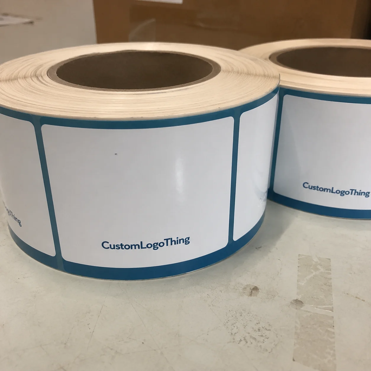
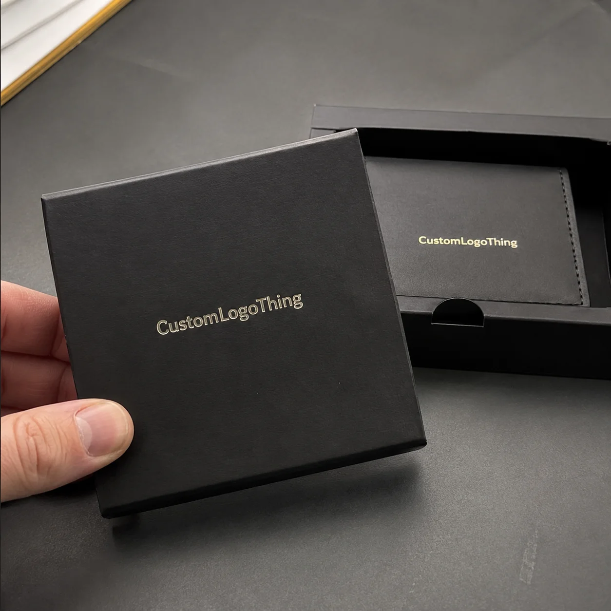
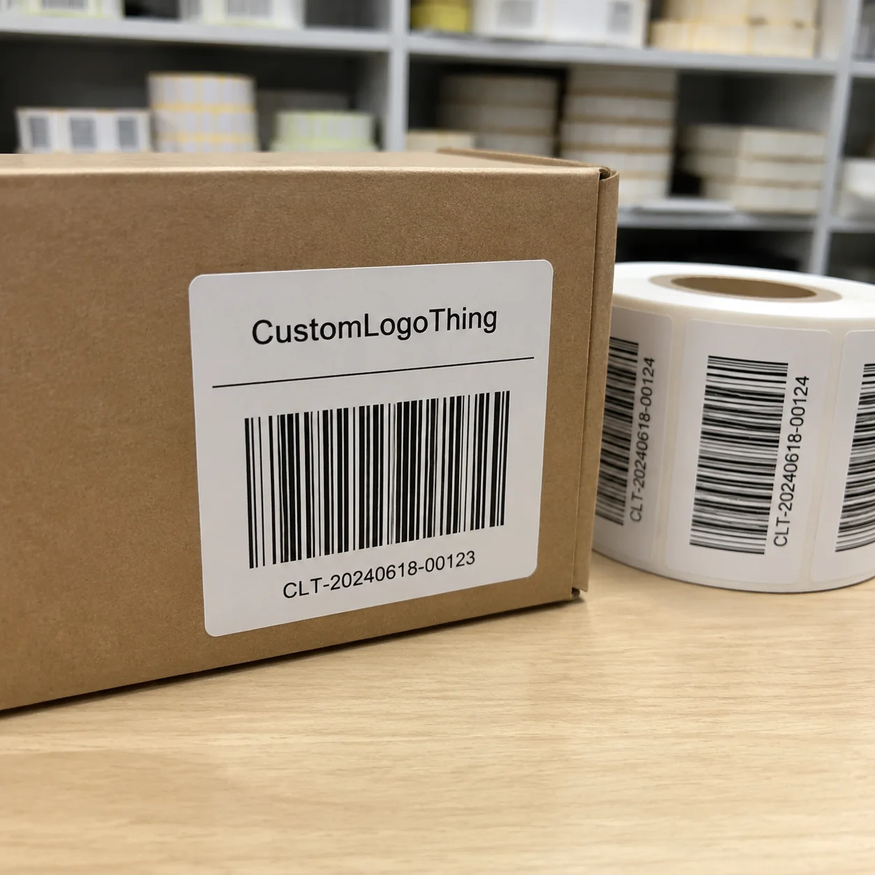
Custom Clothing Labels for cosmetics brands do more than identify a garment or accessory. They help decide whether a robe feels like part of a premium skincare set, whether a tote belongs in a retail display, and whether a staff tee reads as branded merchandise or a random utility item. The label is small, but it sits close to the hand and close to the eye, which means buyers notice it faster than they usually expect.
That matters because cosmetics packaging is rarely one object. It is a system made up of cartons, jars, inserts, bags, apparel, and sometimes boxed sets that travel together. If the label looks off, the whole package can feel less resolved. If it feels considered, the product line gains a sense of order that is hard to fake later with graphics alone.
Why a label can change how a cosmetic product feels in hand
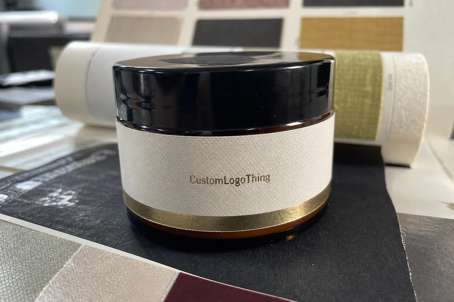
Most cosmetics teams spend time on bottles, cartons, and printed packaging first, then leave apparel labels for the end of the schedule. That is usually where the quality gaps appear. A neck label that scratches, a woven tag that curls, or a print that fades after a few washes can pull down the value perception of a robe, tee, or accessory even if the product itself is well made.
From a buyer’s point of view, the label has four practical jobs. It identifies the brand. It carries required information. It keeps the apparel or accessory consistent with the rest of the line. And it signals that the item was planned as part of the brand system rather than added as a last-minute giveaway. If the label does those things quietly, it has done its job.
That is why the same label approach does not work for every use case. A cotton tote sold in a retail bundle has different needs than a spa robe used by staff every day. A neck label on a shirt needs different comfort characteristics than an interior label on a pouch. The right choice depends on wear pattern, fabric weight, attachment method, and how visible the label will be when the item is used.
When brands get this right, the label feels almost invisible in a good way. The typography matches the rest of the packaging. The finish feels intentional. The color palette stays in the same family as the carton and insert. Nothing competes for attention, and that is usually what premium packaging should do.
A label is a tactile proof point. If it feels cheap, the rest of the package has to work harder to recover trust.
If you want to compare how this shows up across real programs, review the Case Studies. The strongest results usually come from teams that define the label early, not after production has already started.
Custom clothing labels for cosmetics brands: materials and construction
Material choice sets the tone immediately. Woven labels give a refined texture and hold up well when durability matters. Printed labels are better when you need smaller type, sharper detail, or a softer visual read. Satin has a smoother hand feel, which can help on garments worn close to skin. Cotton feels more natural and understated. Heat-transfer labels are useful when the goal is to remove seam irritation and keep the inside of the garment clean.
Construction matters just as much as material. A center fold, end fold, or loop fold changes how the label sits in a seam and how much visible surface area you get once it is sewn in. Sew-on labels are straightforward and durable. Tagless transfers work well on necklines and waistbands where comfort matters. For robes, tees, and many accessories, the attachment method can matter more than the artwork itself because it affects both wearability and longevity.
For cosmetics brands, the visual direction should track the product line rather than follow a generic labeling trend. Minimal skincare lines usually benefit from restrained woven labels with limited color count and quiet texture. Bright beauty brands may need stronger contrast and cleaner printed detail. Luxury lines tend to read better with tighter typography, smaller color palettes, and finishes that avoid glare. The label should feel like it belongs to the jar, carton, and insert card, not sit outside that system.
Size is a real constraint, and it is where a lot of first-time orders go wrong. Many labels need to carry logo, size, fiber content, care instructions, and country of origin. That is possible, but only if the layout is built for the finished dimensions. Small type below about 5.5 pt is risky on woven construction because thread structure can fill in the letters. Thin strokes can disappear. Dense icon rows can become unreadable once the label is folded and stitched. A layout that looks clean on screen may fail once it is reduced to actual production size.
If you are comparing options, ask about thread count, print resolution, backing, edge finish, and the width of the text-safe area. Those details tell you whether the supplier can actually hold the fine details of your logo and whether the final label will feel crisp rather than fuzzy. Color matching matters too. A label that technically uses the right Pantone reference can still look off if the material finish reflects light differently from the rest of the package.
There is also a practical difference between labels for retail apparel and labels for promotional accessories. A spa robe or staff tee may need stronger wash performance. A tote used inside a boxed set may need more emphasis on appearance and less on repeated laundering. That distinction changes the material choice, the stitch spec, and the tolerance for detail.
Fit, finish, and compliance details that customers actually notice
Most buyers start with the logo. The part customers actually feel is usually different. Skin comfort, wash durability, fade resistance, and edge quality decide whether a label feels premium after real use. A label can look perfect in a proof and still irritate the neck, curl after washing, or sit awkwardly against a seam.
Placement changes the user experience fast. Inside neck labels are the most sensitive to comfort. Side seam placement usually feels cleaner for minimalist apparel. Waistband labels need to stay flat and survive repeated flexing. Sleeve or cuff labels have to be small enough not to distort the garment. For totes and interior accessory linings, the label needs to stay readable without interfering with the structure of the item.
Compliance is non-negotiable, but the exact requirements depend on the market and product type. Apparel labels often need fiber content, care symbols, size marks, and country-of-origin details. If the item ships inside a cosmetics kit, the label information should agree with the rest of the packaging so the customer does not see one set of details on the hang tag and another on the inside label. When packaging materials are part of a broader sustainability message, the label should not undermine that message with poor substrate choices or weak durability.
For distribution testing, it helps to think beyond the label itself. If the item ships inside boxed sets, sample kits, or influencer mailers, it has to survive handling, compression, and repeated unpacking. The ISTA testing standards are useful as a reference when apparel or accessories travel as part of a larger packout.
Do not approve based on a screen proof alone. Texture, stitch thickness, and edge softness are hard to judge digitally. Ask for a sample or strike-off and inspect it under normal light on the actual garment or accessory. Check it next to the carton, insert card, or outer pack if those items are part of the same launch. That is usually where the weak contrast, awkward sizing, or incorrect fold becomes obvious.
One useful rule: if the label draws attention for the wrong reason, it is already costing the brand money. The best labels usually feel unremarkable in the room, which is a sign they are supporting the package instead of competing with it.
Cost, pricing, and MOQ tradeoffs that change the quote
Pricing is shaped by a few moving parts: label type, size, color count, fold style, backing, quantity, and finishing. A simple printed satin label usually costs less than a woven label with multiple colors and a custom fold. Heat-transfer labels often sit in the middle, but the final price depends on artwork complexity, application method, and how much setup the job requires.
MOQ matters because setup costs need to be spread across the order. Smaller quantities raise the unit cost. Larger quantities lower the piece price but increase inventory risk. For a cosmetics brand testing a new robe, tote, or staff uniform program, that tradeoff can be awkward. A practical approach is to use a simpler construction for the launch run, then upgrade the specification once the item proves itself.
Typical pricing varies by supplier and region, but these planning ranges are common enough to help with budgeting:
| Label option | Typical use | Approximate unit cost at 5,000 pieces | What moves the price |
|---|---|---|---|
| Printed satin | Soft hand feel, fine detail, neck labels | $0.08-$0.18 | Ink coverage, size, number of colors |
| Woven damask | Premium texture, durable apparel labels | $0.12-$0.28 | Thread count, fold style, color count |
| Heat-transfer | Tagless comfort, clean interior finish | $0.10-$0.24 | Artwork detail, application specs, adhesive system |
| Cotton or specialty blend | Natural aesthetic, limited-brand lines | $0.14-$0.30 | Base material, finish, custom size |
Those numbers are for planning, not a promise. Setup fees, sample rounds, rush service, shipping, and artwork revisions can change the total quickly. If the label order is part of a product launch, the better question is not only the unit price. It is the total program cost across sampling, production, freight, and reorders.
There is also a value argument that is easy to miss while comparing quotes. A slightly better label can reduce complaints, replacement orders, and early wear failures. If a garment keeps its shape, survives laundering, and continues to look aligned with the brand, the label has paid for itself in fewer problems downstream. That matters more than shaving a few cents off the first PO.
For teams managing more than one packaging item, it helps to compare labels with related components in Custom Packaging Products so the spend is reviewed as a system rather than as unrelated line items.
Process and timeline: from brief to approved production
The workflow is simple on paper and usually slower in practice. It starts with a brief that includes the item type, dimensions, quantity, attachment method, and brand assets. Then comes artwork submission and technical review. After that, the supplier sends a digital proof, followed by a sample or strike-off if needed, then approval, production, and shipment. Every step depends on the previous one being clean.
Delays usually come from the same places. Logos arrive in low-resolution files and need to be redrawn. Color references are vague because nobody supplied Pantone values. Final dimensions are not locked, so the proof gets resized after it is already built. Fold style is unclear, which means the construction has to be reworked. None of that is unusual, but all of it costs time.
A practical timeline for straightforward orders is often 10-15 business days from proof approval to production completion. Sampling can add 3-7 business days. More complex woven labels, specialty materials, or custom finishes take longer. Rush production is possible, but it tends to narrow the design choices and raise the price. If the launch date is fixed, build internal deadlines for merchandising, legal review, and packaging approval before production starts.
That checkpoint structure is not administrative noise. It is the simplest way to keep a launch from slipping. A late label can delay a photo shoot, stall a sample kit, or force the team to ship a product with incomplete branding. In cosmetics, where packaging and product often move together, that ripple effect is real.
Ask for a schedule that shows the review steps, not just the ship date. A good supplier should be able to explain where the timeline is tight and where there is room to adjust. That is more useful than a single date on a quote sheet because it tells you where the risk sits.
For visual consistency across the line, compare the label against Custom Labels & Tags and make sure the finish and proportions fit the rest of the brand system.
Common mistakes that make labels look cheap or fail early
The fastest way to weaken a label is to overload it. Too much text creates a crowded hierarchy, makes the brand name harder to read, and forces the design into a smaller type size than the material can support. I see this most often when teams try to fit every care symbol, regulatory line, and logo treatment into a label that was only designed for one or two functions.
Contrast is another common failure. Pale type on a shiny substrate may look elegant in a mockup, then disappear in use. Thin logos can vanish on woven construction. Small reversed-out text can fill in. If the brand uses a delicate wordmark, it may need a larger label or a different material to stay readable at production scale.
Material mismatch causes a different kind of problem. Scratchy labels irritate skin. Weak printing can bleed. Loose edges unravel after washing. A label that looks fine on a sample photo can become a liability once it is sewn into a seam, folded inside a tote, or worn under store lighting for a full shift. Sampling is there to catch those issues early, before the order turns into replacement work.
Another mistake is approving a proof without seeing the item in context. The label might be balanced on a white screen and still look oversized on a slim tee. It may read cleanly flat, then disappear when it is sewn into a side seam. Real-world testing beats digital approval when the item is meant to be touched and worn.
Finally, do not let the label drift away from the rest of the brand family. Luxury beauty cues, clinical skincare cues, and playful indie cues are not interchangeable. The label should echo the typography, color logic, and finish of the packaging around it. If it feels like it belongs to a different line, customers will notice before anyone says a word.
Next steps for a label order that fits launch timing
Start with a one-page spec sheet. Include label type, dimensions, fold style, quantity, target cost, application method, and the exact item it will be attached to. That single document removes a surprising amount of back-and-forth. It also makes it easier to decide whether Custom Clothing Labels for cosmetics brands should be woven, printed, satin, cotton, or heat-transfer.
Then request two or three material options. The point is not to collect endless samples. It is to compare the differences that matter: texture, legibility, durability, and how the label behaves when it is sewn or pressed into place. If one option photographs better and another feels better in hand, that is useful information. The right answer usually sits between visual performance and production reality.
Set a decision calendar before the order moves too far. Build dates for internal review, sample review, legal approval, and final sign-off. If the label has to coordinate with cartons, inserts, or other packaging pieces, include those checkpoints too. The cleanest launches are the ones where the apparel, accessory, and packaging decisions all move on the same schedule.
If the label system will be used across multiple products, check whether one design can adapt without losing comfort or clarity. A layout that works on a robe may need resizing for a tote. A finish that looks right on a hang tag may feel wrong on a neck label. That is normal, not a failure. The goal is consistency of brand behavior, not identical placement across every item.
Before approval, compare the final proof against the rest of the package one more time. The label should support the same quality signal customers see on the carton, the insert, and the outer pack. That is the main job of Custom clothing labels for cosmetics brands: they should help the product feel finished, stable, and part of a coherent line without pulling attention away from the items people actually came to buy.
What material is best for custom clothing labels for cosmetics brands?
Woven labels work well when the brand wants a premium texture and strong durability. Printed or satin labels are better when the design needs fine detail, softer touch, or a smoother feel against skin. The best choice depends on whether the item will be worn often, washed often, or used mainly for retail presentation.
How much do custom clothing labels for cosmetics brands usually cost?
Pricing depends on size, material, color count, fold style, and total quantity. Smaller orders usually have a higher unit cost because setup fees are spread across fewer pieces. Rush production, special finishes, and sample rounds can increase the total order cost.
What is the typical lead time for custom label production?
Lead time usually includes artwork review, proof approval, sampling if needed, and full production. Simple orders move faster; complex woven designs or custom finishes take longer. The safest approach is to ask for a timeline that shows each checkpoint instead of only a ship date.
What MOQ should I expect for custom clothing labels for cosmetics brands?
MOQ varies by label type and supplier, but woven and specialty labels often require more units than basic printed options. Higher MOQs usually reduce unit cost but raise upfront spend and inventory risk. If you are testing a new product line, ask whether the supplier offers lower-MOQ options or phased reorders.
How do I make sure the label matches the rest of the cosmetic brand packaging?
Use the same color logic, typography, and tone that already appear on the box, jar, or insert card. Review the label in natural light and on the actual garment or accessory, not only on a digital proof. Keep the hierarchy simple so the label feels like part of the packaging system rather than an add-on.