Buyer Fit Snapshot
| Best fit | custom cmyk folding cartons branding better for packaging buyers comparing material specs, print proof, MOQ, unit cost, freight, and repeat-order risk where brand print, material, artwork control, and repeat-order consistency matter. |
|---|---|
| Quote inputs | Share finished size, material target, print colors, finish, packing count, annual reorder estimate, and delivery region. |
| Proofing check | Approve dieline scale, logo placement, barcode or warning zones, color tolerance, and any recyclable or compostable wording before bulk production. |
| Main risk | Vague material claims, crowded artwork, or missing packing details can create delays even when the unit price looks attractive. |
Fast answer: Custom Cmyk Folding Cartons Branding Better: Dieline, Finish, Proof, and Buyer Review should be specified like a repeatable production item. The safest quote includes material, print method, finish, artwork proof, carton packing, and reorder notes in one written spec.
What to confirm before approving the packaging proof
Check the product dimensions against the actual filled item, not only the sales mockup. Ask for tolerance on folds, seals, hang holes, label areas, and retail display edges. If the package carries a logo, QR code, warning copy, or legal claim, reserve that space before decorative graphics fill the panel.
How to compare quotes without losing quality
Compare board or film grade, print process, finish, sampling route, tooling charges, carton quantity, and freight assumptions side by side. A lower quote is only useful if the supplier can repeat the same color, closure quality, and packing count on the next order.
Custom CMYK folding cartons carry a surprising amount of responsibility in a small footprint. A shopper may only give a package a few seconds on shelf, and those few seconds have to communicate trust, category fit, and a sense of quality before anyone picks the carton up. That is why custom CMYK folding cartons remain such a practical packaging choice for brands that need color-rich storytelling, crisp structure, and retail presentation that earns attention quickly.
For Custom Logo Things, the appeal is straightforward: custom CMYK folding cartons bring together flexible printing, efficient flat shipping, and a polished branded look once assembled. They handle photography, gradients, layered color fields, fine typography, and product details without forcing the artwork into a narrow visual style. Used well, they make packaging feel more intentional, more premium, and often more believable to the buyer standing in front of the shelf.
That is the part many buyers overlook. A carton is not just a shell around a product. It is a sales surface. In real use, custom CMYK folding cartons can make a small item feel more substantial, make a clinical product feel more trustworthy, or turn a mass-market item into something that looks considered rather than generic. Board grade, print method, coating, and folding structure all shape that impression. Since CMYK excels at photographic imagery and full-color branding, it fits especially well for custom printed boxes that need detail instead of flat single-color treatment.
I have seen teams spend a lot of time polishing a logo and almost no time thinking about how the package will read from three or six feet away. That is usually backwards. The carton has to do the first bit of selling before a hand ever reaches for it, and the cleaner the hierarchy, the better the odds. You do not need a package shouting at the shelf; you need one that says the right thing fast.
What Custom CMYK Folding Cartons Are and Why They Sell Fast
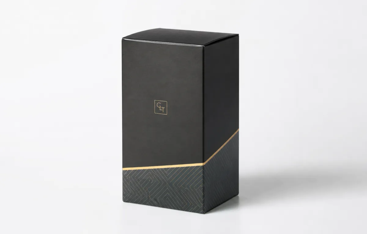
Custom CMYK folding cartons are paperboard cartons built around a specific product size, a brand system, and a retail role. They ship flat, convert into shape during packing, and can be designed as tuck end, reverse tuck, auto-bottom, or other common structures depending on how the product is filled, handled, and displayed. The carton itself is often made from SBS, C1S, C2S, or similar folding carton board in thicknesses that commonly fall around 14pt to 24pt, though the right spec depends on product weight, retailer expectations, and the hand feel you want to create.
They sell fast because they give a brand a lot of visual control without demanding a massive budget. Custom CMYK folding cartons work especially well for cosmetics, supplements, food items, candles, personal care products, and small consumer goods that depend on shelf appeal. A carton with a strong front panel, one clear hero image, and careful typography can outperform a plain package by a wide margin. That is not a theory. It is how shoppers behave in retail environments, where the first judgment often happens before the product is touched.
CMYK matters because it handles a broad range of visual content. If the design includes product photography, ingredient imagery, gradients, subtle shadows, layered pattern work, or multiple brand colors, custom CMYK folding cartons are usually the cleanest route. Spot colors can be excellent for exact brand matching, but CMYK is the more adaptable engine for rich storytelling. For many brands, that flexibility is what separates a carton that feels flat from one that feels active on shelf.
Structure and print need to be treated as one system. A carton with the wrong proportions can make a product feel awkward even when the artwork is strong. A smart structure can make a small bottle look more premium, help a tube feel less generic, or make a compact item easier to trust. Packaging design works best when the printed surface and the box geometry are developed together, not as separate decisions. Custom CMYK folding cartons reward that kind of planning.
There is another reason buyers keep coming back to this format: consistency. When a brand uses custom CMYK folding cartons across a product line, the shelf family can stay unified through color blocks, image style, and logo placement. That package branding matters more than many teams expect. Retailers do not only see one carton; they see a pattern. A clear pattern improves recognition and can make restocking and line management easier too.
“If the carton does not read from six feet away, it is already doing half the job poorly.” That kind of blunt rule reflects how quickly shoppers scan shelves and how much work a carton has to do before the product is ever picked up.
There is also a financial reason these cartons stay popular. Custom CMYK folding cartons can move from a small pilot order to a larger rollout without forcing a packaging format change. The same structure can often support new SKUs, seasonal artwork, or line extensions. For brands trying to keep product packaging coherent while they grow, that matters a great deal. I have watched companies keep a healthy amount of design consistency simply by standardizing the box style and changing only the printed surface.
If you are comparing formats, folding cartons are not the same as rigid boxes or corrugated mailers. They sit in a useful middle zone: lighter than rigid packaging, more retail-ready than plain shippers, and far more brand-forward than unprinted stock. That balance is why many teams start with custom CMYK folding cartons and then pair them with other Custom Packaging Products as distribution expands.
For brands that are still figuring out volume, that flexibility matters. A carton can be the first packaging format that feels scaled enough for retail but not so costly that it freezes future growth. That is a pretty sweet spot, and it is one reason this format keeps showing up in launch plans.
How Custom CMYK Folding Cartons Work: Files, Plates, and Color
The production path for custom CMYK folding cartons starts with artwork and ends with folded, glued cartons packed for shipment. A number of steps sit between those points, and each one can affect the finished package. Artwork is reviewed in prepress, plates are created for offset printing or the file is prepared for digital printing, the press is set up, color is checked, coating is applied if needed, and the board is cut, creased, glued, and bundled. Every step matters more than first-time buyers usually expect.
The first technical piece is the dieline. That line drawing is the map for the carton structure, showing cut lines, fold lines, glue flaps, and panel positions. Artwork should be locked to the dieline before print approval. If it is not, type can drift, barcode placement can fail, and graphics can disappear into the fold. For custom CMYK folding cartons, bleed should extend beyond trim, and safe zones matter even more than many teams assume.
File resolution matters as well. A common mistake is dropping in images that look fine on a screen but break down on press. For most carton work, 300 dpi at final size is a sensible target for placed images, while fine text should stay crisp and well away from folds. Barcodes need enough quiet space around them to scan reliably. Small legal copy should not sit too close to the panel edge. These are basic rules, but ignoring them is how a polished concept turns into a production problem.
Color conversion is another place where projects slip. RGB artwork can look bright on a monitor, but it must be translated into CMYK for print. That conversion changes the outcome, sometimes slightly and sometimes more than slightly. Blues can cool down or dull. Neon-like tones usually lose intensity. Deep reds may print heavier than the designer expected. With custom CMYK folding cartons, the safer move is to review the converted file early instead of waiting until press day to discover the shift.
Proofing is where good jobs save money. A digital proof is fast and useful for content checks, but it does not fully represent printed color on board. A contract proof gives a closer target for color and layout. On-press approval comes closest to the final result because it checks ink on the actual substrate under real production conditions. For important custom CMYK folding cartons, especially retail launches, the proof choice should match the risk level of the project.
The board stock changes the result too. A coated board can hold ink with sharper contrast; an uncoated or matte board may absorb more and soften the image. Gloss coatings increase perceived saturation, while soft-touch lamination creates a muted, tactile finish that can make premium custom printed boxes feel more refined. Dot gain, the tiny spreading of ink on paperboard, also affects sharpness. The same artwork can look different depending on coating sheen, stock brightness, and press calibration.
If you want a solid authority check on print and package construction basics, the Foundation of the Flexographic Technical Association and similar industry groups publish useful material on print behavior and packaging standards. For broader packaging context, the industry resources at packaging.org can help you think through material choices, and for brands that need transport or distribution validation, ISTA testing guidance can matter when cartons are part of a larger shipping system.
The technical side sounds detailed, but the payoff is practical. Better file prep means fewer delays. Better color planning means fewer surprises. Better substrate selection means custom CMYK folding cartons look more like the approved design and less like a compromise. That difference shows up immediately on shelf, where consumers compare packages in real time rather than in theory.
Custom CMYK Folding Cartons Cost and Pricing Factors
Pricing for custom CMYK folding cartons is shaped by a few core variables: quantity, board grade, dimensions, print coverage, finishing, and structural complexity. If a quote looks low at first glance, one of those variables is usually simplified. If a quote looks high, there is usually a clear reason. The real task is knowing which cost driver matters most for your project instead of chasing the lowest number line by line.
Quantity is the biggest lever. Setup costs for plates, prepress, make-ready, and conversion are relatively fixed, so the unit price usually drops as order volume rises. A small run of 1,000 cartons will carry a heavier per-unit burden than a run of 10,000 or 25,000. That is why custom CMYK folding cartons can look expensive at low quantities but become much more competitive once the launch proves itself. It is not magic; it is cost spread across more units.
To make that easier to read, here is a practical comparison. These are not universal prices, because board choice, coverage, and finishing can move the numbers, but they reflect the kind of range buyers often see in the market.
| Option | Typical Use | Relative Cost | Notes |
|---|---|---|---|
| Simple CMYK tuck carton | Light retail product, standard shelf display | $ | Lower coverage, basic folding, minimal finishing |
| Premium custom CMYK folding cartons | Cosmetics, supplements, premium consumer goods | $$ | Heavier ink coverage, coating, better board, tighter color control |
| Hybrid carton with spot accents | Brand-critical color plus image-rich front panel | $$$ | More complex press setup and higher approval sensitivity |
| High-finish retail carton | Luxury or gift-oriented product packaging | $$$$ | Soft-touch, foil, emboss, specialty coating, tighter tolerances |
Artwork coverage also affects cost. A full-bleed design with rich solids, fine gradients, and large photographic panels usually takes more control than a minimalist layout with sparse ink coverage. That does not mean minimal design is always cheaper in the broader sense, but it often is simpler to print. With custom CMYK folding cartons, heavy coverage can require more careful color balancing and more waste during press setup.
Finishing matters more than some buyers expect. Gloss aqueous coating, matte coating, soft-touch lamination, spot UV, embossing, and foil stamping all raise cost at different rates. A small premium can be justified if the finish improves shelf impact or reinforces package branding. A soft-touch carton can feel far more expensive than it is. A foil accent can draw the eye right away. Each extra process adds complexity, and complexity usually adds both cost and lead time.
Structural choice matters too. A straight tuck carton is usually simpler than an auto-bottom or a shape that needs extra locking features. More complex structure means more tooling and more conversion time. For product packaging that will be hand-packed, a simpler structure may be enough. For cartons that need to support faster packing lines or heavier contents, the added cost of a smarter structure often pays back through fewer packing errors.
Here are the pricing questions I would ask before comparing suppliers:
- What is the unit cost at 1,000, 5,000, and 10,000 pieces?
- Which price items are setup fees and which are recurring unit costs?
- How much does coating, lamination, or foil change the quote?
- What is the minimum order quantity for custom CMYK folding cartons?
- Are sample costs credited back if the order moves forward?
- Do rush timelines add an expedite fee, and how much?
As a rough planning range, simple custom CMYK folding cartons in moderate volumes can often land in the broad neighborhood of $0.18 to $0.45 per unit, while more premium versions with stronger board, richer coverage, or specialty finishes can move above that. Quantity and spec both matter a great deal. A small run can land much higher. A large run can move lower. The useful approach is to separate base print cost, structural cost, and value-added upgrades so the quote reads like a real production plan instead of one lump sum. That estimate is directional, not a promise, because regional labor, press type, and finish mix can move it a fair bit.
If you already know the line may expand, it is often smarter to standardize the base structure and change only the artwork. That keeps custom CMYK folding cartons more efficient over time, and it makes future product packaging easier to manage. Many teams also compare cartoned SKUs with other Custom Packaging Products to see where the package itself can do more of the selling.
Custom CMYK Folding Cartons Process and Timeline
The production timeline for custom CMYK folding cartons usually moves through a predictable chain: brief, dieline creation or confirmation, artwork prep, proofing, print, cutting, folding, gluing, packing, and shipment. What changes is the pace at each step. A clean file and a responsive approval process can move quickly. A messy file, unclear dimensions, or late design changes can slow the entire job even when the press is ready to run.
For a standard project, a realistic turnaround often falls around 12 to 20 business days after final proof approval, though that range can widen depending on finishing, order size, and plant scheduling. Rush projects can move faster, but they usually require fewer revisions and tighter customer signoff. In practical terms, the biggest delay is often not the press itself. It is waiting for approval. One slow email thread can add days, and that part is kind of annoying, but it is also predictable.
That is why the best timeline control happens before production starts. Send the right files early. Confirm carton dimensions early. Check the product sample if the fit is still uncertain. If the product is new or the filling line is untested, build in room for a structural revision. Custom CMYK folding cartons can be printed efficiently, but they still depend on a clean chain of decisions.
The approval checkpoints are straightforward, though they are easy to underuse:
- Artwork signoff confirms the visual content, copy, and barcode placement.
- Proof approval checks color, registration, and layout against the approved dieline.
- Sample validation confirms fit, folding behavior, and closure performance.
Each one prevents a different type of mistake. Skip one, and you can still move forward, but you are taking more risk than you need to. For custom CMYK folding cartons, that risk shows up as reprints, delayed launches, or cartons that look fine on screen but fail during handling.
There is also a logistics side to the timeline. Cartons may ship flat for efficiency, but they still need safe transport and storage. Humidity, rough handling, and poor palletization can damage board edges or warp the cartons slightly. If the cartons are headed into a controlled filling room, that is one set of conditions. If they will sit in a warehouse before use, the project should account for that. Transit testing can help when the packaging will travel far or sit with heavier goods.
EPA resources can be useful if a brand is balancing packaging choices with waste reduction and material efficiency. See the EPA recycling and materials guidance for broader context around packaging recovery and material handling. Good carton design is not only about appearance; it is also about how efficiently the package moves through the system.
One practical planning rule: add buffer time for regulatory edits, retailer feedback, and launch-date changes. Packaging schedules rarely fail because of one giant event. They usually slip because three smaller revisions arrive in sequence. If you are producing custom CMYK folding cartons for a launch with a fixed retail date, plan backward from the ship date and protect the approval window first.
Common Mistakes That Hurt Custom CMYK Folding Cartons
The most expensive mistakes usually begin in artwork. Low-resolution images print soft instead of sharp. RGB files that were never converted properly can shift color more than the designer expected. Type that sits too close to a fold can become difficult to read once the carton is assembled. Those are not abstract risks. They are the kinds of errors that create avoidable rework in custom CMYK folding cartons.
Structural neglect is another common issue. If the board thickness is not accounted for, the fit can feel too loose or too tight. If glue flap clearance is too narrow, assembly becomes unreliable. If fold tolerance is ignored, side panels may not land evenly. For custom printed boxes, a few millimeters can make a visible difference. A carton that looks fine flat can behave very differently once it is folded and packed.
Color is another trap. A design that looks vivid on a bright monitor can print heavier, darker, or flatter on paperboard. That becomes especially obvious when the layout depends on subtle gradients or delicate pastel shades. Custom CMYK folding cartons can reproduce beautiful color, but only when the board, coating, and ink limits are treated as part of the design process. Screen color is a reference, not a promise.
Placement mistakes are just as costly. Barcodes should never sit on a fold or near a seam that distorts them. Legal copy should not drift into the trim zone. Decorative patterns can look great until they crowd the die line and make the carton feel visually cluttered. Product packaging needs breathing room. The shelf does not reward overpacked graphics. It rewards clarity.
The sample problem deserves attention too. Some teams skip samples because the project is moving quickly or because they assume a previous carton will behave the same way. That assumption is risky. Different board stocks, different finishes, and different structures can change everything. For high-value or color-sensitive custom CMYK folding cartons, a sample is cheap insurance.
One more mistake shows up often: approving everything as if it is one decision. Print fidelity and structural integrity are related, but they are not the same question. A design review should not become a single checkbox. You need one pass for what the carton says and another pass for how the carton works. Ignore that split, and the project can fail in a way that is hard to diagnose later.
When a carton enters a competitive retail setting, failures become visible quickly. A top flap that opens too easily, a shade that drifts from the brand master, or a barcode that does not scan can undo a lot of hard work. This is why custom CMYK folding cartons need the same discipline that buyers would expect from any serious packaging design process.
Expert Tips for Better Custom CMYK Folding Cartons
The strongest cartons usually begin with hierarchy. What does the shopper need to notice first? Brand name, product type, flavor, benefit, dosage, size. Answer that before adding patterns, effects, or secondary claims. With custom CMYK folding cartons, the most effective front panel is often the one that gives the eye a clear path instead of trying to impress through density. A package can feel energetic without becoming noisy.
Contrast does a lot of work. Dark text on a light field. A logo with enough negative space around it. A product image that stands apart from the background. These are simple moves, yet they do more for shelf readability than many expensive embellishments. From an aisle distance, most cartons are read in blocks, not paragraphs. If the type collapses into decoration, the package loses speed. That is bad news for retail packaging.
Substrate-specific proofs help avoid unpleasant surprises. The same artwork can look warmer on one board and cooler on another. Gloss stock may intensify saturation. Matte stock may pull the design toward a softer look. Soft-touch can make a brand feel premium, but it also mutes contrast slightly. If the carton is going into a category where color accuracy matters, ask for a proof on the intended board whenever possible. Custom CMYK folding cartons are not one-size-fits-all.
I also like a two-pass review system. First pass: print content, copy accuracy, and color expectations. Second pass: structure, fold behavior, and closure. Splitting the review keeps people from mixing artistic preferences with production checks. It sounds minor. It is not. That one habit reduces the chance that a layout change breaks the carton or that a structural fix forces a reprint.
For new products, new SKUs, or cartons that will live in tough retail conditions, a pilot run is often smart. A small production quantity gives you a real-world look at shelf impact, pack-out speed, and handling. It also shows whether the chosen board, finish, and glue style behave the way you expected. If the product matters and the launch budget is real, pilot testing can save both money and reputation.
There is also a sustainability angle that deserves a clear look. If the carton needs to align with FSC sourcing goals, ask about certified board options and how they are documented. If recyclability is a concern, keep the finish stack as simple as the brand can tolerate. Heavy laminations and complex composites can alter recovery pathways. That does not mean never use them. It means choose them with purpose. Custom CMYK folding cartons should support the brand, but they should also fit the downstream reality of disposal and recovery.
Honestly, many teams overestimate the value of extra decoration and underestimate the value of disciplined color control. A carton with strong brand structure, a clean layout, and accurate print will usually outperform a busier one that tries to do too much. That is especially true in categories where shoppers compare products quickly and carry a lot of visual noise with them already. I have watched a simple, well-registered carton beat a fancier one more than once, which is why the basics never get old.
For teams building broader product packaging systems, the smartest move is often to create one controlled carton family and then adapt it by SKU. That protects the identity while allowing enough variation to support flavor, size, or claim changes. It also keeps custom CMYK folding cartons easier to manage across reorders, which is where many brands quietly lose time.
Next Steps for Custom CMYK Folding Cartons Buyers
If you are ready to request pricing, send a packaging supplier a tight brief. The strongest quotes come from the cleanest inputs. At minimum, include product dimensions, carton style, board preference, print coverage, finish choice, artwork files, quantity, target ship date, and whether the cartons are for retail display, ecommerce support, or both. When suppliers have that much context, they can price custom CMYK folding cartons with far fewer assumptions.
It also helps to share the use case. A carton for a cosmetic serum is not the same as a carton for a supplement bottle or a food item. Weight, moisture exposure, shelf duration, and handling all affect the right structure. If the carton must travel through distribution or withstand extended storage, say that up front. If the carton needs to support premium retail packaging with a display-forward face panel, say that too. Better input leads to better output.
When samples arrive, compare them side by side. Check color accuracy, fold quality, closure performance, and shelf presence. Hold them under the same light. Look at them from a few feet away, then up close. Ask whether the carton reads quickly, whether the logo stands out, and whether the product feels more credible in the package. That is the real test of custom CMYK folding cartons.
One more practical rule: if the carton has to win attention fast, prioritize color control and proof quality before extra effects. Foil and emboss are useful, but they should not distract from print clarity or structural fit. A carton that looks good but misbehaves is a problem. A carton that prints cleanly, folds properly, and reinforces the brand is a selling tool.
If you are building a launch plan, think in this order: define the product, lock the dimensions, choose the board, approve the die line, review the color conversion, and only then weigh extra finishes. That sequence protects both budget and timeline. It also makes it easier to compare bids fairly across suppliers. In the end, custom CMYK folding cartons work best when the creative idea and the production plan are treated as one decision, not two.
When you are ready, send your supplier the artwork, dieline, material target, quantity, and shipping window. That is enough to start a serious conversation about custom CMYK folding cartons, and it is usually enough to separate a vague estimate from a quote that actually reflects the job. For brands that need fast shelf impact, clear brand recognition, and reliable product packaging, that is the right place to begin.
FAQ
What are custom CMYK folding cartons used for?
They are used for retail-ready packaging that needs strong color, branding, and product protection in a foldable paperboard format. Custom CMYK folding cartons work well for cosmetics, supplements, food items, and consumer goods that rely on shelf appeal. CMYK printing is especially useful when the design includes photos, gradients, or multiple brand colors.
How do I prepare artwork for custom CMYK folding cartons?
Send final files in the requested format with the dieline locked, bleed added, and all images placed at print resolution. Convert RGB colors to CMYK before approval so you can review the real-world color shift early. Keep text inside safe zones and check barcode placement, folds, and glue panels before submission.
What affects the price of custom CMYK folding cartons most?
Order quantity is usually the biggest driver because setup costs are spread across more units as volume rises. Board grade, carton size, print coverage, coatings, and finishing all change the final unit cost. Rush schedules, custom structures, and special sample requests can add extra charges.
How long do custom CMYK folding cartons usually take?
Timeline depends on artwork readiness, proof approval, quantity, and the complexity of the finish. Standard orders move faster when the dieline is approved and the file review is clean. Rush jobs are possible, but they usually require fewer revisions and faster customer signoff.
Should I choose CMYK or spot colors for folding cartons?
Choose CMYK when you need photographic detail, gradients, or a broad range of printed colors. Choose spot colors when brand color matching is critical and the design uses a limited palette. A hybrid approach can work well if the carton needs both exact brand color and detailed imagery.
Takeaway: start with the structure and the dieline, approve the CMYK conversion before press, and choose finishes only after the carton reads clearly at shelf distance. That order keeps custom CMYK folding cartons looking intentional, on budget, and ready for real retail use.

