A plain brown box can look better than a loud one. That is the appeal of custom kraft Boxes with Logo: they signal restraint, utility, and a bit of taste before the product is even touched. Get the proportions right and the package does half the branding work on its own.
That matters because shoppers are not only judging the product. They are judging the packaging as evidence of how the brand thinks. Kraft stock says practical, considered, and less wasteful. A clean logo turns that into recognition instead of just another brown carton on a pile.
The format fits a lot of categories without feeling forced. Apparel, coffee, cosmetics, stationery, candles, subscription kits, and gift sets all work here if the structure matches the product weight. Kraft is not magic. It is just honest material with a short list of things it does well.
What custom kraft boxes with logo really do on shelf
Kraft packaging wins because it is familiar without being forgettable. The surface has a natural warmth that softens the brand message. Add a sharp logo and the box stops reading like a shipping container and starts reading like a finished product.
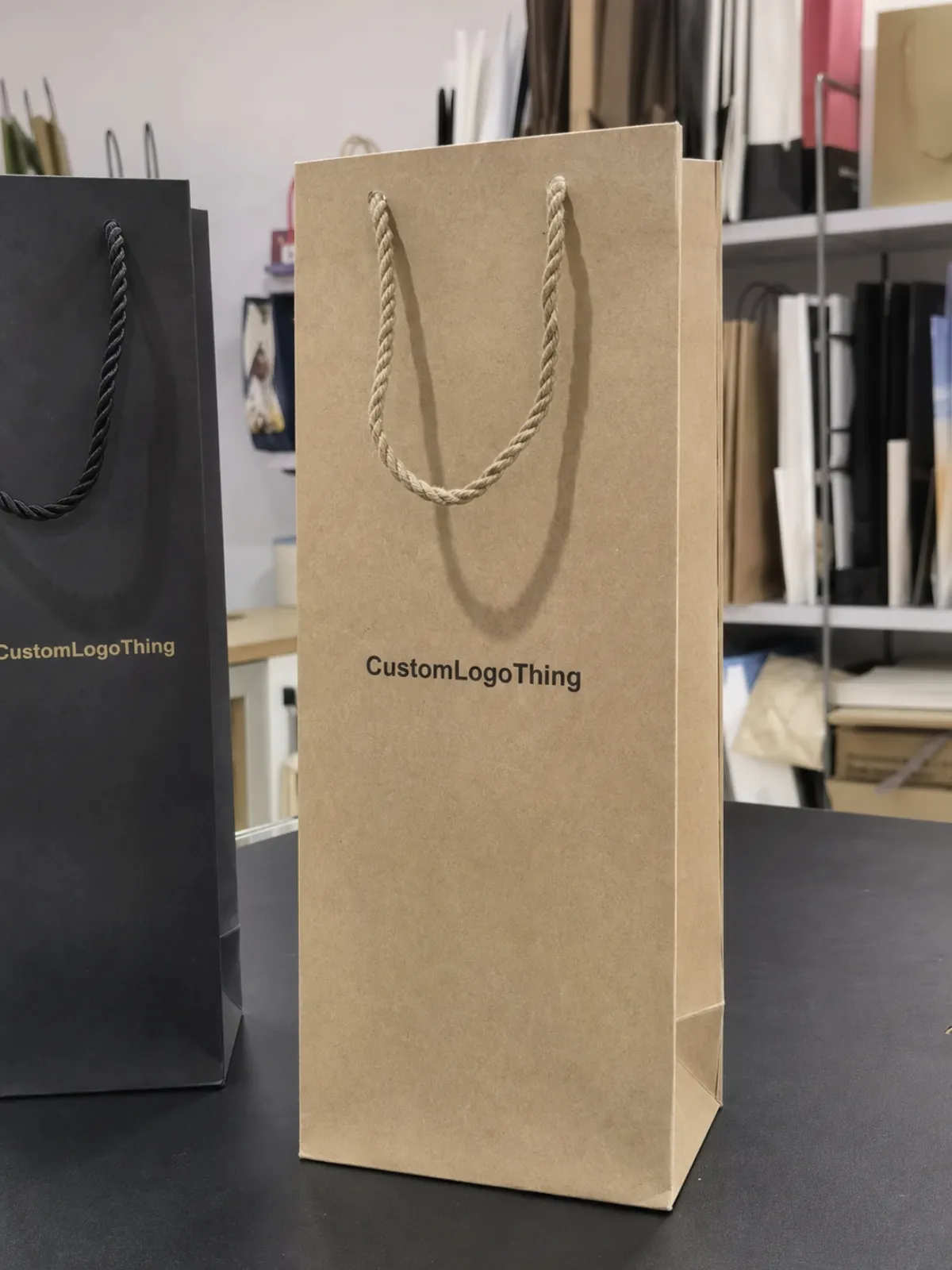
That effect only happens when the design is disciplined. Too-small artwork disappears into the texture. Too much coverage flattens the material and makes the box feel generic again. The surface is unforgiving, which is useful. It exposes weak design quickly.
A few examples show why the format keeps showing up. Folded tees can ship in a tuck-top mailer without looking overbuilt. Coffee sample packs can sit in a compact kraft carton with a simple one-color mark. Skincare sets often need inserts to keep bottles from moving around, but the outer box can stay minimal. The material does not need to be the star; it just needs to support the product.
Kraft packaging looks premium when it avoids panic. One clear logo, enough white space, and a finish that does not fight the paper usually beat a crowded design with six ideas competing for attention.
There is also a buyer-side reality that matters. A kraft box can signal sustainability, but only if the rest of the system backs that up. If the board is over-inked, heavily laminated, or packed with unnecessary coatings, the look and the claim stop matching. Buyers notice that mismatch faster than brands expect.
Structure changes the message too. A mailer says ecommerce and direct fulfillment. A sleeve adds a reveal moment. A rigid-style box says giftable or premium retail. If the goal is a broader comparison of formats, Custom Packaging Products is a useful starting point for weighing board, closure style, and finish before locking in one option.
How the production process and timeline usually works
Most packaging delays come from missing details, not from the press itself. The process usually runs in a predictable order: brief, dieline, artwork proof, sample, production, finishing, packing, and freight. If the box size, logo file, and print method are unclear at the start, the schedule begins to wobble right away.
Vector artwork saves time. So does final sizing. A raster logo, a guessed dimension, or a sketch of the closure forces extra clarification and another round of proofing. That is how a simple order starts behaving like a project with too many cooks and not enough measurements.
Lead times vary with structure and finish. A simple one-color kraft mailer can move faster than a rigid box with inserts, foil, or spot coating. Seasonal demand matters too. Holiday production windows get crowded, and there is less room for corrections once the calendar fills up.
Typical timelines look something like this:
- Brief: confirm dimensions, quantity, product weight, and delivery target.
- Dieline: map the panel layout, fold lines, and closure style.
- Artwork proof: place the logo, any regulatory copy, barcode, or care text.
- Sample: check fit, print clarity, and build quality before the full run.
- Production: print, cut, crease, glue, and finish.
- Freight: pack, palletize, and ship to the warehouse or kitting site.
Sampling deserves more respect than it usually gets. A sample is not just a pretty preview. It is where weak folds, bad tolerances, and awkward logo placement show up before they become expensive. If shipping performance matters, ask for testing that reflects real handling, not just a flat mockup sitting on a desk. Many teams use ISTA protocols as a reference point for transit and drop testing on shipping cartons and ecommerce packaging.
A fast quote is not a fast delivery. It only means the supplier understood the request. The box still has to be proofed, approved, made, packed, and moved. Those are different steps. Skipping that distinction is how people end up surprised by their own timeline.
Cost drivers, pricing, and MOQ tradeoffs
Price is where the conversation gets real. With custom kraft Boxes with Logo, the cost is shaped by quantity, board thickness, dimensions, print coverage, finish, and whether plates or tooling are needed. The same logo can live on a box that costs under a dollar or on one that costs several dollars. Structure changes everything.
Minimum order quantity changes the math too. Lower MOQ reduces inventory risk, but the per-box price usually rises because setup costs are spread across fewer units. Higher runs bring the unit price down, but they also raise the risk of sitting on stock you do not need yet. There is no universal winner here. It depends on launch stage, SKU volatility, and cash flow.
For planning, it helps to think in rough bands rather than exact numbers. Simple plain kraft mailers at higher quantities often land in the lowest range. One-color branded cartons usually sit in the mid range. Rigid boxes, foil, embossing, and complex inserts push the price much higher. The details matter more than the label on the quote.
| Option | Typical use | Relative cost | What drives the price |
|---|---|---|---|
| Plain kraft carton | Basic shipping or internal packing | Lowest | Board grade, size, and quantity |
| One-color logo print | Everyday retail packaging | Moderate | Ink coverage, plate setup, and registration |
| Full-panel branding | Subscription or premium ecommerce | Higher | Print area, fold alignment, and finish |
| Emboss, foil, or specialty finish | Gift sets and premium launches | Highest | Tooling, added labor, and finishing complexity |
On real projects, setup fees often fall somewhere around $50 to $250, depending on the print method and the level of prep required. Plates or tooling may add another $75 to $300. Samples and freight should be shown as separate lines. If they are buried inside a lump sum, comparing quotes gets messy fast.
A quote that looks cheap can still be the expensive option once shipping, sample revisions, and rework are added in. That is why landed cost matters more than the first number an email shows you.
Sustainability claims can affect pricing too. FSC-certified stock often costs more, but it gives the brand a cleaner path for environmental messaging. If the claim matters to your packaging copy, check the certification scope and chain-of-custody language at FSC before printing anything on the box.
Step-by-step spec checklist before you order
A good spec sheet prevents avoidable mistakes. Before asking for pricing, define the product first. Exact dimensions. Actual weight. Fragility. Stackability. Shipping method. A box for a folded shirt is not the same as a box for glass jars or a multi-item kit. The product sets the packaging requirements, not the other way around.
Then pick the structure. A tuck-end carton works well for retail and light ecommerce. A mailer is better for direct shipping. A sleeve adds a reveal without much extra board. A rigid-style presentation box looks premium, but it adds material and labor cost quickly. If you need to compare formats side by side, Custom Packaging Products is useful for mapping those tradeoffs before you commit.
Logo placement should be decided before the first proof. Mark the safe zone, the bleed, and the fold lines. Ask where the visual center lands once the box is assembled. What looks centered on a flat dieline can shift after folding, especially on boxes with narrow panels or deep lids.
- Dimensions: use inside size, not only outside size.
- Weight: enough to judge board strength and stacking pressure.
- Artwork: vector files, outlined fonts, and the correct color space.
- Compliance: barcode, ingredient text, recycling note, or warnings if needed.
- Finish: matte, gloss, uncoated, emboss, foil, or no coating.
- Testing: closure strength, rub resistance, and daylight appearance.
Color expectations need to be explicit. Brown kraft changes the way ink behaves. Dark colors tend to deepen. Pale colors can lose clarity. Fine lines can break up on textured board. If the logo has to be precise, ask for a proof that shows how it sits on the actual brown substrate, not a white screen rendering that lies by omission.
For shipping programs, board strength should match the route. ASTM D4169 is commonly used as a reference for distribution testing in packaging environments. Not every box needs a full lab-style test, but every box needs to survive the handling it will actually see. Pretty is nice. Broken is not.
Common mistakes that make branded kraft packaging look cheap
The biggest mistake is visual overreach. On kraft stock, a giant logo often looks less premium than a smaller one placed with care. Thin type can vanish. Crowded panels can make the box feel rushed. The material does not need much ink to feel branded; it needs the right ink in the right place.
Another common failure is board mismatch. A light carton might be fine for a tee shirt or a few paper goods, then collapse when someone stacks it, ships it long distance, or adds inserts. A box that cannot support the product will never look premium for long. It will just look underbuilt.
Too much coverage can flatten the natural feel of kraft. That texture is part of the appeal. Flood the surface with ink and the box starts losing the reason it was chosen in the first place. Sometimes that is a valid direction. Often it is just overdesign.
There is also an operational trap. Approving art before the dieline is confirmed can trigger correction after correction. Skipping a sample can save a few days and cost much more later. Orders get messy when teams assume the first proof is basically final. Packaging rarely rewards that optimism.
Most bad boxes are not ruined by one giant mistake. They are ruined by four small ones that all point in the same direction.
Expert tips for a cleaner, more premium logo finish
Restraint usually wins. One strong logo, decent whitespace, and a limited palette often look better on kraft than an elaborate illustration system. That is especially true for packaging that has to work both in photos and in transit.
Tactile finishes can add depth without overpowering the paper. Blind deboss and subtle embossing work well when a brand wants a premium signal without shouting. Matte finishes can calm the surface, though they reduce the raw paper feel some teams like. Foil can work too, but it needs discipline. A single metallic mark on a quiet panel can feel elegant. Too much foil starts looking eager.
Typography matters more than people usually expect. Bold letterforms handle texture better than hairline fonts. A compact icon often survives handling better than a delicate gradient or thin script. If the box is going through warehouses and courier networks, the design should be built for abrasion, not just for the mockup.
The strongest packaging systems think in sets. The outer box should sit comfortably beside tissue paper, labels, stickers, inserts, and bags. Branding gets stronger when every touchpoint feels related. If the box is polished but the insert looks random, the system loses confidence.
Check the box in daylight before approval. Kraft packaging lives or dies in real light. Brown tone, ink density, and the shadow around the logo can change once the carton is built and held at arm’s length. A screen can hide a lot. The box will not.
What to do next: build a quote-ready brief
If the goal is accurate pricing, start with a quote-ready brief. Include dimensions, product weight, artwork files, quantity bands, target in-hand date, and any kitting or shipping requirements. That one document can cut days of back-and-forth and make supplier comparisons much cleaner.
Ask for the same structure, the same board, the same print method, and the same freight terms across every quote. Otherwise the numbers are not really comparable. One supplier may include sampling, another may hide freight, and a third may be pricing a completely different box. A lower number does not mean a better offer.
Approval discipline matters too. Decide who signs off on artwork, who checks structure, and who confirms quantity. Delays usually happen after the quote is accepted, when feedback starts coming from three directions at once. Packaging production likes clarity. Chaos just makes everyone older.
If the box is still in early development, ask for a sample or a proper digital proof before moving forward. That matters most when the logo sits near a fold or the product needs real shipping protection. Small layout errors become large repeat errors fast once the line is running.
Once the brief is tight, custom kraft Boxes with Logo become much easier to price, compare, and reorder. That is the real win: a box system that holds up in production, in transit, and on shelf without turning every refill into a fresh headache.
FAQ
How much do custom kraft boxes with a logo usually cost?
Cost depends on size, board grade, print colors, finish, and quantity. Simple boxes at higher runs can land in a low unit-cost range, while rigid structures, inserts, and specialty finishes push pricing up fast. Ask for setup, sample, freight, and production as separate line items so the quote is easy to compare.
What file type works best for a kraft box logo?
Vector files such as AI, EPS, or print-ready PDF work best because they stay sharp at any size. Fonts should be outlined and line weights should be strong enough to survive printing on textured kraft stock. If all you have is a raster file, a redraw is worth it.
How long does the turnaround take for custom kraft boxes with logo?
Simple orders may move from proof to shipment in a few weeks after approval, while custom structures, special finishes, or test-heavy projects usually take longer. Sampling, production, and freight all add time. Fast feedback from your side often matters as much as machine time.
Are kraft boxes strong enough for shipping?
Yes, if the board thickness and construction match the product weight and handling conditions. Fragile or heavy items may need inserts, thicker board, or a sturdier mailer style. A filled sample test is the safest way to check before a full run.
Can I print full color on brown kraft material?
Yes, but the result usually looks darker and less saturated than the same art on white board. Bold contrast works better than pale gradients or very thin detail. A proof is the only reliable way to see how the logo will behave on the brown surface.
What board types are common for kraft packaging?
Folding cartons often use kraft paperboard in the 250 to 350 gsm range, while mailers may use corrugated board such as E-flute or B-flute depending on strength needs. Rigid boxes use thicker paperboard wrapped with kraft paper. The right choice depends on product weight, shipping method, and presentation goals.
Packaging works best when the details are boring in the right way. Clean board choice. Correct dimensions. Honest print expectations. Solid sampling. If those pieces are handled well, custom kraft Boxes with Logo stop looking like a commodity order and start acting like part of the product itself.

