The bag that looks most expensive on a screen is not always the one that prints best on paper. That sounds obvious until a quote lands and the pretty mockup starts fighting with reality. A useful custom wine paper Bags Print Method Comparison starts with the substrate, the print process, and the bag structure, because those three things usually decide the final result more than the press name on the spec sheet.
Wine carriers have a narrow job and a picky one. They need to look premium from a few feet away, carry weight without collapsing, and keep the logo readable on paper that may be textured, recycled, coated, or all three. The wrong print method can make a clean design look cheap. The right one can make a simple layout feel deliberate and expensive.
Most buyers end up choosing between flexographic printing, offset printing, and digital printing. Foil, embossing, spot UV, and similar finishes sit on top of those methods rather than replacing them. The real decision is practical. Match the process to the artwork, order size, paper grade, handle style, and timeline. That is the part most buyers miss in a Custom Wine Paper Bags print method comparison.
Custom Wine Paper Bags Print Method Comparison: What Buyers Miss
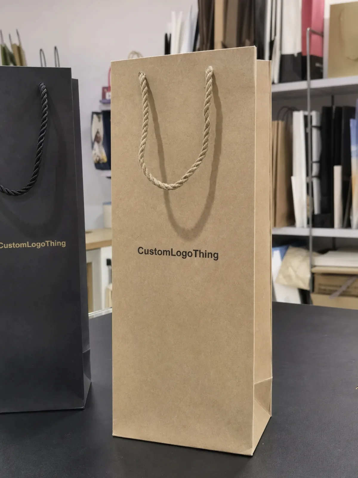
People often start with the machine and skip the bag. That is backwards. A one-color logo on recycled kraft can look sharper than a full-color image on the wrong coated stock. A twisted paper handle, rope handle, or reinforced top changes how flat the front panel sits during printing and how the artwork reads once the bag is filled. Construction affects print quality. It is not an afterthought.
Different buyers also want different outcomes. A tasting room may want a seasonal run for bottle gifts. A retailer may need repeatable stock that can be reordered every month. An event team may need short-run packaging for a launch kit or sponsor pack. The same wine bag format can serve all three, but the print method that works for one can be a poor fit for another. Unit cost matters for one group. Color control matters for another. Speed matters for the third.
Distance matters too. Most bags are judged at shelf distance or while they are being carried, not under a loupe. Fine type that looks elegant on a proof can disappear on textured kraft. Heavy ink coverage can muddy on absorbent paper. A premium-looking layout is not automatically a premium-printed one. The method needs to support the logo, not just decorate the surface.
A wine bag has to sell the bottle before the bottle is even touched.
That same logic shows up in other packaging formats. Any time the package is handled often, printed on a textured surface, or expected to look polished at a distance, the process choice matters as much as the design itself.
How Flexo, Offset, and Digital Printing Behave on Wine Bags
Flexographic printing is the workhorse. It suits simple graphics, repeat orders, and runs where setup efficiency matters. A bold logo, a short line of text, or one or two spot colors can print cleanly on kraft or white paper if the surface is consistent enough. Flexo is not the best choice for tiny reverse type, thin rules, or image-heavy layouts, but it is dependable for brand marks that need to repeat at scale. For bottle bags, that often makes it the quiet winner.
Offset printing is better for fine detail, smoother gradients, and tighter color control. If the artwork uses photography, layered illustration, or exact brand hues, offset usually gives the cleanest result. It also fits a more polished retail look. The downside is setup economics. Plates, alignment, and prepress work make more sense once the quantity is high enough to spread those costs across the run. For small orders, the total project cost can climb fast even when the unit price seems fair on paper.
Digital printing is the quickest path for short runs, seasonal campaigns, sample programs, and variable artwork. It works well when a brand wants to test a holiday graphic, launch a new label concept, or print multiple versions without plate charges. The tradeoff is surface sensitivity. Some papers print beautifully. Some textured kraft stocks soften the image or mute color. White ink can help on dark or brown stock, but not every supplier offers it on every bag style.
The short version is simple: flexo for repeatable simplicity, offset for detail and color precision, digital for speed and flexibility. None of them is best in every case. Each one behaves differently once the paper, ink load, and handle structure enter the picture.
Cost, Pricing, MOQ, and Unit Cost Tradeoffs by Method
The quote only helps if you know what it includes. For wine paper bags, the real cost stack usually includes prepress, plates or files, ink coverage, paper grade, finish options, handle style, freight, and packing labor. A plain bag with a one-color logo and paper handles sits in a very different cost range from a laminated bag with foil and rope handles. That is why any custom wine Paper Bags Print method comparison should look at total project cost, not just the per-piece number.
Minimum order quantity changes by method. Flexo and offset usually reward volume because the setup cost gets spread across more bags. Digital can support a smaller test run because there are fewer fixed charges. Buyers get misled when they compare only unit price. A digital quote with a higher per-piece cost can still be cheaper overall on a 500-piece order if it avoids plates, long setup, and dead inventory. The same logic applies to other branded packaging programs, especially seasonal runs.
| Method | Best Fit | Typical MOQ | Planning Price Range | Typical Lead Time | Main Tradeoff |
|---|---|---|---|---|---|
| Flexo | 1-2 color logos, repeat orders, simple layouts | 2,000-10,000+ | $0.18-$0.38 per unit at 5,000 pieces | 12-18 business days after proof approval | Efficient, but less forgiving on fine detail |
| Offset | Image-heavy art, fine type, stronger color control | 3,000-20,000+ | $0.25-$0.60 per unit at 5,000 pieces | 15-25 business days after proof approval | Excellent print quality, higher setup economics |
| Digital | Short runs, seasonal campaigns, variable artwork | 100-3,000 | $0.45-$1.20 per unit at 1,000 pieces | 5-12 business days after proof approval | Fast and flexible, but higher unit cost |
These are planning ranges for standard bottle bags on kraft or white paper before foil, embossing, heavy lamination, or unusual handle upgrades. Heavier paper, reinforced bottoms, and premium rope handles move the quote upward quickly. Tight Pantone matching, full-panel coverage, and custom sizes do the same. If you want a real comparison, ask suppliers to price the same artwork at two or three quantities so the break-even point is visible instead of guessed.
One more thing: the cheapest method is not always the cheapest order. A larger offset run can make sense if the bags will be reordered repeatedly. A digital run can make sense if the design may change in six weeks. Buying the wrong quantity is how packaging budgets get wasted.
Process and Lead Time: From File Prep to Delivery
The fastest job is usually the one that arrives ready. A clean production flow starts with artwork review, dieline confirmation, color proofing, setup for plates or files, printing, finishing, quality check, packing, and freight booking. If one step stalls, the schedule slips. The most common delay is not the press itself. It is the paperwork around the press: missing dielines, low-resolution logos, or unclear Pantone targets.
Digital printing usually wins on lead time because it skips plate creation and can move from proof to production quickly. Flexo and offset need more coordination because setup, curing, and finishing have to line up. That said, a small digital order can still slow down if the buyer changes handle style or asks for a finish revision after approval. Once the job is in the queue, revisions cost time.
Ask for two dates, not one. You need the target ship date, but you also need the real approval deadline. That second date protects internal review. If marketing, sales, and procurement all need to sign off, a simple wine bag order can become a schedule risk. This happens constantly in packaging programs where multiple teams want a voice and nobody wants to be the one who said yes too early.
For larger or more delicate shipments, ask how the supplier packs the finished bags. If the bags travel long distances, nest with bottles, or ride inside mixed cartons, transit testing matters. Some buyers reference ISTA transit test methods to understand handling and vibration. For paper sourcing, FSC certification can support fiber claims if sustainability is part of the brief.
Paper Grade, Ink Coverage, and Finish Choices That Change Results
Paper is not just a background. It decides how the color behaves. Recycled kraft, bleached white paper, textured stock, and coated surfaces all change the final read. A deep navy that looks elegant on coated white paper can turn flatter on brown kraft. Bright red usually holds better, but only if the ink system and surface are matched properly. That is one reason the custom wine paper bags print method comparison cannot be separated from the paper spec.
Heavy ink coverage can look premium, but it also raises the risk of rub-off, drying issues, and visible banding on rough paper. Small type can close up on uncoated surfaces. Fine lines can vanish into texture. If the artwork depends on detail, ask whether the supplier recommends a smoother stock or a white underbase. A 170-210gsm kraft bag with simple artwork behaves very differently from a 250gsm art paper bag with soft-touch lamination.
Finishes add impact and add cost. Matte gives a quieter look. Gloss pushes contrast. Spot UV pulls attention to a logo area. Foil stamping adds shine, but it can also stretch lead time and demand tighter registration. Embossing adds tactility, though it does not suit every paper. Stack too many effects and the supplier pool gets smaller fast. That is normal. It is also a sign the design may be doing too much.
Handle and structure choices matter as well. Twine handles and reinforced tops can justify a more premium print method because the bag carries more brand weight. But overbuilding the bag can crowd out the print budget quickly. In actual production, a balanced spec often wins: Choose the Right paper grade, keep the artwork readable, and spend the premium where the customer will notice it.
There is a practical QC side to this. A good supplier should check print registration, ink density, handle pull strength, glue lines, and the squared shape of the finished bag before packing it. A bag that looks fine in a stack but opens crooked or sheds ink under light friction is not a premium bag. It is a reprint.
Common Mistakes That Cause Color Drift or Delays
The biggest mistake is choosing the method before locking the artwork. A design built for digital printing may need changes if the order shifts to flexo or offset. Line weight changes. Negative space changes. Sometimes the logo needs a stronger outline so it does not disappear on kraft. If the method changes late, the artwork should change too. Otherwise the final result is compromised before the press even starts.
Pantone approval is another trap. Buyers often approve a screen color without asking how it will translate to absorbent paper. Kraft has undertones. White paper has a different brightness. Coated surfaces reflect light differently again. If brand color is critical, ask how the supplier controls color on the exact substrate, not just in a mockup. A target Delta E can help set expectations, but it will not override the reality of the paper.
- Ignoring minimums until the quote arrives and the budget is already fixed.
- Approving a sample without confirming the same paper, ink system, and finish.
- Using thin type on textured kraft where the letters can fill in.
- Changing finishes late after the production slot has been booked.
- Letting too many reviewers turn one proof into a week-long delay.
Another common problem is assuming the sample is a perfect preview. It is only useful if the same substrate and print process are in play. A digital sample on smoother paper does not predict how offset will behave on brown kraft. A foil sample on a flat proof does not show how it will register on a bag with a handle glued nearby. That is why a serious custom wine paper bags print method comparison needs a proofing plan, not just a thumbs-up on a mockup.
One more caveat: if the bag will be used for chilled bottles, condensation can change how the print looks and how finishes wear. Gloss and foil can highlight moisture marks. Uncoated kraft can soften in humid storage. Those issues are not glamorous, but they are the ones that show up after delivery. Buyers who ignore them usually find out the hard way.
Expert Tips for Proofing, Sampling, and Supplier Comparison
If color matters, ask for at least one physical sample. On-screen proofs rarely capture paper texture, ink absorption, or how metallic foil catches light on an uneven surface. A buyer who skips the physical sample is betting that a monitor can predict paper behavior. It cannot. Not accurately enough for premium branded packaging.
Compare suppliers on more than price. Ask how they handle registration tolerance, what they use for color matching, whether they can support spot colors plus process work, and how they manage reprints or defects. A supplier that has already produced similar wine carriers is more likely to spot a weak line before it becomes waste. That experience matters more than a polished sales deck.
A simple test matrix can save money. Ask for one version with a bold logo, one with fine-detail typography, and one with any special finish you plan to use. That shows where the method starts to fail. It also tells you whether the paper grade is helping or hurting the design. In many cases, the strongest option is not the fanciest one. It is the one that survives real handling.
For sustainability claims, keep the language modest and verifiable. If the paper source carries FSC certification, that is useful. If transit performance matters because the bags ship in kits or across regions, ask whether the supplier references ISTA in packing discussions. If you are unsure, ask for a written recommendation rather than a quick verbal promise. A written recommendation forces the supplier to explain why the method fits the order.
Also ask what happens if the first run misses the target. Reprint policy, waste allowance, and acceptable color tolerance should be part of the discussion before approval. Good suppliers do not hide those numbers. They use them to keep the job clean.
Next Steps: What to Send for a Faster, Smarter Quote
The cleanest quote request is specific. Send the bag dimensions, paper preference, handle style, print colors, finish requirements, and target quantity by size if you need multiple SKUs. Add the artwork file format and brand color references. If the design must stay consistent across bottle sizes, gift sets, or seasonal campaigns, say that upfront. One line can save a lot of back-and-forth.
Ask for two quote scenarios: one built around the lowest unit cost and one built around the fastest lead time. Those are not always the same job. A buyer can see immediately whether flexo, offset, or digital printing is the better fit once the numbers are side by side. If you are comparing bottle bags with other product packaging in the same program, keep the spec sheet consistent so the comparison stays honest.
Also ask how proofing works, whether a physical sample is available, and what approval timing the supplier needs before production can start. A realistic calendar is more useful than an optimistic promise. If the order has to be on shelves by a hard date, build in margin for approval, freight, and one round of corrections. That is the difference between a clean launch and a rushed one.
Use the custom wine paper bags print method comparison as a working checklist, not a slogan. Choose the method that fits the artwork, the quantity, the paper, and the timeline, then spend the money where it changes what the customer actually sees.
Which print method is best for custom wine paper bags with a small order?
Digital printing is usually the most practical starting point for short runs because setup costs are lower and approval cycles are faster. Flexo can still work if the artwork is simple and the supplier offers a low minimum order quantity. The best comparison is at two quantities, so you can see whether a larger run lowers unit cost enough to change the decision.
How do I compare flexo vs offset for custom wine bag printing?
Start with artwork complexity. Offset printing tends to handle fine detail, smooth gradients, and tighter color control better. Then check order size. Flexo often makes more sense when the run is repeatable and the volume is higher. The final filter is the exact paper grade, because the same design can behave differently on kraft, white, or coated stock.
Will digital printing hold up on recycled kraft wine paper bags?
It can, but texture and absorbency affect sharpness, contrast, and color depth. On darker or rougher kraft, some artwork needs white ink or a different stock to stay readable. If logo clarity or brand color is important, request a physical proof instead of relying on a screen preview alone.
What MOQ should I expect for printed wine paper bags?
MOQ depends on the print method, bag structure, and finish choices as much as it does on the artwork. Simple digital runs can be much smaller than flexo or offset jobs that need plates or heavier setup. Ask each supplier for the minimum at each quantity tier so you can compare the true buying threshold, not just the headline number.
How can I avoid color mismatch on custom wine paper bags?
Share Pantone references, specify the exact paper stock, and approve a physical sample whenever possible. Color shifts are common on absorbent kraft, especially with heavy coverage or specialty finishes. Keep the paper, ink system, and finish in the same conversation from the start so expectations stay realistic.
If the order is moving between methods, repeat the sample on the final stock before production. That extra step is cheaper than guessing.

