For a clothing brand, the label is usually the last small component a customer touches before deciding whether a garment feels finished or merely assembled. That is why Custom Fabric Labels design your own matters so much: the right label can make a tee, hoodie, or jacket feel retail-ready, while the wrong one can make an otherwise solid product look unfinished.
Labels do more than carry a logo. They hold size information, fiber content, care instructions, and brand cues that shape trust at the point of sale and after the first wash. From a packaging buyer’s point of view, the label belongs in the same conversation as Custom Packaging Products and branded inserts. If the garment, box, and hangtag all point in the same direction, the brand feels deliberate. If one element looks out of place, the whole presentation loses force.
A label rarely gets attention until it fails: it scratches at the neck, curls at the edge, fades after laundering, or looks mismatched against the garment it is sewn into.
That is why experienced buyers pay attention to material choice, fold style, artwork density, and sewing placement. A label may be small, but it carries both a visual job and a compliance job, and it has to survive stitching, wear, and washing without becoming the weak point in the product.
Why Custom Fabric Labels Design Your Own Matters on the Finished Garment
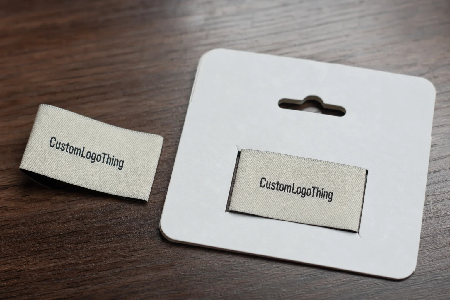
Picture two hoodies made from the same fleece, with the same stitching and the same blank body. One has a soft woven label that sits flat and matches the garment’s tone. The other has a stiff tag with fuzzy edges and a logo that feels oversized for the neckline. The first reads as finished retail product. The second reads as a shortcut.
That difference matters because labels sit at the intersection of product packaging and garment construction. They tell a customer who made the item, what size they need, how to care for it, and sometimes where it was produced. For smaller brands, the sewn-in label can carry more authority than the hangtag because it stays with the garment long after the box is discarded.
Comfort is a practical issue, not a cosmetic one. A label that looks clean in a proof can still irritate once it is stitched into a neck seam or side seam. Too much stiffness, poor edge finishing, or weak ink coverage tends to show up quickly: corners curl after heat exposure, printed satin wears thin, and low-grade woven labels lose definition after repeated washing. That is why Custom Fabric Labels design your own should never be treated as a logo-placement exercise alone.
Brands that already invest in Custom Labels & Tags and coordinated branded packaging usually notice this faster. They understand that every touchpoint needs the same discipline. When the garment label is clean, the outer box is well printed, and the insert card is consistent, the customer reads that as control rather than luck.
There is also a structural reason the label matters. A small label with poor construction can twist, fray, or pucker the seam after the first few wears. On a basic tee, that may be annoying. On a premium jacket, it becomes a visible defect. The label has to match the garment’s fabric weight, wash cycle, and expected handling. A label that works on a structured cotton shirt can feel wrong on a stretch knit, even if the artwork is identical.
Fabric Label Types, Materials, and Finishes
The right material depends on how the garment will be worn, washed, and sold. A label for a soft baby tee should not be chosen the same way you would choose one for a heavy work jacket. Most buyers compare a few familiar constructions, and each has a clear use case.
Woven damask is the most common premium choice. Its tighter thread density keeps small letters and fine details sharper, which matters when a logo uses thin strokes or small type. It feels refined, but it also demands better artwork and usually a higher budget. Woven taffeta is lighter and more economical, with a flatter hand and less texture. Printed satin has a smooth face and is often chosen for care labels or neck labels where softness matters more than texture. Printed cotton gives a more natural look, though it may not be the best fit for high-wash or high-friction use. Polyester satin sits in the durable middle and is common for brands that want a polished look without pushing into the highest-cost woven build.
Finish changes the way a label behaves and the way it reads. A matte woven surface tends to feel more restrained and premium. A gloss finish can work on fashion pieces, but it can fight the texture of the garment if the rest of the product is understated. Heat-cut edges help reduce fraying on printed labels, while soft-edge weaving improves comfort on neck applications. Recycled yarn options are appearing more often too, especially for brands aligning label choices with FSC-certified paper inserts or other sustainability moves in their packaging system.
Fold style affects both appearance and comfort. An end fold keeps the edges tucked and clean. A center fold works well when the label wraps around a seam. A loop fold is useful for sewn-in neck or size applications. A straight cut gives more flexibility for external placement or labels that will be stitched into multiple points. There is no single best answer. The garment decides.
Another practical detail is label thickness. A dense woven label with a crisp edge can feel premium, but on lightweight garments it may create a lump at the seam. A softer printed label may sit better on knits and thin jerseys. That tradeoff is easy to miss if you only look at the artwork. It becomes obvious once the label is sewn in and the garment is worn.
Here is a practical comparison:
| Label Type | Best Use | Feel / Look | Typical Cost Pressure |
|---|---|---|---|
| Woven Damask | Premium apparel, detailed logos | Sharp, textured, durable | Higher setup and unit cost |
| Woven Taffeta | Basic branding, larger text | Flatter, lighter, clean | Moderate |
| Printed Satin | Neck labels, care labels | Smooth, soft, low profile | Often lower for simple art |
| Printed Cotton | Natural or heritage styling | Soft, casual, matte | Moderate, depending on ink coverage |
| Polyester Satin | General apparel use | Durable, polished, flexible | Usually mid-range |
If a brand already uses custom printed boxes, the label should echo the same tone and visual discipline. That does not mean everything must match exactly. It means the same level of restraint, contrast, and finish quality should carry across the system so the customer reads one brand, not a stack of unrelated parts.
How the Label Production Process Works
The production path is fairly predictable, but delays usually appear in the same places. It starts with artwork intake. The supplier checks the file, size, fold style, text content, and any special notes, then converts the design into a production-ready proof. That proof is where most corrections happen, and that is exactly where they should happen. Fixing a problem there is far cheaper than finding it after a full run.
After proof approval, the factory moves into sample or bulk production depending on the order. A simple printed label may move quickly once the artwork is locked. A dense woven design with several colors and a specialty fold usually needs more lead time because the loom setup is more involved. If the order requires a pre-production sample, the timeline expands because the sample has to be made, reviewed, and approved before the full quantity is released.
A realistic timeline for many standard label orders is often around 7-15 business days after proof approval. Complex woven work, custom folds, or orders that require revisions can push that longer. If you are also coordinating garment relabeling, hangtags, and shipping cartons, work backward from the launch date and leave room for shipping, internal approval, and any fit testing you still need to do.
Proof review is where buyers should slow down. Check spelling, size, placement, color notes, and whether the care information fits the actual label dimensions. If the artwork includes fiber content, care symbols, or multilingual text, confirm line breaks and spacing carefully. A label can look polished in a PDF and still fail in production if the letters are too small or the seam allowance was not built in.
One overlooked issue is contrast after stitching. A woven label can look perfectly legible in a mockup and still disappear once it is sewn into a dark garment or placed under poor retail lighting. The supplier may also recommend a slightly larger type size than the screen design suggests. That advice is usually worth taking. On fabric, readability is a physical constraint, not a style preference.
For teams that manage broader retail packaging programs, the label process should sit beside the rest of the packaging workflow, not separate from it. That includes inserts, folding standards, and box presentation. Brands that care about package branding usually get better results when they treat the label as one component in a controlled system rather than a last-minute add-on.
For shipping durability checks, some brands also review ISTA test methods so the full pack can survive transit without scuffing, crushing, or moisture damage. That matters more if labels are packed with folded garments, hangtags, and outer cartons that need to arrive looking retail-ready.
Pricing, MOQ, and Unit Cost Drivers
Label pricing is shaped by a few simple variables, but those variables can move the quote more than buyers expect. Size matters. Material matters. Fold style matters. Artwork complexity matters. And quantity matters a lot, because setup costs get spread across more units as the order grows.
Small runs usually carry a higher per-unit price because the factory still has to set up the loom or print run, review the art, and pack the job. Larger runs lower the unit cost, but they also increase inventory risk if you later change the logo, size chart, or care text. That tradeoff is real. I have seen brands save money on the quote and then pay for it later because they ordered too many labels before finalizing their packaging design or garment fit.
For rough planning, many buyers see something like $0.08-$0.22 per printed label for modest quantities with simple art, while woven labels with multiple colors or tighter detail may sit closer to $0.12-$0.35 per unit depending on quantity, size, and finishing. Those ranges are not a promise. They are a practical starting point for comparing quotes without assuming every supplier prices the same way.
Minimum order quantity, or MOQ, is another key factor. Some suppliers set MOQ by design, some by size, and some by colorway. If a brand needs multiple size tabs or seasonal variations, that structure can matter more than the headline price. Always ask what the MOQ actually applies to before you approve the quote.
When comparing vendors, ask what is included and what is not. Setup charges, sampling, rush production, shipping, and special finishing can be separated out. A low unit price can turn into a more expensive order if the quote hides those extras. The same applies to revision cycles. One round of corrections may be included; three rounds are often not.
| Cost Driver | Effect on Price | Buyer Note |
|---|---|---|
| Quantity | Higher volume usually lowers unit cost | Watch inventory risk if the design may change |
| Material | Damask and specialty satins usually cost more | Choose by garment feel, not by price alone |
| Colors and detail | More thread colors or tighter artwork can add cost | Thin fonts often raise production risk |
| Fold and finish | Complex folds and clean-edge finishing add labor | Comfort and sewing method should drive the decision |
| Sampling and rush | May add separate charges | Confirm before approval, not after |
If sustainability is part of the brand story, check whether any label components or companion packaging use certified materials. The FSC standard applies to paper and paper-based packaging elements, which can matter if the label order is being coordinated with hangtags, inserts, or other retail packaging pieces.
There is also a hidden cost in design complexity. A logo with delicate serifs, tiny gradients, or many color changes may look elegant in a mockup, but production can simplify it only so much before legibility suffers. On woven labels, each thread color and each line of detail has a ceiling. If the art depends on effects that fabric cannot reproduce cleanly, the final label will either look heavy or require simplification.
Artwork Specs and File Prep That Prevent Revisions
Good artwork saves time. Bad artwork usually costs it. The safest starting point is vector artwork, because clean lines and editable text scale better when a design is reduced to a small fabric label size. If the only file available is a raster image, it needs to be sharp enough to survive reduction without turning letters into blobs or soft edges into fuzz.
The most common setup issue is text that is too small for the chosen construction. A woven label with tiny script may look elegant on screen and fail in production because the thread density cannot hold the detail. Another common problem is low contrast: a pale logo on a pale ground can disappear once the label is stitched into a garment, especially under poor retail lighting.
Seam allowances are often overlooked too. If the label will be folded and stitched into a neck seam, the artwork has to be built around the finished visible area, not just the raw cut size. A layout that ignores fold lines can lose important text after trimming or stitching. That is one of the main reasons proofs exist.
Before sending files, run a simple preflight check:
- Spell check every line, including care text and size marks.
- Confirm the final folded size, not just the flat artwork size.
- Verify colors by name or code, especially if your package branding already uses a fixed palette.
- Keep the logo, legal text, and care symbols far enough from the edge to survive cutting and stitching.
- Match the label language to the actual product market.
That last point matters more than many first-time buyers expect. A neck label is not a place to improvise compliance text after the garment has already been cut. If your product packaging plan includes multi-market sales, your label system should be built with that in mind from the start.
It also helps to ask for the supplier’s minimum line weight and smallest readable text size before finalizing artwork. Different constructions have different limits. A printed satin label can tolerate finer text than a tightly woven label with dense threads. A design that looks safe at 2 inches wide may fall apart at 1 inch. That is not a software issue. It is a production constraint.
Common Mistakes That Create Scrap or Rework
The biggest mistake is trying to pack too much into one tiny label. A logo, size, care instructions, origin text, fiber content, and a social handle may all feel useful, but if the label becomes crowded, the customer stops reading it. Worse, the supplier may have to re-layout the artwork after proofing, which adds time and can push the order off schedule.
Placement matters too. A label that works well in a structured jacket collar may fail in a soft knit tee. Knits stretch differently, seam allowances behave differently, and wash behavior changes over time. If the garment is flexible and heavily laundered, the label should be chosen for softness and recovery, not just for appearance.
Another avoidable error is skipping a physical test. One sample stitched into the actual garment tells you more than a dozen screen proofs. You can check hand feel, visible size, thread tension, and whether the label bunches under the seam. If it feels wrong on the first wear, customers will notice it later too.
There is also a habit of ordering too close to the launch date. That leaves no room for a corrected proof, no room for a sample, and no room for a late design tweak. If the rest of the brand system includes custom printed boxes or coordinated inserts, the label should be locked early enough to keep the whole launch aligned.
Finally, do not approve artwork just because the mockup looks clean. Mockups are useful, but they are not the real garment. The actual fabric color can change the look of the label more than expected. A cream label against a warm beige tee can disappear; the same label against deep navy may look balanced. Test against the actual garment color whenever possible.
Another common mistake is ignoring wash performance. Some labels look fine before laundering and then show fraying, fading, or edge lift after one or two cycles. If the product will be worn often, ask whether the ink, weave, and edge finish are rated for the intended use. A label that survives a showroom sample but breaks down in normal wear is not a finished solution.
Honestly, the best way to reduce scrap is to treat custom fabric labels design your own as a production decision, not a graphic design exercise. That mindset catches more problems early, and early fixes are always cheaper than rework.
Practical Next Steps Before You Place the Order
If you are ready to move, keep the decision set tight. Choose the label size, construction, fold style, placement, and exact copy before requesting a final quote. If those points are still moving, the order will drift through revisions and the timing will stretch.
A simple testing plan helps a lot. Start with one sample label on the actual garment, not on paper or on a scrap of unrelated fabric. Then check three things: comfort at the neck or seam, readability in normal light, and stitch quality after a wash or two if the product is close to launch. If the label is for a premium line, add a close look at how it sits next to the rest of the garment finish, including trim, hangtag, and carton presentation.
If your brand is built around coordinated retail packaging, keep the label and the outer presentation in the same conversation. The tee, the fold, the insert card, and the box all need to feel like one system. That is what makes a collection feel intentional rather than assembled from separate suppliers.
Before approving the first run, confirm these items:
- Final artwork text and spelling
- Label size and fold style
- Material choice and finish
- Quantity and MOQ
- Proof approval and expected lead time
- Any added charges for samples, rush service, or shipping
Once those are locked, custom fabric labels design your own becomes much easier to manage. The artwork is cleaner, the proof cycle is shorter, and the label has a better chance of looking right the first time it touches the garment.
FAQ
How do I custom fabric labels design your own for a clothing line?
Start by deciding what the label must do: brand ID, size, care details, or all three. Then choose the material and fold based on garment feel, build the artwork around the final trimmed size, and request a proof before you approve the full run. One stitched sample on the actual garment is the safest check before release.
What affects custom fabric label pricing the most?
Quantity, material, and finish usually drive the biggest price changes. More colors, tighter weave detail, and special folds can raise setup complexity, while rush production and sampling can add separate charges to the final quote.
What is a typical MOQ for woven or printed fabric labels?
MOQ varies by construction, but smaller minimums usually come with a higher unit cost. Woven labels often need more setup than printed labels, so the minimum may differ by method, size, or colorway. Ask whether the MOQ applies per design, per size, or per variant before you approve the order.
How long does the label production timeline usually take?
Timeline depends on proof approval, material choice, and whether a sample is required first. Simple orders move faster than complex woven designs with multiple colors or special folds, and you should still build in time for shipping, revisions, and garment testing before launch.
What file format is best for custom fabric labels artwork?
Vector files are usually best because they keep lines sharp at small sizes. If you only have a raster file, make sure it is high resolution and readable after reduction, and include final text, color notes, and any care symbol details with the artwork. That keeps custom fabric labels design your own practical instead of guesswork, and it helps the first production run land where the brand needs it.