A custom hennessy bottle label does one job quickly: it changes how the bottle is read at a glance. Most people do not inspect the glass, the closure, or the brand history first. They notice whether the bottle looks coordinated, whether the finish catches light well, and whether the artwork sits where it should. That makes the label the highest-visibility part of the package.
That is also why a label can make a standard bottle feel deliberate without pretending to be a full packaging redesign. The bottle stays the same. The outside presentation becomes organized, brandable, and easier to photograph. That difference matters more than people expect, especially for events where the bottle sits among table decor, gift packaging, and branded inserts.
Done well, a custom hennessy bottle label is not flashy for the sake of it. It is controlled. The best versions are usually the ones that look as if they were planned alongside the rest of the packaging, not added after the fact.
What a custom Hennessy bottle label changes immediately
From a buyer’s standpoint, the label is the fastest way to make a bottle feel tied to a specific occasion. That could be a birthday table, a private dinner, a wedding display, a corporate gift set, or a short-run promotional kit. In each case, the bottle is usually seen as part of a larger layout, not as a standalone object.
The practical effect is simple. A standard bottle becomes easier to assign to a person, a brand, or an event theme. Names, dates, logos, monograms, and color cues do that work fast. If the label is balanced, the bottle reads as intentional. If it is crowded or poorly aligned, the bottle looks improvised.
This is decorative branding, not structural packaging. A custom hennessy bottle label changes the outer surface only. It does not change the bottle shape, neck profile, glass tone, or cap style. If the bottle has a narrow label panel or a pronounced shoulder curve, the design has to respect that geometry instead of fighting it.
The upside is that labels are flexible. They can be adapted for premium gifting, event merchandising, or photo-ready presentation without a tooling change. The limitation is that labels expose weak design faster than many buyers expect. Bad spacing, low-resolution art, and weak contrast show up immediately once the bottle is in hand.
What a good label does well:
- Raises visual value without changing the bottle itself.
- Supports personalization through names, logos, or event details.
- Improves photo performance by controlling contrast and layout.
That last point matters. A bottle is often judged in pictures before anyone sees it on the table. A design that reads clearly in a camera frame is usually a stronger design in real use too.
“The label is doing more than decoration. It is carrying proportion, contrast, and first impression at the same time.”
If the surrounding packaging is already branded, the label should align with it. That may mean matching typography, color temperature, or finish across Custom Packaging Products such as cartons, sleeves, tags, or inserts. Consistency is what makes the presentation feel designed rather than assembled from separate parts.
Label dimensions, materials, and finish choices for a custom Hennessy bottle label
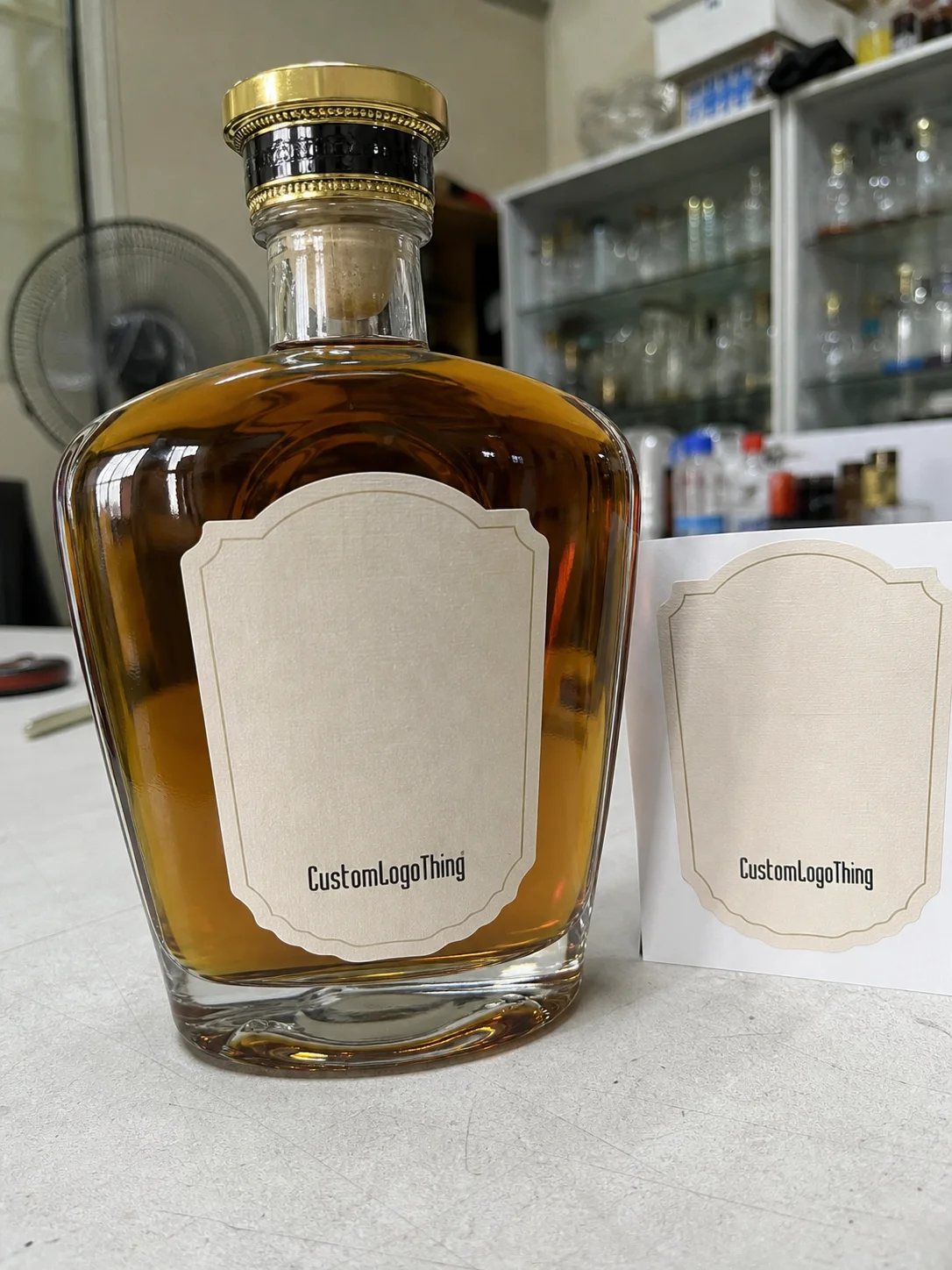
Size comes first. A label that looks correct on a flat digital proof can fail on a curved bottle with a tapering shoulder or a narrow front panel. The usable area is often smaller than buyers think, particularly on rounded glass where the surface starts moving away from the label edge sooner than expected.
Measure the labelable zone, not the entire bottle face. You want the flat or gently curved section where the adhesive can sit without lifting, wrinkling, or creeping toward a seam. On a curved bottle, even a few millimeters can matter. If the artwork is oversized, it can feel crowded. If it is undersized, the bottle can look unbalanced.
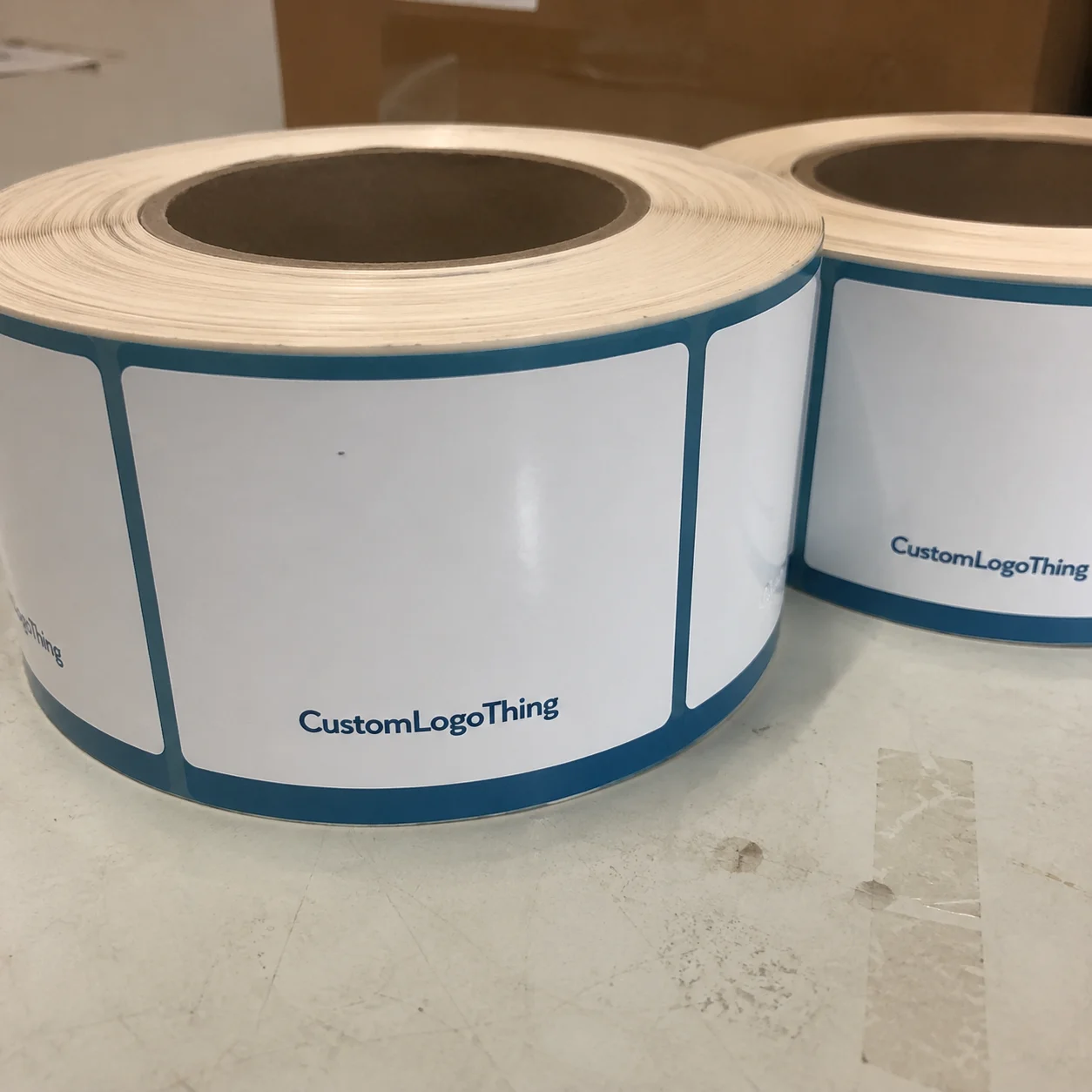
Material choice affects both appearance and durability. A few common options show up again and again in label production:
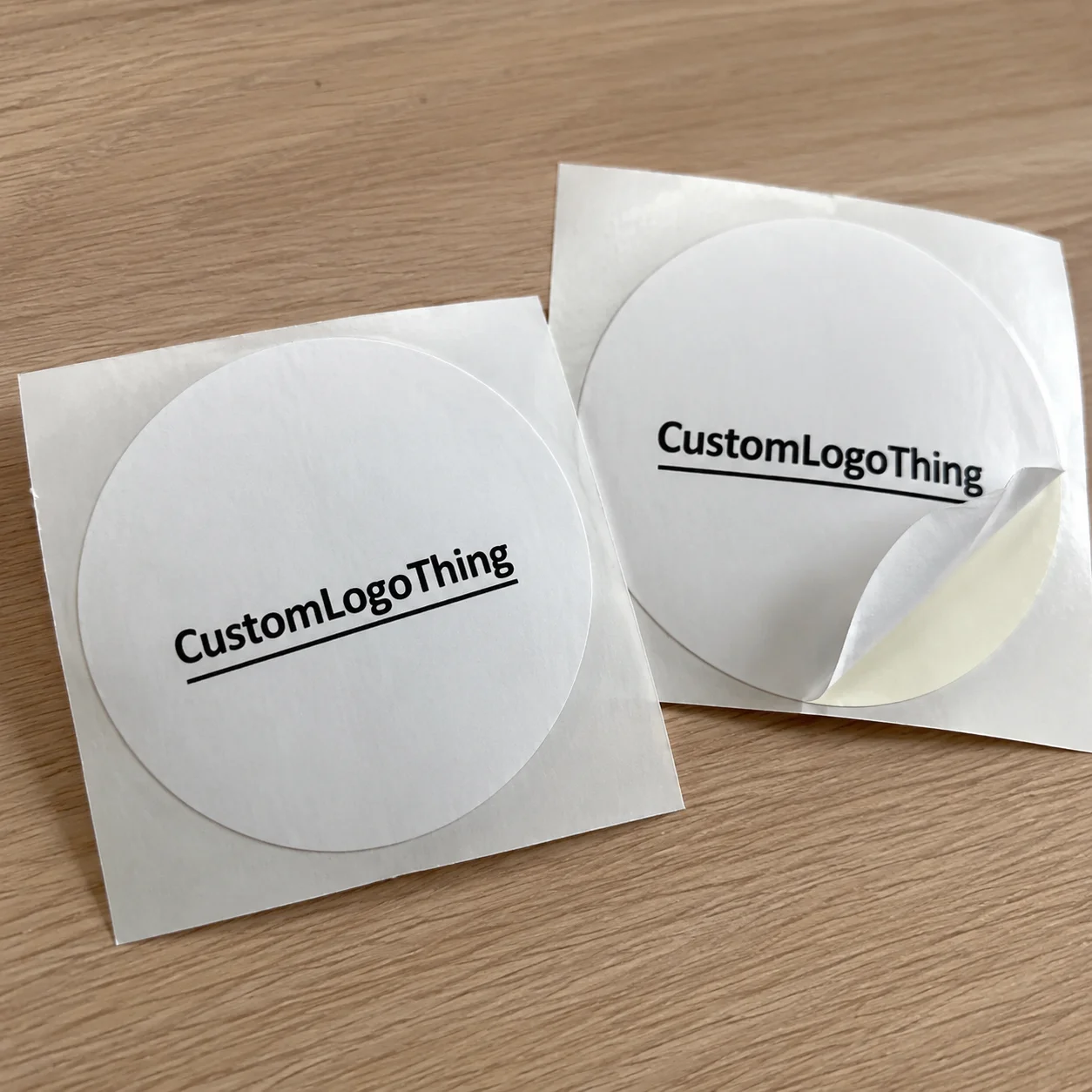
- Paper stock for dry indoor use, lower-cost orders, and short-term display.
- Film or vinyl for moisture resistance, handling, and better edge stability.
- Specialty textured stock for a more tactile, finished appearance.
Paper can work well if the bottle will stay dry and untouched. It is less forgiving once condensation enters the picture. Cold bottles and humid rooms expose weak adhesive quickly. If the event includes ice buckets, chilled bottles, or repeated handling, film usually behaves better.
Stock thickness also matters. Thin labels can conform more easily to curves, but they may feel less substantial. Heavier stocks can look richer, though they require better application and more careful edge control. In practical terms, the wrong stock often does not fail loudly. It just makes the bottle feel slightly off.
Finish is just as important as material. Matte reduces glare and usually reads more restrained. Gloss creates stronger light reflection and can punch up color under event lighting. Soft-touch has a muted surface that feels premium in the hand, though it can mark if bottles are moved around frequently. Foil accents can be effective, but only when the layout is disciplined enough to let the metallic detail do real work.
Clear labels are another option. They can be strong when the bottle color is part of the design and when the white underprint is accurate. Without proper white ink, logos and text can fade into the glass. That is a production issue, not a design preference.
Adhesive selection is rarely discussed early enough, but it should be. Permanent adhesive is appropriate for most event and gifting applications. Removable adhesive can be useful for temporary campaigns or bottles that need to be unwrapped later, though it is not always as stable under chill or moisture. Ask which adhesive is being quoted; otherwise you may not be comparing like with like.
For paper-based stock, FSC certification is worth asking about if sustainability is part of the brief. You can verify certification at FSC. It does not make the label premium by itself, but it does support a cleaner procurement story when the rest of the project is already well controlled.
In the field, most buyers end up balancing three things: appearance, durability, and speed. The cheapest label is not always the smartest one. A slightly better stock or finish often saves more frustration than it adds to the quote.
What drives cost, pricing, and MOQ on a label order
Pricing follows a few predictable variables: material, print method, size, finish complexity, and quantity. Custom cutting, white ink, foil, varnish, and multiple proof rounds all add cost. None of that is arbitrary. Each one adds work or setup time, and label production is sensitive to both.
Setup cost is the main reason small orders feel expensive per piece. A press still needs configuration. Files still need cleanup. Proofs still need review. Whether the order is 100 labels or 5,000, some of that work happens anyway. Larger runs spread the fixed cost more efficiently.
For a custom hennessy bottle label, buyers usually compare three useful pricing bands:
| Option | Typical use | Approx. unit cost | Notes |
|---|---|---|---|
| Paper label | Dry indoor events, low-cost runs | $0.18-$0.32 at 500 pcs; $0.07-$0.15 at 5,000 pcs | Affordable, but less resistant to moisture and repeated handling |
| Film or vinyl label | Condensation, bottle gifts, repeated handling | $0.24-$0.42 at 500 pcs; $0.09-$0.18 at 5,000 pcs | Better edge behavior and stronger overall durability |
| Specialty stock with foil or soft-touch | Premium gifting and display | $0.40-$0.85 at 500 pcs; $0.16-$0.35 at 5,000 pcs | Higher-impact finish, but setup and finishing push price up |
Those numbers are working ranges, not fixed rates. The final quote changes with artwork coverage, label shape, adhesive choice, and whether the order is priced per label, per sheet, or per roll. A quote can look competitive at first and become less attractive once proofing, freight, and rush handling are added.
Minimum order quantity matters too. Many suppliers start around 250 to 500 Labels for Custom work. Some digital short-run providers will go lower, but the unit cost usually rises. For one event, a lower MOQ may be perfectly rational. For repeated activations, a larger run often makes more sense because it reduces the per-piece cost and gives you buffer stock.
Hidden costs are common. File cleanup, extra proof revisions, special cutting, rush fees, and shipping are the usual ones. None of them are exotic. They are simply easy to overlook when a quote is being compared quickly. If a supplier gives only a single number, ask for the breakdown. It is easier to compare line items than guess what the total includes.
If the labels are part of a broader branded kit, check the whole package before approving the spec. A polished label on a low-grade box looks disconnected, and a plain label beside a premium carton can look underfunded. Consistency across the set is what makes the spend believable.
For shipping-heavy projects, it is useful to think beyond the label itself. Cartons, inserts, and outer shippers can affect how the label arrives. ISTA test methods are a practical reference point if you want to think about transport stress in a structured way.
Production process, proofing, and turnaround expectations
A solid production process is straightforward, but the details matter. The usual sequence is: send artwork, confirm dimensions, receive a proof, approve stock and finish, then move into production. For more complex jobs, a sample or color reference may be approved before the full run begins.
The proof is where most mistakes should be caught. A proper proof should show exact dimensions, bleed, safe area, finish, stock selection, and any special instructions for wrap labels, white ink, or foil placement. If a proof only shows the design floating on a blank page, it has not done its job.
Check the proof like a production file, not like a mockup. Verify spelling, number formatting, logo placement, size, and edge behavior. On a bottle label, small shifts are visible. A design that is 2 mm too high can look centered on screen and wrong in hand. That is one of the reasons quality control matters more here than in many other print jobs.
Turnaround depends on complexity and file readiness. Clean, print-ready artwork can move quickly. Low-resolution images, missing fonts, or vague sizing slow everything down. For straightforward orders, production often lands around 7 to 10 business days after approval. Specialty finishes, custom die-cuts, or multiple revision rounds usually push the schedule into the 12 to 18 business day range.
Rush service is usually possible, but it costs more and narrows the margin for correction. If the labels are tied to an event date, leave room in the schedule for proof review and shipping. The label should not become the panic item in the project plan.
Color is another point where expectations need to stay grounded. What looks rich on a monitor can shift once it is printed on film, mounted on glass, and viewed under warm room lighting. Dark labels can lose detail in dim spaces. Pale labels can wash out if the bottle itself is reflective. A clean proof helps, but real-world lighting still changes the outcome.
Common mistakes that make bottle labels look cheap
Most labels fail for avoidable reasons. Proportion is the first one. Too tall, too narrow, too crowded, or slightly off-center all create the same effect: the bottle stops looking deliberate. People may not know exactly why, but they notice the imbalance immediately.
Low-resolution files are another frequent problem. A logo copied from a social post or screenshot will often blur once it is enlarged for print. Edges soften. Text loses definition. The label starts to look like a quick draft instead of a finished piece. A printer can sharpen a lot of things, but not source art that was already poor.
Contrast issues are easy to underestimate. Light text on a light background, dark text on a dark bottle, or too many competing colors can make the label unreadable from a few feet away. Bottle labels are scanned quickly, not studied. If the name or event detail cannot be read at a glance, the composition is doing too much.
Shape mistakes also show up fast. A flat label layout does not automatically translate to a curved bottle. Shoulders, seams, and tapering glass all affect how the edges sit. A nice design on a screen can wrinkle on a bottle if the measurements were guessed instead of measured.
Then there is overdesign. Too many fonts. Too much copy. Too many finishes at once. Buyers often assume a more complex label feels richer, but it usually just feels noisier. A smaller number of visual moves tends to read as more premium, especially on event packaging where the bottle has to be understood fast.
Edge quality matters too. A label that lifts at the corners, leaves adhesive visible, or curls after chilling will look worse than a simpler label that sits flat. Small failures at the edge are obvious because they suggest the entire piece was not engineered carefully.
The cleanest labels usually share the same traits: simple hierarchy, controlled contrast, accurate size, and just enough finish to feel finished. That formula is boring on paper and effective in practice.
Expert tips for a cleaner premium presentation
Start with the message, not the decoration. What should the label communicate in one glance? A name, a logo, a date, or a monogram is usually enough. If the label has to explain the whole event, the design is carrying too much.
My practical rule is to keep one focal point and treat everything else as support. That single focal point can be a wordmark, a monogram, a nameplate, or a centered event title. Extra text should earn its place. The cleaner the hierarchy, the easier it is to make the label feel high-value.
Finish should follow use case. Matte works well for formal settings and restrained branding. Gloss adds more visual energy under bright lighting. Soft-touch gives the piece a quieter, more tactile feel. Foil should be used sparingly unless the rest of the design is stripped back enough to support it.
Readable at arm’s length is a better test than zoomed-in perfection. Guests will see the bottle on a table, in a hand, or in a photo. They will not inspect it like a print file. If the name or logo cannot be read from a few feet away, the design is not doing its job.
Rounded corners can help the label feel less blocky and reduce edge lift. Proper adhesive selection helps even more, especially if the bottle will be chilled or handled by guests throughout the night. A label that remains flat and stable looks more expensive before anyone comments on the artwork.
Color matching matters if the label sits beside other packaging. If the bottle label, inserts, and Custom Labels & Tags all follow the same color language, the set reads as one system. That kind of consistency is subtle, but it is one of the clearest indicators that the packaging was planned rather than assembled.
Another useful habit: ask for a digital proof and a material description, not just a mockup. The proof should tell you what will be printed, on what, and with which finish. That is where production mistakes are usually prevented. It is also where a vendor’s attention to detail becomes visible.
Next steps: what to send before requesting a quote
The fastest quotes come from accurate inputs. Send bottle photos, measurements, quantity, artwork files, finish preference, and any handling concerns such as cold storage, condensation, or repeated touching. If the label has to fit a specific front panel, say so clearly.
Use the application context to guide the spec. A label for event giveaways has different needs than a label for shelf display or private gifting. The former may prioritize speed and price. The latter may justify a higher-end stock or finish. If the use case is unclear, the quote usually becomes generic, and generic specs tend to create rework.
Before approving production, check the proof line by line. Size, spelling, placement, bleed, and finish assumptions should all be verified. Do not assume a mockup reflects the final piece unless the proof explicitly says so. That is one of the easiest ways to avoid a costly mismatch.
If the label is part of a broader presentation, coordinate the rest of the package around it. A custom hennessy bottle label should support the other branded packaging elements, not fight them. Matching typography, finishes, or color temperature across the kit can make a modest budget look much more considered.
Frequently Asked Questions
What size should a custom Hennessy bottle label be?
Measure the actual flat or gently curved labelable area on the bottle. Do not size from the full bottle height, because shoulder taper and curvature reduce the usable surface. A proof should confirm the exact dimensions before production starts.
How much does a custom Hennessy bottle label cost?
Pricing depends on quantity, material, finish, artwork complexity, and setup requirements. Small runs cost more per label because setup and proofing are spread over fewer pieces. Ask for a line-item quote so you can compare print, finish, and shipping separately.
What finish looks most premium on a custom Hennessy bottle label?
Matte and soft-touch finishes usually read as more refined because they reduce glare and feel more controlled. Foil can work well too, but only when the design is simple enough to let the accent carry weight. The best finish depends on bottle color, room lighting, and how the label will be viewed.
How long does production usually take?
For clean files and straightforward specs, production often takes about 7 to 10 business days after approval. Specialty finishes, custom shapes, or multiple revisions can extend that to 12 to 18 business days. Rush service may be available, but it usually raises cost.
What files do I need for an accurate quote?
Send bottle measurements, quantity, artwork files, a reference photo if possible, and any finish or adhesive preferences. Include notes about moisture resistance, cold storage, or repeated handling. The clearer the inputs, the fewer surprises during proofing and production.
A custom hennessy bottle label looks premium when the measurements are right, the stock matches the use case, and the proof is reviewed carefully. That is the part buyers sometimes rush past. It is also the part that usually determines whether the final bottle feels polished or merely decorated.