Custom Hot Sauce Bottle Labels That Sell Faster
How Custom Hot Sauce bottle labels shape shelf appeal, durability, pricing, and production decisions that buyers actually feel after the bottle leaves the printer.
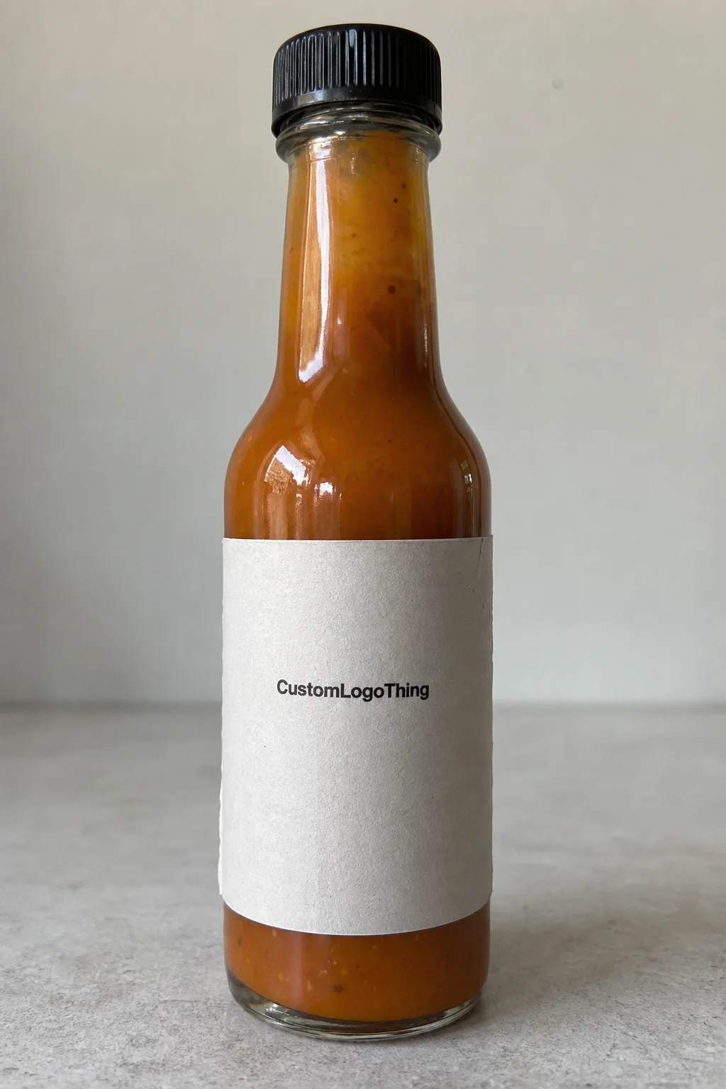
Custom Hot Sauce Bottle Labels get judged quickly. A shopper sees the color, scans the heat level, and decides whether the bottle feels established or improvised. That judgment usually happens before anyone reads the ingredient panel. The label has a narrow job: carry the brand, survive handling, and still look intentional after condensation, oily fingers, and repeated movement in and out of a cooler.
That mix of marketing and abuse is what makes Hot Sauce Packaging a little unforgiving. A label that looks polished in a mockup can fail on a bottle if the stock curls, the adhesive softens, or the typography disappears against a dark sauce bottle. The best labels do not try to be everything. They make the right information easy to find and they hold up in the actual environment where the product is sold.
Think of the label as a working component of the package, not decoration. It has to fit the bottle shape, stay readable, and support the rest of the packaging system, whether the sauce ships in cartons, sits in a retail cooler, or gets bundled with Custom Packaging Products and custom printed boxes for resale.
What Custom Hot Sauce Bottle Labels Need to Do
Hot sauce labels carry more pressure than many food labels because the category is crowded and the product is often bought as much for identity as for flavor. Buyers are not just comparing recipes. They are comparing shelf presence. A label has to signal heat, flavor, and credibility fast. If it looks sloppy, the bottle tends to feel risky, even when the sauce is excellent.
There is a practical side to that first impression. Hot sauce bottles are handled at markets, in kitchens, and in retail coolers where moisture is constant. Oil from the cap, residue from the pour path, and friction from shipping all work against the printed surface. A label that smears or peels after one sticky use is not meeting its job, even if the art direction was strong.
The label should communicate a few essentials without turning into a wall of text:
- Brand name and visual identity that can be read from a short distance.
- Flavor or heat level with a clear hierarchy.
- Trust markers such as small-batch, vegan, gluten-free, or fermented, if they are true.
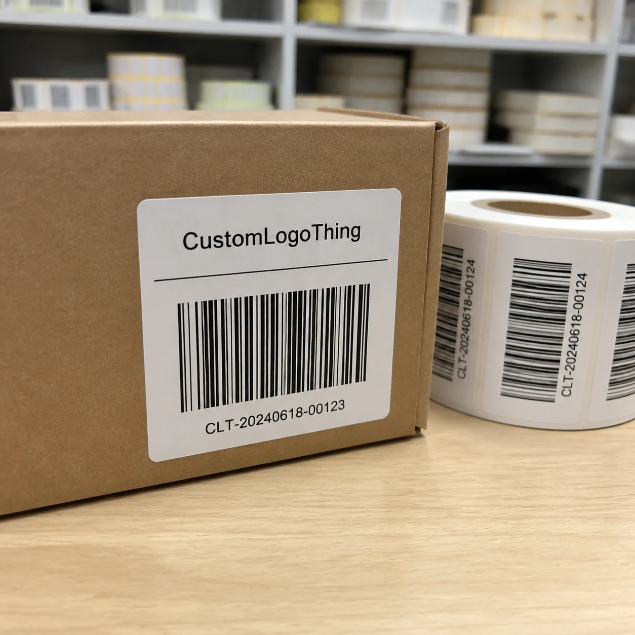
- Compliance details like ingredients, net contents, and barcode placement when retail is part of the plan.
A useful comparison: the best sauce labels behave more like street signs than posters. They are concise, legible, and hard to miss. If too much is competing for attention, the bottle starts to feel noisy instead of focused.
One more detail matters more than buyers expect: scale. The same artwork can look disciplined on a 12 oz bottle and awkward on a smaller or tapered bottle if the panel size changes even slightly. That is why custom hot sauce bottle labels need to be designed around the bottle geometry, not dragged onto it afterward.
A label can be visually strong and still fail if it lifts at the seam, clouds in refrigeration, or loses contrast on a curved bottle. Shelf appeal ends where readability ends.
That is the part many brands miss. The label is a sales tool, but it is also a wear surface. Good packaging respects both.
Format, Material, and Adhesive
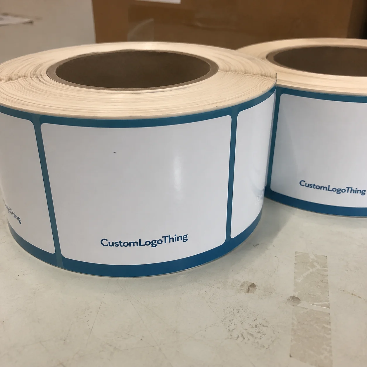
Most hot sauce projects use pressure-sensitive labels because they are fast to apply and flexible enough for short runs, mid-volume retail, and multiple SKUs. They work for front labels, back labels, wraparound layouts, and custom shapes. The format itself is not the challenge. The challenge is matching the format to the bottle and the environment.
Material choice is usually where durability begins. Paper label stock is less expensive and can work for dry conditions or short promotional runs, but it is more vulnerable to moisture, scuffing, and refrigeration. Film-based stocks, such as polypropylene, are usually a better fit for bottles that live in coolers or pass through a lot of hands. They resist wear better and hold shape longer.
Adhesive choice matters just as much. A permanent adhesive is the default for most retail sauces because the label is supposed to stay put through storage and distribution. A removable adhesive can make sense for limited events, sample bottles, or temporary campaigns, but it is rarely the right answer for a product that will spend time in wet or oily conditions. Surface type matters too. Glass, coated plastic, and textured containers behave differently, so test the adhesive on the actual bottle rather than assuming every surface bonds the same way.
Finish changes the feel and the failure mode. Gloss makes saturated reds, yellows, and blacks feel louder and can add color depth. Matte reduces glare and often improves readability under bright store lighting. Soft-touch can feel premium, but it is not always a good fit for a product that lives in a damp cooler or gets handled with oily fingers. Clear film creates a stripped-back look, though it demands tighter art direction because any weak typography becomes obvious.
Print method changes the economics and the range of what is practical. Digital printing is useful for short runs, multiple flavors, and quick proof cycles. Flexographic printing usually becomes more efficient at higher quantities, especially when the artwork is stable and the same spec will be reordered. Neither method saves a weak spec. The stock, ink system, coating, and cutter setup still determine whether the final label looks crisp or just acceptable.
If the bottle is likely to ship inside a larger pack or pass through a rough distribution chain, it helps to think about packaging as a system. Tests modeled on ISTA principles are useful because they force a brand to consider abrasion, vibration, and handling, not just print quality. If sustainability is part of the brief, ask whether the stock can be sourced with FSC certification or an equivalent paper traceability standard.
Pricing, MOQ, and Unit Cost
Label pricing usually comes down to five variables: size, material, finish, shape complexity, and quantity. Change one of those and the quote moves. Change several and the price can move a lot faster than expected. That is normal. What is not normal is approving a spec that was never realistic and then treating the final quote as if it came out of nowhere.
Minimum order quantity affects the per-unit cost because setup time gets spread across fewer labels. A small run almost always costs more per label than a larger run. That is not a penalty. It is math. The expensive part is setup, not the individual sticker. Buyers who understand that usually make better decisions on whether to simplify the design or keep the premium finish.
When a label quote feels high, the first thing to inspect is not the sales markup. It is the spec stack. A Custom Die Cut, specialty finish, heavy coverage, and extra versions for each flavor can all push the price up. If the design already has a lot of texture and color, extra embellishment often adds little and costs a lot.
Here is a practical planning frame:
| Run Type | Typical Unit Range | Best Fit | Tradeoffs |
|---|---|---|---|
| Test run | $0.18-$0.40 per label | Sampling, market tests, early-stage launches | Higher setup share and fewer finishing options |
| Mid-volume retail run | $0.08-$0.22 per label | Local retail, restaurants, regional distribution | Better economics, but specs should be locked early |
| Larger production run | $0.04-$0.12 per label | Stable SKUs with repeat demand | Lower unit cost, but more inventory exposure if artwork changes |
Those ranges are planning ranges, not guarantees. Coverage, coating, stock availability, and whether the artwork uses special shapes all move the number. A simple single-color label on a standard rectangle costs less than a full-coverage design with multiple flavors and metallic accents. The comparison is straightforward: the more a label departs from standard production, the more likely the unit price rises.
Always compare the landed cost. Shipping, proofing, setup charges, and reprint risk are part of the real number. A cheap quote that gets reworked twice is not cheap anymore. It is just delayed expense.
Production Steps and Turnaround
Label production is usually more predictable than buyers assume, provided the file is clean. The process moves through artwork review, proofing, print production, finishing, die cutting, packing, and shipping. Most delays do not come from the press. They come from files that were not actually ready, or from a label size that changed after the quote.
Proofing is the checkpoint that saves money. This is where misspellings, barcode issues, cutoff text, and proportion problems get caught before anything is printed. Small copy is especially vulnerable. Ingredients panels and regulatory details can look fine at design size and become unreadable once the label is scaled to the real bottle. Check the live dimensions, not just the PDF.
Typical turnaround depends on three things more than anything else: artwork readiness, material availability, and finish complexity. A clean file with a straightforward spec can move quickly. A job that needs Custom Die Cutting, specialty film, or a revision cycle will take longer. If the artwork is ready and the proof is approved promptly, many label runs can ship in about 7-15 business days. More complex orders often land in the 12-20 business day range.
Rush work is possible, but it usually exposes weak planning. If a brand is working across multiple flavors, the cleanest approach is to lock the bottle dimensions, label dimensions, adhesive, finish, and target ship date before the artwork is finalized. Every late change ripples through the production schedule. That is especially true when a product line has several SKUs and each one needs its own color coding or heat scale.
Hot sauce brands often pair labels with other packaging pieces such as Custom Labels & Tags for secondary items or branded bundle components. That only works when the label spec is stable. If the bottle label, hang tag, and carton each use a different visual logic, the product line starts to look pieced together. Consistency matters more than decoration.
Shelf Impact and Durability
The labels that perform best on shelf usually have a simple visual order. Brand first. Flavor second. Heat level third. Supporting claims after that. When every element is competing at the same volume, the bottle becomes harder to read and less memorable. The eye needs a path.
Typography does more work than most design teams expect. Fine type can disappear on a curved bottle or on a dark background. A pale gray ingredient list on a deep red label may look elegant on screen and fail in a bright store. Contrast is not a stylistic preference here. It is readability insurance.
Bottle shape can change the whole result. A label that sits cleanly on a straight-sided bottle may wrinkle at the shoulder of a tapered bottle or drift visually if the printable area is narrow. Before approving artwork, measure the actual flat panel, the available height, and the curve radius. Those measurements tell you what the design can realistically support.
Durability should be specified with the sales channel in mind. A farmer’s market bottle gets handled differently from one that sits in a restaurant cooler or ships to an e-commerce customer. Refrigeration adds condensation. Retail adds friction. Shipping adds abrasion and vibration. Each route asks for a slightly different balance of stock, adhesive, and finish.
That is where a comparison with beverage labels helps. A sauce bottle has more surface contamination risk than a dry snack package and often gets opened and resealed more often than a jarred condiment. In plain terms, hot sauce packaging has to handle both food-shelf visibility and handling wear. That combination justifies a more durable spec than a casual first quote might suggest.
Brands sometimes chase premium cues too hard and miss the functional side. Foil, heavy matte, and soft-touch coatings can look impressive, but if the bottle is wet or the print needs to survive cold storage, those choices need testing. A label should match the way the product is actually sold, not the way the concept board looked.
Mistakes That Make Labels Look Cheap
The fastest way to make a label look cheap is to overfill it. Too many fonts, too many badge icons, too many claims, too many colors. The bottle starts to feel like a crowded flyer. Strong packaging is usually more disciplined than that. It leaves room for the brand name to breathe.
Low contrast is another common problem. Dark sauce brands often choose dark labels because the mockup feels bold, but the result can disappear in real lighting. If the bottle only looks good in a render, the spec is not ready. Good design has to survive fluorescent retail lights, refrigerator glare, and quick scanning.
Skipping physical testing is a mistake that shows up later. Designers may approve a flat file, then discover the seam lands in the wrong place or the art distorts at the curve of the bottle. A bottle test reveals more than a polished mockup. It is the shortest path to finding whether the label size, wrap length, and finish actually work together.
Finish mistakes are just as common. Gloss can add energy, but it can also create glare if the copy is small. Matte can feel refined, but a low-grade matte stock can scuff faster than expected. Soft-touch can be appealing, though it can send the wrong signal if the brand identity is aggressive, smoky, or heat-forward. Finish is part of meaning, not just appearance.
Another problem is inconsistent branding across flavors. If one SKU uses a minimal layout, another uses a heavy typeface, and a third suddenly changes the heat markers, the line loses coherence. A label system should be flexible enough to support flavor variation without making each bottle look like it came from a different company.
There is also a production mistake that gets overlooked: choosing a material because it feels premium rather than because it fits the use case. A bottle that will be refrigerated needs different resistance than one sold at room temperature. A bottle that will be sampled at events needs different handling tolerance than one sold through specialty retail. The right spec is the one that protects the bottle through the way it moves.
If the packaging looks stronger in the render than in the hand, the material, adhesive, or finish needs another round of testing.
Labels rarely fail for one dramatic reason. They fail because small choices stack up: weak contrast, wrong adhesive, oversized art, or a finish that is beautiful but fragile. That is why the best results usually come from disciplined specs, not decorative excess.
Practical Ordering Tips
Start with the bottle, not the artwork. Measure the diameter, the flat panel, the shoulder height, and any taper that could distort the label. Then decide whether the job needs a front label only, front and back labels, or a wraparound format. That one choice affects cost, readability, and how much room the regulatory copy will have.
If the product line is still changing, a small test run is the safest move. That is especially true if the brand is still deciding between bottle shapes, flavor naming, or retail and direct-to-consumer distribution. A short run reveals how the label behaves in real use without locking the brand into a large inventory of the wrong spec.
Before requesting pricing, gather the basics:
- Bottle dimensions and usable label area.
- Artwork files in print-ready format.
- Quantity by SKU.
- Preferred stock and finish.
- Target ship date.
- Any moisture, refrigeration, or oil-resistance requirements.
Ask for a proof at actual size, not just a flat design preview. That catches proportion problems early and shows whether the fine print remains readable. Ask about reorder logic too. If a label line is likely to be reprinted, it helps to know how the vendor handles repeat orders, whether the setup changes, and at what quantity the pricing shifts. Those details matter more than the first quote.
For brands building a broader packaging system, the label should sit in the same visual language as the bottle, the carton, and any bundled pieces. That consistency turns the package into a recognizable system instead of a collection of parts. The strongest custom hot sauce bottle labels do not try to carry the whole brand by themselves. They support it.
One last practical rule: if the product is going to touch moisture, oil, or cold storage, test for those conditions before committing to the run. It is easier to adjust stock or finish before production than to explain why a label peeled after the first refrigerator cycle.
FAQ
What material works best for custom hot sauce bottle labels?
Film stocks such as polypropylene are usually the safest choice for bottles that face condensation, handling, or refrigeration. Paper can work for dry, low-wear situations, but it is less forgiving once moisture or oil gets involved. The right material depends on the bottle surface, the sales channel, and how often the product will be handled.
How much do custom hot sauce bottle labels cost per unit?
Pricing depends on size, quantity, material, finish, and whether the label uses a custom shape or specialty effect. Smaller runs usually carry a higher per-unit cost because setup is spread across fewer pieces. The most accurate comparison comes from quoting multiple quantities so the break points are visible.
What turnaround should I expect for custom hot sauce bottle labels?
Turnaround depends on artwork readiness, proof approval speed, stock availability, and the complexity of the finish. Straightforward jobs can move faster than labels with custom die cuts or specialty coatings. A print-ready file and a fast proof response are the two easiest ways to keep the schedule tight.
Do custom hot sauce bottle labels need waterproof or oil-resistant finishes?
If the bottle will be refrigerated, sampled often, or exposed to drips, resistance matters. A protective film stock or coating helps preserve readability and reduces scuffing. The best choice is the one that matches the product’s actual storage and handling conditions.
What should I send when requesting a quote for custom hot sauce bottle labels?
Send bottle dimensions, label size, artwork files, quantity by SKU, preferred material, finish, and your target delivery date. If the line includes multiple flavors or heat levels, include each version separately. Exact specs reduce pricing surprises and shorten the proofing cycle.