Custom Hot Sauce labels have a harder job than most buyers expect. They need to carry the brand, but they also need to survive condensation, oily handling, refrigerated storage, shipping abrasion, and the occasional spill. A label that looks clean on a proof can still fail fast on glass if the adhesive is wrong or the face stock cannot handle moisture.
That is why label buying is really a packaging decision, not just a design decision. The right construction supports product packaging, strengthens package branding, and keeps the bottle readable after it has been moved, chilled, stacked, and picked up a dozen times. If you are comparing label options with other pieces of Custom Packaging Products, the same rule applies: the material, adhesive, and finish have to fit the actual use case, not just the mockup.
For a startup test run, a seasonal flavor, or a shelf-ready retail line, the best label is usually the one that stays attractive without creating expensive rework. That balance matters whether you are building a new sauce brand, refreshing retail packaging, or pairing labels with Custom Labels & Tags for a broader packaging system.
What custom hot sauce labels need to survive the shelf
Most label failures do not begin with the sauce itself. They begin with the environment around the bottle. Cold storage creates condensation. Glass sweats when it moves from cooler air to warmer air. Kitchen use adds oil, damp hands, and repeated wiping. A label that looks great on screen can still curl, cloud, or lift if the adhesive and material are not matched to those conditions.
Hot sauce labels do two jobs at once. They are part of the brand system, which means they need to carry color, typography, and shelf presence. They are also a functional surface, which means they need to stay legible while the bottle is shipped, opened, wiped down, and sometimes chilled before sale. That is a different standard than a decorative sticker on a dry carton or a one-time promotional piece.
The tradeoff is predictable: durability, appearance, and cost all pull against each other. Heavier stocks, stronger adhesives, and specialty finishes usually increase the price, but they also reduce the risk of peeling corners, ink rub, and label clouding. If the bottle will move through refrigeration, curved glass, or greasy kitchen environments, the lowest-cost option is often the wrong one.
A label that survives the proof but fails in cold storage is not a design problem. It is a construction problem.
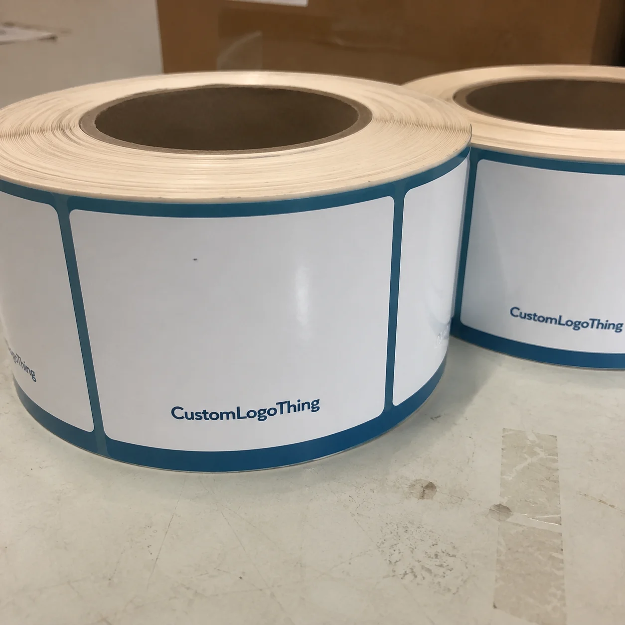
The practical way to evaluate custom hot sauce labels is to think in specifications. Size, material, adhesive, finish, and bottle shape all matter. Once the purchase is framed that way, the label is easier to compare, easier to quote, and much easier to approve with confidence.
One useful benchmark: a label that only has to sit on a dry shelf may perform fine on paper stock, while a refrigerated sauce line usually needs a synthetic face stock and an adhesive that can tolerate moisture. The difference can be a few cents per label, which sounds small until a low-grade choice forces relabeling across a full order.
How the label production process works from proof to bottle
The production flow is usually straightforward, but the details matter. It starts with artwork review, where the file is checked against the dieline and bottle dimensions. From there, a digital proof is prepared so the buyer can verify size, copy, barcode placement, and any special instructions before production begins. That step is not bureaucracy. It is the cheapest place to catch mistakes.
After proof approval, the material is selected and the label construction is checked against the bottle shape. A straight-sided bottle, a tapered bottle, and a rounded sauce bottle do not behave the same way. Curvature, shoulder depth, and cap clearance all affect how the label lands. If the artwork pushes too close to a neck transition or a seam, the final result can look off even when the file looked clean on a monitor.
Printing, finishing, and cutting come next. Depending on run size and label style, the job may use digital printing for flexibility or a more traditional setup for larger volumes. Short-run digital work usually fits flavor testing, seasonal releases, and small batch launches because it keeps setup lighter and revisions easier. Larger runs can bring the unit price down, but only if the design is stable and the specs do not keep changing.
The most common production problems are practical, not dramatic:
- Artwork does not include enough bleed.
- The dieline does not match the bottle curvature.
- Copy sits too close to the edge or cap area.
- Barcodes are placed where the bottle shape distorts them.
- The finish looks smooth on screen but scuffs under handling.
If your labels are part of a larger packaging system, review the artwork together with inserts, cartons, or any Custom Packaging Products you plan to use. A mismatch in sizing, color handling, or finish across components creates more rework than most teams budget for.
For buyers who want a better sense of how packaging behaves in transit, references like ISTA are useful. They show why vibration, compression, and temperature changes can matter even when the order is “just labels” rather than a full shipper.
Cost, pricing, MOQ, and quote factors that change the unit price
Hot sauce label pricing comes down to a few variables: label size, material, finish, ink coverage, order quantity, and how many SKUs are included in the job. Specialty cuts, metallic effects, clear film, and extra finishing steps usually raise the quote. A simple one-color paper label is not the same order as a full-coverage synthetic label with a matte varnish and custom shape.
MOQ matters because setup gets spread over fewer units on smaller orders. That is why a buyer ordering 500 labels across three flavors can see a much higher unit cost than a buyer ordering 5,000 of one design. The better question is not just “what is the price per label?” It is “what will it cost to Get the Right label on the bottle with minimal waste, relabeling, and delay?”
| Label option | Typical use | Approx. unit price at 5,000 pcs | Best for | Watchouts |
|---|---|---|---|---|
| Paper label with standard adhesive | Dry shelf display, low-moisture storage | $0.05-$0.10 | Early testing, low-cost retail packaging | Less forgiving with condensation and oil |
| Polypropylene label | Refrigerated bottles, frequent handling | $0.08-$0.18 | General hot sauce use, stronger durability | Higher cost than paper, especially with heavy coverage |
| Clear film with specialty finish | Premium bottle presentation | $0.12-$0.28 | High-impact shelf appearance | More sensitive to artwork quality and color control |
That table is a planning tool, not a quote promise. Costs move quickly if the label has tight tolerances, unusual die cuts, multiple versions, or a finish that requires extra handling. A clean comparison only works when every vendor is quoting the same spec.
Before approving an order, ask direct questions:
- Does the quote include proofing and one revision round?
- Are freight and packaging included?
- Can multiple flavors be split across the same run?
- Is the adhesive rated for cold or damp surfaces?
- Are samples available before the full run?
If paper stock matters because of a sustainability claim or a brand position, use the FSC system as the reference point for certified fiber. Keep the claim precise and limited to what is actually certified. Stretching the claim creates more risk than value.
One overlooked cost driver is artwork complexity. Heavy ink coverage, tiny type, and multi-panel layouts can increase press time and raise the chance of inspection issues. A simpler label is not always better, but it is often cheaper to print consistently.
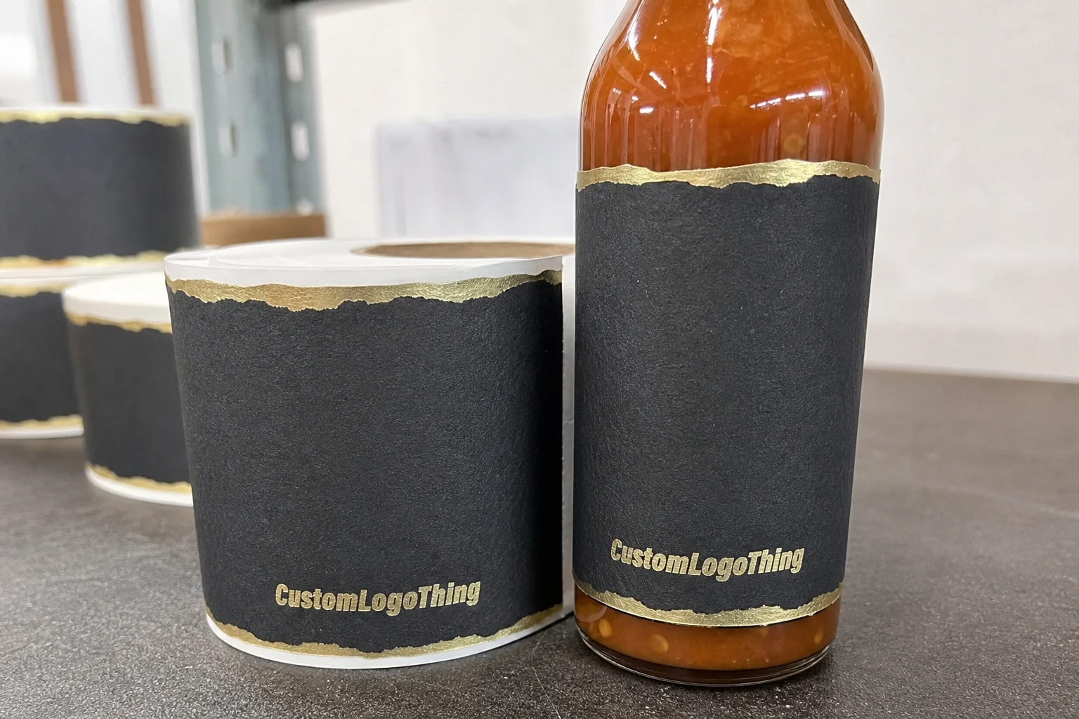
Materials and finishes that hold up to heat, oil, and moisture
Paper labels still have a place, especially for dry display or lower-cost launches. The problem is that paper is less forgiving once moisture, oils, or refrigeration enter the picture. That is why many hot sauce brands move to polypropylene or another synthetic face stock when the bottle will be chilled, shipped widely, or handled often.
Polypropylene is popular because it resists moisture better and stays cleaner through handling. It also works well on curved bottles, where flexibility matters as much as surface durability. Clear film can create a premium look, especially if the design uses transparent areas or a minimal layout, but it also demands more careful color control because every registration issue is easier to see.
Finish affects both appearance and performance. Matte reduces glare and can make flavor text easier to read on a crowded shelf. Gloss tends to make color look brighter and crisper. Soft-touch gives a distinct tactile feel, but it is not always the best fit for greasy environments or for lines that need to stay cost-efficient. A clear overlaminate or protective varnish can help if the bottles will be handled heavily.
| Material/finish | Look | Durability | Best use case |
|---|---|---|---|
| Paper, matte | Natural, simple | Moderate | Dry shelf labels, startup runs |
| Polypropylene, gloss | Bright, crisp color | High | Retail packaging, cold storage, shipping |
| Clear film, soft-touch or satin | Premium, understated | High | Premium lines, premium package branding |
A practical rule helps here: if the bottle will sit in a kitchen, a cooler, or a market table where people keep picking it up, choose the more durable construction. That does not mean every bottle needs the most expensive material. It means the adhesive and face stock should match the real use case, not only the art direction.
Two quality checks are worth asking about before a run is approved. First, rub resistance: can the ink or coating hold up under handling without scuffing? Second, cold-performance testing: does the label stay down after exposure to condensation or refrigerator temperatures? Those checks sound basic, but they are often the difference between a good-looking launch and a relabeling problem.
Turnaround and production steps that affect delivery timing
Lead time depends more on approvals than many buyers expect. The schedule includes file prep, proofing, proof approval, material allocation, press setup, printing, finishing, quality checks, and shipment. If the artwork is ready and the proof is approved quickly, the project moves. If the buyer keeps changing copy, shifting barcodes, or revising the dieline, the timeline stretches fast.
For a straightforward digital run, many projects ship in roughly 7-12 business days after proof approval. Specialty finishes, multiple SKUs, and jobs that require extra finishing can push that farther. Larger conventional runs may take longer if the material has to be scheduled around other production work. None of that is unusual, but it does need to be planned for.
The fastest way to lose time is to send artwork that is not print-ready. Missing bleed, unresolved barcode placement, uncertain bottle measurements, and late legal text are common delay points. A day spent correcting the file often saves a week of troubleshooting later, so the quickest project is usually the one with the cleanest input.
Plan backward from the launch date, not forward from the quote date. If the bottles need to be filled, labeled, packed, shipped, and displayed before a market or retail deadline, leave room for proofing and one revision cycle. That buffer matters even more if you are coordinating labels with custom printed boxes or a broader product packaging rollout.
It also helps to check whether the supplier’s quality-control step includes print inspection, die-cut alignment, and adhesive verification. Those checks are easy to overlook when a quote looks attractive, but they reduce the chance of receiving labels that are technically printed and practically unusable.
Common mistakes that weaken hot sauce label performance
The first mistake is choosing a label because the render looks good. A mockup cannot show how a bottle behaves in a fridge, how a corner reacts to condensation, or how ink rub appears after two weeks on a shelf. A label can look premium in the file and still fail in use.
The second mistake is ignoring bottle geometry. A shape that works on one bottle may fail on another, even if the artwork stays the same. Curved shoulders, narrow necks, seams, and wrap points all affect the finished look. Reusing the same art across several bottle formats is normal, but each format still needs its own fit check.
The third mistake is overcrowding the label. Tiny text, too many claims, and packed flavor notes can turn a strong brand into a cluttered bottle. Shelf readability matters. A shopper should be able to identify the flavor and brand in a quick glance from a few feet away.
The fourth mistake is careless proofing. Teams review color on a monitor, approve copy before checking regulatory details, or forget that a barcode can be distorted by a curve or seam. That is avoidable. A label proof should confirm size, copy, finish, and placement before the run begins.
There is one more issue that gets missed often: the label and bottle work together. If the glass is dark, the cap is wide, or the shoulder angle is sharp, the design has to account for those constraints. Experienced buyers treat labels as part of the larger retail packaging system instead of a one-off graphic purchase.
Another quiet failure point is storage. Labels that sit in a hot warehouse before application can behave differently than labels applied right after delivery. Adhesives, liners, and face stocks all have temperature tolerances. If the goods are going to sit before use, ask about storage conditions before you order.
Next steps for ordering labels that fit your bottle and budget
Start with the bottle itself. Measure the panel width, panel height, and any curved areas where the label needs to stop. Photograph the bottle from the front and side, then mark the exact label position if there is a seam, wrap point, or neck transition that affects placement. That one step prevents a lot of guessing.
Then gather the basics before requesting a quote: artwork files, number of flavors, quantity, bottle specs, and any durability requirements tied to refrigeration, oil exposure, or shipping. If the bottle will be chilled or handled frequently, say so up front. That helps the supplier recommend the right adhesive and face stock the first time.
If you are choosing between finishes, ask for samples or a proof comparison. Side-by-side evaluation is faster than debating color on a monitor. The same is true for label shapes. A rounded-corner rectangle may fit one brand’s layout better than a Custom Die Cut, while another brand may need the custom shape to protect the visual identity.
For buyers building a broader line, the best move is to keep the label spec aligned with the rest of the packaging system. Your custom hot sauce labels, bottle, and any secondary packaging should tell the same story. If the structure is right early, the label arrives ready to apply, read clearly, and hold up in use.
Custom hot sauce labels work best when the buyer treats them like a performance item with a branding role attached. That means fitting the bottle, surviving the shelf, staying inside budget, and supporting the rest of your Custom Labels & Tags and Custom Packaging Products without creating avoidable rework later.
What material works best for hot sauce labels that may be refrigerated?
Synthetic stocks like polypropylene usually perform better than paper when condensation is a concern. Choose an adhesive designed for cold or damp surfaces so the label stays down after chilling and handling. A matte or soft-gloss finish can improve readability while still protecting the printed surface.
How much do custom hot sauce labels usually cost?
Price depends on quantity, size, material, finish, and whether the design uses specialty cutting or extra embellishment. Smaller orders usually have a higher unit cost because setup gets spread over fewer labels. The cleanest quote compares the same specs across vendors so you are not comparing different constructions.
How long does production take after I approve the proof?
Turnaround depends on print method, finishing requirements, and whether the artwork is already print-ready. Fast approvals help the most, especially when no dieline or copy revisions are needed. Complex finishes, multiple SKUs, or rush scheduling can extend the timeline.
Can I use paper labels for hot sauce bottles?
Paper can work for dry shelf conditions, but it is less forgiving around moisture, oil, and refrigeration. If the bottles will be handled in kitchens or chilled before sale, a synthetic label is usually the safer choice. Adhesive choice matters as much as face stock, so test the full construction, not just the print surface.
What do I need before requesting a quote for custom hot sauce labels?
Have your bottle measurements, label dimensions, artwork files, quantity, and number of flavor variants ready. Note any special requirements such as waterproofing, refrigeration, barcode placement, or a premium finish. Providing clear specs up front helps suppliers recommend the right construction and avoid rework.