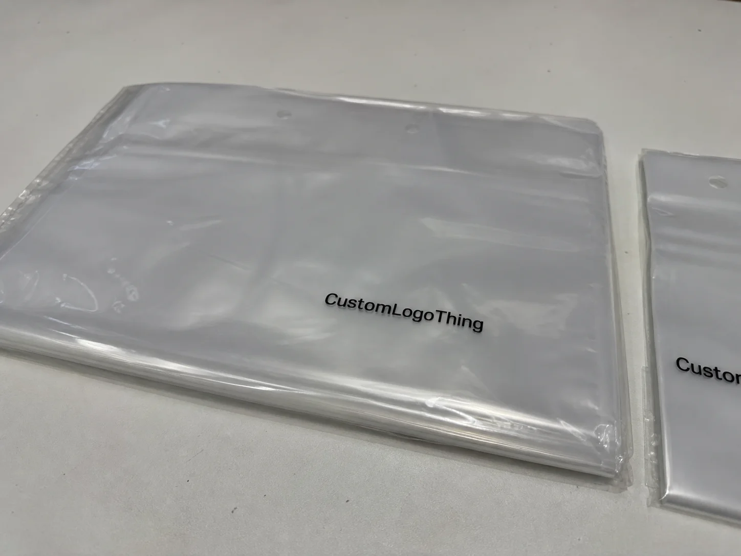
Buyer Fit Snapshot
| Best fit | Custom Labels Comparison projects where brand print, material claims, artwork control, MOQ, and repeat-order consistency need to be specified before quoting. |
|---|---|
| Quote inputs | Share finished size, material target, print colors, finish, packing count, annual reorder estimate, ship-to region, and any compliance wording. |
| Proofing check | Approve dieline scale, logo placement, barcode or warning zones, color tolerance, closure strength, and carton packing before bulk production. |
| Main risk | Vague material claims, crowded artwork, missing packing details, or unclear freight terms can make a low unit price expensive after revisions. |
Fast answer: Custom Labels Comparison: Choose the Right Option should be specified like a repeatable production item. The safest quote records material, print method, finish, artwork proof, packing count, and reorder notes in one written spec.
Production checks before approval
Compare the actual filled-product size with the drawing, then confirm tolerance on folds, seals, hang holes, label areas, and retail display edges. Reserve space for logos, QR codes, warning copy, and material claims before decorative graphics fill the panel.
Quote comparison points
Review material grade, print process, finish, sampling route, tooling charges, carton quantity, and freight assumptions side by side. A quote is only useful when the supplier can repeat the same color, closure quality, and packing count on the next order.
On a cold morning in a beverage plant I visited outside Chicago, I watched a gorgeous mockup fail in less than 20 minutes because the adhesive softened on chilled bottles and the corners started lifting. The product was moving through a 38°F cooler in suburban Illinois, and the label construction simply was not built for that environment, which is the kind of detail that only becomes obvious when a line operator is staring at a pallet of 4,800 bottles. I still remember the look on the production manager’s face—equal parts disbelief and “well, that’s just fantastic” (which, frankly, was fair). That kind of moment is exactly why a custom labels comparison matters so much; the label that wins on a render is not always the label that survives production, shipping, refrigeration, and a few rough hands on a retail shelf.
At Custom Logo Things, I’ve seen brands spend weeks perfecting package branding on Custom Packaging Products and then rush the label choice, which is backwards if you ask me. A solid custom labels comparison looks past appearance alone and weighs material, adhesive, print method, finish, durability, application surface, and the way the label feels to the person opening the carton or picking up the bottle. In branded packaging, those details carry real weight, and they have a funny way of showing up exactly when you hoped they wouldn’t. For a line running 12,000 units a week in a facility outside Atlanta or Dallas, those small differences can mean the difference between a clean launch and a rework order that eats three days of labor.
Custom Labels Comparison — What You’re Really Comparing
Most people think a custom labels comparison is just paper versus plastic, but that’s only the first layer. In practice, you are comparing the full construction: the face stock, the adhesive system, the liner, the ink set, the finish, and the way all of that behaves once the label meets glass, PET, corrugated board, aluminum, or a textured jar. I’ve stood on enough factory floors in Ohio, New Jersey, and northern Mexico to know that a label can look perfect on a proof sheet and still fail on a dusty carton or an oil-prone container. Machines are wonderfully honest that way (annoyingly so, sometimes), especially when a label is being applied at 85 bottles per minute.
The surprising part is how often the “best looking” label loses once production reality shows up. A soft-touch matte paper might look premium under warehouse lighting, but if the product is going into a refrigerated case in Minneapolis or a humid distribution route through Houston, that same label can wrinkle, scuff, or peel. A proper custom labels comparison should therefore include the actual use case, not just the mood board. I’ve learned the hard way that a beautiful sample is not the same thing as a usable label, especially when the final run is 10,000 units and the ship date is fixed for Friday at 4 p.m.
Here’s the plain-language version of the common label families. Paper labels usually cost less and print beautifully for dry applications. Film labels, often polypropylene or polyester, handle moisture and handling better. Foil labels create a reflective premium look that sells beautifully on shelves, though they usually add cost. Removable labels are designed to lift off more cleanly, while permanent labels are built to stay put. Specialty labels might include clear film, textured papers, tamper-evident constructions, or weather-resistant stocks for outdoor exposure, with common production coming from label converters in Chicago, Toronto, Monterrey, and Shenzhen depending on the SKU and volume.
One client in the specialty food space told me, “We thought the label was decoration; now we realize it’s part of the shipping system.” That’s exactly right. A thoughtful custom labels comparison affects shelf appeal, compliance, logistics, and customer perception all at once. For ingredient-heavy products, you also have to think about readability, barcode contrast, and the amount of copy that must fit on a small diameter jar or a slim cosmetic tube, where a 1.25-inch-wide label can be doing the work of an entire brochure.
Honestly, I think many brands compare labels the wrong way because they start with style. I’d start with environment, then surface, then print performance, then brand feel. That order saves time and usually prevents the most expensive mistake: ordering 20,000 labels that look great on a sample roll and behave badly in the real world. And yes, I have watched that happen more than once, which is about as fun as it sounds, especially when the reorder comes in at $0.19 per unit instead of the original $0.12.
“The label that looks most expensive on the table is not always the label that performs best in the line.” That’s a line I’ve repeated in more than one client meeting, usually after someone has held up a sample that never left the conference room.
How Custom Labels Are Made and Applied
A reliable custom labels comparison starts with the production workflow, because every step affects the final result. The process usually begins with material selection, where a supplier matches the face stock and adhesive to the container and storage conditions. After that comes artwork setup, which includes dielines, bleed, barcode placement, and color management. On the press floor, operators set up plates or digital files, run a proof, check registration, and then move into printing, die cutting, finishing, and inspection. For most digital label jobs, the timeline is typically 12 to 15 business days from proof approval, while flexographic work with new plates often lands closer to 15 to 20 business days depending on finishing.

I remember standing beside a flexographic press in a Midwest converter where the lead operator showed me how a tiny 0.5 mm shift in registration could make a metallic accent look fuzzy on a narrow cosmetic label. The guy tapped the press bed, sighed, and said, “That’s not a design problem; that’s a reality problem.” He was right. That’s the kind of issue a good custom labels comparison should anticipate. The press might be able to print it, but the question is whether it will remain sharp at production speed on a 350gsm C1S artboard carton, a 2-ounce glass jar, or a matte polypropylene sleeve.
Flexographic printing is common for larger label runs because it moves fast and can be very efficient once the setup is complete. It uses plates and is well suited to repeat jobs, especially when ink coverage and consistent color matter. Digital printing is usually the better fit for shorter runs, multiple SKUs, or projects that need variable data, because it skips plate-making and gives more flexibility on revisions. Offset printing can deliver excellent detail and smooth solids, but it’s less common for typical pressure-sensitive labels than flexo or digital, depending on the application. For example, a 5,000-piece digital run might price around $0.15 per unit on a standard 2.5-inch by 4-inch film label, while a 25,000-piece flexo order may drop closer to $0.07 to $0.09 per unit once setup is spread across the volume.
Adhesive chemistry matters just as much as print technology. A label that works on corrugated cartons may behave differently on glass or polyethylene, and a carton adhesive is not automatically right for a chilled bottle. Liner selection also matters because it affects dispensing, roll stability, and application speed. On a semi-automatic labeling machine, roll unwind direction and core size can either keep production moving or create constant jams. I’ve seen a line stop dead because a roll was wound the wrong way, and yes, everyone suddenly became very interested in the phrase “small details.”
Finishing is where many label buyers get seduced by appearance. Varnishes, laminates, and coatings can protect the print, improve rub resistance, and change the feel of the label in hand. A gloss varnish can brighten colors and help a label pop under retail lights, while a matte lamination can add a quieter, more premium look. Soft-touch films feel rich, but they’re not always the most practical choice for wet environments. Sometimes the fanciest finish is just a very expensive way to disappoint yourself later, especially if the label has to survive a 72-hour cold-chain shipment through Richmond, Virginia, or Edmonton, Alberta.
Application method should sit inside your custom labels comparison too. A hand-applied label for a small batch candle line has different requirements than a label running at high speed on a bottling line. If you’re labeling 500 jars by hand, you may tolerate a slightly less forgiving adhesive. If you’re labeling 15,000 bottles on a line that runs six days a week, that same label could cause a maintenance headache and a labor bill that grows by the hour.
For products that need both packaging design consistency and operational fit, I always tell clients to think about the label as part of the whole product packaging system, not as an isolated print item. If you’re building out retail packaging with boxes, inserts, and bottles, the label should coordinate with the substrate, finish, and print style of the rest of the pack. That’s where Custom Labels & Tags become more than a decorative layer and start functioning like a controlled manufacturing component.
Key Factors in a Custom Labels Comparison
The best custom labels comparison starts with performance criteria that can be measured, not just admired. The first one is substrate, which is the face material. Paper, polypropylene, polyester, clear film, and metallic stocks all behave differently. Paper gives you a classic look and often lower cost. Film gives you better moisture resistance. Polyester offers strong durability and dimensional stability, which matters when a label is exposed to abrasion or temperature swings from 40°F refrigerated storage to 100°F warehouse loading docks in Phoenix.
Next comes adhesive strength. Permanent adhesive is the default in many applications, but “permanent” does not mean “works everywhere.” A pressure-sensitive adhesive that bonds well to clean glass at room temperature may struggle on a recycled plastic jar with a slightly textured surface. Removable adhesive can be ideal for temporary promotions, refill programs, or reusable containers, but it may not hold under condensation or long transit times. In my experience, the wrong adhesive is one of the most expensive mistakes in a custom labels comparison because it often shows up after the product has already been packed, palletized, and booked for shipment.
Moisture resistance and temperature tolerance matter in very practical ways. If a product travels through a cold chain, gets washed down, or sits near ice buckets, the label needs to survive wet handling and temperature change. A paper label with no protective finish can absorb water, discolor, or wrinkle. Film labels with a moisture-resistant adhesive are usually better for refrigerated or frozen products, although even then the exact adhesive formula must match the dwell time and surface energy of the container. A yogurt cup leaving a plant in Wisconsin at 34°F has very different requirements than a dry snack box shipping from Nashville.
Scuff resistance and print fidelity are easy to overlook until the first shipment comes back looking tired. Scuffing happens when cartons rub against each other in transit or when bottles touch metal rails on a conveyor. Print fidelity is how accurately fine text, logos, gradients, and barcodes reproduce. If your label carries regulatory copy, ingredient details, or UPCs, the contrast and clarity need to hold up under scanning and inspection. That ties directly into industry expectations and standards such as ISTA testing practices for shipment performance and packaging validation, which many converters in California, Illinois, and Tennessee use as part of internal QA.
Visual style is part of the custom labels comparison too, of course. Matte finishes can signal natural, artisanal, or luxury positioning depending on the design. Gloss finishes feel brighter and often perform better for bold color. Metallic effects add shelf presence. Clear labels create a “no-label” look that works well on glass or sleek plastic, but only if the product and container are clean enough to support that minimalist effect. If the bottle has seams, scratches, or visible fill lines, a clear label can sometimes make the package look unfinished instead of premium, especially under bright LED lighting in a retail cooler.
Compliance and information density Matter More Than many marketers expect. Food, beverage, cosmetic, chemical, and industrial products often need ingredient panels, hazard warnings, batch codes, lot numbers, and barcodes that remain readable. A strong custom labels comparison accounts for how much information needs to fit within the label shape. If you crowd too much onto a tiny circle label, you may win on aesthetics and lose on legibility, which becomes a real issue if the final dieline is only 1.75 inches wide.
Surface compatibility is another major factor. Curved bottles need labels with enough flexibility to conform without tunneling. Corrugated cartons may require a different adhesive and liner behavior than smooth plastic. Jars often create challenges at the shoulder and the seam. Frozen products introduce condensation. Oil-prone containers may resist adhesive bonding unless the surface is cleaned and the label construction is chosen carefully. If you want durable branded packaging, the label should match the surface, not fight it, whether the final pack is assembled in Toronto, Charlotte, or Guadalajara.
Brand positioning also changes the result of a custom labels comparison. A premium skincare brand might choose soft-touch film with foil accents and precise color control. A warehouse-style industrial product might choose a straightforward matte label with high-contrast text, strong adhesion, and a rugged print finish. Neither is “better” in the abstract. Each is right for a different audience and environment. That’s the part many people get wrong, especially when they compare a $0.32 premium label against a $0.09 utility label without accounting for the customer experience.
For brands coordinating labels with custom printed boxes and broader package branding, I like to compare label options beside the box finishes, not separately. If the carton uses a 350gsm artboard with a satin aqueous coating, a high-gloss label may clash unless that contrast is intentional. Packaging design works best when every component feels like it belongs to the same system, from the mailer in Bentonville to the shelf-ready carton in Seattle.
Cost and Pricing Differences You Should Expect
Pricing in a custom labels comparison is rarely driven by size alone. I’ve quoted small labels that cost more than larger ones because they used specialty film, metallic ink, or a complex die cut. The material construction, ink coverage, finishing, and order quantity all affect the final number. A standard paper label on a simple rectangle shape is usually among the most economical options. Once you move into clear film, foil, textured stock, or removable adhesives, the price usually moves up, sometimes by 25% to 60% depending on the converter and the finish package.
Setup costs can matter just as much as the per-unit rate. Flexographic jobs may involve plate charges, setup time, and proofing, while digital printing often removes plate costs but can have a higher unit price on larger volumes. For a run of 5,000 labels, digital may be the cleaner choice if you need a fast turnaround or multiple versions. For 50,000 labels of one SKU, flexo often becomes more economical. That’s why a smart custom labels comparison looks at both unit cost and the total job cost, including freight from the plant in Ohio, South Carolina, or Ontario if the labels are crossing borders.
Here’s a practical example from a cosmetics client I worked with. They were comparing a paper label at about $0.11 per unit for 10,000 pieces against a clear BOPP film label at roughly $0.18 per unit for the same volume. The film label cost more, but the product was stored in bathrooms and shipped through humid climates, so the paper version would have failed quickly. The cheaper option would have become the more expensive mistake once relabeling, returns, and damaged brand perception were added in. I still remember the client pausing and saying, “So the bargain label is only a bargain if we pretend humidity doesn’t exist.” Exactly. For a 5,000-piece order, that same clear BOPP construction might land near $0.15 per unit if the artwork is already approved and the die is standard.
Special effects increase cost in predictable ways. Foil stamping, embossing-like textures, specialty varnishes, and custom dies all add labor or setup complexity. In some cases, a premium look is worth the spend because the label helps the product earn a higher shelf price. In other cases, the finish is pure decoration and does not support the brand’s margin or use case. I always ask clients whether the effect is earning its keep in the custom labels comparison, especially if the project includes 8,000 units and the premium finish adds 6 to 9 cents per label.
Waste and labor are hidden costs that people forget. A label that bucks up on the applicator or lifts at the edges can slow the line by 10% or more, and that slowdown costs real money. A label that misaligns barcodes may need manual inspection. A label that peels in transit can create relabeling costs, chargebacks, or disposal fees. If your team is handling a manual application on 2,000 jars, even a few seconds saved per label can matter, especially when the labor rate is $19 to $24 per hour and the shift is already stretched thin.
One supplier negotiation I remember clearly involved a brand owner who wanted to save $0.02 per label by downgrading adhesive. On paper that sounded reasonable. After testing, the labels failed on chilled PET bottles after 36 hours in a 38°F cooler, and the brand had to spend far more fixing the issue than they saved on purchase price. That’s why I keep returning to total packaging cost, not unit price alone, in any custom labels comparison. A small savings at the purchase order level can become a large expense once you add rework, freight, and customer complaints.
If you are also ordering Custom Packaging Products such as cartons, inserts, or mailers, it can be smart to compare label costs against the whole pack. Sometimes a slightly more expensive label allows you to simplify a box finish or reduce a separate sleeve, which changes the economics of the whole packaging program. A label at $0.14 per unit may save a $0.06 shrink sleeve, and that trade can make perfect sense if the brand wants a cleaner opening experience.
Process and Timeline: From Quote to Delivery
A straightforward custom labels comparison should include timeline, because a label that arrives late is not useful, no matter how good it looks. The process usually starts with an inquiry that includes size, quantity, material preference, artwork, application method, and storage conditions. From there, the supplier reviews specs, suggests constructions, and sends a quote. If the project is new, the artwork often goes through a proofing cycle before production begins, and a good quote should specify whether the plant is in Illinois, Texas, or the Guangdong region.
For a simple reorder with existing art and the same materials, I’ve seen jobs move through production in 5 to 8 business days after approval. First-time projects usually take longer, often 12 to 18 business days from proof approval depending on the finishing and quantity. Add Custom Die Cutting, foil, multiple versions, or complex color matching, and the timeline can stretch further. That’s not a failure; it’s just how production works when precision matters. The press doesn’t care about your launch party, unfortunately, even if the marketing deck has already been printed.
I once sat in a launch meeting where the marketing team was ready three weeks early, but legal had not approved the warning copy. The press room was not the bottleneck; artwork approval was. That’s one of the biggest lessons in any custom labels comparison: bottlenecks often happen before the label ever reaches the press. If you miss the approval window, you can lose your entire launch cushion, and a three-day delay can turn into a three-week scramble if the shipment has already been booked out of a warehouse in New Jersey.
Seasonal rollouts need extra discipline. If you are packaging holiday candles, limited-edition beverages, or promotional gift sets, build in enough margin for at least one proof revision and one transit delay. I usually recommend planning the label order before the carton order if the label carries regulatory content or a launch date. That keeps the pack schedule from slipping because of a single missing approval, and it is far easier to correct a label proof on Tuesday than to rebook a pallet pickup on Thursday.
Complexity adds time in practical ways. Multiple SKUs require version control. Specialty finishes may need extra setup. Clear films can require more careful color management. If the labels need to match custom printed boxes, the supplier may need to coordinate shades and finishes across materials, and that can add another review cycle. A thorough custom labels comparison should make those time costs visible before anyone signs off, especially if the launch window is tied to a trade show in Las Vegas or a retail reset in California.
Shipping also matters. Labels are light, but they still need the right packaging, especially if rolls are going to be stored in humid warehouses. Core size, roll direction, and carton packing should match your application equipment. I’ve seen perfectly printed labels arrive in a format that caused 45 minutes of line downtime because the rolls were wound the wrong way for the applicator. It was a small detail with a very loud invoice, and the plant manager in Missouri was not amused.
Common Mistakes When Comparing Custom Labels
The biggest mistake in a custom labels comparison is choosing based on price alone. I understand the pressure; budgets are real and margins are tight. But if a label fails adhesion, smears, scratches, or peels, the “cheaper” option can become the most expensive line item in the packaging program. A good comparison has to include performance in transit, during storage, and on the shelf, whether the product is moving through a warehouse in Pennsylvania or sitting in a refrigerated display in Vancouver.
Another common mistake is mismatching the material to the environment. Paper labels may be fine for a dry candle box or a short-run promotional carton, but they are a weak choice for cold, wet, or oily conditions. Film labels usually handle moisture better, and that is exactly why they are so common for refrigerated products and household goods. If your product lives in a cooler, freezer, or bathroom, your label needs to be part of that reality, not a decorative afterthought.
Poor artwork preparation creates avoidable trouble. Fine text that looked crisp on-screen can blur in print if the resolution is too low or the font is too thin. Barcodes can fail to scan if contrast is weak or the design crowding is too dense. Colors can shift if the proofing standard is not clear. In a serious custom labels comparison, print method and artwork setup should be discussed together, not after the file is already sent, especially if the final label is only 300 dpi on press while the source file started as a low-resolution screenshot.
Application method gets ignored more often than it should. If the label is being applied by hand, the peel-and-stick experience matters. If it is running on a label applicator, roll direction, spacing, core size, and unwind tension matter. If the line speed is high, even a slightly inconsistent liner can create stoppages. I’ve seen plants lose more money from bad roll format than from the cost difference between two label stocks, and in one case the issue came from a 3-inch core being substituted for a 1-inch core without warning.
There is also the trap of approving a sample that was never tested on the actual packaging line. A label can look beautiful on a single bottle in a showroom and still fail on a line with cold containers, dust, vibration, or operator handling. I strongly recommend real-world testing. Put the sample on the actual bottle, box, or jar. Run it through the same storage conditions. Test it after 24 hours, 48 hours, and, if needed, a week. That kind of evidence tells the truth, and it is far better than discovering a peel issue after 6,000 units have already shipped.
For brands focused on retail packaging, I usually remind them that the label has to coexist with the box, the insert, and the shelf environment. A label that clashes with the carton finish or hides important information can hurt the entire package branding effort. Good packaging design is consistent, not just attractive, whether the outer carton is a 350gsm C1S artboard sleeve or a kraft mailer with a water-based coating.
A sample that passes the “looks good on my desk” test is only a starting point. The real test is what happens after condensation, carton rubbing, and a few hours under warehouse lights.
Expert Tips for Choosing the Best Label Option
If I were helping a brand run a custom labels comparison from scratch, I would begin with testing on real containers under real conditions. That means filling the bottle, sealing the jar, loading the carton, chilling it if needed, and then checking adhesion, edge lift, scuffing, and readability. A 20-minute bench test can save a 20,000-unit mistake later. I’d rather annoy a room with testing questions now than apologize for a failed launch later, especially if the product is being packed in a facility in Kentucky and shipped nationwide the next morning.
I also recommend building a simple scorecard. Rate each option from 1 to 5 on durability, appearance, cost, production fit, and compliance readiness. For example, a matte paper label might score high on cost and natural brand feel but lower on moisture resistance. A clear film label might score high on durability but lower on cost and ease of visual alignment during hand application. A custom labels comparison becomes much clearer when the tradeoffs are visible on paper, and the team can see whether a label is saving $0.03 while creating an operational risk worth ten times that amount.
Request material samples, adhesive specs, and print proofs from the supplier before committing. If the supplier can provide technical data, even better. Ask about temperature range, adhesion performance, and whether the adhesive is designed for glass, plastic, or corrugated surfaces. If a supplier cannot explain the construction in plain language, that is a warning sign. I trust vendors more when they can talk about liner release values, coat weights, and application conditions without hiding behind vague claims, and I especially like to hear specifics such as 2.5 mil BOPP, 60# liner, or a 3.5 mil clear film with a permanent acrylic adhesive.
Planning for future SKUs is smart, especially if the brand may expand into new flavors, scents, or pack sizes. A label system that works for one SKU but breaks when you add a second version creates avoidable complexity. I’ve seen brands redesign the whole packaging system because their first label choice could not scale across the line. That is a painful lesson, and one that a thoughtful custom labels comparison can prevent before the purchase order is signed.
It also helps to compare labels against the rest of the packaging program. If the brand is ordering custom printed boxes, shipping mailers, and inserts, the label finish should support the same visual language. A kraft carton with a matte, earth-toned label tells a different story than a silver foil label on a gloss-coated box. Neither is inherently better, but they should feel intentional together, especially if the box is produced on 350gsm C1S artboard in a facility near Shenzhen or printed locally in Ohio.
When in doubt, ask for three options: an economy option, a midrange option, and a premium option. Compare them on the actual packaging, not just in a file. For a refrigerated beverage line, that might mean a paper label, a BOPP film label, and a clear film label with a protective laminate. For a cosmetics line, it could mean textured paper, soft-touch film, and foil-accented film. The best custom labels comparison is the one that gives you evidence, not guesswork, and you can usually see the difference clearly after a 48-hour chill test or a simple rub test with a cotton cloth.
And if you need a broader view of packaging coordination, our team can help connect label decisions with Custom Packaging Products so the print story stays consistent across the full product packaging system.
One more practical tip: if sustainability matters to your brand, ask whether the label construction aligns with your environmental goals. Some papers can be sourced with FSC-certified content, and that can matter if your retail partners ask for responsible sourcing documentation. The adhesive and liner choices matter too, because not every “eco” claim holds up under scrutiny. I’ve learned to ask direct questions here, because vague sustainability language can create trust issues fast, especially when the final material spec needs to be documented for a retailer in California or a distributor in Germany.
For brands thinking about broader environmental compliance or waste reduction, the EPA’s packaging and materials guidance is a useful reference point as well: EPA recycling and materials resources. That does not replace a packaging engineer’s judgment, but it helps frame the bigger responsibility around material choice and disposal pathways across different markets.
My final recommendation is simple: gather your packaging specs, request three label constructions, test them on the real package, and compare them against your actual environment, not your idealized one. That is how a custom labels comparison turns from a design exercise into a business decision, and it usually leads to better outcomes for the plant, the brand, and the customer.
At Custom Logo Things, I’ve seen the best results when teams treat labels as part of the machine, the brand, and the supply chain all at once. That mindset produces better shelf appeal, fewer surprises in production, and cleaner decisions around branded packaging. And if you ask me, that’s the real win, especially when the label, carton, and insert are all designed to arrive together in a single, well-run shipment from a converter in the Midwest or the Pacific Northwest.
Custom labels comparison is not about finding the fanciest option; it’s about finding the label that fits the product, the line, and the customer experience without creating problems down the road. If you compare material, adhesive, finish, cost, and timeline with real-world testing, you’ll usually make the right call the first time. That approach keeps your packaging budget grounded in facts, not assumptions, and it makes the next reorder a lot easier to manage.
Custom Labels Comparison: decision table
| Decision area | Best fit | What to verify | Risk if skipped |
|---|---|---|---|
| Substrate | Labels, stickers, ribbons, inserts, tags, and tissue paper | Paper/film type, adhesive, GSM, roll direction, and finish | The print looks right but fails during application or handling |
| Artwork control | Brand color, barcode, QR code, and small text clarity | Vector file, Pantone target, safe area, and proof route | Small details blur or shift across a full production run |
| Use environment | Retail display, shipping, food-safe handling, or gift presentation | Moisture, rubbing, heat, and surface compatibility | A pretty sample fails in the real use case |
What is the best way to approach a custom labels comparison?
The best way to approach a custom labels comparison is to start with the product’s real environment, then compare substrate, adhesive, finish, print method, and timeline. Test each label on the actual container, under the actual storage conditions, before you decide. That order gives you a more accurate result than comparing visuals alone, and it helps you avoid expensive surprises after production.
Frequently Asked Questions
What should I compare first in a custom labels comparison?
Start with the label’s environment: dry, refrigerated, frozen, wet, oily, or outdoor exposure. Then compare substrate, adhesive, and finish before worrying about decorative effects. That order gives you a much more accurate custom labels comparison because performance comes before appearance, and a label that survives a 40°F cooler in Wisconsin is more useful than one that simply looks good in a PDF.
Are custom label prices mostly based on size or material?
Material and construction usually drive pricing more than size alone. Special finishes, adhesives, and low order quantities can raise the unit cost quickly. In many custom labels comparison scenarios, a small specialty label costs more than a larger standard one, especially when foil, die cutting, or premium film is involved.
How do I know which adhesive is right for my product?
Match the adhesive to the container surface and the storage conditions. Test it on the actual packaging, especially if the product will be chilled, frozen, or handled often. A practical custom labels comparison should always include real container testing, ideally after 24 hours, 48 hours, and under the same temperature the finished product will see in transit.
What is the best label type for moisture or refrigeration?
Film-based labels and moisture-resistant adhesives usually outperform standard paper in wet or cold environments. The best option depends on condensation, temperature swings, and how long the label must stay intact. That’s why a custom labels comparison should never stop at the material name alone, and why a 2.5 mil BOPP with a permanent acrylic adhesive is often a safer choice than uncoated paper.
How long does a custom label project usually take?
Simple jobs can move quickly, but first-time projects often take longer because of artwork, proofing, and testing. Complex finishes, custom shapes, and multiple versions add time, so build in margin before launch. A realistic custom labels comparison includes timeline as part of the decision, not after it, and most projects land in the 12 to 15 business day range from proof approval when the materials and die line are already established.