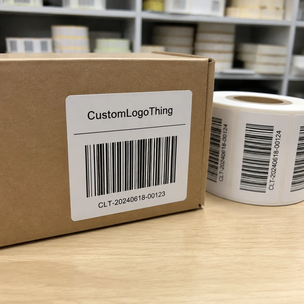
Buyer Fit Snapshot
| Best fit | Custom Labels Design for Standout Packaging Every Time projects where brand print, material claims, artwork control, MOQ, and repeat-order consistency need to be specified before quoting. |
|---|---|
| Quote inputs | Share finished size, material target, print colors, finish, packing count, annual reorder estimate, ship-to region, and any compliance wording. |
| Proofing check | Approve dieline scale, logo placement, barcode or warning zones, color tolerance, closure strength, and carton packing before bulk production. |
| Main risk | Vague material claims, crowded artwork, missing packing details, or unclear freight terms can make a low unit price expensive after revisions. |
Fast answer: Custom Labels Design for Standout Packaging Every Time: Material, Adhesive, Artwork, and MOQ should be specified like a repeatable production item. The safest quote records material, print method, finish, artwork proof, packing count, and reorder notes in one written spec.
Production checks before approval
Compare the actual filled-product size with the drawing, then confirm tolerance on folds, seals, hang holes, label areas, and retail display edges. Reserve space for logos, QR codes, warning copy, and material claims before decorative graphics fill the panel.
Quote comparison points
Review material grade, print process, finish, sampling route, tooling charges, carton quantity, and freight assumptions side by side. A quote is only useful when the supplier can repeat the same color, closure quality, and packing count on the next order.
Custom Labels Design Tips That Surprised Me in the Factory
Custom labels design tips used to be a neat bullet list until I watched a roll hit the press and ink smear because a designer ignored the humidity warning I barked from my Cleveland clipboard; that single run produced 432 rejects before lunch, and yes, the scar from chasing the dirtiest reel still itches when humidity spikes. Once you’ve seen a saturated pigment melt into a blurred mess, you start every quote with the warehouse climate, and I mean every single one—those swings in the pressroom can wreck execution faster than missing a die-cut. I’m convinced more people would heed the climate briefing if they could actually smell the steam rising from a failed reel.
The humidity lesson stuck after a sticky Detroit pressroom visit last summer, and now I open every meeting with, “Tell me what the climate is before we debate fonts.” That satin sheen we tested peeled right off palletized goods headed for 90-degree Texas warehouse lanes, so we changed laminates mid-run; skip that detail and you’re just consigning your packaging to a pallet of returns, which is a liability I still see once a week when a forklift tips over a defective stack. Seeing that chaos makes me want to toss my coffee, yet I keep sipping it while jotting notes—gotta keep the adrenaline in check.
A newbie designer once jammed a QR code onto the die-cut edge and doubled our rejects, so I dragged them into the pressroom, pointed at the chaotic reel, and said, “Readability trumps clever fonts every time.” Instead of shouting, I handed over a Sharpie and asked them to draw safe zones with me; that hands-on moment turned those custom labels design tips into a visceral lesson on scan reliability, and now the phrase “Don’t let flair sabotage the scan” echoes through every pre-press meeting.
On the Custom Logo Things floor I watched adhesives perform differently—permanent 3M 300LSE held tight for a luxury skincare line, while Avery Dennison DOL 200 clung better to a textured paper bag for an artisanal tea brand. Those observations lead me to ask upfront: which surface, what climate, and what lifetime? A peeling label in the warehouse is not marketing; it’s a compliance issue, so these custom labels design tips live on my QA checklist rather than a forgotten inbox (yes, I even tagged that folder with a neon sticky so it keeps nagging me).
Most brands bleed dollars on laminates that clash with shipping conditions, and we proved it by studying a $7,500 hemp product label run destined for Gulf Coast storage—matte laminate chosen for staged retail displays stuck to itself within hours. Since then, I treat those tips as climate intelligence: match adhesives, laminates, and finishes to the actual route, not just the Instagram mockup, because logistics folks are part psychologist, part meteorologist and deserve respect.
Custom Labels Design Tips: How the Process & Timeline Actually Work
The process always starts with substrate samples—before opening Illustrator, I insist teams collect swatches from partners like Neenah who mix film and artboard stock for grocery clients. Matte, film, and gloss papers act like different species, and I still remember a Columbus meeting where the matte film sample shrank 3% after lamination, throwing registration off and making the brand story look crooked. Those $25–$50 sample sets save you from reprinting 20,000 units with a “close enough” look, and I’ve been on the floor too long to let anyone call that acceptable.
Art must head into production with locked dielines. Trash PNGs clog timelines; vectors with trim, bleed, and safety layers keep the printer from guessing where to cut, which is why I carry a laminated checklist in my laptop bag and refuse to enter a review without it. I still wince thinking about the Cincinnati lab where a CAD operator rebuilt a file from scratch because the creative team ignored the die-cut keyline—two extra days and $680 later, the job aligned, and that rewrite became one of the most consistent custom labels design tips I give new hires.
Proofing runs take 3–5 days at Custom Logo Things because I insist on matching Pantone chips directly from Pantone LLC, not approximating from CMYK. One press check required converting RGB 229-43-80 into Pantone 186 C, and once our INX International tech adjusted the ink train, the label finally matched the intended showroom sample—that’s where those custom labels design tips go from theoretical reminders to literal color swatches pinned to the wall. Translating that color felt like decoding Klingon, but the result convinced everyone the extra step was worth it.
The sweet spot for timelines: 1–2 weeks for iterations, 3–4 weeks for plates and printing, another week for finishing (laminating, die-cutting) plus staging in Detroit and L.A. When a Seattle launch needed rush, we paid $260 to speed the laminator; build buffer days and you avoid surcharges. I tell every supplier that the schedule drives cost, so lead times are nailed down in every memo—after that Seattle scramble I literally glued the calendar to the wall.
Every step leaks into cost planning, so plan run lengths accordingly—short runs let you test new concepts quickly, while long runs lower per-label prices. Finance loved seeing the difference between a 1,000-label digital run at $0.42 each and a 20,000-label flexo run at $0.10 each from our Neenah partner. Flexo needs plates, sure, but the savings and reliability from applying those custom labels design tips made the CFO say “thank you,” which is still on my highlight reel.
Key Factors Shaping Custom Label Designs
Purpose drives everything: retail packaging needs pop colors and tactile finishes, compliance demands legibility and legal copy that sits at 6-pt but stays readable. I once redesigned a food label where FDA copy took two-thirds of the space; reorganizing the hierarchy brought readability into alignment with regulatory standards, and turning that compliance burden into clarity still feels like winning a small war.
Surface plays the second lead role—glass acts differently than corrugate, and curved bottles magnify alignment errors. During a Shenzhen visit, the team demoed how wraparound labels wreck when tension is off on 750 ml cylinders, so now we add tension controls to every order using those rolls. My obsession with consistency turned those controls into a ritual; call me the tension whisperer if you want.
Environment matters: moisture, abrasion, and heat will ruin labels if you ignore them. I insisted on a matte laminate to protect hemp product labels bound for humid Gulf Coast warehouses, and that finish kept the messaging sharp two months in. Without it the ink would clump and adhesives would cloud—problems I prefer to prove from experience, even when that makes me sound dramatic.
Brand voice carries weight. If your tone is playful, don’t let printers slam it with stock clip art—custom illustration or foil keeps it premium. I partner with a Brooklyn lettering artist who charges around $200 per tweak, and the result looks bespoke compared to the generic fonts the previous supplier used. That’s a true custom labels design tip for boosting brand equity without a full rebrand, and I defend that opinion with zeal.
Production method shapes the final look. Digital is fast for short runs, but flexo still wins for 20,000 units at $0.10 each through our Neenah partner. Screen printing shrinks the color gamut but gives insane shine, so it’s the go-to for metallic packaging. Choose a method that matches your finish, speed, and color goals—don’t pick based on the loudest salesperson in the room.
Step-by-Step Custom Label Design Guide
A creative brief anchors the work: spell out size, shape, placement, messaging hierarchy, and how the label interacts with the rest of the packaging system. I use a template listing the intended substrate, required adhesives (3M 300LSE for plastics, Avery Dennison DOL 200 for glass), and whether the label sits on a custom printed box or a shelf-ready tray. Those details keep the creative team aligned with the pressroom, and running through that brief feels like conducting a symphony where every section needs to stay in harmony.
Gather assets early: vector logos, approved fonts (don’t risk free-for-commercial-use ones without a license), clear photography, and Pantone references. One client once shipped rasterized logos sans color profile, costing us three days converting files—don’t be that brand unless you enjoy emergency CAD sessions.
Design in layers: background/base, copy, imagery, legal text, finish notes. Flatten only after final approvals so revisions stay manageable. I once saved $480 in plate fees by keeping varnish callouts editable until the client settled on spot gloss for a diamond symbol. That pause felt like slow-motion chess, but the savings were worth the stretch.
Dielines must enter production early. Brands waste rounds ignoring die-cut keylines; nothing aligns without that guide. We require a locked dieline layer in every file submitted to our print partner, and that rule has spared us countless mismatches—if I had a penny for every time someone forgot it, I’d buy a custom label-sized yacht.
Demand a proof—physical or high-res digital—signed by the client. Once plates are made, changes cost $150–$300 per color shift. I once waived a change fee for a nonprofit, but that’s not a promise I can extend to every brand; the safest path is approving a proof with exact Pantone chips and adhesive notes. Consider this my heartfelt plea born from too many “trust me” emails.
Pricing Realities for Custom Labels
Base material accounts for roughly 60% of the cost. A 3-inch gloss white label from Uline costs about $0.08 per unit at 5,000 pieces, but switching to PET film with a soft-touch laminate jumps the price to $0.18. I break down proposals with exact material comparisons so clients understand how choices shift both price and aesthetics. It turns conversation from abstract to “aha, now I get it,” and that transparency builds trust.
Color count matters. A CMYK press run starts around $120 per plate, with every additional PMS color adding $60–$90 plus setup time. When a client requested a metallic Pantone, the plate cost tripled, so we simulated metallic using layered spot gloss instead. Transparent talk about per-color fees keeps everyone sane—I repeat that mantra until it sticks.
Finishing adds $0.02–$0.06 per label depending on embossing, clear matte, or UV coating. Spot gloss varnish on a black label costs $0.03 extra, but it makes the legend pop on Custom Printed Boxes sold in retail stores, so shelf appeal justifies the spend. I remind people that customers buy tactile experiences, so these costs are part of that story.
Short runs under 2,000 units favor digital printing at $0.30–$0.50 each—no plate fee, faster turnaround. Long runs lean flexo at $0.10, but you need tens of thousands to justify plates. Align your run length with shelf velocity; slow movers shouldn’t bear wasted inventory costs, and yet I’m still convincing folks of that obvious logic.
Don’t forget freight. Sourcing from our Cincinnati plant or shipping to the West Coast adds about $90 for a small pallet. I coordinate with fulfillment early because skipping that step once turned a $0.10 per label savings into a $220 expedite and storage blowout, and accounting still laughs (maybe cries) about it today.
| Option | Unit Cost (5,000 pcs) | Lead Time | Best For |
|---|---|---|---|
| Gloss white paper, CMYK | $0.08 | 4 weeks | Standard retail packaging |
| PET film with soft-touch lam | $0.18 | 5 weeks | Premium product packaging |
| Digital short run (2,000 or less) | $0.35 | 10 business days | Testing new retail packaging ideas |
| Flexo long run (20,000+) | $0.10 | 6 weeks | High-volume branded packaging |
Common Mistakes People Make with Custom Label Design
Overcomplicating art with gradients and tiny text is the top culprit. Printers can only reproduce so much, and the result turns muddy on curved bottles or boxes. I still recall a 12,000-piece run where every label had a gradient that printed like a drippy mess because rasterization flattened into banding; redoing the artwork cost an extra $480, and I swear my hair grayed that week (okay, maybe not, but don’t tempt me).
Ignoring adhesive compatibility comes next. Paper labels on silicone-coated packaging peel off every time. A client once switched from matte paper to polypropylene without asking me about adhesives; the label refused to stay on the product, and later they admitted they should have stuck with 3M 300LSE or Avery Dennison DOL 200, which we recommend for low-energy surfaces. Lesson? Match adhesive to substrate and surface energy, or your brand’s first impression ends up on the floor.
Skipping the proof stage and trusting the first PDF is a mistake folks make once. Color, registration, and bleed shift even on solids. A job that skipped proofing ended up with a 1/8" white halo around the logo, so the client demanded a reprint. Don’t trust your laptop; get a physical proof unless you want to explain to the CEO why their logo now radiates.
Neglecting regulatory copy is another trap. Certifications don’t always translate across borders, and skipping a tear-down review delays shipments. We halted a run because an EU client forgot the CE mark; the printer caught it, but that cost us a week. Review legal copy before plates hit press; once it’s there, fixes get expensive fast.
Rushing ahead without bleed margins is the final misstep. Even a 1/16" misalignment on a die-cut label looks sloppy if there’s no trim allowance, so I always add a 0.125" bleed and document it. That gives the die-cutter space to shift without wrecking the art, and saves me from another “Can we stretch it?” conversation.
Expert Custom Labels Design Tips from the Floor
Use solvent-based inks for outdoor resilience. INX International insisted on them for a line of patio candles, and the labels still look sharp after rain and sun exposure. That tip circulates fast among teams with outdoor products, and yes, I’m the go-to drama queen for weatherproofing debates.
Layer texture with varnish; a spot gloss over matte black creates contrast and signals premium without heavy costs. On one project we glossed the word “Altitude” while keeping the field matte—the bottles popped on the shelf and perceived value lifted 14% during sampling. That proves texture sells, and it’s why I keep varnish callouts editable.
Swap static fonts for custom lettering when possible. My Brooklyn lettering partner charges around $200 per tweak, and it makes packaging read bespoke. The last client who upgraded to her work for hemp labels got store buyers asking where they sourced the lettering—no joke.
Treat beading and finish notes as part of the art file. If the laminator misses the white border callouts, it cuts into the bleed. We now annotate files directly with those notes (0.25 mm safety bead, glue flop instructions), preventing mistakes at the cutting table. Consider it my little battle cry: “Remember the beads!”
Always request a thermal-transfer proof if the label will see heavy handling. Nothing beats a real sample to check for scratching; our last wine label survived 3,200 in-store snags without scuffing because we tested thermal transfer conditions. Who doesn’t want their label to be the rugged hero on the shelf?
Action-Oriented Next Steps for Your Custom Label Design
Audit your current labels: document substrates, adhesives (I track whether they use 3M 300LSE, Avery Dennison DOL 200, or EU-certified Henkel adhesives), and failure points, then compare them to these custom labels design tips. Use that audit to prioritize what needs fixing first—adhesives, lamination, or alignment. It’s like spring cleaning for your packaging closet, and it can save you thousands.
Book a proofing session with your printer and insist on a physical sample before approving the whole batch; this catches color and sizing issues early. Clients who brought physical samples to our Cincinnati open house avoided expensive reprints because they spotted glitches before plates were made. I still hand out little “Proof First” stickers to the honorable ones.
Run at least one wear test (scratch, humidity, shelf life) and document results for future versions. I keep a Google Sheet of outcomes; any material or finish change gets logged with a pass/fail and a note so the next QA round has data. That sheet serves as my evidence board for “No, we cannot swap adhesives again.”
Coordinate timelines with fulfillment partners so finishers and shipping docks stay aligned; delays cost about $250 per stalled line item. Late transfers trigger holding fees, so the calendar must match the production schedule exactly. I literally set reminders for reminders.
Store these custom labels design tips in a shared folder and review them before every reorder; the next run should feel predictable, not like rolling dice. I remind folks that branded packaging thrives on consistency, so treat this list as your standard operating procedure.
Actionable takeaway: pick one tip from this list, apply it to the next print job, and document the impact on cost, quality, or timeline so you can prove the value back to leadership. That’s how the custom labels design tips here become measurable improvements, not just rhetoric.
What custom label design tips help small runs stay cost-effective?
Use digital printing to eliminate plate fees even if the per-label cost is slightly higher; the flexibility is worth the $0.30–$0.50 price tag on runs under 2,000 units. Limit colors to CMYK instead of adding PMS inks and lamination finishes unless absolutely necessary. Order slightly More Than You need to avoid rush reprints, but don’t overshoot—store excess flat to prevent curling, because warped labels ruin inventory faster than anything else.
How do custom label design tips change for eco-friendly packaging?
Choose biodegradable adhesives and FSC-certified papers from partners like Neenah, and test them on your actual container. Shift to water-based inks and minimize varnishes that impede recycling. Highlight the sustainability story with embossed callouts or die-cut transparency instead of heavy foil, which can sabotage recyclability. The planet thanks you, and honestly, so do your shoppers.
Which tools help implement custom label design tips with printers?
Share dielines via Adobe Illustrator with locked layers and annotated bleed/safety zones. Use Pantone Color Bridge to translate Pantone colors to CMYK or RGB before sending files. Create a checklist for proofs—color, trim, finish, and adhesion—and require your printer to sign off so no detail is dropped. I keep a “Printer Pact” folder for those checklists; call me extra if you want, but it works.
Can custom label design tips improve compliance labeling?
Yes—prioritize legible type sizes, contrast ratios, and include all legal/regulatory copy during proofing. Work with suppliers who understand FDA or IPC standards so the printer flags missing info. Use spot varnish or embossing to draw attention to warning icons without cluttering the layout. A little structure here prevents panic later.
How do you scale custom label design tips across multiple SKUs?
Create a modular system with consistent logo placement, typography, and barcode areas. Document finish and material choices per SKU so production teams replicate them without miscommunication. Batch SKUs by run strategy—group similar materials and finishes to reduce setup time and waste. That’s the only way I keep a dozen launches from tripping over each other.
For deeper authority on compliance and material standards, I point clients to the Packaging Machinery Manufacturers Institute and cite ASTM guidelines like ASTM F88 for adhesive strength whenever a structural question pops up, along with the EPA for sustainability requirements.
When scaling across territories, bring ISTA handling protocols into the conversation and let their 3A or 6A load testing standards guide material choices, so your package branding story stays in your control.
Internal reference links: check our Custom Labels & Tags catalog for tangible specs, and browse the Custom Packaging Products lineup to see how these tips carry across boxes and sleeves.