Custom Lollipop Labels: Order the Right Specs for Better Presentation and Better Handling
Custom lollipop labels do more than decorate candy. They set the first impression, carry practical information, and decide whether a small product feels finished or improvised. On a surface this small, there is no room for vague specs or decorative excess. A label that curls, smears, or hides key copy can make a perfectly good treat look cheaper than it is.
That matters because the format is doing several jobs at once. One label may need to show a brand name, flavor, event date, ingredient note, and a tiny logo. It might also need to match boxes, bags, ribbons, or inserts from the rest of the packaging system. In that sense, the label is not an accessory. It is part of the product architecture.
Why Custom Lollipop Labels Change the Sale
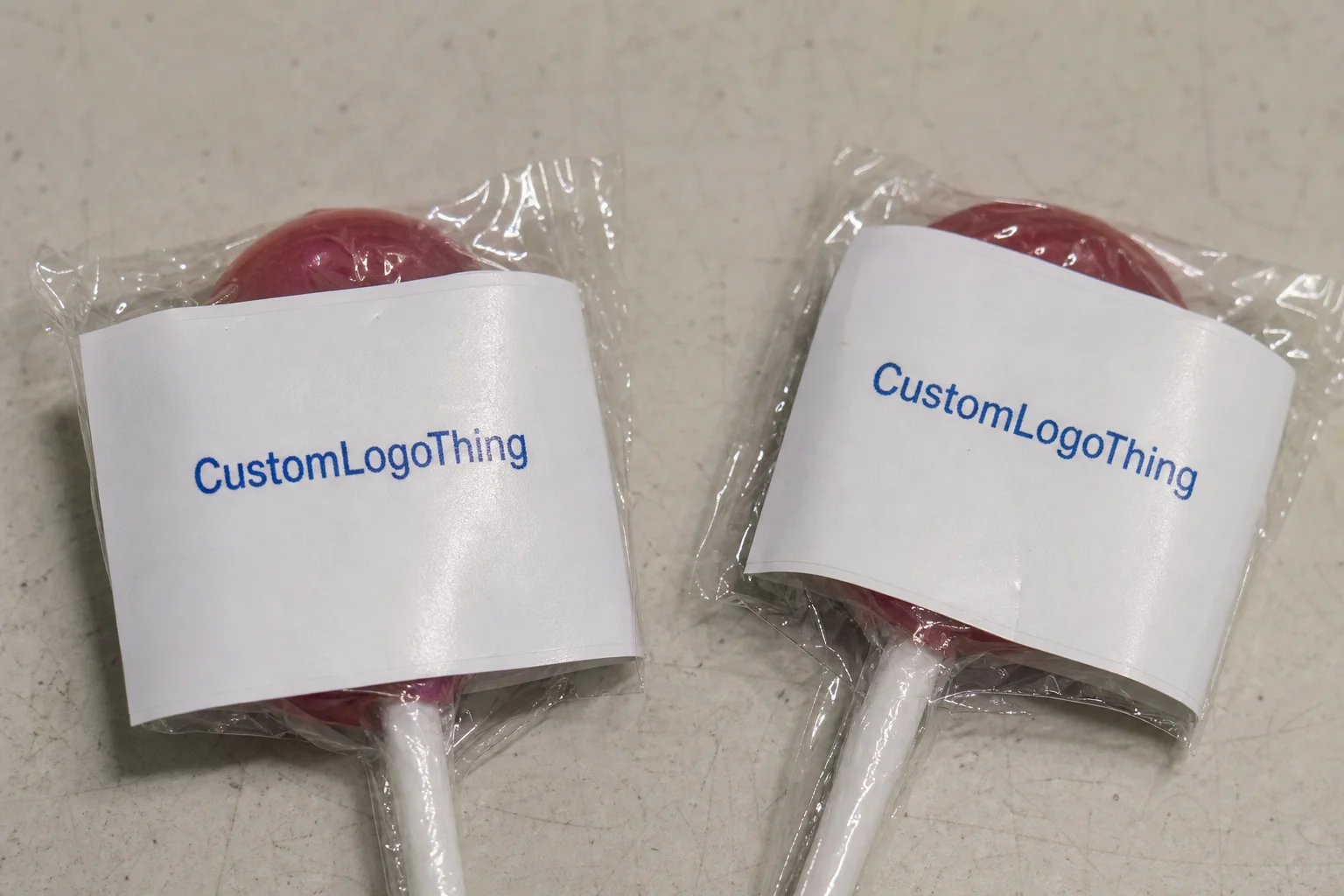
Packaging buyers usually learn this the hard way. A plain lollipop can feel like a loose giveaway. The same candy with a clean label suddenly reads as intentional, whether it is being used for a wedding favor, school fundraiser, retail checkout display, or trade-show handout. The shift is visual, but the effect is commercial. People trust the item more when it looks assembled with care.
That trust depends on consistency. If the label is off-center, if the artwork is crowded, or if the finish fights the design, the product loses polish fast. Consumers rarely separate the candy from its presentation. They judge the whole item from the smallest visible flaw.
The best custom lollipop labels usually balance four information layers:
- Brand identity: logo, name, or a short mark that identifies the source
- Product cue: flavor, color, or event purpose
- Operational details: date, lot note, or handling instruction when needed
- Visual structure: borders, spacing, and contrast that keep the label readable at arm’s length
That last point is easier to miss than the others. A label can have the right words and still fail if the typography is too thin, the contrast is too soft, or the layout ignores the curve of the candy. The scale is the constraint. If the design depends on delicate details, it will not survive the actual size.
For buyers who are coordinating more than one packaging item, the label should match the rest of the set in color tone, finish, and type treatment. That often means aligning it with other Custom Labels & Tags or with the larger Custom Packaging Products program so the candy does not feel disconnected from the box or bag around it.
That kind of alignment is not a luxury detail. It is the difference between a one-off candy and a branded package component.
How the Label Sticks, Prints, and Reads in Real Use
A label is built from four basic parts: the face stock, the adhesive, the liner, and the print method. Each one influences how custom lollipop labels behave on smooth wrappers, paper sticks, or coated packaging surfaces. If one part is mismatched, the result is usually visible within minutes, not weeks.
The face stock is the visible layer. Paper stocks tend to feel familiar and usually cost less. Film stocks, such as BOPP, are more resistant to moisture and handling, which makes them a better fit for chilled storage, warm environments, or products that may see condensation. Clear film can look premium when the design is minimal, but it is less forgiving if the artwork is cluttered or low-contrast. White stock remains the safest choice because it gives the print a stable base.
The adhesive matters just as much as the face stock. Temporary event favors may only need a moderate tack. Retail items or candies that will be handled repeatedly often need a stronger adhesive that holds through transport, display, and casual touching. For chilled products, the adhesive needs to perform when the surface is cool or slightly damp. That is one of the most common points of failure in label orders, and it is usually preventable.
Print method changes how detail behaves at small scale. Digital printing is common for short runs and variable designs. Flexographic printing often becomes more efficient at larger quantities, especially when the design will repeat unchanged across the run. If the label includes very small type, a barcode, or a thin-line logo, the supplier should be able to explain how the file will hold up at final size.
Readability is mostly a contrast problem. Dark copy on a light field is easier to read than a pastel logo sitting on a busy background. Bold sans-serif type generally survives reduction better than thin scripts. Round or oval labels usually fit the candy head naturally, but square labels can work when the margins are deliberate and the art stays centered.
A proof can look clean on screen and still fail on a 1.25-inch circle. On small-format packaging, line weight, whitespace, and contrast are structural decisions, not style choices.
The use case changes the spec. A single-pack favor may only need to survive a short event table display. A bundled giveaway bag may rub against tissue, ribbon, and other items. A retail peg-hook item has to handle shoppers’ fingers, cart friction, and backroom storage. The same file does not belong in all three environments without adjustment.
Spec Choices That Affect Fit, Finish, and Shelf Life
Most ordering mistakes start with vague specs. “Small round labels” is not enough. The printer still needs the exact diameter, the stock, the finish, the adhesive type, and the conditions the label will face after it leaves the press. The right choice depends on the candy itself, the venue, and how long the labels need to hold their appearance.
Size comes first. Standard round lollipops usually need a label that covers the candy head without spilling too far over the edge or sliding down onto the stick. If the candy is unusually large, a wider label may work, but the border needs enough breathing room to keep the artwork from feeling tight. For irregular shapes, custom die-cut labels often perform better than forcing a standard circle to do a job it was not made for.
Finish changes both the look and the reading experience. Gloss finish boosts color and makes saturated artwork pop, which helps if the design depends on bright branding. Matte reduces glare and can improve legibility under strong indoor lighting. Clear stock can look sharp with minimal design, though it requires careful artwork because anything behind it remains visible. White stock is still the default for good reason: it is the easiest to proof, the easiest to read, and the least fragile visually.
Moisture resistance deserves more attention than it usually gets. Paper may be enough for a dry indoor event. Film stock becomes the safer choice when candy is stored cold, packed in humid conditions, or transported across a season with temperature swings. If there is any chance of condensation, ask how the adhesive behaves in that environment. A label can be technically “moisture resistant” and still perform poorly once it is actually handled.
A practical way to narrow the spec is to work from use case:
- Dry, short-life favors: paper stock, standard adhesive, gloss or matte finish
- Chilled or humid handling: BOPP or comparable film, moisture-tolerant adhesive, stable white base
- Retail or repeated handling: stronger adhesive, high-contrast print, proofed size, and a tested fit
If sustainability is part of the buying brief, ask whether the stock is available with FSC certification or another traceable paper claim. That matters more when the label sits inside a larger branded packaging setup that includes cartons, inserts, or folded paper components. Standards from ISTA are also useful if the labels must travel through rough handling or mixed shipping conditions, because they keep the discussion focused on package integrity rather than design alone.
Finish should be chosen with the artwork, not after it. Matte can quiet an otherwise busy design. Gloss can rescue a minimal one by adding contrast and depth. The wrong finish makes a clean label look dull or a soft palette look muddy. That is a small detail with a large visual effect.
Cost and Pricing Factors Buyers Should Compare
Custom lollipop labels are usually priced through a combination of quantity, material, shape, print coverage, and finishing. If a supplier gives a number without those details, the quote is only a placeholder. Buyers get into trouble when they compare one incomplete price against another and assume the cheaper option is actually cheaper.
Unit cost usually drops as quantity rises, but total spend still climbs if the order includes specialty film, custom die-cutting, white ink, or rush production. Short runs tend to be expensive on a per-piece basis because setup is spread across fewer labels. Larger runs reduce the unit cost, but they raise inventory risk if the event date moves or the product test underperforms.
Typical pricing ranges for standard-sized labels are often close to the following, though actual quotes depend on artwork, quantity, and supplier capability.
| Option | Typical Use | Approx. Unit Cost at 5,000 | What Changes the Price |
|---|---|---|---|
| Gloss paper round label | Dry event favors, basic branding | $0.18-$0.28 | Print coverage, size, proof revisions |
| Matte BOPP label | Retail packaging, light moisture exposure | $0.24-$0.36 | Film stock, adhesive strength, finish |
| Clear film with white ink | Premium package branding, minimal artwork | $0.32-$0.55 | White ink pass, alignment, ink density |
| Custom die-cut shape | Special events, branded packaging sets | Base cost plus 10%-20% | Tooling, shape complexity, waste |
Compare quotes on the same basis. Ask whether proofing, setup, shipping, and minimum order quantity are included. A quote that looks low on page one can become more expensive after line items appear. That is especially true for date-driven orders, where buyers are under pressure to approve quickly.
There is another way to think about the budget. The label should be measured alongside the full packaging stack, not in isolation. A good label on a weak outer package still looks incomplete. A weak label on a polished box does the opposite. The system either holds together or it does not.
Process and Timeline: From Artwork to Shipment
The cleanest jobs follow a predictable sequence: confirm the label size and application surface, send artwork, review the proof, approve the final file, then move into print, inspection, packing, and shipment. Most delays happen before production starts. Once the file is approved, the schedule usually depends more on capacity and shipping than on creative work.
Artwork readiness is a major factor. If a file needs logo cleanup, font replacement, or color correction, the proof cycle slows down. Vector artwork is usually the safest format because it holds sharp edges at small size. High-resolution raster files can work, but only if they are large enough to preserve detail. Brand colors, legal text, and any copy that must appear on the label should be included before the first proof goes out.
Production time varies with complexity. A simple paper circle usually moves faster than a custom shape with specialty film or white ink. Stock availability also affects timing. Shipping distance matters, especially when the labels must arrive before an event or retail launch. For planning purposes, a common production window is around 12-15 business days after proof approval for standard work, with shorter or longer timelines depending on the job. That is a working range, not a guarantee.
Build in buffer time. A proof revision can add several days. A color adjustment can add more. Reprints are rare, but even a small error can become expensive if the order is linked to a fixed date. The cheapest insurance is a clear internal review before approval.
If the labels are being ordered alongside Custom Packaging Products, confirm that the stock, finish, and color direction match the rest of the kit. It is easier to align a label with the packaging system before production than after the shipment is already on its way.
Build for the proof, not just the final artwork file. The best production runs usually start with one boring but accurate document: exact size, exact quantity, exact in-hand date.
For retail programs, a simple transit test can be worth doing before volume is locked in. The goal is not to simulate every possible failure. It is to catch the obvious ones: curling, rubbing, adhesive weakness, and print dulling after handling. Labels are small, but they still live inside a bigger packaging environment.
Common Mistakes That Make Labels Peel or Read Poorly
Size errors come first. A label that is too wide wraps awkwardly and looks forced. One that is too small leaves dead space and makes the design look unfinished. Both mistakes weaken the presentation even when the print quality is fine.
Design problems are next. Low contrast is a frequent issue, especially on bright candy colors or clear stock. Thin script fonts may look refined on a monitor and vanish once reduced to final size. Too much copy is another common failure. A small round label is not a place for paragraph-level messaging. If ingredients or legal text are required, the layout needs discipline, not optimism.
Production errors are usually preventable. Low-resolution files blur. Images pulled from a website often carry compression artifacts. Bad cropping can push key text too close to the die line. These are the kinds of issues that a proof should catch, which is why proof review matters more than many buyers give it credit for.
Application mistakes can be just as costly. Dust, oils from handling, and residue on the surface all weaken adhesion. Cold storage may reduce initial tack on some stocks. If labels are applied and then packed immediately, the adhesive may not have time to settle. That point matters when non-production staff are assembling the batch by hand.
Surface mismatch is another overlooked problem. A label that works on smooth wrapper film may fail on textured paper or irregular packaging. Ask what surface the adhesive is intended for before the order is placed. That one question can prevent a whole batch from peeling early.
Most failures are not dramatic design disasters. They are process misses. The best quality control is still a tight proof cycle and, when the order is large enough to justify it, a physical sample.
Expert Tips and the Fastest Next Steps
If the order matters, request a sample or proof every time. A ten-minute review can prevent a batchwide mistake, and on small-format packaging that is usually the cheapest quality control available. Buyers who get good results with custom lollipop labels are rarely the ones chasing the lowest quote. They are the ones who specify clearly and compare like for like.
Three details speed up the process more than anything else:
- Exact label size, including diameter and any bleed requirement
- Final quantity, so the supplier can quote the right price tier
- Required in-hand date, not just the date the order is placed
After that, send the artwork files, brand colors, and any text that must appear on the label. If the labels need to match a broader packaging system, include references to the box, bag, or insert design. That helps the printer align the finish and color tone across the set instead of treating the candy label as an isolated item.
When comparing suppliers, do not stop at the headline rate. Confirm the adhesive type, finish, turnaround, proof policy, and minimum order quantity. Ask whether the stock is suitable for humid handling or chilled storage if that is part of the use case. If the labels will be handled repeatedly, ask how the print holds up under abrasion, because the first person to touch the pack is often the real quality inspector.
There is a practical reason custom lollipop labels deserve this level of attention. They sit at the intersection of decoration and communication. That is why they can either polish a candy presentation or make it look improvised. Get the specs right, and the format does exactly what it should: it makes a small item feel intentional, branded, and ready to hand over.
For buyers working across favors, giveaways, and retail packaging, the next step is straightforward: compare two or three quotes, verify finish and adhesive, and check that the proof matches the rest of the packaging system. If custom lollipop labels are part of the launch, treat them like any other branded packaging component, because that is how they will be judged.
What size should custom lollipop labels be for standard round lollipops?
Start by measuring the candy head and the flat area the label can cover without dropping onto the stick. Round labels usually work best when they leave a small border for adhesion and clean visual balance. If the lollipop shape is unusual, request a proof before you commit to a full run.
Are custom lollipop labels waterproof or moisture-resistant?
They can be, but the result depends on the stock and finish you choose. Ask whether the label is intended for light moisture, refrigeration, or direct contact with condensation. For humid storage or chilled products, confirm the adhesive and face stock are designed for that use case.
How much do custom lollipop labels usually cost?
Price depends on quantity, material, finish, artwork complexity, and whether you need a faster turnaround. Per-piece cost usually drops as the batch size rises, but minimum order requirements can affect the total. Compare what is included in each quote before judging the lowest number.
What artwork files work best for custom lollipop label printing?
Vector files are usually best because they keep edges sharp at different sizes. If you only have a raster image, it should be high resolution and large enough for print without blurring. Include brand colors, fonts, and any legal text so the proof stage moves faster.
How far in advance should I order custom lollipop labels?
Order as soon as the size and quantity are known, especially if the labels are tied to an event date. Build in time for proof edits, production, shipping, and any last-minute reprint risk. If the deadline is fixed, ask about lead time before you finalize the artwork.