Custom Mason Jar Labels: Pricing, Specs, and Turnaround
Custom Mason Jar Labels can look polished in a mockup and still fail on glass. Condensation, curved surfaces, imperfect placement, and the wrong adhesive will expose the weak spots fast, which is why custom mason jar labels should be treated as a packaging specification rather than a simple print order. For jars used for food gifts, candles, dry goods, and event favors, the label has to do two jobs at once: carry the brand and stay readable after handling.
The part many buyers miss is that the artwork is only one piece of the job. Fit, substrate, adhesive, and finish usually decide whether the label still looks intentional after a week in a refrigerator or a few hours in an ice bucket. A decorative jar for a wedding favor does not need the same build as a retail product that will be shipped, shelved, and touched repeatedly.
If you are coordinating outer cartons or bundled sets, it helps to think about the label as one part of a wider branded packaging system. Pairing the jar label with Custom Packaging Products or matching it with Custom Labels & Tags keeps the look consistent across the pack.
Why Custom Mason Jar Labels Fail Faster Than You Expect
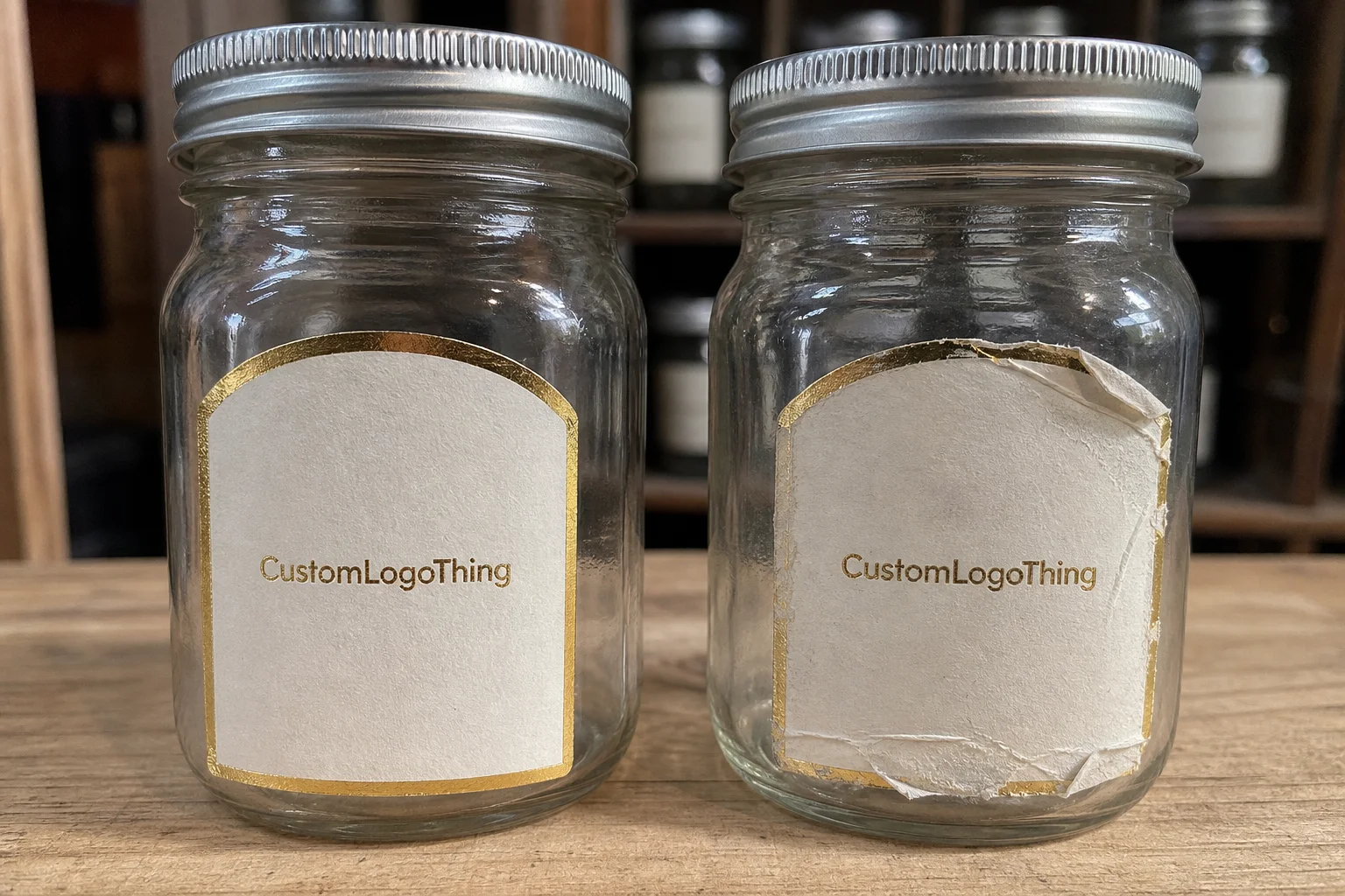
Glass is smooth, which sounds ideal until the label has to survive real use. It shows every flaw: trapped air, edge lift, crooked placement, and moisture under the film. A design that looks fine on a screen can fail because the jar has a shoulder taper, because the adhesive was chosen for dry cartons instead of chilled glass, or because the label was cut too close to the edge and starts curling after a few rounds of handling.
Custom mason jar labels are used in very different conditions. Jam, honey, spice blends, candle jars, wedding favors, and gift packaging all demand different levels of moisture resistance and scuff protection. A paper label with a standard permanent adhesive can work well for dry pantry display. Put that same label into refrigeration or a damp setting, and performance changes quickly.
The challenge is that presentation and durability are linked. If the label is too thick, it may resist the curve and lift at the edges. If the stock is too thin, it can wrinkle or show adhesive distortion. If the finish is too glossy, it may catch light and reduce legibility. The better question is not what looks nice on a flat proof, but what still looks right after the jar has been handled, chilled, or shipped.
“If the label passes the eye test but fails on condensation, it is the wrong label.”
That mindset applies to almost every packaging decision. A label is part of brand presentation, but it is also a material choice with a job to do. On a small jar, the margin for error is narrow.
How Jar Labels Adhere, Wrap, and Stay Readable
A label system is made up of the face stock, the adhesive, any laminate or topcoat, and the cut shape. Each part changes how the label behaves on glass. Smooth glass helps, but only if the adhesive is designed to wet out cleanly and keep its grip under the conditions the jar will actually see.
For most custom mason jar labels, the practical options are front labels, wrap labels, or smaller accent labels for lids and necks. A front label is the safest choice when the jar has a strong shoulder or limited flat area. A wrap label gives more room for legal copy, flavor notes, or brand storytelling, but it is less forgiving if the jar diameter varies between suppliers. Small lid labels work well for batch codes, seasonal colors, or simple identification marks.
Finish changes readability more than many buyers expect. Gloss can make color feel richer and brighter, but it can also create glare under retail lighting. Matte cuts reflection and usually helps busy artwork read more clearly. Clear labels can look refined on plain glass, although they need strong contrast control because the jar itself becomes part of the design. If the contents are dark or visually busy, that transparency can help. If the contents are pale or uneven, it can work against legibility.
Water resistance matters most for jars that are refrigerated, iced, washed, or handled by damp hands. Temperature resistance matters when jars move between cool storage and room temperature, or when they ship through seasonal swings. For that reason, label performance should be matched to the use case, not picked from a generic sticker catalog.
For retail packaging, the same logic that protects cartons in transit applies to labels on glass. Vibration, abrasion, and repeated touch are usually what expose a weak build. Standards groups such as ISTA are relevant here because the label often looks fine at application and fails later, after the pack has been moved around enough to test the bond.
If broader material strategy matters, paper-based structures and recycled content can still play a role in the outer packaging even when the jar label uses film. In that case, FSC certification may matter more for cartons, inserts, or hang tags than for the label itself.
Key Specs That Decide Fit, Durability, and Shelf Appeal
Jar size is the first spec to get right. Measure the actual label area on the container, not the nominal jar size on a product page. Two 16 oz jars can have different shoulder shapes, wall curves, and usable label zones. On curved glass, the wrong width is a common reason edges lift. A little clearance is better than pushing the artwork right to the boundary and hoping the adhesive makes up the difference.
Surface texture matters as well. Most mason jars are smooth, but some decorative jars have embossing, frosted sections, or molded seams that interfere with adhesion. If the jar has a pronounced seam, keep critical text away from that line. The same rule applies to lids and neck bands. Small labels can work there, but only if the art is simplified enough to stay legible at a glance.
For a practical view, the common build choices usually break down like this:
| Label Type | Best Use | Typical Material | Typical Durability | Relative Cost |
|---|---|---|---|---|
| Paper front label | Dry goods, favors, short display life | Semi-gloss or matte paper | Low to moderate | Lowest |
| BOPP wrap label | Refrigerated food, wet handling, retail packaging | White, clear, or metallic BOPP | High | Moderate |
| Laminate-coated label | Frequent touch, scuff-prone jars, shelf display | Paper or film with overlaminate | High | Moderate to higher |
| Specialty die-cut label | Premium branding, seasonal runs, shaped jars | Paper or film with custom cut | Depends on substrate | Higher |
Artwork quality is another spec that gets underestimated. On a small surface, low-resolution images, weak contrast, and dense copy become liabilities. Keep critical text simple, maintain margins, and use high-resolution files with proper bleed. On a small jar, a crowded layout reads as cheap even when the print quality is good. That is not a printer issue. It is a packaging design issue.
For branded packaging and product packaging, the label should reinforce the product promise immediately. If the jar is premium, the label should feel controlled and deliberate. If the brand is playful, typography can carry that energy, but the structure still needs discipline.
Custom Mason Jar Labels Cost and Pricing Drivers
Pricing for custom mason jar labels usually comes down to five variables: size, material, quantity, print coverage, and finishing. Special adhesive systems, Custom Die Cuts, and water-resistant films all add cost. Heavy ink coverage does too, especially on large labels or dark backgrounds where color consistency has to be maintained across the run.
For short runs, digital print is usually the most practical option. A small order often lands around $0.18 to $0.55 per label depending on size, stock, and finish. At higher volumes, unit cost can drop sharply, sometimes into the $0.06 to $0.18 range for simpler specifications. Those figures are broad because a 2-inch lid label is not priced like a 4-inch wrap label with laminate and a custom shape.
Setup and proofing matter more on smaller orders. If the run is only a few hundred pieces, a flat setup fee can meaningfully affect the unit rate. Once volume rises, material and press time matter more than prepress work. That is why comparing quotes only by unit price is risky. One vendor may include proofing, finishing, and basic shipping, while another separates every line item.
Buyers usually get a clearer picture by asking for the same quote components on every estimate:
| Quote Component | What to Confirm | Why It Matters |
|---|---|---|
| Proof | Digital proof only or physical sample available | Prevents sizing and color surprises |
| Material | Paper, BOPP, clear film, waterproof stock | Affects durability and touch feel |
| Finish | Gloss, matte, laminate, or none | Changes glare, scuff resistance, and shelf look |
| Cut | Standard shape or custom die cut | Changes tooling cost and turnaround |
| Shipping | Included, zoned, or billed separately | Can shift the real landed cost quickly |
Specialty finishes add style, but they should be tied to the application. Rounded corners usually improve edge durability and reduce peeling. Soft-touch lamination can feel premium, although it is a better fit for dry environments than for wet, high-contact jars. Metallic inks and clear film can raise shelf appeal, but they should not be selected just because they are available.
For buyers building a broader package branding system, the same cost logic applies to custom printed boxes and outer retail packaging. The cheapest option is not efficient if it causes relabeling, customer complaints, or rework later.
Process and Turnaround: From Proof to Finished Roll
The cleanest label jobs start with accurate measurements. Measure the jar diameter, the flat application area, and the distance to any shoulder or seam. Then define quantity, application method, and environmental conditions. A label for hand-applied craft jars has different requirements than one applied on a production line or packed in refrigerated cases.
The workflow is usually straightforward:
- Collect jar dimensions and placement requirements.
- Prepare artwork with the correct bleed and safe area.
- Review a digital proof for size, copy, and color intent.
- Approve revisions and confirm materials.
- Print, cut, finish, and inspect.
- Pack and ship on rolls, sheets, or finished pieces.
Where time gets lost most often is in two places: incomplete measurements and low-resolution artwork. A designer can create an attractive file, but if the vendor has to resize or rebuild it because the jar dimensions were guessed, the timeline stretches. The same thing happens when the proof is delayed by unclear copy or missing barcode requirements.
Realistic turnaround depends on volume and complexity. Simple digital label runs may take 5 to 10 business days after proof approval. Small sample orders can sometimes move faster if the stock is on hand. Larger runs, custom shapes, or specialty finishes often land closer to 10 to 15 business days, and rush service can compress that window if the schedule allows it. Rush work usually costs more because it interrupts production flow, not because the order is difficult.
For launches, it helps to leave room for one test round. A proof is not a formality. It shows whether the label wraps cleanly, whether the contrast survives the actual jar color, and whether the finish reads the way the brand intended. That step is even more valuable for refrigerated food, gifting programs, or retail distribution, because a small mistake becomes a much larger correction once inventory is printed.
Quality Control Checks That Prevent Waste
Quality control is where good label specs either hold up or fall apart. On custom mason jar labels, the checks that matter are usually simple, but they need to happen before the full run is released. Registration should be checked so text does not drift near the cut line. Die-cut consistency matters because a small shift can make labels look uneven on the shelf. Ink density needs to be reviewed on dark colors and solid backgrounds, where banding shows up fastest.
Adhesive performance deserves its own test. A label can pass a visual review and still fail if the tack is too aggressive for clean placement or too weak for chilled glass. For food jars and candle jars, a small sample run should be applied to the actual container, then left in the real use environment for a short period. If the label lifts at the edge, clouds under moisture, or scuffs with light handling, that should be caught before the order scales.
There is also a practical difference between a label that looks good off the press and a label that survives packing. Roll winding, spacing between labels, and core size can affect how efficiently the labels apply. If the labels are going onto jars by hand, clean weeding and consistent spacing reduce waste. If they are being applied in production, roll direction and unwind orientation become part of the spec, not an afterthought.
A useful QC checklist before approval looks like this:
- Confirm the artwork size matches the measured application zone.
- Check that fine type remains legible at final print size.
- Test the label on the actual jar surface, not just on a flat sheet.
- Review the finish under the light the product will see on shelf or in display.
- Verify that moisture, cold, or handling do not break the adhesive bond.
The cost of skipping these checks is usually larger than the cost of the proof itself. A short run that peels, smears, or misregisters can create relabeling labor, delayed fulfillment, and avoidable waste. On a small brand, that kind of mistake is expensive enough to affect the next order.
Common Mistakes That Cause Peeling, Smearing, or Waste
The most common mistake is sizing the label to the artwork instead of the jar. A label can be technically correct on paper and still fail on glass because the curve steals usable width. Another frequent error is choosing a paper label for a wet environment simply because the print looks sharper. Sharp print does not matter if the label smears after one cold-storage cycle.
Ink resistance and substrate resistance are not the same thing. A glossy label can still fail if the stock absorbs moisture or if the adhesive softens under temperature swings. A matte label can perform very well if the film and adhesive are right. Buyers often focus on finish because finish is visible, while adhesive choice is hidden. That priority is backwards.
Other mistakes show up in the copy:
- Too much text for a small label face.
- Critical details pushed too close to the edge.
- Low contrast between text and background.
- Ignoring how the label looks once wrapped around a curved surface.
- Skipping a test application before ordering the full run.
Waste gets expensive quickly. If 10 percent of a short run peels or smears, the replacement cost is not just the reprint. It also includes labor, relabeling, delayed fulfillment, and lost confidence in the product line. For small brands, that can be the difference between a clean launch and a messy one.
Condensation deserves separate attention because it is often underestimated. Jars pulled from a cold case may look fine for the first hour, then the edge starts to lift. Once water gets under the adhesive, failure usually spreads. That is why refrigerated products should be tested in the actual storage condition, not just on a bench.
Practical Ordering Notes for Better Results
Start with the use case, not the artwork. If the jar will sit on a dry shelf in a gift set, appearance can lead the decision. If it will live in a refrigerator, be handled often, or travel through shipping, durability comes first. That order matters because the wrong material choice can force design compromises later.
A concise ordering checklist helps keep the job controlled:
- Measure the jar diameter and label zone on the actual container.
- Confirm whether the label is front-facing, wrap-around, or a lid accent.
- Define the handling environment: dry, refrigerated, washed, or shipped.
- Choose paper, film, or waterproof stock based on that environment.
- Ask what is included in the quote: proof, finishing, shipping, and revisions.
If the order supports retail packaging, ask for a sample or proof on the intended stock before volume is approved. That advice matters even more if the design uses fine type, light backgrounds, or a clear substrate. The aesthetic can be strong and still be unreadable at a glance. A good proof catches that before it becomes inventory.
For food, beverage, and gift products, it also helps to review the broader package before final approval. The label should not fight the jar, the lid, the outer carton, or the e-commerce image set. It should sit inside a complete branded packaging system that feels deliberate from first touch to shelf view.
Do not guess from a generic template if the jar shape is unusual. Custom mason jar labels work best when they are specified to the jar, the handling conditions, and the application method. That is the shortest path to a label that looks clean, stays readable, and does not create waste.
With the quantity defined, the timeline confirmed, the proof approved, and the substrate matched to the use case, custom mason jar labels become a controlled packaging purchase instead of a recurring problem.
What materials work best for custom mason jar labels in cold storage?
Moisture-resistant or waterproof stocks with an adhesive designed for chilled surfaces perform best. A film face stock such as BOPP usually holds up better than standard paper when condensation is part of the environment. The finish should also keep text readable when the jar surface turns wet.
Can custom mason jar labels go through washing or refrigeration?
Yes, but only if the adhesive and topcoat are built for moisture, temperature changes, and repeated handling. A standard paper label is usually not enough for wet environments, especially if the jar gets chilled and warmed more than once.
How do I size custom mason jar labels for a curved jar?
Measure the actual flat application area and account for the jar’s curvature and any shoulder taper. Keep critical text away from the edges so the label does not wrinkle or lift as it wraps around the glass.
What is a realistic MOQ for custom mason jar labels?
MOQ depends on print method, material, and finishing, but short-run digital orders are often lower than traditional runs. Ask whether pricing changes by sheet, roll, or finished label count so you can compare quotes properly.
How long do custom mason jar labels take to produce?
Turnaround depends on proof approval, material availability, quantity, and finishing complexity. Rush orders are possible, but they usually cost more and leave less room for artwork changes or dimension fixes.

