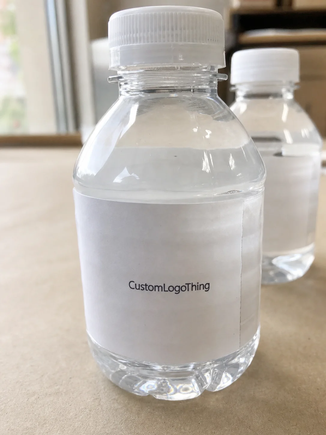
Mini bottles punish loose label decisions fast. With custom mini Water Bottle Labels, a width miss of even a quarter inch can expose the seam, crowd the logo, or leave the design floating awkwardly on the bottle, which is why size, stock, and adhesive have to be decided together rather than treated as separate choices.
The catch is that a small bottle gives you less usable surface than people expect. The curve tightens sooner, condensation shows up quicker, and guests tend to hold the bottle right where the label sits. A design that reads cleanly on a monitor can look clipped, shiny, or underpowered once it is wrapped around cold plastic and set on a table, in a cooler, or in a display tray.
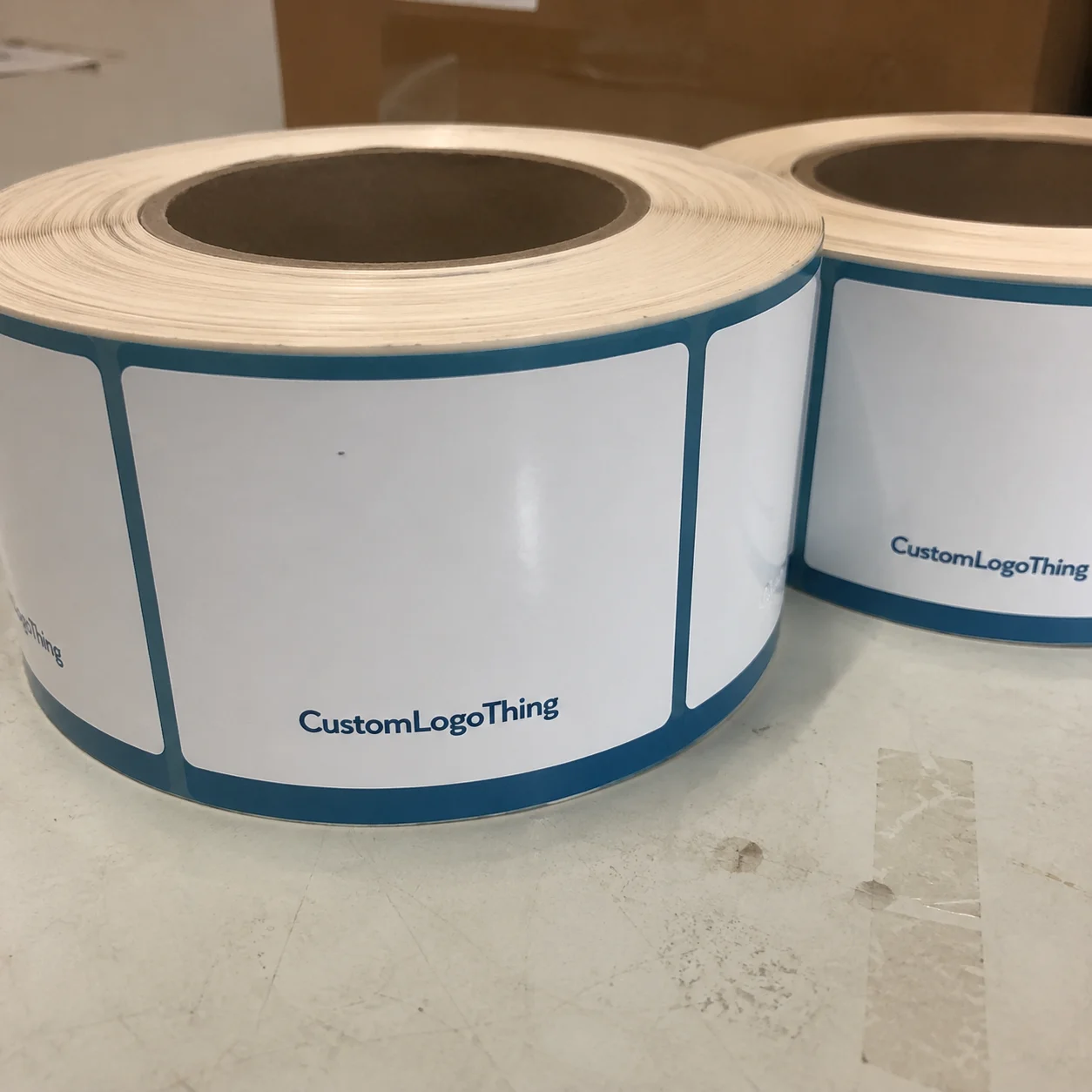
That is the practical side of small-format packaging. The label is not just decoration. It has to identify the bottle, support the brand, and still survive handling without peeling, wrinkling, or fading into the bottle shape itself.
Why mini bottles are harder to label than they look
A standard bottle gives you room to recover from a weak layout. A mini bottle does not. Once the canvas shrinks, every decision becomes more visible, including the ones that look harmless in proofing.
Curvature is the first problem. Mini bottles usually taper faster and offer less flat wrap area, so a label can look perfectly aligned on screen and still wrinkle near the seam or lift at the shoulder. Handling is the second. Guests often grip a mini bottle around the middle, which means the most important information has to stay legible even when a hand is partially covering it.
There is also a basic mismatch between the job and the format. Larger labels can carry product stories, ingredient copy, and decorative filler. Mini bottle labels have a narrower assignment: read clearly, hold the brand, and look finished without taking over the bottle. That makes hierarchy more important than ornament.
Small labels also compete with the cap, the water line, and the bottle silhouette. If the art is too light, too detailed, or too centered on a tiny logo, it can disappear fast. The safest approach is usually a bold layout with controlled spacing and fewer fragile elements.
If a mini bottle label only looks good when zoomed in, it is probably too delicate for production. Small-format labels reward strong contrast, clean margins, and restraint.
There is one more point buyers often miss: a label on a mini bottle is usually judged from a distance. That changes the design math. Fine lines, tiny type, and pale colors often fail not because they are ugly, but because they are too subtle to survive real use.
How the label format, material, and adhesive work together
The face stock, finish, and adhesive matter as much as the artwork. A label can print beautifully and still fail if the construction does not match the bottle’s conditions. Cold storage, ice buckets, humidity, and short-term refrigeration all punish weak material choices.
Paper is the least forgiving option. It can work for dry, short-lived use, but it tends to soften when condensation shows up. BOPP and other synthetic films are usually better for mini bottles that will be chilled, handled, or displayed in damp environments. They resist moisture, keep edges cleaner, and hold up more reliably around ice. Clear film is useful when the design needs the bottle to show through, though it only works well if the artwork is built for transparency. Removable adhesive makes sense when labels need to come off later, but it still has to be tested on a cold, wet surface before anyone assumes it will perform.
Finish changes the behavior of the label too. Gloss can make color feel sharper and more saturated, but it also reflects more light. Matte usually reads quieter and more controlled, which can help a simple design look premium without trying too hard. Clear labels can feel modern and minimal, yet they demand stronger contrast and more precise art preparation than most buyers expect.
The adhesive is where many orders fail in practice. A label meant for a room-temperature bottle is not automatically appropriate for one pulled from a cooler. The bottle surface may be damp, the air may be humid, and the label may need to hold through repeated handling. For that reason, a printed sample on a chilled bottle tells you far more than a spec sheet. ASTM-style test methods can inform the conversation, but they do not replace a real bottle test.
If sustainability is part of the brand brief, the material choice should be checked against the larger packaging plan, not treated as an afterthought. Paper options can be aligned with FSC-certified sourcing when the project calls for it; the certification framework is described by the Forest Stewardship Council. That does not solve moisture problems, but it does matter when the bottle label sits inside a broader packaging story.
| Label option | Best use | Strengths | Typical tradeoffs |
|---|---|---|---|
| Paper | Dry, short-term indoor use | Lower cost, easy to print, familiar look | Poor moisture resistance, may wrinkle or scuff |
| BOPP / synthetic film | Cold bottles, ice buckets, events | Moisture resistant, durable, clean edges | Slightly higher cost, less paper-like texture |
| Clear film | Minimal designs, premium presentation | Lets the bottle show through, modern appearance | Needs strong contrast and careful white ink planning |
| Removable adhesive stock | Temporary promotions, returnable packaging | Cleaner removal, useful for short-term use | Still needs testing on cold, damp surfaces |
For larger packaging programs, it helps to think about how the label behaves alongside the rest of the shipment. If the bottles are part of a broader product packaging system, the ISTA testing framework is worth referencing so the label spec is not developed in isolation from the rest of the pack-out.
Size, layout, and artwork factors that control the final look
The bottle dictates the label. Not the other way around. Before approving anything, you need the bottle diameter, the usable wrap area, the label height, and the seam allowance. Capacity alone is not enough. Two bottles that both hold 8 oz can still have very different curves, shoulders, and label zones.
On a mini format, margins need to be more generous than many buyers expect. Text that sits too close to the cut edge looks cramped once the label wraps. Logos that are oversized in the proof can crowd the seam or visually disappear as the bottle curves away from the viewer. Small formats punish crowding.
Typography deserves the same restraint. A typeface that looks elegant at a larger size can become weak once reduced. Thin strokes, narrow spacing, and overly delicate details are the first things to fail. The main brand name should carry the label. Fine supporting copy can be present, but it should not fight for attention with the part people need to read immediately.
Color contrast matters more than decoration. A pale logo on a lightly tinted background can vanish once the bottle is cold or photographed under event lighting. Dark copy on a clean field usually reads better and often looks more polished because it feels certain. That is one reason simple mini bottle layouts often outperform busier ones.
If the bottle label needs to fit inside a wider packaging system, keep the visual language consistent across the bottle, any insert card, the outer carton, and other branded pieces. A label that uses a different tone or type weight from the rest of the package can make the whole presentation feel disconnected. Consistency matters more than novelty here.
Mockups help, but they do not answer everything. A flat PDF cannot show how the seam lands, how the label behaves around a taper, or whether the design still feels balanced once it is wrapped. A quick physical sample on the real bottle exposes those issues immediately.
Practical sizing check:
- Measure bottle diameter at the label zone, not at the base.
- Confirm the usable label height above any shoulder curve or ridge.
- Leave enough safe margin so the seam does not crowd the art.
- Decide whether the label should overlap, gap, or wrap edge to edge.
- Test a sample on a chilled bottle if the product will be refrigerated.
Custom mini water bottle labels: process and turnaround
The production path is usually straightforward if the inputs are complete. A clean order starts with bottle measurements, final artwork, quantity, and a decision on finish and adhesive. Those details keep proofing short and reduce the chance of a late-stage correction that could have been avoided earlier.
The first step is spec gathering. The supplier needs the bottle diameter, the height available for the label, the intended application temperature, and whether the bottles will be dry-handled or exposed to moisture. After that comes proofing, where the file is checked for size, bleed, color expectations, and text placement. This is usually where delays start if the original request was vague or the artwork was not built for print.
Once the proof is approved, the press setup begins. Digital production tends to move faster for smaller runs and event orders. More specialized label programs, or jobs that include custom printed boxes and other packaging components, can take longer because the label needs to fit into a broader production schedule.
For planning purposes, a practical timing range looks like this:
- Proofing: often 1 to 3 business days, depending on how complete the file and specs are.
- Standard production: often 5 to 10 business days after proof approval for many digital label jobs.
- Special materials or finishes: add time if the job requires a custom stock, unusual adhesive, or specialty cut.
- Shipping buffer: leave room if the labels must arrive before a fixed event or launch date.
Rush orders are possible, but they expose every weak link in the process. If the art is not final, if the bottle dimensions are uncertain, or if the label needs to be tested for cold adhesion, the schedule becomes harder to control. It is usually smarter to close the proof early than to chase a last-minute fix that costs more and still carries risk.
The schedule does not really start at checkout. It starts when the proof is usable. If the dimensions, artwork, and application conditions are unclear, the timeline expands whether anyone wants it to or not.
Cost, pricing, and MOQ for small-format bottle labels
Pricing for mini bottle labels is driven mostly by quantity, material, finish, shape, and the amount of setup required. The fixed steps do not shrink much on a small order. Proofing, file prep, finishing, and cutting still take time whether the run is 250 labels or 5,000.
For a practical budget range, many small-format label jobs land around $0.10 to $0.35 per label at moderate volumes, depending on stock and print coverage. Simple paper labels on larger runs can sit near the low end. Synthetic film, clear stock, or custom shapes push the price up. If the order is very small, the per-label number usually rises because the setup cost is spread over fewer pieces.
Minimum order quantities vary by supplier and production method. Digital printing generally allows lower MOQs than older analog methods, which is useful for tastings, events, internal launches, and trial runs. If the order is small, it is still worth asking whether a slightly larger quantity improves the unit cost enough to justify the extra inventory. In many cases, the jump from 250 to 1,000 labels lowers the per-piece price more than buyers expect.
Here is the simplest way to think about the budget:
- Events and hospitality: prioritize appearance and moisture resistance first.
- Retail launches: prioritize readable copy, consistent color, and enough inventory for reorders.
- Recurring replenishment: lock the spec so future runs match the first one closely.
Special adhesive, tighter cut tolerance, white ink, metallic effects, or a rush window can change the quote. So can a clear-film layout that needs more prepress attention. The lowest bid is not always the best value if the labels fail in ice or need to be reprinted because the first proof was underspecified.
For brands balancing bottle labels with other packaging purchases, the spend should be reviewed as part of the whole program rather than as a single isolated line item. A label that finishes the bottle cleanly can support the same visual system used on retail packaging, shipping cartons, and other branded packaging materials.
Step-by-step ordering checklist for a clean proof
A good proof starts with complete information. The more precise the input, the less back-and-forth you need before production. That saves time, but it also protects the finished label, which is the part that matters.
- Measure the bottle carefully. Capture diameter at the label zone, usable height, and any taper or ridge that affects wrap area.
- Choose the label construction. Decide between paper, BOPP, clear film, or a removable option based on moisture and handling.
- Confirm the finish. Gloss, matte, and clear styles all change readability and how the label photographs.
- Provide final artwork. Use the right file type, keep critical text away from trim, and make sure logos are sharp.
- Review the proof carefully. Check copy, size, color references, and any regulatory text before approval.
- Test if possible. Wrap one sample on an actual bottle, especially if the bottle will be cold or handled often.
It helps to think of the proof as a production document, not a design preview. If the labels are going onto Mini Water Bottles for a launch, wedding, event bar, or promotional kit, the proof should answer the practical questions: does it fit, can it be read, will it stay on, and does it match the rest of the package branding?
Before approving, ask these questions:
- Does the seam land where the design expects it?
- Will the label be exposed to ice, refrigeration, or condensation?
- Is the smallest text still legible at arm’s length?
- Does the finish support the look of the brand?
- Will this order need a reorder later, and if so, is the spec documented?
That checklist looks basic, but it is where a lot of reprints are avoided. If you lock the measurements and application conditions before production, custom mini Water Bottle Labels are much easier to approve with confidence.
Common mistakes to avoid and next steps to take
The most common mistake is guessing the size from bottle capacity alone. A mini bottle marked 8 oz can still vary enough in shape that the label looks too wide, too short, or awkwardly wrapped. The next mistake is underestimating moisture. Paper stock that looks fine in a dry room can fail once the bottles hit a cooler or ice bucket.
Another problem is artwork that is too detailed for the format. Tiny text, thin lines, and busy backgrounds get hard to read fast. Mini labels need stronger contrast and more breathing room than larger labels do. If the design starts to feel crowded, strip it back before print. Simpler usually performs better.
Do not approve from a screen alone if the labels are meant for a real event or chilled product. A physical sample catches the things a PDF hides: seam placement, curve behavior, reflective finish, and whether the adhesive actually grips the bottle surface. That single step can prevent avoidable waste and a last-minute scramble.
For the cleanest result, move in this order:
- Gather the bottle specs and usage conditions.
- Choose the right material and adhesive for moisture exposure.
- Ask for a proof and check it at true size.
- Test one wrapped bottle before signing off on the full run.
- Keep the approved spec on file for the next reorder.
If you treat fit, material, and timeline as one decision instead of three separate ones, custom mini water bottle labels are much easier to get right. That is the difference between a label that merely prints and a label that actually supports the bottle, the event, and the rest of the packaging system.
What size should mini water bottle labels be for 8 oz bottles?
Measure the bottle diameter and the usable wrap panel before choosing width. Leave a seam gap or overlap based on the label style and application method. A physical sample is safer than guessing from bottle capacity alone.
Which material works best for custom mini water bottle labels in ice buckets?
Use a moisture-resistant film such as BOPP or another synthetic stock. Choose an adhesive designed for cold, damp surfaces. Paper labels are usually a poor fit when condensation is expected.
How much do custom mini water bottle labels usually cost?
Price is driven mostly by quantity, stock, finish, and shape. Unit cost usually drops as the run gets larger while setup stays relatively fixed. Rush timing or special adhesives can increase the quote.
How long does production take for mini bottle labels?
Proofing is usually the first variable, followed by print and finishing. The schedule depends on approval speed, material choice, and the production queue. Add shipping time if the labels must arrive before a fixed event date.
Can I order custom mini water bottle labels in a small quantity?
Yes, but the per-label price is typically higher on small runs. Ask whether the supplier offers a low MOQ or a digital print option. Small orders are useful for testing a design before scaling up.