Custom neck labels do more than carry a name. They set the tone the moment a customer turns a garment inside out, and that moment is often more revealing than the hang tag or the product photo. A shirt can fit well, wash well, and still feel unfinished if the label scratches, curls, or looks like a generic afterthought. A clean, well-placed label does the opposite: it makes the inside of the garment feel intentional, which is exactly what buyers notice when they compare one brand against another.
The best decisions here are rarely cosmetic alone. Material, construction, wash life, seam bulk, and order volume all affect the result. A soft tee, a heavyweight hoodie, and a performance layer need different solutions, even if the logo is identical. If a brand already uses coordinated Custom Labels & Tags or broader Custom Packaging Products, the neck label should fit that system rather than sit outside it.
That connection matters more than many teams expect. Inside branding is not separate from packaging design; it is part of the same customer experience. A premium box with a rough neck label creates a mismatch. A simple carton paired with a soft, clean label can feel more deliberate than a complicated package with inconsistent finishing.
Why custom neck labels change how a garment feels
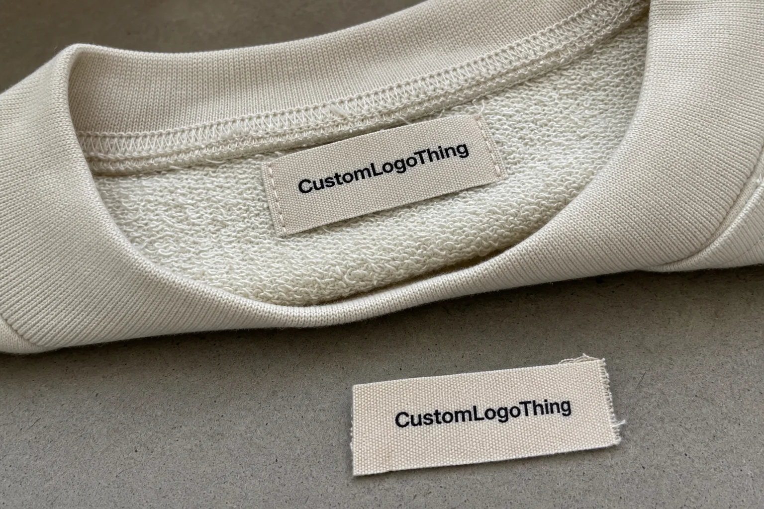
The neck area is one of the first surfaces that touches skin, which makes it unusually sensitive from a comfort standpoint. A label that sits flat and uses a soft back feels almost invisible. One with thick edges, dense stitching, or poor fold placement can irritate the wearer every time the garment moves. That irritation may sound minor on paper, but it is one of the fastest ways to make a well-made item feel cheaper than it is.
In practical terms, custom neck labels are the branded identifiers placed inside apparel, usually at the back neckline. They replace or cover generic manufacturer tags and may include the brand name, size, fiber content, country of origin, and care information. They help with presentation, but they also help the garment read as finished, especially in retail or wholesale environments where the inside details get inspected alongside the outside ones.
There is no single default style. Woven labels are chosen when detail and durability matter. Printed labels are chosen when softness matters more. Satin has a smoother hand and tends to read more polished. Heat-transfer or tagless systems remove the stitched tag entirely, which suits some activewear and minimalist basics, but not every fabric or finish can tolerate that process.
A neck label has three jobs at once: identify the brand, stay comfortable, and survive repeated washing. If it only does one of those well, the weak point shows up later as complaints, returns, or a rework cost that was avoidable from the start.
The right choice depends on how the garment is worn. A hoodie sold as loungewear can tolerate a different label profile than a fitted jersey tee worn all day, and a children’s garment usually needs a softer internal finish than a jacket or a structured overshirt. The label should follow the use case, not just the logo file.
How custom neck labels are made and applied
The production path is usually straightforward, but every stage affects the final result. Artwork is reviewed first for size, line weight, color count, copy length, and legibility at actual scale. The supplier then confirms the label type, fold or edge finish, attachment method, and any required regulatory copy. After proof approval, production starts, then the labels are cut, folded, packed, or prepared for heat application.
Sewn-in labels remain the most common choice. They are durable, accepted across most apparel categories, and easy for cut-and-sew teams to handle during finishing. The downside is physical bulk. The stitch line, fold, and seam placement all need to be planned together or the label can twist, poke out, or feel thicker than expected once it is sewn into the neckline.
Heat-applied labels are useful when the goal is a cleaner interior. They work well on many performance fabrics and on minimalist basics where a tagless feel is part of the design. That said, they depend on the right adhesive system, proper heat and pressure, and a fabric that can tolerate the process without warping, glossing, or delaminating later.
Artwork translation is one of the first places where buyers get caught off guard. A logo that looks sharp on a screen can lose definition when the weave is too dense or the line weight is too fine. Small legal copy can become unreadable after folding. Some suppliers have limits on Pantone matching, thread color count, or icon size. Those limits are normal production constraints, not a sign of poor capability.
Good quality control checks usually cover color consistency, edge finish, stitch placement, adhesive strength, and wash testing. For apparel headed into retail, the most useful check is the one that predicts what happens after repeated laundering. The low-grade failure is rarely dramatic; more often, it is a label that curls, frays, or peels just enough to make the garment look tired before it should.
Materials, finishes, and sizing choices that matter
Material choice drives hand feel and lifespan. Woven damask is widely used because it handles fine detail well and holds up through repeated washing. Satin feels smoother and suits brands that want a softer interior finish. Cotton can support a natural look, though it is not always the best option for a label that has to stay crisp after repeated wear. Printed labels are flexible, soft, and often practical for small runs or for brands that want to keep the inside finish as light as possible.
Finish style changes the experience more than many first-time buyers expect. A center fold or end fold can tuck neatly into a seam. A cut edge can work, but if the construction is not handled well it may fray or feel rough over time. Heat-seal finishes are common in tagless systems, yet they need the right fabric and the right application settings. The real test is simple: does the label stay flat, stay readable, and stay comfortable after laundering?
Size is not just a design preference. It affects legibility, comfort, and cost. A label that is too narrow forces the text to shrink. One that is too tall can crowd the neckline seam or distort once it is sewn in. A good spec starts with the garment, then adapts the artwork to the available space. Forcing a standard template into every style usually creates problems that show up only after production.
For buyers comparing options, the tradeoffs usually look like this:
| Label type | Best use | Hand feel | Durability | Typical budget note |
|---|---|---|---|---|
| Woven damask | Premium basics, detail-heavy logos | Smooth to moderate | High | Often best value at larger quantities |
| Satin | Fashion apparel, softer inside finish | Very soft | Moderate to high | Good balance for many mid-range brands |
| Cotton | Natural-looking apparel, heritage styling | Soft, matte | Moderate | Can be cost-effective depending on construction |
| Printed / tagless | Performance wear, kidswear, minimal branding | Very soft | Depends on ink or transfer system | Often efficient for small to mid-size runs |
If the garment will ship in custom printed boxes, with inserts, or with other premium packaging design details, the label should match that level of finish. A soft tee with a stiff label feels inconsistent. A clean, low-profile neck label makes the inside and outside of the product read as one design decision rather than two separate ones.
Skin sensitivity also matters. A finish that looks refined on a sample board can still irritate someone who wears the garment all day. That is one reason many brands choose lighter constructions or printed systems for everyday basics. The customer does not care that the label was technically premium if it gets scratched every time the shirt is worn.
Cost, pricing, and MOQ for custom neck labels
Pricing usually turns on a few variables: material, size, color count, finish, quantity, and whether application is included. A simple woven label at volume can be inexpensive. A small run with several colors, special folding, or heat application will cost more per unit. That is not a sign of inefficiency; it is how setup-heavy manufacturing works.
MOQ, or minimum order quantity, matters as much as unit price for many brands. A lower cost per label does not help if the minimum is far above what the launch needs. The opposite problem is just as common: ordering too few labels means setup charges, freight, and sampling costs loom too large relative to the order itself.
Higher quantities generally lower the unit cost because setup is spread across more pieces. Smaller orders often carry fixed fees for loom setup, print setup, artwork prep, or machine calibration. Custom color matching, a special fold, or pairing the labels with other branded components can move the quote more than buyers expect. A quote that looks cheap at first glance can become expensive once all the finishing and delivery pieces are added.
For budgeting, ask for the landed cost, not only the label price. If application is included, labor may matter as much as the label itself. A useful quote should show the material, finish, unit price, setup charges, lead time, and shipping method. Without that, price comparisons are usually misleading.
As a practical range, simple programs at higher volume can land in the cents per unit, while smaller or more complex orders often move into the teens once setup and finishing are included. That range is broad because the spec matters more than the category. A 20 mm woven label with a single-color logo behaves very differently from a tagless label with regulatory copy and a Custom Heat Transfer system.
There is also a hidden cost in bad specs. If the label is too wide for the neckline, too thick for the seam, or too detailed for the chosen material, the issue may not appear until the garment is assembled. That is when rework becomes more expensive than a better decision would have been at the quote stage.
Process and timeline: from proof to delivery
The timeline usually begins with artwork review and ends with packed labels or finished garments. A standard flow looks like this:
- Submit artwork, dimensions, quantity, garment type, and attachment method.
- Receive a proof that shows size, layout, copy, and finishing details.
- Approve or revise the proof before production starts.
- Move into manufacturing, cutting, finishing, and packing.
- Receive the shipment or schedule the labels for garment assembly.
Lead times vary with complexity and approval speed. Straightforward orders can move quickly once the proof is approved, while woven labels with detailed artwork, special folds, or custom application need more time. A typical straightforward order may finish in about 1 to 2 weeks after approval; more complex runs or mixed programs can take longer, especially if the label has to coordinate with hang tags, inserts, or other packaging components.
What slows a project down most is rarely the machine time. It is missing measurements, unclear artwork, late copy changes, and delayed proof approval. Production can only run as cleanly as the information it receives. If the garment type, label size, and attachment method are not fixed early, the quote may be technically correct but practically unusable.
The proof should be treated like a production document, not a loose mockup. If the logo sits too close to the edge, if the size mark is too small, or if the fold interferes with the seam allowance, that should be corrected before the order is released. Catching those issues at proof stage is cheaper than catching them after the labels are already in the garment room.
For brands that manage multiple suppliers, it helps to keep the label spec tied to the broader packaging workflow. The same discipline used for carton sizing, insert proofing, and transit checks applies here as well. Industry references such as the ISTA community for transit testing and FSC guidance for paper-based components can help teams ask better questions, even though they do not replace a supplier quote or a fit-for-purpose spec.
Common mistakes buyers make with neck labels
One of the easiest mistakes is shrinking the artwork too far. A logo that looks clean in a mockup can become unreadable once production limits are applied. If the label also needs size information, care copy, or country-of-origin details, the layout gets crowded fast. Small text is the first thing to fail when the fold, stitch line, or wash cycle starts working against it.
Another common issue is choosing the material before deciding how the garment feels on the body. A woven label may be correct for a premium jacket and wrong for a soft tee. A very soft print system may be right for a comfort-first basic, but not durable enough for heavy laundering or retail handling. The material should match the wearing context, not the mood board.
What gets missed in approvals
Buyers often approve artwork without locking down dimensions, Pantone limits, or edge details. That creates avoidable problems later. What looked close enough on screen may not match the actual production format, and once the order is released, changes can trigger delay or extra cost.
What gets missed in application planning
Some brands focus on the label itself and forget the attachment method. That becomes a problem when a label is technically correct but awkward to sew, too bulky for the neckline seam, or not suited to heat application. Planning the application method early keeps the label aligned with the garment build instead of fighting it.
It is also wise to request a sample or production proof when the label will represent a premium line. A physical sample shows softness, opacity, sheen, edge behavior, and how the fold sits in real fabric. Digital mockups cannot show those things well, and that gap is where many disappointments start.
Expert tips for cleaner branding and smoother reorders
Standardizing one core neck label system across related product lines makes reorders easier and keeps the brand visually consistent across tees, hoodies, and accessories. From a production point of view, consistency also reduces rework because dimensions, copy placement, and fold logic can be reused without rethinking the file every time.
Keep a master spec file with artwork, dimensions, Pantone references, approved copy, and the final attachment method. That simple habit saves time later, especially when team members change or the brand starts ordering through multiple suppliers. A clean file usually produces a cleaner reorder.
Design for the actual garment rather than a blank template. A label that fits neatly in a mockup may sit differently once it is sewn into a ribbed neckline, a lined hood, or a stretch panel. Fabric tension and seam placement matter more than most buyers expect. The label should be tested against the garment construction, not only against the artwork.
For basics, loungewear, and premium casualwear, softer materials and cleaner backs are often worth the added cost. That is not true for every category, but it is true often enough that comfort should stay near the top of the decision list. The least successful labels are usually the ones that look perfect on paper and feel wrong in the hand.
Simpler layouts also produce better results. High contrast, clear type, and fewer tiny details hold up better in weaving and printing. A neck label is not just decoration; it is one piece of the full branding system, alongside hang tags, garment construction, and the rest of the branded packaging.
Next steps for ordering custom neck labels
If you are requesting pricing, gather the essentials first: garment type, label dimensions, quantity, preferred material, artwork, and whether the label will be sewn or heat-applied. With that information in hand, the quote is more accurate and the back-and-forth drops sharply.
It also helps to compare two or three spec options before making a final decision. One version may be softer. Another may be cheaper at volume. A third may fit the retail presentation better because it aligns with the rest of the brand system. The right choice usually comes from comparing those tradeoffs honestly rather than assuming the lowest unit price is the strongest value.
Before approving production, ask for a proof that shows copy placement, sizing, fold or finish details, and any color matching limits. If the supplier offers application, confirm whether it is included or priced separately. Those details change both the final look and the real landed cost, which is why they should be settled early.
For many brands, the strongest custom neck labels are the ones specified around how the piece will be worn, washed, sold, and packed. That is the difference between a label that merely identifies the garment and one that supports the entire product experience.
What are custom neck labels used for in apparel?
They identify the brand inside the garment, replace generic manufacturer tags, and help create a cleaner, more premium inside finish. They can also carry size, care, and compliance information when the layout allows it.
Which material is best for custom neck labels on soft T-shirts?
Soft woven, satin, or printed options are common because they reduce scratchiness against the skin. The best choice depends on the fabric, wash frequency, and whether the label is sewn or heat-applied.
How much do custom neck labels usually cost?
Cost depends on material, size, print or weave complexity, finishing, quantity, and whether application is included. Larger orders usually lower the unit cost, while small runs can carry setup or minimum-order charges.
What is the typical turnaround for custom neck labels?
Turnaround depends on proof approval speed, quantity, material choice, and whether the labels need sewing or heat application. Straightforward orders can move in 1 to 2 weeks after approval; more complex runs usually take longer.
What should I send when requesting a quote for custom neck labels?
Send garment type, label dimensions, quantity, artwork, preferred material, attachment method, and your deadline. Including these details helps the supplier quote accurately and reduces back-and-forth before production begins.