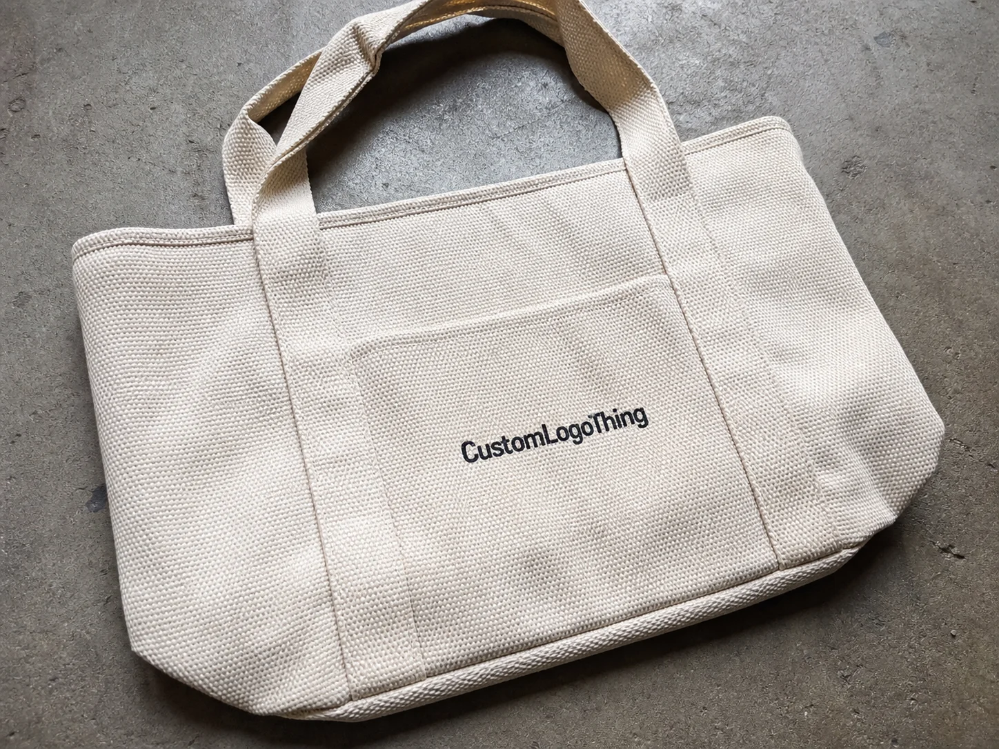
Custom photo tote bags do a surprisingly efficient job: they carry a product, a memory, and a brand message in one object. That is why they keep showing up in retail, events, artist merch, museum shops, and gift programs, even when cheaper disposable bags are available.
The category looks simple from a distance. Then the artwork gets bigger, the image gets more detailed, and the weaknesses start to show. A clean logo can hide a lot. A portrait, product shot, or scenic print cannot. Once a buyer moves into custom photo tote bags, the details matter in a way that standard one-color totes never require.
The real challenge is not choosing a bag. It is getting the image, material, and construction to support one another so the finished piece feels intentional rather than improvised.
What Makes Photo Tote Bags Different from Standard Printed Bags
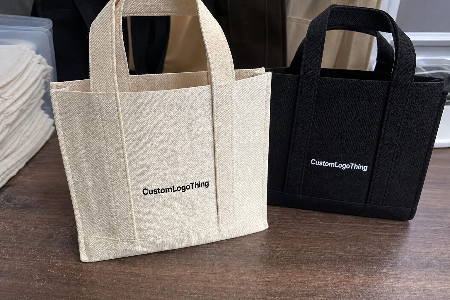
Photo totes are asked to do more than carry a logo. They need to reproduce faces, gradients, textures, product details, and sometimes a full scene across a soft, foldable substrate. That is a harder job than most buyers expect. A small shift in tone may be invisible on a simple word mark, but it can make skin look unnatural or turn a crisp product image muddy.
The practical difference shows up in the way people use them. At a trade show, the bag carries literature. At retail, it becomes part of the purchase experience. Later, it may be reused for groceries, commuting, or storage. That repeated use is a marketing advantage, but only if the bag still looks good after it has been opened, folded, and carried a few times.
Custom photo tote bags are usually chosen when the image itself is the message. That includes artist portraits, branded photography, seasonal campaigns, event souvenirs, and premium gift packaging. A tote with a memorable image tends to be kept longer than one with text alone, which gives it more chances to be seen.
Compared with standard printed bags, the photo version has a narrower margin for error. Four variables control most of the outcome:
- Print method — digital, screen, heat transfer, or sublimation
- Material — cotton, canvas, polyester, or nonwoven polypropylene
- Image quality — resolution, contrast, and file format
- Order size — setup cost spread, unit price, and production flexibility
That is why tote sourcing is never just a bag decision. It is a packaging decision with image requirements attached.
How the Printing and Production Process Works
Most tote orders follow a familiar path: artwork submission, file review, proofing, printing, finishing, inspection, and packing. Photo-heavy designs demand more attention in the front half of that process because the file has to survive enlargement, substrate texture, and ink behavior all at once.
For detailed images, digital printing is often the most practical choice. It handles gradients, portraits, and tonal shifts without forcing the artwork into a limited color count. Screen printing can still be a good option for simplified artwork or stylized photo treatments, but it is less forgiving when the design depends on subtle shadows or skin tones. Sublimation is usually strongest on polyester and similar synthetic fabrics because it bonds the image into the material rather than sitting heavily on top of it.
File preparation matters more than many buyers realize. A design that looks sharp on a monitor may blur once enlarged onto a tote panel. For most jobs, 300 dpi at final size is the safest target when possible. The file should also include clean bleed, proper crop marks if requested, and a clear print-safe area away from seams and handles.
A proof can look polished on a screen and still fall apart on fabric. Screens emit light; fabric absorbs ink and introduces texture. That change affects both sharpness and color.
This is why mockups are useful, but not as a decorative extra. A good mockup shows whether the image is placed too close to a seam, whether a face lands awkwardly across a fold, and whether the focal point is large enough to be read from a few feet away. The same logic applies across branded packaging: a file can be technically correct and still look wrong once it is printed.
Most suppliers should be able to provide a proof review. For orders where color accuracy matters, a strike-off or sample is worth requesting, even if it adds time and cost. Good checkpoints include:
- Prepress review for resolution, bleed, and layout issues
- Proof approval for placement, crop, and color intent
- Printing checks for density, registration, and banding
- Final inspection for visible defects before packing
That inspection stage matters because print errors repeat across the whole run. If the placement is off by a few millimeters or the file is too soft, every bag carries the same mistake.
Key Material, Image, and Construction Factors That Affect Results
The material changes how the image reads. Cotton and canvas have a natural, premium feel, but their texture can soften fine detail. Polyester usually reproduces sharper detail and more vivid color, especially with sublimation or certain digital methods. Nonwoven polypropylene is common for promotional use because it keeps costs down, though it rarely delivers the same visual depth as a woven fabric.
If the tote is intended as a gift or retail item, material choice carries as much weight as the artwork. A beautiful photo on a thin, utilitarian bag creates a mismatch that buyers notice immediately.
Image quality is the second major constraint. A phone image may look fine on a small screen and still fail at tote size. Enlargement reveals blur, compression artifacts, and weak contrast. Busy backgrounds, low-light photos, and soft-focus subjects tend to print poorly. Strong focal points, better separation between subject and background, and clear edges produce more reliable results.
Color management deserves more attention than it gets. Most design files start in RGB, which can look brighter on screen than the final print will appear. Production usually converts the artwork into a print workflow such as CMYK or another press-specific process. Saturated blues, reds, and neon tones often shift during that conversion. Skin tones and delicate gradients are especially vulnerable. If brand color is a priority, ask how closely the supplier can match it on the chosen material before approval.
Construction details matter just as much as print quality. They are easy to overlook on a quote, and they can affect both appearance and usability.
- Gussets add depth but can distort artwork if the image crosses a fold
- Handle length affects shoulder carry comfort and retail usability
- Seam placement can cut through important parts of a photo if the layout is not planned carefully
- Print-safe zones help keep the image away from stitching and edge loss
Bag shape changes the visual result too. A portrait centered on a flat mockup may feel balanced in the file, then look awkward once the tote is full and the front panel bends. Experienced buyers think about the bag as a container first and a print surface second. Both have to work together.
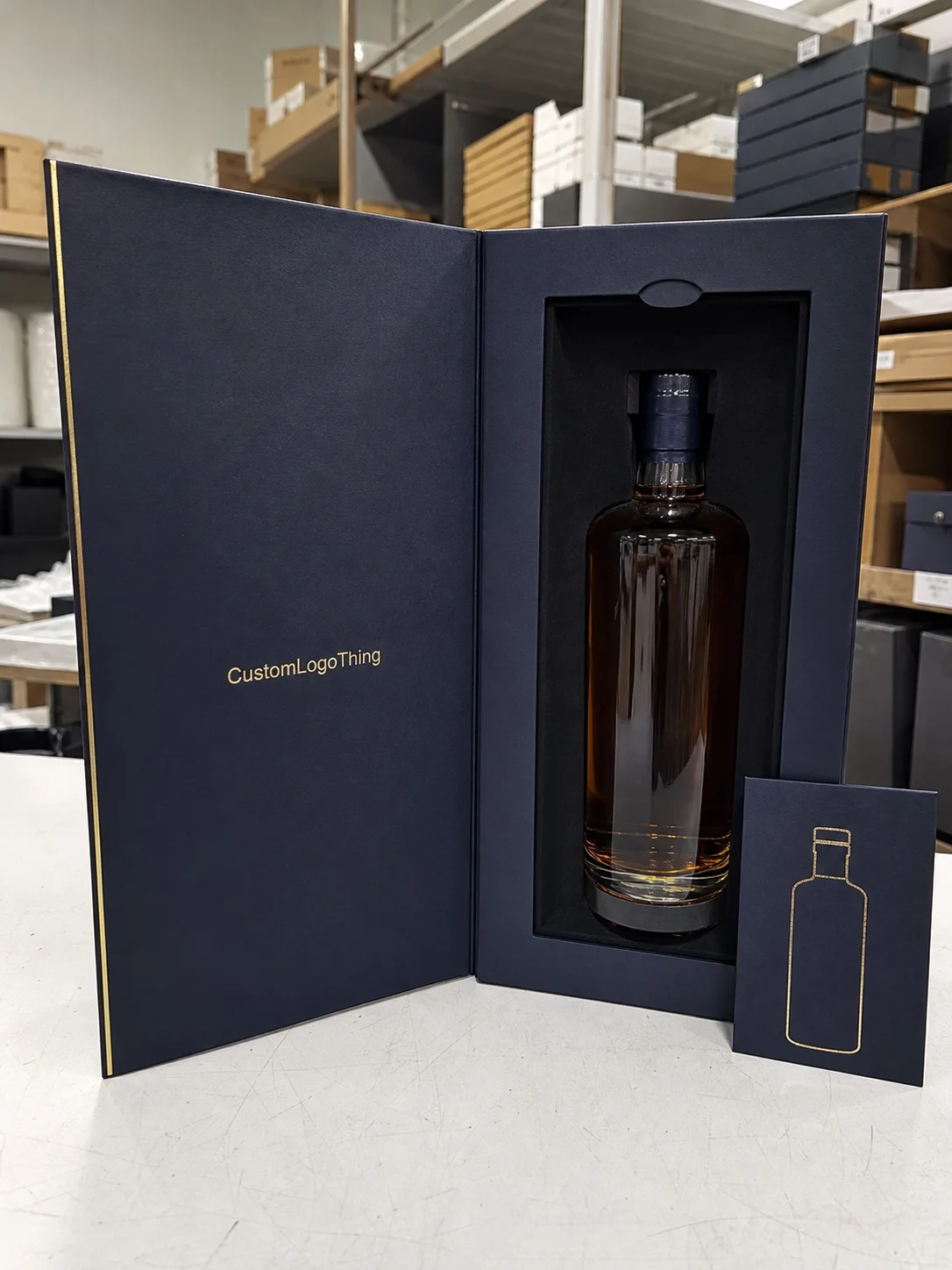
For premium gifting or resale, the material should match the value of the image. A high-resolution product photo printed on a flimsy bag creates a strange disconnect. Good packaging avoids that tension by making the image, structure, and hand feel point in the same direction.
For buyers who care about sourcing documentation, adjacent packaging categories offer a useful reference point. Material transparency, recycled content claims, and certification language are common purchase considerations across packaging, and similar questions often come up with textile bags. The Institute of Packaging Professionals offers practical industry context, and the Forest Stewardship Council is a useful benchmark when material claims need independent reference.
| Material | Print Appearance | Typical Use | Buyer Tradeoff |
|---|---|---|---|
| Cotton | Soft, natural, slightly textured | Gifts, lifestyle brands, retail | Comfortable and familiar, but fine detail can soften |
| Canvas | More body, good image presence | Higher-value promotional bags | Better structure, usually higher cost |
| Polyester | Sharp detail, vibrant color | Photo-heavy promotional work | Less natural hand feel than cotton |
| Nonwoven polypropylene | Practical, less photographic depth | Events, giveaways, short-term use | Lowest cost, lower perceived value |
Pricing, MOQ, and Unit Cost Explained
Pricing for custom photo tote bags depends on five main inputs: print method, image complexity, bag material, size, and finishing. A full-color print on canvas will cost more than a simple logo on nonwoven polypropylene. That is obvious in principle, but the gap can still surprise buyers when the quote arrives.
As a rough planning range, small custom runs often land around $1.20 to $3.50 per unit, depending on Material and Print coverage. Larger orders can fall below that once setup costs are spread across more bags. A 5,000-piece run usually brings the unit cost down, but only if the artwork is straightforward and the construction is standard. Heavy ink coverage, specialty finishes, or complex assembly reduce those savings quickly.
MOQ is the minimum order quantity, meaning the smallest run a supplier can produce at a practical cost. Lower quantities usually carry a higher per-unit price because the setup, proofing, and machine time are divided across fewer pieces. A 100-piece order can look expensive next to a 1,000-piece order for that reason alone.
Setup charges deserve close attention. Some quotes look attractive at the unit level and then add artwork prep, plate or screen fees, sample charges, or proof revisions. Those fees are not hidden in a shady sense; they are simply part of the real job cost. A useful quote should separate:
- Setup or prepress fees
- Unit price
- Shipping
- Rush charges
- Sample or strike-off fees
There is also a packing cost that many buyers miss. Polybagging, carton labeling, retail-ready folding, and bundle counts can change the final total. In package branding and promotional fulfillment, these details affect both presentation and labor. If the tote is meant to be sold at retail, the quote should reflect how it needs to arrive, not only how it is printed.
A simple planning frame helps keep the pricing conversation focused:
- Giveaway — prioritize unit cost and acceptable print quality
- Retail item — prioritize image fidelity, material feel, and finish
- Premium gift — prioritize structure, color accuracy, and presentation
Once the use case is clear, the quote becomes easier to evaluate because the tradeoffs are visible.
Step-by-Step Order Process and Timeline From Artwork to Delivery
A clean order process saves more time than most teams expect. Before requesting a sample or quote, confirm quantity, bag size, print area, artwork format, and deadline. If those details are vague, the estimate will be vague too.
The usual workflow looks like this:
- Intake — artwork, quantity, dimensions, and use case are submitted
- Prepress review — the supplier checks resolution, bleed, and placement
- Digital proof — the layout, crop, and color intent are reviewed
- Approval — production starts after sign-off
- Printing and curing/drying — the timing depends on ink and material
- Finishing and inspection — handles, seams, and print quality are checked
- Packing and shipping — cartons are labeled and sent out
For straightforward orders, a typical turnaround is often around 12 to 15 business days from proof approval. That can stretch if the artwork needs revisions, the substrate is out of stock, or the order lands during a busy retail season. Rush orders are possible in some cases, but they usually reduce the room for revision and raise the cost.
Several variables can change the schedule:
- Image complexity and whether the chosen print method can handle it cleanly
- Stock availability for the selected bag style and color
- Seasonal demand around holidays, launches, and event peaks
- Revision count after the first proof
Buyers can speed things up in practical ways. Send a high-resolution file, keep the layout simple, and limit revision requests to the points that actually matter. If the bags are tied to a launch or event date, build in buffer time. A small delay on proof approval can easily become a missed deadline.
Common Mistakes Buyers Make With Photo Tote Orders
The first mistake is using a low-resolution photo because it looks fine on a monitor. Once enlarged onto a tote panel, it can turn soft or pixelated. The second is choosing a dark bag color without checking contrast. A portrait or product image can disappear into the background if there is not enough separation.
Seam placement is another common problem. If a face, logo, or key visual element crosses a fold, the bag can look slightly off even when the file was technically acceptable. Good proofs catch that issue, but only if the buyer reviews placement carefully rather than approving the layout on speed alone.
Some buyers also forget to match the bag to the actual use case. A tote meant to carry bottles, catalogs, or boxed products needs different construction than one used for lightweight handouts. Handle strength, gusset depth, and overall body matter if the bag is expected to carry weight.
Skipping proof review is costly for another reason: printers can reproduce the file, but they cannot guess the intent behind it. They do not know which crop you prefer, whether the shadow should be warmer, or whether the subject should read larger on the panel. Late approval is another easy way to lose control of both schedule and quality.
Most of the expensive mistakes come from treating the tote like a minor accessory. It behaves much more like product packaging than a blank bag. The image, structure, and timeline interact, and one weak link can pull the whole job down.
Expert Tips for Better Artwork, Value, and Reorder Results
One strong focal image usually works better than a busy layout. If the tote carries a portrait, product shot, or scenic brand image, give that image room to breathe. White space is not wasted space; it helps the artwork read faster and makes the bag feel more premium.
If the budget or production method may change, prepare a second version of the artwork. One version can be built for full-color photo realism. The other can be simplified for a different print process or lower-cost run. That extra file often saves time when a quote comes back with different production assumptions than expected.
Request a proof that shows scale, crop, and color before final approval. A good proof will not answer every question, but it should settle the main ones: Does the image sit correctly? Are the colors close enough? Do any seams or handles interfere with the composition?
Match the bag style to the audience. Premium event bags can justify heavier material, stronger handles, and more detailed imagery. Mass giveaways usually benefit from simpler construction and lower unit cost. The same logic applies across retail packaging: the outer container should feel aligned with the value of what the customer is receiving.
Keep a record for every reorder. Save the approved file version, proof, dimensions, material choice, and any supplier notes. Reorders tend to go wrong when teams rely on memory instead of documentation. A clean record removes that problem before it starts.
Durability matters because it affects brand exposure. A tote that holds up gets reused, folded, carried, and seen again. In packaging terms, those second and third impressions can be more valuable than the first. That is one reason a well-made tote often outperforms a short-lived handout.
If you are comparing tote options inside a broader sourcing plan, it can help to look at related product packaging decisions at the same time. Custom tote choices often sit alongside Custom Packaging Products when a brand wants consistent presentation across events, retail, and fulfillment.
What to Check Before You Request a Quote
Before sending artwork, confirm the bag material, size, print area, quantity, and use case. Those five details shape the quote more than almost anything else. A supplier can usually work from partial information, but the estimate is far more useful when the buyer has already decided what the bag needs to do.
Also check three practical limits early: how much detail the chosen print method can reproduce, whether the image contains enough contrast for the selected material, and whether the timeline allows for proof changes. If any of those answers are uncertain, the job should be scoped more carefully before production begins.
A quote request becomes much stronger when it includes:
- Final bag dimensions
- Artwork size and file format
- Target quantity and reorder expectation
- Preferred material and handle style
- Required delivery date
That information does not just help pricing. It also reduces the chance of getting a bag that looks good in theory and disappointing in the hand.
FAQ
What file format is best for photo tote artwork?
High-resolution vector files are ideal for logos and text, while photo art usually works best as a high-resolution raster file, often TIFF, PSD, or a print-ready PDF depending on the supplier’s workflow. The critical factor is resolution at final size.
Can a tote handle full-color photos well?
Yes, but the result depends on the print method and material. Polyester generally handles photo detail more sharply than textured cotton or canvas. If the image uses subtle gradients or skin tones, proofing becomes especially important.
How long do custom photo tote bags usually take to produce?
A straightforward order often takes around 12 to 15 business days after proof approval. Complex artwork, stock shortages, or rush scheduling can change that timeline.
Why do two quotes for the same tote look so different?
One quote may include setup, sample costs, shipping, or better finishing. Another may only show the base unit price. The cheapest-looking quote is not always the lowest total cost.
Which material is best for premium-looking photo bags?
Canvas and heavier cotton often feel more premium in hand, while polyester usually delivers stronger image sharpness. The right choice depends on whether the priority is tactile quality or photo fidelity.
What is the biggest mistake buyers make?
Approving artwork too quickly. Most problems can be traced back to low-resolution files, weak contrast, ignored seam placement, or a proof that was reviewed too casually.