Buyer Fit Snapshot
| Best fit | Custom Retail Cartons Made from Kraft projects where brand print, material claims, artwork control, MOQ, and repeat-order consistency need to be specified before quoting. |
|---|---|
| Quote inputs | Share finished size, material target, print colors, finish, packing count, annual reorder estimate, ship-to region, and any compliance wording. |
| Proofing check | Approve dieline scale, logo placement, barcode or warning zones, color tolerance, closure strength, and carton packing before bulk production. |
| Main risk | Vague material claims, crowded artwork, missing packing details, or unclear freight terms can make a low unit price expensive after revisions. |
Fast answer: Custom Retail Cartons Made from Kraft: Board, Finish, Dieline, and Unit Cost should be specified like a repeatable production item. The safest quote records material, print method, finish, artwork proof, packing count, and reorder notes in one written spec.
Production checks before approval
Compare the actual filled-product size with the drawing, then confirm tolerance on folds, seals, hang holes, label areas, and retail display edges. Reserve space for logos, QR codes, warning copy, and material claims before decorative graphics fill the panel.
Quote comparison points
Review material grade, print process, finish, sampling route, tooling charges, carton quantity, and freight assumptions side by side. A quote is only useful when the supplier can repeat the same color, closure quality, and packing count on the next order.
Custom retail cartons made from kraft tend to speak in a lower register than glossy packs, yet on a crowded shelf they can pull attention fast. That matters because packaging rarely gets a long introduction; shoppers see the carton, clock the texture, register the shape, and decide whether the product feels worth picking up.
From the buyer side, custom retail cartons made from kraft do three jobs at once: they protect the product, carry the brand, and suggest a material story that feels grounded rather than theatrical. Teams comparing Custom Packaging Products often start here because kraft can deliver a natural look without giving up structure, accurate print, or practical handling.
The phrase custom retail cartons made from kraft covers more ground than a lot of teams expect. A folding carton for a candle, a sleeve-and-tray build for cosmetics, and a mailer-style carton designed for retail display all use kraft in different ways. The substrate family may be similar, but the board grade, print method, finish, and structure change the outcome more than most first sketches suggest.
That is why this topic works best as a packaging decision, not as a mood board. Natural fiber texture can make branding feel honest, but it can also expose weak artwork, poor die lines, or a board chosen for convenience instead of performance. The strongest custom retail cartons made from kraft make the product look deliberate. The weak ones just look brown, which is kind of the worst possible middle ground.
What custom retail cartons made from kraft are
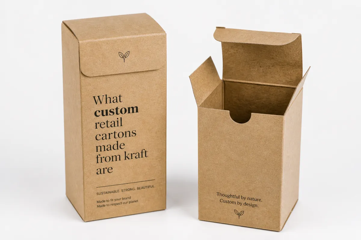
Custom retail cartons made from kraft are retail-ready paperboard or corrugated cartons built from kraft-based stock, selected for their fiber appearance, structural usefulness, and often a more recyclable profile. In practice, that might mean a light folding carton for a small consumer item, a sturdier wrap around an insert tray, or a mailer-style retail carton that still looks presentable after it leaves the shipping lane.
What separates them from standard boxes is the combination of fit, print, and presentation. A stock brown box can move product from one place to another. Custom retail cartons made from kraft are shaped to hold the item, frame it, and communicate the brand before a shopper reads a single claim. That first impression carries real weight in product packaging, especially in categories where five similar items sit within arm's reach of one another.
Kraft does not shout, and that restraint is part of the appeal. The natural tone, the visible fiber pattern, and the muted surface can communicate authenticity faster than a high-gloss coating. For many retail teams, that quieter look is useful because it creates room for typography, illustration, or a single strong brand mark to do the heavy lifting. In a category filled with bright competitive noise, a calm carton can feel more premium than a louder one.
There is also a technical side to the term. Kraft can refer to uncoated paperboard, recycled kraft liner, white-backed kraft, or corrugated structures that use kraft liners with a fluted middle. The right choice depends on what the carton needs to do. A lightweight soap carton may only need a few hundred microns of board thickness, while a larger retail-ready shipper may need corrugated construction, locking tabs, or a reinforced insert. The label is the same, but the engineering is not.
For teams building a packaging line, it helps to think about use case first and material second. If the carton is only a shelf carton, appearance and print fidelity may matter more than crush resistance. If the carton also needs to survive e-commerce handling, then edge strength, corner protection, and closure performance become more important. That is why custom projects often begin with a sample or dieline review rather than with artwork alone.
Another useful distinction is between purely protective packaging and retail packaging that must sell. A kraft shipper can absolutely be custom, but if it never faces the consumer it may not need the same finishes, visual balance, or layout discipline as a carton sitting under bright store lighting. In retail, every panel counts. Even the tuck flap can matter if it is visible during display or opening.
How custom retail cartons made from kraft work on the shelf
On the shelf, custom retail cartons made from kraft work because they create a tactile pause. Shoppers pick up what looks stable, intentional, and easy to understand. Kraft stock supports that effect by signaling material honesty, and it does so without requiring aggressive embellishment. The carton does not need to pretend to be luxury; it only needs to look considered.
Structure is a big part of that performance. A folding carton with clean folds, well-tuned score lines, and accurate glue placement feels reliable even before the contents are revealed. If the carton has a window, insert, or opening feature, the opening sequence can become part of the product experience. Many retail cartons use tuck-end closures because they are efficient and common, but straight tuck, reverse tuck, auto-bottom, sleeve, and two-piece styles are all typical depending on the product weight and display plan.
Visual hierarchy matters just as much. Kraft backgrounds usually reward clear typography, strong contrast, and concise copy. A design that depends on tiny copy blocks or subtle color gradients may lose impact because the natural board already brings texture and tone variation. Successful cartons often use one focal point on the front panel, a clear product name, and a hierarchy that reads from three feet away first and from hand-held distance second.
That does not mean kraft limits design. It simply shifts the design logic. A warm brown substrate can make black, deep green, navy, or muted red feel grounded and tactile. White ink can be used for contrast on darker kraft tones, although coverage and opacity should be tested because results vary by stock and print method. When the brand wants a premium finish, a restrained foil accent, embossing, or spot varnish can add emphasis without erasing the material character.
Retail environments also expose weak print choices quickly. High-coverage solids may show more texture on uncoated kraft, and fine reversed text can fill in if the artwork is too delicate for the chosen process. That is why proofing is so important. A design that looks clean on screen may need adjustments to line weight, trapping, or ink density before it prints well on actual board.
Good shelf performance also depends on the carton being easy to handle. If the product is small and frequently touched, the carton should open and close cleanly without frayed flaps or loose tabs. If the carton is meant to hang, stack, or face out in a display tray, then the bottom geometry and panel stiffness should support that use case. Practical retail packaging succeeds when the carton keeps its shape after repeated handling, not just when it looks good out of the carton pack.
For brands that want help selecting the right retail structure, browsing Custom Packaging Products can be a useful starting point because it helps compare carton styles before artwork decisions are finalized. That often saves time later, especially when the packaging needs to fit both shelf requirements and fulfillment constraints.
Key factors that affect strength, print, and sustainability
Several variables determine whether custom retail cartons made from kraft feel sturdy, print cleanly, and support sustainability goals in a believable way. The most obvious one is board grade. Kraft paperboard commonly ranges from lighter folding carton boards to heavier chipboard or corrugated constructions. In practical terms, many folding cartons fall somewhere around 14 pt to 24 pt, while corrugated retail cartons might use E-flute, B-flute, or a double-wall structure if the product is heavier or more vulnerable to compression.
Thickness alone does not tell the whole story. A carton's strength depends on fiber quality, board direction, scoring, glue area, and the way the shape distributes load. A well-designed lighter carton can outperform a heavier but poorly scored one. Likewise, a carton with smart insert support may protect a fragile product more effectively than a thicker board with no internal stabilization. For that reason, structural testing is usually more valuable than guessing from board weight alone.
Print performance is another major factor. Kraft accepts several common print methods, including flexographic, offset, digital, and sometimes screen or special accent printing. The best choice depends on quantity, coverage, and artwork complexity. Digital printing is often useful for shorter runs or variable versions. Offset printing is often preferred when image quality and color consistency are priorities. Flexo can be practical for larger runs and simpler graphics, especially on corrugated structures. The surface and ink system together determine whether colors stay crisp or look muted.
Uncoated kraft brings character, but it also changes color behavior. Warm tones can shift slightly, dark colors may absorb differently than they do on coated stock, and fine gradients may appear less smooth. That is not a defect so much as a material reality. Teams that expect exact brightness or glassy saturation should plan for print samples and adjusted color targets. A common approach is to keep artwork simple, use bold type, and leave some board visible so the kraft substrate contributes to the visual story instead of fighting it.
Finishes matter too. Aqueous coating is often used when a little surface protection is needed without creating a plastic-heavy feel. Matte varnish, soft-touch coatings, embossing, debossing, and selective foil can all add depth if used carefully. The right finish depends on whether the carton should feel rustic, modern, premium, or somewhere in between. In many cases, a light protective coat is enough for scuff resistance during distribution, while heavy lamination is only necessary when moisture, abrasion, or repeated handling is more severe.
Sustainability claims should stay practical. Kraft is often chosen because it can fit into widely recognized paper recovery streams, and recycled content is common in certain grades. Still, the actual recyclability of a carton depends on inks, coatings, liners, adhesives, windows, and local collection systems. A carton with minimal coating and simple construction is usually easier to explain than one with many mixed components. If sustainability is part of the value proposition, the packaging brief should define what the claim means in plain terms and avoid overpromising.
Closure style and secondary materials also influence performance. A carton with no plastic insert may be simpler to recycle, but it might need a custom paperboard insert to keep the item centered. A glue dot, paper seal, or tear strip might improve retail handling, yet each extra component needs to justify itself. The best cartons usually find a balance between structure and simplicity so the packaging looks thoughtful without becoming wasteful or fragile.
Process and timeline: from dieline to delivery
The typical process for custom retail cartons made from kraft starts with product dimensions, retail requirements, and a clear idea of what the carton must accomplish. Before artwork gets too far, the packaging team usually confirms the product's length, width, height, weight, and any special needs such as hanging tabs, tamper evidence, or inner support. Those details shape the dieline more than the artwork does.
From there, a supplier or packaging partner often develops a structural concept. This may be a standard folding carton style adapted to the item, or a more custom build if the product shape is unusual. A dieline helps visualize panel sizes, flaps, scores, and glue areas. It is usually wise to review the dieline as a flat template before approving graphics, because even a small change in panel size can shift copy placement, barcodes, or legal text. That is especially true on cartons where the front, back, and side panels all carry important information.
Once the layout is approved, sample production usually comes next. A plain structural sample or a digitally printed prototype can reveal fit problems, open-close behavior, and print placement concerns. This stage is where many packaging issues are caught cheaply. If a carton is too tight, the insert may need to be adjusted. If the graphics wrap unexpectedly around a fold, the artwork can be corrected before the press run begins. In practical packaging work, prototype review is rarely wasted time.
The timeline depends on complexity and quantity, but a common range for a straightforward custom carton project might be a few business days for dieline review, several more for sample approval, and then production after final signoff. Simpler jobs can move faster if the artwork is ready and the structure is standard. Projects with unusual finishes, multi-piece construction, or custom inserts often take longer. For larger runs or more detailed finishing, it is safer to plan for extra time rather than assume the fastest case.
After approval, production typically moves through printing, die cutting, finishing, and packing. During printing, color checks help confirm that the kraft stock is accepting ink as expected. During die cutting, the board is cut and scored so folds line up cleanly. After that, glueing or folding operations may be completed, and cartons are packed flat for shipping if the structure allows it. Flat-pack efficiency is one reason folding cartons are so common in retail: they save space before final assembly.
Quality checks are important at each stage. A good run usually includes inspection for registration accuracy, score quality, glue strength, dimensional consistency, and any scuffing from handling. If the product will be assembled at a co-packer, retail site, or fulfillment center, the cartons should be tested in that setting if possible. A design that looks fine on a sample bench can behave differently under production speed.
When planning the project, it is also smart to coordinate with the broader packaging set. If secondary packaging, inserts, labels, or shipping cartons are part of the system, aligning sizes and materials early can reduce waste and rework later. Many teams use one custom retail carton design as the anchor and then build supporting packaging around it, which usually creates a cleaner workflow overall.
Cost and pricing: what changes your quote
Pricing for custom retail cartons made from kraft usually comes down to a few predictable drivers. Quantity is one of the biggest. Lower-volume runs often cost more per unit because setup, tooling, and press prep are spread across fewer cartons. Higher-volume orders generally improve unit pricing, though storage, cash flow, and forecasting should be considered before committing to large quantities.
Board grade also affects cost. A heavier or higher-performing kraft board typically costs more than a basic lightweight option. If the carton needs better crush resistance, a special liner, or a more premium feel, that adds material expense. Corrugated retail cartons also have different cost profiles than folding cartons because the structure, cut style, and assembly steps differ.
Printing complexity can move the price more than teams expect. A one- or two-color layout is often more economical than full coverage artwork with multiple spot colors, detailed illustration, or white ink on kraft. Special finishes such as embossing, foil, soft-touch coating, spot varnish, or window application can add both material and labor cost. None of those features is inherently excessive, but each should earn its place in the brief.
Structure is another important driver. A simple tuck-end carton is usually less expensive than a carton with auto-bottom construction, internal locks, custom inserts, or multi-panel display features. If the design requires precise fit around a shaped product, then tooling and sample iterations may add cost before the first production run even starts. In many projects, the safest pricing assumption is that the more the carton has to do, the more it will cost.
Artwork preparation can influence the quote as well. If files are clean, dieline-ready, and properly separated for print, production tends to be smoother. If artwork needs technical corrections, barcode placement adjustments, or last-minute panel changes, the project may require more prep time. That does not mean design work should be rushed, only that it should be planned with the manufacturing method in mind.
Shipping and packing matter too. Flat-packed cartons are usually more efficient to transport than pre-assembled ones, but the carton style must allow that. Some projects also require palletization or protected packing to avoid edge damage in transit. When comparing quotes, it helps to ask whether shipping, warehousing, samples, and setup charges are included. A slightly higher unit price can still be better if it includes fewer hidden steps.
As a rough planning mindset, many teams budget for the structure first, then the print and finishing, and finally the logistics. That sequence is more realistic than choosing a visual style and assuming the budget will fit later. If a project must stay within a narrow cost range, it is often better to simplify the carton geometry, reduce finishing, or limit the ink count than to underbuild the structure and risk damage in the field.
Common mistakes that weaken kraft carton performance
One common mistake is choosing kraft for the look while ignoring the product load. Kraft may feel sturdy, but not every kraft board is meant for heavy or fragile items. A carton that is too light can bow, crush, or open too easily during handling. If the product has sharp corners, a weak board may also show scuffing or edge wear faster than expected. Structural testing should come before final artwork, not after problems show up in the warehouse.
Another frequent issue is overdesigning the print. Kraft already brings texture and tone, so too many fine details can become hard to read. Small reversed text, thin rules, and low-contrast color combinations often look weaker on the final carton than on the monitor. It is usually safer to keep messaging concise, use larger type, and create one clear visual entry point. On packaging, clarity usually beats cleverness.
A related mistake is assuming all brown boards behave the same. Natural kraft, recycled kraft, coated kraft, and white-backed options all print differently. Ink absorption, shade variation, and surface smoothness can change the final look more than expected. Designers who skip proofing may end up with cartons that are technically correct but visually off. Sampling is not a luxury here; it is part of the process.
Some teams also overlook assembly and filling speed. A carton can look excellent flat but slow down the line if its folds are awkward or its closure is finicky. If the pack will be filled by hand, workers need a carton that opens easily and holds its form while being loaded. If the carton is part of an automated or semi-automated process, tolerances become even more important. A few millimeters of variance can cause jams or inconsistent closure performance.
Excessive finishing can also work against the material story. Heavy lamination or too many decorative layers can make a kraft carton feel less honest, and they can complicate recovery or recycling discussions. That does not mean no finishing should be used. It means each finish should solve a real problem, whether that is abrasion resistance, branding emphasis, or moisture protection. If a feature does not improve the carton, it probably should not be there.
Finally, some projects underestimate the value of alignment across packaging formats. If the retail carton, shipping box, insert, and label are all designed separately, the result can feel fragmented. A better approach is to define one packaging system and let each part support the others. The retail carton should not have to carry every task alone, and it should not be forced to look like a shipping container when what it really needs is shelf presence.
Expert tips and next steps for custom retail cartons made from kraft
If you are planning custom retail cartons made from kraft, the most useful first step is to define the carton's job in one sentence. Does it need to sell on shelf, protect during shipping, support display, or do all three? A clear answer narrows the material and structure choices immediately and prevents the design from drifting into unnecessary complexity.
It also helps to build the brief around real product behavior. Measure the item as it is sold, not as it appears in a catalog rendering. Include any accessories, inserts, or protective wraps that will ship with it. If the product expands, compresses, or shifts during transport, note that too. Custom retail cartons made from kraft perform best when the structure is sized to actual use, not idealized dimensions.
For brands that want a natural aesthetic without losing polish, a restrained layout often works better than a crowded one. Let the kraft surface show through. Use one or two strong type sizes. Keep legal copy organized. If a premium cue is needed, add it with precision rather than volume. A small foil mark, an embossed brand name, or a clean window can feel more confident than a full-panel effect that competes with the material itself.
It is also smart to request a sample before scaling up. A physical carton reveals things that digital proofing cannot: the feel of the board, the depth of the scores, the way the closure snaps, and the actual color shift against the kraft tone. If the project is important, ask for a prototype, then test it with the product and with the person who will pack or open it. That simple check often catches the problems that cost the most later.
When you are ready to compare options, review the available Custom Packaging Products so the structure, material, and finishing choices are all considered together. That is usually the easiest way to avoid mismatched components and to keep the project grounded in what the carton actually has to do.
- Start with product weight, fill method, and retail display needs before choosing board.
- Keep artwork simple enough to survive kraft texture, ink absorption, and production variation.
- Use samples to test closure, fit, and shelf behavior before approving a large run.
- Choose finishes only when they improve scuff resistance, brand focus, or handling.
- Ask for a full packaging view so the carton, insert, and shipper work as one system.
In most cases, the best custom retail cartons made from kraft are not the most elaborate ones. They are the ones that fit the product cleanly, communicate the brand with confidence, and hold up through actual retail handling. That combination is what makes kraft feel smart rather than merely economical.
Custom Retail Cartons Made From Kraft: decision table
| Decision area | Best fit | What to verify | Risk if skipped |
|---|---|---|---|
| Board or flute choice | Product protection, stacking strength, and shipping distance | Caliper/flute, crush resistance, and sample fit | Weak structure or oversized cartons increase damage and freight cost |
| Print and finish | Retail presentation, unboxing, and shelf recognition | Color proof, coating, scuff resistance, and logo placement | A good dieline can still look cheap if finish and color drift |
| Packing method | Hand packing, ecommerce fulfillment, or retail-ready cartons | Inner count, master carton, label position, and warehouse handling | Good packaging slows operations if pack-out is ignored |
Frequently asked questions
Are custom retail cartons made from kraft always recyclable?
Usually they are easier to recycle than mixed-material packs, but the answer depends on coatings, inserts, inks, adhesives, and local recycling systems. A simple fiber-based carton is often the cleanest option.
What products work best in kraft retail cartons?
Common examples include candles, cosmetics, soaps, supplements, specialty foods, accessories, and small electronics. The best fit depends on weight, fragility, shelf position, and whether the carton needs to ship or only display.
Can kraft cartons still look premium?
Yes. Premium usually comes from clean structure, strong typography, precise print, and restrained finishing. Matte coatings, embossing, foil accents, and well-planned windows can help without removing the natural kraft character.
Do custom retail cartons made from kraft cost more than stock cartons?
Often the unit cost is higher than a generic stock pack, especially in low quantities. The tradeoff is better fit, better presentation, and less risk of damage or brand inconsistency.
What is the safest way to start a project?
Begin with product dimensions, desired retail appearance, and quantity range. Then review structure options, request a dieline, and test a sample before approving production.
How much design flexibility does kraft allow?
Quite a bit, but results depend on the board and print method. Bold graphics, strong typography, and selective finishing usually perform better than very fine detail or heavy color coverage on uncoated kraft.

