Custom santa labels do one thing well only when the basics are right: they make a garment feel finished without getting in the way of how it wears. That sounds simple until the first sample comes back curled at the edge, too stiff at the neck, or hard to read after stitching. A festive design is easy. A label that survives folding, sewing, washing, and repeated handling is the real job.
There is a practical gap between a label that looks charming on a screen and one that behaves like a clothing component. Buyers usually discover it late, after artwork approval, when the small details start to matter: contrast, stitch allowance, fabric hand feel, fold direction, and how much information can fit without turning muddy. Holiday graphics make that harder, not easier, because reds, greens, golds, and white can collapse into one another if the layout is crowded.
Why Holiday Labels Fail When the Fabric Moves
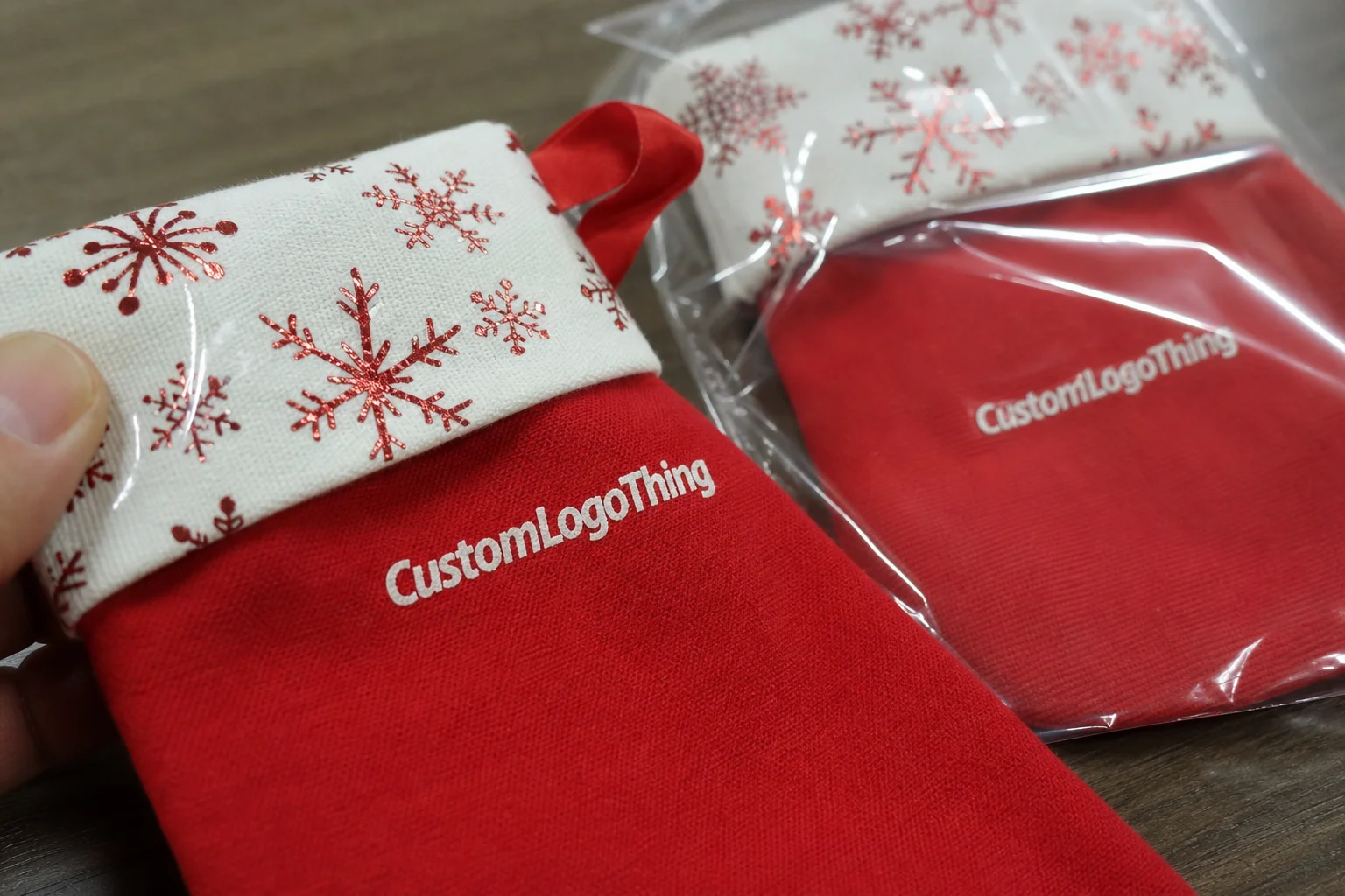
In practice, custom santa labels are seasonal clothing labels. They may carry a brand mark, a festive icon, care instructions, a size callout, or just a decorative finish for holiday apparel. The use case changes the spec. A label for a giftable sweater is not the same as a label for children’s sleepwear, and neither one should be treated like a paper sticker on a box.
Fabric changes everything. It bends, stretches, compresses, and rubs against skin and seams. A label that looks crisp in a flat mockup can become irritating once it is sewn into a neckline or side seam, especially on soft knits and lighter fabrics. The smaller the item, the less room you have to hide a bad decision. Holiday garments tend to be worn close to the body and handled often, which exposes weak edges quickly.
There is also a packaging mistake hiding in plain sight: some buyers talk about labels as if they are purely decorative. They are not. A sewn-in label is a product component, not an insert. If the garment is sold as part of a gift set, the label should still work with the wider packaging system, but the apparel spec comes first. That distinction matters more than people expect.
Before ordering, buyers should be able to answer three questions:
- Where will the label sit on the garment?
- What has to be readable at a glance?
- Is the label branding, care information, sizing, or a decorative seasonal accent?
If the label only needs to support a look, the design can be more flexible. If it must communicate fiber content, washing instructions, or size, then clarity becomes the priority. Seasonal graphics can still work, but they need breathing room. A holiday motif that overpowers the copy is a common failure point.
The label is also part of the brand’s product presentation. A sweater, hangtag, carton, tissue, and sewn-in label should not look like four separate purchases. They should read as one system. That connection is especially visible in winter merchandise, where the line between product and gift packaging gets thin.
What custom santa labels need to do on fabric
A good clothing label has four basic jobs: identify the brand, stay comfortable, remain readable, and keep its appearance after production and laundering. Those goals pull in different directions. Comfort pushes toward softer materials. Durability pushes toward denser construction. Readability pushes toward cleaner layouts and enough contrast to survive real use.
Woven labels are usually the first comparison point because they handle detail well and feel premium. They work best for logos, small seasonal icons, and compact text where a clean edge matters. Printed satin is useful when smoother hand feel and brighter color reproduction matter more than texture. Cotton gives a softer, more natural appearance, while heat-transfer labels remove bulk and can be a strong choice for modern, low-profile interiors.
Material choice should follow the garment, not just the design mood board. A busy holiday graphic may look festive on screen and still fail on a woven label if the type is too thin or the icon too detailed. White text on a deep red background can work, but only if the spacing is generous enough that stitching does not crush the letterforms. Fine lines need room. Tiny copy needs even more.
Most buyers do better when they think in terms of use case rather than style labels. A good working guide looks like this:
- Woven for durable branding and crisp small detail.
- Printed satin for comfort and stronger color coverage.
- Cotton for a softer, more natural feel.
- Heat-transfer for low-bulk interiors and smoother wear.
Size matters more than most people expect. A label that is too small forces the copy to shrink. One that is too large can bunch inside a neckline or create a scratchy fold. In the apparel world, the practical sweet spot is usually measured in fractions of an inch, not dramatic jumps. Moving from 1 inch to 1.25 inches can change readability more than swapping one color for another.
There is a second distinction worth making: a paper hangtag and a sewn-in fabric label are not interchangeable. If the item is going inside the garment, choose textile construction. If the item is hanging from the product, then paper stock, coating, and string choice become relevant. Mixing those categories creates confusion fast, especially in seasonal buys where many components are ordered at once.
Cost and pricing factors that change your quote
Label pricing is driven by a handful of practical variables: size, material, print method, color count, edge finish, fold style, and whether the shape is standard or custom. Quantity is the biggest lever. A small run absorbs setup work across fewer pieces, which raises the unit price. A larger run spreads that same setup cost more efficiently, which is why the difference between 500 pieces and 5,000 pieces can be dramatic even if the artwork stays the same.
Artwork quality changes the quote too. Clean vector files, accurate spelling, and a clear proof cycle reduce back-and-forth. Poor source files create friction. So do half-finished instructions. If the logo is low resolution, if the fold direction is not specified, or if the buyer keeps changing the size after proofing, the job usually costs more in time even before production starts.
| Label Type | Typical Use | Approx. Unit Cost at 5,000 pcs | Notes |
|---|---|---|---|
| Woven damask | Premium branding, fine detail | $0.08-$0.18 | Strong for compact logos and repeated wear |
| Printed satin | Soft apparel, vivid seasonal color | $0.05-$0.12 | Good color coverage and smoother hand feel |
| Cotton sew-in | Natural look, softer feel | $0.07-$0.16 | Works well for heritage or artisanal branding |
| Heat-transfer | Low-bulk interiors, knitwear | $0.09-$0.22 | Depends heavily on fabric type and artwork complexity |
Those ranges are useful, not absolute. A custom fold, extra color, specialty yarn, or tighter finish tolerance can move the number. The cheapest option is not automatically the best value if the label frays, irritates the neck, or loses legibility after laundering. Cheap visibility is still expensive if it fails in use.
For buyers comparing the full presentation, it helps to think in terms of the complete package rather than the label alone. A garment shipped in a clean carton with a poor interior label still feels unfinished. A modest item with a strong label, clean fold, and consistent outer packaging can feel more considered without adding much cost. That is a better place to spend money than polishing the wrong component.
A small but useful rule: ask for quotes that break out the choices. Quantity, size, fold, finish, and special construction should all be visible. A flat price with no spec detail is hard to evaluate and even harder to compare across suppliers.
Process and timeline from artwork to delivery
The production flow is usually straightforward. Artwork review comes first, then a digital proof, then material selection and production, followed by edge finishing, inspection, counting, and packing. That sequence sounds routine because it is. The mistakes happen at the proof stage, not the machine stage.
Proofing should catch spelling errors, wrong size callouts, incorrect fold direction, low contrast, and type that is too small for the chosen material. It should also catch copy that lands too close to the stitch line. That last one is easy to miss and expensive to fix. A label that looks balanced on screen can shift once folded or sewn.
Lead time depends on quantity, construction, and revision count. Simple runs move faster when the artwork is ready and approved on the first pass. Specialty materials, layered finishes, and seasonal rush periods add time. For holiday merchandise, waiting until the end of the season is usually a bad bet. Even when production is fast, transit delays and proof revisions can eat the margin.
Review the proof as if you were the person sewing it, wearing it, and unpacking it. If one of those viewpoints exposes a problem, fix it before production starts.
Shipping and handling matter once the labels leave the factory. Vibration, compression, and abrasion can affect folded goods, especially when labels are packed with other apparel components. Industry testing references such as ISTA exist because the route from supplier to shelf is not gentle. If paper-based packaging is part of the order, material sourcing may also need to align with recognized paper standards such as FSC.
The practical takeaway is plain: the proof is not a formality. It is the last low-cost chance to prevent a production mistake from becoming a full-order problem.
How to choose size, fold, and placement without guessing
Label size affects readability, comfort, and the way the garment behaves after sewing. Bigger gives you room for branding and care details. Smaller reduces bulk. The wrong balance shows up immediately: either the copy is too cramped to read or the seam feels cluttered and stiff.
Fold style shapes both appearance and function. A center fold works well when the label needs to hang from a seam. An end fold helps tuck the edges into stitching. A loop fold creates a neat interior finish. A flat cut is common for labels sewn on multiple sides or used as a visible exterior accent. The fold should match the sewing method, not fight it.
Placement is usually determined by the product. A soft tee often benefits from a neck label or a low-profile heat-transfer mark. A sweater may need a side seam label because the neck is too tight or too soft. A costume piece or seasonal gift item may use an exterior label when visibility is part of the branding strategy. Holiday products can be less forgiving because many are worn for short periods but photographed, gifted, and handled a lot.
Fabric type changes the decision. Knit goods stretch, which means stiff edges can become annoying. Brushed fabrics can catch on rough constructions. Light cotton usually tolerates more options than a delicate synthetic blend. If the label touches skin directly, comfort has to beat novelty. A charming label that itches is a failed label.
A useful shorthand:
- Soft tees: thin printed or heat-transfer labels.
- Knit sweaters: woven or soft printed labels with careful placement.
- Children’s apparel: smooth finish, low scratch risk, clear care text.
- Giftable holiday items: visible decorative label plus consistent outer packaging.
For Brands That Sell both garments and gift boxes, the label should follow the same seasonal language as the rest of the package. If the box is minimal and the label is loud, the product feels split. If the label is refined and the rest of the packout is coherent, the item feels deliberate.
Common mistakes buyers make with seasonal clothing labels
The first mistake is over-detailing the artwork. Tiny snowflakes, narrow script, and dense borders can look sharp on a monitor and turn muddy on a finished woven label. The issue is not creativity. It is scale. Fabric does not reproduce a screen mockup exactly, and the smaller the label, the less forgiveness you get.
The second mistake is choosing a finish that feels rough on apparel intended for close contact. That shows up quickly on sleepwear, children’s clothing, and anything worn near the neck. A holiday label that looks premium but scratches the wearer loses value immediately. Comfort is part of the spec, not a nice-to-have.
Another frequent miss is assuming the sewing method will sort itself out later. It will not. Fold direction, stitch allowance, placement, and edge finish are all part of the design. If those details are vague, the label can be technically correct and still wrong for the garment.
Proof approval is the last place buyers tend to slip. A rushed review can miss a typo, a slightly off logo ratio, or care text that is too close to the trim. Once the run is complete, those errors are expensive. Rework on a seasonal item is especially painful because the selling window is short.
The same pattern shows up in branded packaging. If the visual system is approved too fast, the printed box, garment label, and hangtag can all drift apart. The result is not dramatic failure. It is something more common and more damaging: a product that feels less finished than it should.
Expert tips for better holiday label results
Start with contrast. Strong legibility matters more than decoration when the label has to be read quickly in store, during packout, or after several washes. If the brand name disappears into the background color, simplify the layout before you approve production. Holiday color schemes are notorious for flattening detail.
Match the label to the garment’s hand feel. A luxurious knit can be undermined by a stiff, rough interior label. A playful hoodie can lose its quality feel if the edge finish is heavy or the stitch density is too aggressive. The label should belong to the fabric, not sit on top of it like an afterthought.
If the artwork is new, the garment is expensive, or the label will be visible on the outside of the item, a sample or short test batch is worth the extra step. That is where you see the real color, texture, and placement behavior. It is cheaper to discover that a red runs darker than expected or a fold looks awkward on the garment before scaling up to a full run.
Keep version control tight. Save the approved file, proof, size callout, and color reference together. If a revision comes late, make it obvious. Mixed versions cause more production errors than most buyers realize, and those errors are rarely visible until the goods are already packed.
Think in systems, not single items. A well-made clothing label, a clean hangtag, the right box stock, and a sensible packout method all push the product in the same direction. That is where branded packaging earns its keep. The individual parts do not need to be flashy. They need to agree with one another.
For sustainability language, precision matters more than broad claims. If paper components are involved, check whether FSC-certified stock is actually being used. If transit protection is part of the brief, ask how the labels will be packed and protected instead of assuming a generic mailer is enough. Careful specs beat vague claims every time.
Next steps to order with confidence
Before requesting pricing, confirm the garment type, label placement, artwork format, and whether the label needs care information, size information, or branding only. Those inputs shape the quote far more than most people expect.
Then compare material against use. A satin label can look beautiful and still be the wrong choice for a children’s sweater. A woven label can look premium and still be too dense for a lightweight knit. Holiday merchandise is handled more often than people think, so durability should come before novelty.
Ask for a quote that reflects the complete specification: quantity, size, fold, finish, and any special construction. That is the only way to judge value cleanly. A single number with no context is not useful for buying, and it is rarely comparable across suppliers.
Then review the proof carefully. Check spelling, logo proportion, color contrast, fold direction, and any care or sizing text. If the proof does not match the garment and placement you intend to use, stop there and fix it. That is the cheapest point in the process to make changes.
For buyers ordering custom santa labels for holiday apparel, the right decision is the one that works on fabric, survives handling, and supports the product story without creating comfort problems. The best labels are rarely the flashiest. They are the ones that still look correct after the garment has been folded, shipped, worn, and washed.
If you are building a seasonal line, review your label choices alongside the rest of your custom labels and tags so the interior finish and exterior packaging feel like one system rather than separate purchases.
What are custom santa labels used for on clothing?
They are used to brand seasonal apparel, costume pieces, and gift-ready clothing with a festive look. They can also carry size, care, or identification details when the garment needs more than decoration. The right format depends on where the label will be sewn and how much wear it needs to survive.
Which material works best for custom santa labels on fabric?
Woven labels work well when you want a durable finish with fine detail. Printed satin or other soft printed options are useful when comfort and color clarity matter more than texture. The best choice depends on the garment, the placement, and whether the label will be seen or felt more often.
How much do custom santa labels usually cost?
Price depends on quantity, size, material, fold style, color count, and finishing requirements. Lower quantities usually have a higher unit cost because setup work is spread across fewer pieces. A clear quote should show the impact of each spec rather than one flat number.
How long does it take to produce custom santa labels?
Timeline depends on artwork approval, proof revisions, production method, and order size. Standard lead time can move quickly if the file is ready and the proof is approved without changes. Rush orders may be possible in some cases, but they usually narrow material and finishing options.
What should I check before approving my custom santa labels proof?
Check spelling, logo proportions, size, fold direction, color contrast, and any care or sizing text. Make sure the label matches the garment type and placement you plan to use. Approve only after confirming the proof reflects the final production version you want shipped.