Custom Satin Labels: How to Choose the Right Finish
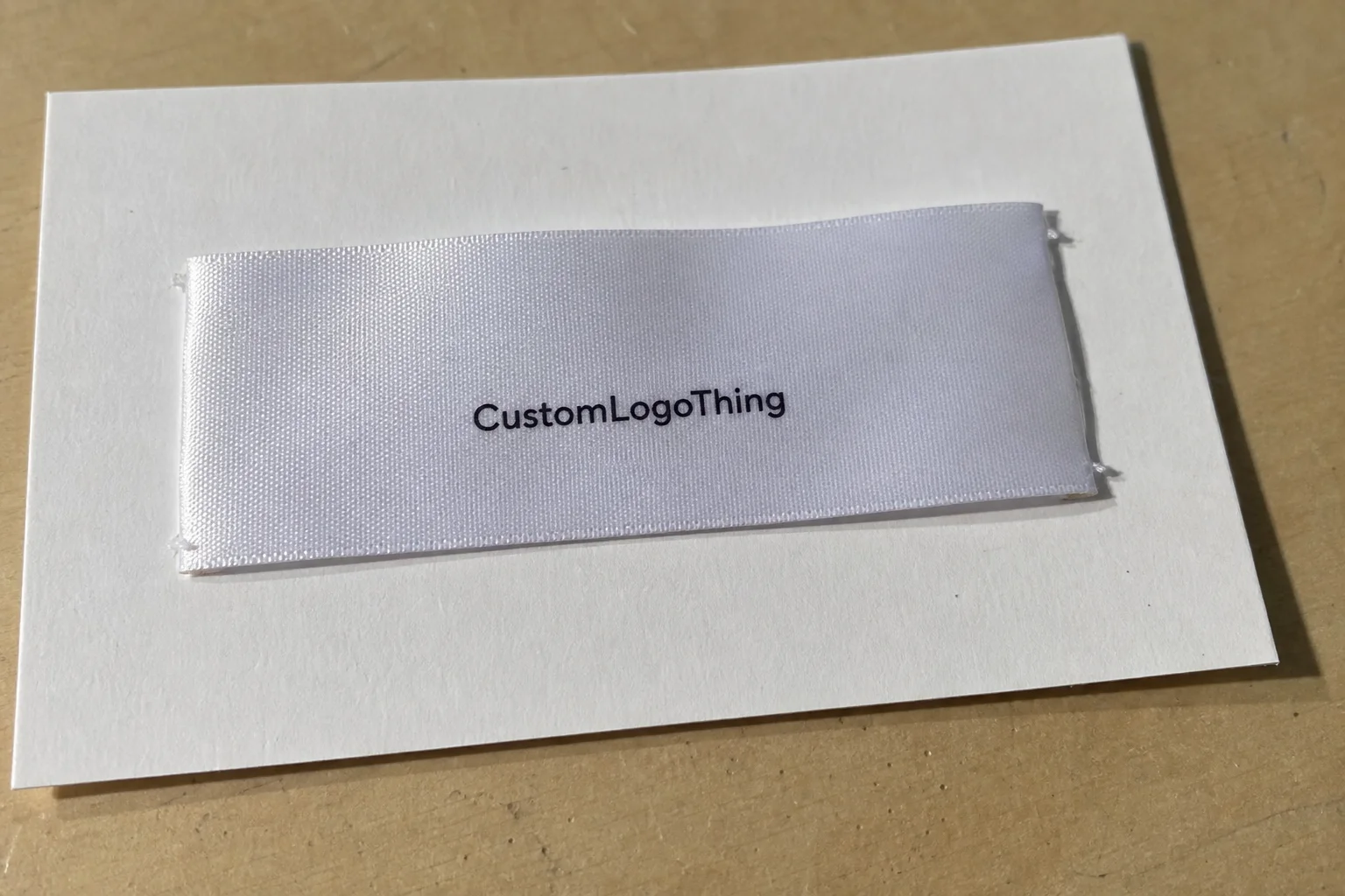
Custom satin labels change the feel of a garment before anyone reads the brand name. That matters more than many buyers admit. A soft neckline, a controlled sheen, and a label that lies flat can make a hoodie, baby set, or lingerie piece feel more finished than the same item with a scratchy tag.
From a packaging buyer’s point of view, labels belong in the same conversation as hang tags, retail packaging, and Custom Packaging Products. If the label looks polished but the rest of the presentation feels disconnected, the brand story weakens. If the label, insert card, and box all follow the same visual logic, even modest product packaging can read as considered.
Satin sits in a useful middle ground. It is softer and more refined than many woven labels, more visible than a heat-transfer mark, and less utilitarian than a plain care tag. Used well, it supports branded packaging and package branding without shouting. Used poorly, it can look shiny, thin, or overdesigned.
Why custom satin labels feel premium before the tag is read
The first thing shoppers notice is not the logo. It is the hand feel. The label sits against skin, folds into seams, shows up in product photos, and gets noticed by buyers comparing similar items in a few seconds. That is why custom satin labels often carry more perceptual weight than their size suggests.
Satin has a directional sheen. Under store lighting, it catches highlights differently from matte woven labels, so the mark can feel brighter and more deliberate. In photography, that slight reflectivity adds depth, especially on apparel, accessories, and premium basics where the finish has to support the price point without making the product look loud.
Compared with Printed Care Labels, satin usually feels softer and less industrial. Compared with woven labels, it often feels smoother on skin. Compared with heat-transfer branding, it gives a more tangible sewn-in presence. None of those options is automatically better. The right choice depends on the product, the wash cycle, and how much label visibility the brand wants.
Best-fit categories tend to be the ones where comfort is part of the promise:
- Lingerie and intimate apparel
- Babywear and children’s basics
- Loungewear and sleepwear
- Scarves, hats, and soft accessories
- Premium tees, knitwear, and light outer layers
That said, satin is not a cure-all. It is not an invisible label, and it is not built for hard abrasion the way some workwear tags are. If a garment needs to survive industrial laundering, repeated high-friction wear, or a rough wash environment, another construction may be smarter. Fit matters more than trend.
“A satin label can feel expensive or flimsy depending on the edge finish more than the fabric itself.”
That line comes up because the label is only one part of the presentation. If the hang tag, folding method, and Custom Labels & Tags program are inconsistent, the brand loses authority. If they line up with the garment and the rest of the package branding, the entire offer feels more intentional.
For buyers who want a broader view of materials and print considerations, the educational material at packaging.org is a useful reference. The basic lesson is simple: material choice changes perception faster than copy does.
How satin label construction, weave, and finish affect wear
Construction determines whether a label feels refined or merely glossy. A satin label is not just a strip of ribbon with text on it. The base, print method, cut, fold style, and attachment all affect how it performs after sewing, washing, and repeated wear.
The face finish matters first. A smoother face gives sharper text, better contrast, and cleaner edges in the final brand mark. A softer drape matters next because the label has to move with the fabric instead of standing away from it. If the base is too stiff, it can scratch. If it is too thin, it can curl or distort after sewing.
Fold style changes the experience more than most sourcing teams expect. An end fold hides raw edges. A center fold works well for side seams and neck seams. A loop fold gives more room for content. A flat cut can be useful for heat-seal applications or specific stitch setups, but it needs careful finishing or the edges can feel unfinished.
Reverse-side behavior matters too. A label folded into a seam may only show the back face under certain movements. On reversible garments, that back face can become part of the visible brand experience. If the reverse has weak print, uneven coating, or a rough edge, the issue shows up quickly in use.
In practical terms, the structure breaks down like this:
- Substrate: usually polyester satin, selected for smooth hand feel and light sheen.
- Print method: affects clarity, color density, and how the copy holds up.
- Edge finish: cut, heat-sealed, folded, or stitched, depending on the application.
- Attachment style: sewn into seams, topstitched, or inserted into a folded hem.
Each step creates a different failure point. A decent substrate with poor ink coverage still looks cheap. Good print with sloppy cutting still feels cheap. Clean cutting with bad stitch placement still feels cheap. Buyers judge the label as one object, not as separate procurement choices.
For teams that care about transit and abuse resistance, the thinking should be similar to parcel testing. The ISTA framework is a useful reference for how products are stressed in shipping, even if the label itself is not the primary package component. A sewn-in label still has to survive the same ecosystem as the garment it belongs to.
Material specs that decide softness, clarity, and durability
If a buyer wants to compare custom satin labels intelligently, the conversation should start with specs, not aesthetics. Width, length, contrast, font size, fold preference, and content density all affect whether the final label feels sharp or crowded.
Text density is a bigger issue than many teams expect. A glossy surface can handle a small logo well, but long legal copy, multiple care lines, and tiny size marks can become hard to read if the spacing is tight. On a 15 mm label, a two-color logo may be fine. On the same width, four lines of care content plus fiber content can turn into a visual mess. At 20 mm or 25 mm, the layout becomes easier, but only if the garment can handle the extra footprint.
Color matching also has real limits. Exact Pantone matching is sometimes possible, but the satin substrate, print system, and base color all influence the final result. Dark copy on white satin is usually straightforward. Pale ink on a bright or reflective base is harder. If the brand wants a specific tone, ask for a physical sample under daylight, not just a digital proof.
The other detail that gets overlooked is compliance content. Fiber content, country of origin, size designation, care instructions, and any required legal copy all affect spacing. If the label is too small for the content, the design will either shrink to the point of illegibility or force a layout that looks cramped. That is not a design problem. It is a specification problem.
Good suppliers will ask whether you need a satin ribbon base, a coated print surface, or a woven-look satin finish. Those are not interchangeable. A satin ribbon base tends to drape differently from a coated surface. A woven-look finish may mimic the appearance buyers expect, but it can behave differently in sewing and washing. Ask directly, because the answer changes how the label feels in the garment.
A practical material check usually includes the following points:
- Base fiber and finish, typically polyester satin for the most common applications
- Face smoothness and edge stiffness after cutting or sealing
- Print opacity on the chosen background color
- Wash resistance for the expected care cycle
- Stitch tolerance so the label does not pucker in the seam
That is the part many sample reviews skip. A label can look clean on a table and still fail once it is sewn into a curved seam or washed a few times. Asking for real-fabric testing catches more problems than approving a proof alone.
| Use case | Typical MOQ | Approx. unit price | Best fit | Main watchout |
|---|---|---|---|---|
| Test drop or sample run | 500-1,000 pieces | $0.24-$0.42 | New brands, fit testing, short season trials | Higher per-piece cost and setup fees |
| Core reorder | 5,000 pieces | $0.08-$0.18 | Small wholesale programs, steady e-commerce lines | Artwork revisions can add time and cost |
| High-volume program | 20,000+ pieces | $0.04-$0.10 | Recurring retail programs and multi-SKU brands | Storage, forecasting, and color consistency |
Those ranges vary by size, print coverage, and finishing. Even so, they are useful because they show how quantity changes the economics. A buyer comparing custom printed boxes, hang tags, and sewn-in labels should treat the label line as part of the total branded packaging budget, not as an isolated expense.
Production steps and turnaround: from artwork to sewn-in labels
A clean process reduces surprises. The usual sequence is straightforward: file review, proofing, sampling, bulk production, finishing, and shipment. Delays usually appear in the handoff between proof approval and production, not in the print itself.
Artwork should be ready before quoting starts. The supplier needs the exact text, the finished size, the fold style, and vector artwork for the logo. If there are care symbols, they should be supplied in a clean format rather than embedded in a blurry image. A supplier can sometimes fix a file, but every revision adds risk. For custom satin labels, that risk is usually not worth it.
Sampling matters because screen color and stitched reality are not the same thing. A label that looks crisp on a monitor can shift once it is sewn into a neckline under tension. The stitch line changes the visual balance. The lighting changes the sheen. Even the garment fabric beneath the label changes how the copy reads.
Typical turnaround depends on quantity, print complexity, stock availability, and whether the order needs a special fold or packing method. A simple run can move faster than a multi-color program with custom finishing. Rush orders are possible in some cases, but the real question is whether the sample was approved cleanly enough to justify speed.
One useful check is to ask for both the lead time and the estimated ship date. Those are not the same thing. Lead time describes the work window. Ship date describes when the order actually leaves the facility. Revisions, proof delays, and stock issues often add hidden days that buyers do not see until the calendar is already tight.
In a controlled workflow, the production steps should be transparent:
- Confirm size, fold, copy, and artwork format
- Review a digital proof for text accuracy and layout
- Approve a physical sample on the intended fabric if the order is important or the garment is sensitive
- Check bulk production against the sample for color, cut quality, and stitch placement
- Inspect packed labels for counts, folding consistency, and damage during shipment
That level of process sounds basic, but it is usually what separates a label that works from one that creates extra handling on the factory floor. For brands managing product packaging across multiple SKUs, the label schedule should be treated with the same discipline as insert cards and retail packaging. The more precise the brief, the fewer surprises in the final run.
Cost, pricing, and MOQ: what changes your unit cost
Price is usually driven by five variables: quantity, size, number of print colors, fold style, and finishing. Add packaging or special packing requirements, and the quote can move quickly. A buyer comparing suppliers should expect some spread, because the same label spec can be priced differently depending on setup efficiency and production method.
The biggest misunderstanding is assuming that a lower MOQ always means a better deal. It does not. Low minimums are useful for testing, but the per-piece cost usually climbs fast. For a small capsule collection, paying more per unit can still make sense if it prevents overbuying. For a recurring wholesale line, the math flips.
Here is a practical way to compare quote scenarios:
| Quote factor | Lower-cost setup | Higher-cost setup | Why it moves price |
|---|---|---|---|
| Quantity | 20,000+ pieces | 500 pieces | Setup cost spreads across fewer units in small runs |
| Print coverage | Simple one- or two-color copy | Dense artwork with care copy and logo detail | More ink, more handling, more proofing |
| Fold style | Standard end fold | Loop fold or custom finishing | Extra finishing steps add labor |
| Packing | Loose bulk packing | Custom bagging or labeled bundles | Extra assembly and materials |
| Timeline | Standard schedule | Rush order | Priority production typically carries a premium |
Most buyers should also budget for sample fees, artwork revisions, shipping, and any setup charge. A quote that looks low can become expensive once freight and proofing are added. That is especially true for cross-category programs where labels are only one part of the package branding stack alongside tissue, inserts, and custom printed boxes.
If you want a fair comparison, ask every supplier for the same items: finished size, material base, print method, fold style, MOQ, unit price, sample cost, setup fee, and estimated ship date. Without that checklist, price shopping turns into guesswork.
There is also a timing cost that does not show up on the quote. If the label is late, the garment may sit in WIP inventory, and that creates a bottleneck that costs more than the label itself. The cheapest label is not useful if it does not arrive in the production window.
Common mistakes that make satin labels look cheap
The most common mistake is overloading the label. Too much text, too many logo elements, and too little whitespace make the design feel cramped. A satin surface needs room. If the layout is busy, the sheen starts working against readability instead of supporting it.
Low contrast is another issue. Light gray copy on silver satin or pale copy on a reflective base can disappear after sewing. That may look subtle in a proof, but once the garment is washed and folded, the copy can become hard to read. A label should survive ordinary use, not only a studio mockup.
Ignoring seam allowance is a quieter problem, but it causes real damage. If the fold direction is wrong or the stitch line cuts too close to the copy, the label can warp. Even a good material feels low grade if it is sewn off-center. That is a production problem, not a design preference.
Skipping wash and rub testing is expensive. If the garment will be laundered often, the print needs to survive friction, detergents, and repeated handling. Ask the supplier what type of testing they use and whether they can show evidence of durability against standard wash and abrasion methods. The exact lab protocol varies, but the principle does not: if the label fails after a few cycles, the brand pays for it later.
Brand inconsistency also makes satin labels look cheaper than they are. If one SKU uses a 15 mm label, another uses a 25 mm version, and a third uses slightly different wording, the line stops feeling deliberate. Buyers notice that inconsistency even if they cannot name it.
Another issue is the mismatch between label finish and garment category. A high-gloss satin on a matte, understated garment can feel out of place. A very soft, understated label on a fashion piece with sharp construction details can feel underdesigned. The label should sit inside the product language, not argue with it.
Expert tips and next steps before you request samples
Start with the use case. A label for babywear needs different softness and content spacing than a label for an outer layer. A hidden seam label is not the same as a visible brand mark. If the garment is washed often, say so. If the label has to stay visible in photos, say that too. Clear input saves time and keeps the quote realistic.
Before asking for samples, send a short spec sheet. It should include the exact dimensions, artwork file, copy, color references, fold preference, placement, and any compliance text. If the brand already has a broader packaging design system, share it. That helps the supplier match the label to the rest of the retail packaging program instead of treating it as a one-off item.
Order a physical sample or a short test run on real fabric. That step catches issues digital proofs cannot show: sheen, drape, edge stiffness, and how the label looks once it is stitched. Then inspect it under daylight and indoor lighting. Satin can read differently under each. A label that looks fine in one setting may feel too shiny or too muted in another.
My practical checklist is simple:
- Confirm garment type and placement
- Finalize artwork and copy
- State wash and wear expectations
- Compare two or three quotes on identical specs
- Approve a physical sample before bulk production
That sequence protects margin and presentation at the same time. It also keeps custom satin labels aligned with the rest of the brand system, which is where the value shows up in the final product. If the label, insert card, and packaging all speak the same visual language, the garment feels more deliberate without becoming overworked.
There is a final practical point worth keeping in mind: labels are small, but they are not trivial. A narrow width, a poor fold choice, or an inaccurate color can affect returns, customer perception, and how easily the product moves through packing. Good sourcing respects those small decisions because they show up later in the customer’s hands.
FAQ
What are custom satin labels made from?
They are typically made from a polyester satin base that is printed or finished for branding and care information. The material is chosen for smooth hand feel and a light sheen, not for heavy abrasion resistance. The exact result depends on the substrate, print method, and edge finish used by the supplier.
Are custom satin labels softer than woven labels?
Usually yes, especially when the priority is a smooth surface against skin. Woven labels can feel more structured, while satin often feels lighter and more flexible. Softer does not always mean more durable, so wash testing still matters.
What is the usual MOQ for custom satin labels?
MOQ varies by supplier, but smaller runs usually cost more per label than larger repeats. Some vendors offer low-MOQ options for test drops, while others are set up for bulk production. Ask whether the quote is based on pieces, rolls, or finished labels, because that changes the effective minimum.
How long does production take for custom satin labels?
Turnaround depends on artwork approval, quantity, print complexity, and whether a sample is required first. Simple orders can move faster than custom programs with special folding, packing, or rush requests. Ask for both estimated lead time and expected ship date so delays are easier to spot.
How do I make custom satin labels look premium instead of shiny and cheap?
Use restrained typography, strong contrast, and enough whitespace for the text to breathe. Choose a finish and fold style that matches the garment rather than forcing a one-size-fits-all label. Approve a physical sample before bulk production so the final look is checked under real lighting and stitching.
Can custom satin labels include care instructions and legal copy?
Yes, but the layout has to be planned carefully. Once size, fiber content, country of origin, and care symbols are added, the available space can shrink quickly. On smaller labels, dense legal copy may need a larger width or a different label type entirely.
If the brief is clear and the sample is approved on real fabric, custom satin labels tend to do exactly what they should: stay soft enough to disappear in wear, stay polished enough to support the brand, and stay consistent enough to hold the rest of the packaging program together.