Overview: why seasoning packaging labels do more than look good
Custom seasoning labels have a practical job that is easy to underestimate. They need to stop a shopper for a second, explain the flavor quickly, and carry the regulatory and operational details that keep the product usable through packing, shipping, retail, and kitchen storage. If the label only looks attractive on a mockup, it is doing half the work. If it only communicates information and ignores shelf presence, it is also falling short.
Spice packaging sees more abuse than many teams expect. Jars are handled with oily hands, wiped after spills, and stored near heat. Shakers get picked up repeatedly, set down on damp counters, and exposed to humidity changes. Pouches flex in transit and can rub against other packages inside a case. Those conditions push the label stock, adhesive, and finish in ways a screen proof cannot show.
The container format changes the spec quite a bit. Glass jars usually need labels that track cleanly around a curve without wrinkling at the seam. Plastic shakers often need an adhesive that grips well on slightly textured surfaces. Metal tins can trigger edge lift if the bond is too weak or the panel has a subtle radius. Pouches are their own category because the material moves and the printable area is narrower than most people assume at the design stage.
Custom seasoning labels also help a product line stay organized as it grows. A small brand may only need a handful of blends, but the moment it adds seasonal variants, larger sizes, or wholesale versions, consistency matters. A clear label system keeps the family connected while still allowing each SKU to carry its own ingredient list, net weight, barcode, and usage details.
The short version: label choices affect appearance, compliance, inventory control, and line performance at the same time. A good order balances all of that instead of optimizing for just one piece of the puzzle.
How custom seasoning labels are made and applied
Label production usually starts with artwork review. The supplier checks the file format, trim size, bleed, barcode placement, and any required text that has to stay readable after the label is printed and cut. Once the layout is verified on the correct dieline, a proof is prepared. That proof matters because it shows how the artwork behaves on the actual shape, not just on a flat screen.
Printing method depends on quantity and variation. Digital printing tends to make sense for shorter runs, seasonal changes, or product lines with several SKUs because setup is lighter and changeovers are simpler. Flexographic printing is usually stronger economics at higher volumes, especially when the design is stable and the color count is predictable. There is no universal winner. The right method is the one that matches quantity, artwork complexity, and how often the design will change.
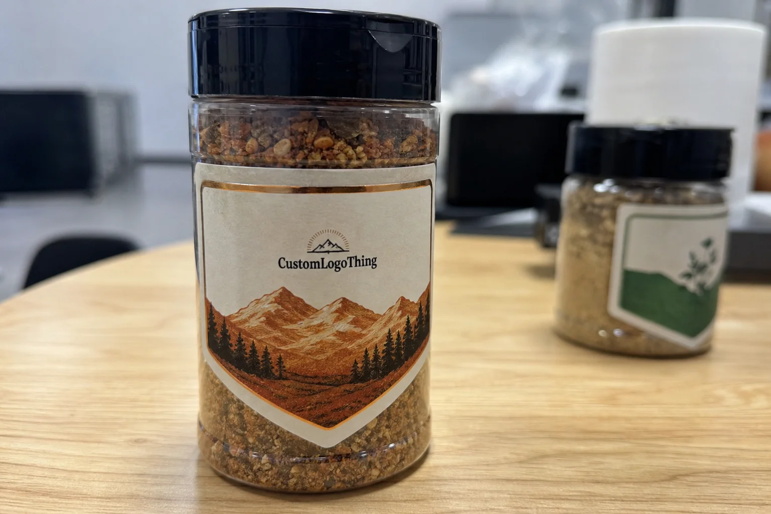
Adhesive selection is one of the more consequential decisions. Smooth glass gives you more flexibility, but not every jar is truly flat, and not every plant runs the same fill environment. Curved plastic shakers are less forgiving, especially if the container has light texture or a narrow shoulder. Some paper-based containers and pouches need an adhesive tuned for rougher surfaces so the edges do not start peeling after storage or transport. If the label will face refrigeration, condensation, or constant handling, that has to be part of the spec from the beginning.
Finish changes both the look and the behavior of the label. Matte reduces glare and can make small ingredient text easier to read under store lighting. Gloss usually sharpens color and can make a spice blend look richer on shelf. Soft-touch feels premium, but it is not automatically the right fit for a seasoning line because some soft-touch coatings show handling marks faster than a standard laminate. Clear film can be strong for minimalist branding, especially when the contents are part of the visual story and the brand wants the jar to stay visible.
Application is another place where the real world exposes weak assumptions. Small producers often hand-apply labels, which works well enough at modest quantities if the die-cut shape is simple and the liner releases cleanly. As volumes increase, semi-automated applicators save time, but they also reveal issues faster: poor spacing, inconsistent die cuts, skewed label rolls, and adhesive that does not grab evenly. In practice, the label spec and the application method should be discussed together.
Key label specs that affect durability and shelf appeal
Material is usually the first decision that affects the rest of the order. Paper labels can work well for dry pantry products with limited handling, particularly when cost control is a priority. Polypropylene films are more durable and resist moisture better, which is why they are common for products that may sit in a humid kitchen, get handled frequently, or travel through a long distribution chain. In harsher conditions, a more rugged film stock can make sense, but not every seasoning line needs the most expensive material available.
Size and shape matter more than many teams expect. A narrow round-jar label can look elegant, yet if the type becomes too small, the flavor name and ingredient callouts lose clarity at arm’s length. Wide pouches need a stronger visual hierarchy so the brand, blend name, and net weight stay readable without crowding one another. Multi-panel layouts can help when the information load is heavy, but the front panel still has to do the selling.
Color management is often the difference between a package that reads cleanly and one that disappears into the shelf. Light text on a dark background can look premium, but contrast has to hold up once the product is under store lighting or seen through tinted plastic or glass. Seasonings themselves also complicate things. Dark powders, herbs, and spice blends can make the label feel visually dense, so the design has to create breathing room rather than fight the contents.
Environmental exposure should be part of the spec sheet, not an afterthought. Condensation can weaken an adhesive that looked fine in a proof. Oil can stain uncoated paper. Shipping abrasion can scuff glossy varnish or scratch inks that are not protected by a laminate. A label that looks sharp on approval but fails after two weeks in a warehouse is not a successful label.
Finish and adhesive should be selected as a pair. A matte stock with the wrong adhesive can lift at the corners. A glossy film with weak tack can peel on a curved shaker. Get that pairing right, and the label keeps its shape, color, and bond through normal handling.
Custom seasoning labels cost, MOQ, and unit price factors
Pricing for custom seasoning labels depends on more than quantity. Size, material, finish, adhesive, shape, color count, and special effects all affect the final number. A simple rectangular paper label in a single version will usually price very differently from a custom die-cut film label with multiple SKUs and a specialty laminate. That is not a markup problem; it is production math.
Minimum order quantity, or MOQ, matters because setup costs are spread across the run. Smaller orders carry a higher unit price since proofing, plate or file setup, press time, cutting, and packing do not shrink in the same proportion as the quantity. Larger orders lower the per-label cost, but only when the artwork is settled and the spec is stable enough to avoid revisions.
When buyers compare quotes, the detail level matters more than the headline number. Ask what material is being quoted, whether the finish is a laminate or varnish, how the adhesive is described, whether one or several versions are included, and what proofing or shipping charges are separate. A quote that looks lower can become more expensive once rush fees, revisions, or SKU changes are added.
| Option | Typical use | Common price behavior | Notes |
|---|---|---|---|
| Paper label, simple shape | Dry pantry seasonings, low moisture exposure | Lowest setup cost, best at larger quantities | Good for budget control, but not ideal near oils or humidity |
| Polypropylene film, matte or gloss | Jars, shakers, refrigerated or frequently handled products | Mid-range unit price | Often the practical balance of durability and shelf appearance |
| Clear film with custom die cut | Premium branding, minimalist jar designs | Higher unit price | Works well when the product color is part of the visual system |
| Special finishes and multiple SKUs | Retail launches, product families, promotional packs | Highest setup complexity | Visually strong, but the artwork workflow has to stay disciplined |
Ballpark pricing varies by market and run size, but the pattern is consistent: small orders often have a higher per-label cost, while larger runs can pull the unit price down once setup is absorbed. That is why a buyer who only chases the cheapest raw material can end up paying more later. If the label fails to fit the container or the barcode is placed badly, the reprint costs dwarf any savings from the original quote.
For that reason, the best pricing conversations treat product packaging as a system rather than a sticker purchase. The label has to fit the container, survive the environment, and support the brand. Cheap labels that create production friction are not actually cheap.
Process and timeline: from artwork approval to delivery
The timeline begins once the artwork is submitted. A supplier checks resolution, fonts, dielines, bleeds, and whether the barcodes and legal text are set up correctly. Clean files move quickly. Missing elements, incorrect dimensions, or last-minute content changes can slow the job before production even starts.
For straightforward orders, the flow is usually predictable: proof review, approval, print, finishing, inspection, and shipment. More complex work takes longer because every SKU, finish, or variable-data element has to be checked. In many purchasing cycles, the press is not the bottleneck. Approval is.
Good file prep shortens the schedule. Vector artwork, correct bleed, barcode quiet zones, and a true dieline prevent avoidable back-and-forth. If a label wraps a jar, the seam needs to be considered early. If the package is a pouch, the fold lines and usable panels should be verified before sign-off. Those details sound small until they create a line stoppage.
Timing should also account for the rest of the packaging chain. If the blend is tied to a seasonal launch or a retail reset, the labels need to be approved before filling is scheduled tightly. The same applies to relabels, barcode changes, and product family rollouts. Late labels tend to create expensive problems somewhere else in the workflow.
For buyers comparing durability or material sourcing, general guidance from organizations such as the ISTA can be useful for transit assumptions, and FSC is relevant when paper sourcing or sustainability claims are part of the brief. Those resources do not replace label testing, but they help frame smarter packaging decisions.
One more practical point: if a new container is being introduced, prototype before committing to the full run. A few labels on the actual jar or pouch can expose edge lift, awkward seam placement, or glare under store lights. A digital proof cannot catch those problems because it does not reproduce the physical behavior of the package.
Common mistakes when ordering seasoning label designs
The first mistake is choosing stock without considering the environment. If the container may face moisture, oil, or refrigeration, paper-only labels can fail sooner than expected. The second mistake is crowding the layout. It is tempting to fit every claim, note, and compliance line onto one face, but too much text can bury the product name and weaken shelf impact.
Scale causes problems more often than teams expect. A design that looks balanced on a monitor may wrap awkwardly around a curved jar or land badly across a pouch seam. Clear containers bring another layer of difficulty because weak contrast and poor spacing become immediately visible once the label is applied. The design needs to work on the actual surface, not just in the file.
Color and contrast deserve special attention for seasonings. Dark spices, transparent jars, and reflective surfaces can make low-contrast graphics hard to read. If the flavor name is not legible from a normal shelf distance, the label is not doing its job. That is more obvious in retail packaging because the product has only a few seconds to earn attention.
Production errors are just as expensive as design errors. Missing bleed creates unwanted white edges. Barcode quiet zones that are too tight can cause scanning failures. Approving one SKU while assuming the rest match can lead to a reprint that a single careful proof would have avoided. Those are preventable mistakes, but only if somebody checks the details before release.
Custom seasoning labels work best when the art team, packaging buyer, and production spec are aligned before the order goes live. That sounds basic, but it is usually the point where label jobs drift.
Expert tips for labels that sell and survive handling
Design around the container first. A lot of label problems start when the artwork is developed as a flat graphic and only later forced onto a real jar, shaker, or pouch. The better path is to measure the package, understand the curve or panel, and build the visual system around that physical surface.
Use hierarchy to help the buyer read quickly. The product name should be obvious. The flavor or blend cue should be immediate. The net weight and essential claims should be placed where the eye naturally lands. If a shopper has to hunt for the basic information, the label is asking too much of them.
Choose the finish to support both appearance and handling. Matte or satin can reduce glare and improve readability. Gloss or film lamination can improve resistance to scuffing and moisture. If the product will be handled often, a more durable finish usually earns its keep by preserving the look of the package over time.
Think in product families instead of isolated SKUs. Seasoning lines often expand into related blends, sample packs, value sizes, and seasonal versions. A consistent visual structure makes those additions easier to manage. It also keeps the brand recognizable if the packaging later extends into coordinated Custom Packaging Products or matching custom printed boxes.
“A label has to look right after packing, shipping, stocking, and a week of handling. The shelf photo is only one checkpoint.”
Prototype short runs whenever the container is new or the finish is unfamiliar. Even a small sample can reveal problems that a proof will not show, such as awkward label tension, edge lift, or reflections that make text harder to read. That kind of test saves more money than a lot of teams expect.
Next steps: how to prepare a strong label order
Start with the container details. Gather the jar, shaker, or pouch measurements, label dimensions, artwork files, ingredient copy, barcode data, quantity targets, and any regulatory text that must be included. Once those basics are organized, quoting becomes more accurate and the review process gets shorter.
Then make the major decisions in the right order. Container first, then label material, finish, and adhesive, and only then final artwork adjustments. A lot of teams reverse that sequence and end up redesigning a label because the package never gave them the space or shape they assumed it would.
Requesting tiered quotes is useful because it shows how the unit price changes across quantity levels. That makes the real breakpoints visible and often reveals the best run size for a launch. A single lump-sum quote rarely gives that kind of clarity.
Before releasing the full order, check one printed sample against the actual package. Confirm the size, barcode placement, contrast, and finish in real lighting. For brands that rely on consistent branded packaging, that extra check is rarely wasted time.
Once the specs are locked, order with final artwork and exact container details. That is the cleanest way to launch custom seasoning labels, and it gives the production team the best chance of delivering labels that stick properly, read clearly, and hold up through filling, storage, and shelf display.
FAQ
What material works best for custom seasoning label designs?
For dry pantry storage, paper labels can work well, but film materials usually handle oil, humidity, and frequent touching better. If the container may be refrigerated or wiped down often, a moisture-resistant polypropylene or similar film stock is usually the safer choice. The right option depends on the container surface, the shelf environment, and whether the brand wants a matte, gloss, or clear finish.
How much do custom seasoning labels usually cost per label?
Unit price depends on size, quantity, material, finish, shape, and whether the order includes multiple versions or special effects. Small runs tend to cost more per label because setup and production time are spread across fewer pieces. In many cases, the cheapest quote is not the best value if it leaves out proofing, revisions, or shipping.
What information should be on custom seasoning labels?
Most labels need the product name, flavor or blend name, net weight, ingredient list, and any required regulatory details. Many brands also add usage instructions, allergen notes, batch codes, and barcodes depending on the sales channel. The front of the label should still keep the core selling message readable at a glance.
How long does turnaround take for custom seasoning labels?
Turnaround depends on artwork readiness, proof approval, quantity, material choice, and any special finishing requirements. Simple orders with approved files usually move faster than multi-SKU orders that need revisions or custom shapes. A realistic schedule starts with clean files and enough time for proofing before the fill date.
Can I use the same label layout for jars and spice pouches?
You can keep the same branding system, but the layout usually needs to change because jars and pouches have different surfaces, curves, and visible panels. A jar label may rely on a wraparound format, while a pouch often needs stronger hierarchy and more vertical space. It is usually better to build one flexible system than force the same exact layout onto every package.