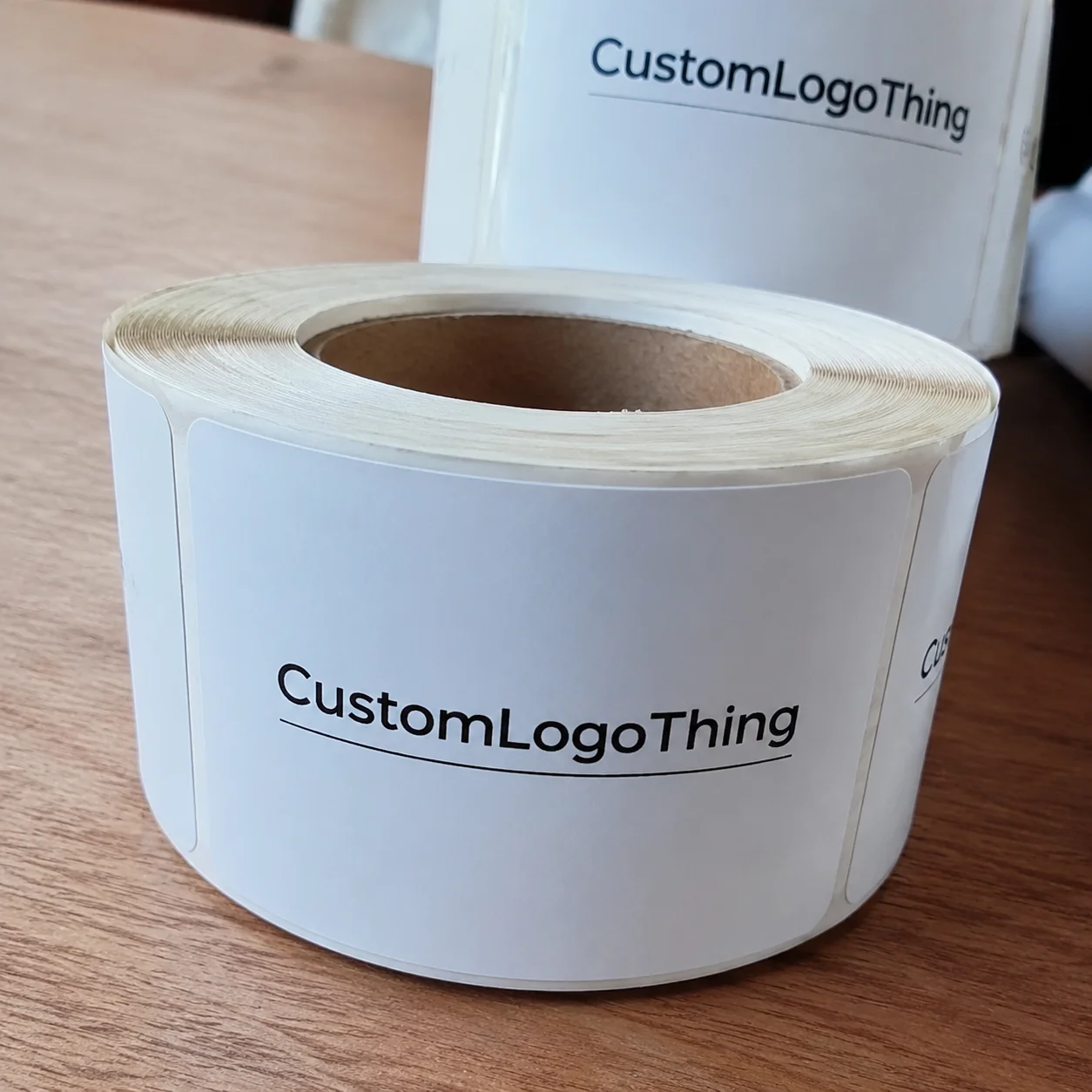
Buyer Fit Snapshot
| Best fit | Custom Soy Ink Printed Boxes projects where brand print, material claims, artwork control, MOQ, and repeat-order consistency need to be specified before quoting. |
|---|---|
| Quote inputs | Share finished size, material target, print colors, finish, packing count, annual reorder estimate, ship-to region, and any compliance wording. |
| Proofing check | Approve dieline scale, logo placement, barcode or warning zones, color tolerance, closure strength, and carton packing before bulk production. |
| Main risk | Vague material claims, crowded artwork, missing packing details, or unclear freight terms can make a low unit price expensive after revisions. |
Fast answer: Custom Soy Ink Printed Boxes: Structure, Print Proof, Packing, and Reorder Risk should be specified like a repeatable production item. The safest quote records material, print method, finish, artwork proof, packing count, and reorder notes in one written spec.
Production checks before approval
Compare the actual filled-product size with the drawing, then confirm tolerance on folds, seals, hang holes, label areas, and retail display edges. Reserve space for logos, QR codes, warning copy, and material claims before decorative graphics fill the panel.
Quote comparison points
Review material grade, print process, finish, sampling route, tooling charges, carton quantity, and freight assumptions side by side. A quote is only useful when the supplier can repeat the same color, closure quality, and packing count on the next order.
Custom soy ink printed boxes get talked about as if they’re only a sustainability checkbox, but that undersells them badly. On a solid press run, custom soy ink printed boxes can deliver crisp type, rich solids, and cleaner color handling than many people expect, especially when the board, coating, and press setup are matched properly. I’ve stood on enough factory floors, from folding carton lines in Shenzhen to corrugated plants in Ohio and Wisconsin, to know that the ink is only one part of the story; the substrate, die-cut, and finishing choices decide whether the box looks premium or merely “acceptable.” And yes, I’ve seen more than one perfectly decent design get blamed for a problem the pressroom didn’t cause, which is a very human packaging industry habit, unfortunately. For a 5,000-piece carton order, the difference between a good spec and a loose one can show up as a quote swing from about $0.15 per unit to $0.38 per unit depending on board grade, coating, and die complexity.
If you’re sourcing custom soy ink printed boxes for retail packaging, e-commerce mailers, or food-adjacent product packaging, it helps to understand where soy ink truly shines and where it needs support. I’ve seen brands assume soy ink automatically fixes every packaging design problem, and honestly, that’s one of the biggest myths in the trade. It’s a strong tool, not a magic wand. I remember one launch in Los Angeles where a team wanted “eco” packaging and then quietly asked for a soft-touch laminate, foil stamping, and a full flood of dark ink on a 350gsm C1S artboard. I had to laugh a little, because that’s not exactly the same thing as a simple low-impact packaging build. On a domestic run in the Midwest, the proof approval alone took three rounds and 6 business days before the plant could schedule the press.
Custom soy ink printed boxes can cover folding cartons, corrugated shippers, rigid-style wraps, sleeve cartons, and mailer boxes, usually printed on paperboard or corrugated stock. That flexibility is one reason converters keep fielding requests for them. Brands want a package that tells a cleaner materials story without giving up sharp package branding, decent run speeds, or shelf appeal. In other words, they want the box to look thoughtful without becoming a production headache for everyone involved. For a 10,000-unit apparel mailer out of Dallas or Chicago, that usually means balancing a 32ECT corrugated spec with a one- or two-color flexo layout so the factory can keep the schedule tight and the unit cost near $0.22 to $0.45 each.
Here’s the practical truth: custom soy ink printed boxes perform best when the full print system is designed around them. That means choosing the right board grade, checking absorbency, planning the coating, and giving the press team the information they need before ink ever touches the sheet. I’ve seen a 350gsm SBS carton look terrific with soy-based offset ink, then watched a natural kraft mailer with the same artwork struggle because the board drank the color differently and the fine reversed text disappeared into the texture. Printing on paper can be wonderfully forgiving right up until it suddenly isn’t. A plant in Guangzhou may run one substrate at 8,000 sheets per hour and another at 5,500 because the sheet surface changes the ink holdout that much.
Why Custom Soy Ink Printed Boxes Are Worth Understanding
Custom soy ink printed boxes matter because they sit right at the intersection of branding, print science, and sustainability claims. Soy ink is not just a feel-good label on a spec sheet. In the pressroom, it often handles cleanup more cleanly than many petroleum-based inks, and in the right setup it can produce rich color with good transfer. I remember a client meeting in Portland where a beverage startup asked for a “greener” carton, and the first thing we discussed was not the ink at all—it was the board source, coating choice, and whether the box needed to survive refrigerated storage for 48 hours without curling. That conversation saved them from a very expensive redesign later, and it also helped them avoid a $1,200 replate charge for artwork that would have been unreadable on the wrong board.
In plain language, custom soy ink printed boxes are packaging pieces printed with soy-based ink systems, usually on paperboard or corrugated substrates. You’ll see them in folding cartons for cosmetics, snack boxes, mailers for apparel, and shippers for subscription kits. The appeal is straightforward: strong print fidelity on many paper-based materials, a useful sustainability narrative, and compatibility with retail packaging and e-commerce packaging goals. Honestly, I think that practical mix is why buyers keep coming back to them after the first test run. For a cosmetics line produced near Dongguan, a simple straight tuck carton with soy ink and aqueous coating might land around $0.28 per unit at 5,000 pieces, while the same visual concept in a rigid setup could push well above $1.10 each.
That said, I always tell clients the same thing: soy ink does not make a weak structure strong. A box that fails in distribution will still fail, even if the ink formula is ideal. If you need a 32ECT corrugated mailer with a precise logo hit and a matte finish, the structural spec matters just as much as the print method. Custom soy ink printed boxes are only as good as the system behind them, and I’ve watched more than one beautiful carton get mangled because someone treated the box like a brochure with a fold line. In one Atlanta fulfillment project, a package that looked perfect in proofs collapsed after two days in a humid warehouse simply because the board caliper and glue pattern were never matched to the load.
One more thing people often miss: the ink story is part of package branding, but not the whole brand story. Your board choice, your unboxing experience, your adhesive behavior, your scuff resistance, and even your barcode placement all shape the final impression. I’ve watched buyers approve beautiful artwork on screen, then panic when a small UPC code vanished on a darker kraft panel. That’s not an ink problem alone; that’s a packaging design problem. And yes, the barcode scanner does not care how pretty the mockup looked in the conference room. A retailer in Minneapolis once rejected 2,000 boxes because the quiet zone on the UPC was only 2.5 mm instead of the safer 3.2 mm we should have held.
How Soy Ink Printing Works on Packaging Lines
At a practical level, soy ink replaces a portion of petroleum oils with soybean oil or modified soy derivatives. That changes how the ink flows, transfers, and dries on press. On a good day in the pressroom, that means stable ink laydown, clean trapping, and a more manageable cleanup process. On a bad day, it means the press crew has to adjust density, fountain solution, and drying conditions because the board is too absorbent or the humidity is too high. I’ve seen operators in Suzhou and Indianapolis stare at a sheet, rub their hands together, and mutter things I won’t repeat here when a paper mill’s texture shift threw the whole run off by a hair. Even a 5% change in board moisture can alter how a 2-color layout lands on press.
Custom soy ink printed boxes are commonly produced through offset lithography for folding cartons, flexographic printing for corrugated mailers and shippers, and digital workflows where the ink set has been approved for the substrate. On a folding carton line, I’ve seen a Heidelberg offset press run 1,000-sheet lots with excellent solids on white SBS, then switch to a rougher recycled board and require a different ink key setting just to hold the same gray balance. Flexo on corrugated is a different animal entirely; the anilox roll, plate durometer, and flute profile all influence the final print. If you’ve never stood beside a flexo line when the registration drifts by a fraction, imagine trying to thread a needle while a forklift goes by. Not my favorite hobby, especially when a 7-color job in Shenzhen is supposed to hit ship date in 12 business days.
The factory sequence usually looks like this: prepress file setup, color proofing, plate-making or digital RIP, press calibration, ink density checks, drying or curing, and then converting operations like die cutting, folding, and gluing. In many plants, the press crew will run a few hundred sheets for makeready waste before production stabilizes. That waste is not laziness; it’s the cost of getting registration, color, and coverage right. I’d rather lose 80 test sheets than ship a pallet of boxes that all look slightly “off,” which is the sort of sentence that ruins a brand manager’s week. For a standard carton run in Vietnam or Illinois, final production often lands 12-15 business days after proof approval if the board is already on hand.
Finishing matters just as much as the print itself. Matte aqueous coatings can soften the look of soy ink and reduce glare. Spot UV can add contrast on a premium carton, but it also changes the tactile feel. Lamination may improve scuff resistance, yet it can complicate recyclability claims and may not align with a brand’s sustainability goals. If you’re planning custom soy ink printed boxes, ask how the finish interacts with the ink film, especially on dark solids or large flood coats. I’ve had more than one sample go from “luxury” to “why does this feel like a catalog from 2008?” just because the finish choice was rushed. On a 12pt board with matte aqueous, the surface can stay attractive without adding the extra $0.07 to $0.12 per unit that soft-touch lamination might bring.
One client of mine ran a line of specialty tea cartons and wanted an uncoated feel with a muted olive green brand panel. The first press proof looked beautiful, but the type softened slightly on the uncoated stock. We adjusted the artwork, boosted the line weight on the logo, and removed one overly thin reversed element. The final custom soy ink printed boxes looked cleaner, and the client’s retail team stopped worrying about legibility under store lighting. That project came out of a factory in Kunshan, and the second proof held much better after we widened the smallest strokes from 0.35 pt to 0.75 pt.
“The ink did not save the design. The design and the board made the ink work.” That was a comment from a press operator in a carton plant I visited outside Chicago, and it’s still one of the truest lines I’ve heard in packaging.
If you want a neutral industry reference on packaging sustainability and materials recovery, the EPA’s packaging guidance is a solid starting point. For box structures, board properties, and converting basics, the trade resources at Packaging Education are also useful when you’re trying to speak the same language as your converter. I also recommend asking your supplier which mill the board comes from, because mills in North Carolina, Oregon, and Guangdong can behave differently under the same press settings.
Key Factors That Affect Print Quality, Cost, and Performance
The substrate is the first major variable. Bleached paperboard, kraft board, corrugated C-flute, and E-flute all behave differently under soy ink. A 400gsm coated SBS carton can hold fine detail and sharp Pantone work far better than a rough recycled kraft mailer, while a corrugated shipper may require heavier line weights and simplified art so the design survives the flute texture. With custom soy ink printed boxes, the board often decides the visual outcome before the ink even arrives. I’ve joked with converters that the board is basically the real art director, and after enough bad press surprises, that joke starts to feel uncomfortably true. On a 350gsm C1S artboard, a three-color design might reproduce cleanly at 85 lpi, while the same art on a brown kraft surface may need 65 lpi or less.
Color expectations need to be realistic. Deep solids, fine typography, gradients, and brand-critical Pantone matches can all require testing because absorbency and dot gain vary from one board grade to another. I once watched a cosmetic client in New Jersey insist that a pale lavender swatch would match their screen exactly on natural kraft. It didn’t, and it couldn’t; the board tone shifted the whole image. We solved it by moving to a brighter white board and running a dedicated drawdown. The lesson was simple: custom soy ink printed boxes should be designed on the actual stock whenever possible, not on a generic digital mockup. A better board choice can reduce color correction time by 1 to 2 proof cycles, which matters when the press slot is already booked.
Cost is usually driven by artwork complexity, the number of colors, proofing rounds, plate charges, press time, board grade, and post-print finishing. A one-color kraft mailer with simple black type is a very different job from a six-color folding carton with matte aqueous coating, embossing, and a spot varnish. For example, I’ve seen a run of 5,000 custom soy ink printed boxes land around $0.18 per unit on a straightforward mailer spec, while a premium carton with multiple finishing steps jumped above $0.90 per unit because of setup, plate work, and coating complexity. Exact pricing always depends on the plant, the region, and the final spec. A factory in Dongguan quoting a 10,000-piece carton may give one number, while a plant in Ohio with domestic freight and shorter transit can quote differently even if the print is identical. And if someone gives you a suspiciously low quote without asking about coatings or tolerances, I’d keep one eyebrow raised.
Order size matters a great deal. Short runs can cost more per box because setup labor, makeready waste, and die costs are spread across fewer units. A job for 1,000 boxes may look expensive compared with 10,000, but if you only need 1,000 to validate a launch, the lower capital exposure can still make sense. That’s especially true for brands doing test-market retail packaging or limited-edition seasonal product packaging. I’m a big believer in testing before scaling; it’s far cheaper than discovering a flaw after the warehouse is already full. A 1,000-unit pilot at $0.42 each can be smarter than a blind 20,000-unit purchase that ties up $8,400 and still misses the market.
Compliance and sustainability choices can affect the budget too. Food-contact requirements may call for specific ink and coating approvals, and FSC-certified paper can add documentation requirements even if the material premium is modest. Recyclable coatings, water-based varnishes, and minimal-use finishes may support environmental goals, but they can alter the print appearance and the scuff performance. If you are seeking custom soy ink printed boxes for a food brand, always confirm with the supplier whether the system suits the application and whether they can provide the right paperwork. I’ve had clients learn the hard way that “looks food-safe” is not the same as having the actual documentation in hand, especially when a retailer asks for the certificate the week before launch.
For corrugated and mailing applications, I like to remind buyers that the box has to travel before it has to impress. If the stack strength, edge crush, or print rub resistance are off, the brand experience breaks down in the warehouse long before it reaches the customer. That’s why a spec sheet matters so much. The sheet should list flute type, board grade, finish, print method, and tolerance limits before production starts. It sounds basic, but basic is where a lot of expensive mistakes begin. A 32ECT mailer with a 1.5 mm die tolerance and a 3 mm glue flap is much easier to control than a loose spec written in an email thread.
Step-by-Step Process From Artwork to Finished Boxes
The first step is defining the box’s real job. Is it protecting a product in transit, sitting on a retail shelf, or doing both? A rigid-style wrap for a luxury candle has very different needs than a corrugated shipper for supplements. I always ask for box dimensions, target load requirements, and the brand goal before design even starts, because the right custom soy ink printed boxes spec depends on the use case. That sounds like a simple question, but it saves everyone from the awkward moment where a “premium display box” turns out to need parcel-level abuse resistance. A candle box in Brooklyn and a supplement shipper in Phoenix may share artwork, yet they will not share the same structural requirements or freight realities.
Step two is artwork preparation. A proper production file needs bleed, safe areas, dielines, ink coverage limits, and barcode placement that respects the converting tolerances. If the carton folds on a crease line, I want critical copy kept well clear of that fold. For custom soy ink printed boxes, I also prefer artwork that anticipates slight variation in dot gain, especially on natural stocks. A file built for a screen is not enough. It needs to be built for a press, and yes, that means someone has to care about the boring technical bits that save the day later. A 3 mm bleed may be enough on one carton, but a folding mailer with heavy artwork often benefits from 5 mm to protect the trim.
Step three is choosing the structure and board. A mailer box, a straight tuck folding carton, and a crash-lock bottom carton are all built differently, and each one affects both print behavior and shipping performance. If the product is fragile, the structure may need more board strength or a better insert. If the product is premium, the board surface may need to support finer graphics. In our Custom Packaging Products line, I’d rather see a buyer spend an extra hour on structure selection than rush into a spec that looks good in a mockup but fails in transit. I’ve learned that the hard way, and not just once. A 300gsm folding carton and a 32ECT mailer can both look elegant, but they do very different jobs in the warehouse.
Step four is proofing. Digital proofs are useful for layout and copy, but they do not fully show how soy ink will behave on the chosen stock. When color is critical, ask for a physical press proof or a drawdown. I’ve stood beside proofing tables where a brand manager approved a sample only after seeing it under 5000K light, because the office light had made the sample appear warmer than it really was. That kind of check saves a lot of grief later. It also prevents the classic “this looked beige in the conference room and gray in the warehouse” argument, which is somehow both common and exhausting. A physical proof often costs $75 to $250, which is a small number compared with a misprinted production batch.
Step five is production approval and timeline planning. A typical run includes prepress, material sourcing, printing, drying or curing, converting, quality control, and freight. If the job includes specialty coatings or custom dies, add time for those items. A simple run of custom soy ink printed boxes might move in 10-15 business days after proof approval, but a structurally complex carton with premium finishing can take longer, especially if the board must be sourced to a specific FSC or recycled-content spec. I always tell clients to plan around the longest realistic step, not the shortest optimistic one. That little shift in thinking prevents a lot of drama later. In practice, a plant in Xiamen or Chicago may need 3 business days for materials, 4-6 days for printing and converting, and 2 extra days for freight booking alone.
Step six is final inspection. The finished samples should be checked for registration, scuffing, fold quality, adhesive performance, and color consistency. I like to inspect the first cartons right after converting, before they go into full-scale release. If the glue line is wandering by 1-2 mm, or the fold is cracking on a heavy ink area, it is far better to catch that in the plant than in the warehouse. Custom soy ink printed boxes are only successful if the finished carton can survive handling, stacking, and opening without embarrassing the brand. And once a box embarrasses a brand in front of a retailer, good luck unseeing that. A good QC check will usually include 10-point sampling across the first 500 units and a rub test at 50 to 100 cycles, depending on the finish.
A practical example: a nutraceutical client once asked for matte black custom soy ink printed boxes with a silver logo and a tight reverse-type ingredient panel. The mockup looked beautiful, but the first sample showed minor rub on the corners after carton rubbing tests. We adjusted the coating and increased the corner board caliper slightly. The result was better handling performance and less customer complaint risk. That was a small change with a big payoff. The final spec moved from a lighter 250gsm insert to a sturdier 300gsm option, and the per-unit cost only rose by about $0.04.
If you’re checking package durability, look at standards and test methods from organizations such as ISTA. Their procedures help you think beyond graphics and ask whether the finished packaging can survive the distribution cycle. That matters just as much as the ink tone. A carton that passes ISTA-style vibration and drop testing in Phoenix is far more likely to protect the product through a 600-mile parcel route than one approved only on visual appearance.
Common Mistakes Brands Make With Soy Ink Packaging
The biggest mistake is assuming soy ink automatically makes the box fully sustainable. It doesn’t. Sustainability depends on board source, coatings, adhesives, laminations, and whether the box is recyclable in real-world conditions. I’ve seen buyers focus on the phrase custom soy ink printed boxes and forget to ask whether the glossy film laminate they specified would complicate recovery at the end of the box’s life. That’s one of those moments where the phrase “well, technically…” starts showing up in meeting notes. A carton printed in Toronto on FSC board can still be a poor environmental choice if it carries a non-recyclable laminate and oversized inserts.
Another common problem is choosing a substrate before testing. A bright white SBS board and a natural kraft mailer will not reproduce the same colors, full stop. If the brand demands precise red packaging or a controlled skin-tone image, you should test on the actual board before approving the run. Otherwise, the final product packaging may look rich on a monitor and dull on the shelf. I’ve had teams discover this after approving artwork for weeks, which is exactly the kind of delayed surprise no one enjoys. A sample run on two stocks can save a launch from a $2,500 reprint and several days of lost schedule time.
Too many spot colors and tiny reversed elements can also cause trouble, especially on textured corrugated surfaces. Fine serif text, hairline rules, and narrow barcode quiet zones can break down when the flute pattern or absorbency interferes with the ink film. I once had a client insist on a micro-pattern background with a reversed logo inside it. On screen it looked elegant; on the corrugated sample it looked muddy. We simplified the layout, and the final custom soy ink printed boxes looked stronger and printed cleaner. Sometimes the best design move is the one that cuts the least impressive-looking thing. A design that reduces line work by 20% can often print with far better consistency on E-flute or B-flute stock.
Skipping proofing is another expensive habit. A screen preview is not a press sheet. Even a very good digital proof can’t fully account for board tone, coating holdout, and press density. If the job matters, ask for a proof you can hold in your hand. If you’re ordering custom soy ink printed boxes for a launch, that proof is often the cheapest insurance you’ll buy. I know insurance isn’t glamorous, but neither is a pallet of wrong-color cartons. A physical proof in a plant near Dallas or Shenzhen can save a full production error that would otherwise cost 500 to 5,000 units.
Timing mistakes are just as painful. Specialty dies, custom inserts, and unique coatings often carry longer lead times than buyers expect. A plant may be ready to print, but if the die maker is two weeks behind or the board mill is constrained, the schedule moves. This is why I tell teams to lock the specification early. Changes after approval can ripple through every downstream step, from plate remakes to freight booking. The packaging line never forgives indecision; it just invoices it. I’ve seen a 14-day project stretch to 26 days because a team changed the logo placement after dielines were already approved.
Expert Tips for Better Results and Smarter Buying Decisions
Build color expectations around the actual board, not a generic profile. A white C1S folding carton and a natural kraft mailer will not behave the same way, even with the same press conditions. If you want the strongest package branding, ask the supplier to show the artwork on the exact substrate being quoted. With custom soy ink printed boxes, that one decision can save hours of back-and-forth. I’ve seen it prevent more than one heated email thread, which is a win in my book. A factory in Guangdong may even provide two drawdowns on separate board lots so you can see the variation before production starts.
If sustainability is the goal, balance soy ink with recyclable finishes and right-sized packaging rather than chasing one material claim alone. A smaller box that uses less board, avoids unnecessary lamination, and ships efficiently can often beat a more complicated “green” carton that looks nicer on paper but uses more material. Honestly, I think buyers sometimes get trapped by one claim and miss the bigger environmental picture. A well-sized box is often more responsible than a box covered in virtue-signaling language and extra finish layers. A 20% reduction in board area on a 10,000-piece run can save a meaningful amount of material, often more than a specialty coating can justify.
Ask for a production sample or near-line proof when the box carries logos, flavor cues, or premium graphics that must look exact on shelf. I’ve seen beverage cartons and skincare cartons both benefit from this step, because small shifts in tint can affect how the consumer reads the brand. A subtle cream background can feel luxurious on one board and look washed out on another. That is not a failure of custom soy ink printed boxes; it is the normal reality of print on paper. Paper has moods. Sometimes annoyingly so. A near-line proof in a plant outside Shanghai or Cleveland can reveal a warm cast that would be invisible on a monitor.
Work with the converter on ink coverage, trapping, and coating choices so the design survives shipping, shelf handling, and warehouse stacking. A well-planned box doesn’t just look right on day one; it still looks good after the pallet wrap is removed and the cartons have rubbed against each other for a few hours. That’s especially important for retail packaging that spends time under hot lights or in repeated handling. Nothing humbles a glossy concept render like a warehouse ride. On some jobs, shifting from a heavy flood coat to a controlled 70% coverage panel can improve rub resistance and cut touch-up rejections by a noticeable margin.
Use a packaging spec sheet to document dimensions, material, print method, coatings, and tolerance limits before the job enters production. I’ve seen one-page specs prevent weeks of confusion. The sheet should include the exact box style, board grade, finish, print colors, adhesive notes, and any test requirements. When your supplier knows exactly what you mean, custom soy ink printed boxes are much easier to quote, produce, and approve. A clear spec can also make it easier to compare bids from plants in Mexico, the U.S., and China without guessing which quote left out finishing or freight.
Here’s a supplier question set I like to use in meetings:
- Which substrate do you recommend for this artwork, and why?
- How will soy ink behave on that board under your press conditions?
- Can you provide a digital proof and a physical proof if color is critical?
- What is the minimum order quantity for this structure?
- Will the coating or finish affect recyclability?
- What file format and dieline setup do you need for production?
Those questions sound simple, but they reveal whether a supplier truly understands custom soy ink printed boxes or is just repeating marketing language. The good converters can explain board absorbency, coating holdout, ink density, and die tolerance without stumbling. That’s the sort of expertise you want backing your branded packaging. If they can’t answer those questions clearly, I’d keep shopping. A capable packaging partner should be able to tell you whether your job is better suited for offset in Suzhou, flexo in Columbus, or a mixed production plan that keeps unit cost in a sensible range.
What To Do Next When Planning Custom Soy Ink Printed Boxes
Start by writing down the box’s real job. Does it need to protect a product, sell on shelf, ship safely, or do all three? That answer drives nearly every decision, from board caliper to print method. If you skip this step, your custom soy ink printed boxes spec will probably drift into compromises that cost more later. I’ve seen that movie more than once, and the ending is always a stack of “almost right” cartons. A 28mm mailer made for shelf presentation and a 50mm shipper made for transit should never be treated like the same object.
Next, gather three essentials before requesting quotes: size, estimated quantity, and the finish level you want, such as matte, gloss, or uncoated natural. If you can also share a target board preference, that helps a lot. A quotation based on a 350gsm SBS carton is going to look very different from one based on a kraft corrugated mailer, even if the artwork is identical. The clearer you are upfront, the less time everyone wastes trying to decode a vague PDF and a hopeful email. A quote for 5,000 units can be accurate within a few cents when the spec is tight, but the same quote can drift by 20% if the board and coating are left open.
Then organize your brand assets and print requirements in one file. Include logo files, barcode placement, regulatory text, Pantone references, dielines, and any notes about color sensitivity. The more complete the file, the faster prepress can review it. I’ve sat through enough project handoffs to know that “we’ll send the rest later” usually becomes the reason a job slips a week. Somehow that phrase is never followed by “and then everything was fine.” A complete prepress packet can cut approval time to 2 or 3 rounds instead of 5.
Compare samples from at least two substrate options. I like to see one bright board and one natural or recycled option so the brand can judge the actual visual difference. The price gap might be modest, or it might be significant. Either way, the tactile feel and print appearance will tell you far more than a spreadsheet can. For custom soy ink printed boxes, the sample table is often where the decision gets made. It’s also where everyone gets the most honest about what they actually want. A side-by-side sample in a showroom in Los Angeles or Chicago can settle the debate faster than a dozen email threads.
Use the first production run as a validation run. Inspect the quality, note any issues, and refine the spec before ordering the next batch. That first run is not just inventory; it is a live test of your assumptions about board, ink, finish, and handling. Brands that treat it that way tend to get better packaging over time, and honestly, that’s how the smart buyers work. They learn, adjust, and stop pretending the first version has to be perfect. The smartest teams usually take the initial 1,000 to 2,000 units, collect feedback from fulfillment and retail, and then lock the revised spec for the larger follow-up order.
I’ve seen a subscription coffee client improve their entire package branding by changing only three details after the first run: a heavier logo stroke, a more controlled matte coating, and a slightly stronger corrugated insert. The second run of custom soy ink printed boxes looked cleaner, stacked better, and gave the warehouse fewer corner crush complaints. Small adjustments like that are where packaging expertise pays off. The total change cost was under $300, but it prevented a much larger reprint and a lot of customer-service noise.
If you need a starting point for sourcing, compare a few printed packaging suppliers, review board options, and ask for sample structures before locking anything in. You can also review Custom Packaging Products to see how different box styles align with retail packaging and shipping needs. A quick comparison of two factories, one in Texas and one in Guangdong, can also show you whether domestic freight speed or overseas unit cost matters more for your project.
My honest view after decades around presses and die cutters is simple: custom soy ink printed boxes are worth understanding because they sit in the real world, not the brochure world. They need the right board, the right artwork, the right coatings, and the right factory discipline. Get those pieces aligned, and the result is usually a box that looks sharp, feels intentional, and supports your brand without overcomplicating the run. That’s true whether the job is 2,000 cartons for a regional launch or 20,000 mailers for a national campaign.
That is the real payoff of custom soy ink printed boxes. Not a perfect solution. A better informed one.
Custom Soy Ink Printed Boxes: decision table
| Decision area | Best fit | What to verify | Risk if skipped |
|---|---|---|---|
| Board or flute choice | Product protection, stacking strength, and shipping distance | Caliper/flute, crush resistance, and sample fit | Weak structure or oversized cartons increase damage and freight cost |
| Print and finish | Retail presentation, unboxing, and shelf recognition | Color proof, coating, scuff resistance, and logo placement | A good dieline can still look cheap if finish and color drift |
| Packing method | Hand packing, ecommerce fulfillment, or retail-ready cartons | Inner count, master carton, label position, and warehouse handling | Good packaging slows operations if pack-out is ignored |
Frequently Asked Questions
Are custom soy ink printed boxes actually better for the environment?
Custom soy ink printed boxes can reduce reliance on petroleum-based ink vehicles, but the full environmental picture depends on the paper source, coatings, adhesives, and whether the box is recyclable in practice. In my experience, the best outcome usually comes from pairing soy ink with responsibly sourced board and minimal finishing that does not interfere with recovery. A 350gsm FSC board with water-based coating in a 5,000-piece run is often a cleaner choice than a laminated premium carton with heavy extras.
Do custom soy ink printed boxes cost more than standard printed boxes?
They can, but not always. Pricing depends more on substrate, quantity, color count, proofing, and finishing than on soy ink alone. A short run with multiple coatings will often cost more per unit than a larger, simpler order, regardless of the ink system. For example, 5,000 units might price at $0.15 to $0.18 each for a simple one-color mailer, while a more finished carton could land closer to $0.85 to $1.10 each depending on the plant in the U.S. or China.
Can soy ink be used on corrugated mailer boxes and shipping boxes?
Yes, soy-based inks are commonly used on corrugated packaging, especially in flexographic printing for mailers, shippers, and e-commerce boxes. Surface texture and absorbency matter a lot, so the design often needs stronger line weights, smarter color planning, and careful press setup. A 32ECT mailer in E-flute will print differently from a C-flute shipper, even when both are produced in the same factory.
How long does it take to produce custom soy ink printed boxes?
Typical timelines include artwork setup, proofing, material sourcing, printing, drying or curing, converting, and quality checks before shipment. Simple jobs may move in about 10-15 business days after proof approval, while custom structures, specialty coatings, or additional press proofs can extend the schedule. If a custom die or a specific board grade has to come from another region, it can add 3-7 more business days.
What should I ask a supplier before ordering soy ink packaging?
Ask which substrate they recommend, how the ink will behave on that board, what proofing options they offer, and whether the finish affects recyclability. Also confirm minimum order quantity, lead time, color matching capability, and the file format they need for production. If you’re ordering 10,000 pieces, ask for a unit price breakdown that separates board, print, finishing, and freight so you can compare bids accurately.