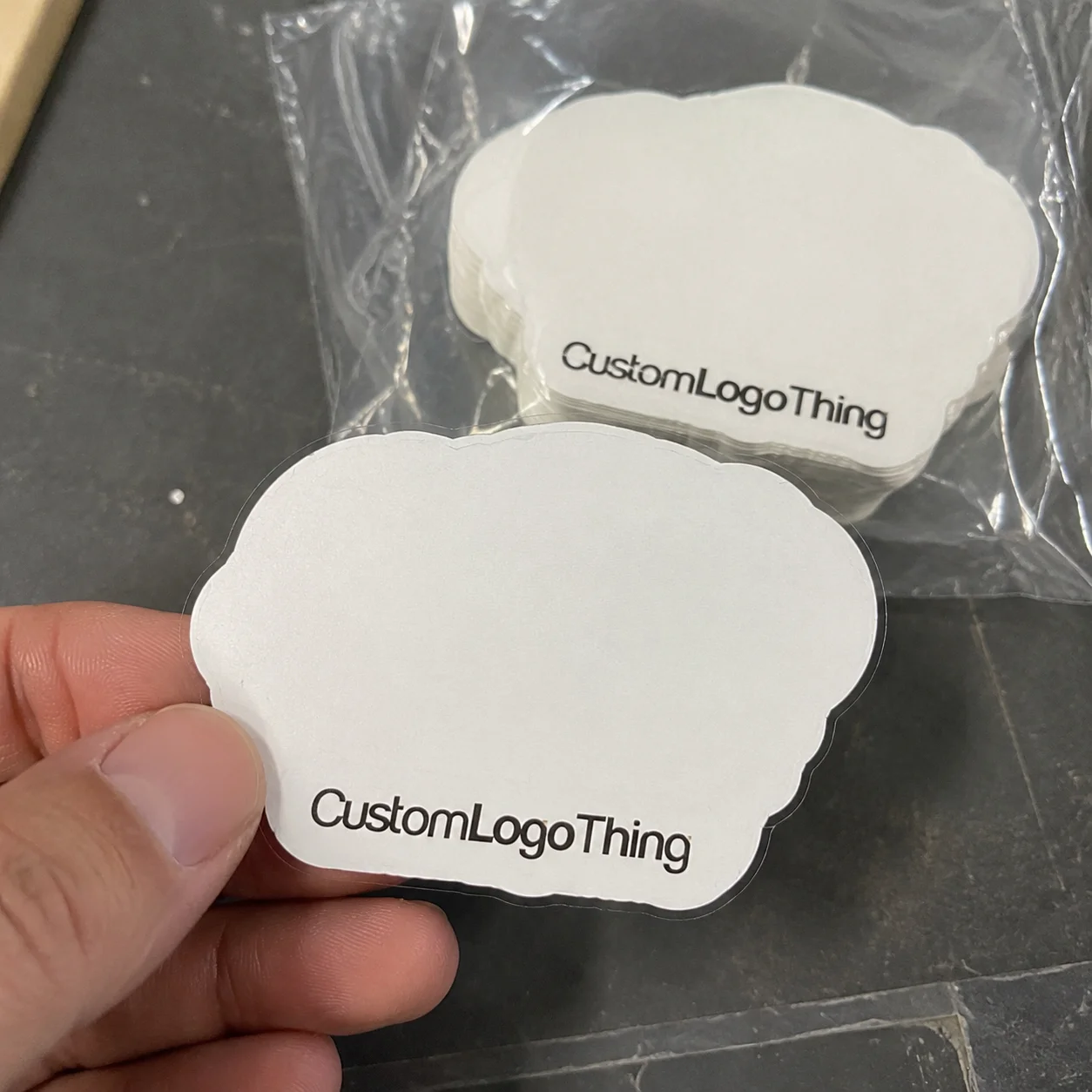
Custom transparent labels do one useful thing very well: they keep attention on the product instead of on the sticker. On apparel, that can mean the fabric, the print, the fold, or the hang presentation stays visually dominant. On packaging, it can mean the box or insert looks cleaner because the label carries information without adding another obvious block of color.
That restraint is part of the appeal. Transparent film can make a brand feel more considered than a heavy opaque label, but only if the artwork, adhesive, and finish are all chosen with discipline. Clear material does not hide weak design. It exposes it. Bad spacing, low contrast, and a poor substrate choice show up faster on clear film than they do on a standard white label.
For brands building branded packaging and tighter package branding, transparent labels can sit in the middle ground between utility and presentation. They are less visually loud than a full-color sticker and usually lighter in hand feel than a sewn tag. That makes them useful in apparel, retail inserts, e-commerce packaging, and some product bundles where the branding needs to stay present without taking over the surface.
Why custom transparent labels punch above their weight
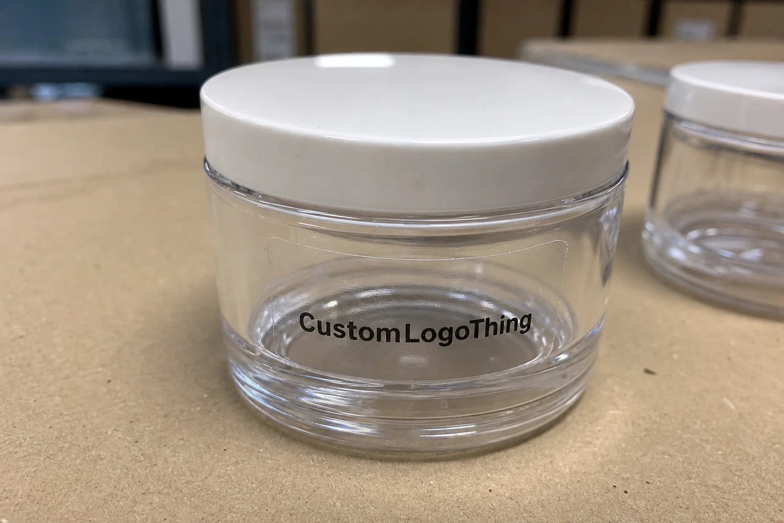
Most buyers do not ask for a transparent label because they want a technical spec on paper. They ask for it because they want the product to look cleaner. That instinct is sound. A transparent label allows the garment, carton, or insert to keep its visual texture, while still carrying the brand mark, size, care message, or packaging note.
The effect is strongest on simple surfaces. A clear label on a folded tee insert or a smooth retail bag can read as calm and deliberate. Put the same label on a busy pattern or a dark surface, and the design has to work harder. That is not a flaw in transparency. It is the normal cost of reducing visual weight. If the artwork depends on opacity to survive, the label needs a white underlay or a different construction.
There is also a practical reason to use them in a packaging system: transparent labels reduce the number of competing visual blocks. If the box already has a strong print treatment, a loud label can start to feel like an interruption. A clear label keeps the hierarchy intact. It supports the design rather than competing with it.
That said, the best use case is usually specific. Clear labels are not the answer for every garment, every box, or every surface. They work best when the brand wants subtle branding, a clean retail presentation, or a label that blends into a premium package structure. They are less forgiving when the background is textured, stretched, curved, or constantly handled.
For teams managing more than one packaging component, it helps to think in systems. A transparent label should fit alongside Custom Labels & Tags and Custom Packaging Products without looking like it came from a separate project. That consistency matters. Packaging looks more expensive when the elements feel related, not merely assembled in the same week.
If the label only works because it disappears, the design has already become the problem. Good transparent labeling should still read clearly under normal viewing conditions.
One buyer lesson shows up again and again: the mockup is rarely enough. A clear label can look refined on a white background and under studio lighting, then read too faint or too glossy on the actual package. Testing on the real substrate is not an extra step. It is the step that tells you whether the label belongs there at all.
How the material and adhesive actually work
A transparent label is built from a few layers that each change the final result. The face stock is usually a clear polypropylene or polyester film, sometimes another pressure-sensitive film depending on the supplier and application. On top of that sits the print layer. In many cases, a white ink underlay is added so the colors stay readable on dark or patterned surfaces. Beneath the print is the adhesive, and beneath that is the release liner that keeps the label usable before application.
Those layers are not interchangeable. A small change in one of them can shift the whole result. The same artwork can look crisp, hazy, glossy, or flat depending on the film and ink system. That is why transparent labels should be specified like production items, not treated as a decorative afterthought.
Opacity is usually the first technical decision. A fully clear label with no white backing can look elegant on pale packaging or light garments. On dark surfaces, though, it can lose contrast quickly. Partial white backing is a common compromise. It preserves some of the “invisible” effect while keeping the logo readable. Full white backing gives the best contrast, but it also moves the label farther away from the fully transparent look.
Finish changes perception too. Gloss clear labels reflect more light and can feel sharper or more polished. They also draw attention to edges and can look a little sticker-like if the rest of the package is matte. Matte clear labels are usually the better fit for soft goods and understated packaging because they reduce glare and sit more quietly on the surface. If the product line already uses soft-touch cartons, paper inserts, or textile textures, matte often feels more coherent.
The adhesive is where performance lives. For smooth boxes and coated inserts, a standard permanent acrylic adhesive may be enough. For garment-adjacent use, or for labels that need to survive handling, folding, shipping, and possible temperature swings, the adhesive has to match the substrate more carefully. A label that bonds well to one surface can fail on another that looks nearly identical in a mockup. Texture, coating, humidity, and surface energy all matter.
That is also why experienced buyers talk about use conditions before they talk about artwork. Will the label sit on a polybag? A satin ribbon? A kraft insert? A coated carton? Will it be removed later, or stay in place? Will it travel through hot warehouses or cold storage? Those details decide the adhesive spec more than the graphic itself.
For broader packaging programs, standards thinking helps. If the labels are part of a packaged garment or shipped retail kit, packaging validation methods such as ISTA testing can be useful when you are checking the full assembly under transport conditions. If paper-based components are involved, FSC sourcing may matter for procurement or brand claims. Neither certification fixes bad art direction, but both keep the production conversation grounded in real-world constraints.
There is also an honest limit. Transparent labels are not a universal replacement for conventional garment labels. If the application is highly textured, repeatedly laundered, or exposed to heavy abrasion, the spec needs more care. In some cases, another construction is simply the better choice. The right answer is the one that survives the use case, not the one that sounds minimal in a sales deck.
Key specs that decide the final result
The final result comes down to a handful of specifications that buyers should ask about directly. Material thickness is one of them. Thin film can feel more refined and conform better to curved or soft surfaces, but it may scuff or wrinkle more easily. Thicker film usually holds shape better and can print more cleanly, although it may read as a sticker if the design is too plain. The right thickness depends on the surface, the handling, and the look you want to preserve.
White ink usage is another major decision. A label with no white underprint can look almost invisible in the right conditions. Put it on a dark insert, and the same design may disappear. Partial white underlay lets the brand preserve transparency without sacrificing legibility. Full white underlay gives the strongest contrast but reduces the sense of visual lightness. For many apparel and packaging applications, the middle ground works best.
Size and shape need to be driven by placement, not by the design file. A tiny clear square can work for a logo seal on packaging. It will not work for a care label that needs hierarchy, spacing, and room for text. Once the layout gets too crowded, transparency stops helping. The design just becomes hard to read at normal distance.
Durability should be discussed before any quote is approved. Ask about abrasion resistance, moisture exposure, temperature tolerance, and whether the label must tolerate repeated handling or laundering. If the label is going on a package that folds, slides, or ships inside a carton, the surface movement matters. If the application is garment-related, flex and wash exposure matter even more.
A label that needs white ink to remain legible is not a problem label. It is a correctly specified one.
Print method also affects the outcome. Digital printing is often practical for smaller runs or versions with variable content. Flexographic or other high-volume methods can make sense at scale, especially if color consistency across a large packaging order matters more than prototype speed. The machine name matters less than the print quality, edge control, and repeatability on the quantity you actually need.
Surface finish, while easy to overlook, can change buyer perception fast. Gloss can look more premium in some lines and too shiny in others. Matte can feel restrained and expensive, but if the rest of the packaging is highly polished, it can look muted. The finish should belong to the packaging system. If it feels borrowed from another line, it usually is.
Custom transparent labels process and timeline
The production process is straightforward, but it slows down quickly when the brief is vague. It usually begins with artwork review. That means checking file format, line weight, font size, bleed, and whether the artwork will still read properly on transparent film. Then comes material selection, where the supplier should confirm film type, adhesive type, finish, and whether a white underlay is needed. After that, you move into proofing, revisions if necessary, approval, production, and shipment.
Most delays happen before the press starts. The usual causes are missing vector files, unclear die lines, incomplete specs, or last-minute design changes. If the supplier has to reconstruct your logo from a screenshot or guess the placement from a loose mockup, the schedule starts slipping immediately. That is rarely a machine problem. It is usually a file problem.
Timelines vary by complexity. A simple transparent label with standard film and a straightforward print build can often move from approval to production in roughly 10 to 15 business days. Add white ink, specialty adhesive, multiple sizes, or more demanding quality checks, and 15 to 20 business days is a more realistic expectation. Sampling can add a few days if the first proof needs changes. Buyers with fixed launch dates should plan for that instead of building around a best-case assumption.
Good spec discipline shortens the process. Lock dimensions before quoting. Confirm the label’s placement on the actual product or package. Decide whether the adhesive must be removable, semi-permanent, or permanent. If the label is part of a broader branded packaging rollout, align approvals early across all components so one piece is not waiting on another.
The strongest production teams do not ask for speed first. They ask for fewer surprises. They check proof size at actual scale, on the actual substrate, under normal lighting. That sounds basic, but it removes a large share of avoidable mistakes. A proof that looks perfect on a screen is not proof of anything except that the screen looks good.
Cost, pricing, MOQ, and quote variables
Price is shaped by several variables, but quantity usually matters most. Small runs cost more per label because setup, proofing, and production time are spread across fewer pieces. As quantity rises, unit cost usually falls. That is the standard manufacturing curve, and labels follow it closely.
For a 5,000-piece order, ballpark pricing for custom transparent labels often falls into these ranges:
| Label build | Typical unit cost | Best fit | Main watch-out |
|---|---|---|---|
| Clear film, single-color print, simple adhesive | $0.08-$0.16 | Light-duty packaging, inserts, simple branding | Can look washed out on dark surfaces |
| Clear film with white ink underlay, matte finish | $0.12-$0.24 | Premium apparel packaging, stronger contrast needs | White layer adds cost and may increase setup time |
| Durable clear film, high-tack or specialty adhesive | $0.18-$0.35 | Wash-prone, high-handling, or textured applications | Adhesive matching must be tested on the exact substrate |
Those are ranges, not quotes. Size, shape, color count, finish, adhesive system, and artwork complexity all move the number around. A small label with lots of fine detail can cost more than a larger label with simple artwork if the print setup is more demanding. Rush production, individual packaging, and extra proof rounds can add cost too. Shipping is often separate. That gets overlooked more often than it should.
MOQ is another practical issue. Lower minimums help brands test a design, run a seasonal drop, or validate a new packaging system without tying up too much inventory. Larger runs usually reduce unit cost, but they also increase capital tied up in stock. The better choice depends on how quickly the product line moves and how much risk the team can hold.
When comparing quotes, compare the actual build, not just the headline number. One supplier may quote a matte clear label with white ink and a tested permanent adhesive. Another may quote a plain clear film with no backing layer and a generic adhesive. Those are not equivalent products. The price difference is often the spec difference.
If you are buying coordinated product packaging or retail packaging at the same time, ask whether the label supplier can keep the visual system consistent. A transparent label that clashes with the box finish, tissue color, or insert stock can make the whole package feel less coherent. That becomes a packaging design issue, not just a label issue.
Step-by-step: how to order the right label the first time
Start with the use case. Where will the label live? On a garment fold, a carton, a polybag, a hang tag, or an insert? What surface is it touching? How much handling will it see? If those answers are fuzzy, the spec will be fuzzy too.
- Define the application in plain language. State what the label is for, where it will go, and whether it needs to stay removable or permanent.
- Match the film and adhesive to the substrate. Smooth boxes, coated inserts, textile surfaces, and textured materials behave differently.
- Set the size from the actual placement area, not from the design file. Measure the real space around seams, folds, and print.
- Build the artwork for contrast. Transparent media punishes thin lines, pale colors, and tiny type.
- Request a proof or sample. Check it on the real garment or package under normal lighting.
- Approve production only after verifying readability, adhesion, and placement.
Artwork prep matters more than many teams expect. Vector files are cleaner. Line weights need to survive print. Clear space around the logo helps the label feel deliberate rather than crowded. If the design uses fine type, test it at actual size. What looks crisp on a screen can fall apart in the hand, especially on transparent film where the background keeps changing.
Sample evaluation should be systematic, not cosmetic. Check the edge for lift. Rub the corner. Look for scuffing or ink smear. Apply the sample to real production pieces, not a hand-picked demo item. If the label is part of a broader branded pack, compare it against the hang tag, tissue, and Custom Packaging Products so the final presentation feels coordinated.
Keeping a spec sheet is one of the simplest ways to save money later. Record the film type, adhesive type, finish, white ink usage, dimensions, and approval date. Then the next reorder does not rely on old emails, buried PDFs, or somebody remembering what the team meant six months ago. Reorders should be repeatable. If they are not, the spec was never fully locked.
Common mistakes that make transparent labels look amateur
The most common mistake is weak contrast. If the logo disappears on the surface it was supposed to brand, the label has failed its main job. Transparent does not mean faint. It means the structure beneath the label should still show through, while the brand mark remains readable. Thin strokes and low-contrast artwork often need white support to survive.
Another mistake is finish mismatch. A glossy clear label on a soft-touch carton can feel visually out of place. A matte clear label on a highly polished fashion insert can look too flat if the rest of the presentation is shiny. The finish should belong to the package, not fight it.
Handling conditions get ignored more often than they should. If the label will be folded, handled, packed, shipped, rubbed, or washed, the adhesive and film need to account for that from the start. People tend to approve the proof and then act surprised when the label scuffs or peels in use. That is a spec issue, not bad luck.
Placement is another trap. A label that looks balanced in a mockup may sit awkwardly on the real item, cover a seam, or disappear into a fold. Always test placement on the actual product. A few minutes of physical checking can save a lot of wasted stock.
The last mistake is assuming every clear label is the same. Film thickness, adhesive chemistry, finish, and print method all affect the result. If a supplier cannot explain those differences clearly, that is usually a warning sign. The materials are the product. If the spec is vague, the outcome will be vague too.
Next steps for a cleaner label rollout
The cleanest rollout starts with the hardest application. Pick the garment or packaging use case with the most handling, the most visibility, or the most demanding surface. If that version works, the easier versions usually follow. That is a practical way to standardize custom transparent labels without guessing your way through the first order.
Before requesting quotes, gather the basics: artwork, quantity, substrate type, finish preference, adhesive requirement, and durability expectations. If the label is part of a larger packaging system, say so. The supplier should understand how the label needs to behave alongside the rest of the line, not just how it looks in isolation.
Ask for a proof or sample that matches the actual fabric color or package finish. A generic mockup is not enough. Then test the first production run for readability, adhesion, and wear before scaling up. That one habit catches most of the expensive mistakes while they are still fixable.
Labels perform better when the whole package is treated as one system. The label, the box, the insert, the tissue, and the finish all need to agree. That is packaging discipline. It is also what makes a release feel intentional instead of pieced together.
Once the right build is established, lock it down. A stable spec makes reorders faster, reduces inconsistencies, and keeps package branding from drifting over time. If the label is meant to stay invisible in the best sense of the word, the process behind it has to be more deliberate than the final surface suggests.
Are custom transparent labels good for clothing that gets washed often?
They can be, but only if the film and adhesive are built for laundering and repeated abrasion. The label needs to be tested on the exact garment material, with attention to wash temperature, drying conditions, and stretch. A sample that holds on a bench test can still fail in the wash if the adhesive is not matched correctly.
What fabrics work best with transparent clothing labels?
Smooth, stable surfaces usually perform best because the adhesive can bond evenly. Highly textured, stretchy, or heavily coated fabrics often need a different adhesive or a different label construction. The safest approach is to test on the exact fabric, not a similar swatch.
Do transparent labels need white ink?
Often they do, especially if the label has to stay readable on dark or patterned surfaces. White ink can act as a backing layer so the artwork does not disappear into the substrate. Some brands skip it for a subtler look, but that only works if contrast still holds at normal viewing distance.
What affects the price of custom transparent labels the most?
Quantity usually has the biggest effect on unit cost. After that, size, print complexity, finish, adhesive type, and proofing or tooling requirements matter most. Smaller runs cost more per label because setup costs are spread over fewer pieces.
How do I make sure the label size is right before ordering?
Mock it up on the actual garment or package at full scale. Check readability, edge clearance, and placement from normal viewing distance. Approve the proof only after the label works on the real product, not just on a screen.